GFH Annual & ESG Report
Applied Intelligence
A quick introduction to GFH’s Annual Report 2023
We have worked on GFH (formerly known as Gulf Finance House) annual reports since 2015. GFH has evolved into one of the leading financial investment companies in the Kingdom of Bahrain and growing its power base across the GCC. Established in 1999, the firm has been a client of the agency for nearly ten years, winning a slew of branding and design awards. Unisono has been responsible for all of their annual reports since we rebranded the bank in 2013. In all previous years we think we set a high bar for the brand and this year we believe we achieved an even higher height for GFH’s Annual Report.
The creative challenge
The creative challenge we had in creating GFH’s 2023 Annual Report was how to create an elaborate on the AI calendar concept without it being repetitive. The client’s Corporate Communications team were very happy with the result of the earlier released calendar they wanted the AI concept to be applied to a the annual report again, as in previous years. The creative team at Unisono took this challenge on and set to work creating an annual report that was infused with intelligent design cues and reused the AI images from the calendar in a manner that didn’t result in a ‘seen this before somewhere’ reaction.
The creative strategy
The theme behind the calendar was ‘Applied Intelligence’. We took the notion of AI and applied it to the approaches GFH takes in building its investment vehicles. The firm looks at markets and opportunities that have stable growth patterns and positive cash flows that perform well in the mid to long term. Applying Intelligence to opportunities rather than following a fast-in-fast-out ‘trader’ mentality.
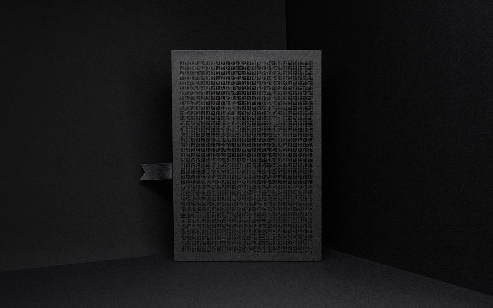
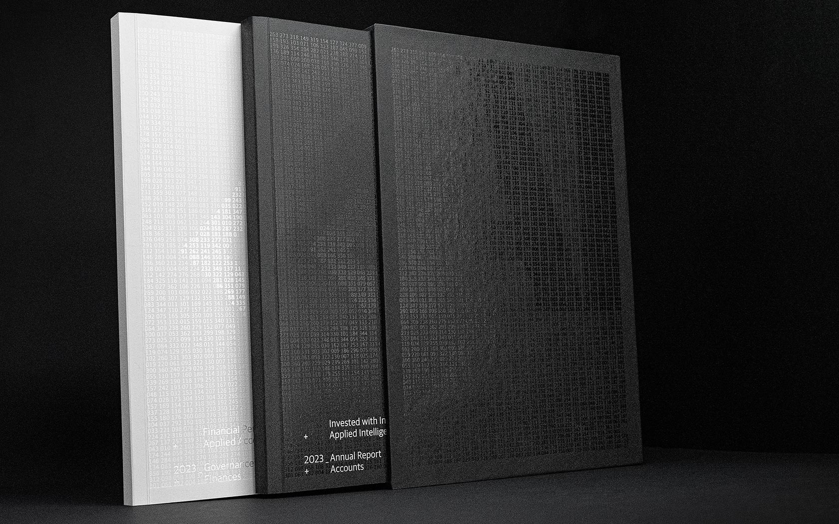
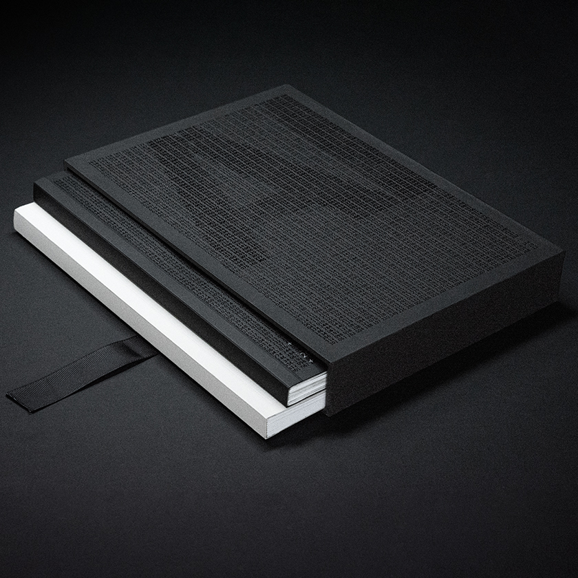
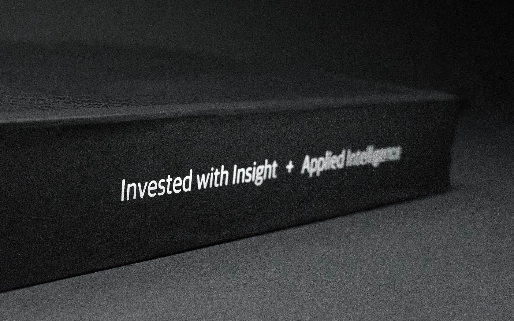
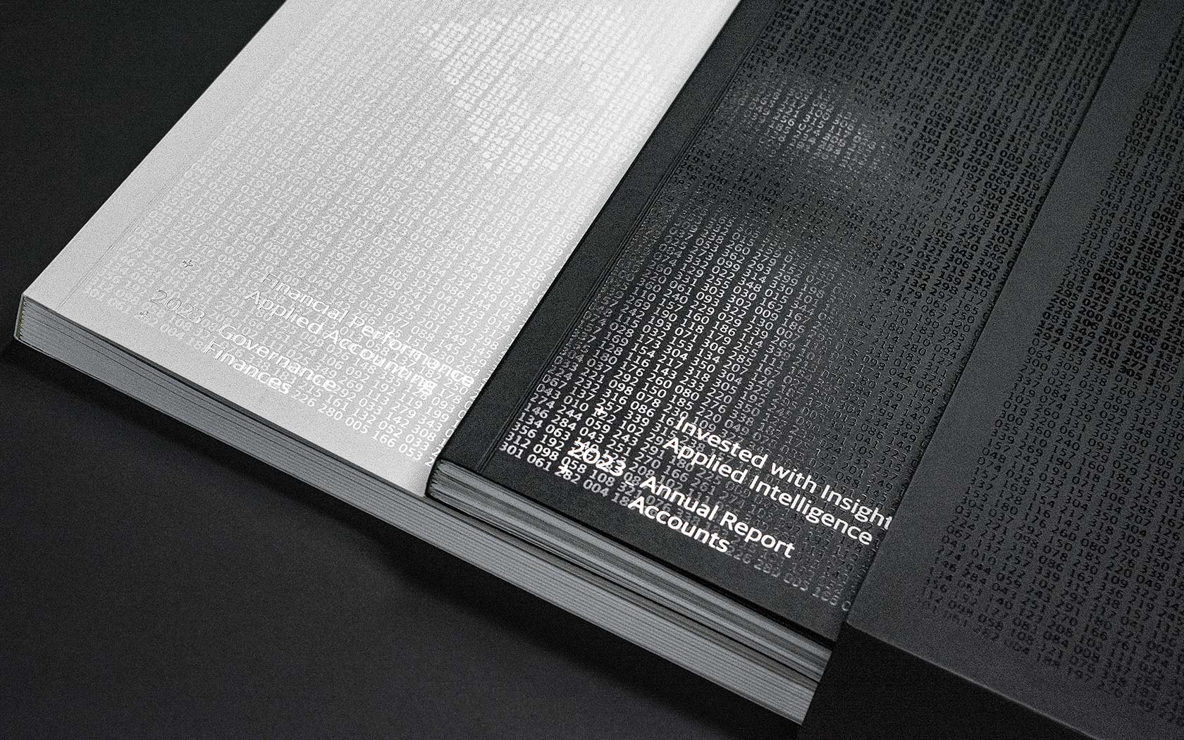
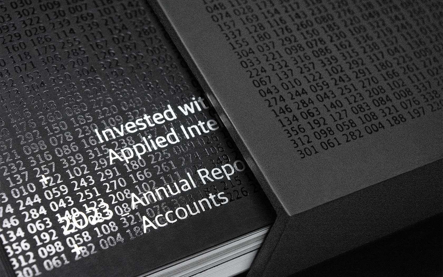
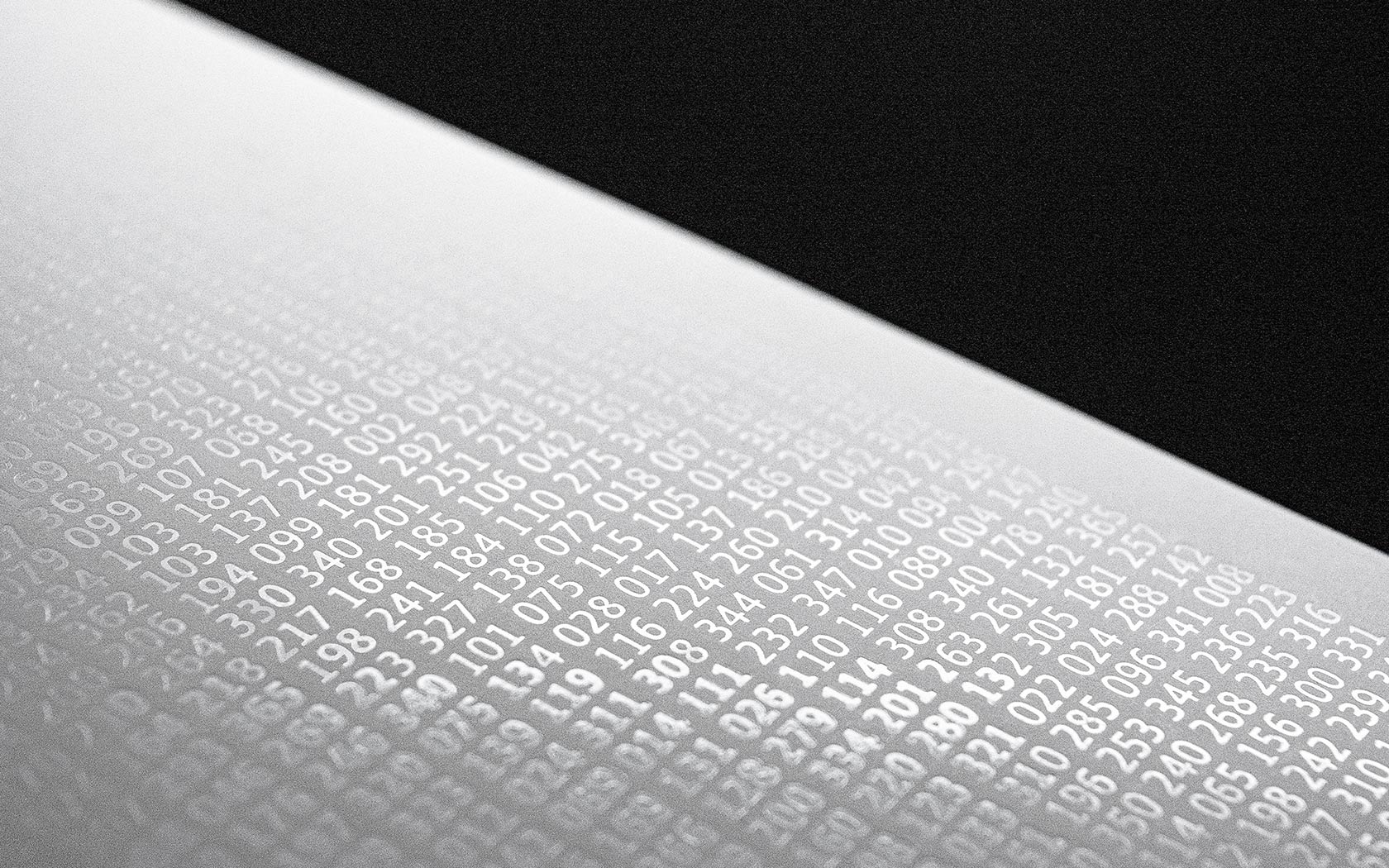
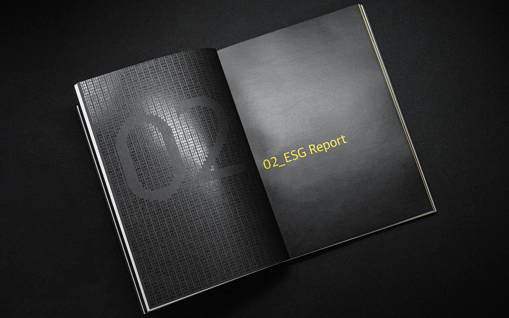
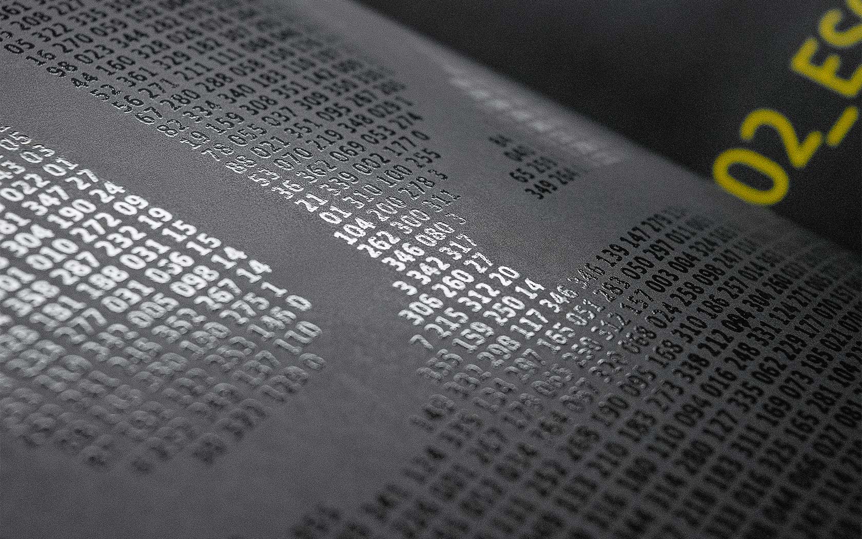
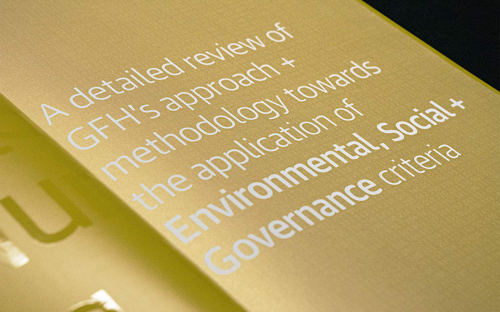
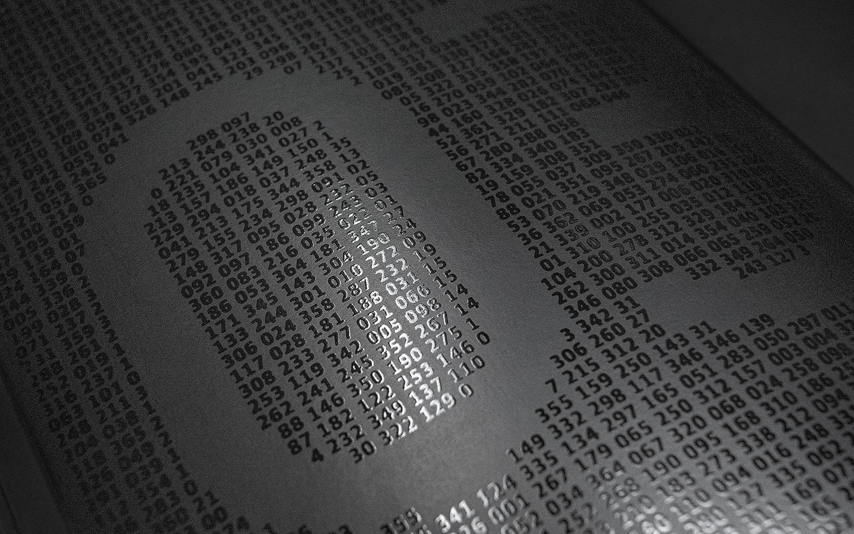
The slip case features a pattern made from 2,023 unique dates created by AI. The AI (Applied Intelligence) theme is applied on the cover using foil in two weights of Commercial Type’s Guardian Sans Agate. The heavier weight contrasts with the background creating the title ‘AI’ graphic.
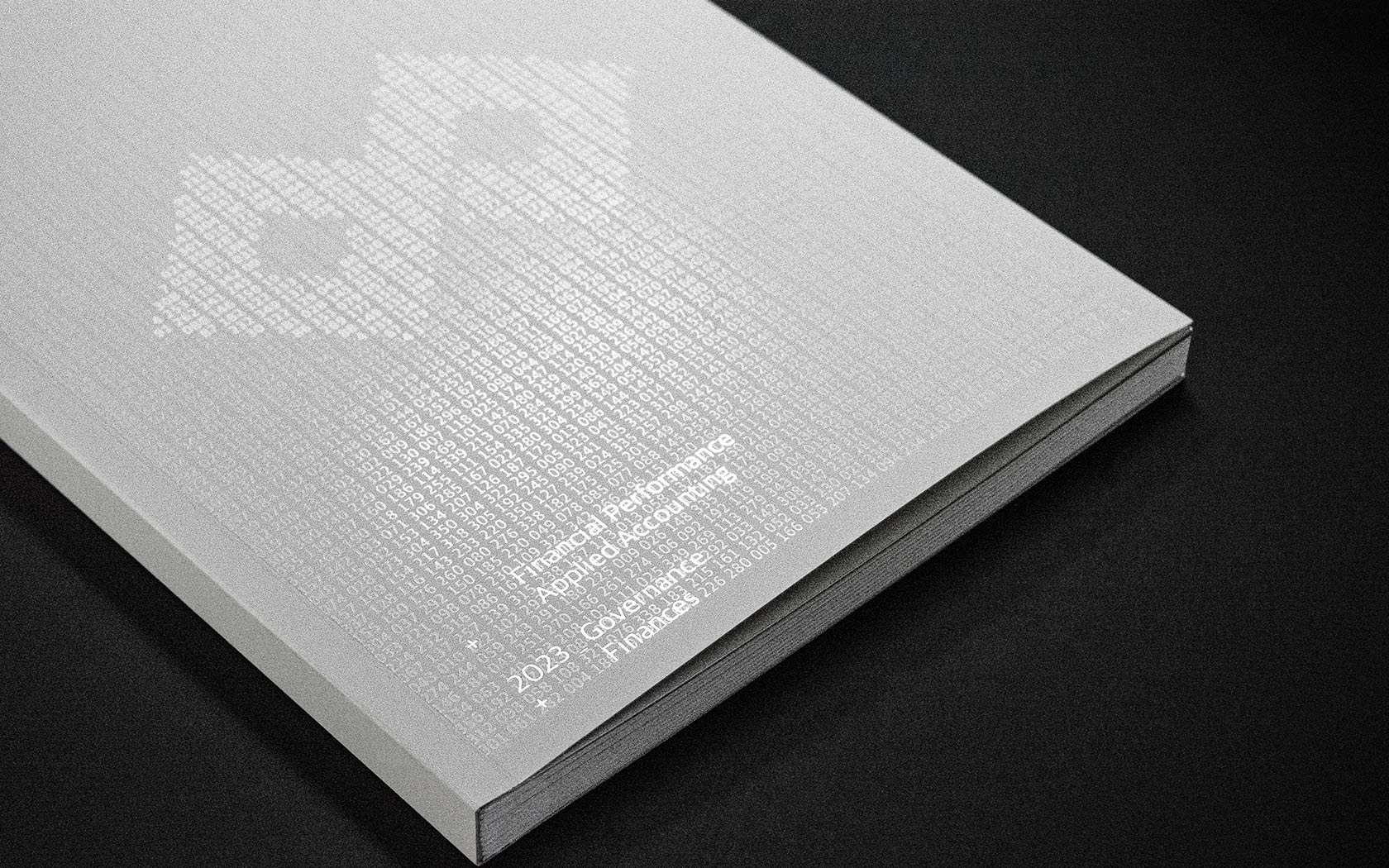
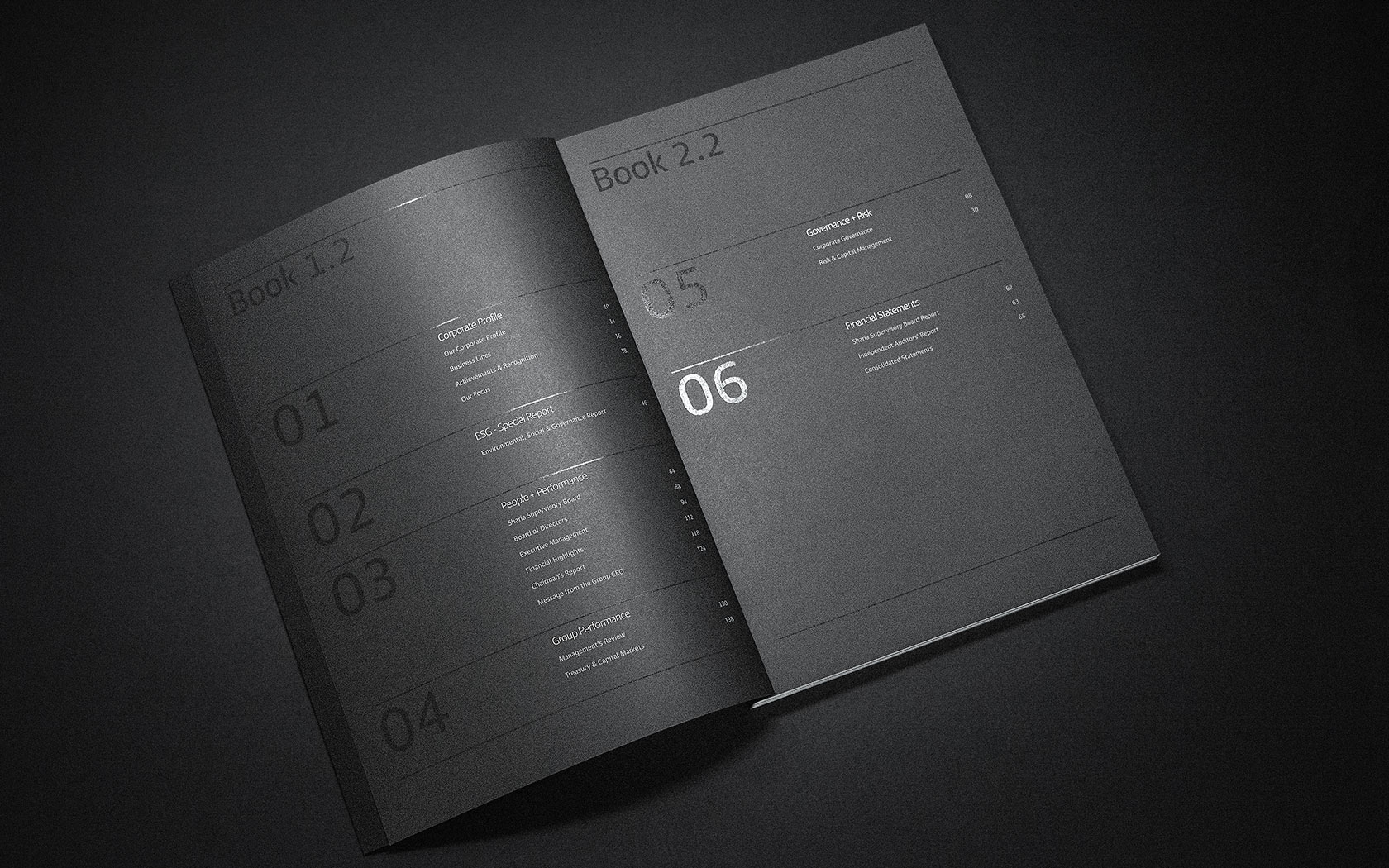
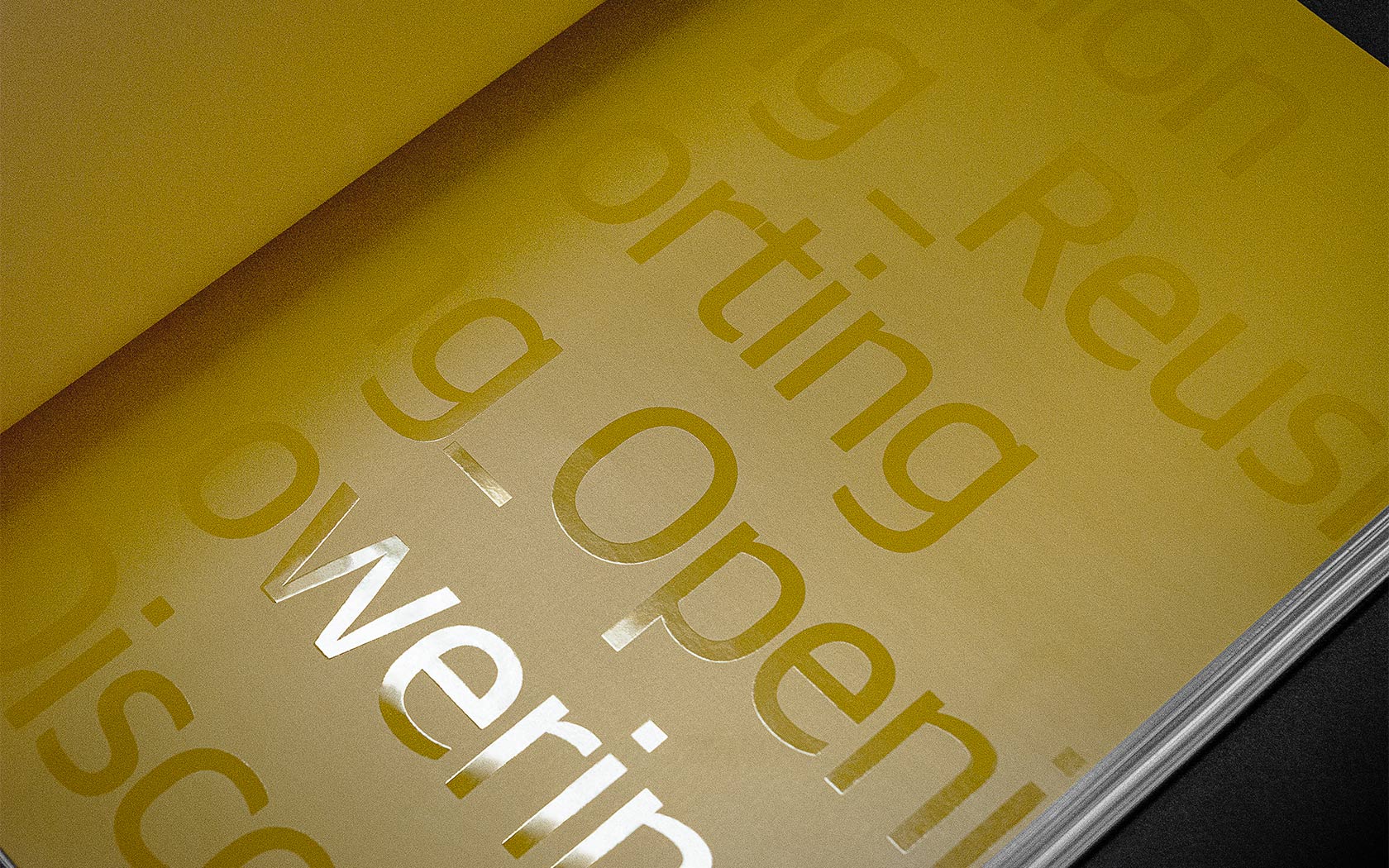
This duality is enhanced Inside on the covers of the two volumes by the two paper stocks (Arjo Wiggin’s Curious Skin Black + Ivory) used on the report and the financial section. Set on top of the pattern, are titles for each volume, set in a contrasting foil. Matt silver over the white foil on Curious Skin Ivory and white over black foil on the Curious Skin Black.
The contrasting print volumes for the front section and the financials provides intrigue and the different light reflections promotes interaction with the volumes and clearly sets the two works apart. The colour of the white foil didn’t contrast well on white stocks but worked perfectly on the Curious Skin Ivory, providing the perfect balance of contrast and subtly. After extensive testing we got the Ivory and white foil combination to work as we imagined.
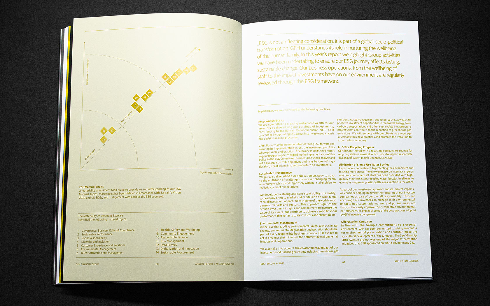
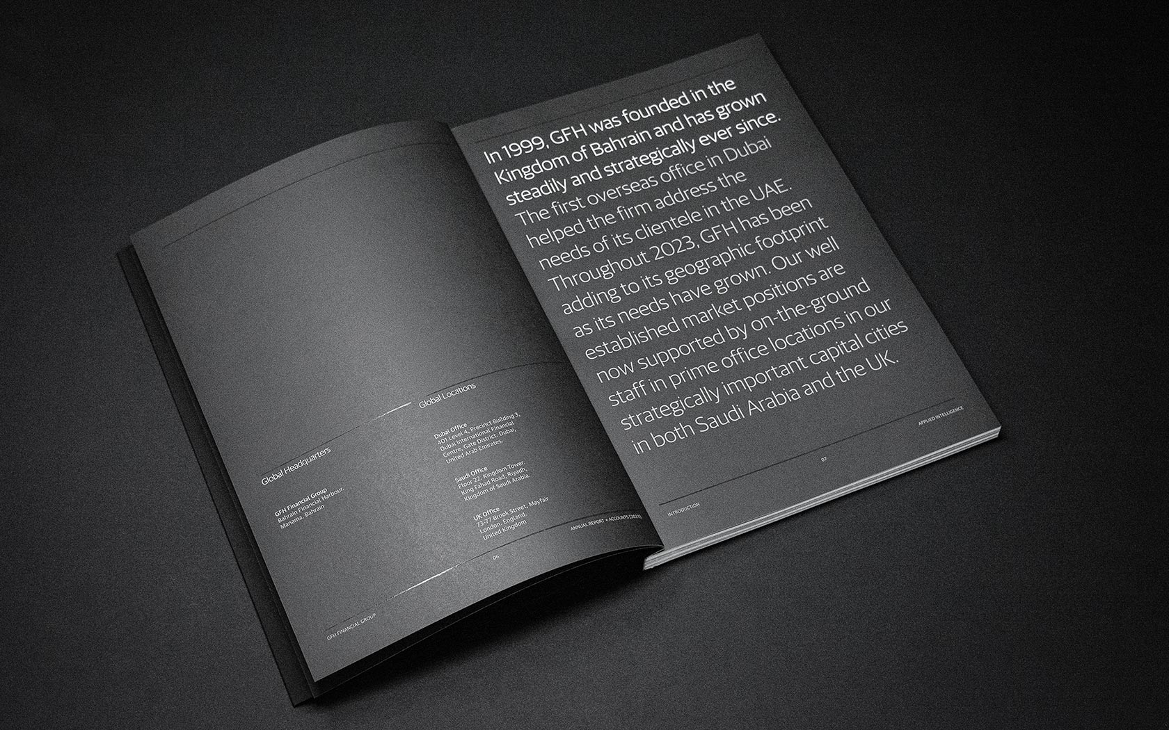
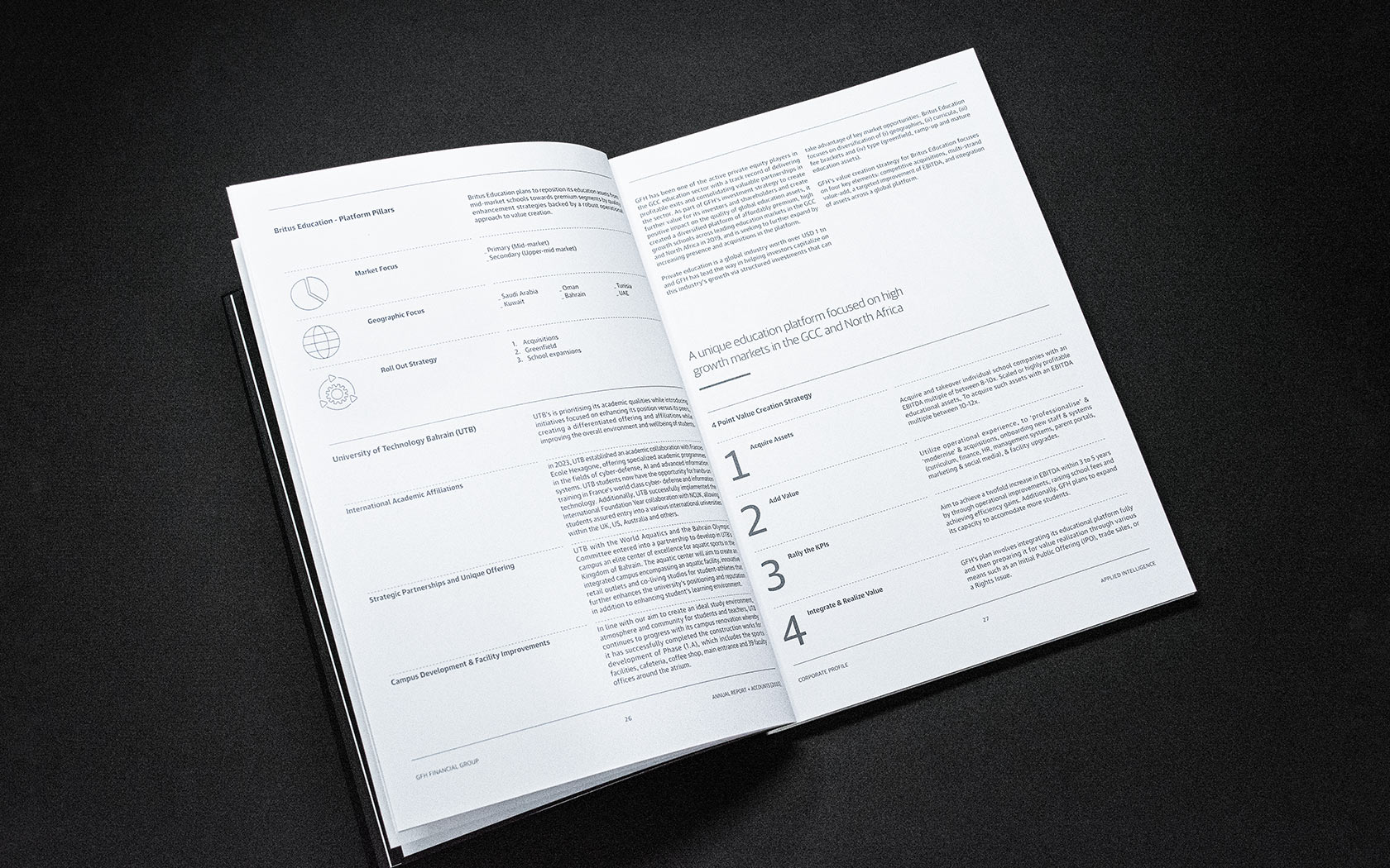
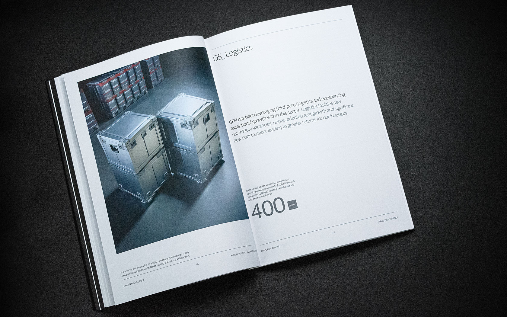
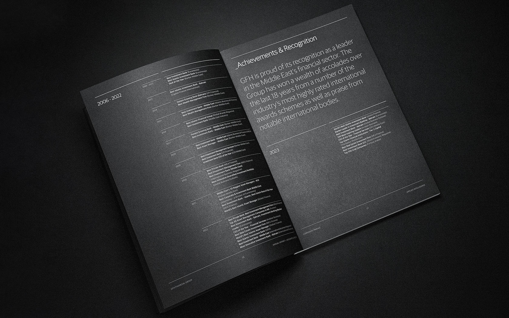
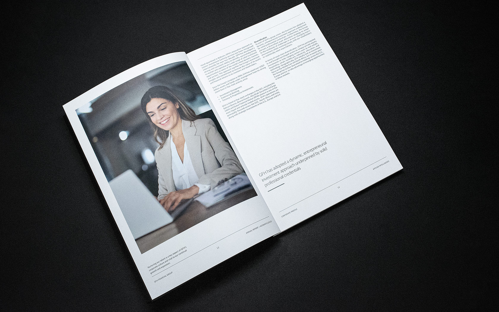
The duality continues with the internal typographic content spreads, split into two column asymmetric spreads, with the weightier column falling on the right of the spread and the numerical, title or iconic content falling on the left. This design approach builds consistency in the design and eases cognition of the content in large volumes.
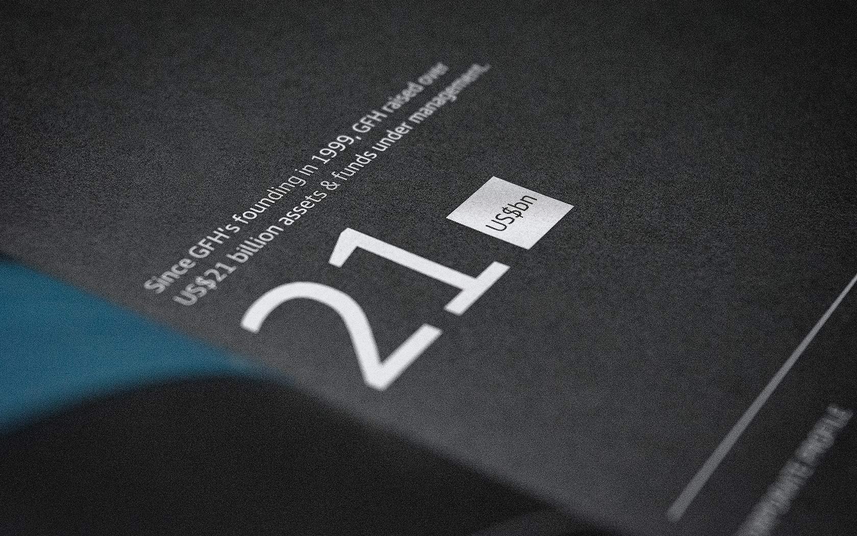
The tension the two column spreads is further aided by the application of elements like numerical call outs. Large open areas on layouts feel complete with a call out strategically placed in the right location. The tension on spreads is also supported by typographic copy call outs with two column underlines or strokes. Aligned to the baseline of the images, these strokes support the call out and promote visual consistency from the verso to the recto page in the layout.
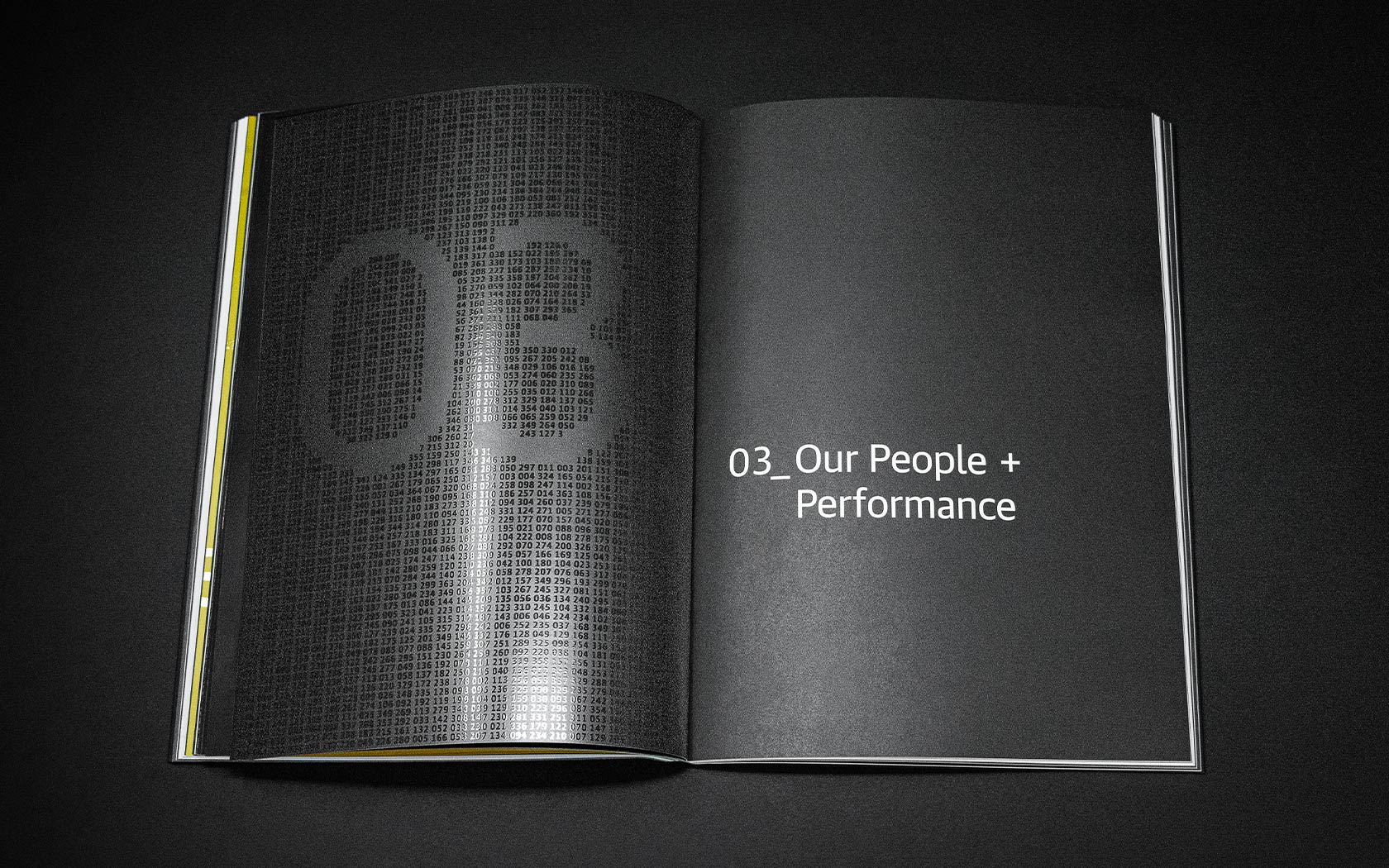
The numerical section breakers or interstitials use a similar 2,023 AI generated dates with a knocked out figure in the centre spread. Underscore dashes ( _ ) added to the machine-like quality of the overall aesthetics.
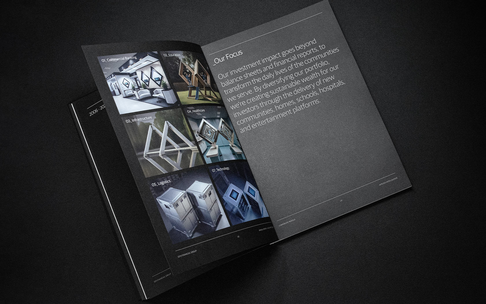
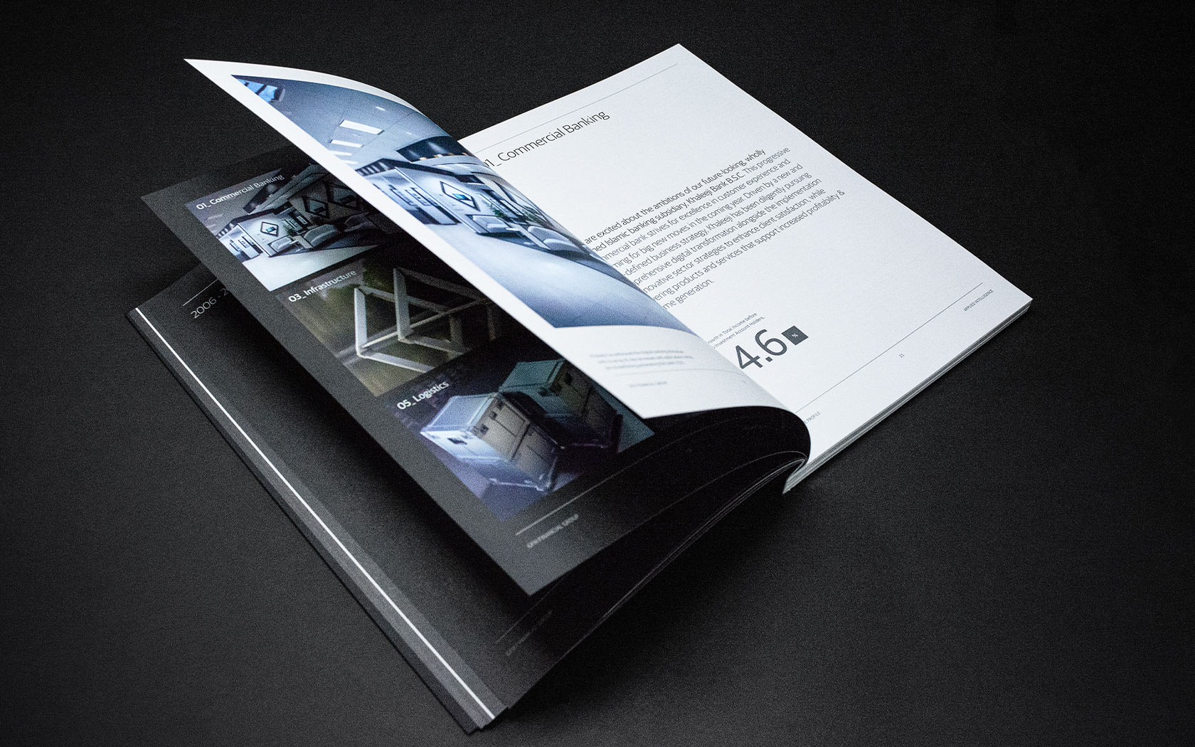
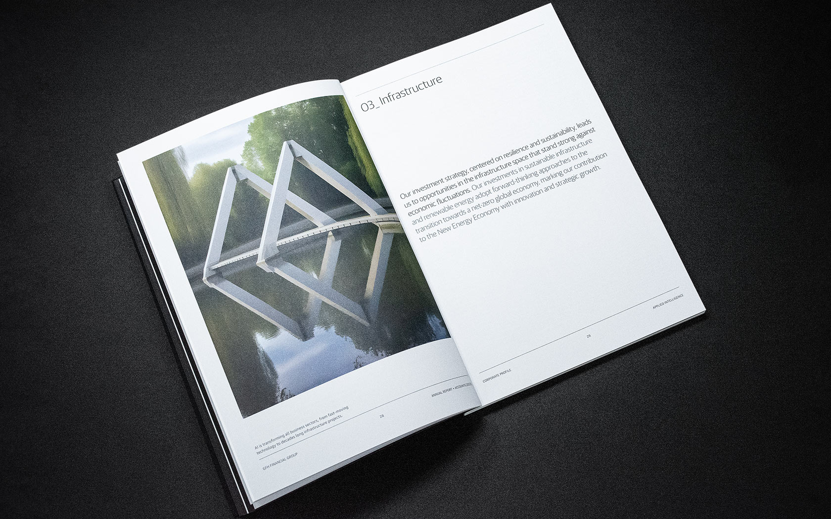
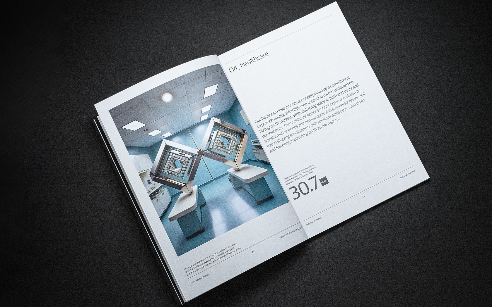
The portfolio section of the report features sub-sections punctuated by hero images generated by artificial intelligence. Each one a reflection of the business focus area and comprised of the brand mark’s signature double diamond form.
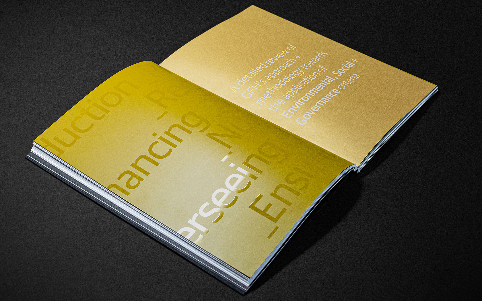
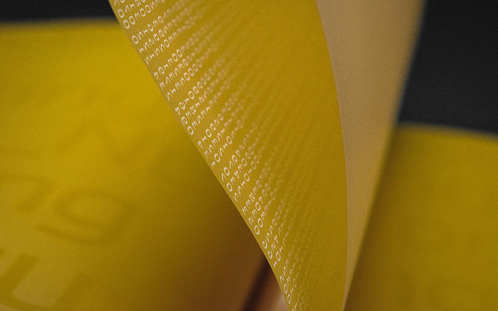
The centre of the first book features a unique volume with a velum paper breaker. The paper changes from CX22 to a uniquely tactile stock. The velum paper is screen printed with white ink on the front and inside sections, creating a layered finish.
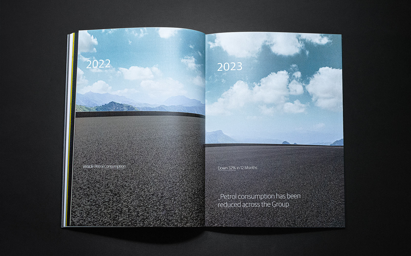
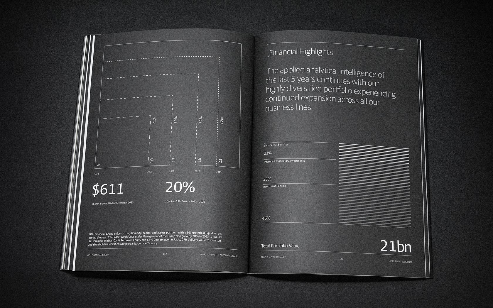
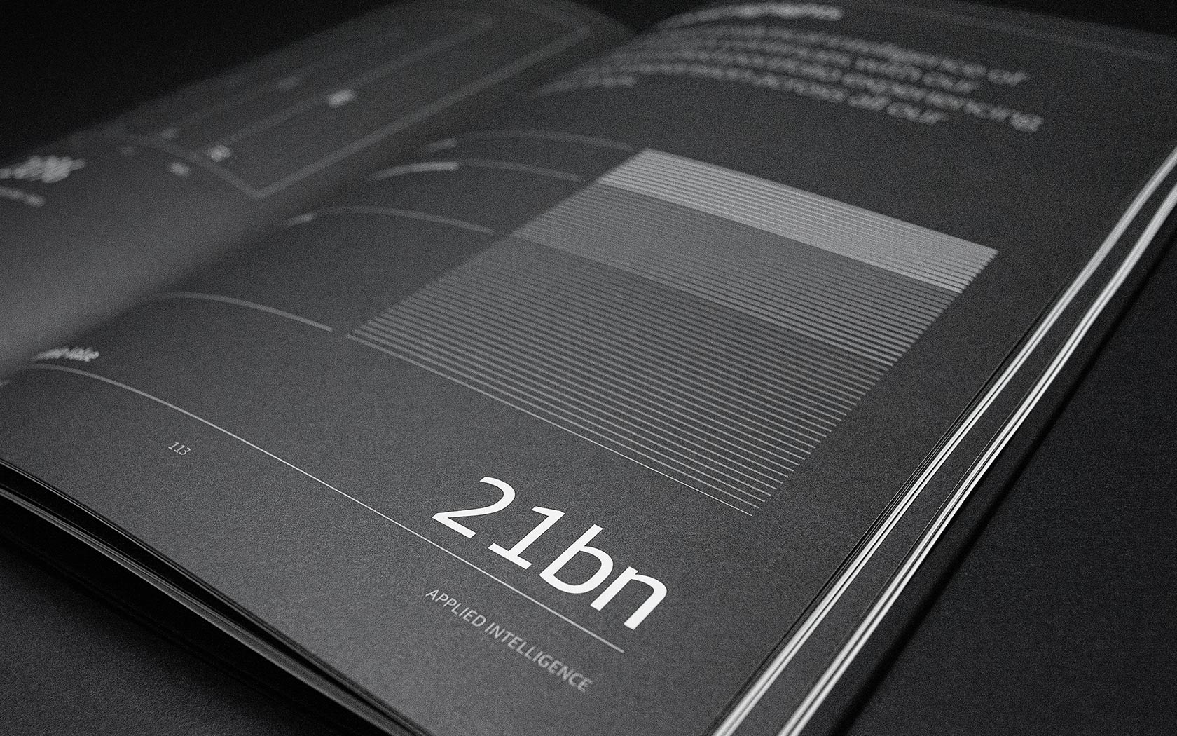
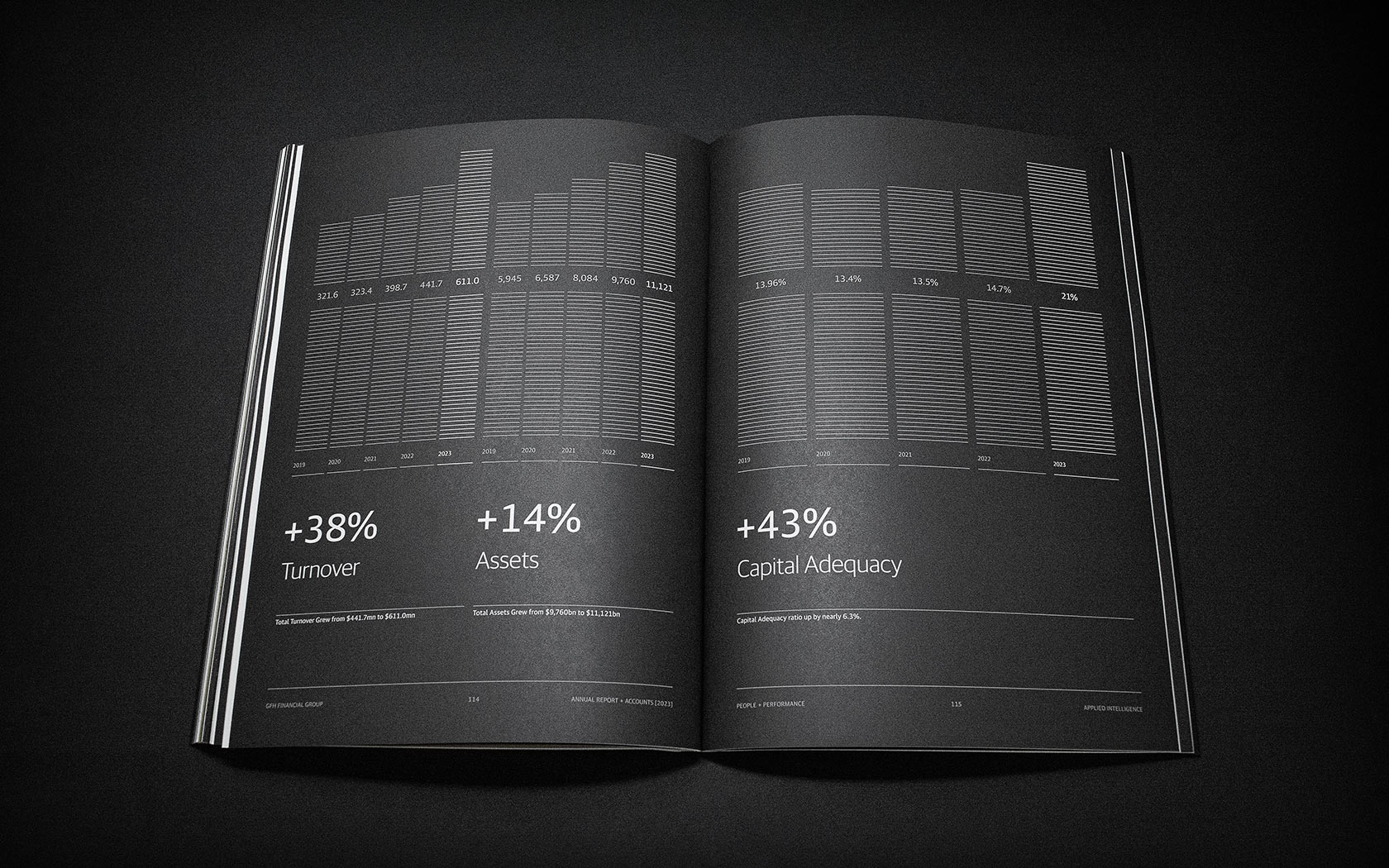
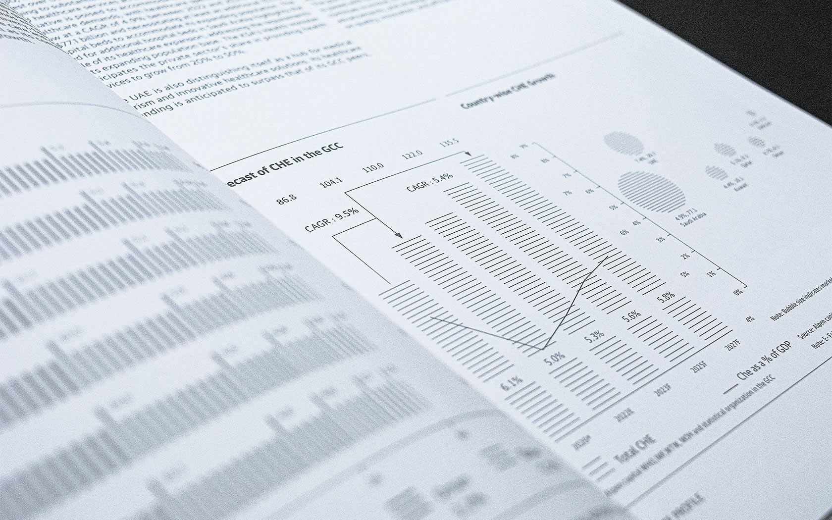
The key data in the report is made into a hero of the work thanks to bold and contemporary charts. The two column design is carried through again with the title in the light lefthand column and the weightier chart element on the right.
The results of our 2023 Annual Report works
We worked on the every aspect of 2023’s GFH annual report, from concept and design to copywriting and the core craft of the printing the final production. The covers of the reports feature a fold back section complete with foil and spot UV, creating a sensory and arresting front cover. The proofing process was extensive and the end result was worth the late nights and near-exasperated relationships. CX22 paper was used internally for its feel and ability to take varnish. This allowed the internal spreads to subtly reflect the cover designs and provide a high-end finish for the brand.
The end result of the 2023 GHF Annual Report project is an incredible product, a creative report that insists on your attention from the very cover and delivers on a reader’s curiosity through every section and across both volumes. The reception to the report from all recipients has been great and we are happy to be discussing next years concept with them as we type.
Hisham Alrayes, the CEO of GFH gave us a one word review of the work “Incredible”; this says it all.
We thank GFH and their corporate comms team for their assistance in delivering this report. It’s exciting, challenging and very, very rewarding.
Want to see more?
GFH’s own website is here and their social media is here. The work we have done for GFH’s previous annual report is here.
Incredible!
Hisham Alrayes. CEO. GFH
Details View Close
The application of creative intelligence has resulted in another spectacular result
Liam Farrell. Creative Director & Partner.
Esterad.
Annual Report 2019
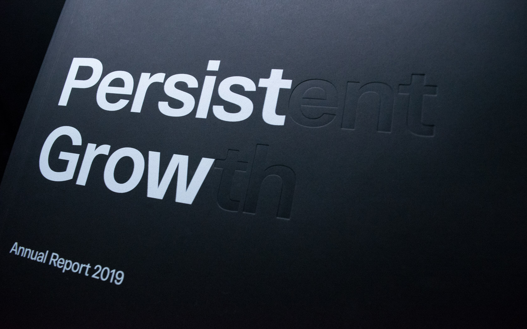
This beautifully finished Esterad Annual Report 2019 celebrates another remarkable year for this prosperous brand.
Big 5.
Rebrand
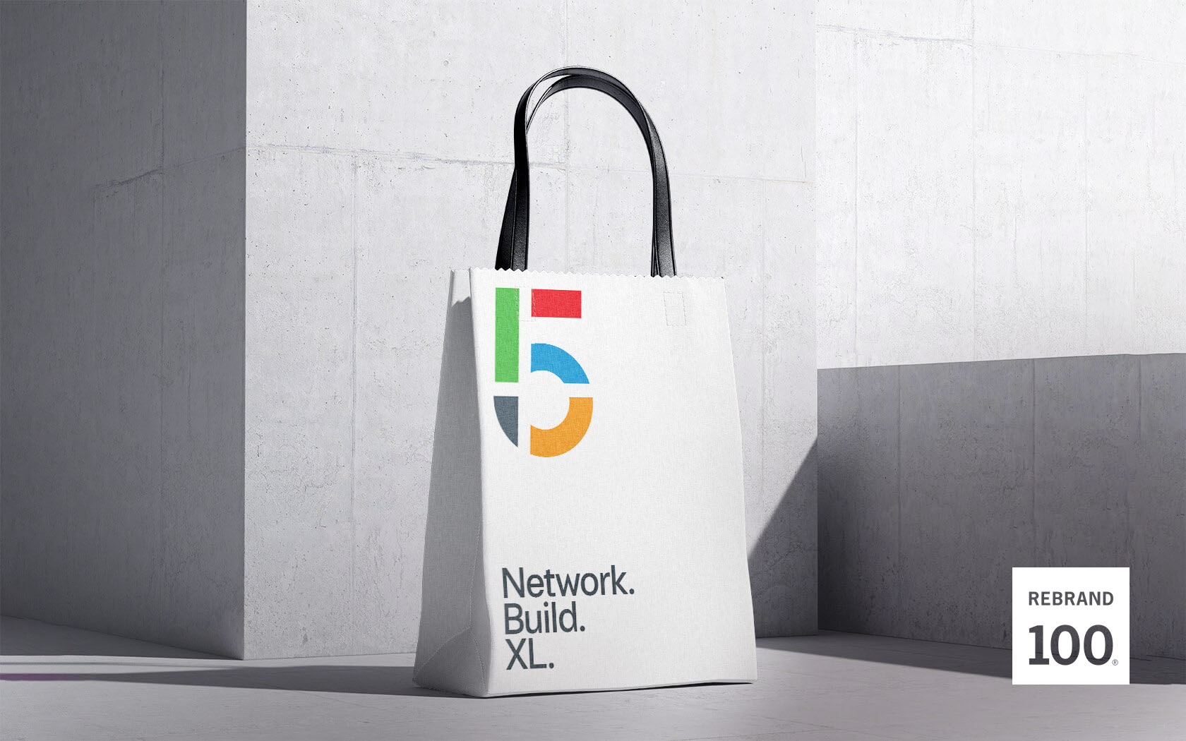
When DMG events asked us to reimagine their flagship construction industry's event, The Big 5, a show that never knowingly thinks small, we helped them to really XL.
Ertiqa.
Rebrand
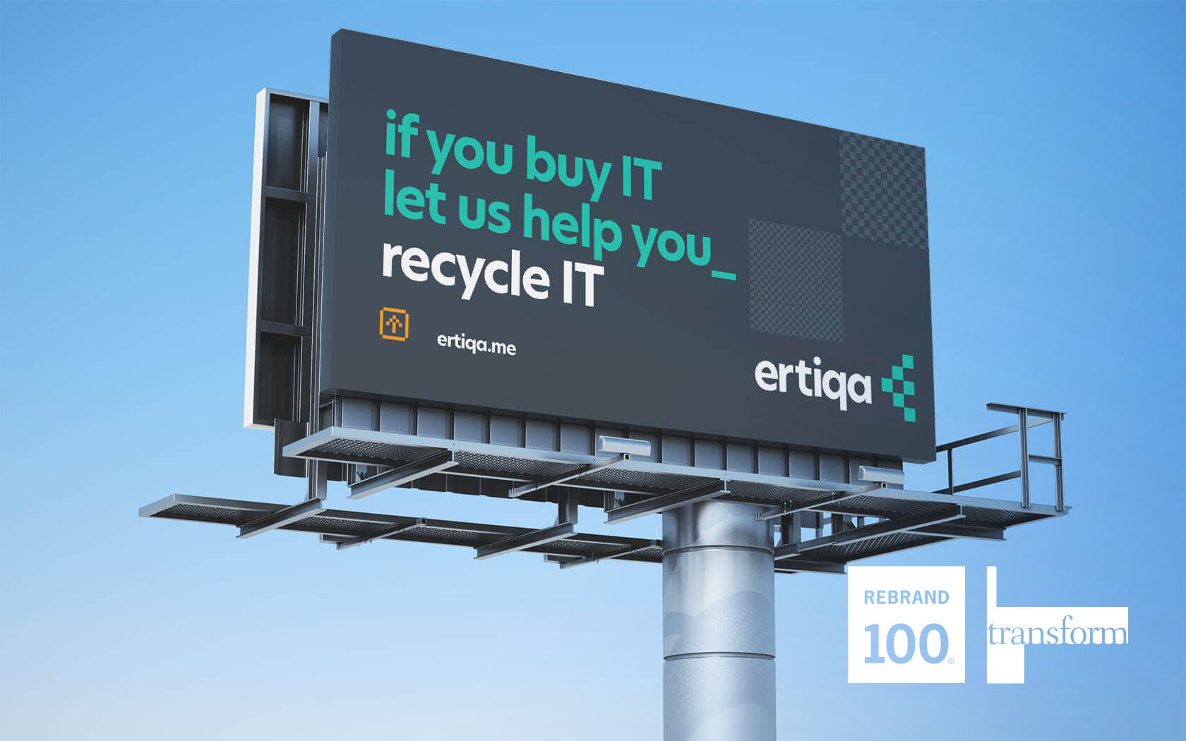
Ertiqa's Transform Gold and Silver plus Rebrand 100 Award winning rebrand helps lead the way for digital waste transformation.
Alhoty.
Rebrand
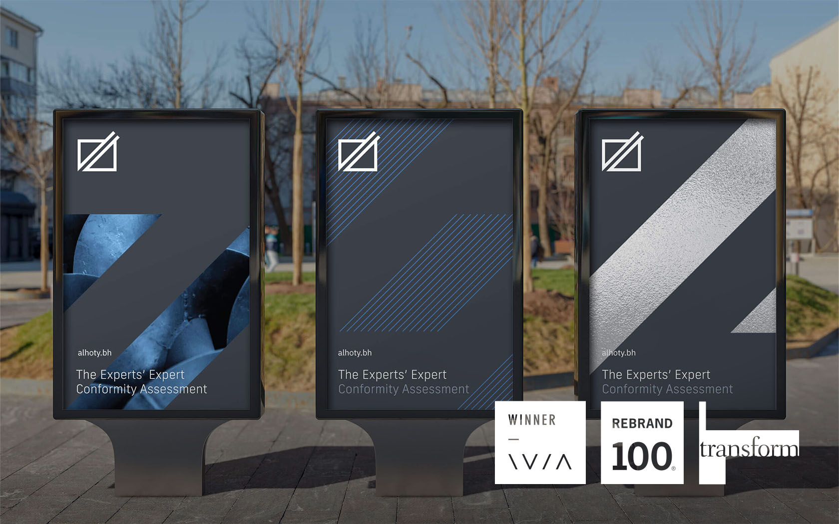
The experts' expert is beautifully rebranded by Unisono. Say hello to the new Alhoty, Bahrain's trusted analytical services provider.
GFH.
Annual Report 2019
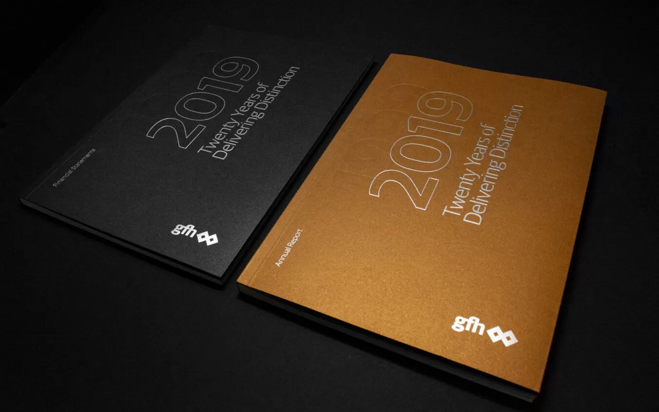
A very special annual report for a very special occasion. 20 years in business for one of the region's leading financial groups.