Harbour Heights. Rebrand
Reaching a new height in waterfront real estate
The Harbour Heights rebrand process started with a review of the previous incarnation of the brand’s – Villamar. The project had stalled under its previous owners and needed to be brought back to life, with greater purpose. We were really excited to be selected to redevelop the identity for this project as it has been, hitherto unfinished but none-the-less, a skyline defining building on Manama’s water front for over a decade.
Market Challenges
The project needed a new name and new identity to drastically reposition it from the previous presentation. The existing identity looked very dated even when it wass first used; it was very provincial in aesthetics and didn’t reflect the buildings lofty standards of architectural design. We had to move the thinking of the identity away from typical building-design-reduced-to-an-icon visual solutions and towards a wholly-more elegant and sophisticated aesthetic.
Our strategy
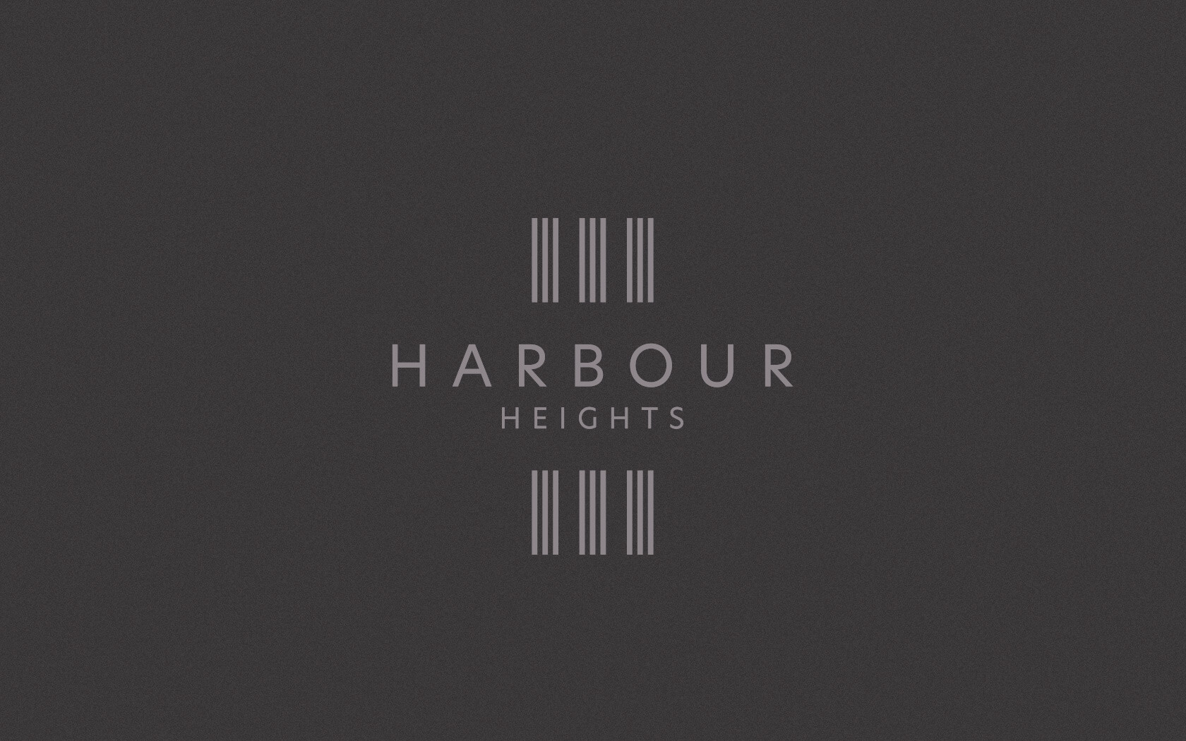
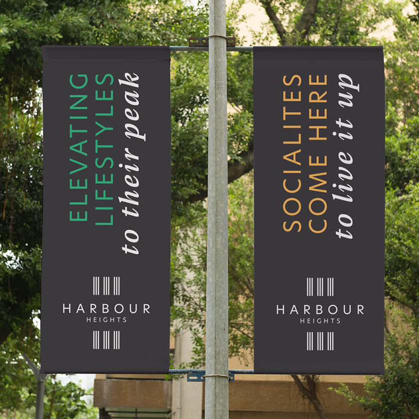
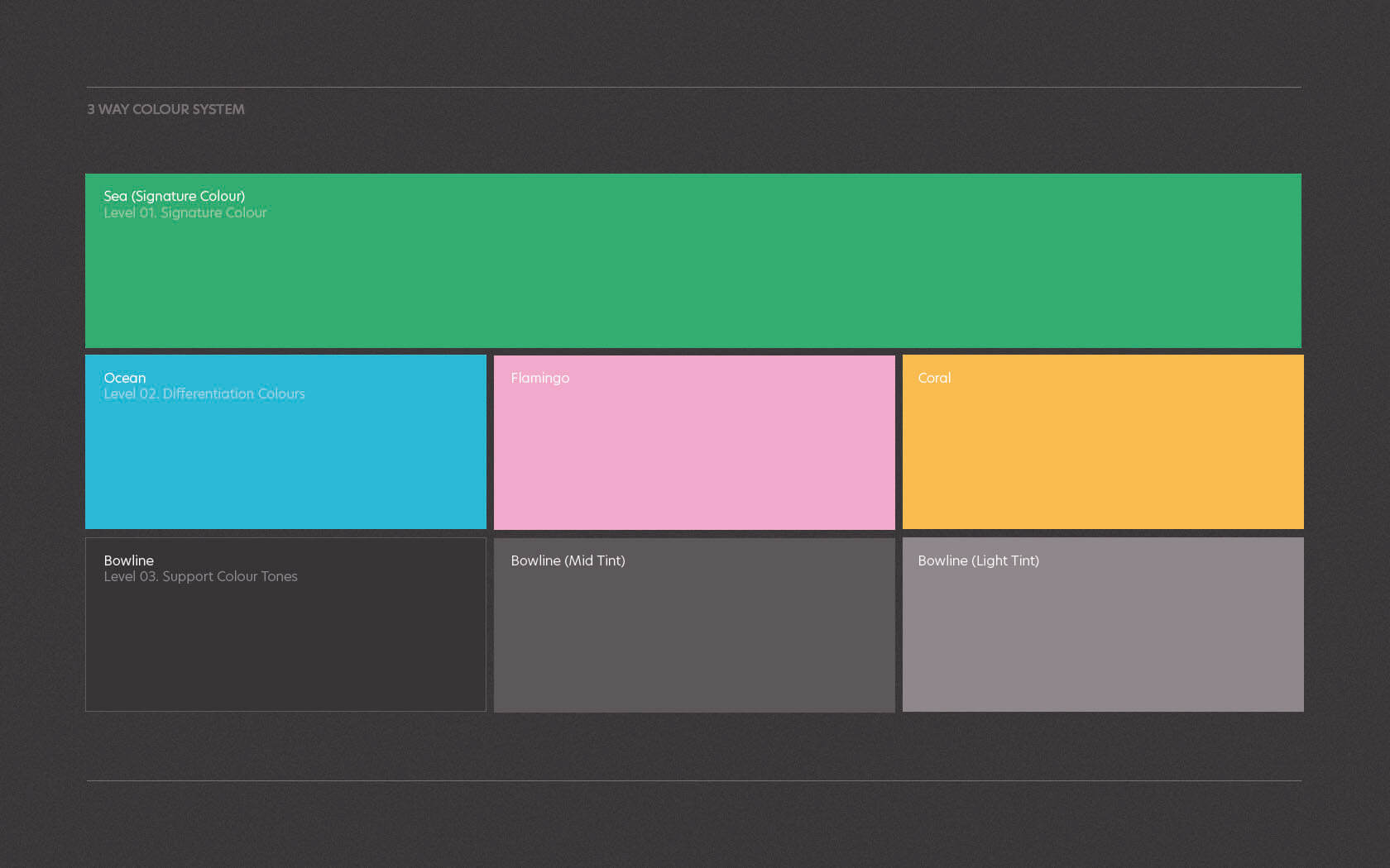
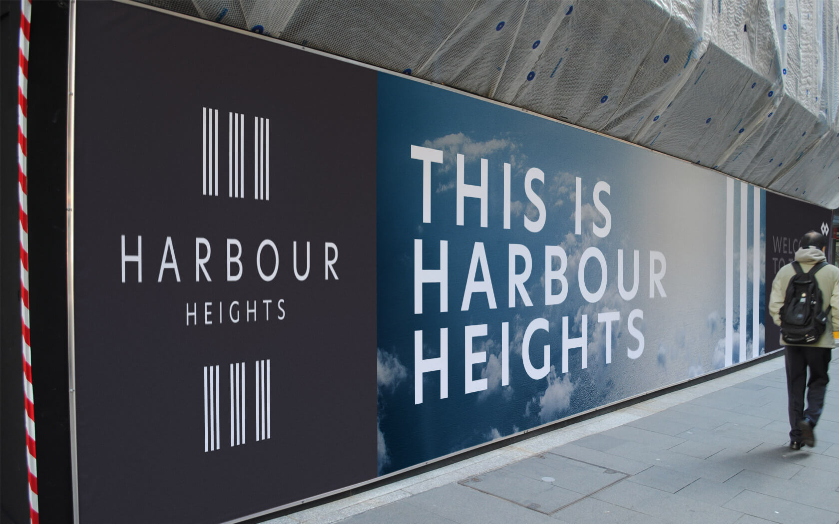
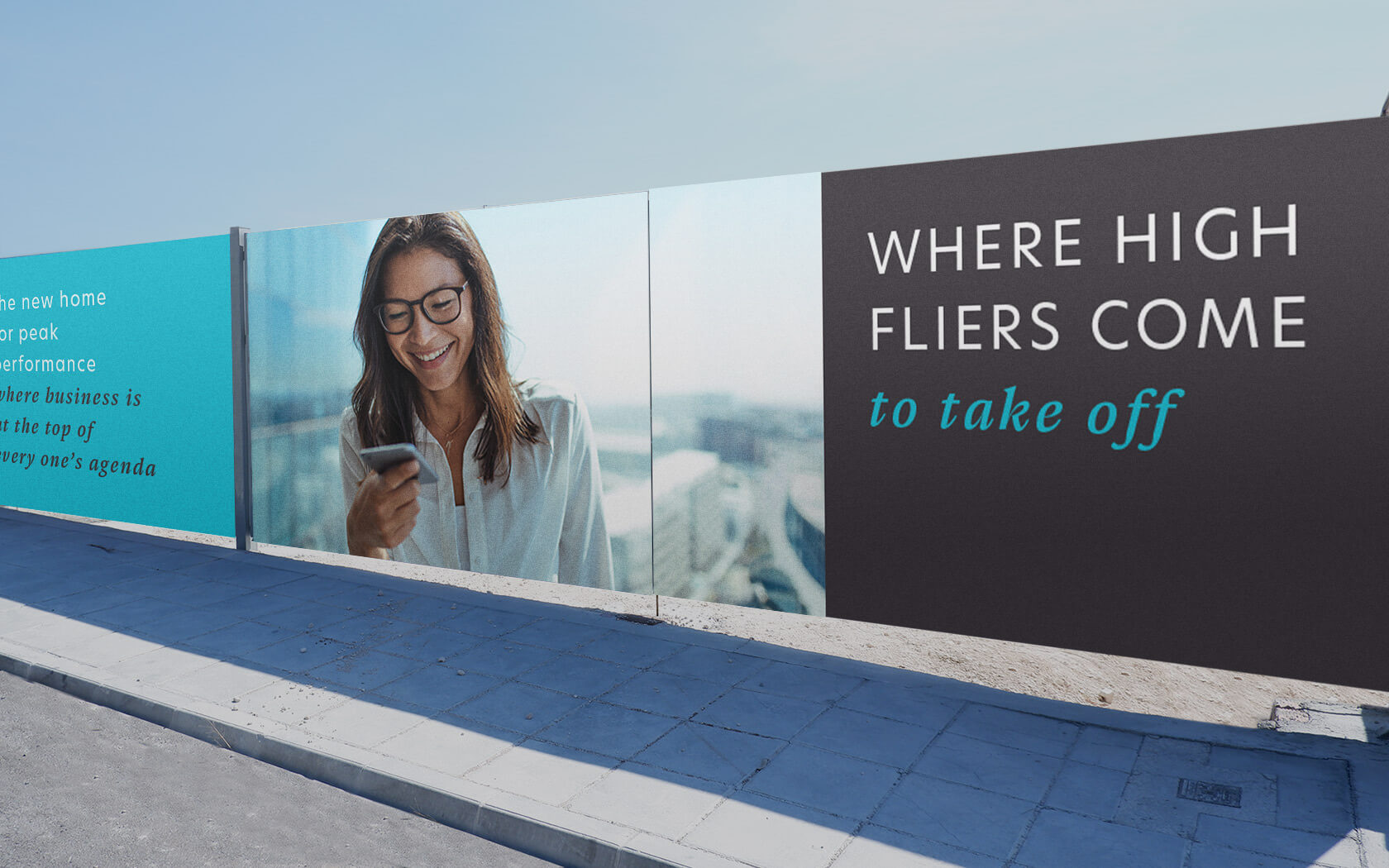
Our creative strategy centred around the signature visual properties of the development – it was comprised of three towers, sat upon a mall at water level. The three vertical monoliths dominate the skyline and it was this that we knew had to be the cornerstone of the new visual principles. Our strategy was called The Power of Threes.
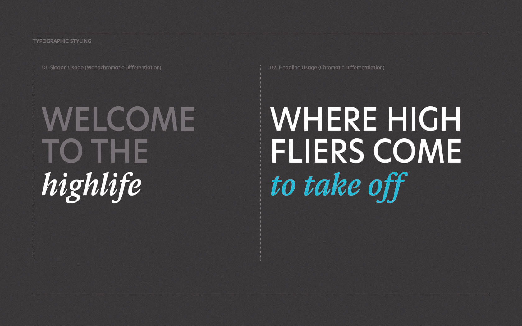
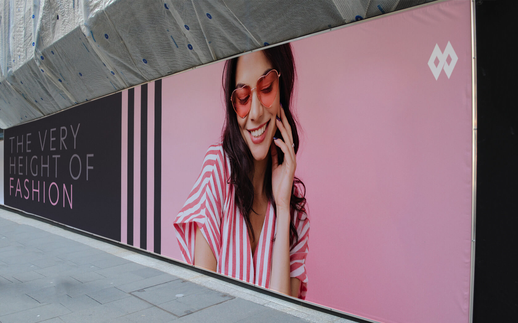
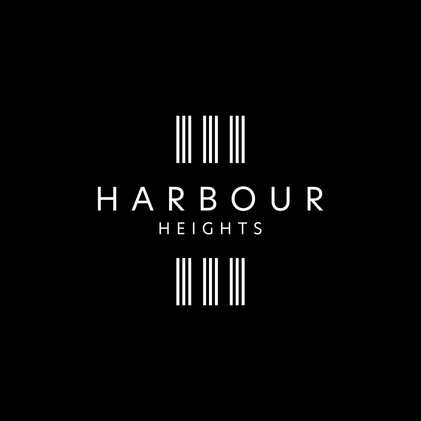
Three became the signature and reference point for all creative works. The iconic logo form is based on three parts – the building above, the water level and the reflection below. The typographic structure was set to three – two lines of dominant uppercase type and one of lowercase italics – for contrast and emphasis. The colour scheme was based on three tonal ranges -1) a signature green colour (reflective of the glass facade), 2) the differentiation palette of three colours and 3) the supporting warm grey tone for use on text and surrounds.
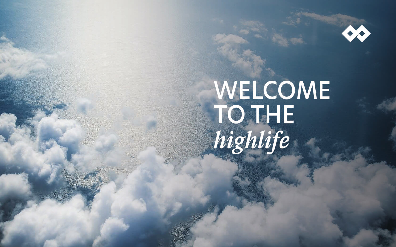
Supporting the brand identity is a set of brand imagery and suitably lofty messages. The messaging espoused everything tall, lofty, hight and haut. We lifted you up as far as we could and as close to the top as possible. High fliers enjoying the highlife in a truly elevated tone of voice.
Results
Unveiled in May 2020 through a new project hoarding system and blitz in July 2020 with a burst of PR, the project is now starting to be rolled out across its key touch points and more importantly, customers who have been waiting for their units for a long time are finally being handed the keys to their new, elevated living quarters.
The work for the Harbour Heights rebrand will be entered for numerous awards so check in soon for the results!
Services delivered:
Brand Strategy, Naming, Brand Design, Visual Identity, Slogan, Tone of Voice, Digital Design, Print & Graphic Design.
Love lift us up where we belong.
Joe Cocker.
Details View Close


This development achieved what was clearly the peak of good taste.
Liam Farrell. Creative Director & Partner.
Infracorp
Brochure
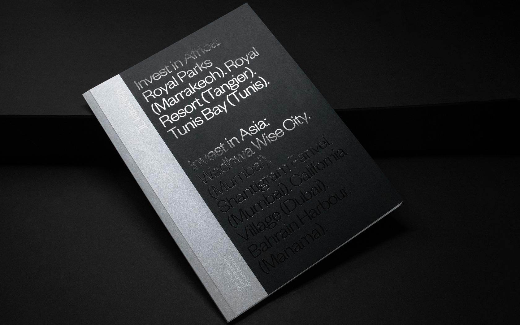
Prestige papers, bespoke treatments and delicious foil finishes set this Infracorp investment brochure well apart from the rest.
Unisono
Notebooks
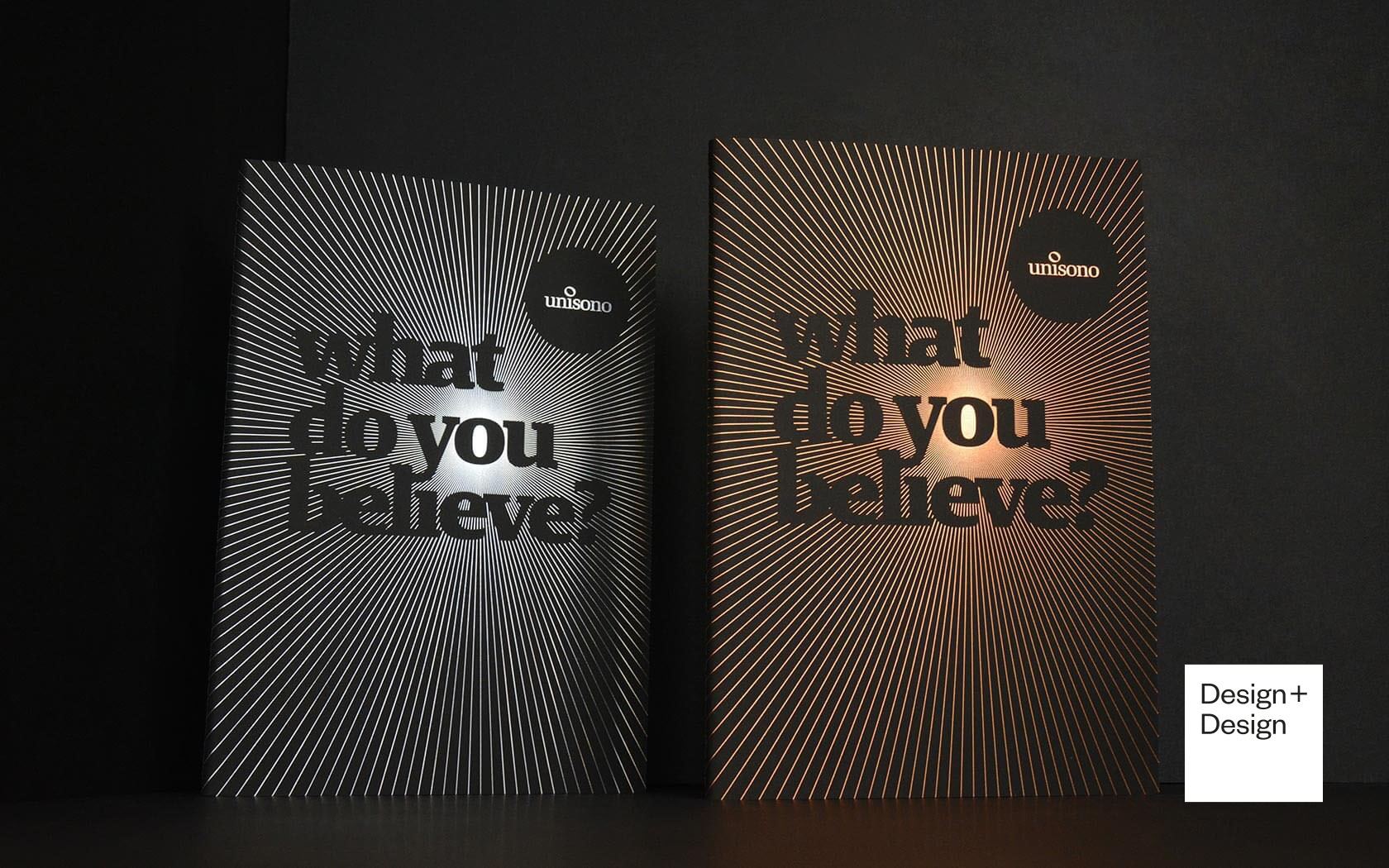
Luxurious print finishing combine with eloquent copy and dramatic typography on these 2019 Unisono Notebooks
Bank Muscat.
Rebrand
Bank Muscat's iconic rebrand is helping a regional leader to grow beyond traditional banking.
Alhoty.
Rebrand
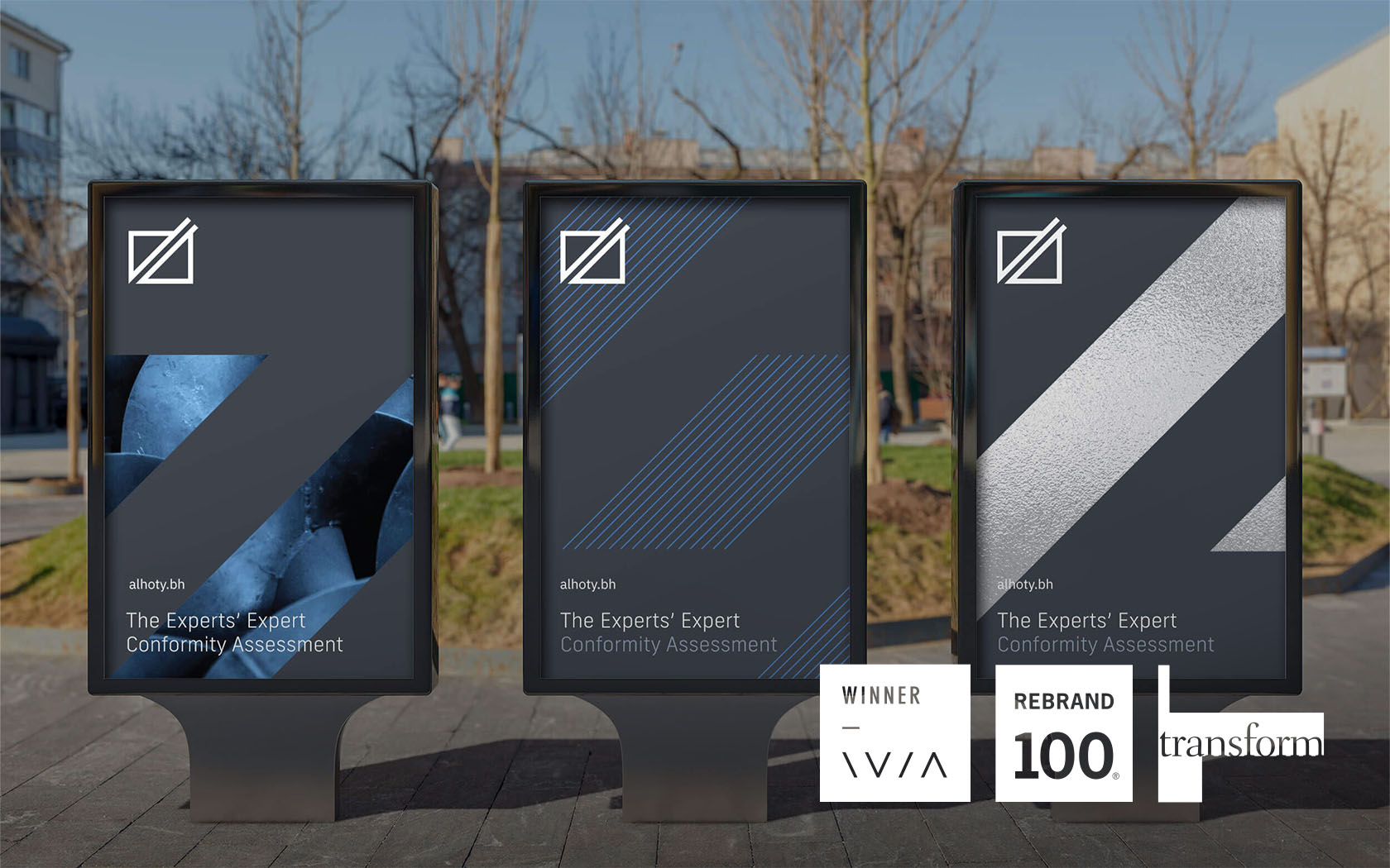
The experts' expert is beautifully rebranded by Unisono. Say hello to the new Alhoty, Bahrain's trusted analytical services provider.
GFH.
Rebrand
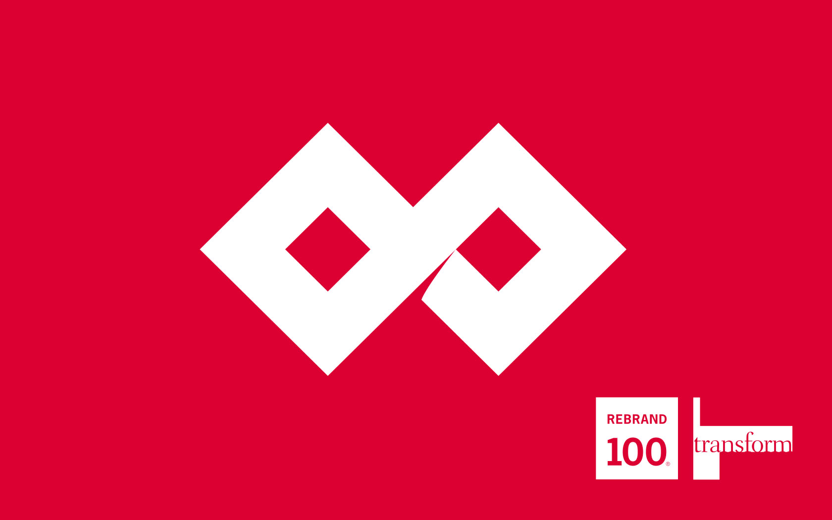
Rebranding one of the region's most notable Islamic investment banks into a new financial group.