GFH. Rebrand
A rebrand that literally created a gulf between then and now
Industry Setting
The region’s excess of investment capital combined with the fast growth of a developing market lead to excessive confidence and over supply in the real estate sector. Poor diversification further compounded the risk, leading to a resounding crash.
Challenge
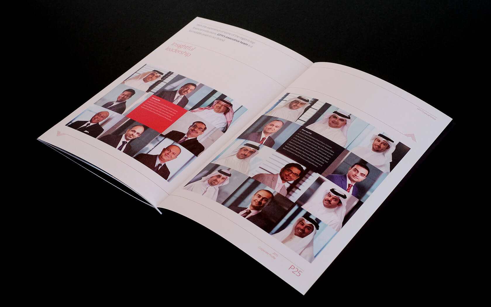
Gulf Finance House (GFH) was one of Bahrain’s brightest stars, gaining a reputation for unbelievably good returns thanks to a series of high profile development and investment opportunities (MENA/Global). GFH became synonymous with bold statements and success, but rumours also grew about secretive business practices and an egotistical culture. When the market crashed GFH fell hard, fast and far leaving many investors high and dry and the brand’s reputation in tatters. The challenges seemed insurmountable and many questioned if GFH could survive.
Strategy
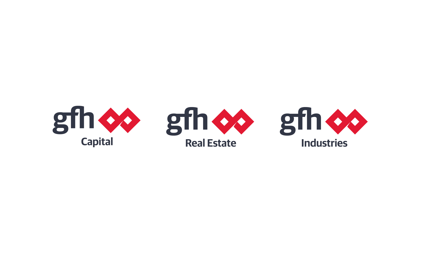
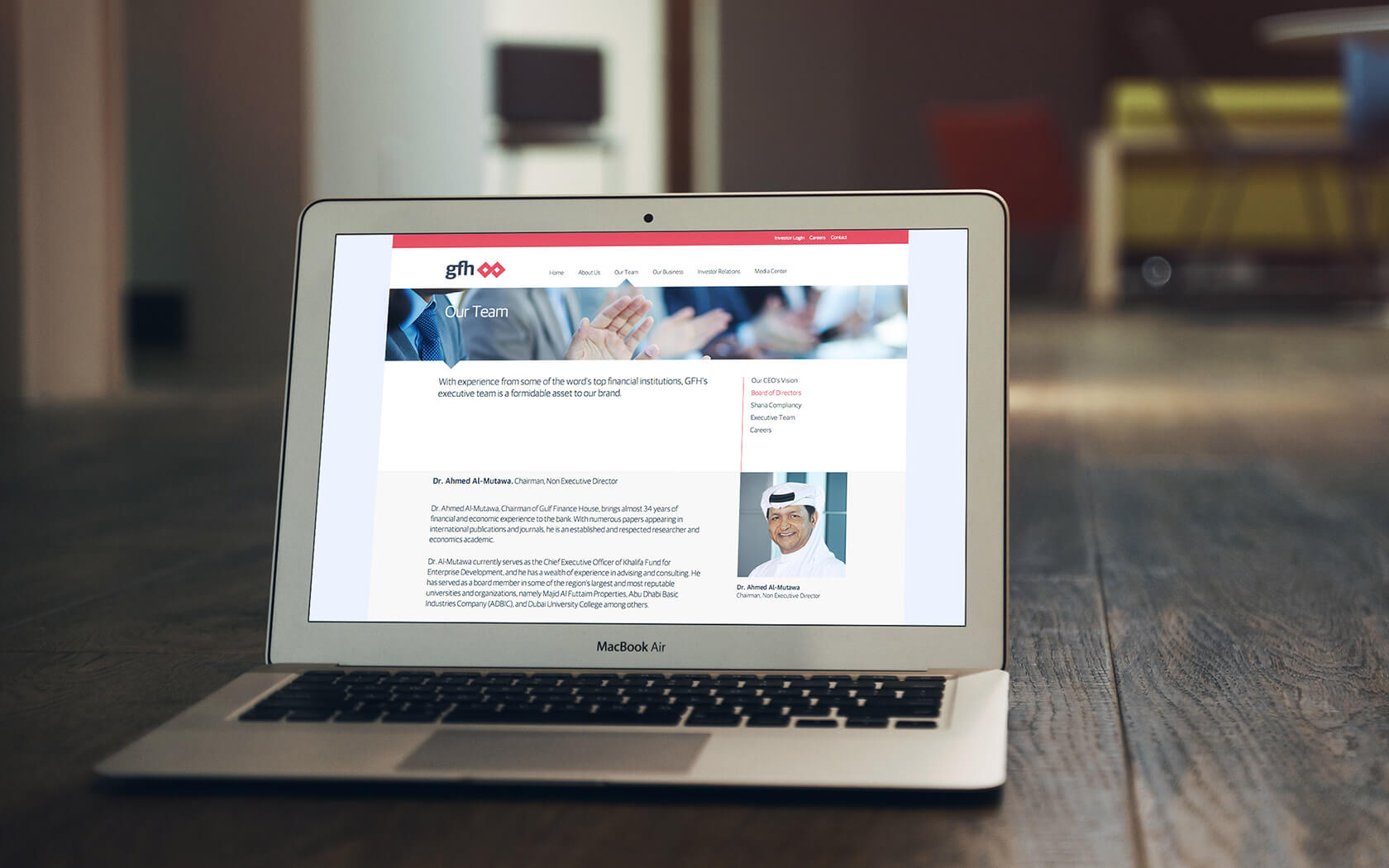
First we asked: could the brand name survive such ignominy? Following extensive surveys (staff, investors, public) we determined the name held enough equity to be retained as a symbol of accountability, though fundamental change was required to reposition the brand and restore confidence. We considered what GFH stood for, what the market needed, and how could we position ourselves for success in this new era. The transformation began with the development of a new structure and architecture. We retained the pioneering aspect of the brand, but balanced it with new qualities of diligence, transparency, and innovation to inspire diversification, professional focus and a new attitude of humility. Performance was placed at the heart of the brand creating a platform for measuring and sharing results.
Result
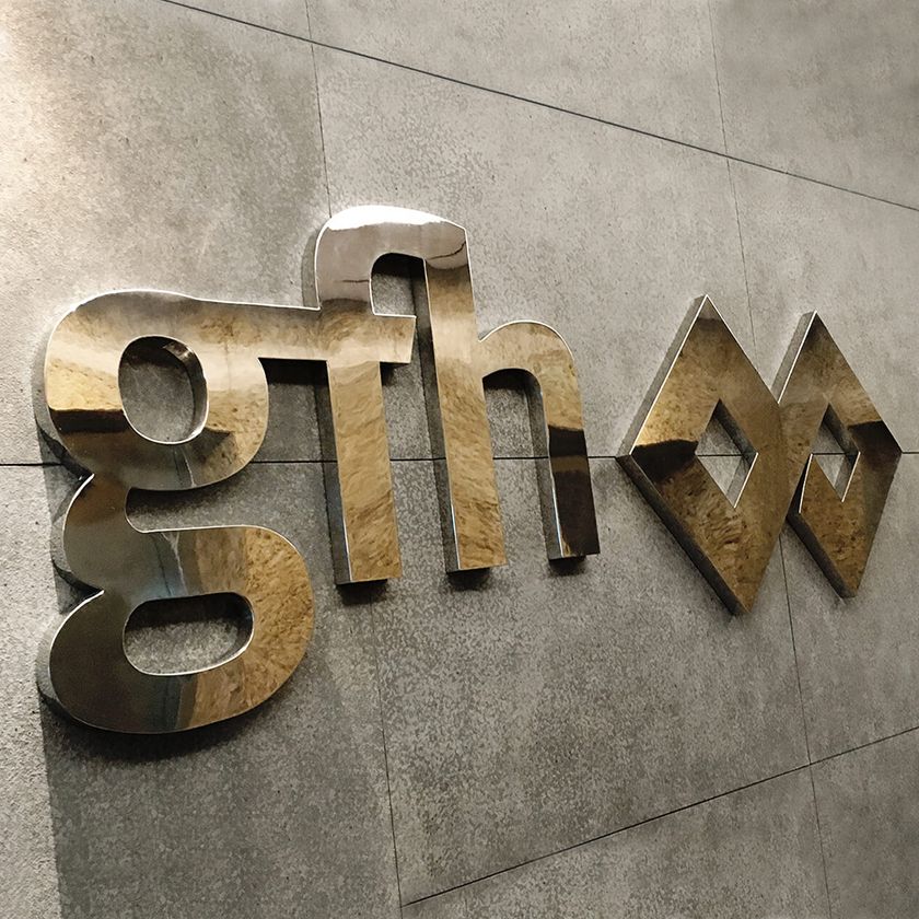
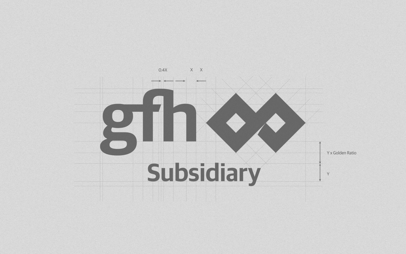
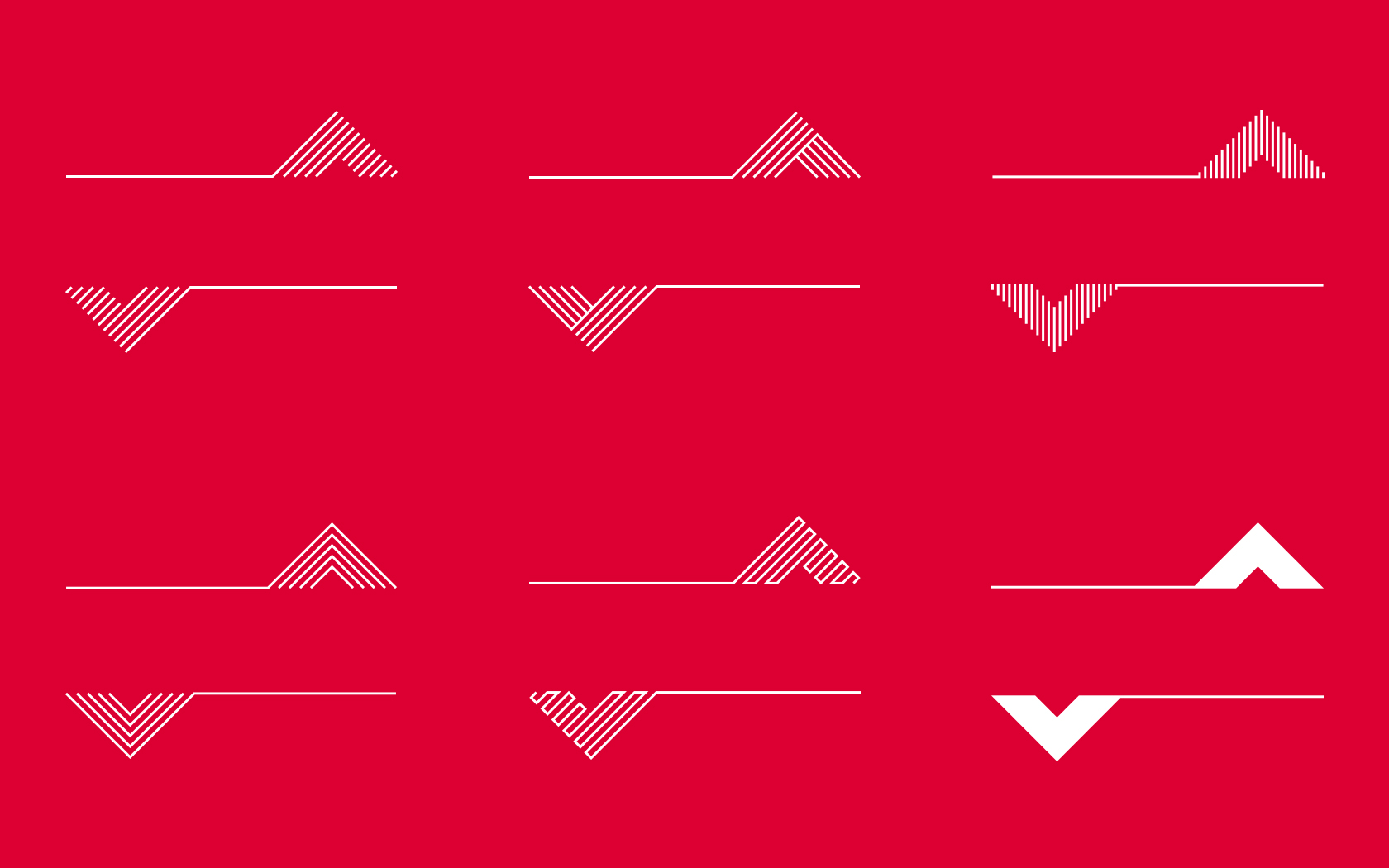
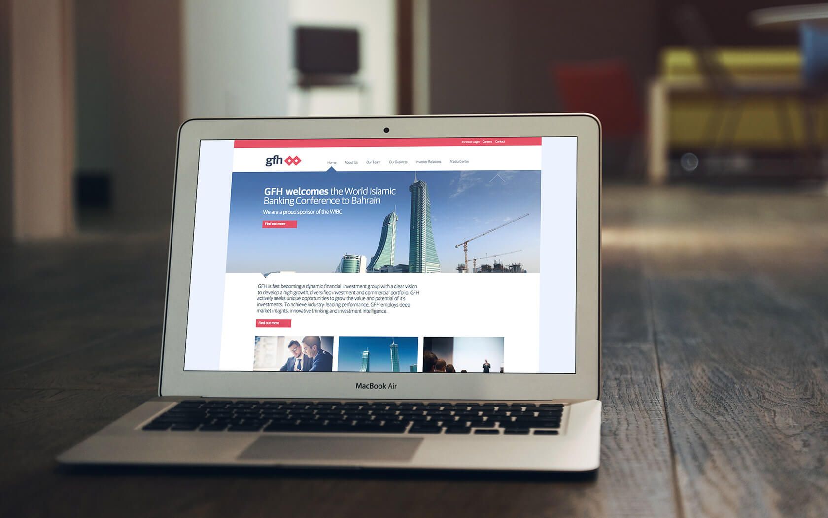
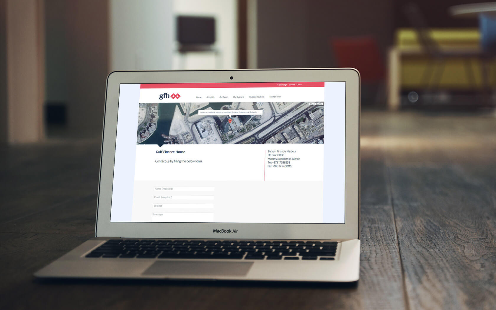
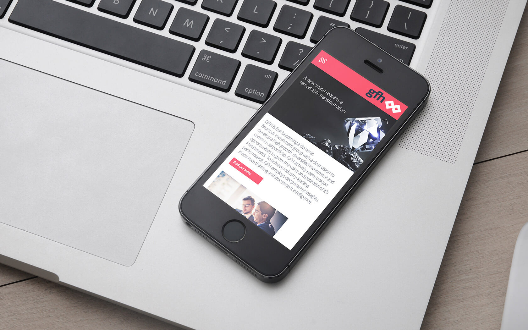
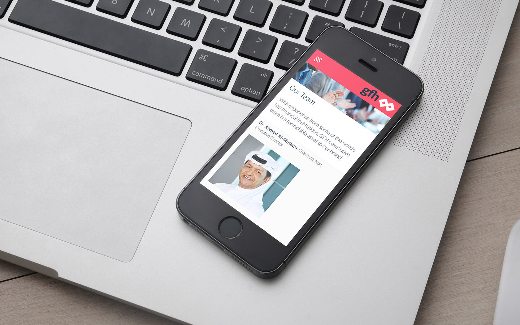
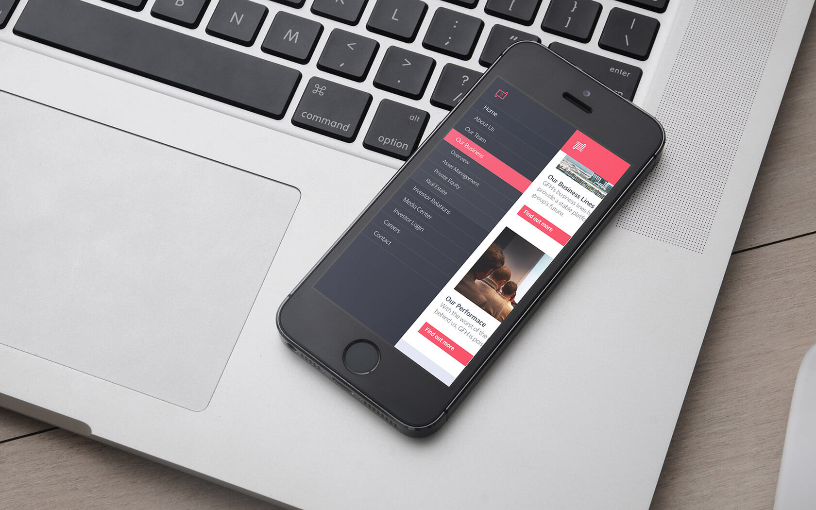
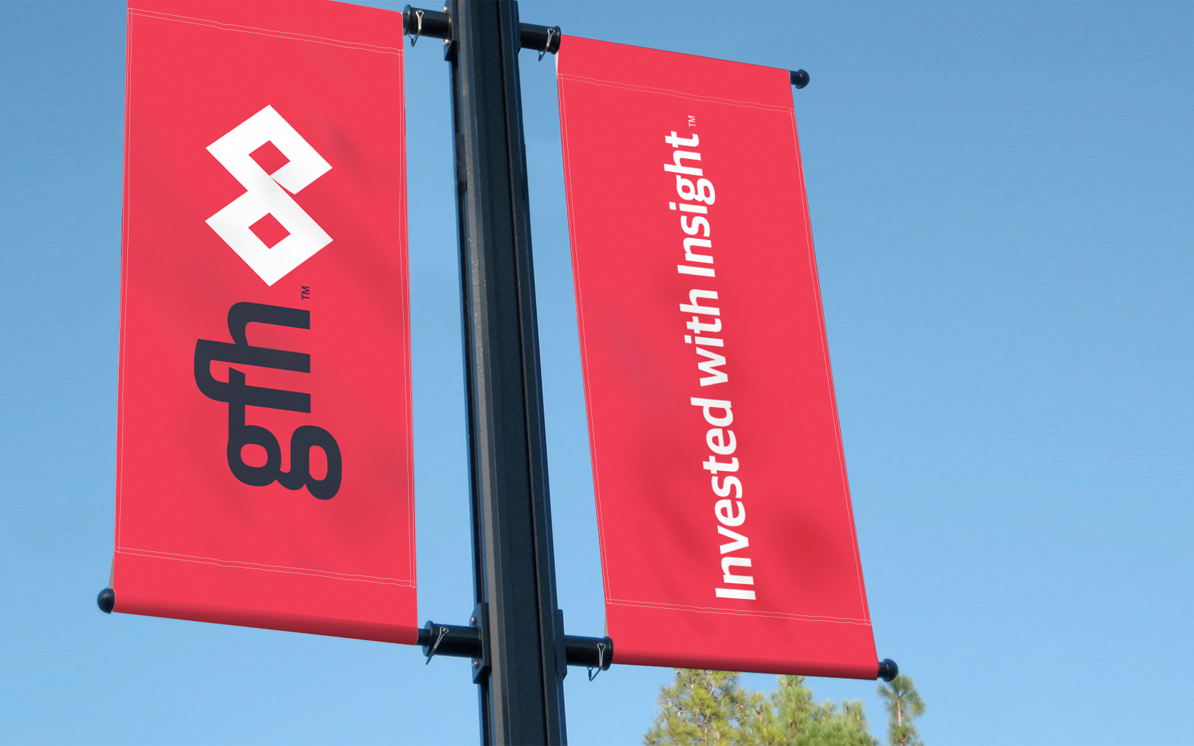
The new identity dropped the more ‘traditional’ calligraphic treatment and fully embraced a new international tone of voice – expressing in its simplicity the newfound clarity and strength of purpose. The elegance of the brand tool kit directly addressed the need for transparency and a new dynamism that had focus and diligence at its core. The legacy ‘diamond’ elements symbolised the commitment to realising value potential through insightful intelligence. The rebrand has been universally hailed as one of the key success stories of the last 12 months, with GFH reporting its best results since the crash and with positive brand perception increasing across all stakeholders – from investors and the market, to the general public. GFH has transformed from troubled ‘finance house’, to fully-fledged financial services group and industry leader.
Services Delivered
Brand Strategy, Naming, Brand Design, Visual Identity, Slogan, Tone of Voice, Digital Design, Print & Graphic Design.
Want to see more?
GFH’s own website is here and their social media is here. The work we have done for GFH Capital is here.
We chose to work with Unisono because we wanted a branding consultancy who clearly understood our business objectives and had the creativity to provide a world-class image. The subsequent creative expression was an insightful and logical migration for GFH. Our identity now reflects our strategy and the message we are conveying to the world is building a new and positive perception for the brand.
Hisham Alrayes. CEO.
Details View Close
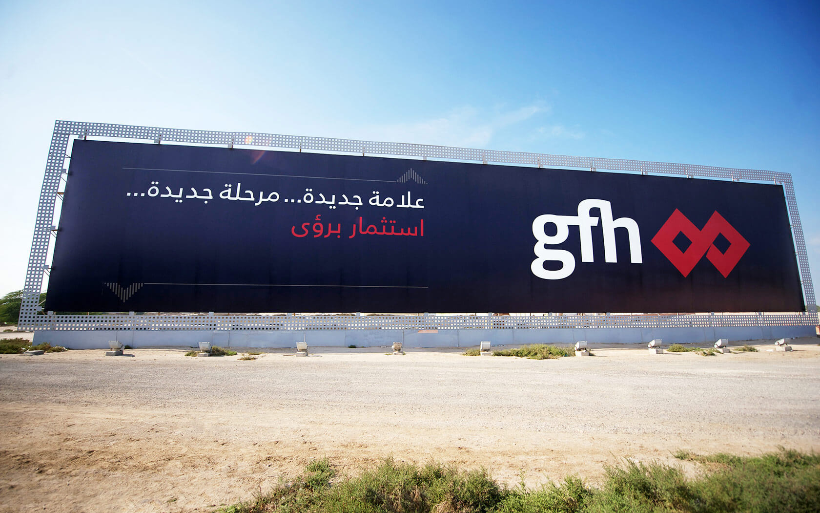

A major regional financial brand emerged from this truly transformational rebrand.
Liam Farrell. Creative Director & Partner.
Raees & Co.
Rebrand

This legal firm rebrand for one of Bahrain's leading company of lawyers has helped align their expert practice to a more befitting presentation.
Britus Education.
Rebrand

GFH, one of the leading financial institutions in the GCC, launches a new educational brand platform, Britus. This shiny identity and PPM are the initial elements of a multiphase roll out.
GFH.
Calendar
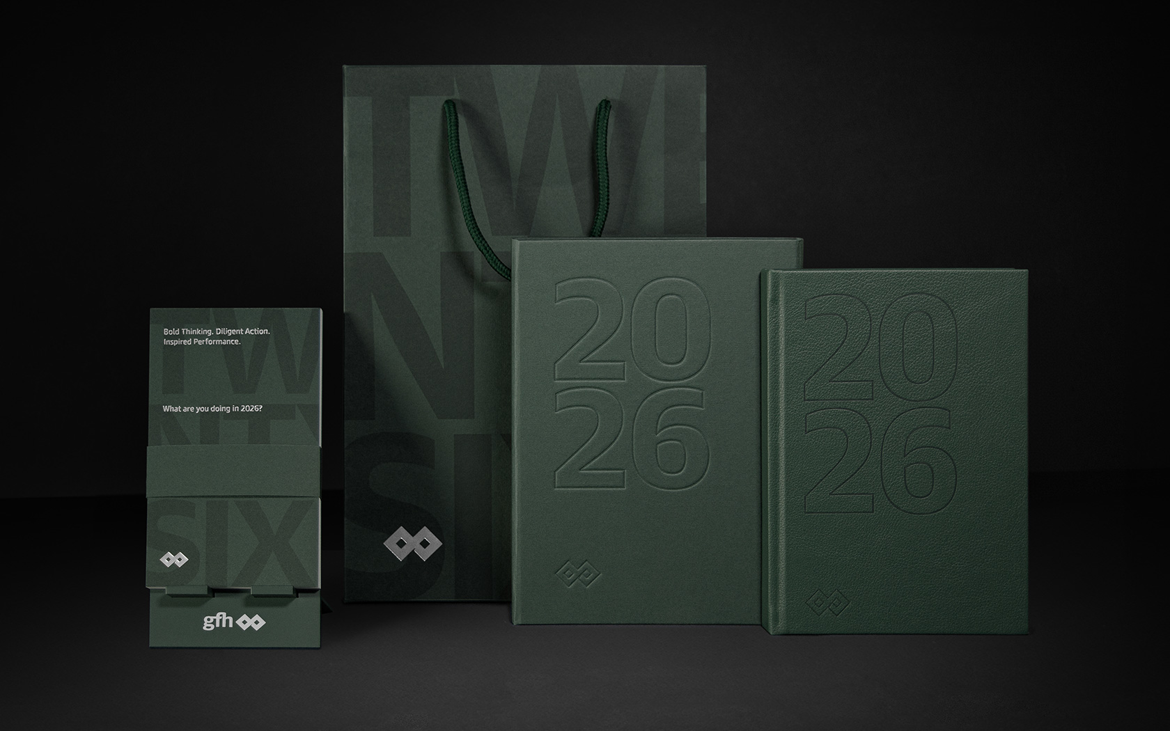
It's 2026 and our latest calendar for GFH is already out there providing a platform for our creativity.
BIW.
Rebrand
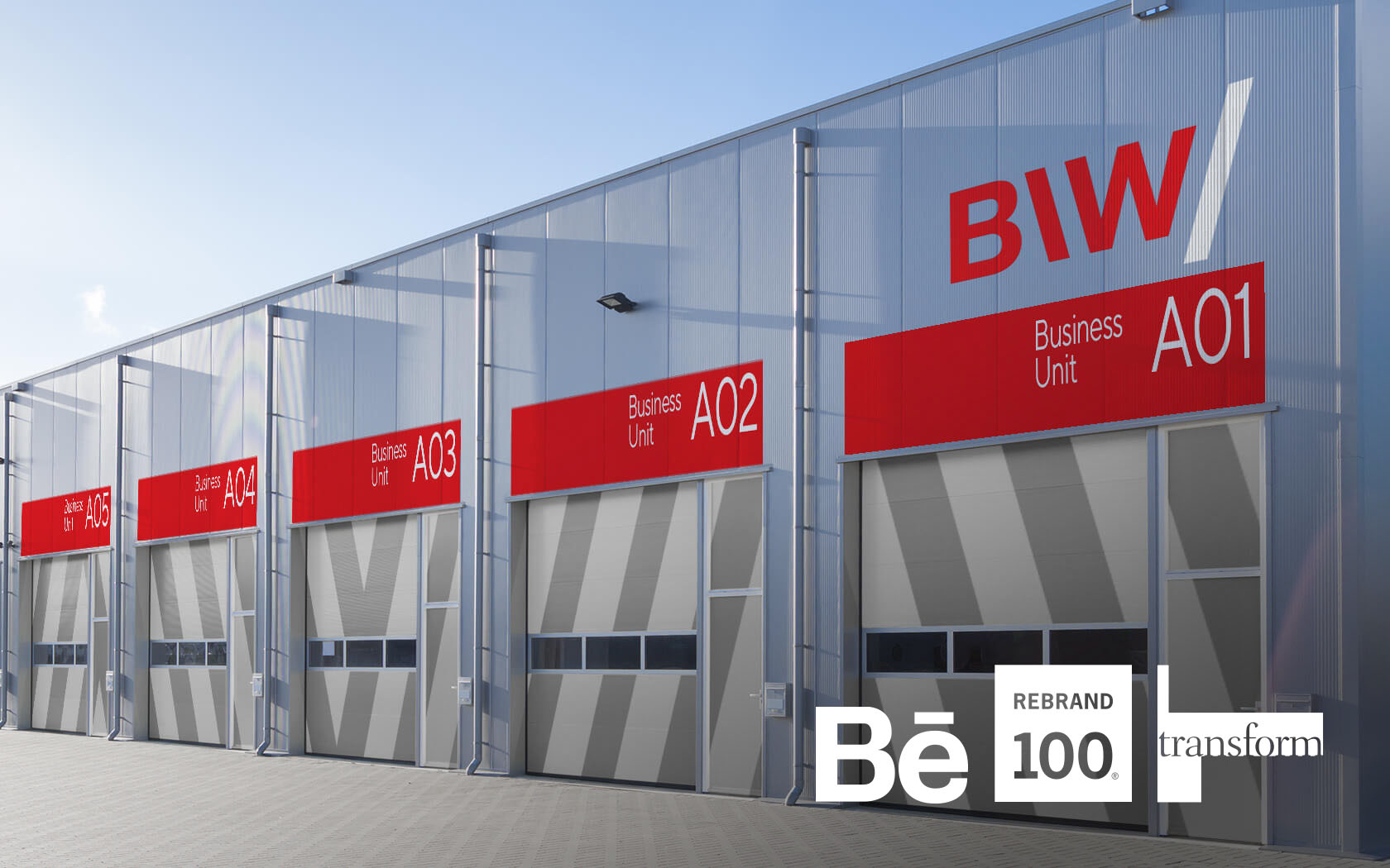
BIW’s award winning brand helps industrial firms to start up in Bahrain. It's where business begins.
Big 5.
Rebrand
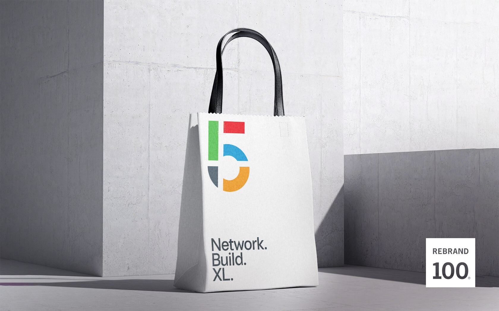
When DMG events asked us to reimagine their flagship construction industry's event, The Big 5, a show that never knowingly thinks small, we helped them to really XL.