Healian. Branding
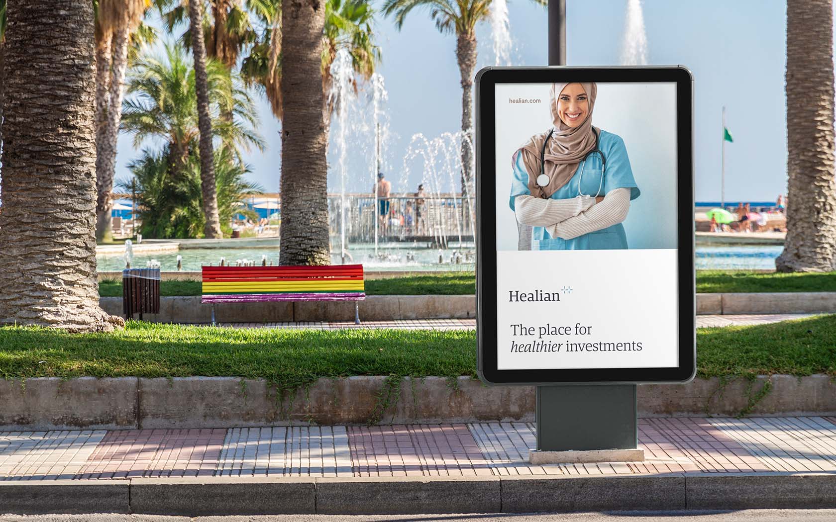
A Healthier Return on Your Investment
Creating the Healian Brand Identity
Healian is the new medical investment brand platform for GFH. Part medical, all financial, the parent company sought a new identity that would give the right perception about the funds the new entity would offer its investors.
We started out with a blank prescription sheet and have ended up with a visual identity that not only inspired faith in the practice, but through a professional beside manner, clearly positions the entity as a trusted practitioner in the medical investment arena. Healian is A medical investment brand you can trust.
Challenges we faced creating a medical investment brand
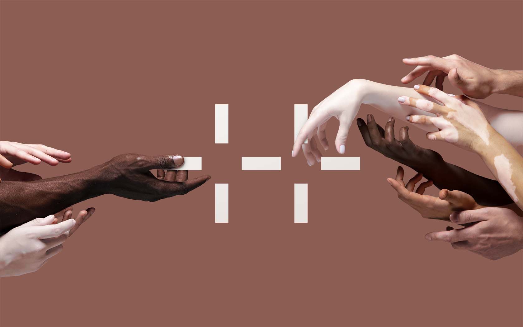
Healian is a special purpose investment vehicle generating new revenue streams for GFH, a large financial group in Bahrain. The brand is part of a wide spectrum of discrete financial products offered by the group. Our key challenge was how to create a brand that felt at home within two different contexts, 1) the medical community and 2) financial institutions. The brand had to house unique offerings within the medical arena but package them in ways that made the investment prospects attractive to investors who had largely been focussed on real estate and infrastructure investments across the Gulf region.
Our role was to find the right voice which could bridge this spectrum of perception. To bring to life a new entity and provide the right visual tools and communication approaches to launch and begin to build the perception of a new arena of investment for an entire region.
Building a medical investment brand, our strategic response
From our discussions with key stakeholders on the project team the complexities of the brand’s narrative started to emerge. We knew an international name would be required to build faith in the products offered and started to long-list over fifty names. With more collaboration and consultation with stakeholders, we narrowed the list down to 5 key candidate names that were tested to understand contention and a winner emerged. Healian.
The name fits with the strategic imperative and creates intrigue in the mind of the segments. The name is a derivative form touching on notions of Healing and Helios, combing the idea of health and financial energy. Of creating a world of health focussed financial products. Once the narrative behind the name was understood it was sold and has been adopted easily by both segments.
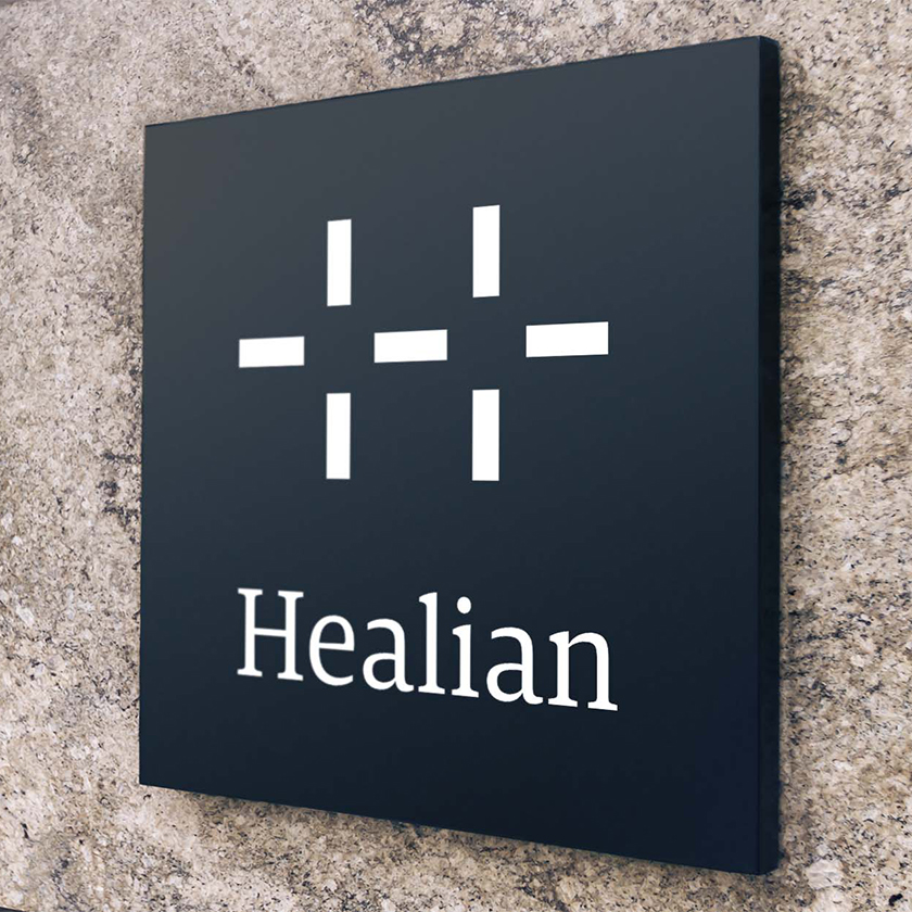
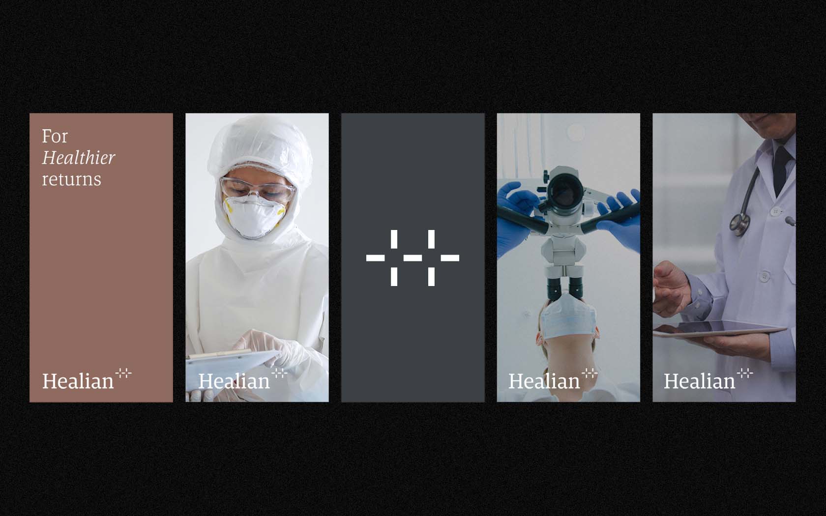
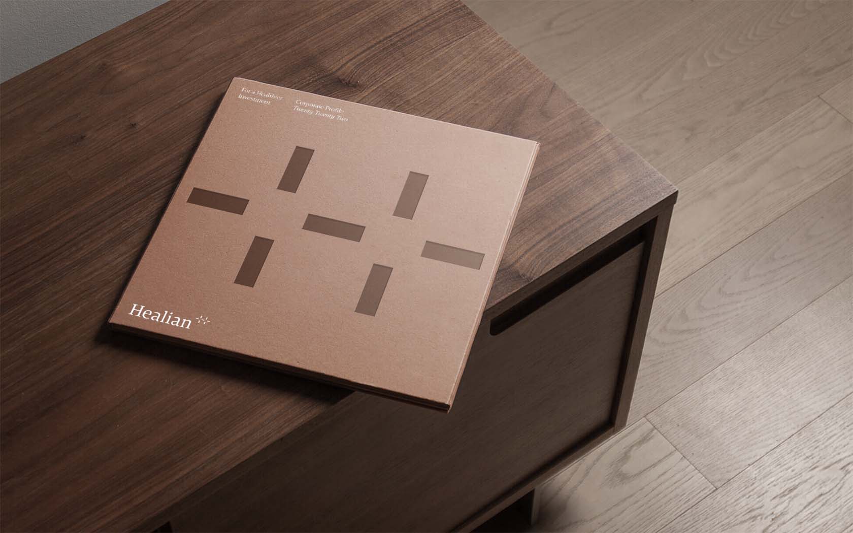
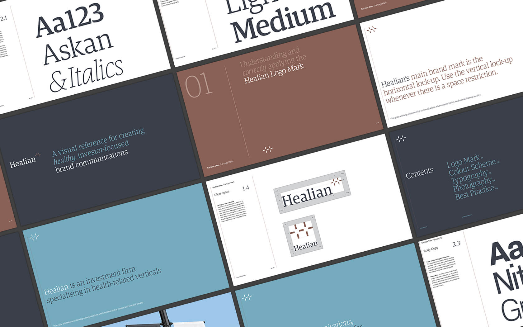
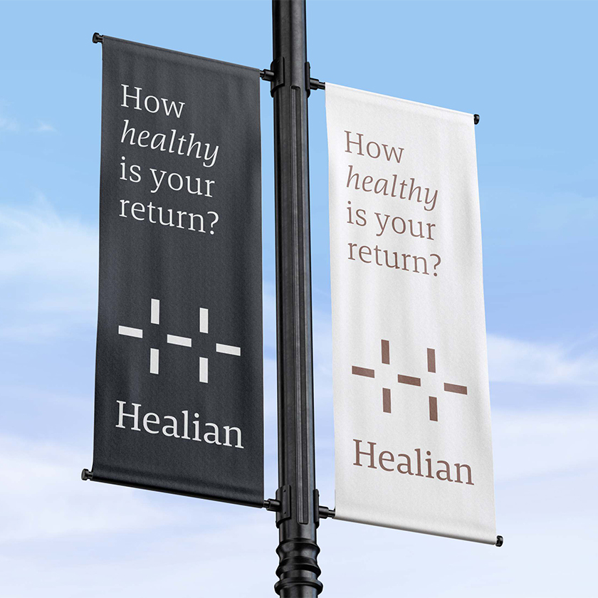
With a name in place we began working to create a graphic language that would resonate with both segments (those being packaged as an investment and those investing) and provided three key candidate approaches for consideration. After much deliberation the final form emerged. At once a set of plus symbols, and a ‘H’ initial can be seen in the form which again combines the idea of health and positive financial performance.
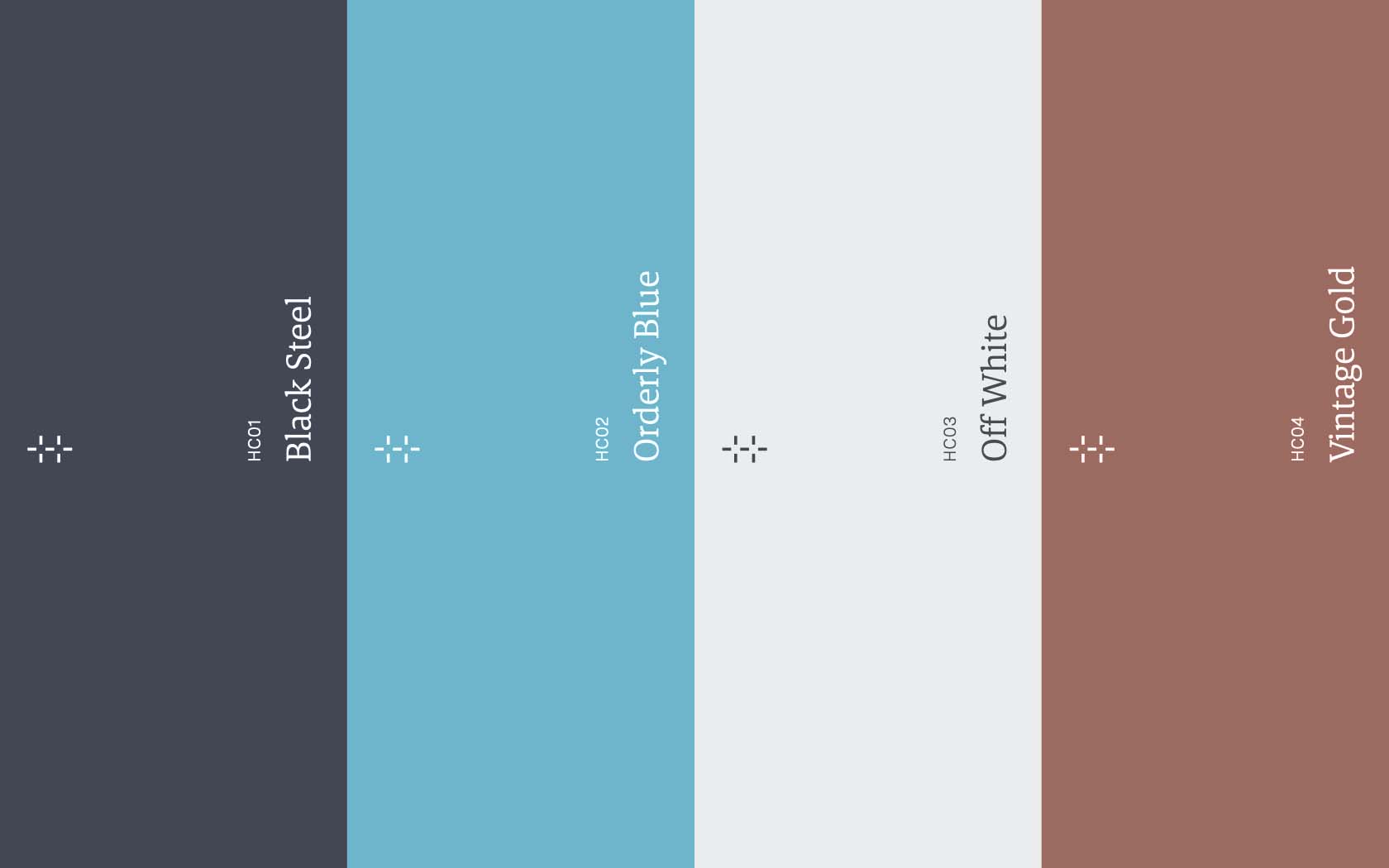
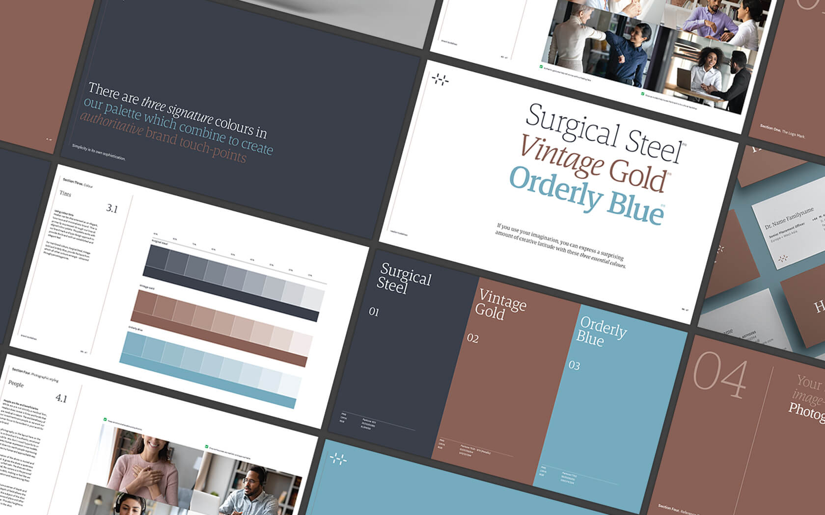
The colour palette uses a simple set of tones which again help to enforce a notion of health and finance. The Surgical Steel creates a strong visual base on which the Orderly Blue colour creates its visual link to typical uniforms found within medical practices while Vintage Gold speaks of old money, helping to lend the brand a feeling of legacy, great for building trust, especially in the investor segment.
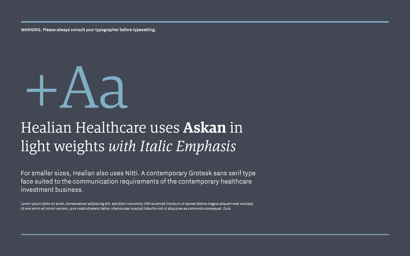
The type palette also supports the perception requirements by combining Askan, a wonderfully drawn Serif type family with Nitti Grotesque, a sensible and slightly technical type face for smaller sizes. The more technical look of Nitti makes the brand feel Northern European and technically competent, perfect for a financial services brand seeking to establish itself with sensitive fund managers.
The results of our medical investment brand are showing really healthy early signs
The brand has launched several funds to much appreciation by the region’s financial community and while it is early day, the initial numbers look very promising. More and more financial institutions are opening their doors to the potential of Healian to expand their investor base so the future looks quite healthy.
To see the GFH website, click here
Services delivered
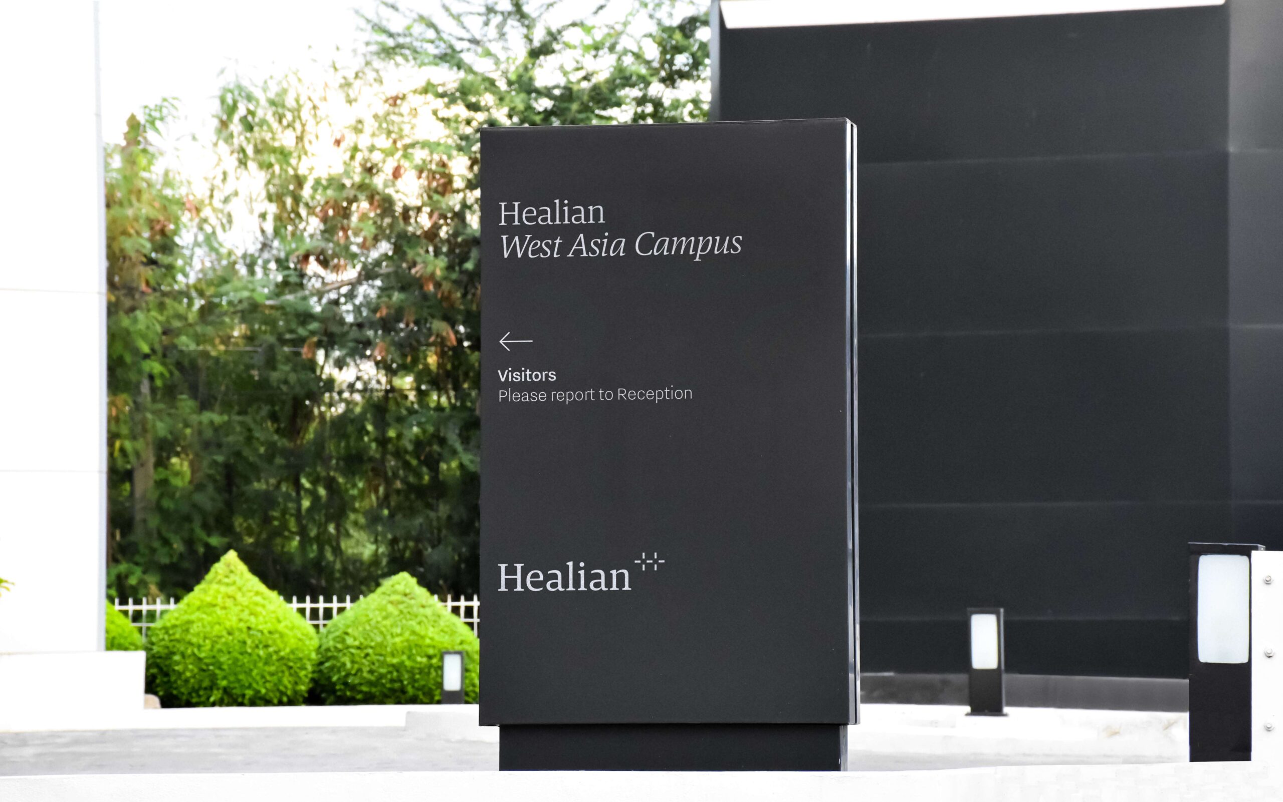
Naming, Brand Identity Design, Slogan, Signage, Advertising, Graphic Design and Application Design.
Very elegant, very nice. Exactly what we expect from Unisono.
Hisham Alrayes. CEO. Healian (GFH)
Details View Close


We aimed for a perception that spanned international finance and medicine and believe we reached a solution that conveys both health and positive financial results. A definitive win/win.
Liam Farrell. Creative Director & Partner.
Infracorp.
Website
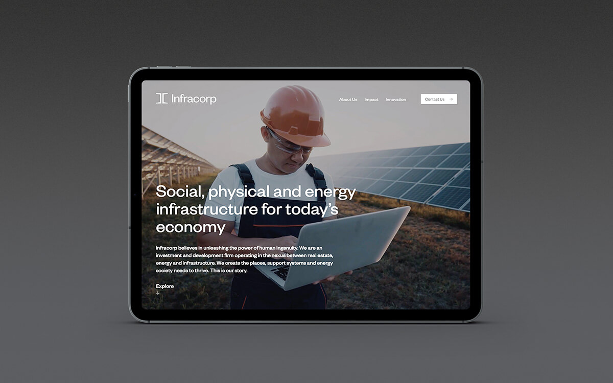
Two times Transform Award winners, Infracorp's unique digital home is effortless online design at its best.
Shamsaha.
Rebrand
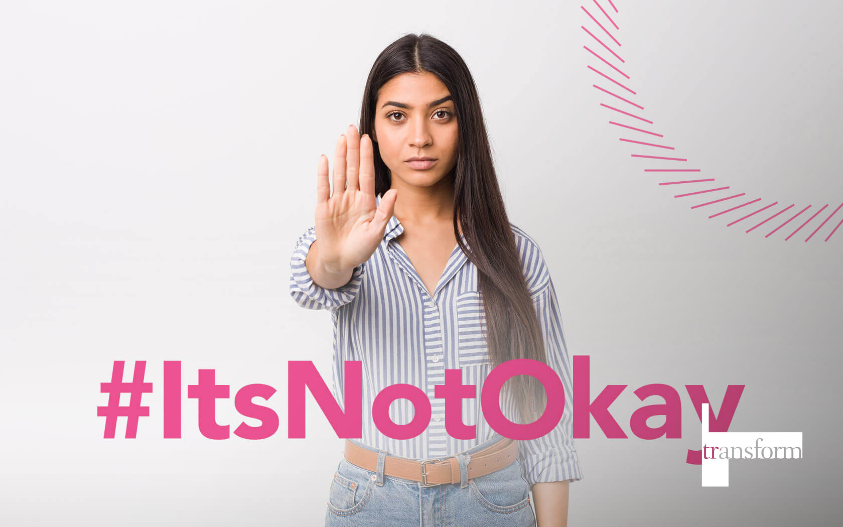
This illuminating rebrand for Shamsaha, the women empowerment charity, won Highly Commended at Transform 2021.
GFH
Annual & ESG Report
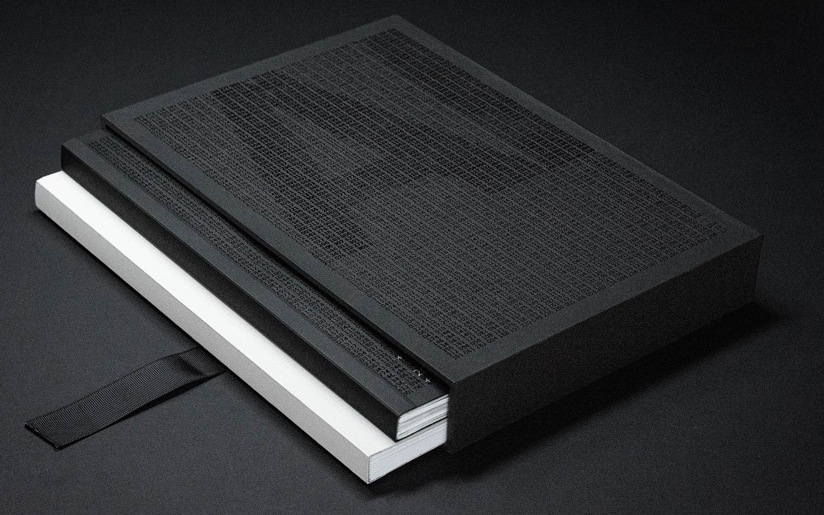
Slick print treatments from slip case to back cover and every section in between for this impressive annual and ESG report for one of the GCC's leading financial groups.
GFH.
Calendar
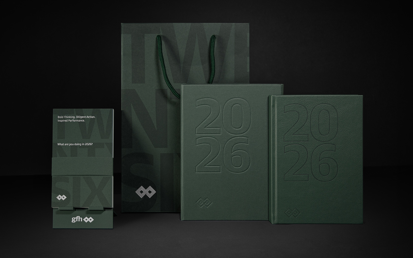
It's 2026 and our latest calendar for GFH is already out there providing a platform for our creativity.
Delilah's.
Branding
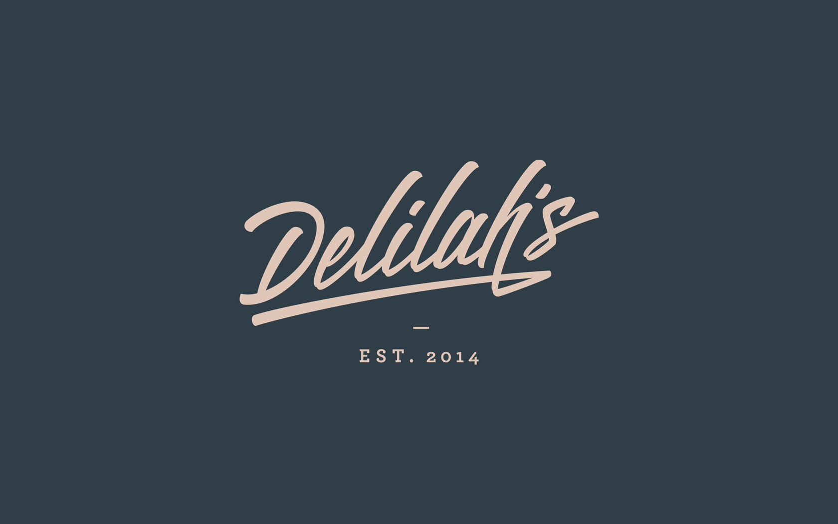
Delilah's is entering a whole new era with a super delightful rebrand.