Super Fridaze. Rebrand
Go large or go home
Background to our rebrand of the Super Fridaze club brand
Super Fridaze began life as Super Friday, a night hosted by Mindset, Bahrain’s leading promotions company at the popular night spot Calexico in Adliya. The island has many competing nights and Super Fridaze books leading local talent who do a splendid job of entertaining the growing team of loyal party animals.
Super Fridaze club brand’s challenges
Super Fridaze it’s a new brand that is growing in popularity on the island. In the absence of any brand strategy, the club night needed a creative identity and tone of voice that could provide a creative framework for promotions and to help establish this new fixture on Bahrain’s nightlife.
Creative strategy we applied
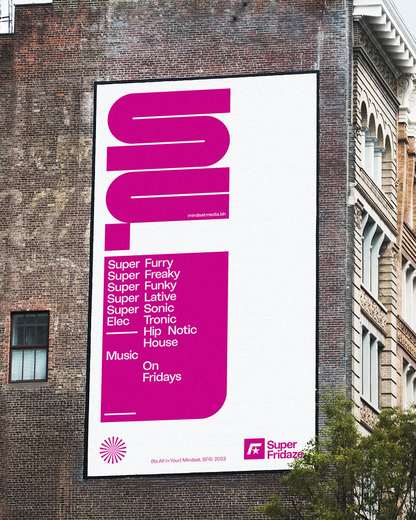
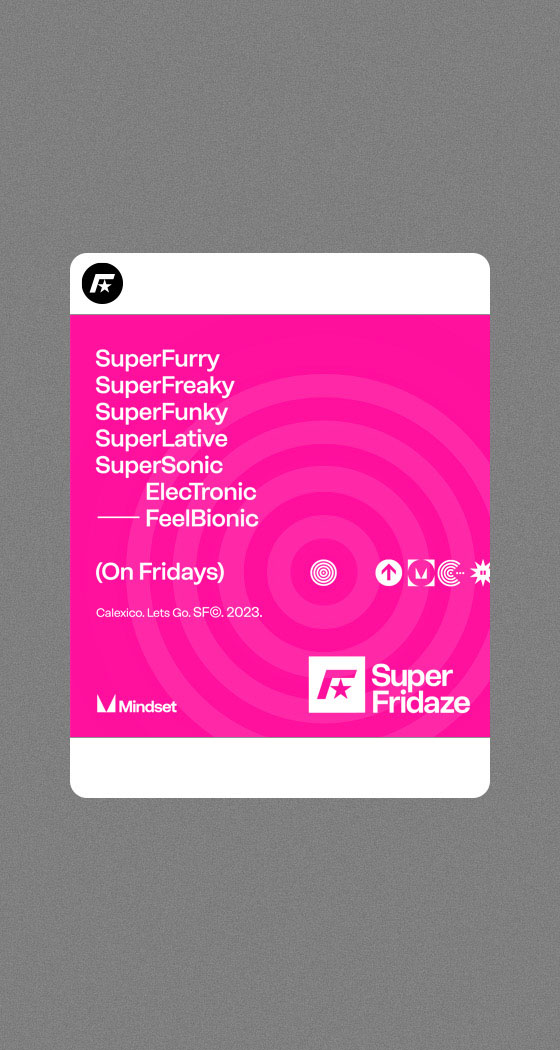
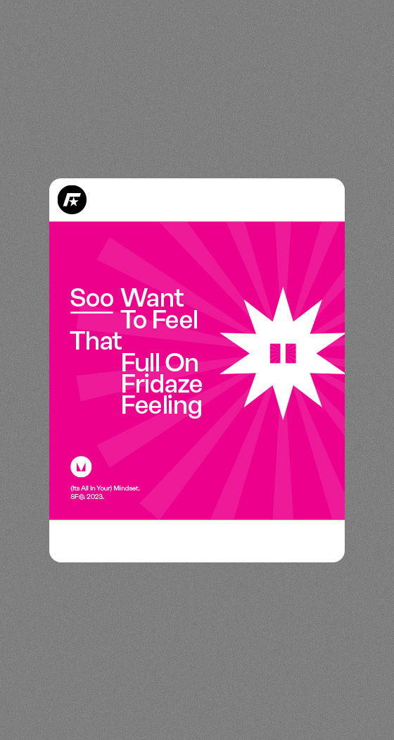
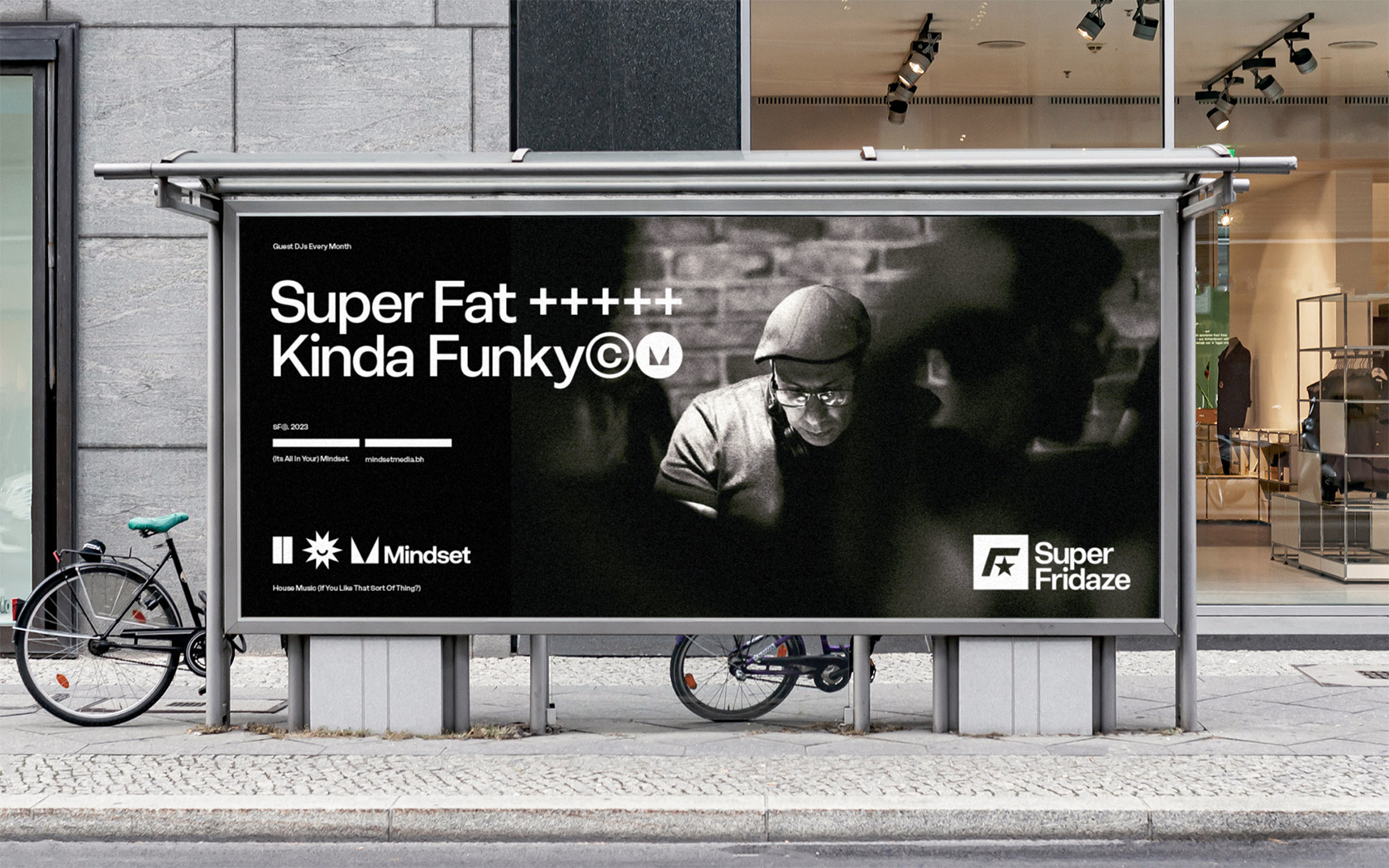
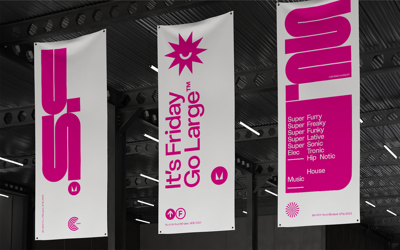
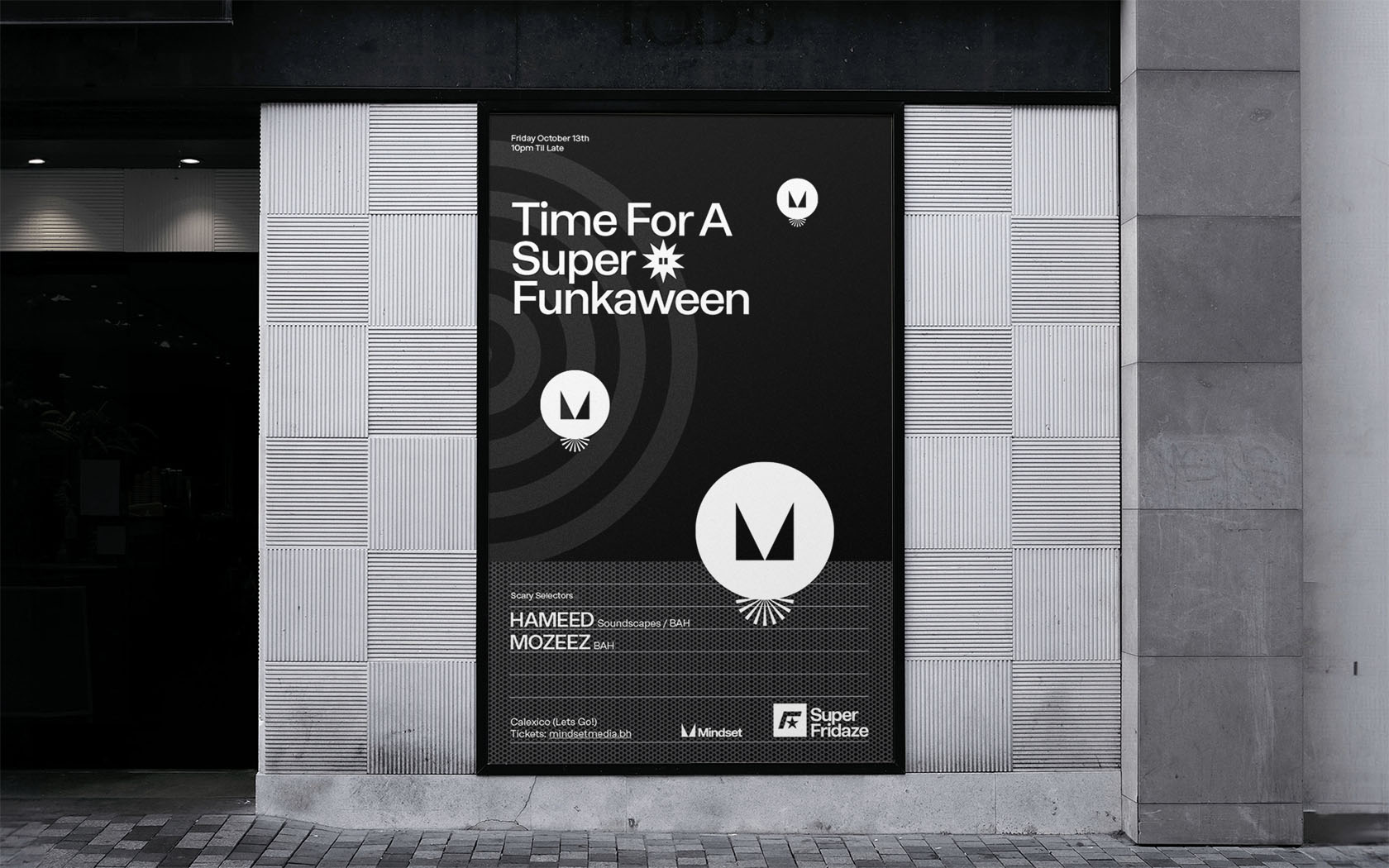
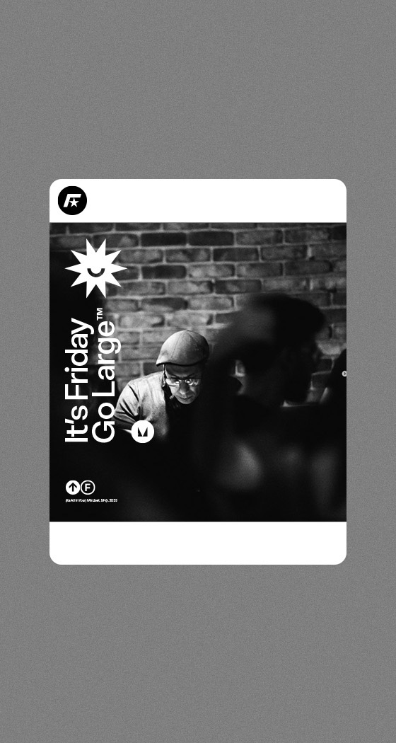
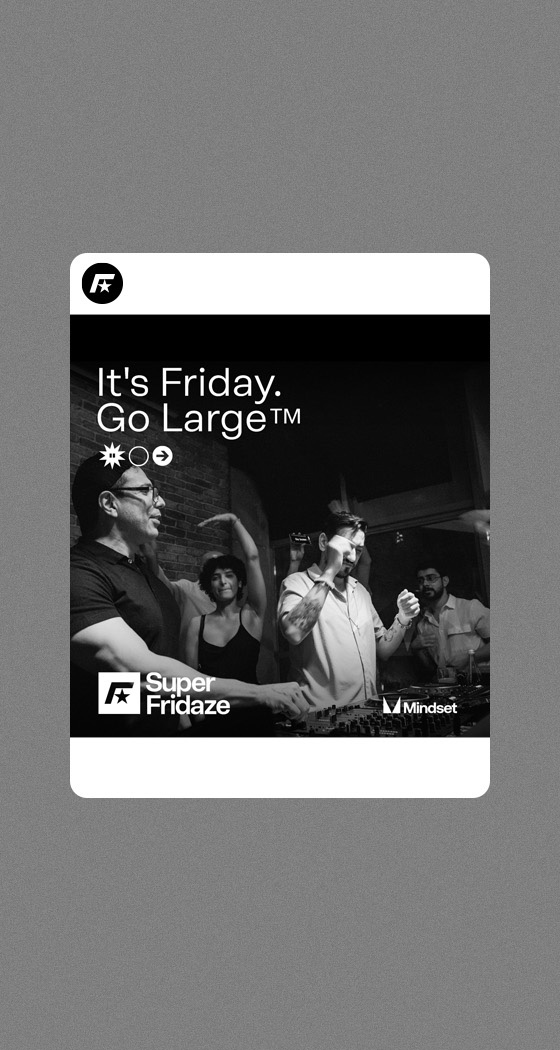
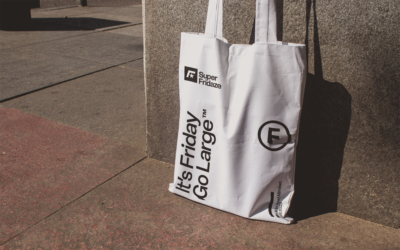
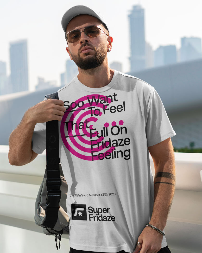
As the Super Fridaze’s name suggest, the night plays big tune to crowd that likes to go large. The name is tongue-in-cheek and really informed the development of our graphic and literal language, which is super-playful, down-to-earth and fun.
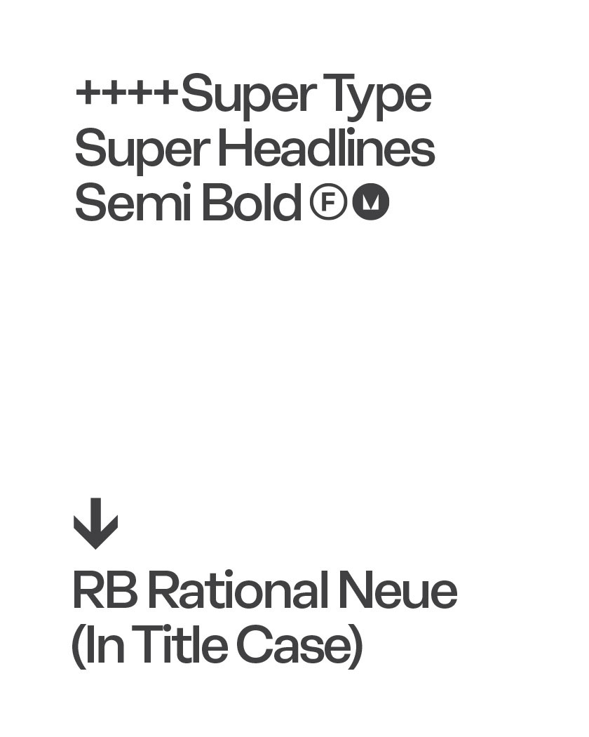
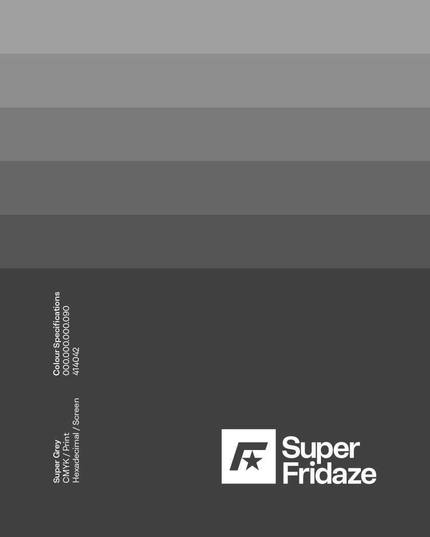
We completely changed, the original brand identity which was using a quirky S icon. We reset the brand name in Rene Bieder’s RB Rational Neuer in a semi bold weight with some tighter letter spacing. We built and unique ‘F’ mark, replacing the crossbar with a superhero star to create an iconic mark who’s combination is as simple as it is expressive.
The graphic language is like the music – large fun and very playful. RB’s Rational Neuer’s curvaceous forms are giving the typography a human dimension other sans serifs could not match. The typefaces semibold type have a chubby, funky quality perfectly matching the music’s bass heavy rhythms.
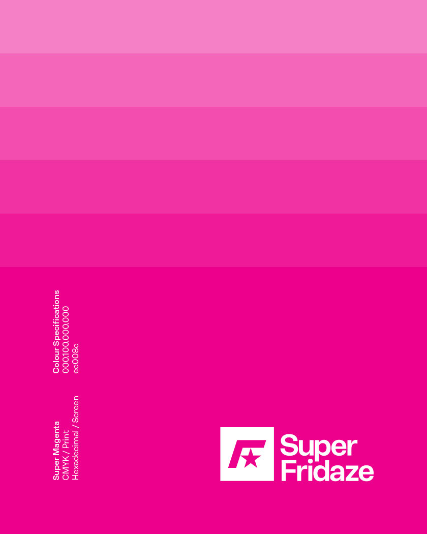
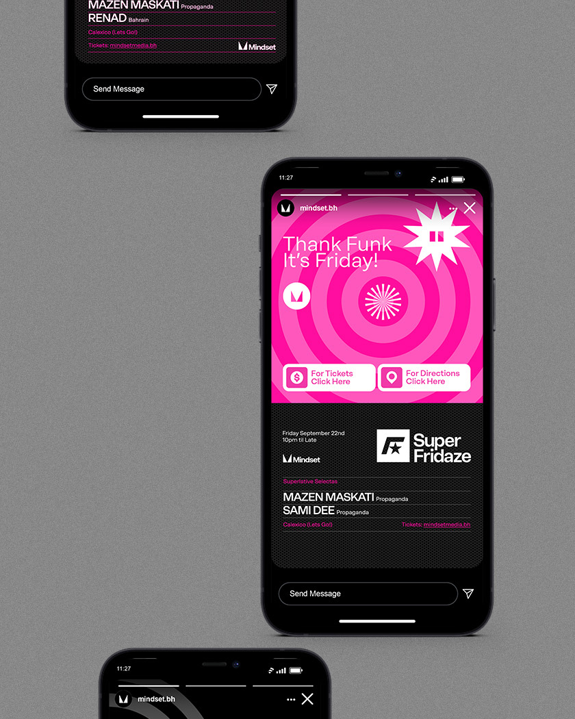
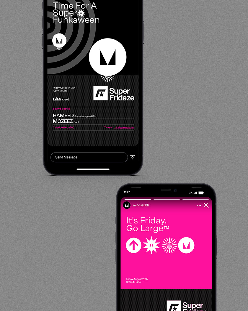
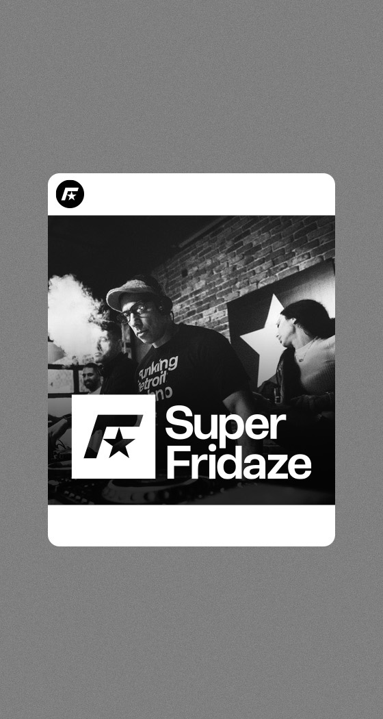
We created an icon set to provide the brand with a wide pallet of identifying marks, which all help to create a playful graphic language. I expressed the music the type of night you might expect, and the kind of pleasure that only a Dancefloor brimming with other cheerful souls can deliver. Utilizing, the icons are brand visuals which are are largely magenta or black and white, supported by monochrome photography of the crowd, resident or guest DJs.
Results
The results of the Super Fridaze rebrand are well appreciated by Mazen Maskati, the promoter and owner of Mindset. ReBrand has been positively received by its audience, attendees and talent alike.
Want to see more?
Check out Mindset Media here, follow their instagram here, see our rebrand of Propaganda here and Mindsets own rebrand here, also done by Unisono.
Unisono helped us realise our ambition for this night. We needed an identity that was world class, like the music we play and the crowd we entertain. The results were larger than we ever imagined.
Mazen Maskati. Promoter. Mindset.
Details View Close
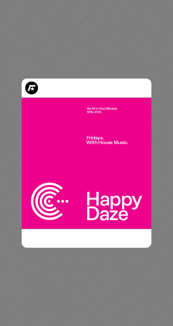
We managed to produce a super sized result for this up-coming night out. Happy daze.
Liam Farrell. Creative Director & Partner.
UTB
Rebrand

Bahrain's newest technical university gets a visual identity uplift, new brochure and website.
Rukn.
Rebrand
At last, Bahrain’s tech-entrepreneurs have their own incubator to help them grow IT from ideas into gazelles!
Al Nooh.
Rebrand
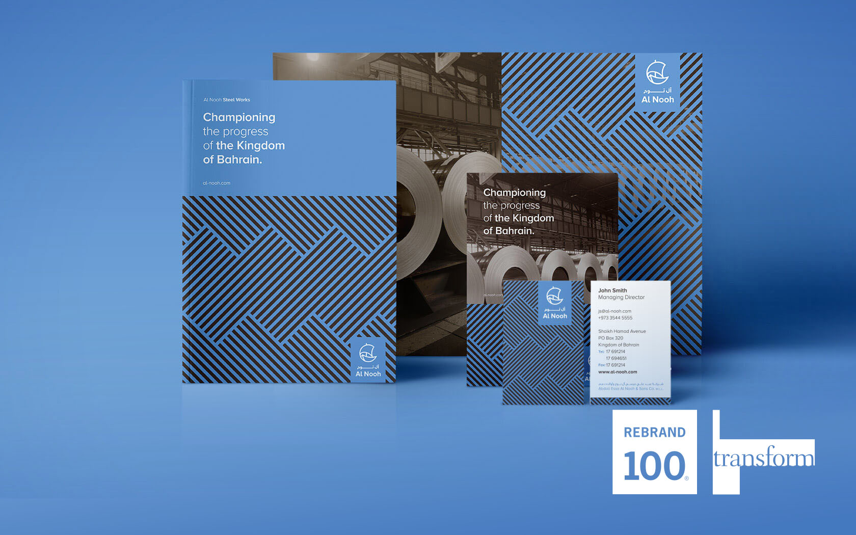
Winning Visual Identity of the Year by IVIA, Rebrand 100 in 2018 and Gold & Silver Transform Awards in 2017 says it all for Al Nooh.
Mala'a
Rebrand
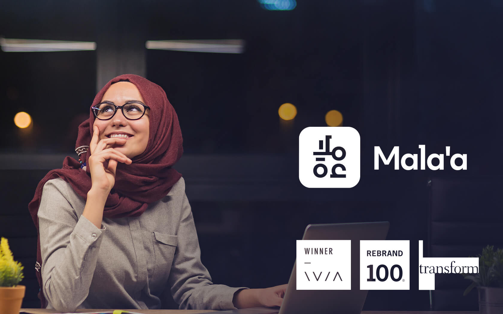
Introducing Mala'a; the new credit bureau and data analytics expert from Oman's Central Bank.
Esterad.
Rebrand
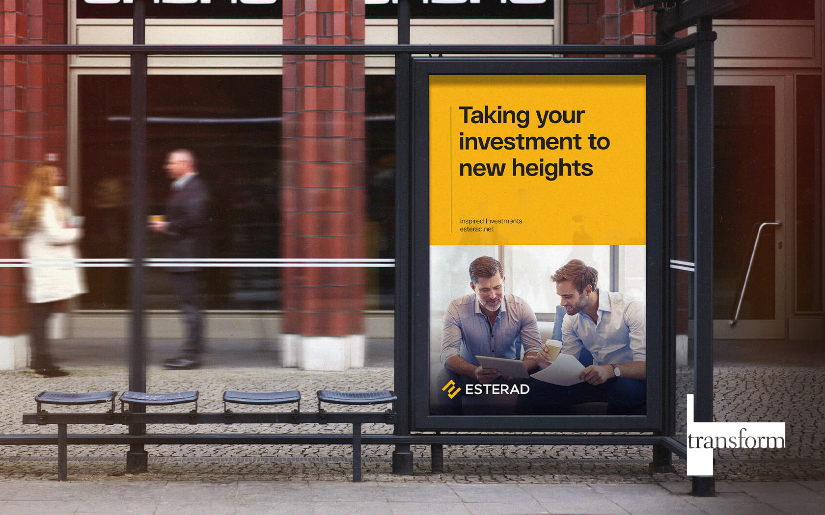
Esterad is rooted in transformative investments in Bahrain and the region.