Shamsaha. Rebrand
Empowering women, one brand at a time
Introduction to Shamsaha
Shamsaha started life titled ‘Woman’s Crisis Care International’. Our founding partner Amy Morgan got involved with the project and brought her strategic muscles to the organisation, lending her skills and agency fire power to the fight for greater equality for women and the disenfranchised. We were all delighted to help – this is what we did and how we did it.
Challenges
The WCCI brand name told us immediately that the organisation needed to reconsider its approach and refocus its intentions – from issues to solutions. Women in crisis need help to get out of their situation, not a reinforcement of the drama. “You are in crisis!” leads to “I know, I know” where as “We know how to help!” leads to “I want to change”.
We wanted to bring about positive transformation in their lives. The name needed to change if the organisation was going to hit its primary objective of being a pivotal force changing the regional expectation of women’s empowerment & equality.
Due to its antiquated and negative energy, the brand was struggling to attract and approach large sponsors and partners.
A strategic approach
We worked with the WCCI team to create a name that would set the right tone for the brand from the get go. After many rounds of ideation, one of the team struck upon ‘Shamsaha’ (meaning ‘our sun’ in Arabic) and everyone rallied around this title – it felt perfect for what the brand seeks to do – to shine a light of hope into the dark lives of the disenfranchised.
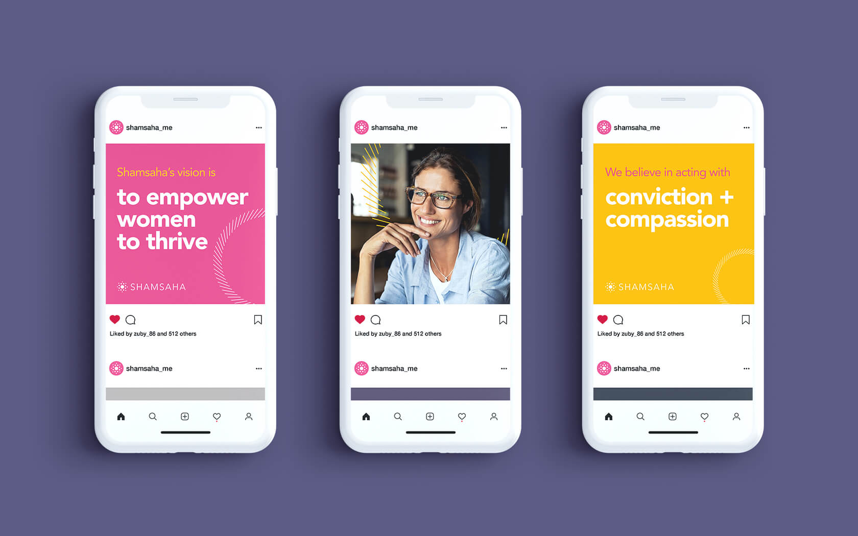
From strategic workshops with Shamsaha’s leaders we were able to draft the foundation of the brand. We agreed the reason we existed and what gave us the greatest sense of success was ‘To contribute to a greater cause’; as an organisation, we exist to empower women to realise their potential. Knowing why we exist enabled us to develop a vision to drive us forward. Our vision for the brand is ’to empower women to thrive’.
We made a promise to people that we would ‘empower your potential’ by living our values of Conviction & Compassion. With these two simple values we had a framework on which we could build a compelling and highly defined culture. This culture would come to be understood by our audience and position us in their minds as ‘Inspiring champions of empowerment’.
Our creative solution
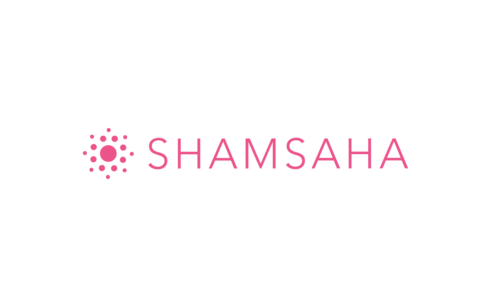
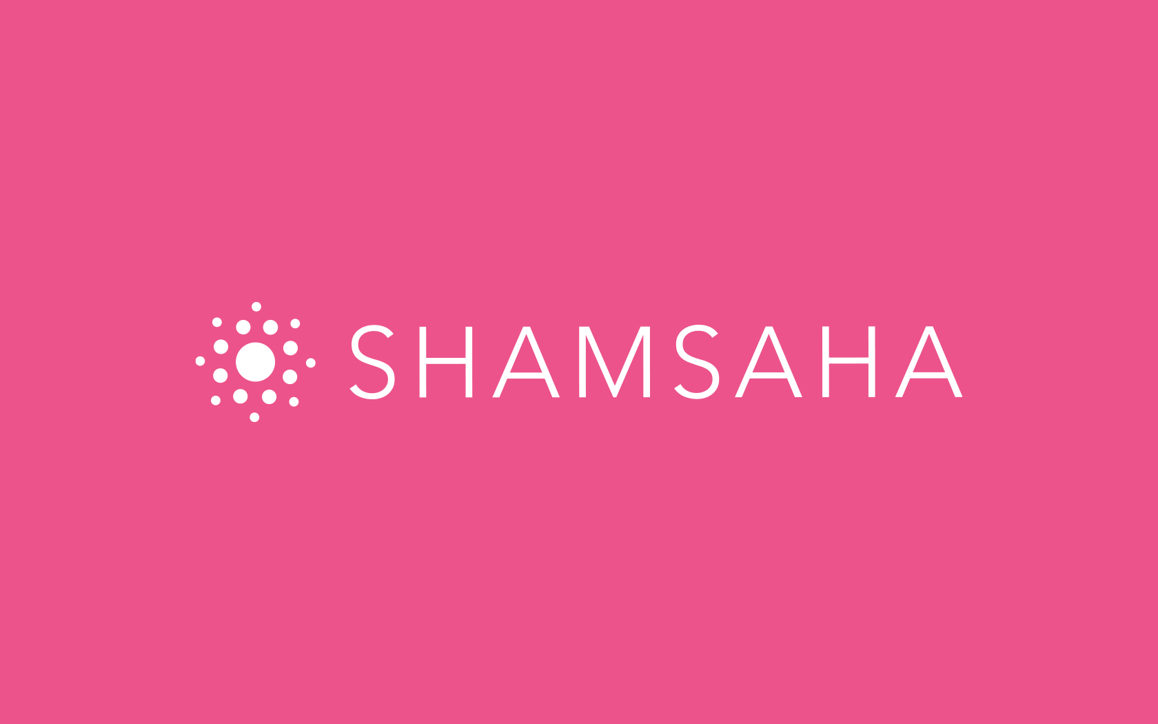
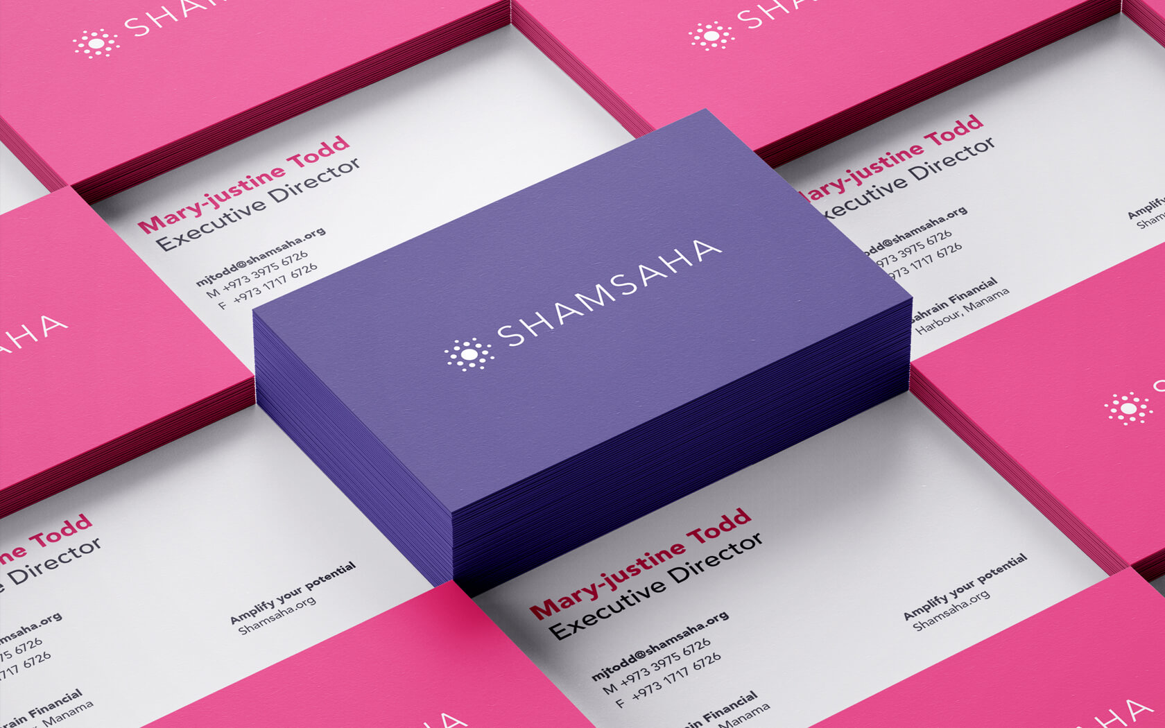
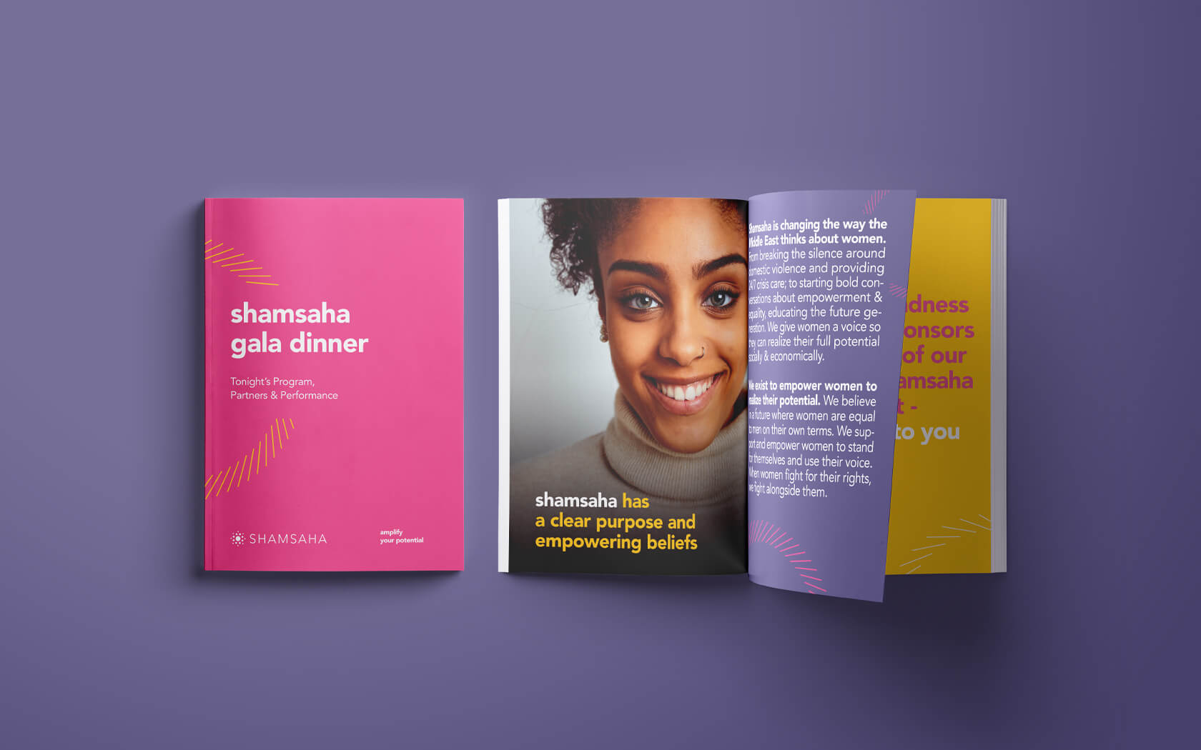
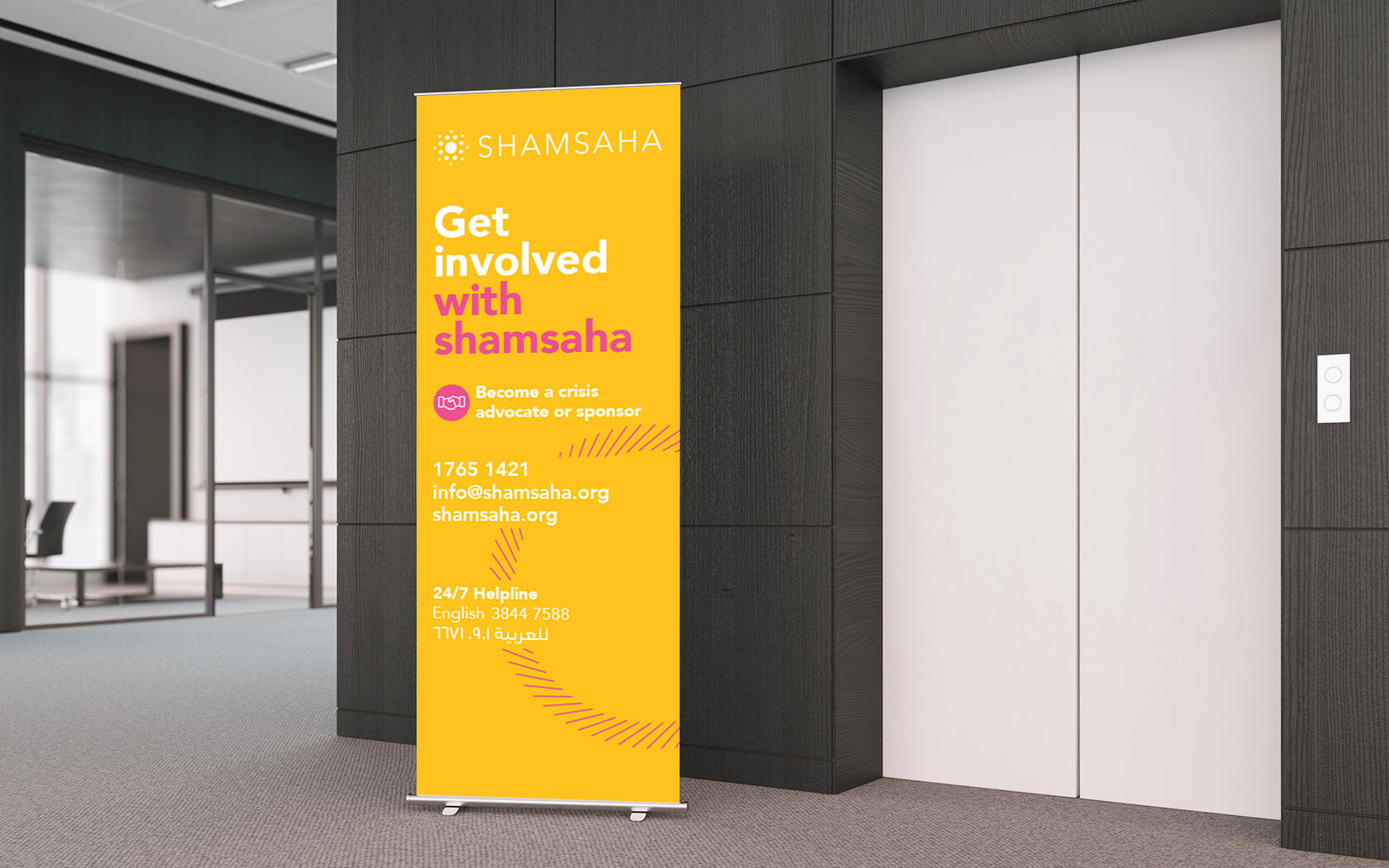
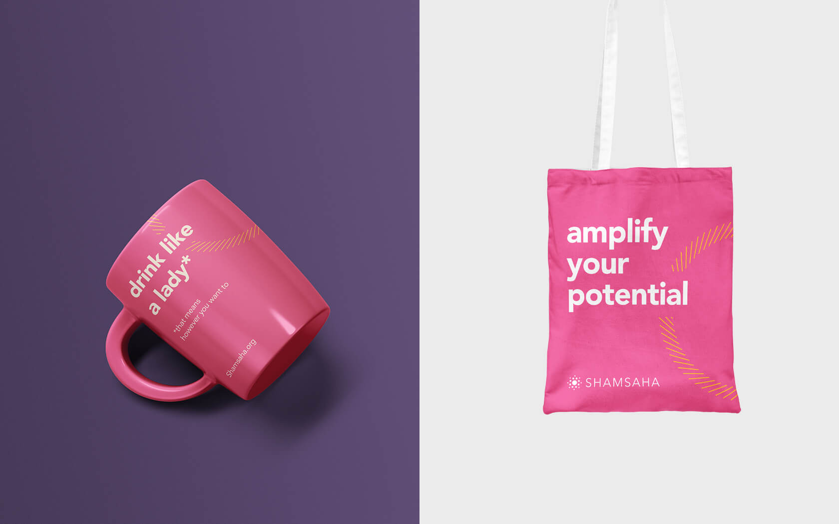
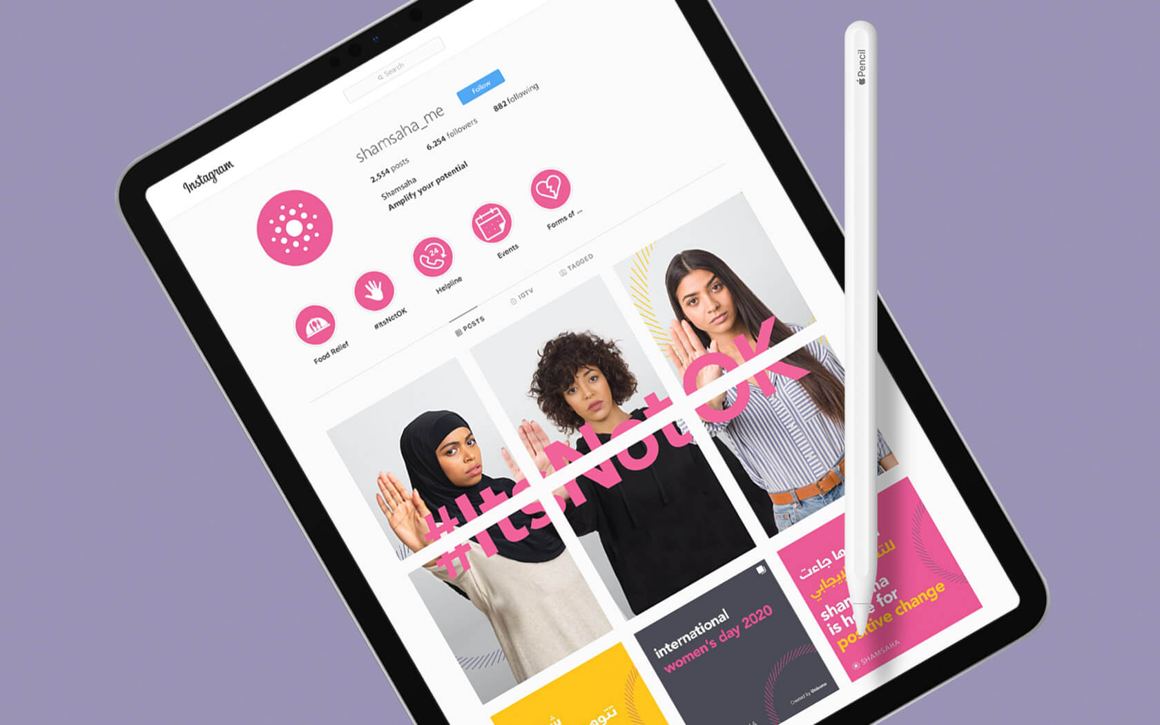
With a name like ‘her sun’, the brand mark was always likely to be halo-centric. The old brand mark looked highly Islamic with its bold use of a crescent and kind of foreboding, thanks to its dark blue circle. The new brand mark evokes a positive emotion with a clear feeling of community and support; several circles come together to collectively form a radiant sun-like element.
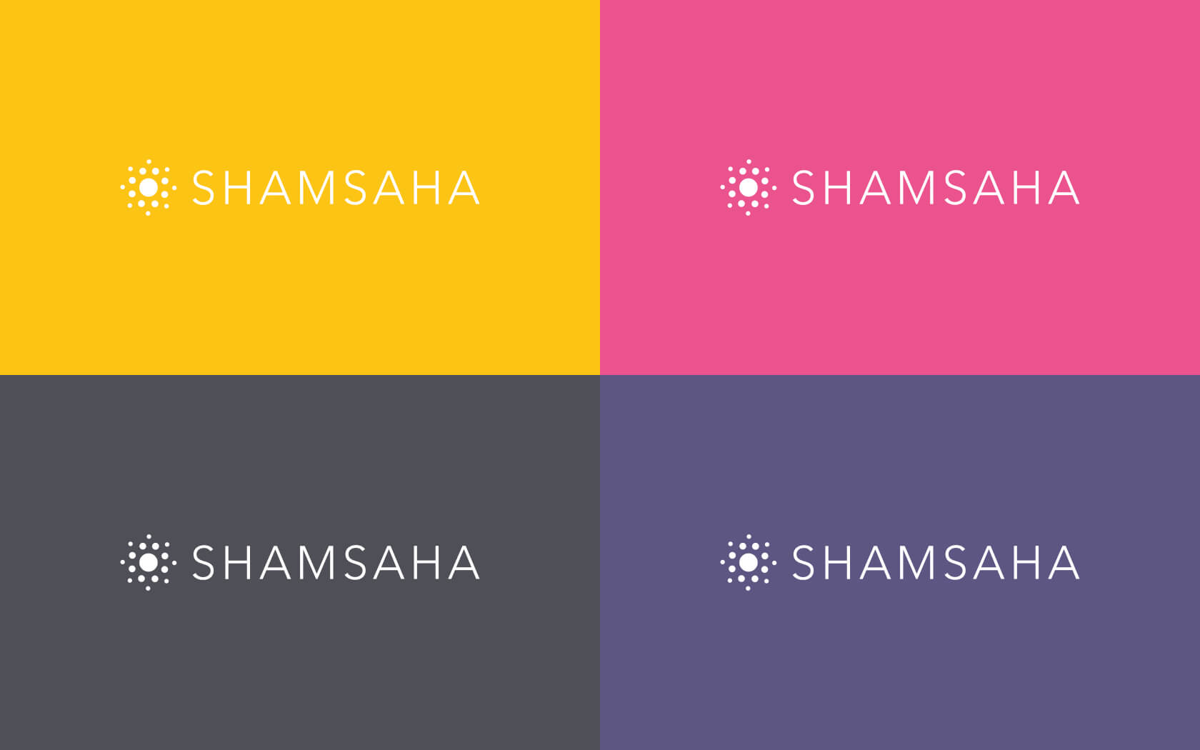
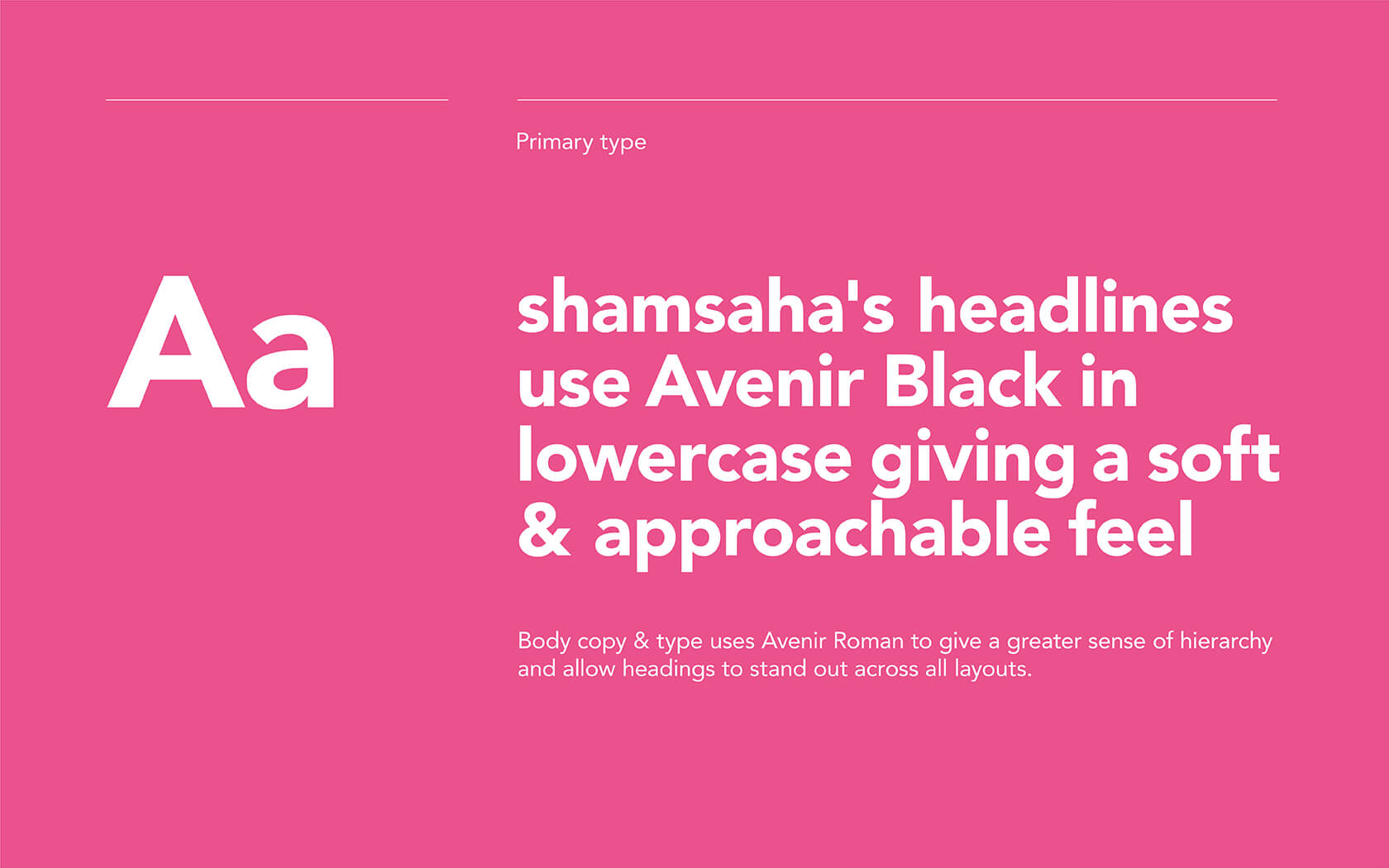
The pink colour was always a consideration, not because it is girly but because one of the founders ‘absolutely loves pink!’ – we didn’t fight it. Pink is right for the brand, it feels feminine and energetic which is exactly what the brand is about – empowering women. The colours are bright and positive, hinting at the charge the brand brings into a person’s life. Coupled with the sober Avenir type family, the brand is balanced between positive, helpful energy and clear, level-headed support.
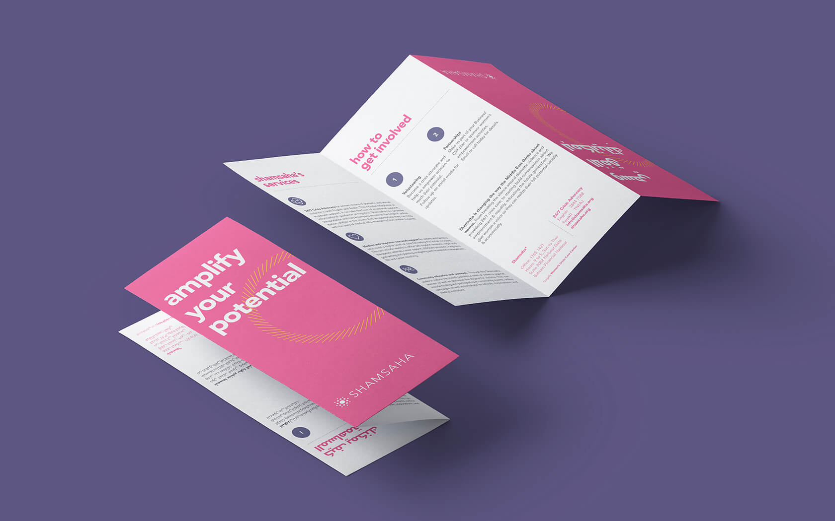
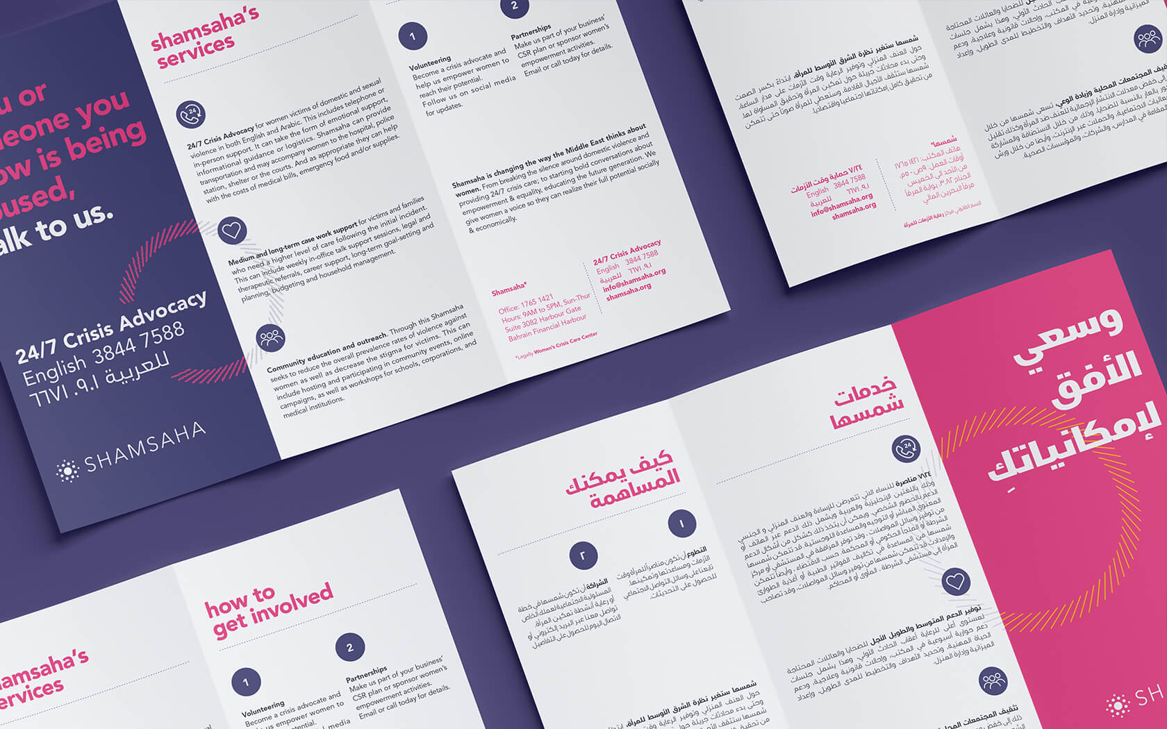
The final element is a radiating energy burst which signals the power the brand shares with the disenfranchised. Shamsaha literally empowers women and this women’s empowerment brand identity communicates this clearly and succinctly.
The early results are positive
Shamsaha is now working to be recognised as the ‘voice of women’ and create a platform to hand power back to women, enabling them to make decisions for themselves and their future.
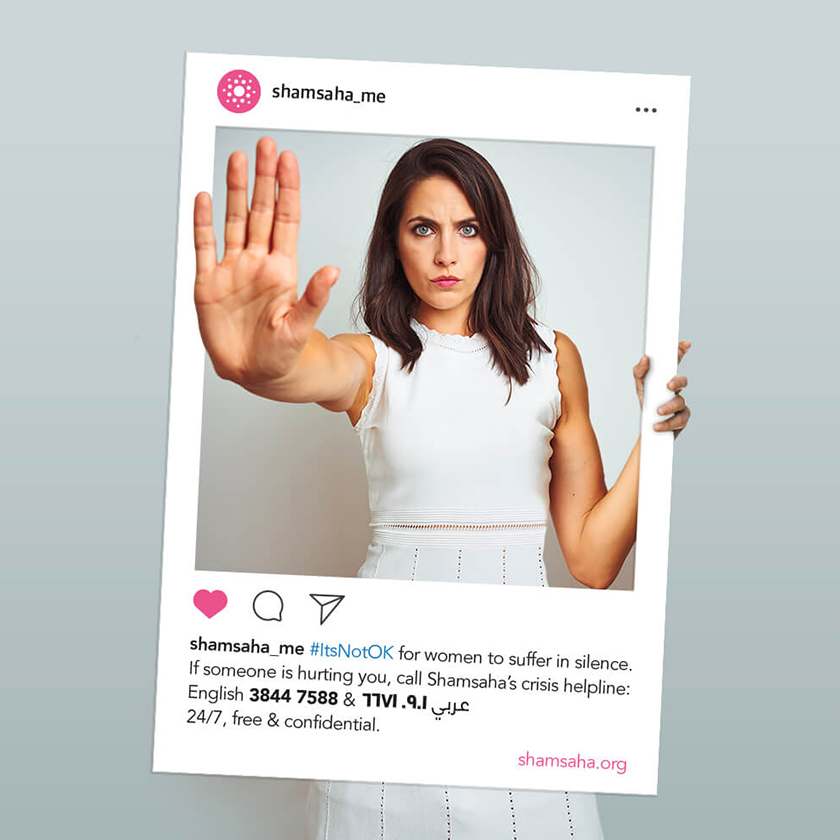
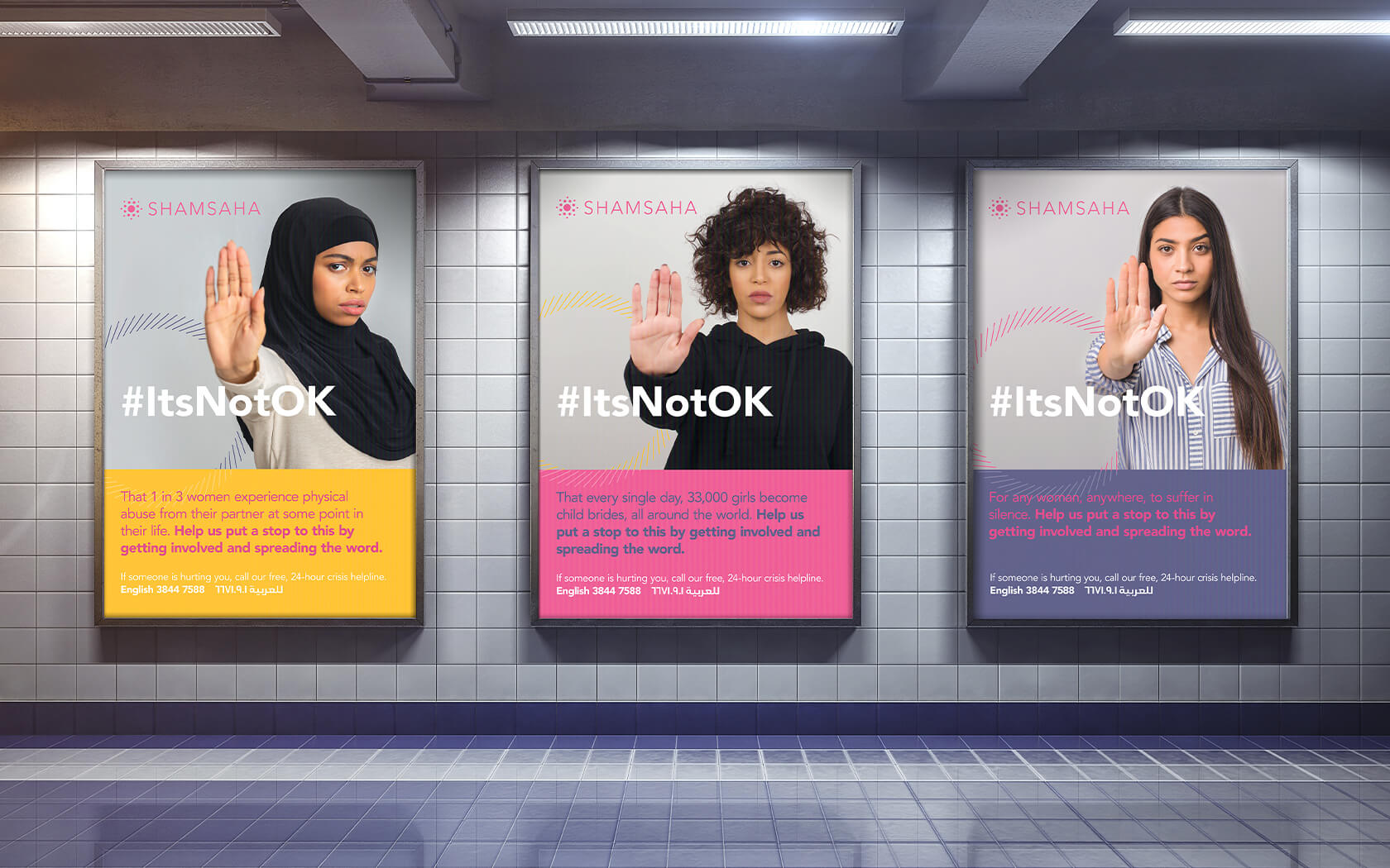
With an unwavering conviction and true compassion, the Shamsaha team are building a name that is both respected and trusted regionally. Creating dialogues around taboo topics, leading powerful campaigns to ‘abnormalise’ violence against women and establishing the association of pink with this cause. Shamsaha’s game-changing approach is sure to help transform the way the world sees women and secure the brand’s position as a formidable leader in the region’s equality movement.
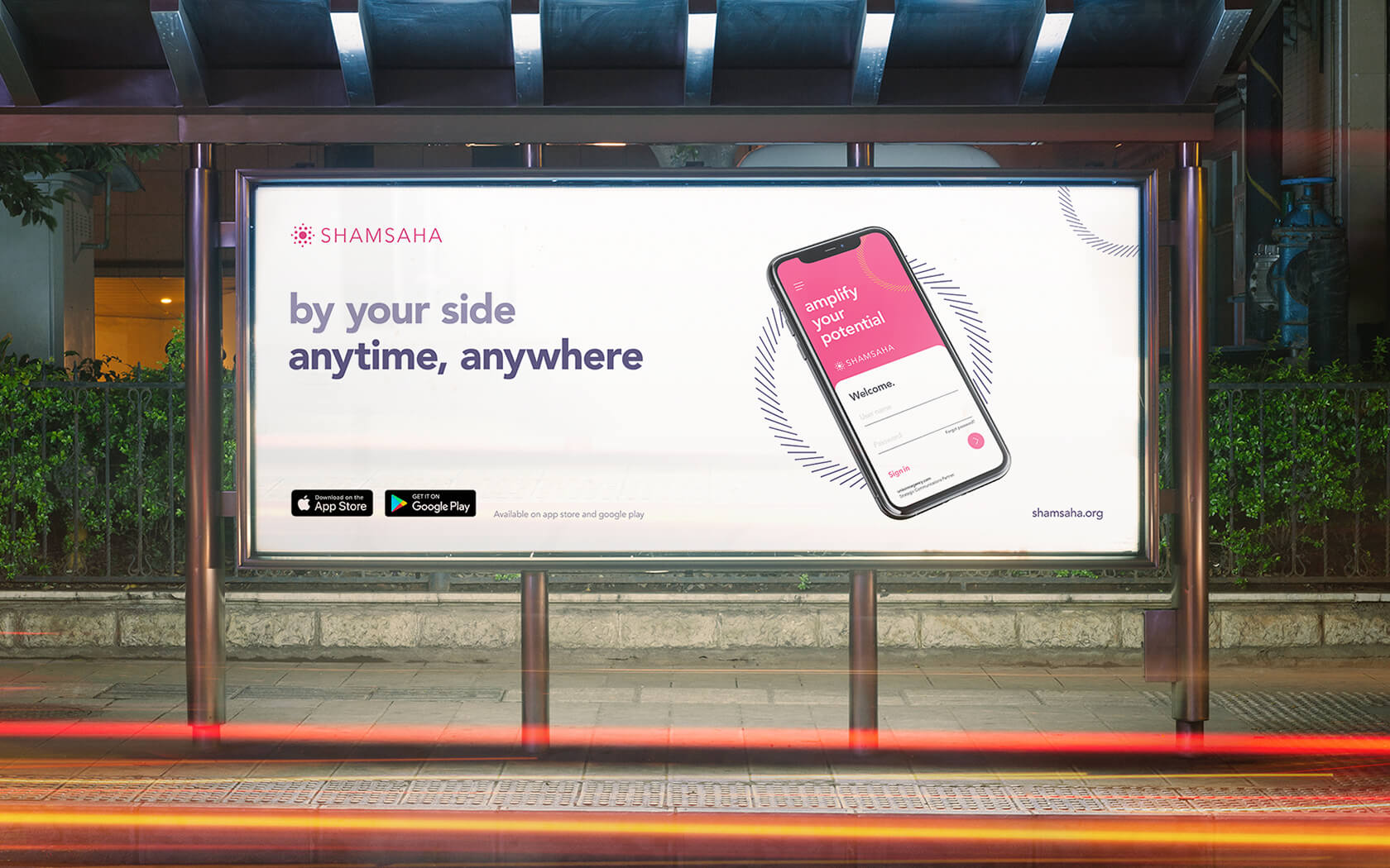
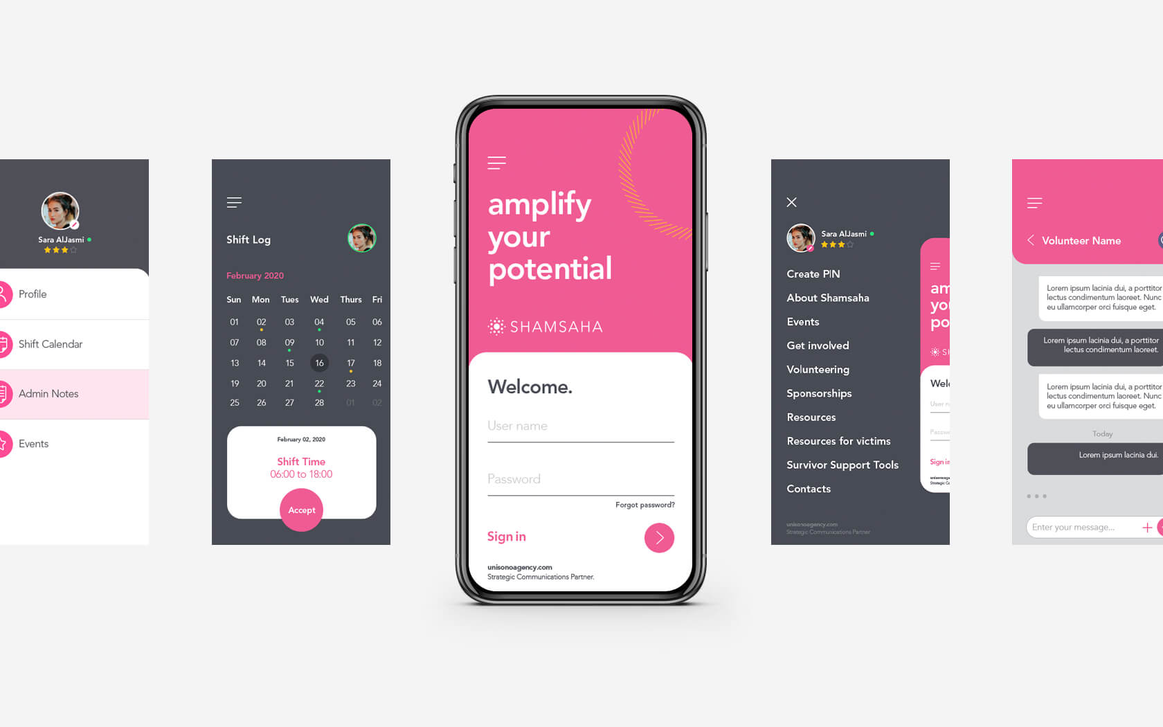
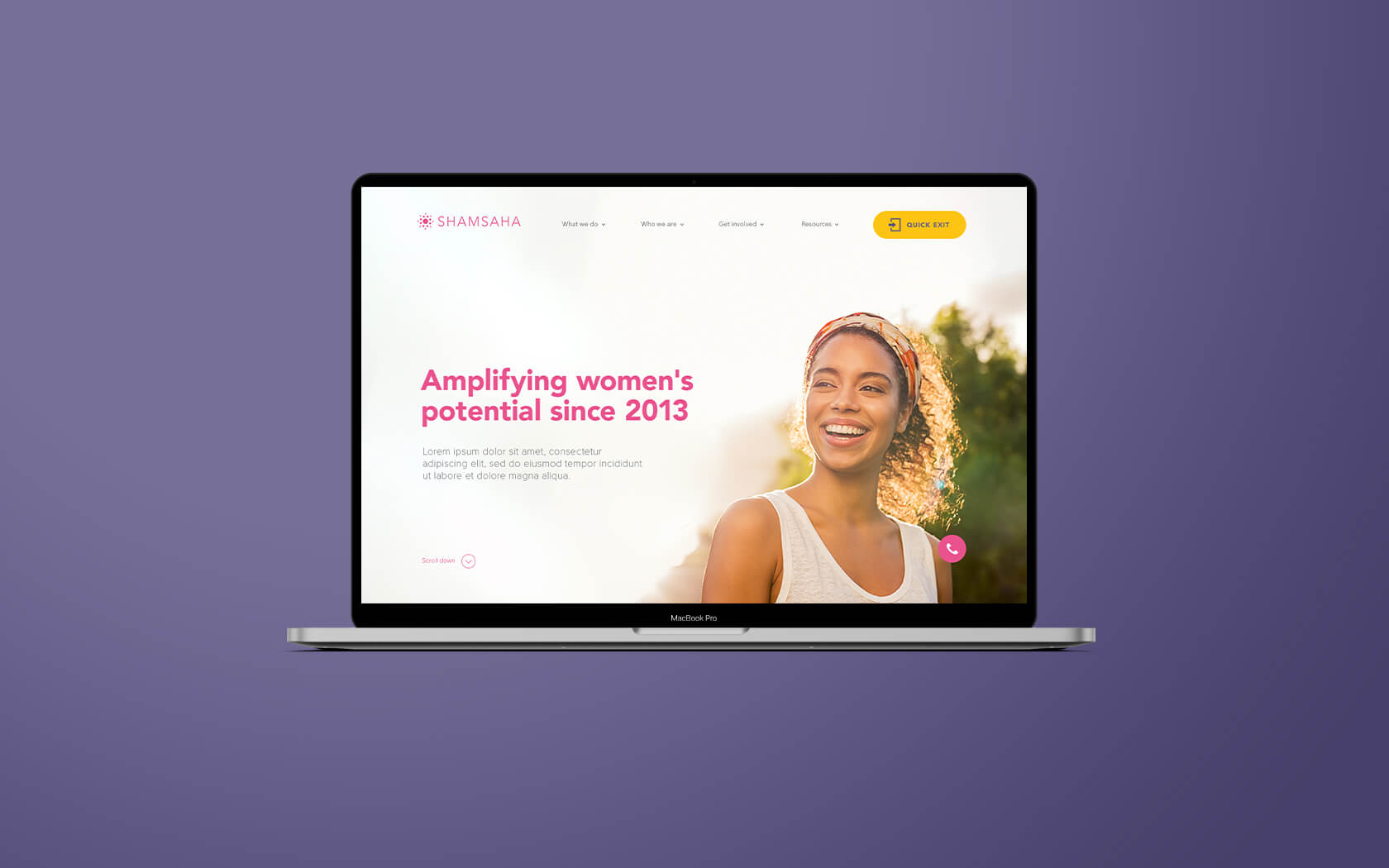
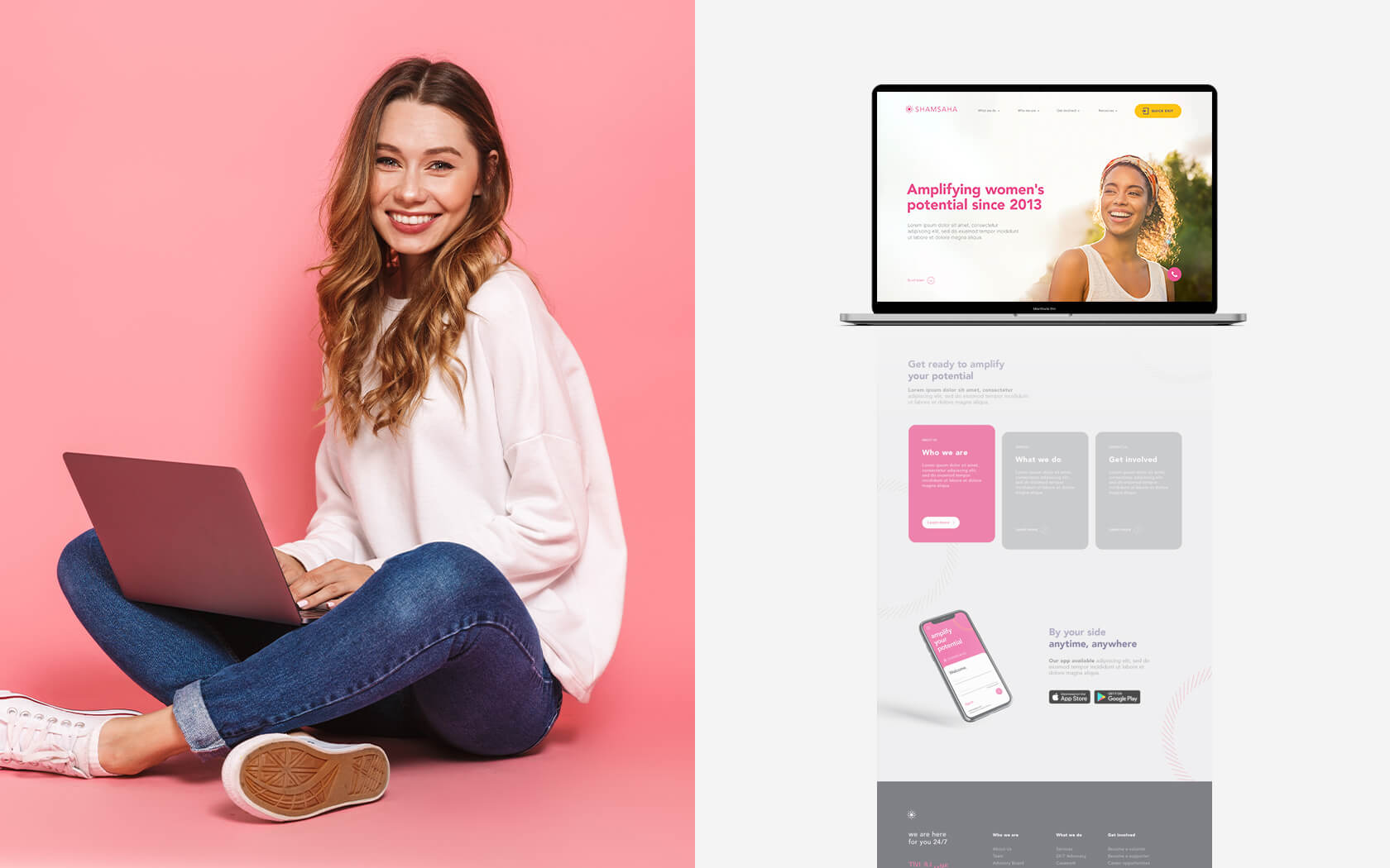
The brand was successfully launched at the charity’s annual fundraising gala to a stunning applause and ringing praise from a star studded audience. The new website and app are launching soon and we also expect to see a new service offering from the same team launching later this year.
Finally, thanks in no small part to the new brand, Shamsaha was able to attract the attention and support of several, new large entities that will help support funding so they continue doing the amazing work they do.
Mary-Justine Todd, their Executive Director, added, “the new brand immediately helped improve our reputation, professionalism, trust and dependability. You’ve helped us become who we always knew we were deep in our hearts.”
Services Delivered
Brand Strategy, Naming, Brand Design, Visual Identity, Slogan, Tone of Voice, Digital Design, Print & Graphic Design.
The new brand immediately helped improve our reputation, professionalism, trust and dependability. You’ve helped us become who we always knew we were deep in our hearts.
Mary-Justine Todd. Executive Director.
Details View Close


A powerful brand that is helping to empower women.
Liam Farrell. Creative Director & Partner.
GFH
Annual & ESG Report
Slick print treatments from slip case to back cover and every section in between for this impressive annual and ESG report for one of the GCC's leading financial groups.
Mala'a
Rebrand
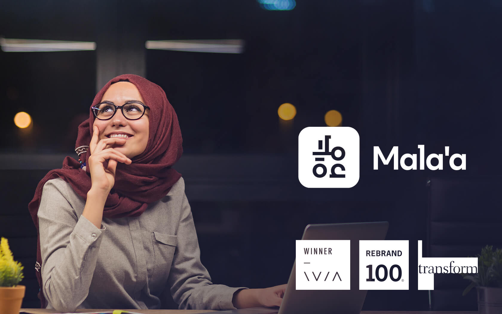
Introducing Mala'a; the new credit bureau and data analytics expert from Oman's Central Bank.
Infracorp.
Branding
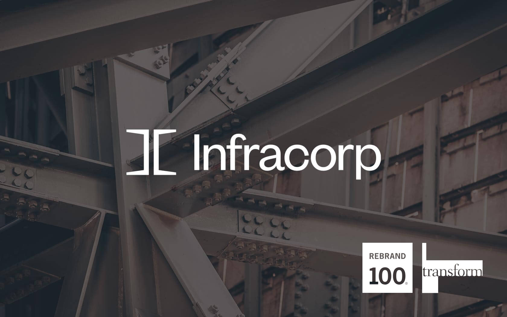
Unisono delivers a Transform Gold Award winning infrastructure brand identity for Infracorp, the region's first value investing brand.
Esterad.
Annual Report 2019
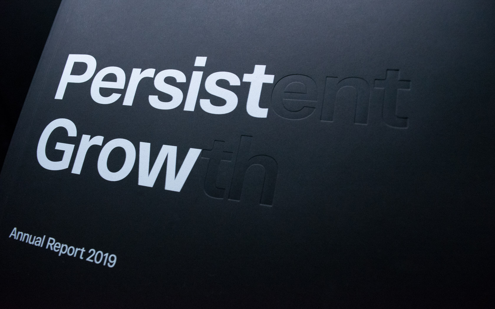
This beautifully finished Esterad Annual Report 2019 celebrates another remarkable year for this prosperous brand.
Esterad.
Annual Report 2021
From the from the cover to the financial detail, the 2022 Esterad Annual Report creates next level impact thanks to a subtly applied theme and refined design treatments.