Ertiqa. Rebrand
Digital waste has rarely looked this good
Industry Setting
Ertiqa is an innovative charitable entity within Saudi Arabia’s Al Fozan Group. Operating out of Dammam in Saudi’s Eastern Province, Ertiqa is a digital waste charity that helps business across Saudi Arabia recycle their technological waste, such as PCs and other electronic devices. The firm receives donations of old equipment and then cleans, restores and upgrades them, before distributing them to schools, charities and other deserving causes.
The charity’s innovative approach supports large enterprises needing to dispose of older ‘tech’ and empowers them to enhance their CSR activity, while reducing environmental impact when they need to upgrade their facilities. Ertiqa is truly an impactful charity for the modern era.
Challenges
- It was a brand with little or no definition or visual definition – it looked low budget and unprofessional
- The existing identity reduced stakeholder confidence, especially with donors who were providing the required PCs
- The colours were not aligned with the brand’s purpose or computer technology being more reminiscent of the Indian flag
- The identity suffered from a number of technical challenges and there were no graphic standards or purposeful layout devices –
- The brand mark was not distinctive enough to create impact or represent the brand’s purpose
- The touchpoints suffered from a lack of visual consistency
- Brand images were problem, not solution focused and were not unique or communicative of the brand’s proposition
- There was no purposeful distinction, every element in the graphic language from type to colours to imagery detracted from the perception they needed
- The graphic tools were limited and unsupportive of their strategy.
We helped build a new Ertiqa by:
- Running ‘deep dive’ strategic client ‘Why ™’ workshops to discover the brand’s true purpose and potential
- Creating a brand vision they could believe in and rally around delivering: “To discover potential and deliver value”
- Creating a brand value system: “Committed, Creative, Direct and Energetic” helping the team to build a defined company culture to further empower support realization of their brand vision
- Defining a clear brand personality and archetype: ‘The Entrepreneur’ – a personality driven the desire to innovate and find or create solutions
- Creating a relevant brand promise: “To find and create value through profitable opportunities” – a brand promise aligned to their core purpose and operation
- Defining a creative strategy that would effectively express the new strategy
Creative strategy
The creative strategy was built on three key pillars 1) create a graphic identity that could increase the organisation’s credibility, 2) create a toolkit of elements (font, colours, layout devices, etc.) to build an technological aesthetic that hinted at rejuvenation and sustainability (green causes), 3) create a literal identity that would express the purpose of the brand and also connect with its ‘tech-savvy’ audience,
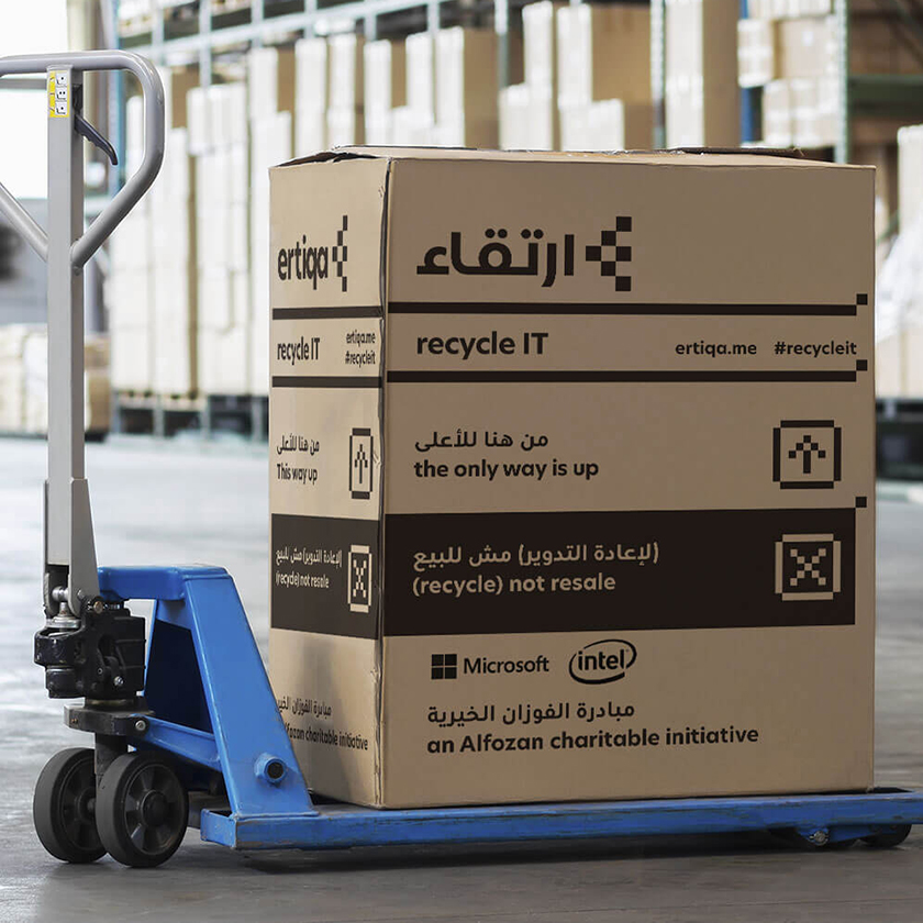
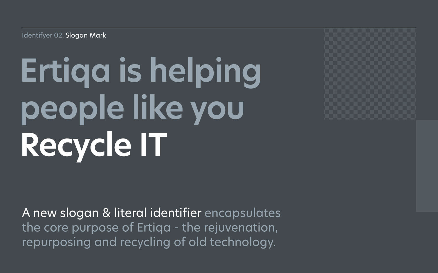
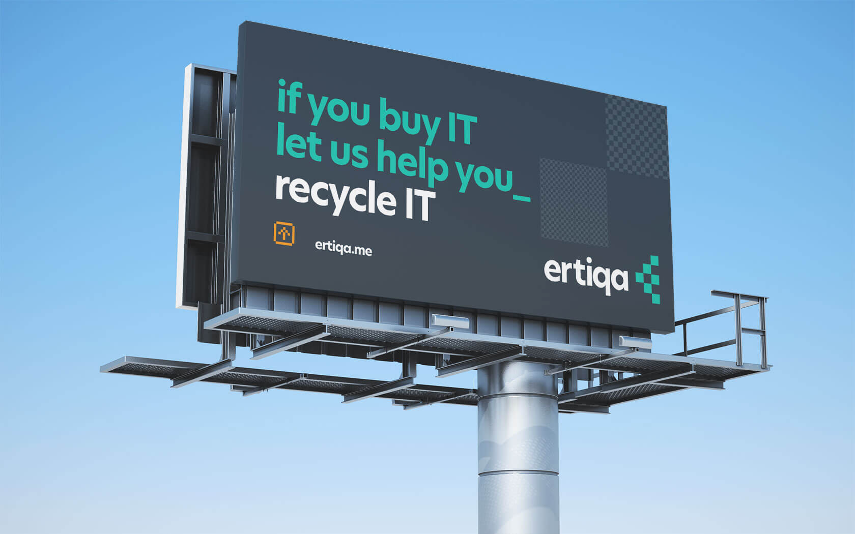
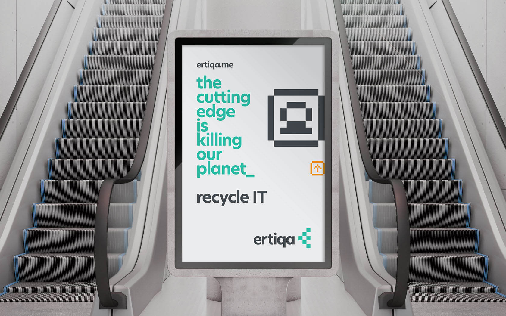
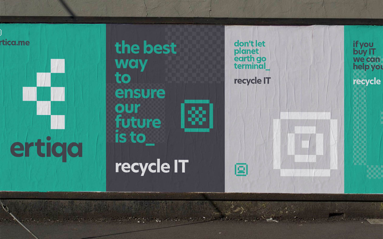
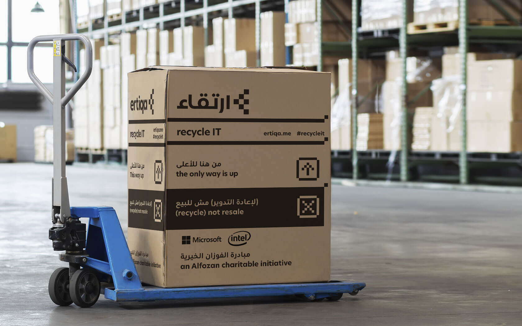
Ertiqa’s voice is centered on engaging messages punctuated by a clear slogan. The messaging is lively and youthful, helping connect yesterday’s technology to today’s digital natives in a fun, solution-focused manner. The brand has a clear and direct slogan ‘Recycle IT’ which creates playful a smile in the mind, thanks to the double-entendre of IT/it. The slogan links the brand clearly and unambiguously to its purpose and is playfully used, helping punctuate communication (‘If you by IT, let us help you Recycle IT’) and in doing so, building a unique messaging platform.
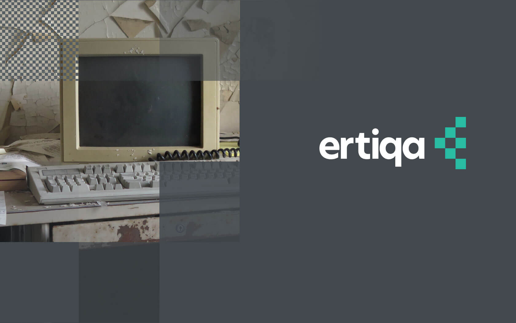
Ertiqa’s visual aesthetic was designed to create a feeling of retro-futurism; connecting the subject and familiar ‘graphic voice’ of old technology with the graphic language of today in a way helps Ertiqa stand out. This approach allows us to build a connection, resulting in the feeling that you already knew the brand somehow.
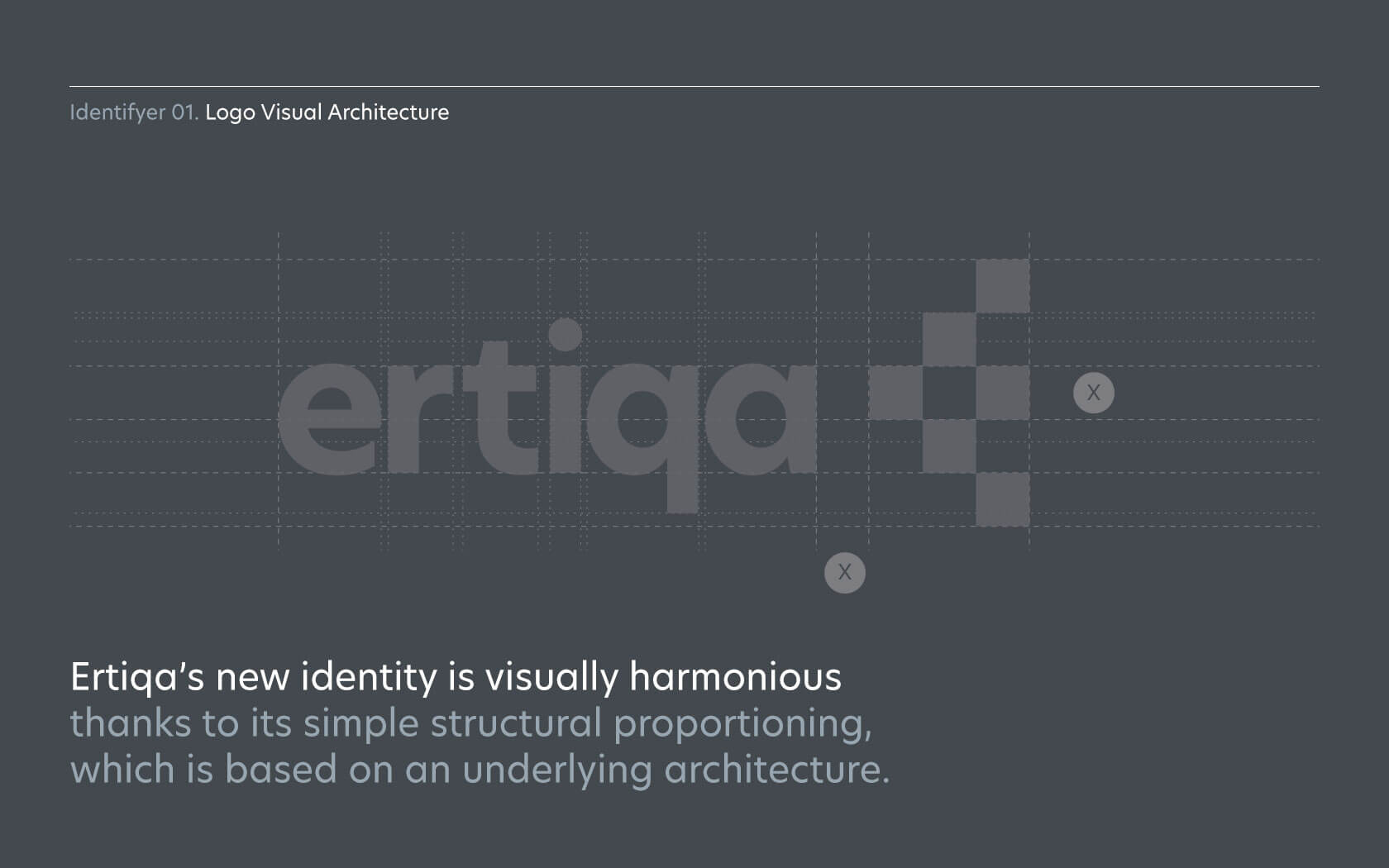
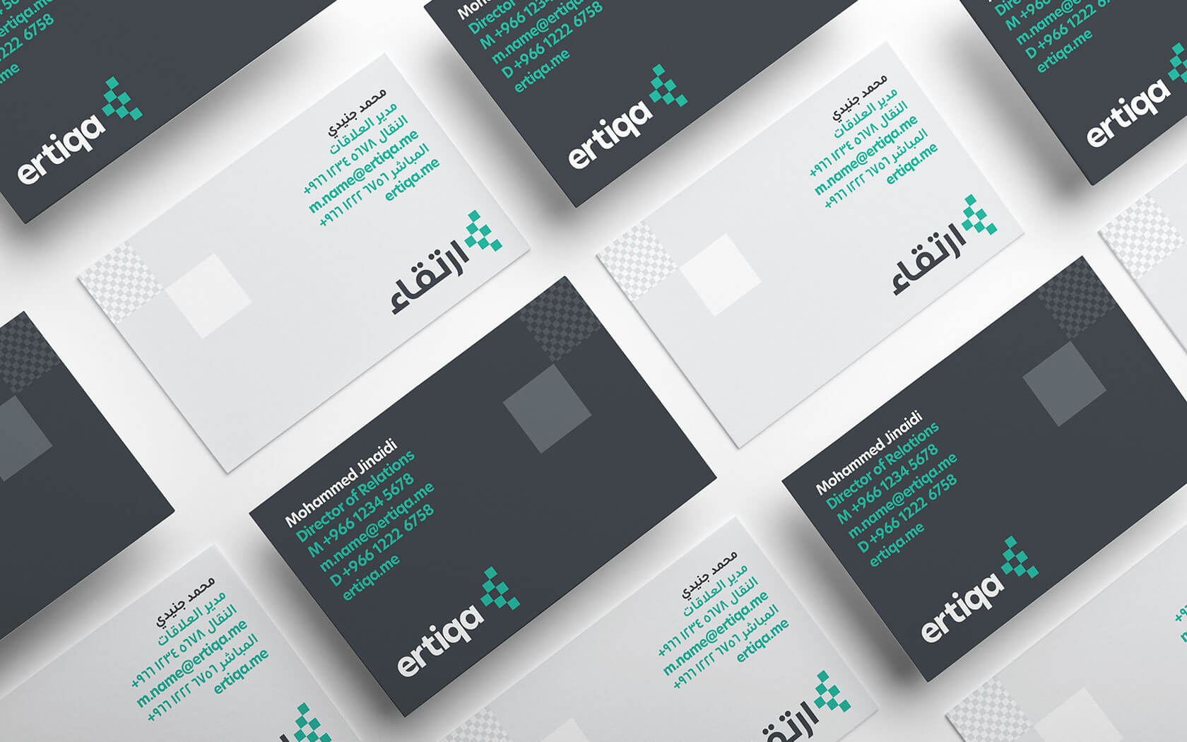
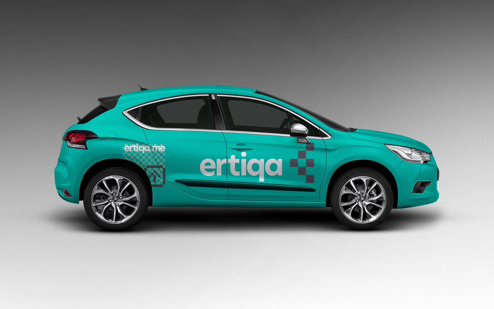
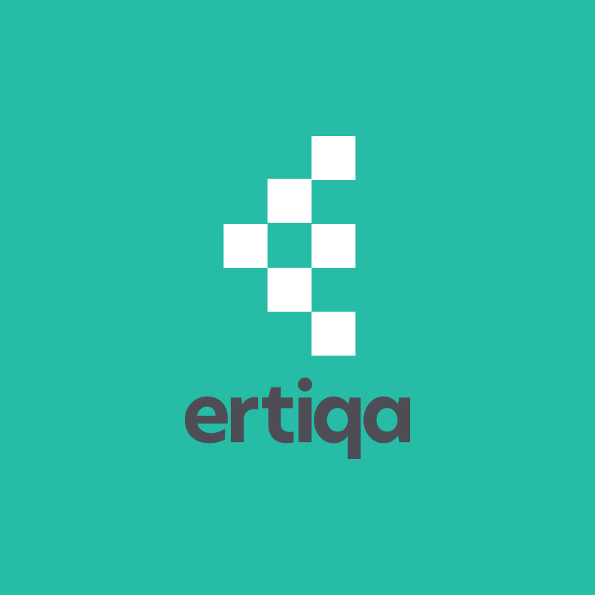
The brand logo use an icon that looks both like a stylised ‘E’ as well as an arrow – denoting progress. The icon is constructed from regular squares, referencing the binary code images used at the dawn of the silicon era – i.e. the black and white ‘on & off’. This mark combines the notion of progress with legacy on which modern technology was built. The Arabic mark’s type was built from the English to ensure the form works perfectly across dual language communication.
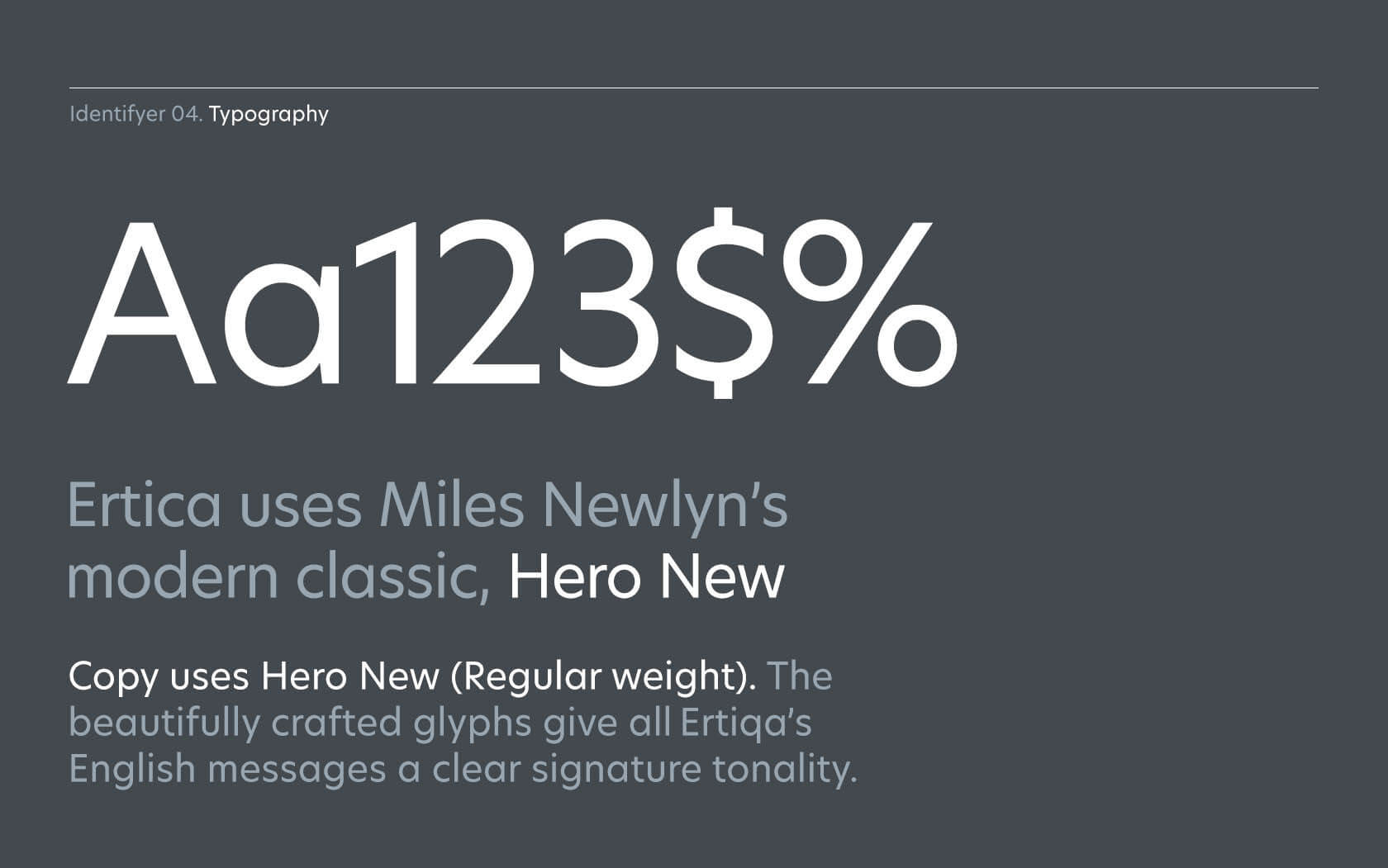
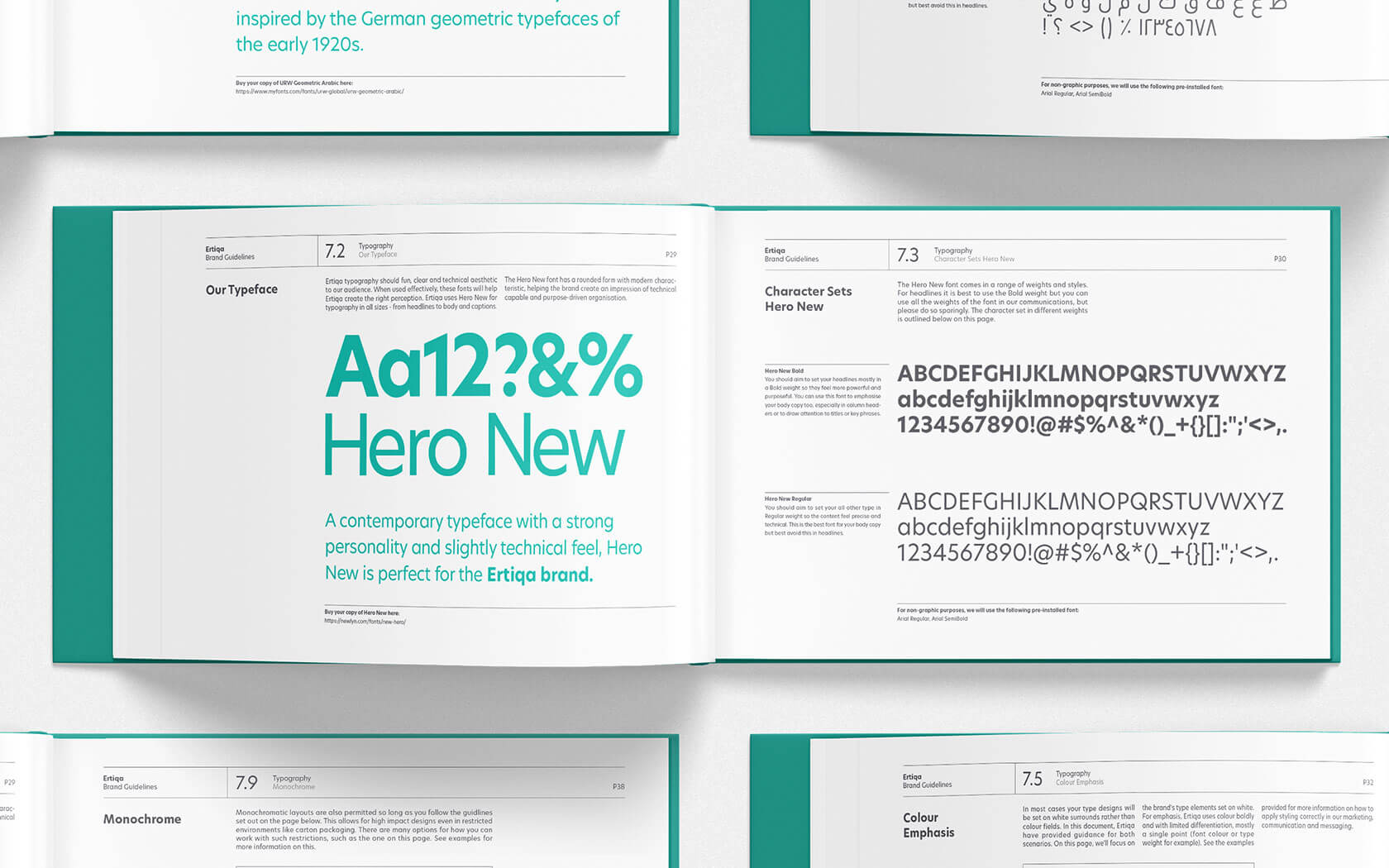
We chose Hero New as this clean sans font provides the brand’s messaging with a unique technological quality, without losing its inherent humanity. This ‘technical yet human’ property made the font the appropriate choice for Ertiqa; a charitable cause who revives old technology so it can serve humanity once again.
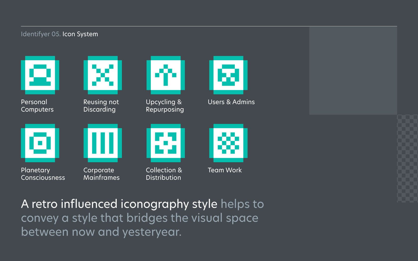
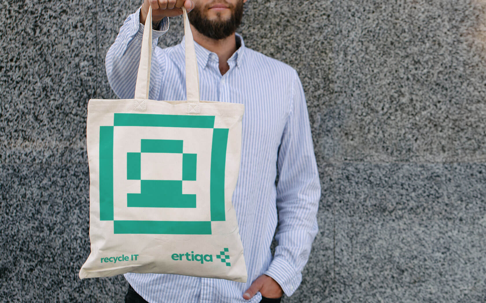
The engaging graphic palette employs a system of ‘binary’ icons, denoting key topics (PC’s, People, Mainframes, Planets, Recycling etc). The icon set creates a direct link to the earliest computer imaging. In support of the icons is the base layer, a unique layout tool we call an ‘opacity grid’. The opacity grid hints at resurrection and rejuvenation. Old machines being brought flickering back to life thanks to Ertiqa’s tender technical ministration.
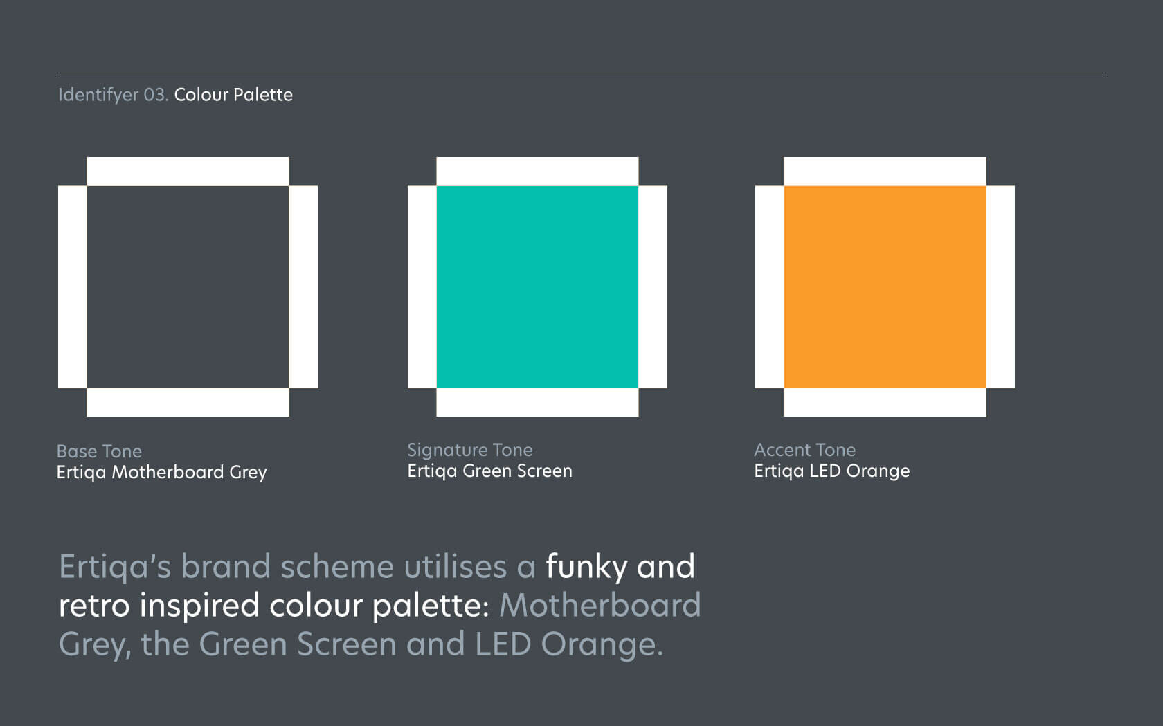
The signature green colour is deeply significant. It connects with the brand’s core purpose – the remedy and care of computers (i.e. hospital green) with the age of the technology (the age of the green screen) in the new sustainable (green) economic era. The overall colour palette is based on green with warm grey and orange. The green is reminiscent of medical uniforms creating a subtle visual connection (to digital rejuvenation) while the orange tone is a link to the past visual identity helping the brand to migrate.
The overall aesthetic is clearly technological, the messaging is fun and engaging and lightens the mood from one based on issues to one focused on solutions. The graphic devices cut through the noise to deliver a brand message that begs participation.
Our identity program included:
- A new, dual language logo with humanist type-mark and a binary-style icon, reflecting the technological brand context as well as a progressive arrow and a connection to the initialism of brand name
- A binary icon set to help express the brand’s areas of concern
- A unique opacity grid for use in layouts and to treat images
- Hero New and GRW Arabic Fonts to project a modern, humanist brand voice
- A colour pallet based on (green screen, medical uniforms and eco-friendly) Green, an Orange tone (connecting the brand to its legacy) and Steely Grey (motherboards, technological products, etc.)
Awards
- Transform Gold. Best identity charity/NGO/not-for-profit
- Transform Silver. Best visual identity, technology, media & telecom
- Rebrand 100. Merit
Results
- Created a highly distinctive voice to clearly and uniquely project the brand’s position and purpose
- Helped Ertiqa, to house its messages in a framework that speaks of digital rejuvenation helping it connect to its benefactor’s environmental CSR strategies and initiatives
- Created a purposeful framework for typographic layouts helping the brand to identify the brand even without a logo mark
- Ensured a level of visual consistency across all touch points (promotional, communication, environment, traditional and digital) irrespective of whether an image was used
- Incorporated all images into brand layouts in a highly distinctive but very purposeful fashion
- Enjoyed a level of purposeful distinction from type to icon system to Opacity grid. The icons felt unique, arresting on the eye and engagingly fun.
Services Delivered
Strategy, Graphic Design, Copywriting and Print Management.
ReUse, ReCycle, ReThink IT.
Anon.
Details View Close
I might not ride a bike anymore but I’m very keen on recycling.
Liam Farrell. Creative Director & Partner.
Gtech
Rebrand
Britain's most-loved homeware brand gets a perfectly engineered brand strategy and revised identity.
Seef Entertainment
Branding
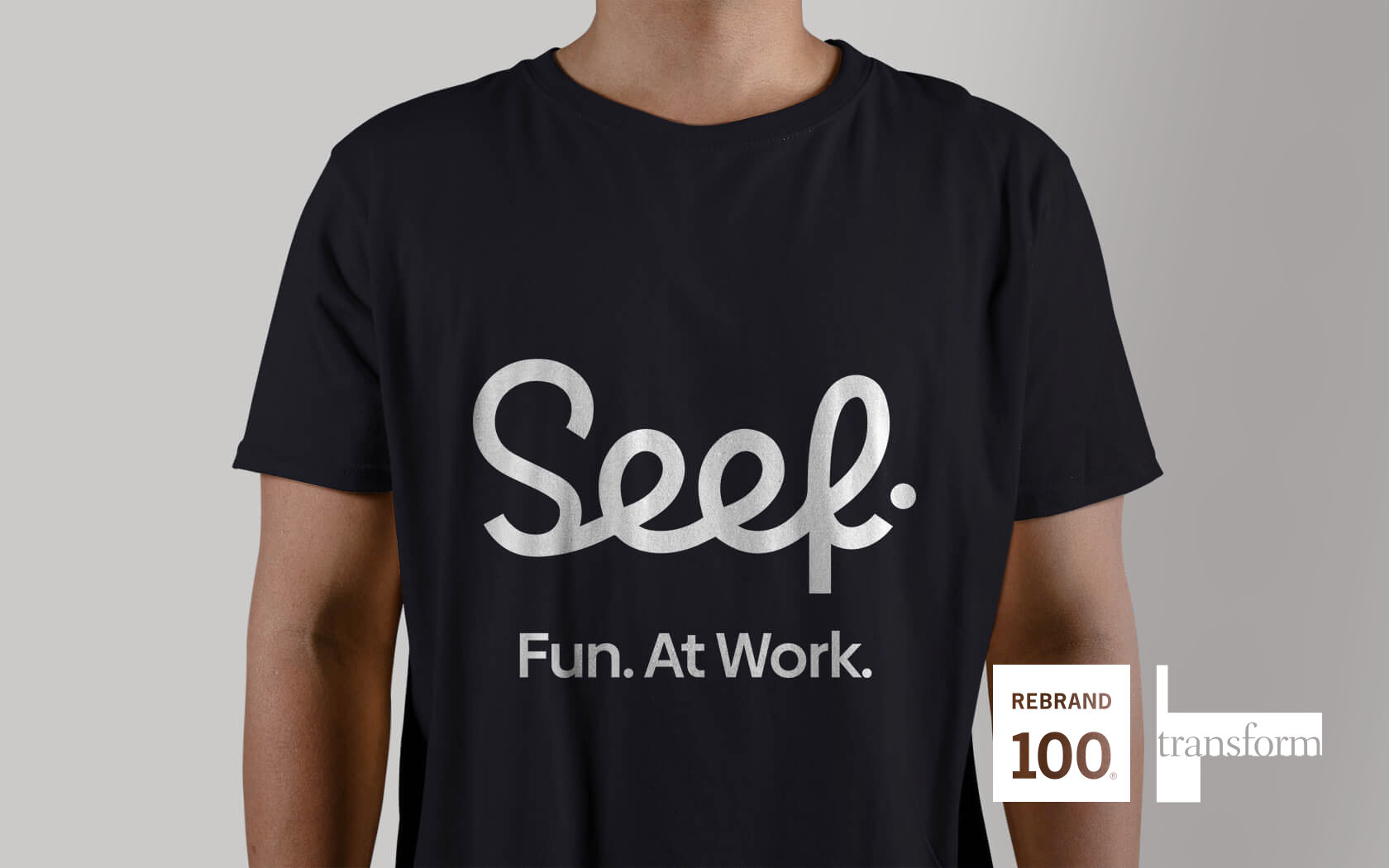
Silver Transform Award winning branding for the good people of Bahrain, who are about to get a whole new level of entertainment... Seef-level good times.
Rebrand 2024
Winners
Unisono won 10% of all Rebrand 100 2024 awards. Yes, you read that right. 10 of the top 100 rebrands, including The Best of Show, were created and delivered by one creative team.
Seef Mall.
Rebrand
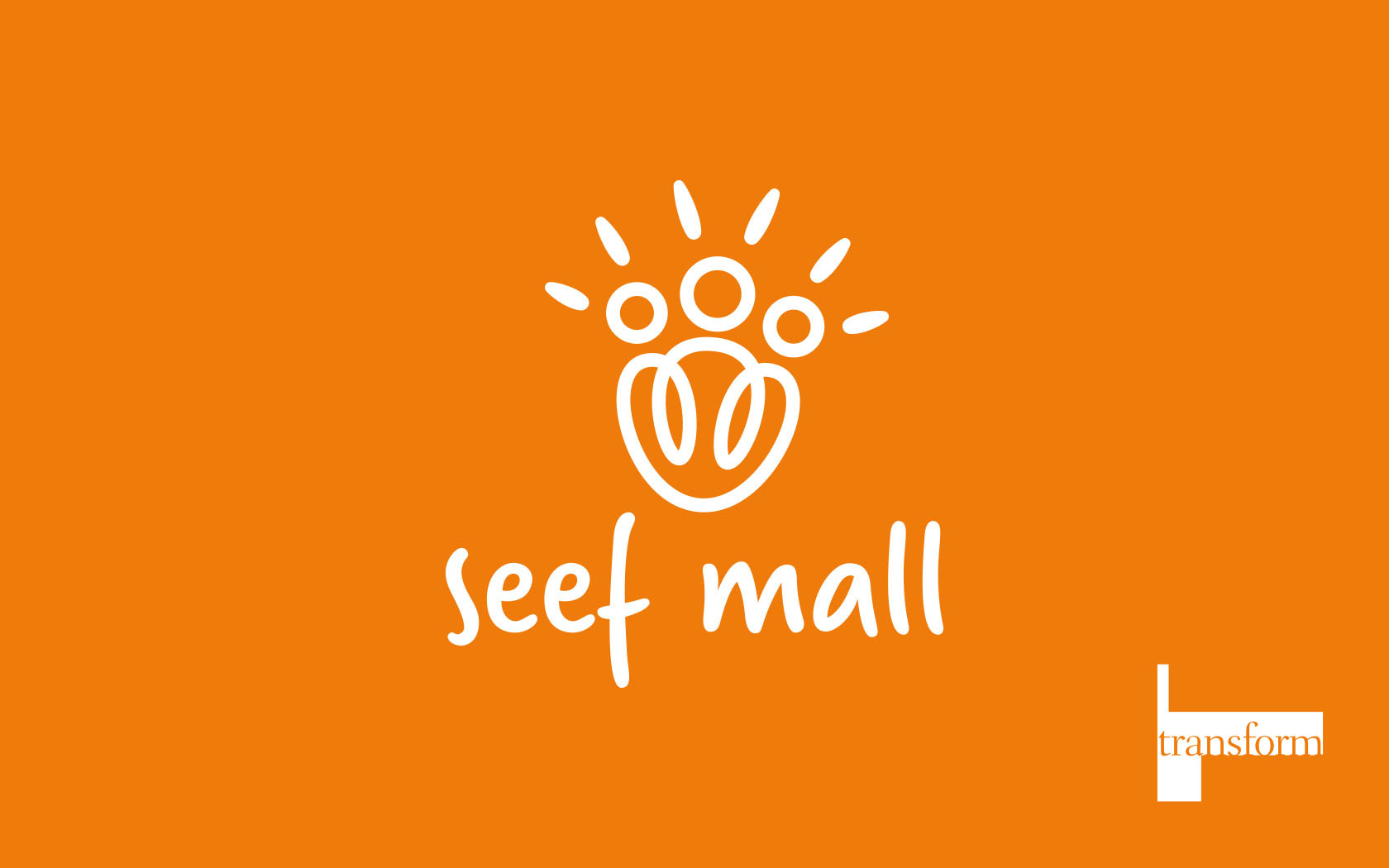
This Transform Gold award-winning rebrand for what has become Bahrain’s friendliest mall also featured on Brand New, the world’s leading branding site.
Rukn.
Rebrand
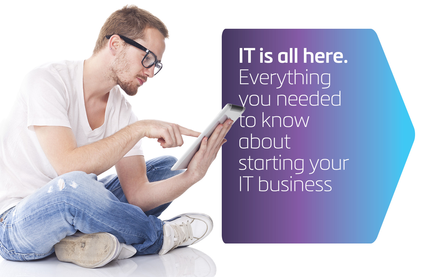
At last, Bahrain’s tech-entrepreneurs have their own incubator to help them grow IT from ideas into gazelles!