Infracorp. Branding

Structured for Sustainability
Creating the Infracorp Brand
Infracorp is bringing value investing to the GCC. A bold new move to bring end-to-end value considerations into investment. In place of typical valuations of assets, value investing looks at the Environmental, Social and Governmental aspects of a project to determine the essential value of the opportunity.
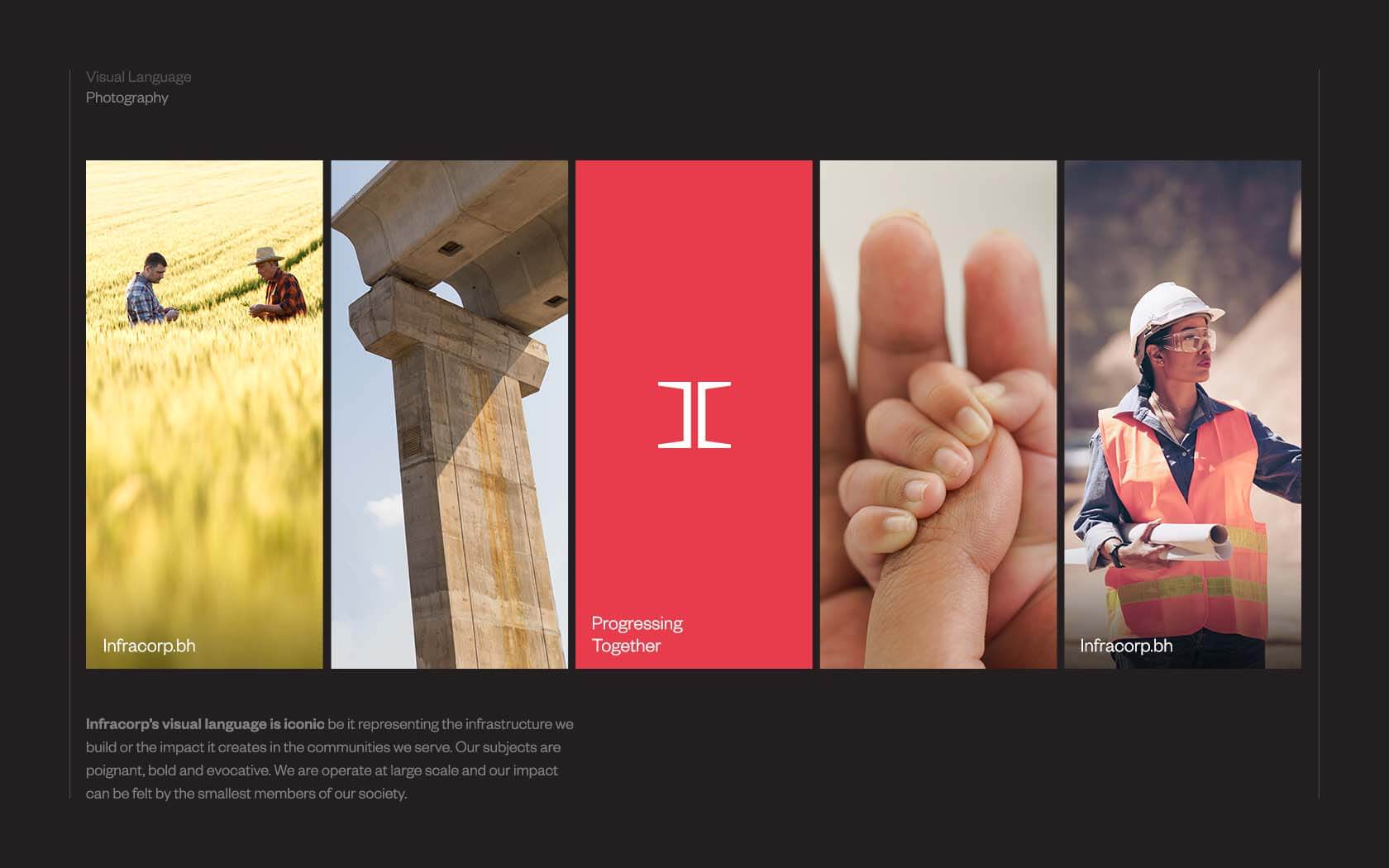
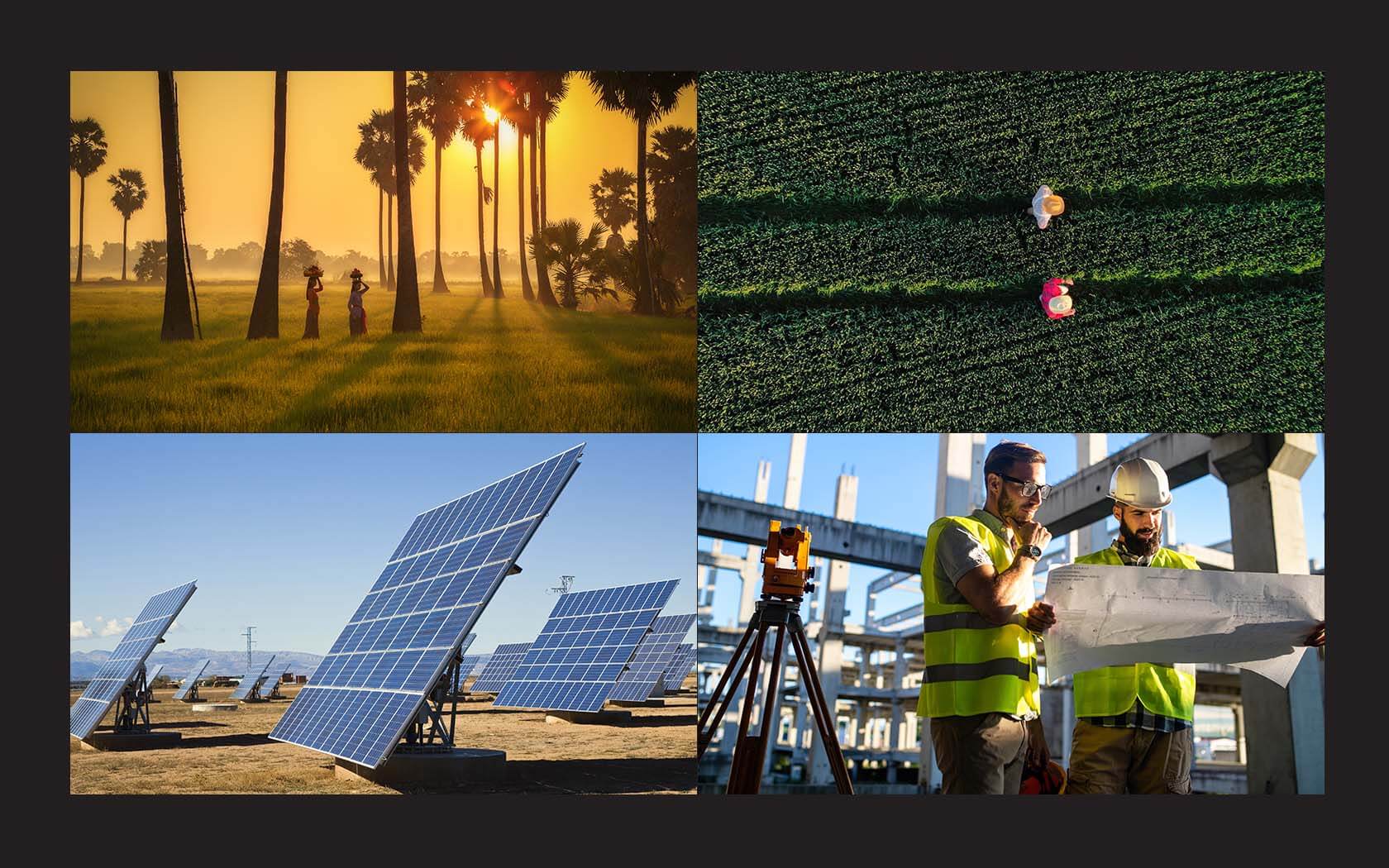
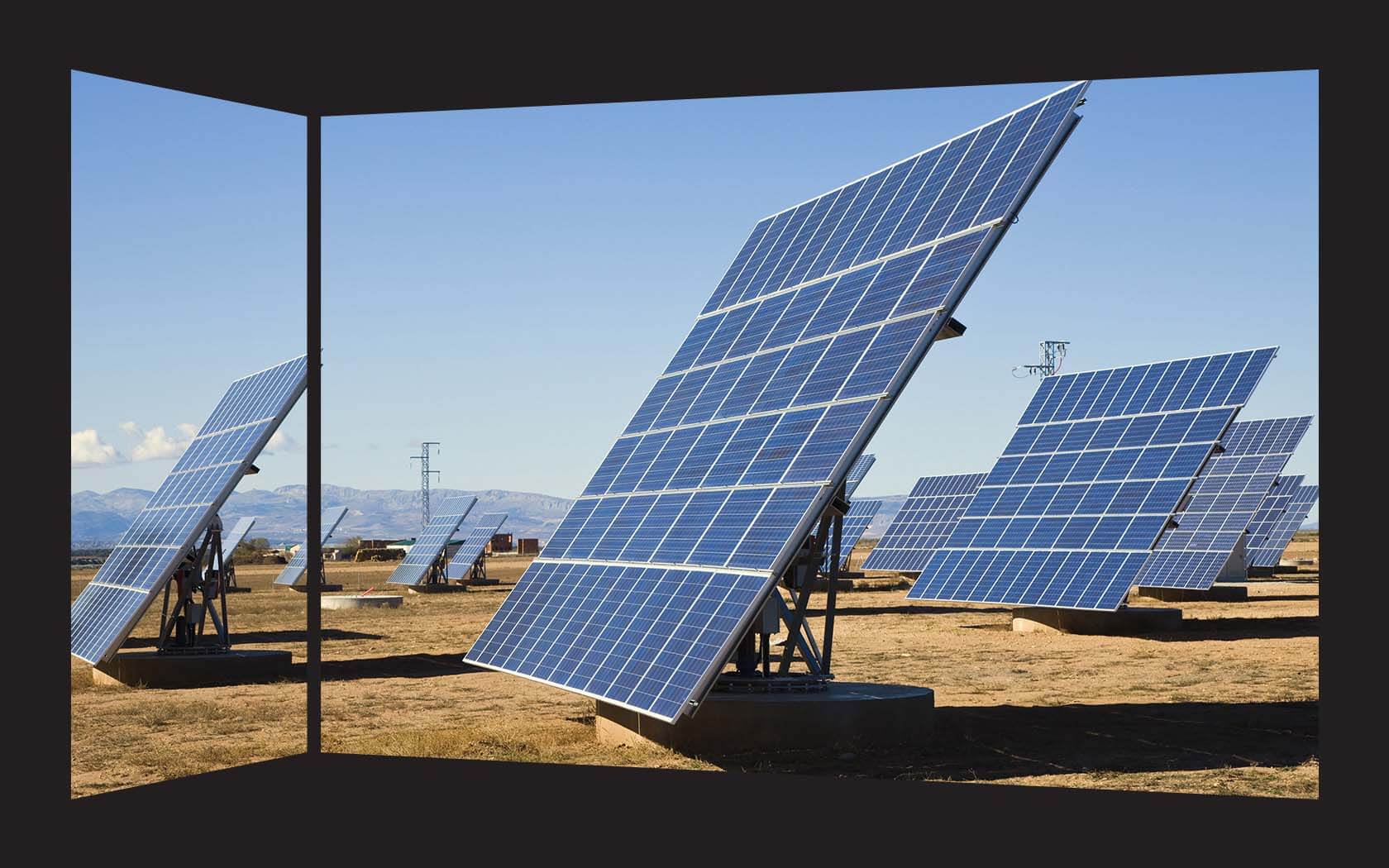
At the core of Infracorp’s value delivery is development; the firm will harness its group capabilities to deliver end-to-end value. From ideation and feasibility, to marketing and sales of finished infrastructure projects. Infrastructure projects are likely to span the physical and non-physical as well as services such as energy and utilities. It is a wide brief and the resulting identity helps to capture the expansive possibilities.
Challenges we faced creating Infracorp’s infrastructure brand
Infracorp is a new brand that is taking over and holding a number of assets previously owned by GFH, a large financial group in Bahrain. The brand now owns Falcon Cement, Balexco and GFH Properties, brands once owned by GFH Group.
Our key challenge was how to create a brand that could communicate corporate strength as well as reach down to a personal level, to the communities in which its impact is most keenly felt. The brand had to house unique offerings spanning the development and servicing strata and repackage development projects in a way that could make the investment prospects attractive to investors who had been reserved about further investment in regional real estate projects – especially large scale infrastructure-led projects.
Our role was to find the right voice which could create belief and foster participation with all levels of stakeholders – from staff to investors.
Building Infracorp’s infrastructure brand, our strategic response
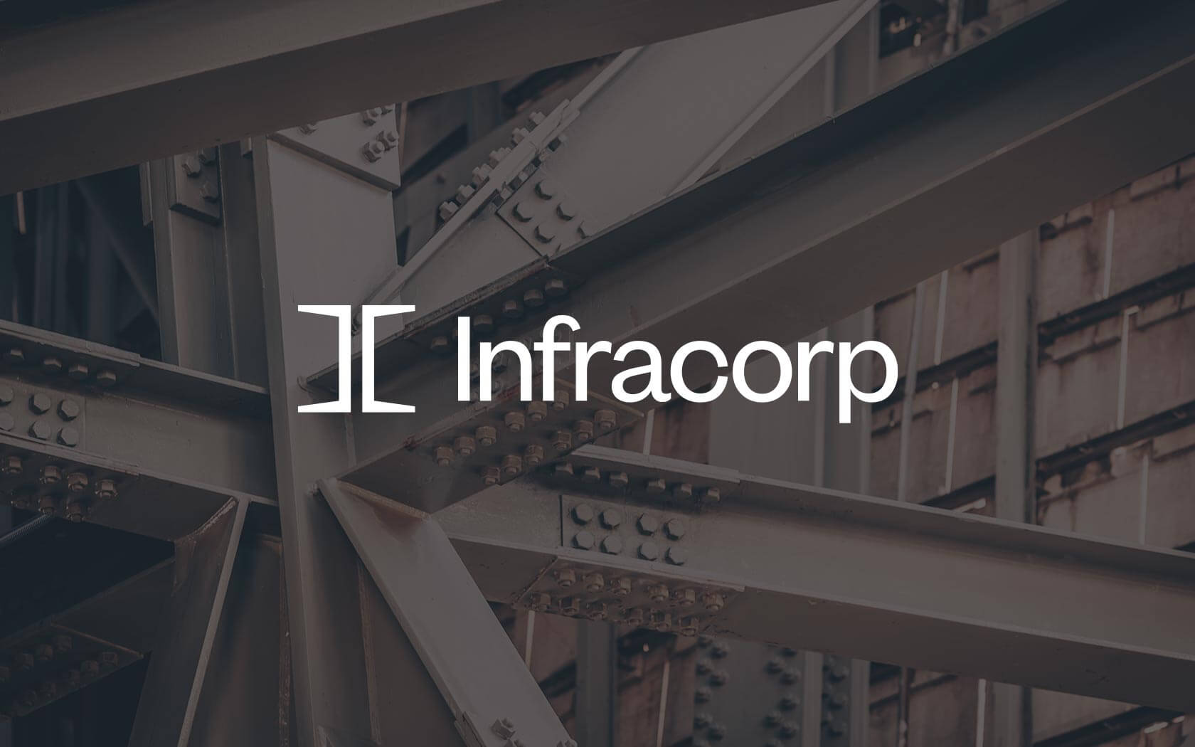
From our discussions with key stakeholders on the project team, the brand’s narrative started to emerge. The Infracorp name fits with the strategic direction of the brand and creates a perception of corporate strength from the outset. The name is an obvious portmanteau but clearly and unambiguously communicates the focus of the brand.
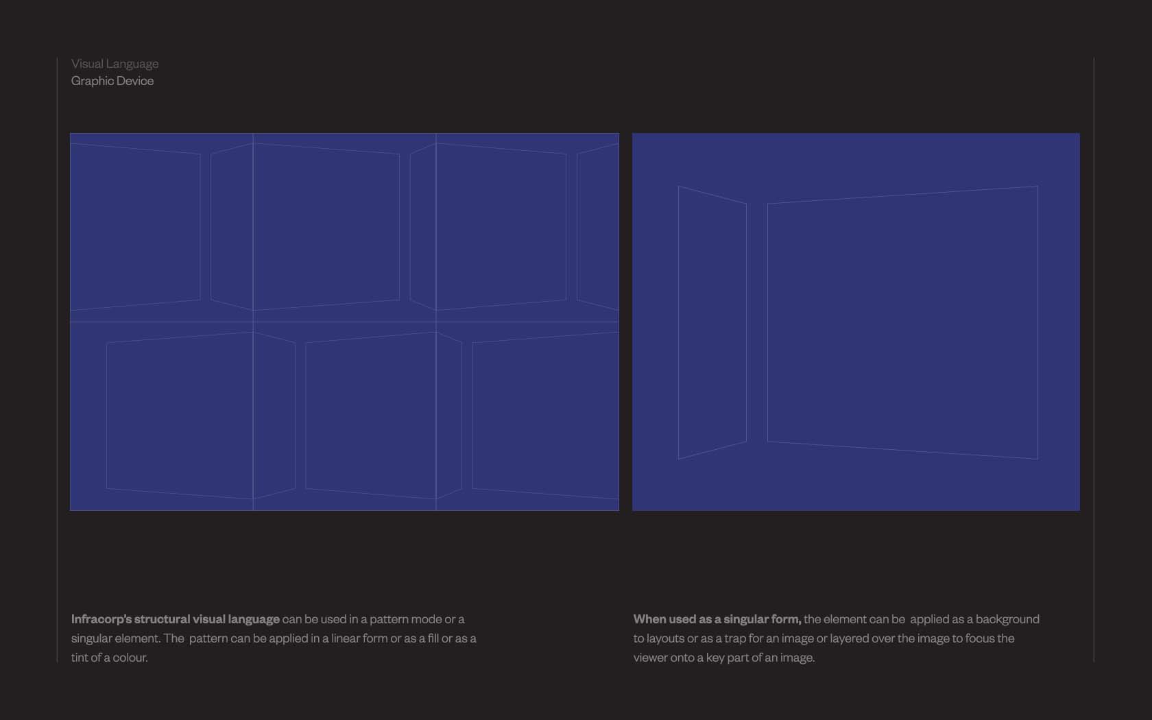
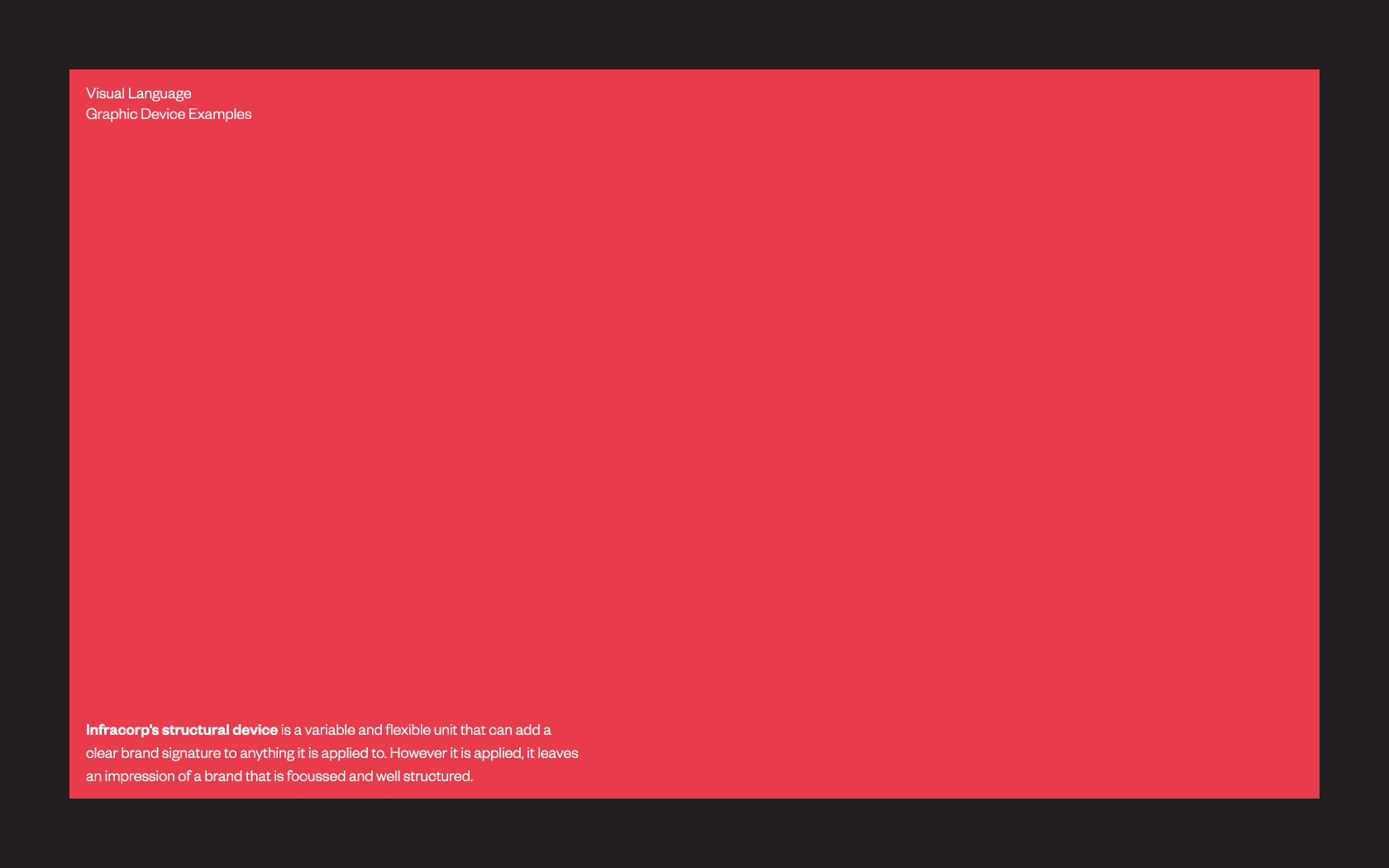
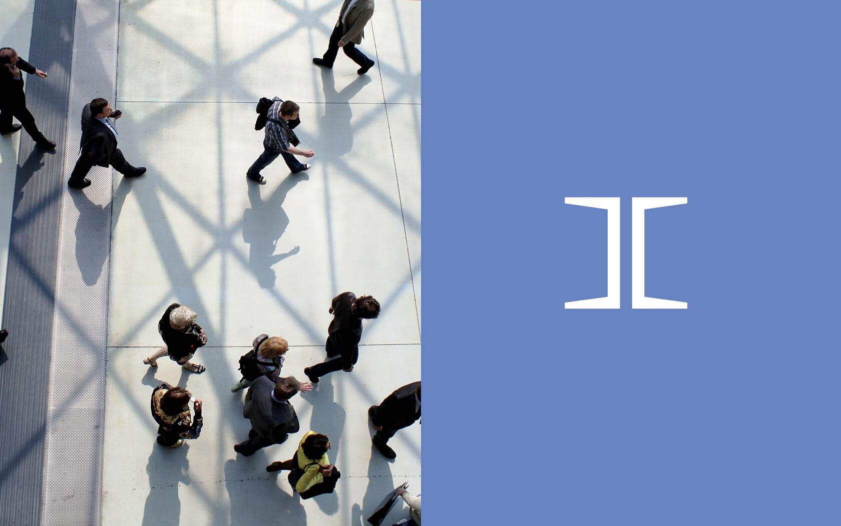
With a name in place we began working to create a graphic language that would support the notion and have enough width to be able to reach across and cover subjects in both the corporate and human dimension. From candidate approaches presented for feedback and consideration, the final form emerged pretty much unscathed. At once a I beam or girder but on closer inspection, a capital I made of two back to back Cs. Coupled with Klim’s Founders Grotesk, a delicately balanced and more humanistic variation on Neua Haas Unica (the foundation of Helvetica), the final mark is a corporate mark of strength, simplicity and understated elegance.
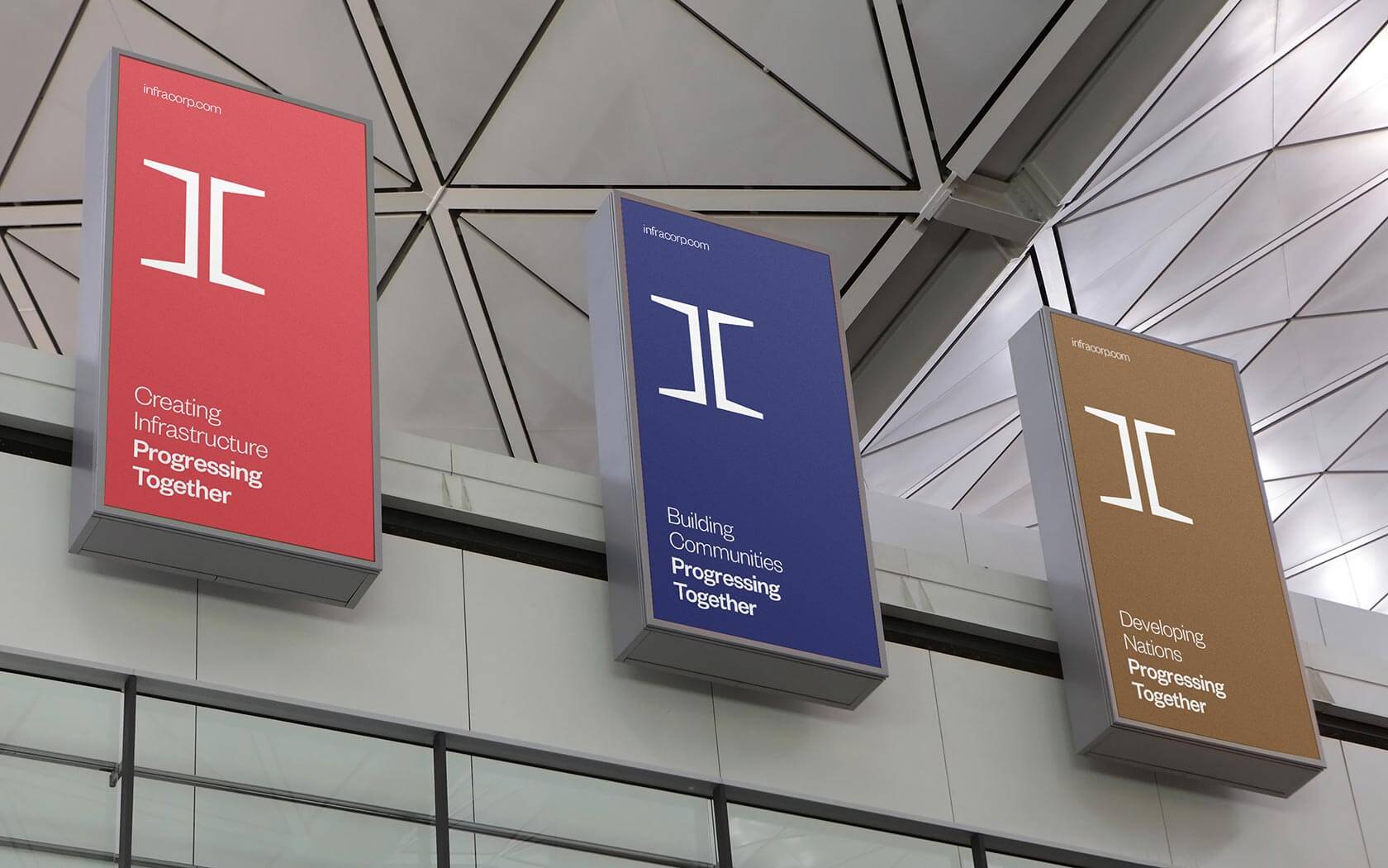
The colour palette focusses on monochrome as its key tones, supported by a simple set of hues which help to convey more human themes. The type palette is singular and based on the logo. The finished aesthetic is one that is clearly international in status and timeless in presence.
The results of our work on Infracorp’s infrastructure brand
The brand has launched internally and externally and has earned a great response so far from internal staff to external shareholders alike. The board have all been consistently positive about the results as has the chairman and CEO.
Services delivered
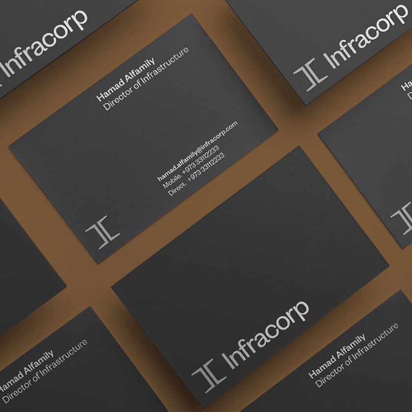
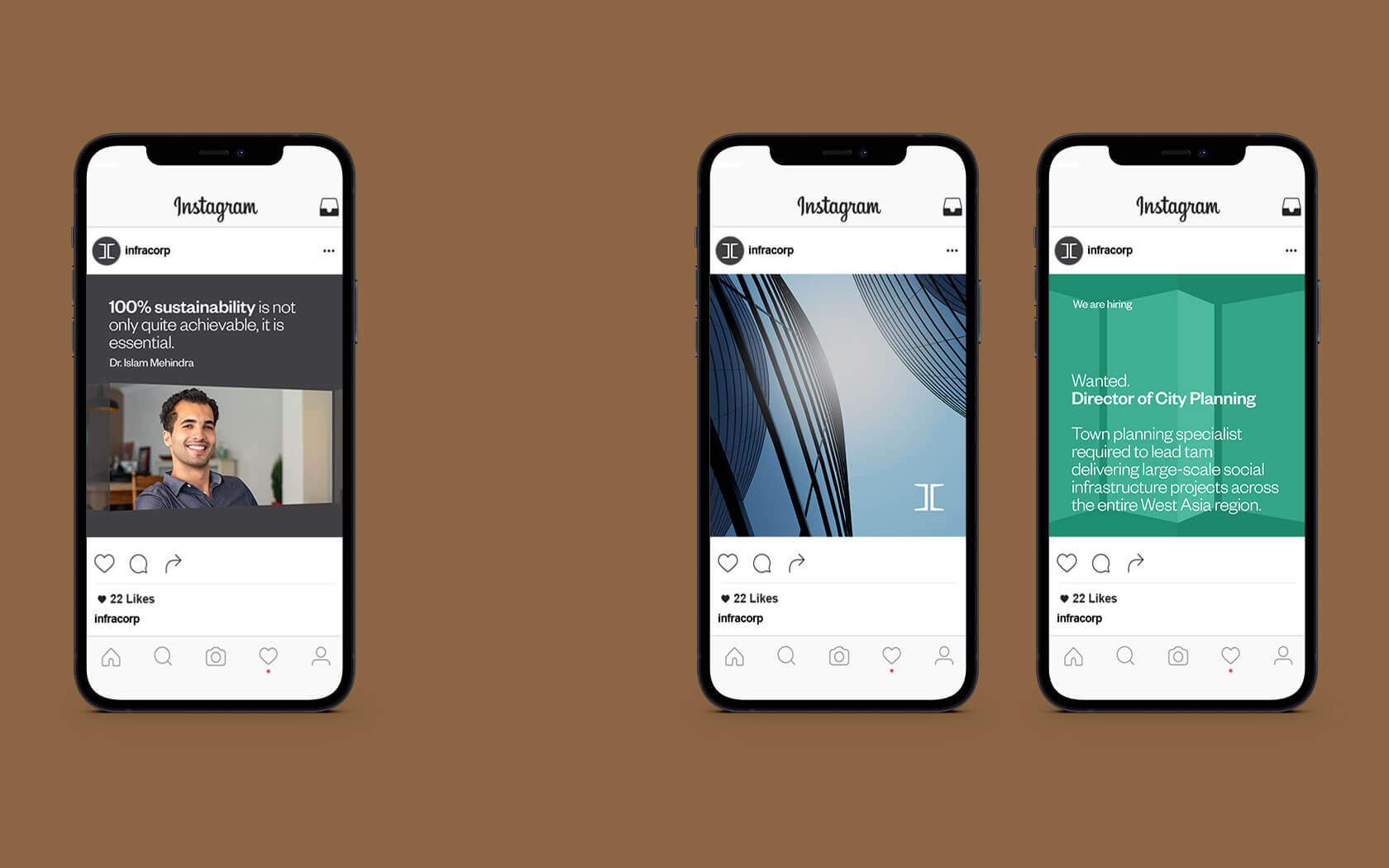
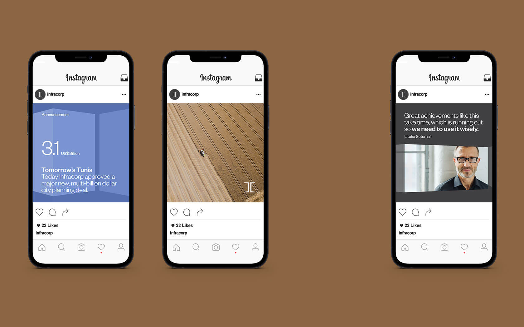
Naming, Brand Identity Design, Slogan, Signage, Advertising, Graphic Design and Application Design.
This is a very elegant brand. We are getting a lot of positive feedback from the market.
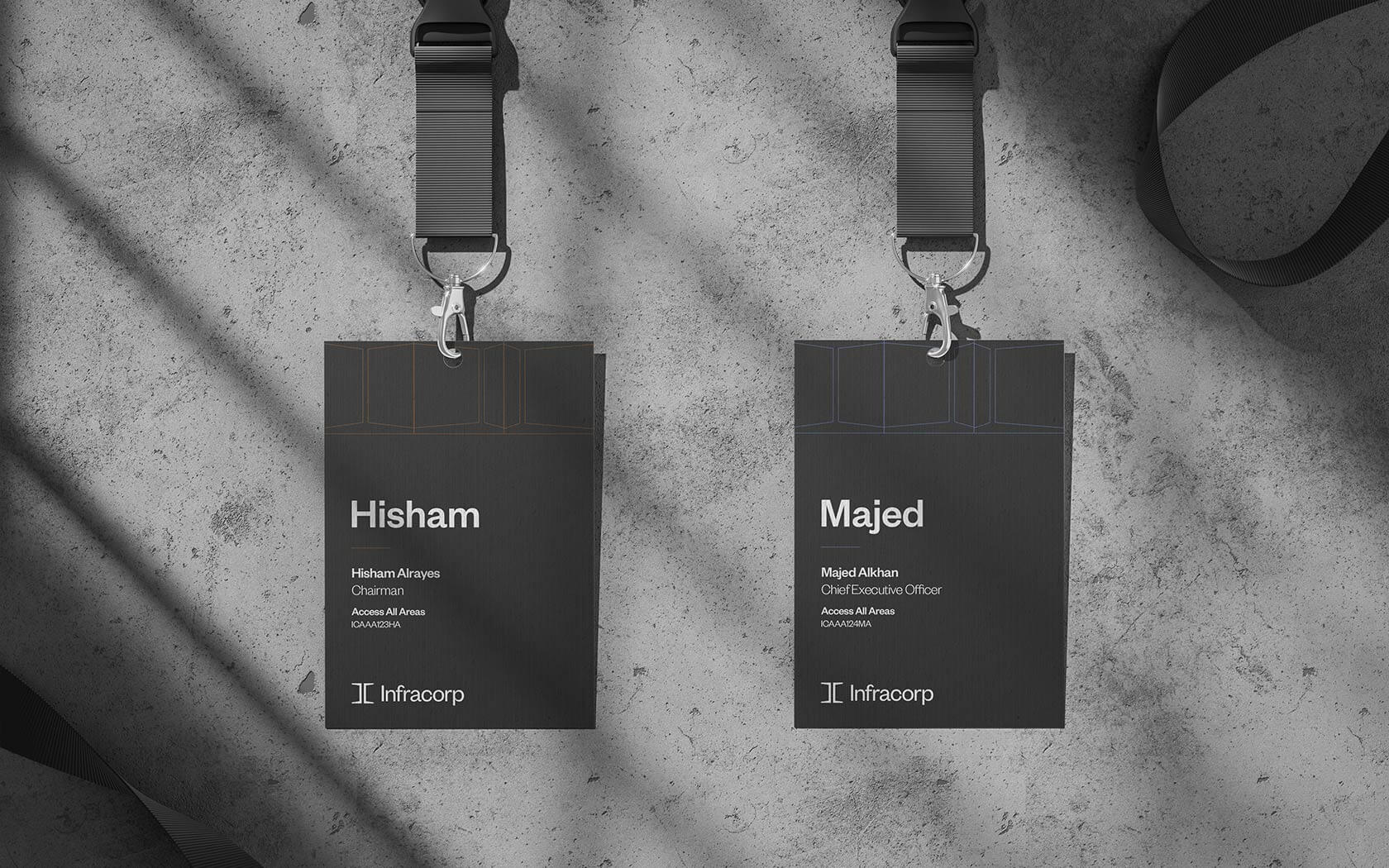
Majed Alkhan. CEO. Infracorp
Details View Close
This has been a very satisfying project to work on. A great client who demands international excellence is a fantastic partner to work with. The responses and the results (and our happy, smiling faces) of the collaboration speak for themselves.
Liam Farrell. Creative Director & Partner.
Britus Education.
Rebrand
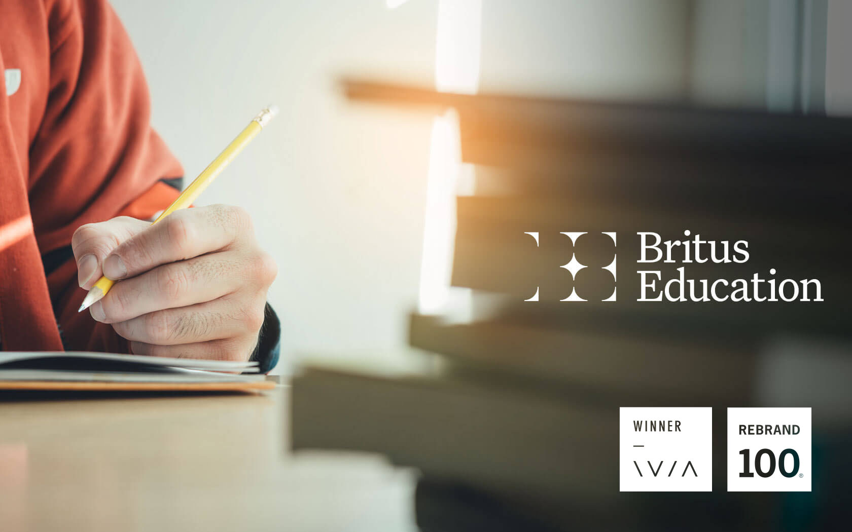
GFH, one of the leading financial institutions in the GCC, launches a new educational brand platform, Britus. This shiny identity and PPM are the initial elements of a multiphase roll out.
Yabeela.
Branding
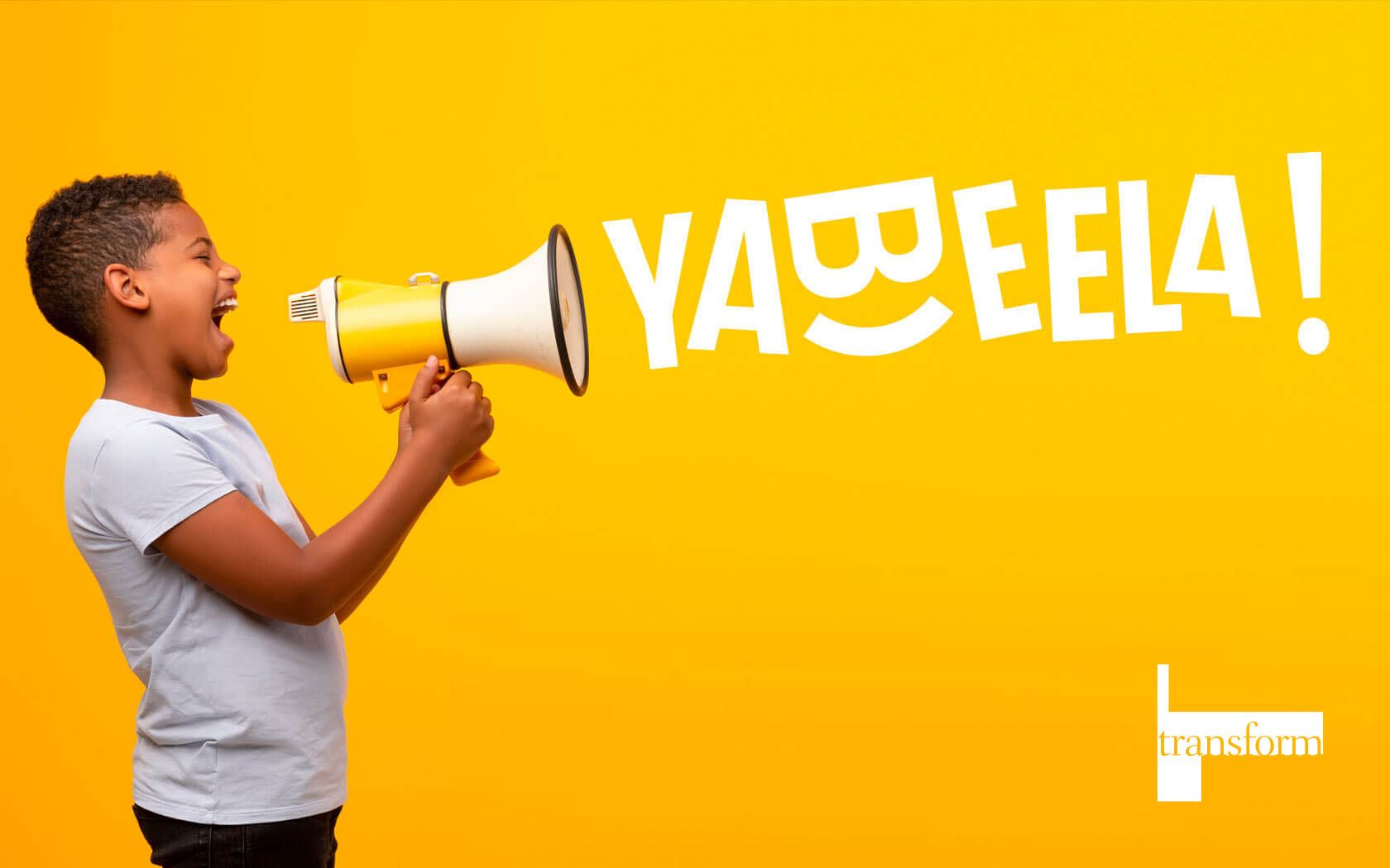
Transform Gold winning rebrand from Unisono. This is a bold, loud and very entertaining brand for Seef Entertainment. Yabeela is suited to the needs of the modern Bahraini youth... and their parents...
GFH.
Rebrand
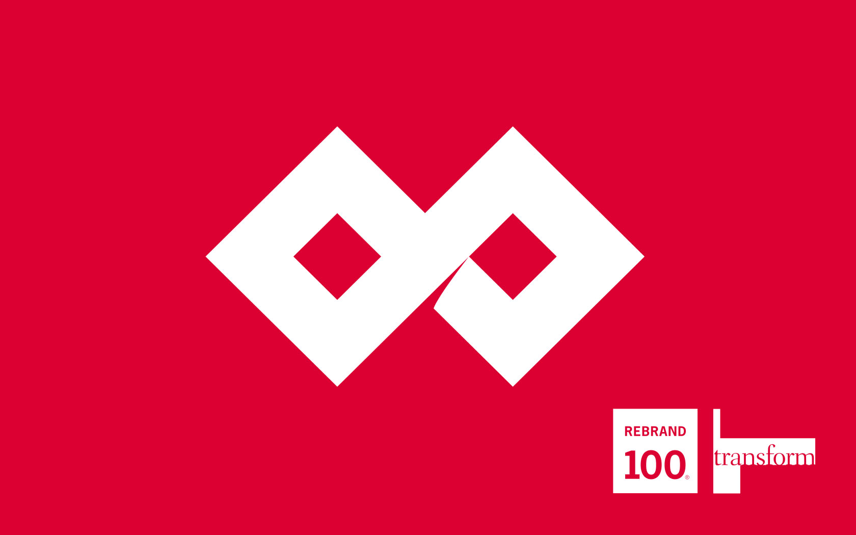
Rebranding one of the region's most notable Islamic investment banks into a new financial group.
Khaleeji
Rebrand
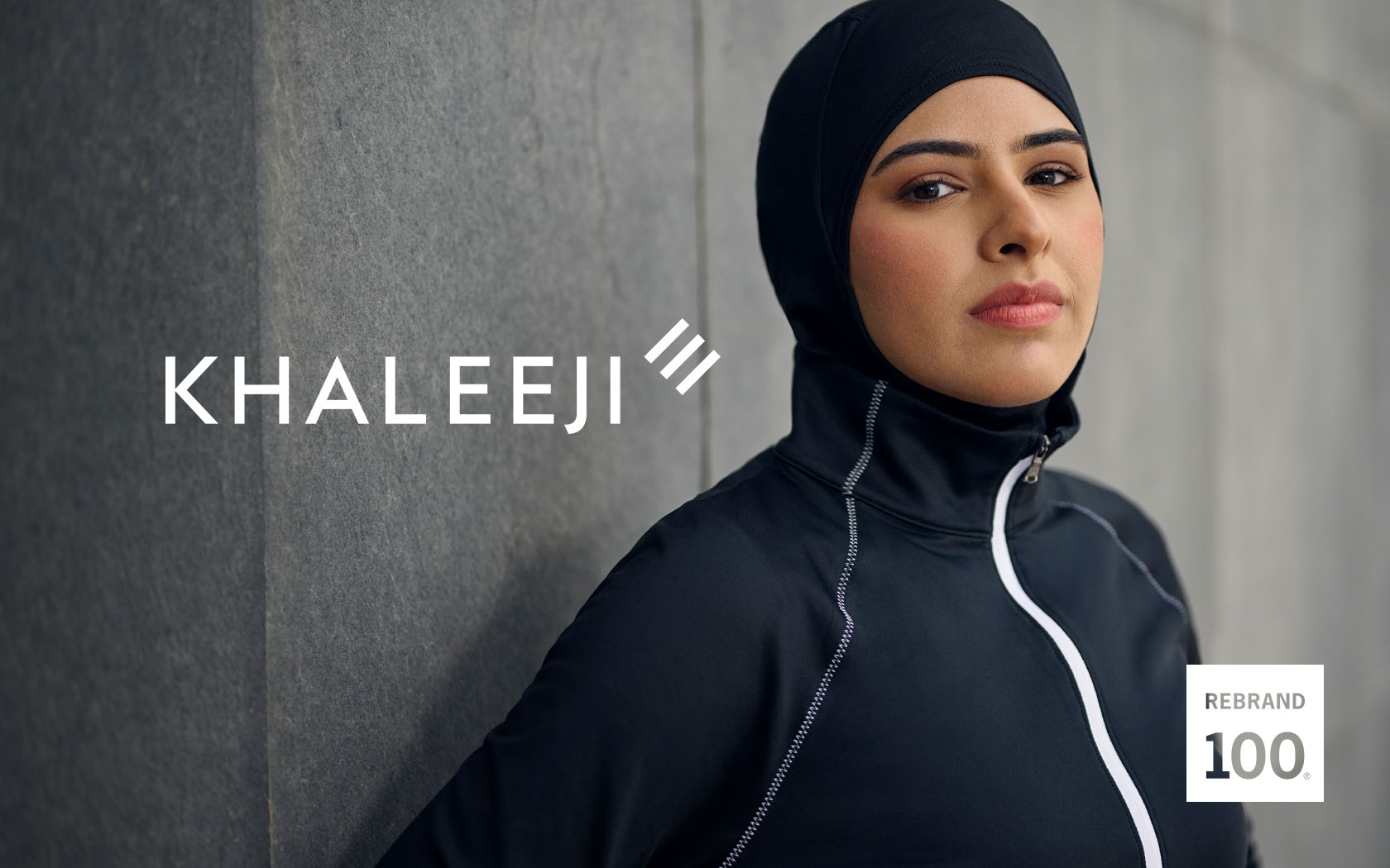
Bahrain's most ambitious Islamic bank gets a bold new, ambition-focussed brand strategy and identity.
Ras Hayan Village.
Branding
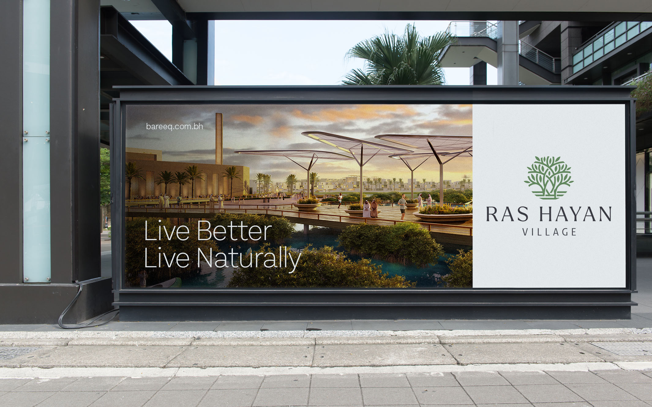
When Bareeq Development asked us to create the brand for Ras Hayan Village, their pivotal and inspiring new ecological real estate development, lets just say we were positively charmed.