How Typography for Annual Reports can make or break your brand's perception

Great Typography for Annual Reports Can Make or Break Your Brand’s Perception
Typography and layout are the unsung heroes of annual report design. Beyond the numbers and narratives, the way information is presented determines whether your report is a success or an eye-glazing missed opportunity. Typography is not just about fonts; it is about creating visual clarity, hierarchy and a seamless reading experience. Combine this with a strong layout and your annual report can become a standout communication tool that enhances your brand and resonates with stakeholders.
“Typography is the craft of endowing human language with a durable visual form.” – Robert Bringhurst, celebrated typographer and author of The Elements of Typographic Style. Bringhurst’s words remind us that good typography is not decorative—it is functional and integral to great communication.
Setting the Tone with the Appropriate Typeface
Typography for Annual Reports starts with typeface selection. The typeface you choose sets the tone for the entire report. Serif fonts like Garamond or Baskerville are timeless and lend an air of sophistication, while sans-serif fonts such as Helvetica or Univers are modern and clean. However, it is not about choosing a “trendy” font; it is about selecting a typeface that aligns with your brand and provides optimal readability across both digital and print formats.
Avoid novelty or overly complex fonts—they may look intriguing but will strain readers when used for large amounts of text. Use display fonts sparingly, such as in headlines or section titles, to create impact and contrast with the main text.
Type Ratios and Hierarchy
Typography is all about balance and type ratios are the secret ingredient. A good hierarchy allows readers to navigate the content effortlessly. Headings should stand out but remain proportional to body text. For instance, a 1:1.6 (golden ratio) between body text and headings works well for most reports. Use subheadings to break content into digestible sections, maintaining consistency in style and size throughout.
Display vs Text Fonts
Display fonts are designed for large sizes—think headlines, covers and major section dividers. These fonts are often more decorative and expressive but lack the readability needed for body text. Text fonts, on the other hand, are optimised for smaller sizes and long-form reading. Mixing the two wisely ensures both functional and aesthetic appeal. Keep display fonts bold and memorable, while ensuring text fonts are neutral and easy on the eyes.
Paragraphs and Colour
Proper paragraph styling can elevate readability. Typography for Annual Reports isn’t only a utilitarian consideration, it is the essence of the reports ability to convey vital information. Line spacing (leading) should sit between 120–145% of the font size. Too tight and it feels cluttered; too loose and the flow is disrupted. Align text to the left for most content—justified text can create awkward spacing and rivers of white that disrupt reading.
When it comes to colour, high contrast is essential and black text on a white background is the gold standard for high contrast body text. Avoid using low contrast list light grey for body copy — it sacrifices legibility for style. Accent colours can be used for highlights or callouts but keep it minimal and in line with your brand palette.
Tabular Lining Improves Financial Data Legibility
Annual reports rarely omit financial tables and these demand special attention. Typography for Annual Reports need to use tabular lining fonts to ensure numbers align perfectly, both horizontally and vertically. This alignment greatly enhances readability and the overall professionalism of there report. Professionally designed typefaces will contain tabular lining in the main set or via Open Type variables from the Options Panel. Paid with subtle gridlines can enhance the clarity of dense financial date in your financial section.
Page Sizes & Ratios
The physical size of the annual report affects its usability and perception. Standard A4 (210x297mm) works well for most organisations, providing ample space without being unwieldy. Larger sizes or different ratios might seem attractive at first and even create a premium feel but these unusual formats eventuate in a report that feels unusual in the hands of your analyst audience and will not sit well on their nicely order shelving, filled with other orderly A4 sized reports.
Baseline Grids
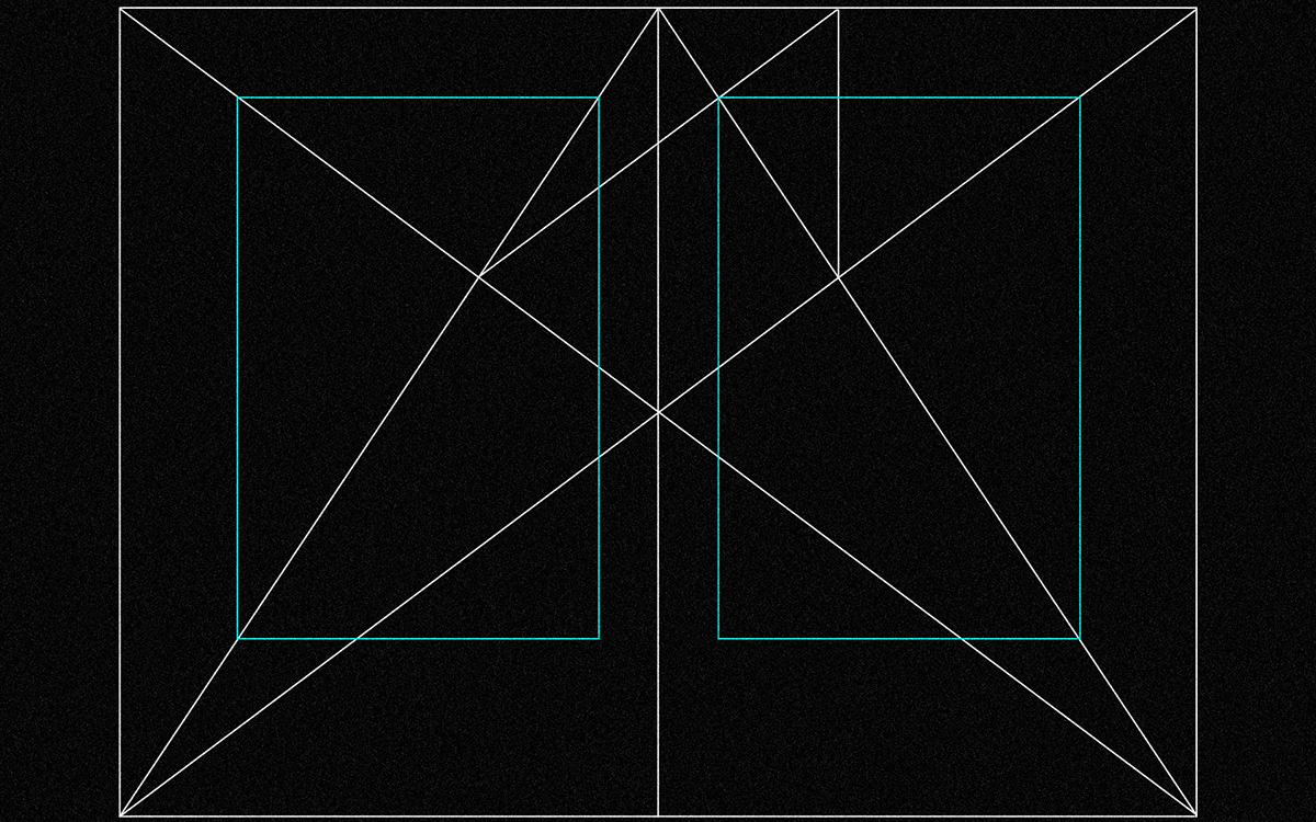
The baseline grid is another critical aspect. Aligning text to a consistent baseline ratio ensures text lines and images maintain harmony across pages. Common ratios include 12pt font with an 18pt baseline grid or 10pt font with a 15pt baseline grid. Similarly, margins should create a comfortable whitespace without making the content feel cramped or sparse. We always base our document grids on the body copy size (typically 9pt) and set the type on a 4mm (roughly 11pt) baseline. This provides a clean and simple margin and column grid that aligns perfectly with the baseline grid, for ease of application.
Typography for Annual Reports – Your 10 Point Design Checklist
Designing an annual report is a complex task and no detail can be overlooked. Use this checklist to ensure your typography and layout are on point:
- Typeface Choice: Have you chosen a readable text font and a striking display font that align with the brand?
- Type Ratios: Is there a clear hierarchy between headings, subheadings and body text?
- Leading and Line Spacing: Does the text feel open and readable without unnecessary gaps?
- Colour Contrast: Are body text and background colours optimised for legibility?
- Paragraph Alignment: Is body text left-aligned with consistent paragraph breaks and no awkward justifications?
- Tabular Fonts: Are financial tables using tabular lining fonts for perfect numerical alignment?
- Grid Consistency: Does the baseline grid align text and elements across all pages?
- Margins and Whitespace: Are page margins balanced and is there enough whitespace for easy reading?
- Page Size: Is the page size appropriate for your audience and distribution method?
- Proofreading: Have all text and layout elements been checked for errors, typos and inconsistencies?
Typography and Layout as Storytellers
Ultimately, typography and layout are more than technical tools; they are storytellers that shape how your annual report is perceived. Great design speaks volumes about your organisation’s professionalism, attention to detail and respect for its audience. By mastering the art of typography and layout, you ensure that your report informs as much as it inspires, engages and builds trust with your vital shareholder audience.
Invest the time to perfect these elements, because when it comes to annual reports, great design is not optional, it is essential.
___
Want to elevate your firm’s perception with its shareholder? We can do that together, by improving the professionalism of your annual report’s typography and layout design. Email us today.

The role typography for annual reports plays is as essential as the overall concept it supports and the content it conveys. Great type has to work with its context; the page, the margin ratio and typographic grid have to partner together to create a perfectly balanced report.
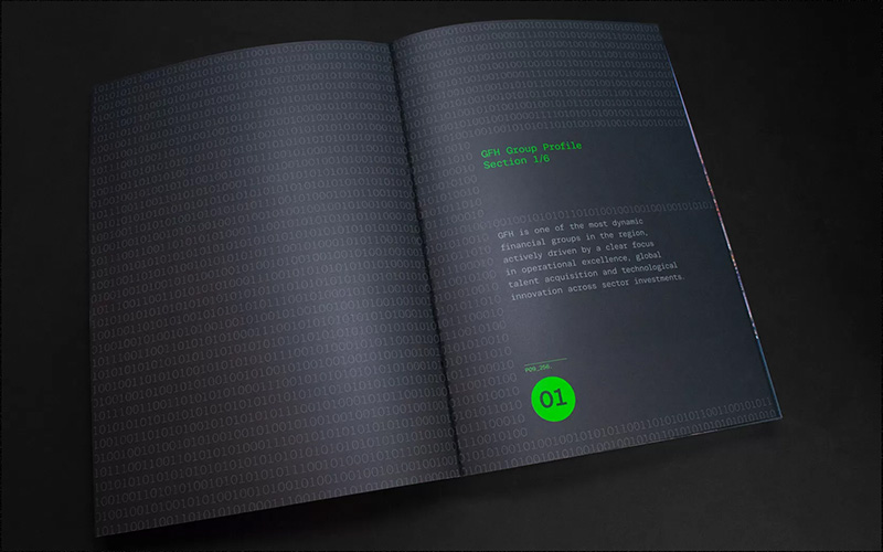
See our work on GFH’s annual report here.
Typography is the craft of endowing human language with a durable visual form.

