Big 5. Rebrand
An Event Brand that’ll XL
Big 5 rebrand is a project the team have been keen to win for over a decade and finally getting the chance to help forge the new identity for MEASA’s regional power house has been a dream come true. Owners DMG Events approach the agency to see how we might create lasting impact for them and the team did not disappoint.
The event brand was suffering from a bout of overt-complexity and, after a few rounds of discovery, the team came on board with our less-is-more thinking. The bold new look sets them apart from the other brands in their space and closer to the brands they help promote. (See our animation work on our Behance page here)
Big 5 rebrand, the ultimate development platform
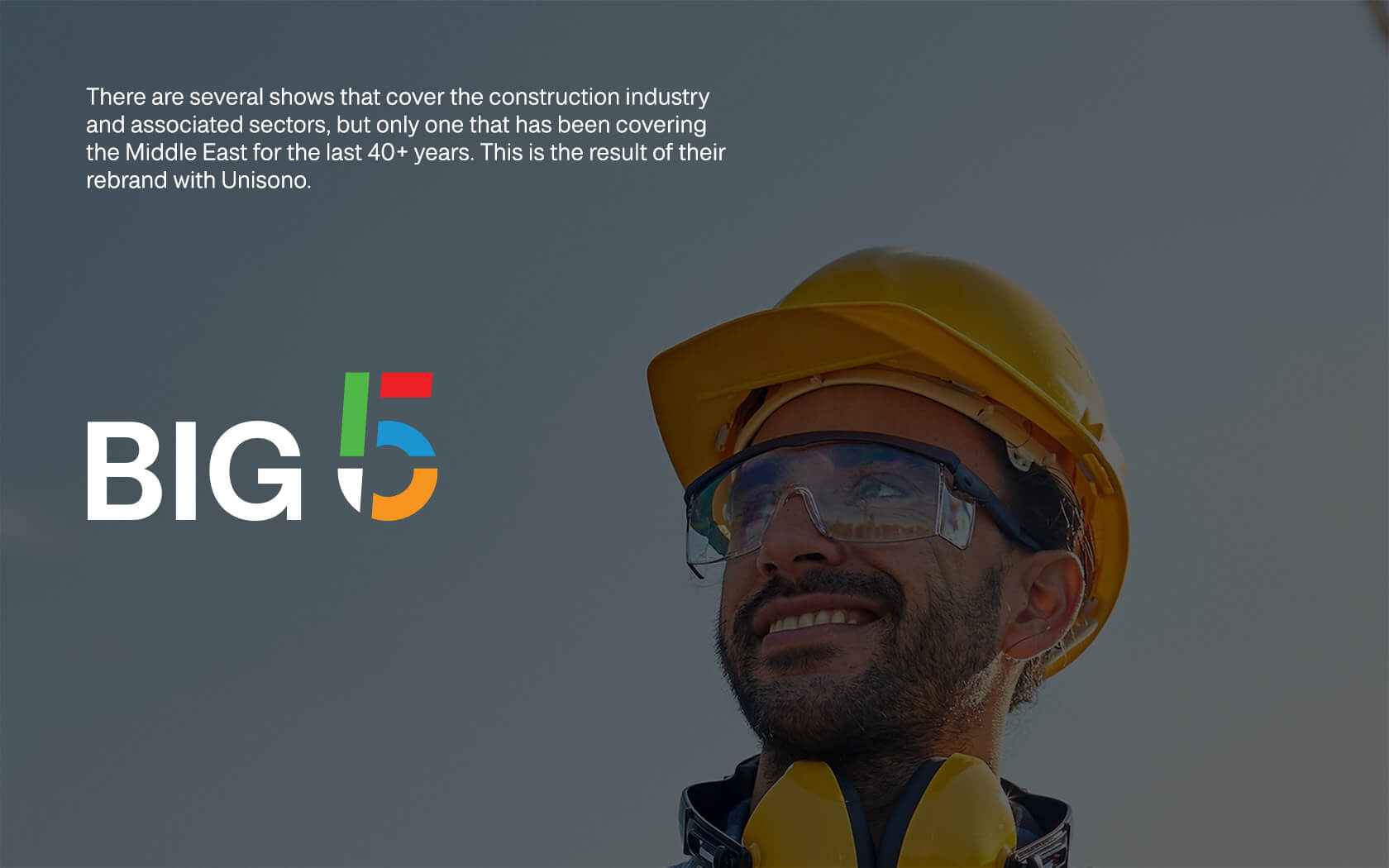
There are several shows that cover the construction industry and associated sectors, but only one that has been supporting the development of the Middle East for the last 40+ years. This is the result of their rebrand with Unisono.
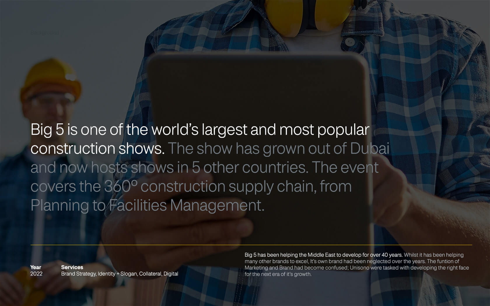
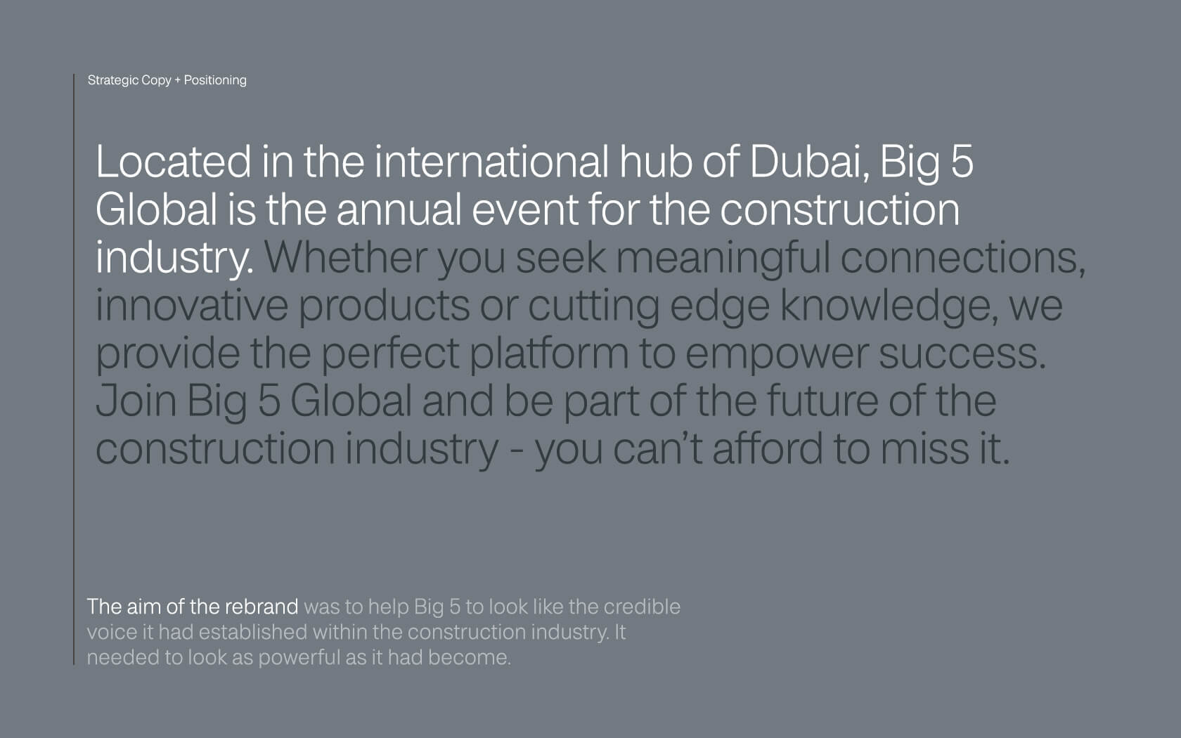
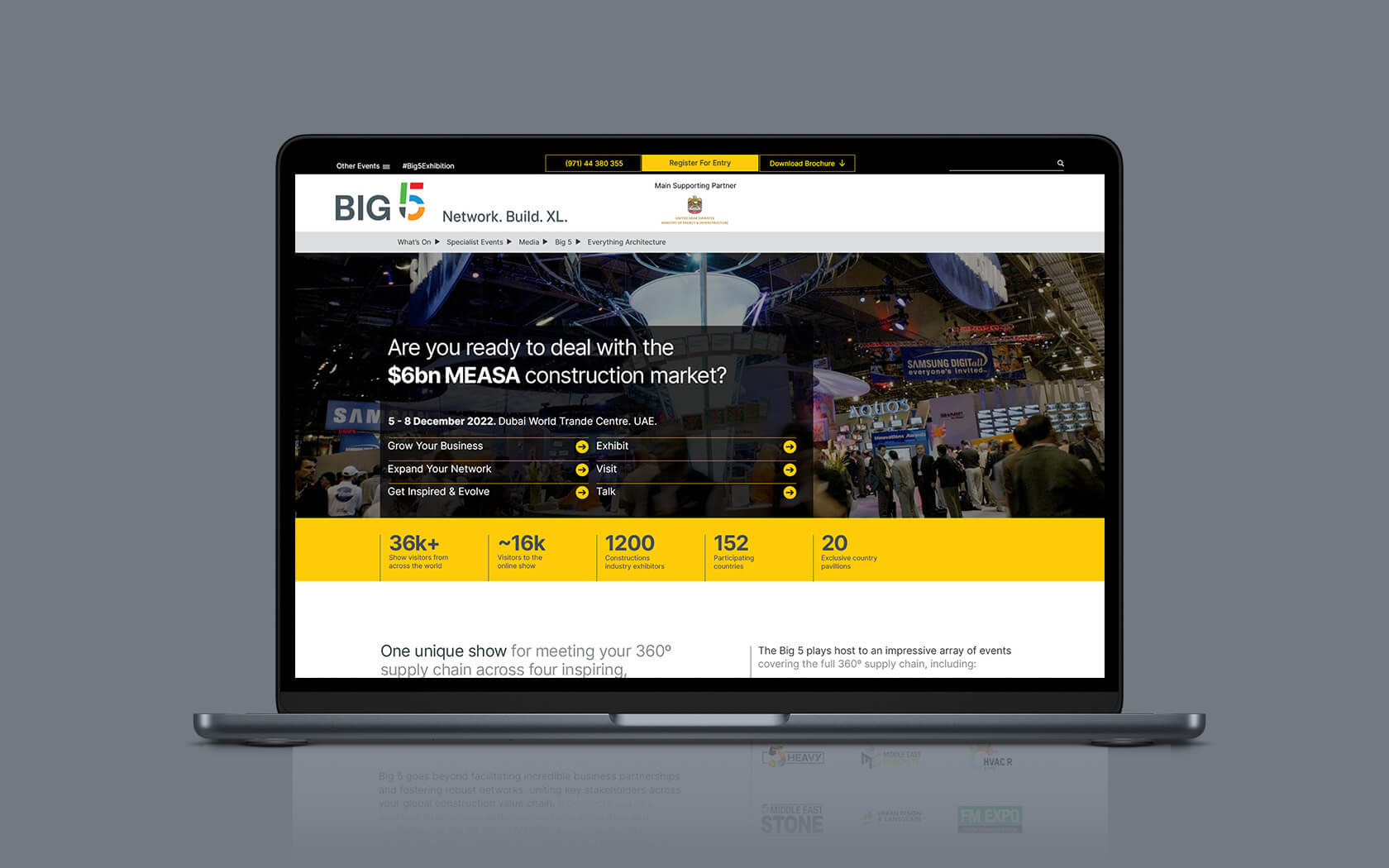
Big 5 is one of the world’s largest and most popular construction shows. The show has grown out of Dubai and now hosts shows in 5 other countries. The event covers the 360º construction supply chain, from Planning to Facilities Management.
The event is a cornerstone of the construction industry and is very well known throughout out the globe for its Middle Eastern focus and credentials. What we knew from the get go was that after 42 years of delivering a platform for business in the region, that the brand and construction were more or less interchangeable. What need then for adding words like ‘construction’ and ‘event’ into its brand mark?
A strategic response to the Big 5 rebrand
Big 5 has been helping the Middle East to develop for over 40 years. Whilst it has been helping many other brands to excel, It’s own brand had been neglected over the years. The function of Marketing and Brand had become confused; Unisono were tasked with developing the right strategy and identity for its next era of its growth.
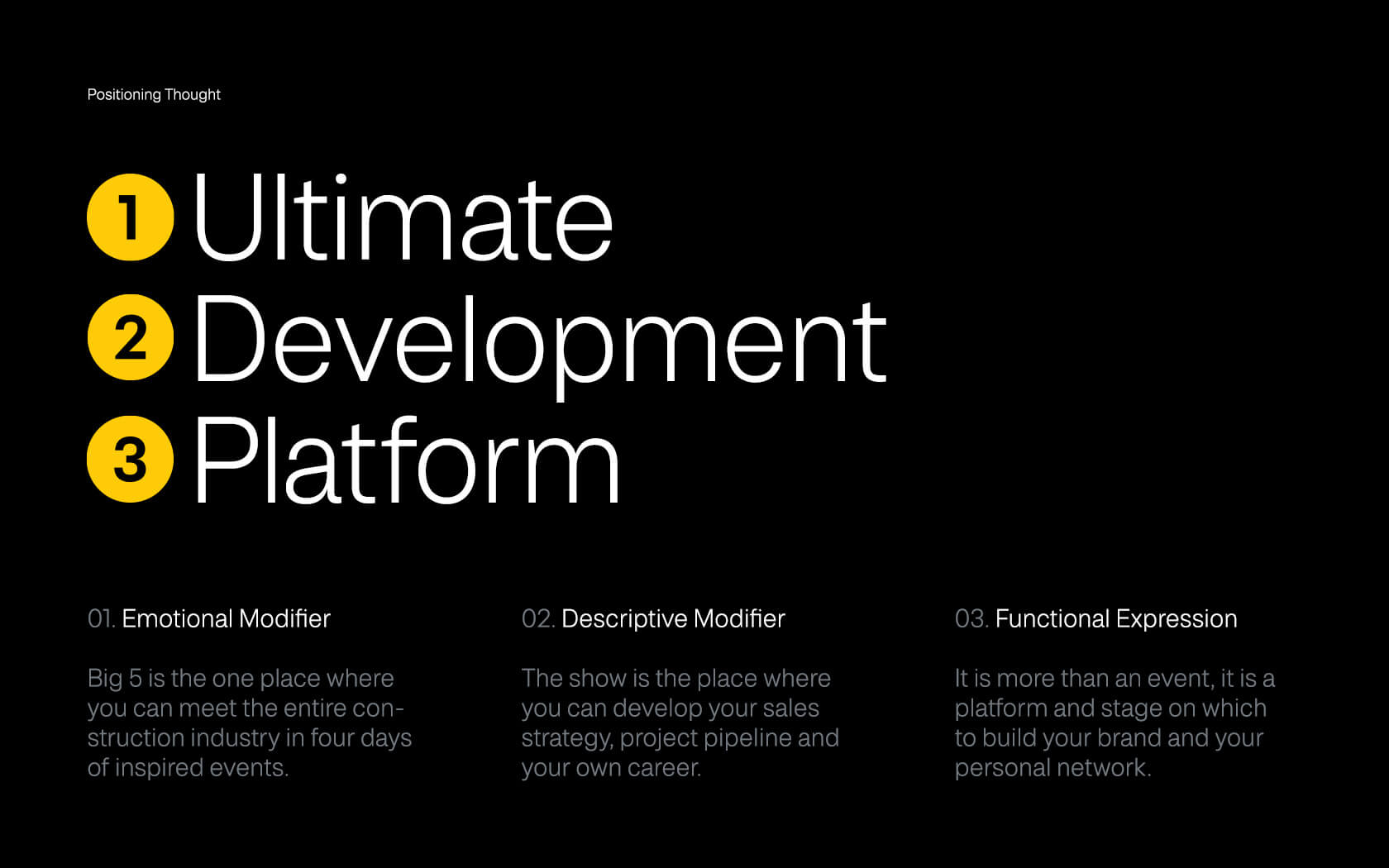
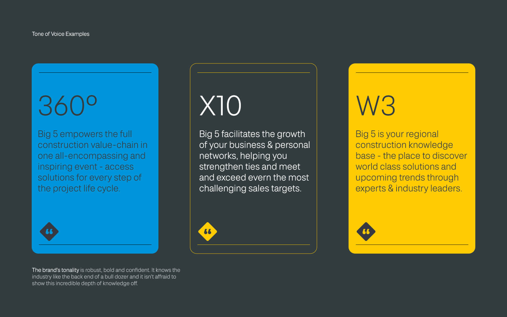
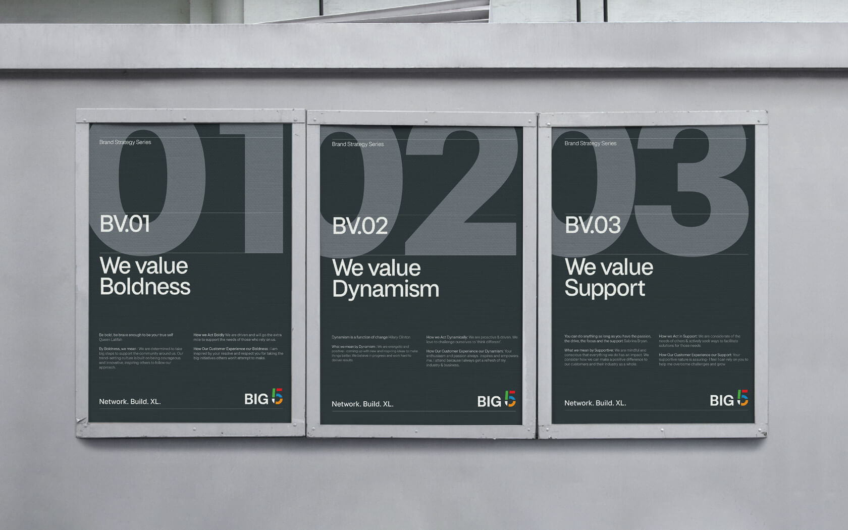
The brand strategy begins with the reasons why they exist, ultimately they exist ‘to contribute to the success of their audience’. The Big 5 are essential a media platform that brings an industry together, showcasing the best practices of an industry. The new Big 5 vision is ‘to facilitate and accelerate the industry’s evolution’. Big 5 promise to ‘provide the platform that empowers the development of the construction industry by being ‘Bold’, ‘Dynamic’ and ‘Supportive’. The essential nature of the brand is one of a ‘Networker’ who helps facilitate growth by providing the ‘Ultimate Development Platform’
The right identity for the Big 5 rebrand
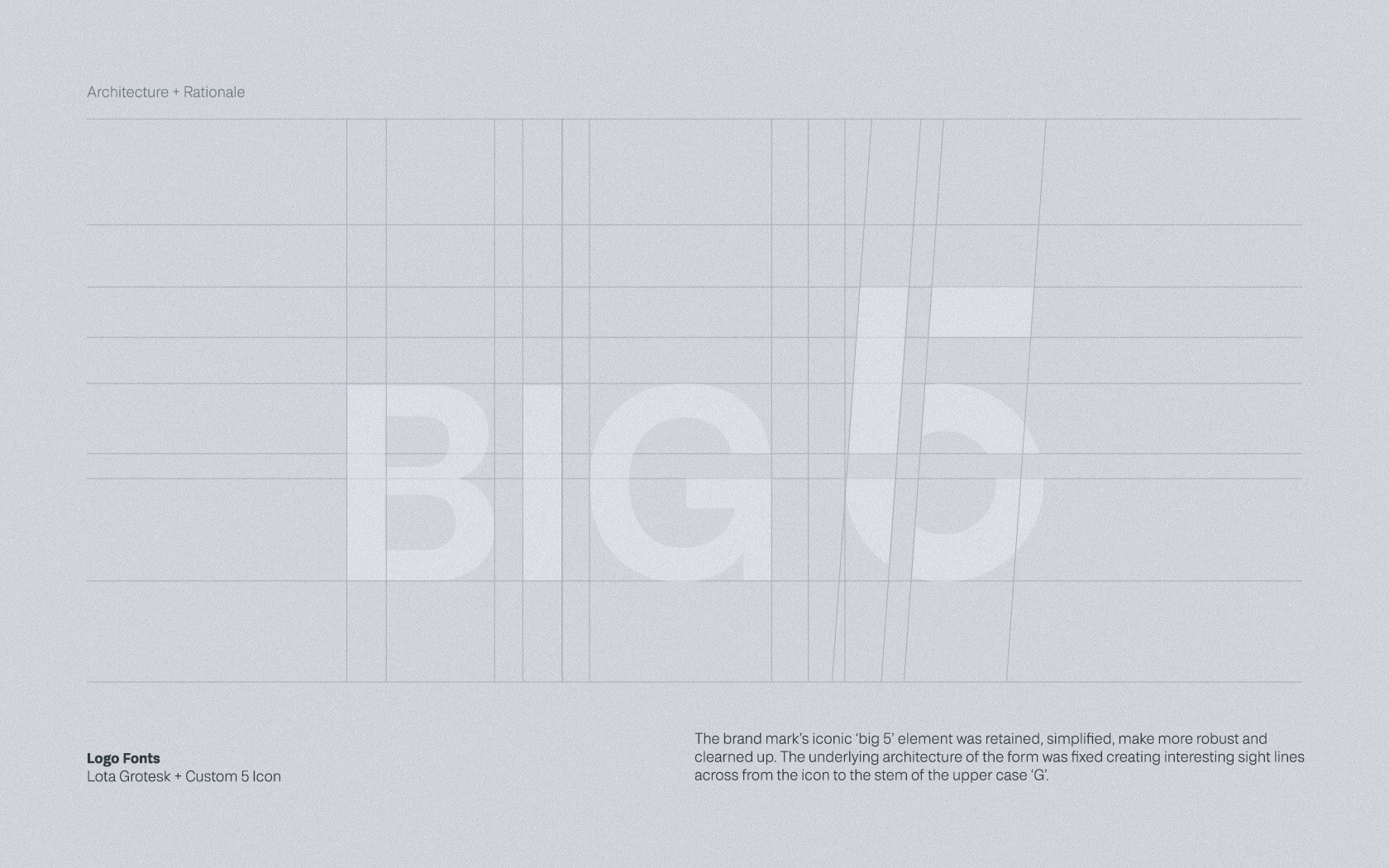
The existing brand mark was a confusion of dimensions, colours and shading. Aesthetic tastes and personal design preferences aside, technically, it was hard logo to replicate consistently. We had our feelings about the multiple colours too but these are a sacred cow that had to stay and ultimately, the final form works well with them in place.
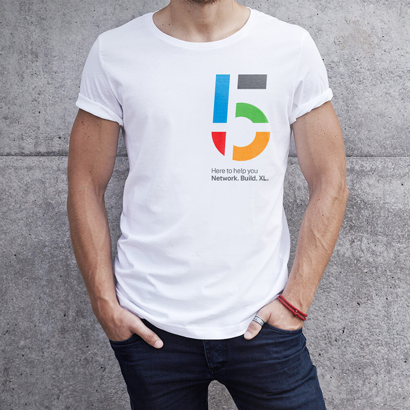
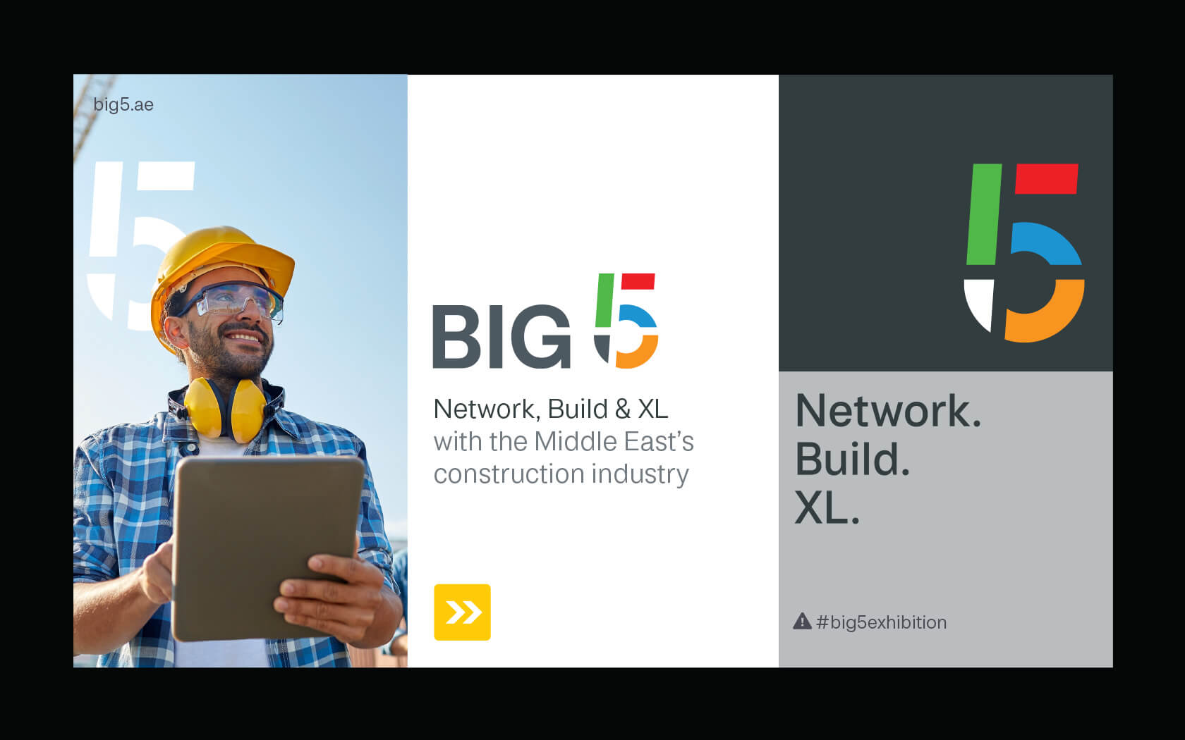
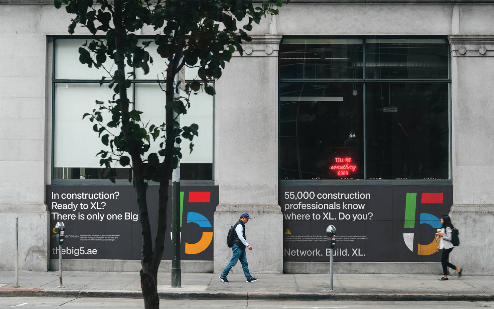
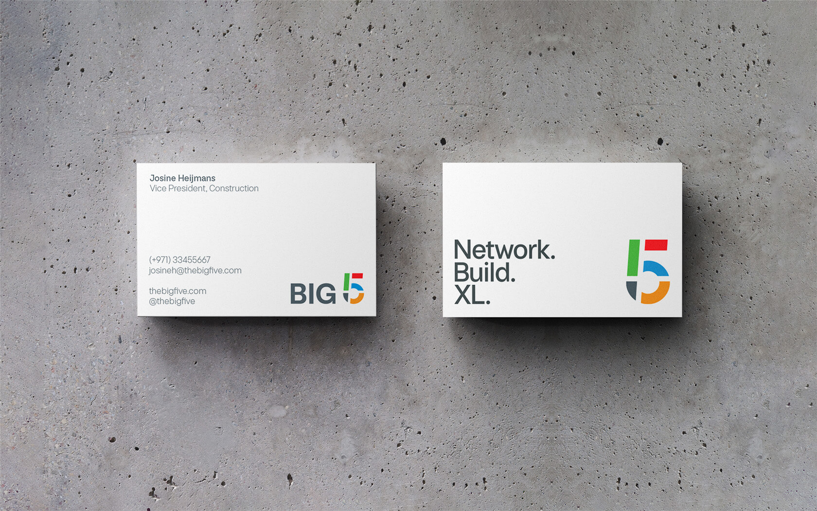
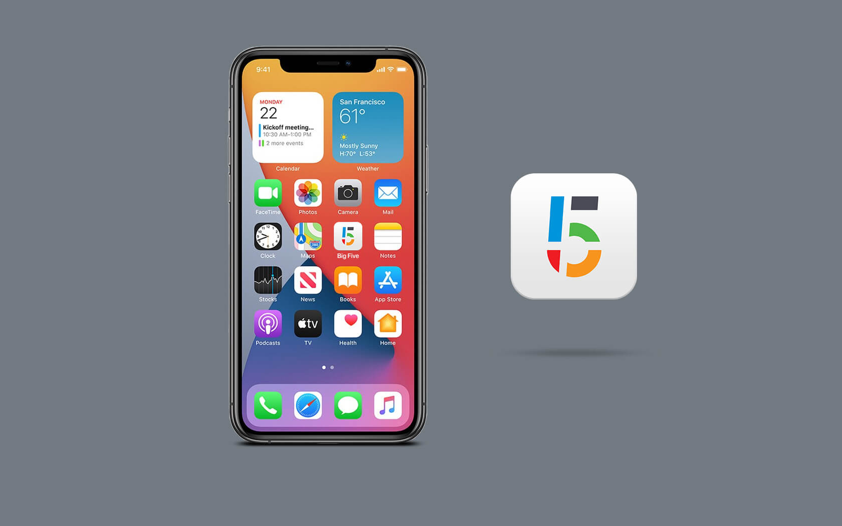
The design exercise was a process of elimination and expansion. We reviewed the logo and agreed with the client that a key visual property was the multicoloured 5 icon. It was lost in a sea of complexity so we worked to remove this and allow a more robust visual form to emerge. We removed the word ‘The’ leaving ‘Big 5’ as the brand name.
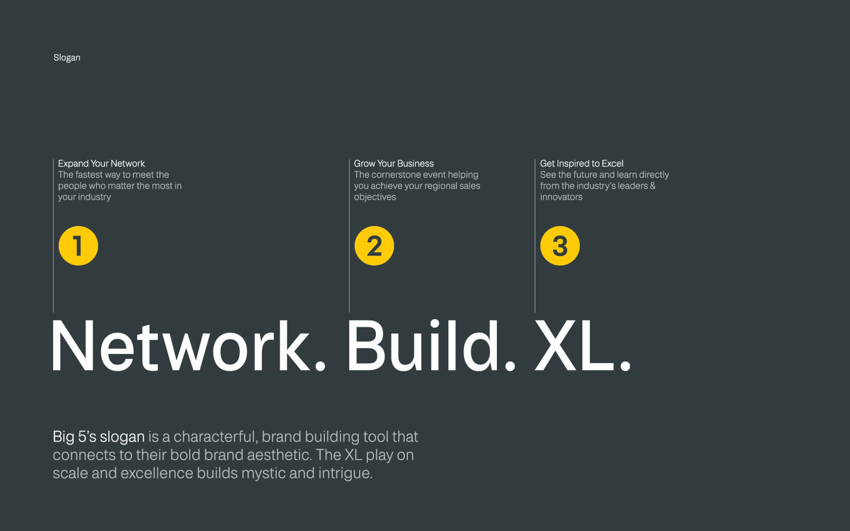
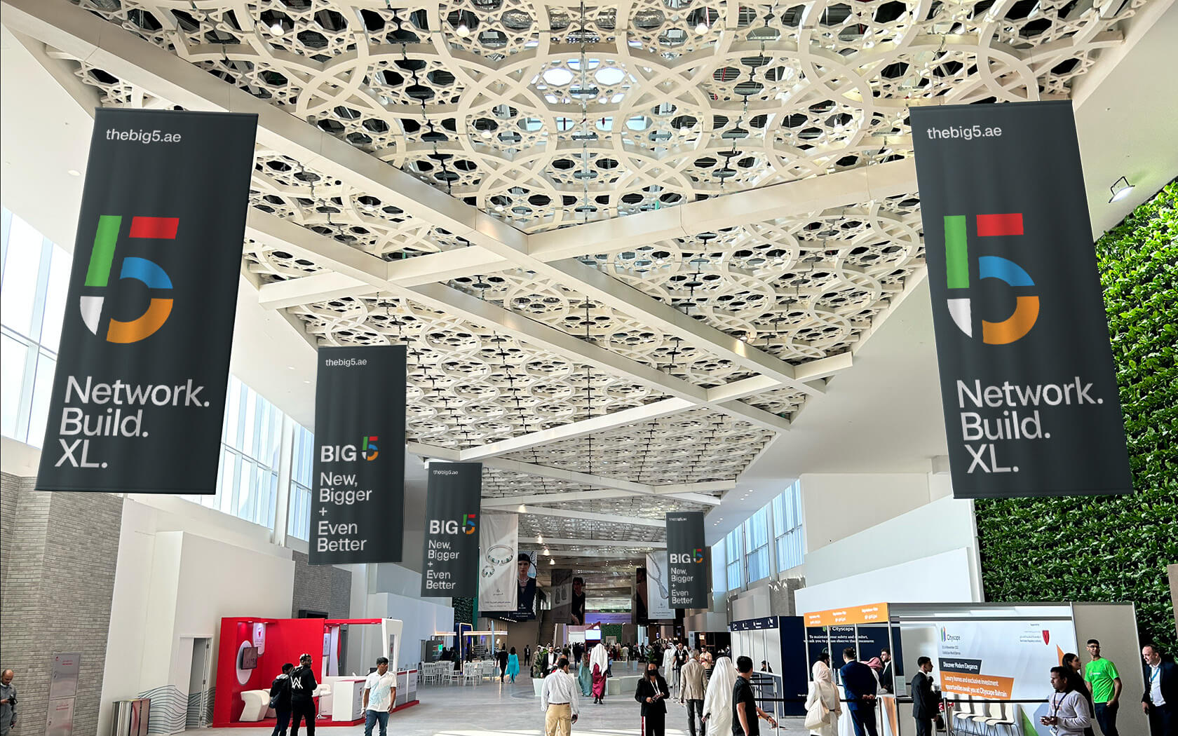
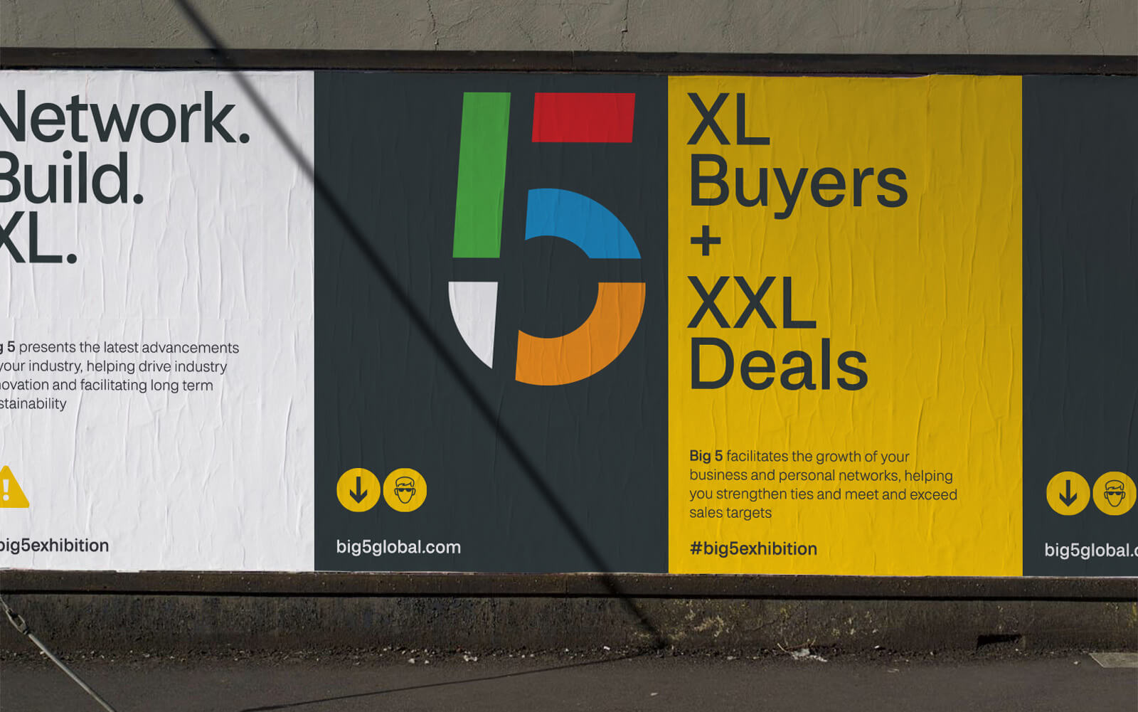
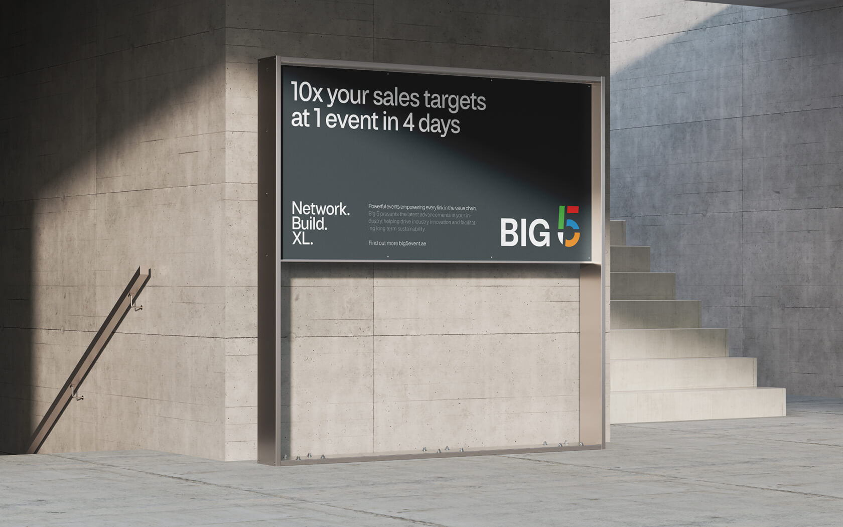
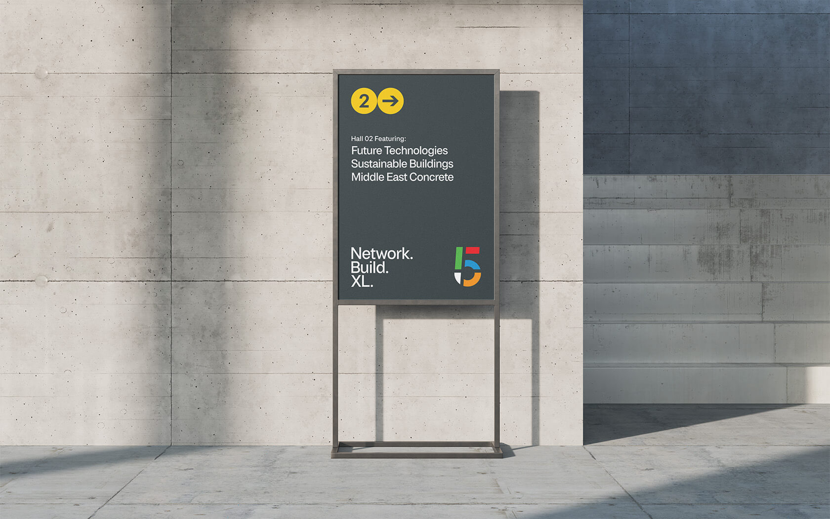
The Big 5 slogan ‘Network. Grow. XL.’ is a characterful, brand building tool that connects to their bold strategy and brand aesthetic. The ‘XL’ literation play on both the nation of scale and excellence, creating engagement through mystic and intrigue.
From our design research we noted that no competitor show in the construction industry referenced the visual language of the construction site. So we set about co-opting it for Big 5. We created an icon set that plays a homage to the kind of icons construction sites use across the world, from numerals to heads to direction arrows and warning signs, the whole set is used across all touchpoints in a new an appropriate manner.
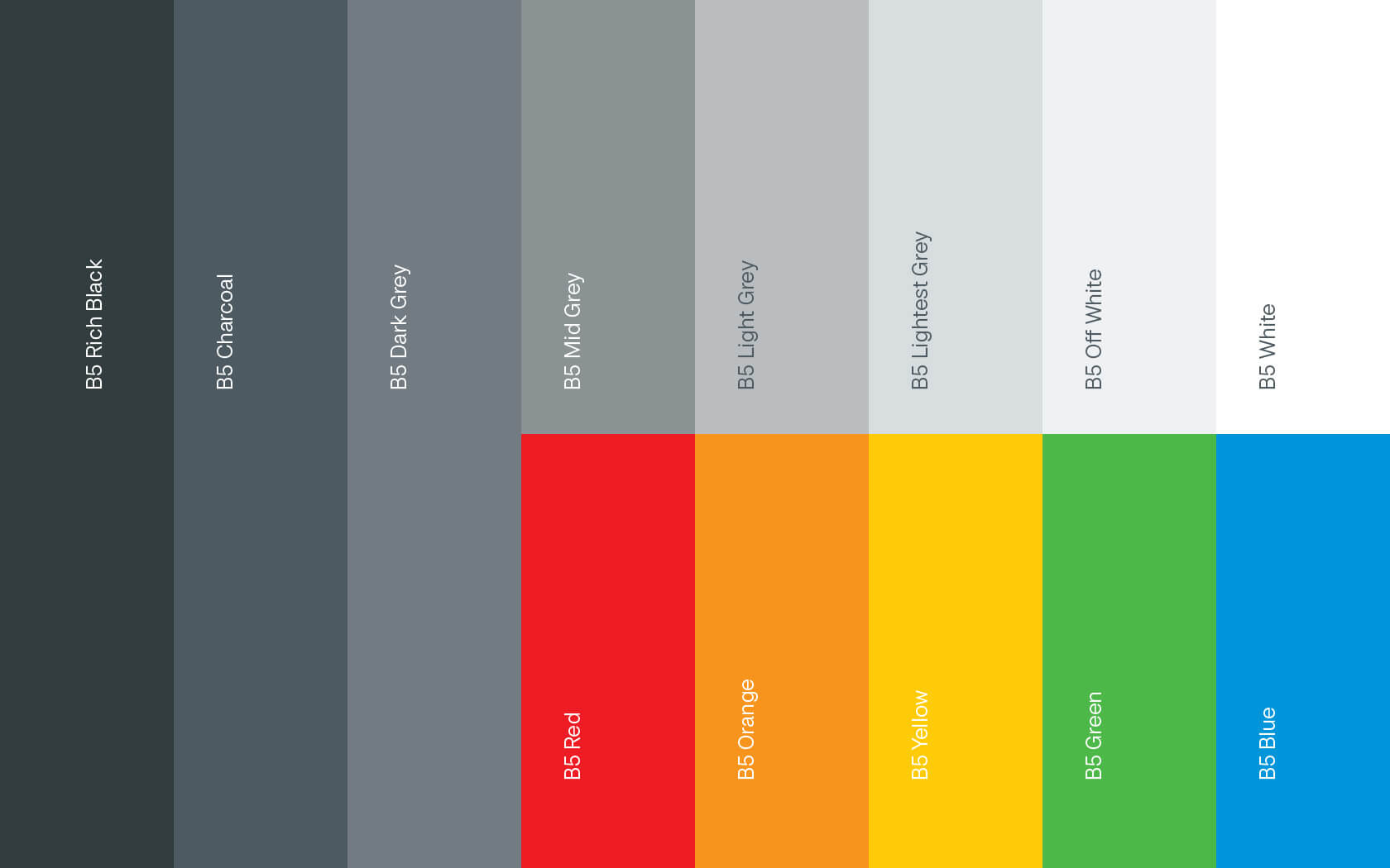
We also created a bold, primary colour set which accompany’s the dark grey and yellow primary colours which are the most associated with the master brand. Event brands will use a combination of primary colours from the wider palette.
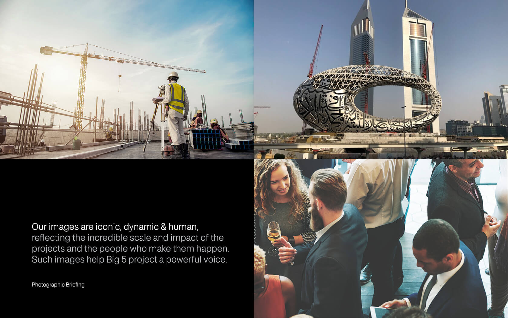
Big 5 rebrand uses images that are iconic, dynamic & human, reflecting the incredible scale and impact of the projects and the people who make them happen. Such images help Big 5 project a powerful voice to its audience.
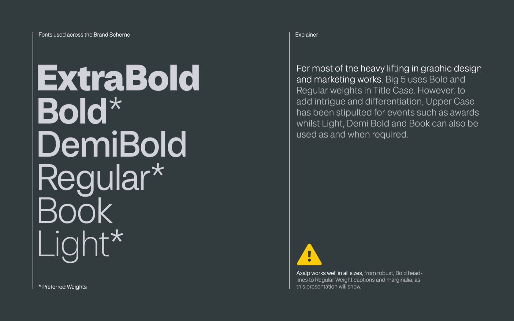
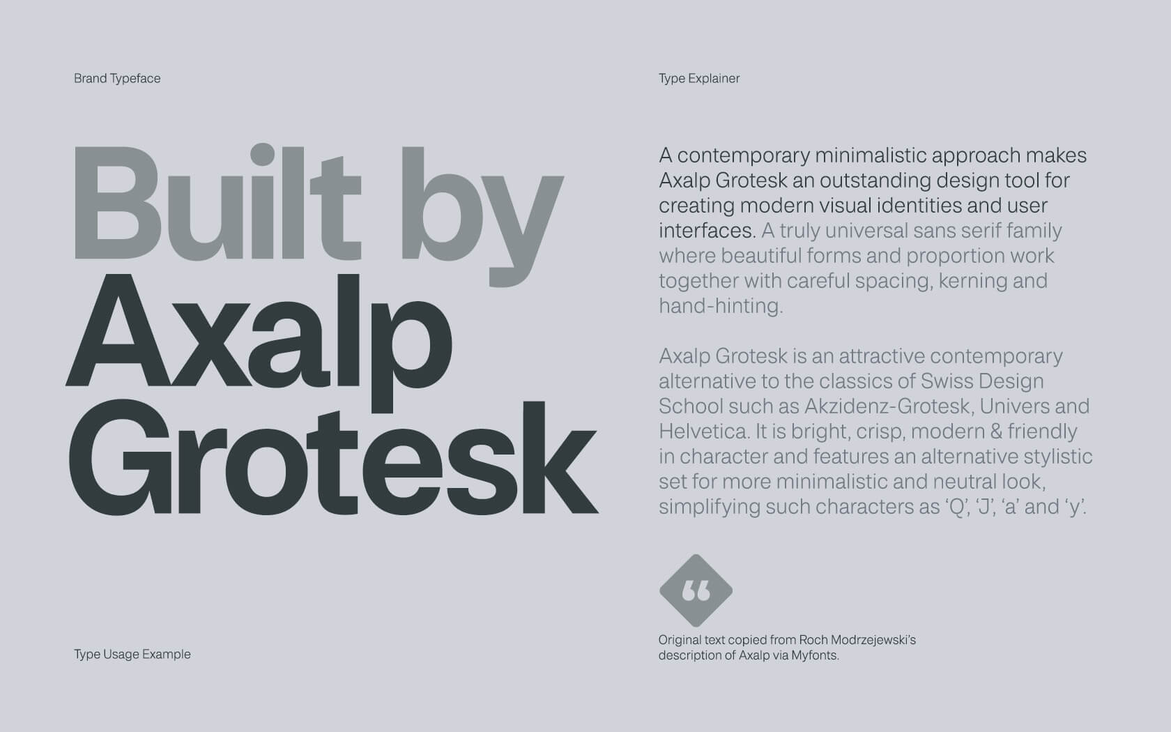
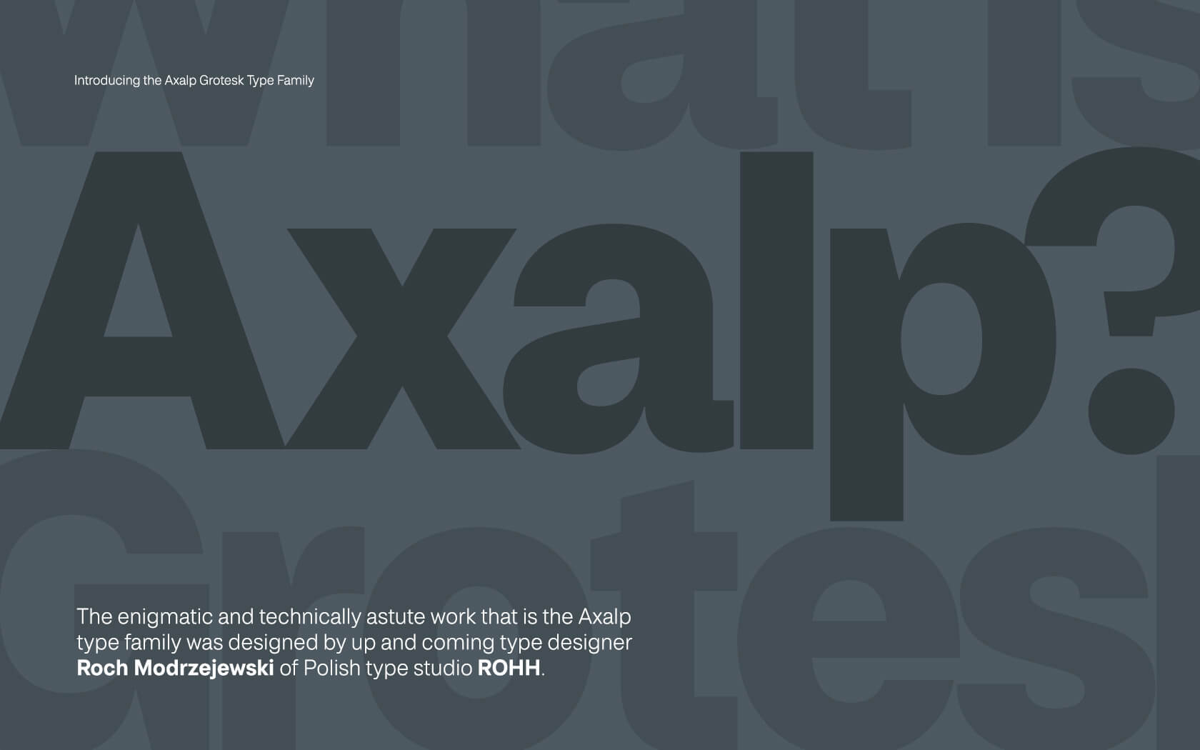
For type, we are using Axalp Grotesk and Inter. The enigmatic and technically astute work that is the Axalp type family was designed by up and coming type designer Roch Modrzejewski of Polish type studio ROHH. Axalp will be used for all offline communications and Inter for the app and digital platforms.
Services delivered for the Big 5 rebrand
Visual Identity, Icon Set, Slogan, Tone of Voice, Brochure, Social, Web, Exhibition Stand and Graphic Design
You guys have done some amazing work… we are so excited about what you have done with the brand.
Faye Black. Group Marketing Manager. DMG Events.
Details View Close


We knew this brand needed to evolve and simplify, by doing so Big 5 would feel bigger and bolder. The brand’s identity now feels like the perfect combined expression of Media (what it is) and Construction (who it serves).
Liam Farrell. Creative Director & Partner.
Alhoty.
Rebrand
The experts' expert is beautifully rebranded by Unisono. Say hello to the new Alhoty, Bahrain's trusted analytical services provider.
Mindset.
Rebrand
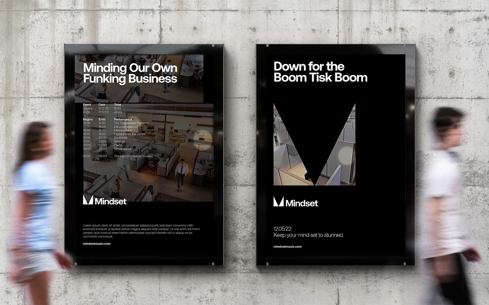
Mindset play host to some of Bahrain's most rocking electronic music nights, now they look as banging as they sound.
GFH
Annual & ESG Report
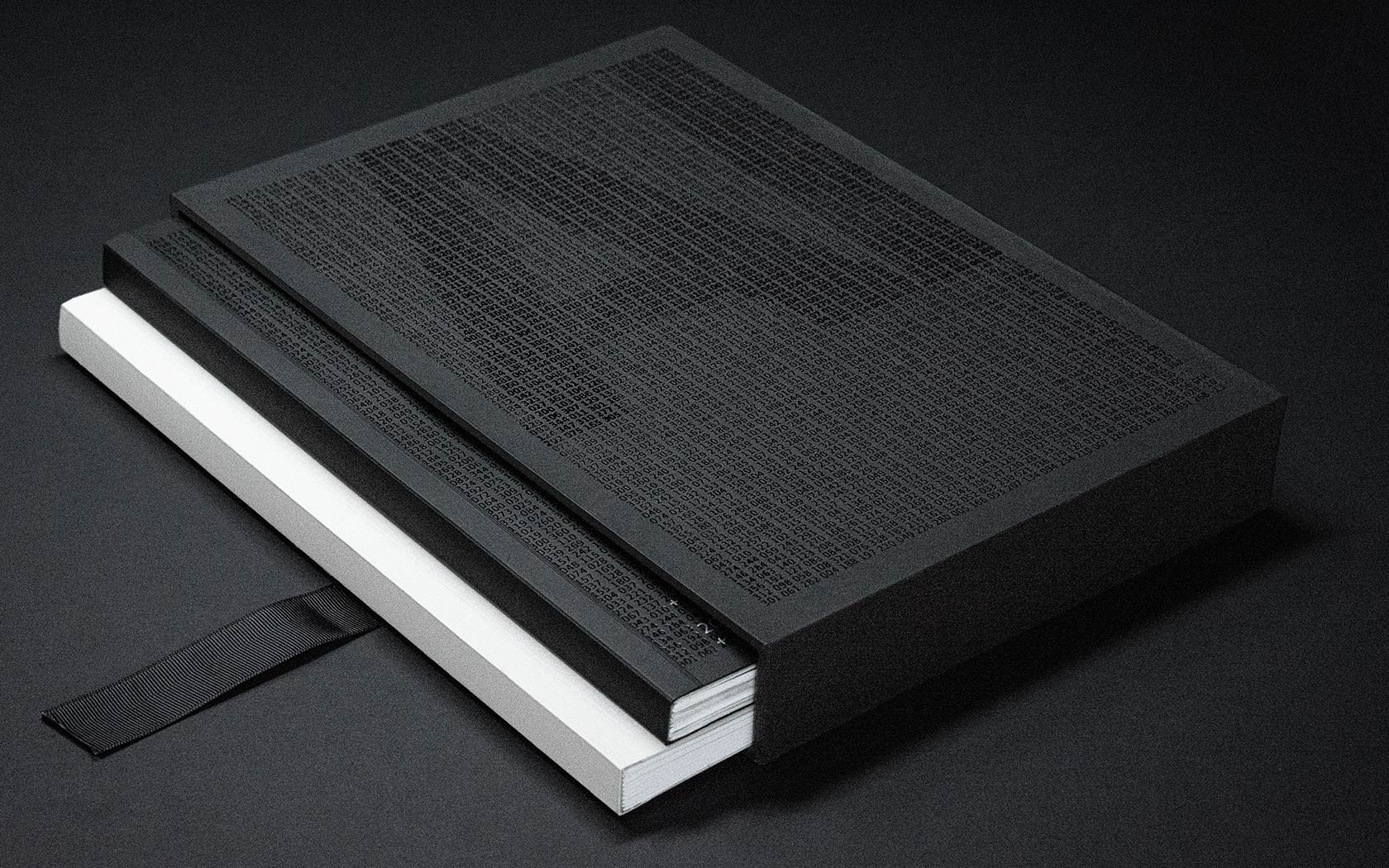
Slick print treatments from slip case to back cover and every section in between for this impressive annual and ESG report for one of the GCC's leading financial groups.
Ertiqa.
Rebrand
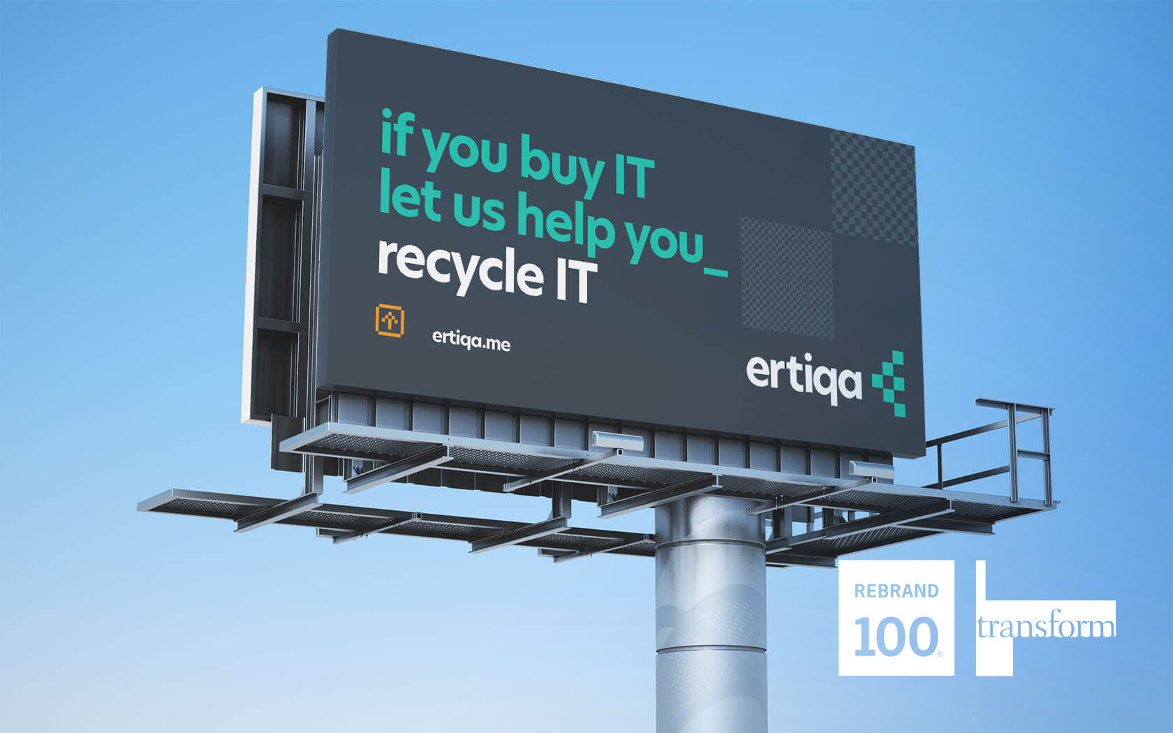
Ertiqa's Transform Gold and Silver plus Rebrand 100 Award winning rebrand helps lead the way for digital waste transformation.
GFH
Annual & ESG Report
Slick print treatments from slip case to back cover and every section in between for this impressive annual and ESG report for one of the GCC's leading financial groups.