Propaganda Rebrand
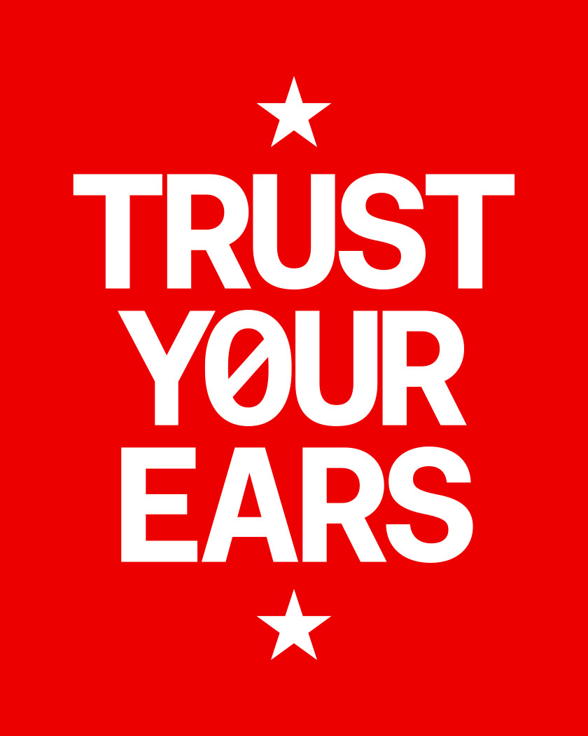
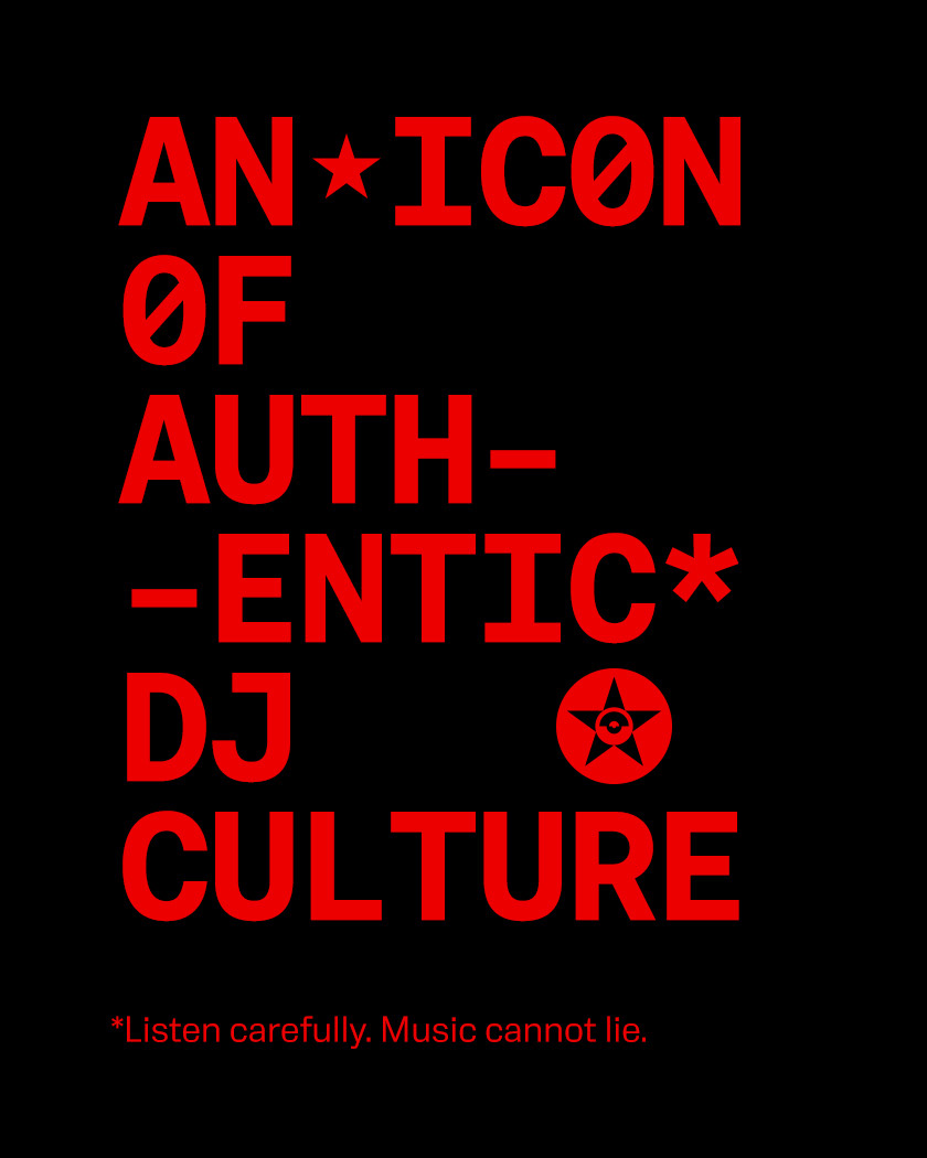
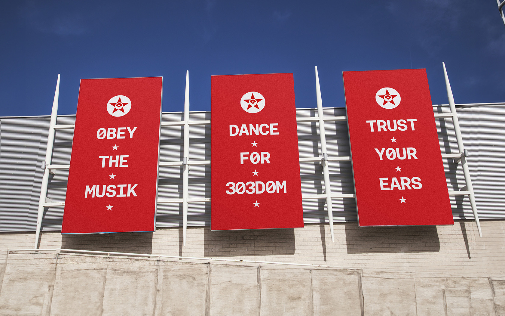
The party’s final command was chilling. Trust. Your. Ears.
The Propaganda Rebrand’s Industry setting
Propaganda is Bahrain’s leading monthly techno night. The island has many competing nights and Propaganda books some of the scene’s leading artists, who play for it’s avowedly loyal followers.
The Propaganda Rebrand had a Few Market Challenges
For several years, Propaganda has grown in popularity and the talent bookings increased in status. In the absence of a considered brand strategy, what the brand needed was a new philosophy, identity and tone of voice that would match the quality of the talent and experience while providing a tonal framework for ongoing promotions.
Strategy Applied to the Propaganda Rebrand
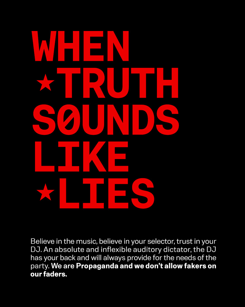
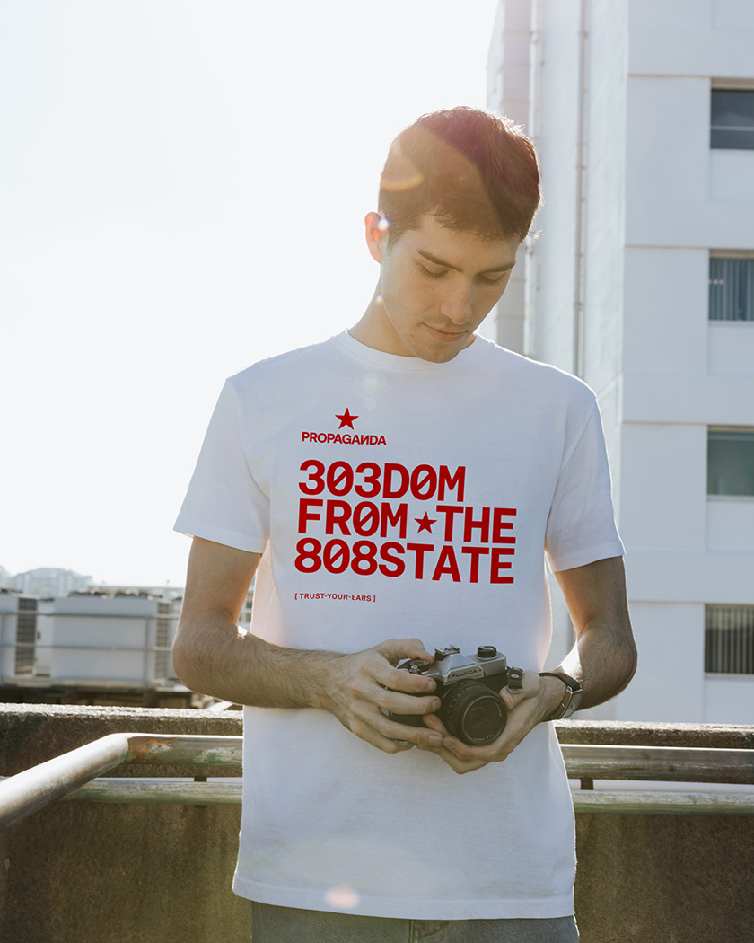
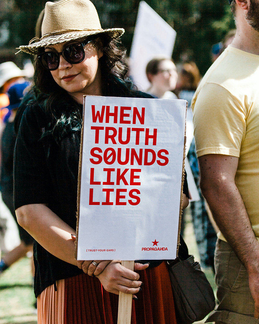
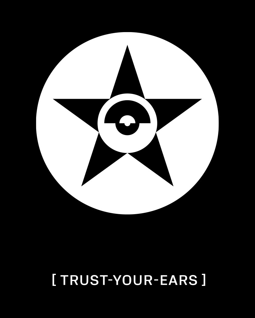
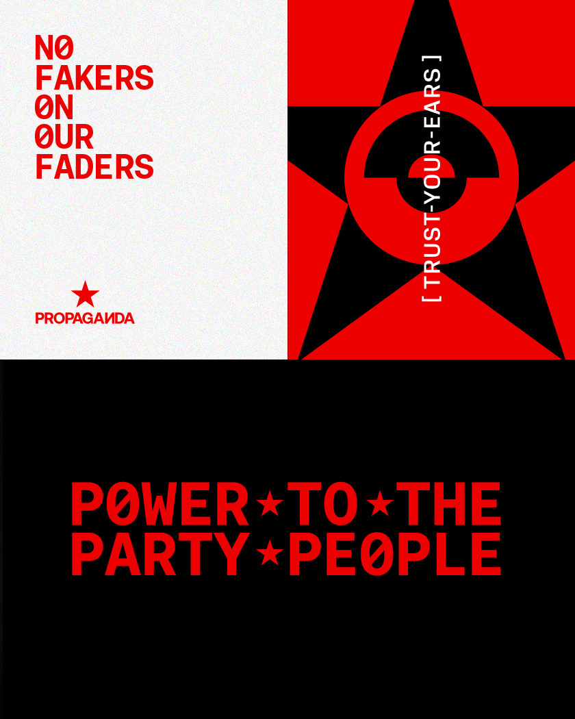
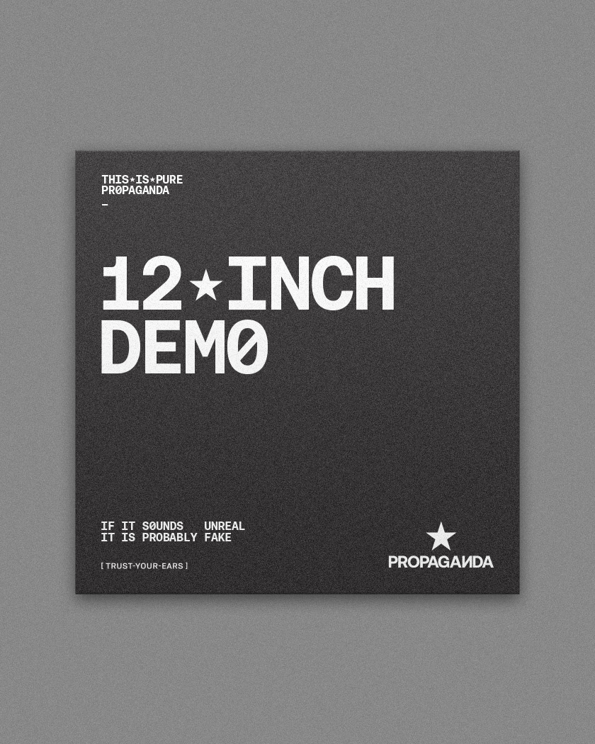
Propaganda’s name (and techno music) informed our approach and the development of the ‘Sovietech’ graphic and literal language. The brand’s tone of voice has a clear Orwellian flavour, exemplified by the new slogan ‘Trust Your Ears’. A play on 1984’s ‘The party told you to reject the evidence of your eyes and ears. It was their final, most essential command.’ Often, fake DJs turn nobs but there is no discernible musical difference. They are faking. Trust Your Ears succinctly references this notion.
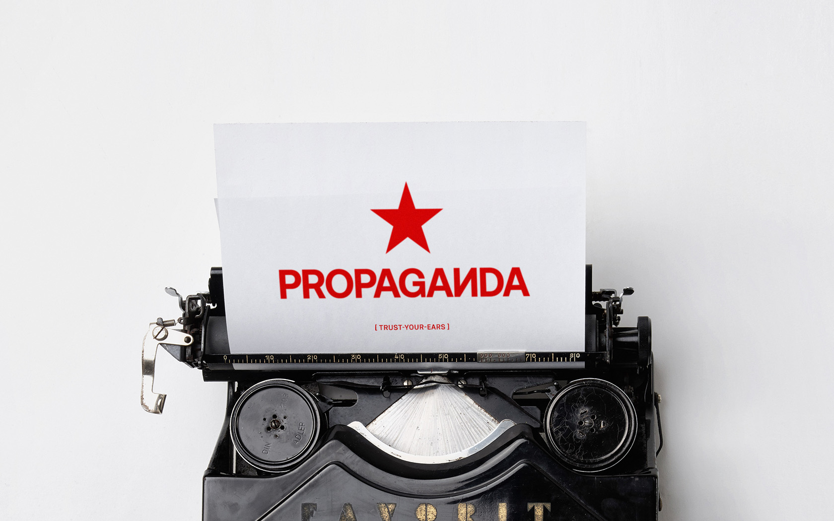
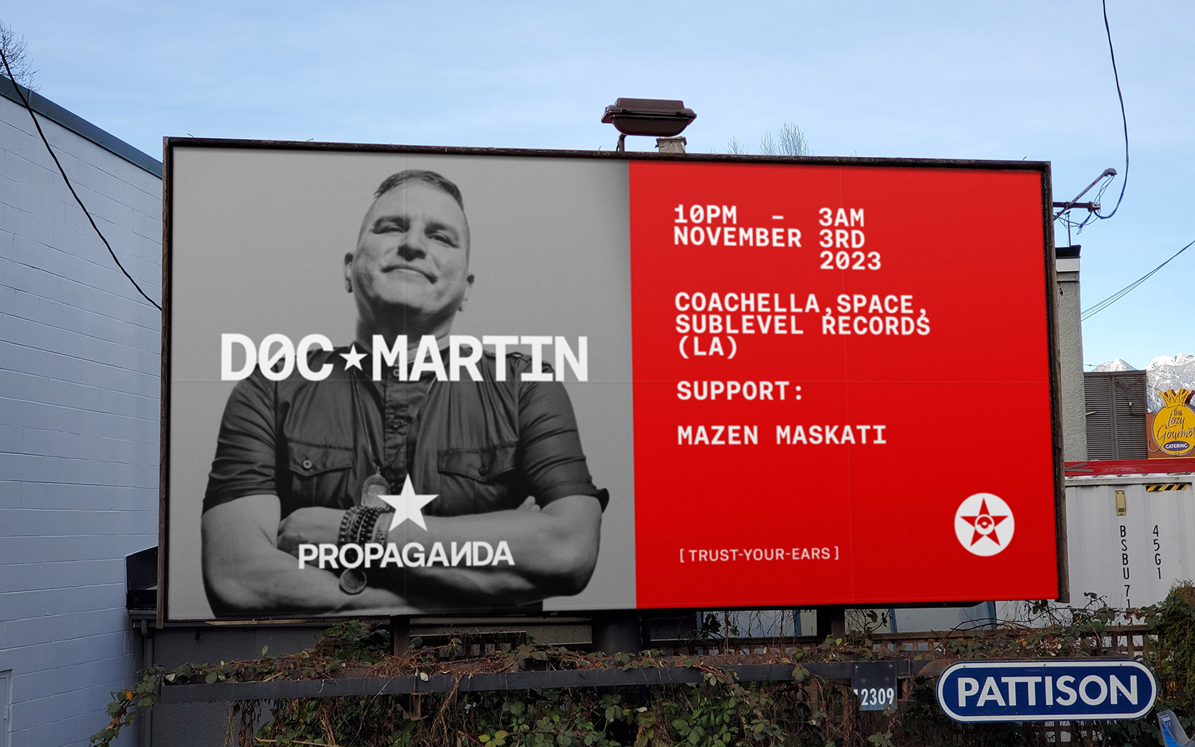
We simplified the original brand icon and set the name in Aeonik Bold type. The reversed N is pronounced “E” in Cyrillic. We wanted to express Sovietech while eschewing clichés; reversing the N had subtly power.
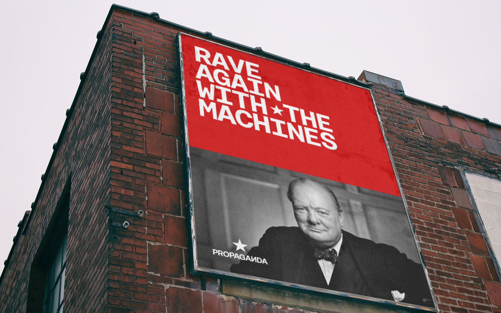
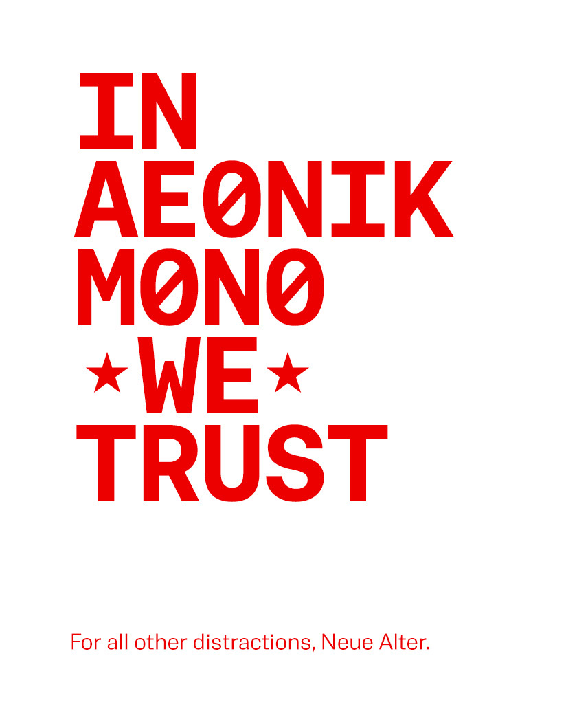
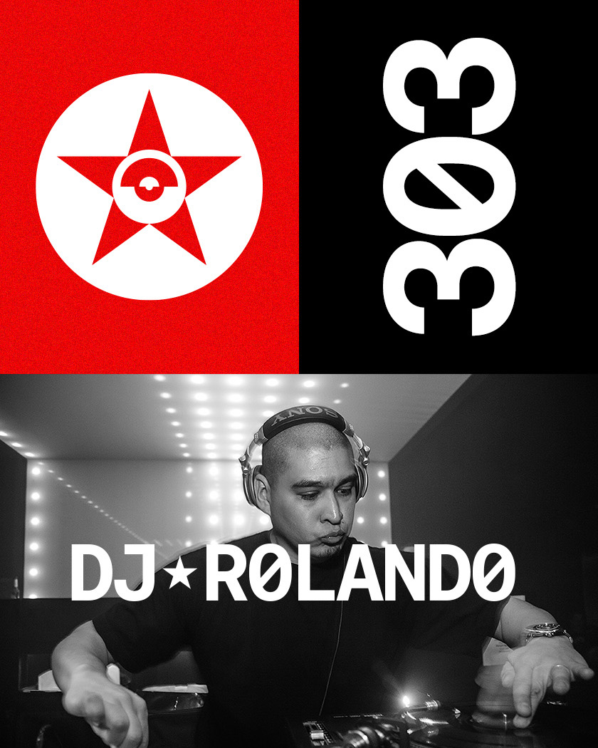
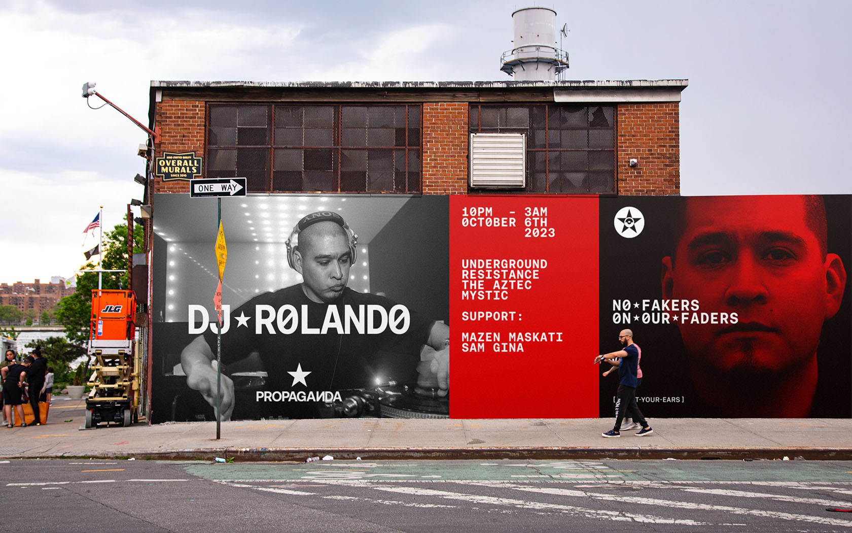
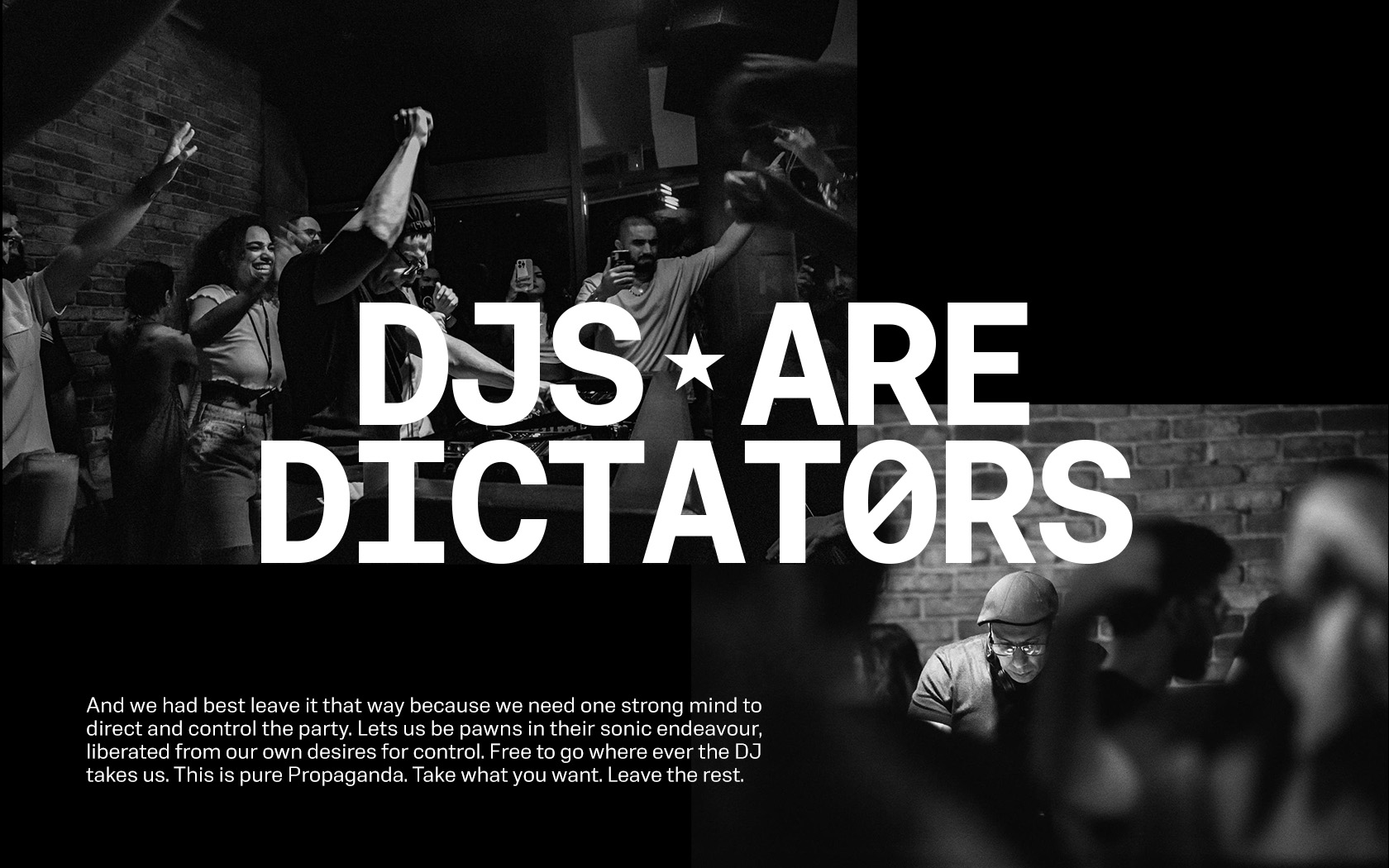
The Sovietech graphic language is like techno, machine-like, cold and brutal yet with an inherent beauty. Machine type like Aeonik Mono married with Neue Alter’s squared profiles to provide the perfect accompaniment to the ‘portraits of dictators’ art direction.
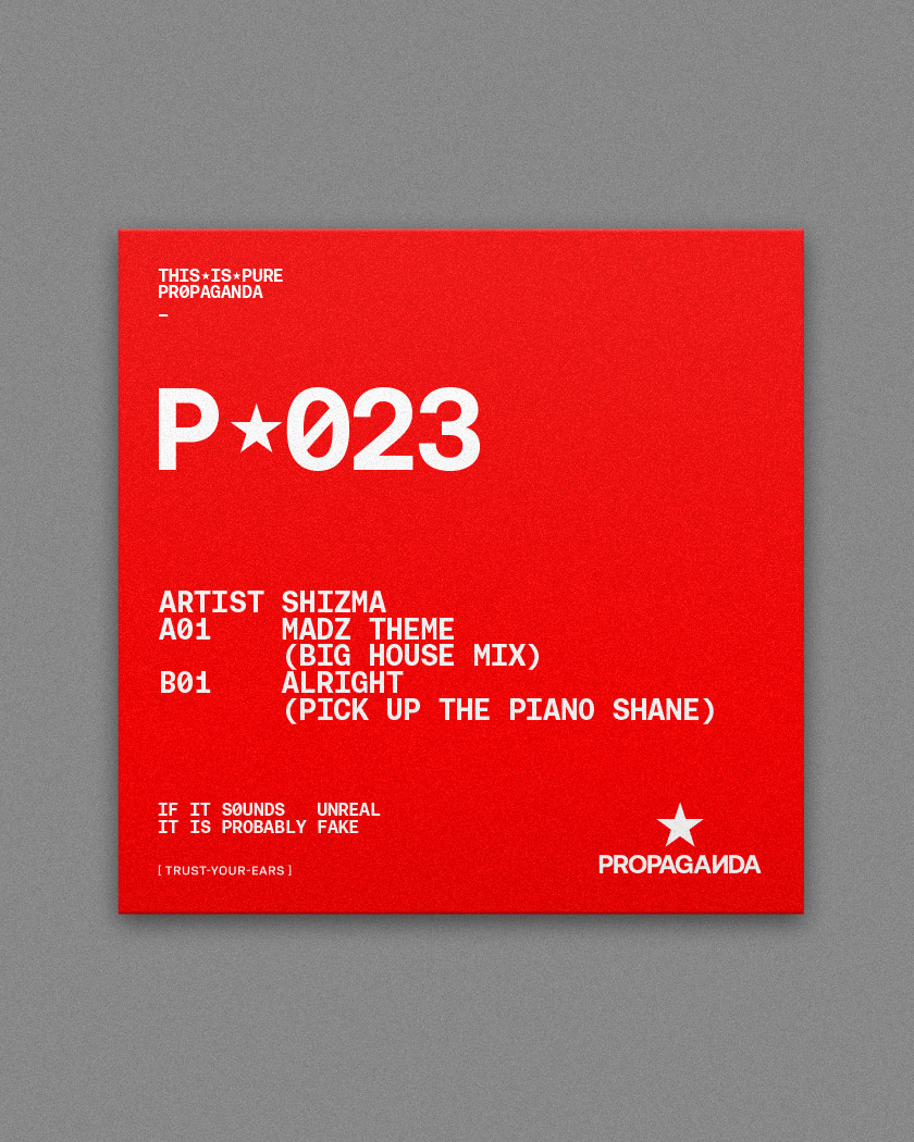
For the Propaganda rebrand’s type treatments, we chose Aeonik for its powerful stance and mechanical aesthetics. Aeonik (from ‘Aeon’ and ‘Nik’ as in Beatnik) has been crafted with mechanical detail. Conceived as a ‘neo-grotesque with a geometric skeleton’ Aeonik expresses rigidity and sovietech coldness through strict perpendicular terminals.
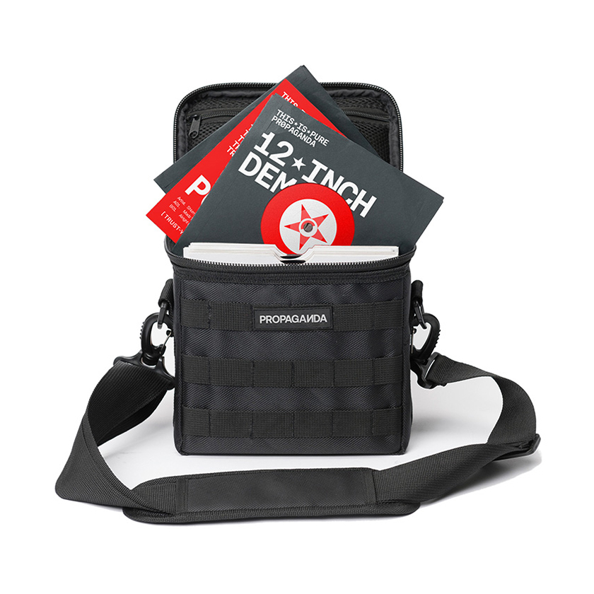
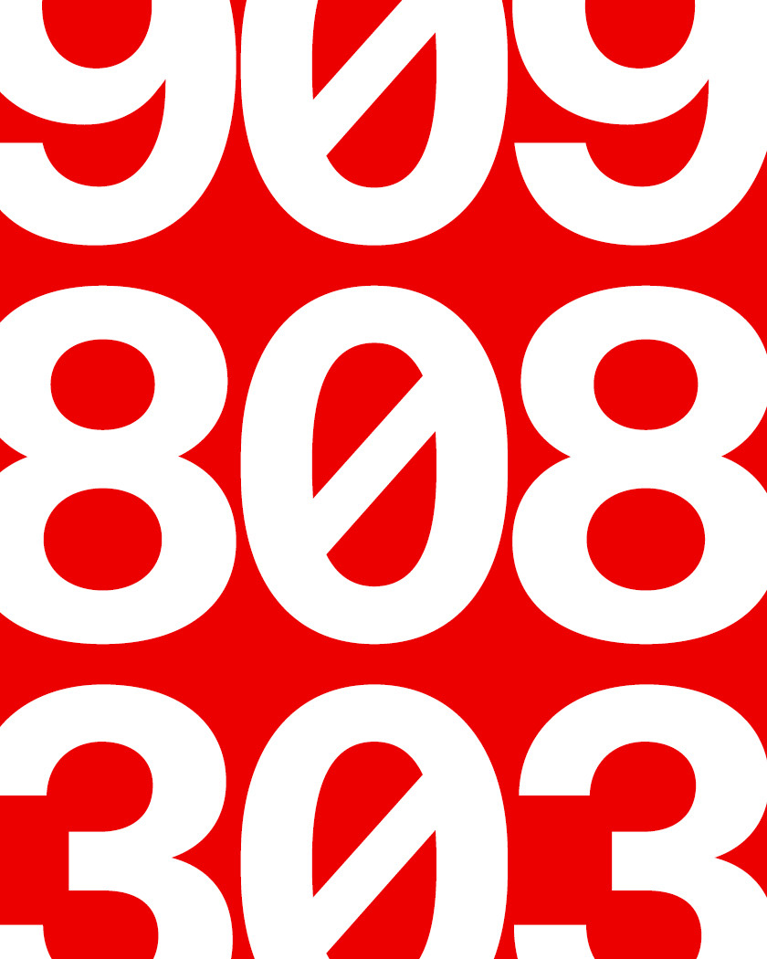
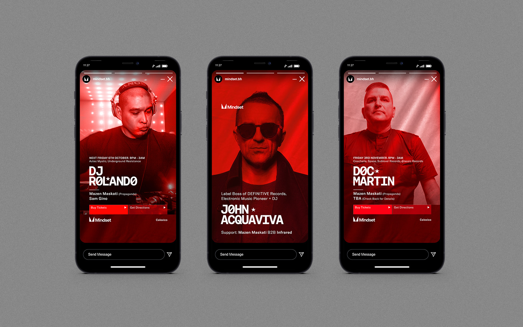
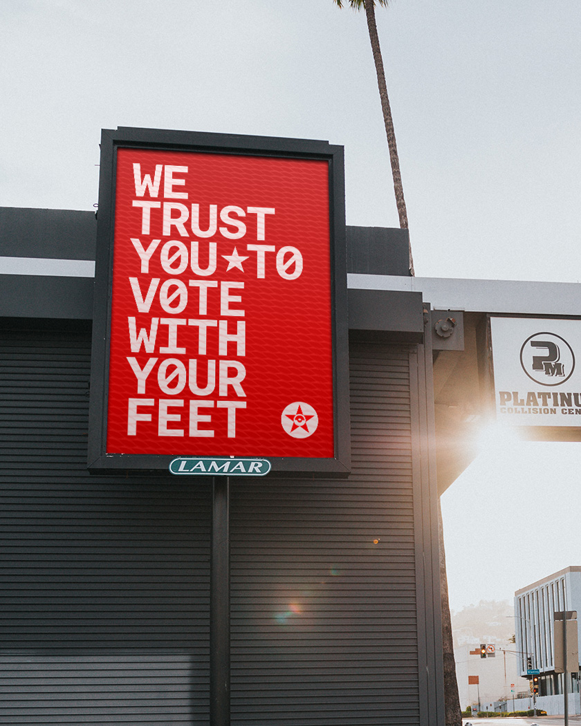
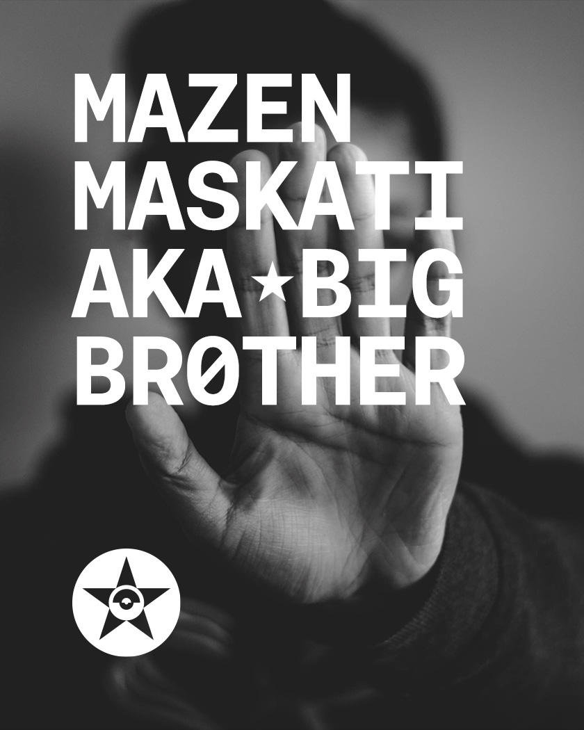
We spell all words with a Zero rather than a letter O; set in Aeonik Mono uppercase giving the typography a machine-like aesthetic which complimented the big-brother visuals. In Aeonik Mono’s spaces we added a star, echoing both the soviet identity and avatar.
Complimenting Aeonik Mono headlines is body copy set in Neue Alter. A squared off neo grotesque, Neue Alter’s profiles provide an added machine-like dimension to layouts, further supporting industrialism of the Soviet revolution with a form of ‘code-speak’.
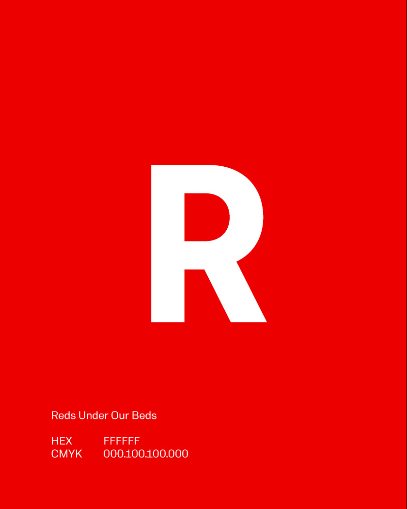
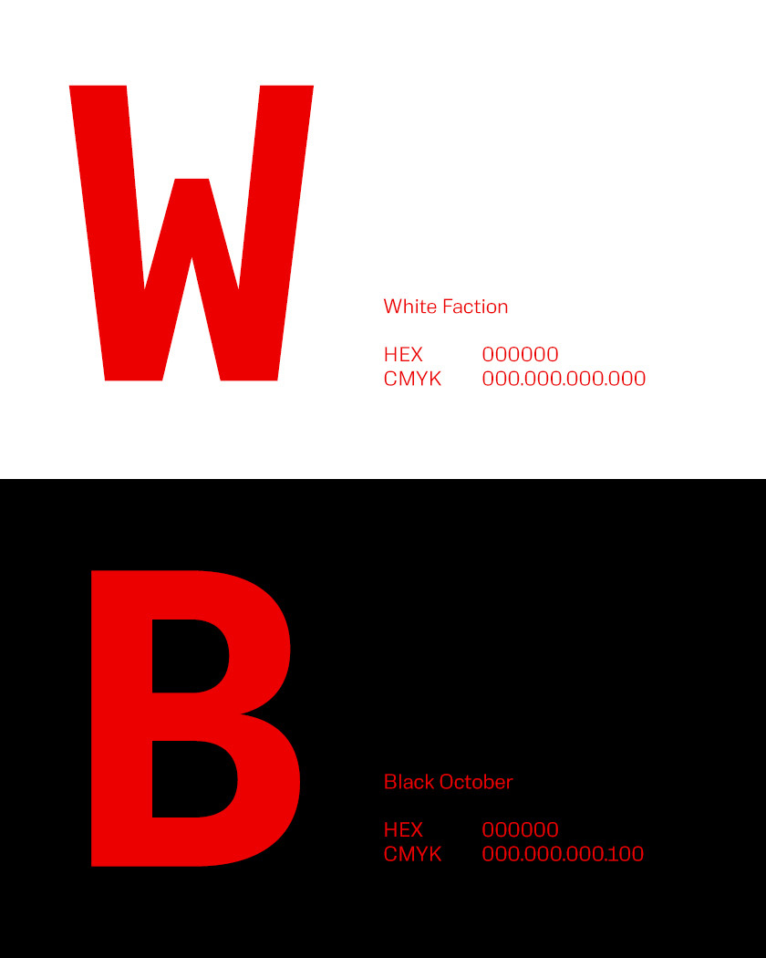
The visuals are monochrome in either red or black. We sought to reflect the aesthetics of the era by adding a billowing red silk – a link to the propagandist PR presentations given by party.
Results
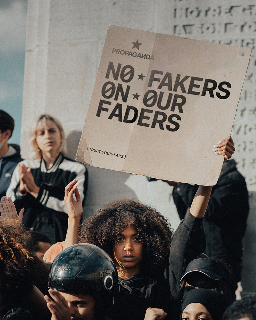
The results of the Propaganda rebrand are well appreciated by promoter and audience alike. Attendance numbers and followers are up and the branding has caught the attention of global DJs who positively comment on the tone of voice; the ‘No Fakers on Our Faders’ headline is especially noted.
Want to see more?
Check out Mindset Media here, follow their instagram here, see our rebrand of Super Fridaze here and Mindsets own rebrand here, also done by Unisono.
We needed an identity as legendary as the global DJs we host. Unisono has a reputation for global quality + brilliant 360° thinking. We were looking for a brand that expressed our passion and commitment to our movement – they did not disappoint.
Mazen Maskati. Promoter. Mindset.
Details View Close
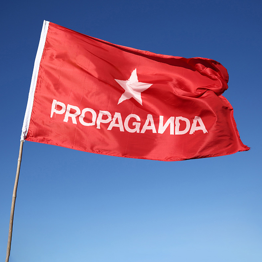
This was fun. Almost as much fun as a night out at Propaganda.
Liam Farrell. Creative Director & Partner.
Esterad.
Annual Report 2019
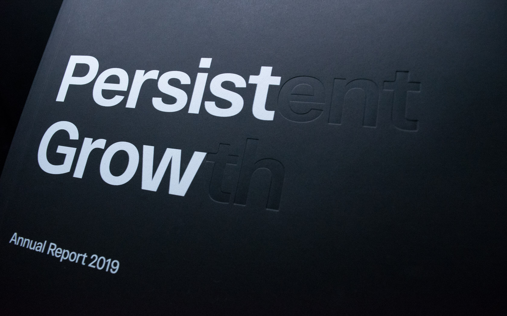
This beautifully finished Esterad Annual Report 2019 celebrates another remarkable year for this prosperous brand.
GFH
Annual & ESG Report
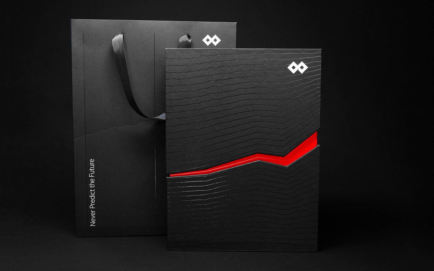
Slick print treatments from slip case to back cover and every section in between for this impressive annual and ESG report for one of the GCC's leading financial groups.
Super Fridaze.
Rebrand
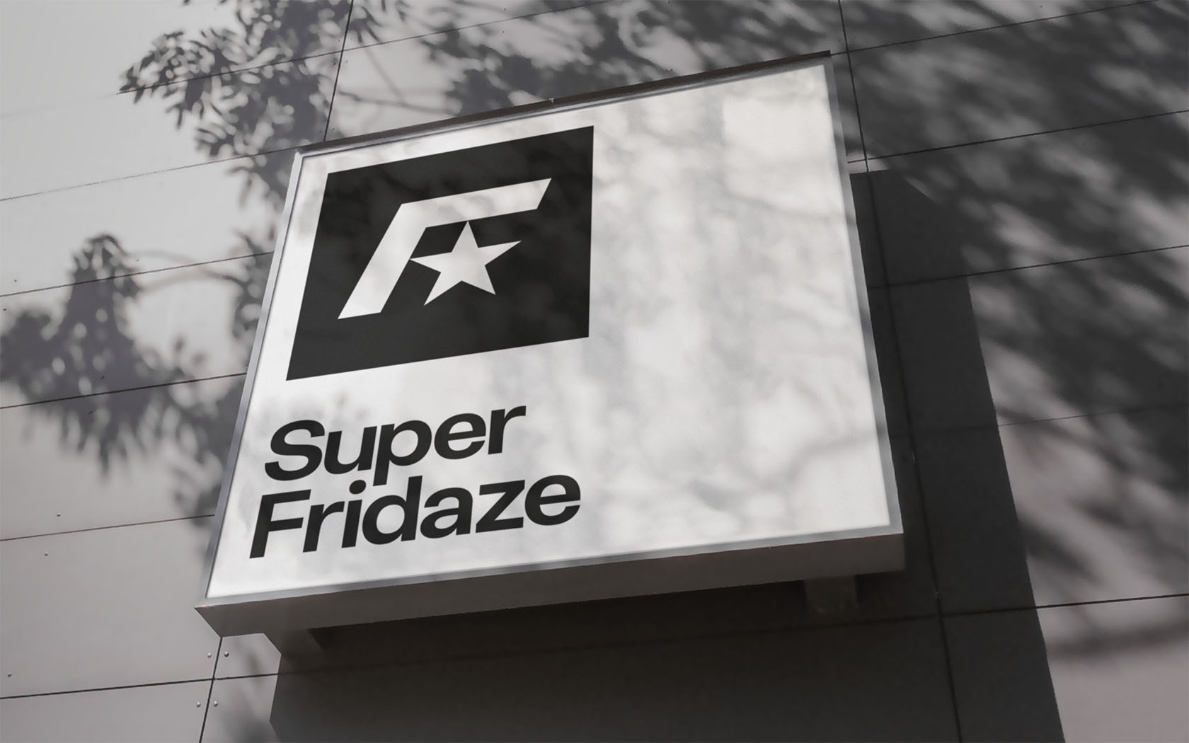
One of Bahrain's newest underground club nights gets a whopping great big Unisono remix. Superb...
Epix.
Branding
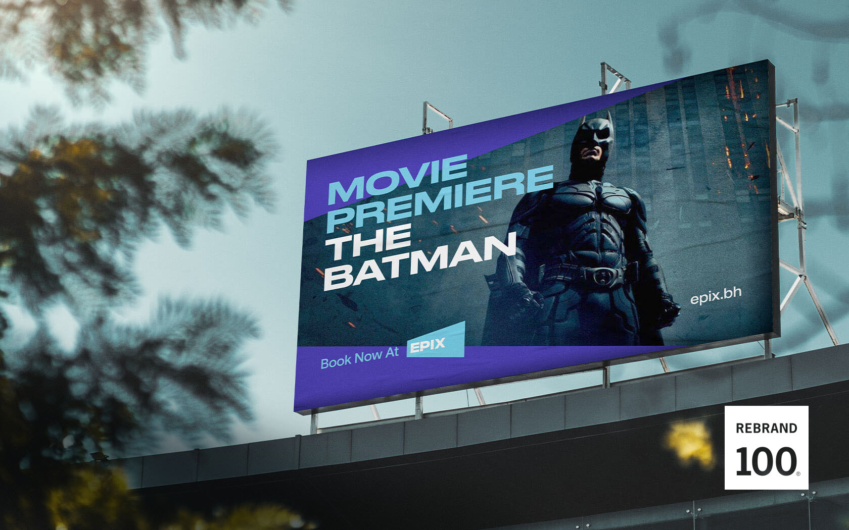
With a whole slew of firsts from 4k laser projectors to Dolby Atmos sound, Epix is about to unleash a truly monstrous upgrade to Bahrain's cinematic expectations.
Ras Hayan Village.
Branding
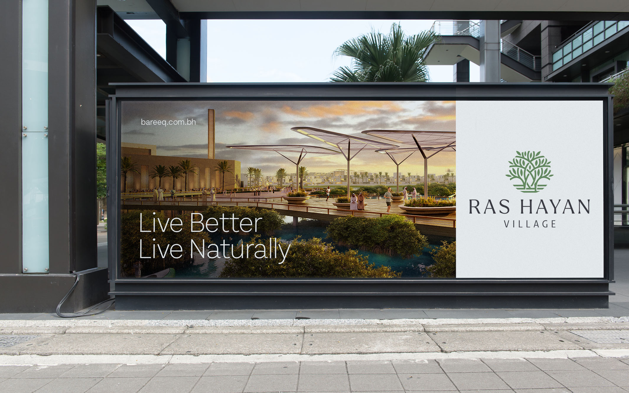
When Bareeq Development asked us to create the brand for Ras Hayan Village, their pivotal and inspiring new ecological real estate development, lets just say we were positively charmed.