Rukn. Rebrand
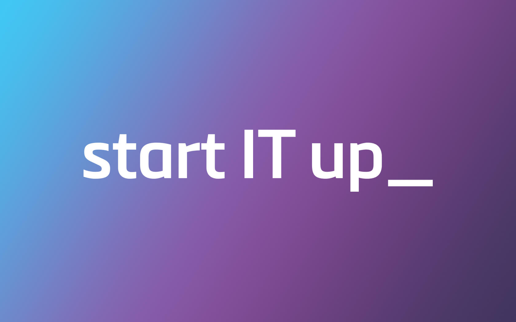
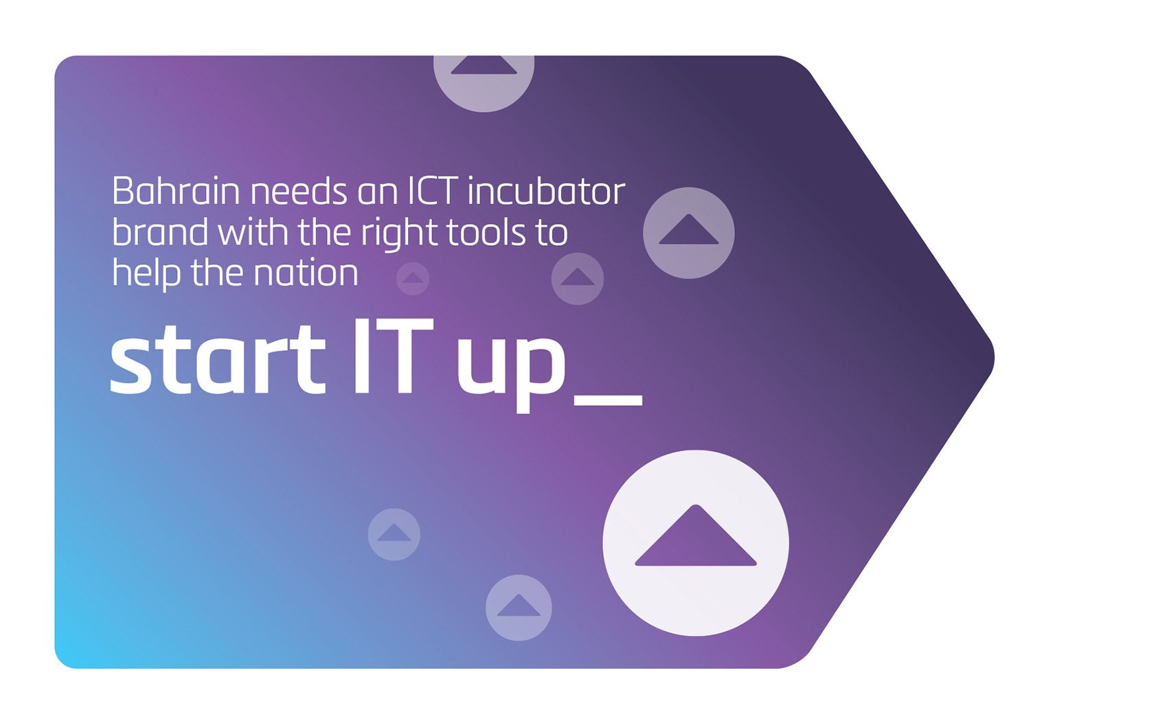
Giving IT a proper start (up) button to push
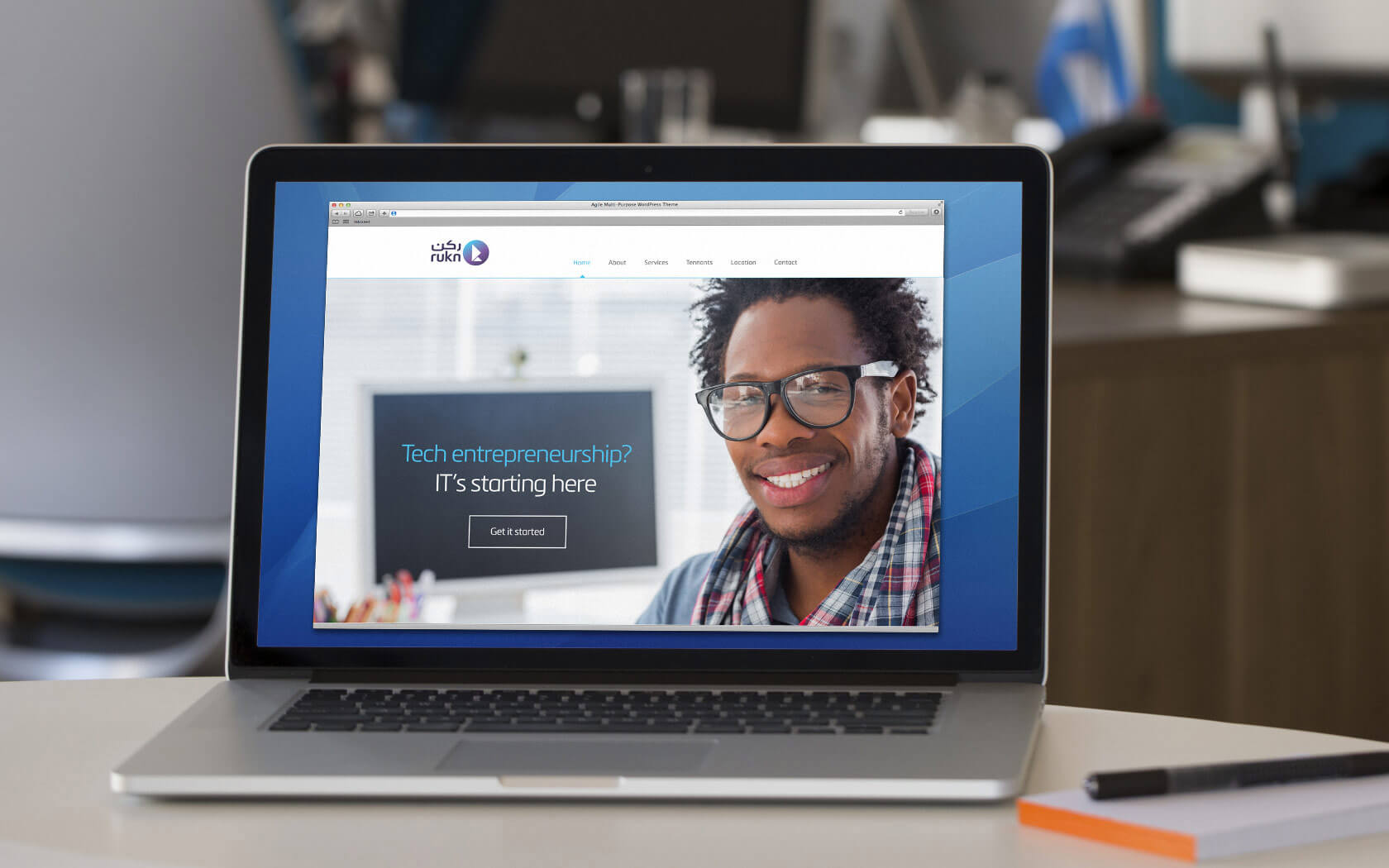
Rukn is a business incubator operating in the ‘tech’ field with a purpose designed office space and suite of ‘inbuilt’ services for small businesses to ‘start up and grow’ in. Given the growing rise in entrepreneurism and start-ups there are a growing number of businesses occupying the incubator space.
Challenge
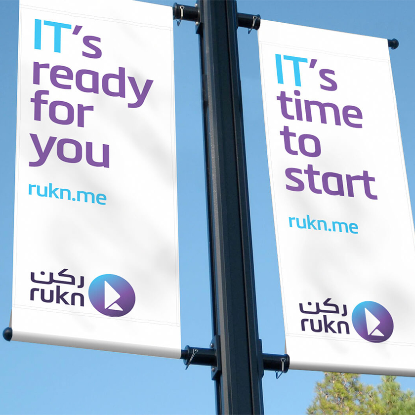
Incubators by nature are meant to be welcoming and friendly, while also being practical and resourceful. Despite their objective, most incubators in Bahrain have a slightly governmental/institutional feel; they usually lack a compelling brand and proposition and rarely feel related to the sector they serve. Rukn was no different. Conceived to serve the IT industry Rukn presented itself as anything but ‘high tech’. With a government backer, our challenge was to create a strategy that would transform bureaucratic thinking and an institutional look and feel, to embrace a modern, start-up friendly brand expression – a less conservative entity that could speak on the level of its audience.
Strategy
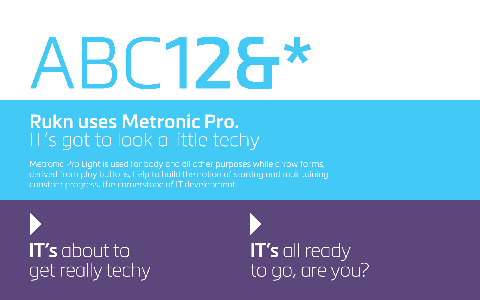
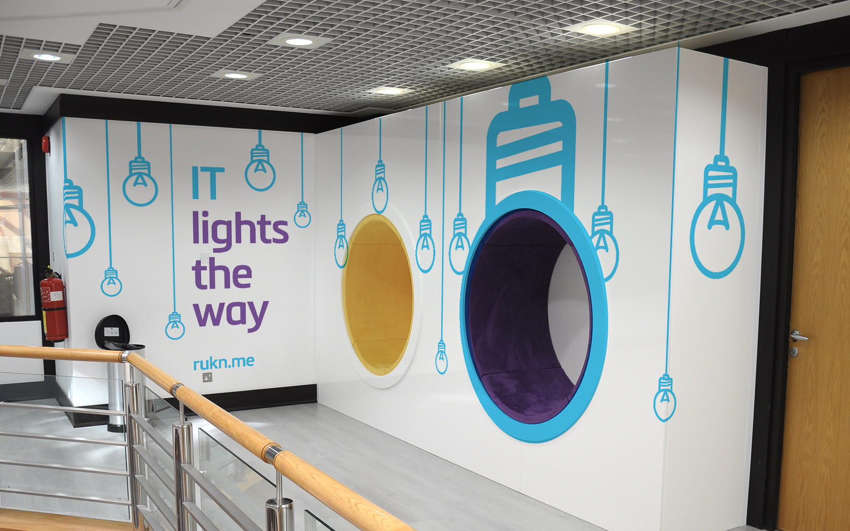
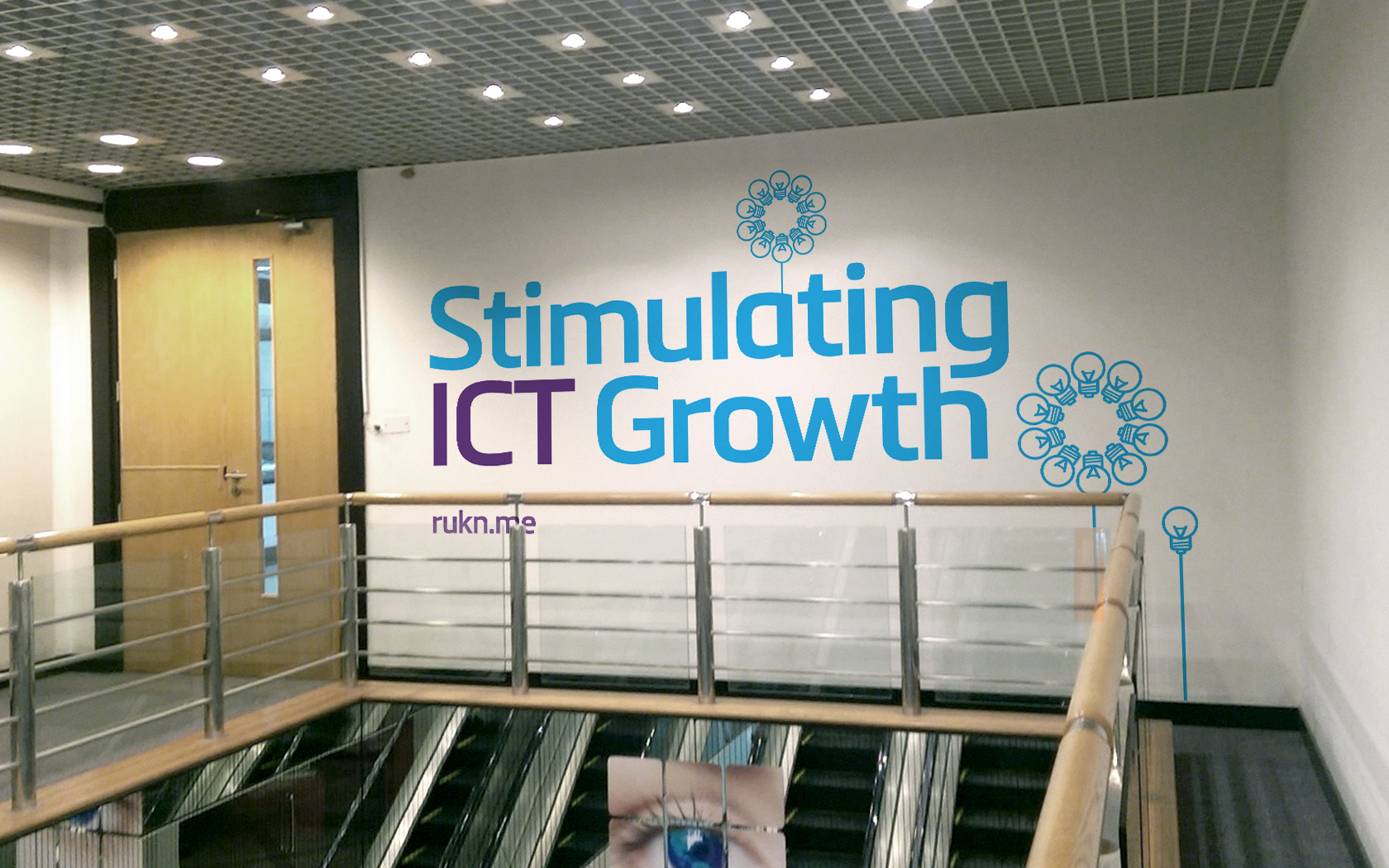
Despite outward appearances, Rukn’s founders and backers were a human and friendly bunch who truly cared about supporting entrepreneurs in Bahrain and wanted to create the right home for the IT industry to grow in. Founding our brand tool kit and messaging platform on the concept of ‘best practice’ – a concept the client was comfortable with, we sought to decode the language of entrepreneurship and technology to create a set of familiar cues that could be incorporated into the brand, injecting it with values of dynamism and friendliness.
Result
The new expressive energy of the brand has supported enhanced communications to start-ups and entrepreneurs, engaging them in the promise of Rukn “to support and stimulate entrepreneurial success”. The fresh and dynamic feeling contained in the new brand language has facilitated the creation of a much more fertile expressive feeling environment and the center is full. The tool kit has empowered Rukn to be a much more visible participant in industry events, further supporting awareness and engagement, and feedback from the community confirms that Rukn now ‘feels’ like a brand capable of supporting innovation.
Rebrand won Best use of copy style/tone of voice and Best visual identity from the technology, media & telecommunications sector at Transform MENA 2015.
Services Delivered
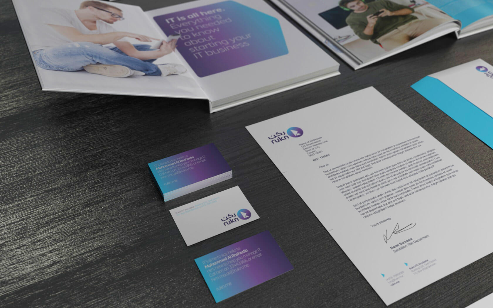
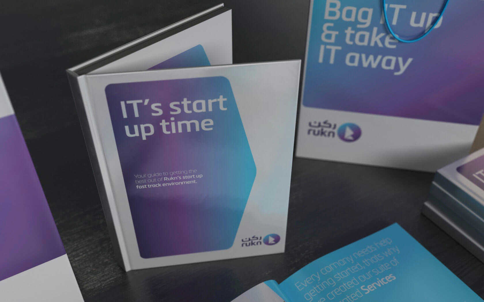
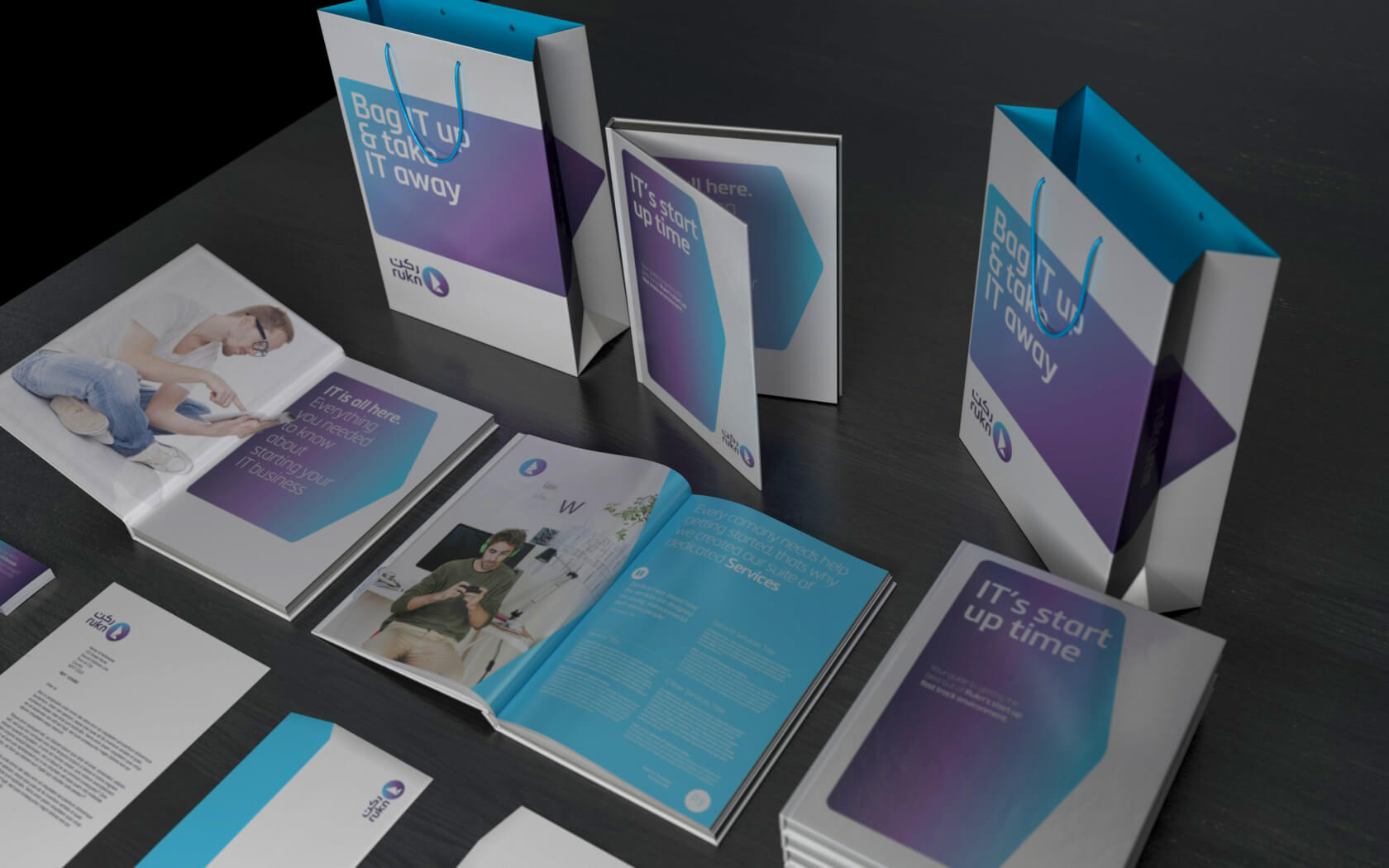
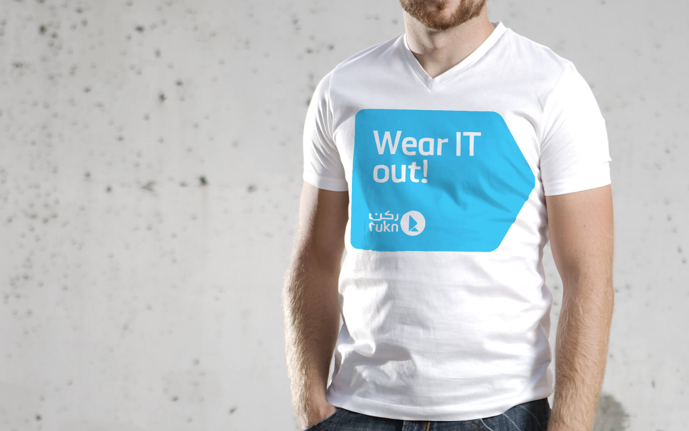
Brand Strategy, Naming, Brand Design, Visual Identity, Slogan, Tone of Voice, Digital Design, Print & Graphic Design.
I’m convinced that about half of what separates successful entrepreneurs from the non-successful ones is pure perseverance.
Steve Jobs.
Details View Close

Good to see IT getting the support IT deserves in Bahrain.
Liam Farrell. Creative Director & Partner.
Infracorp.
Branding
Unisono delivers a Transform Gold Award winning infrastructure brand identity for Infracorp, the region's first value investing brand.
Harbour Heights.
Rebrand
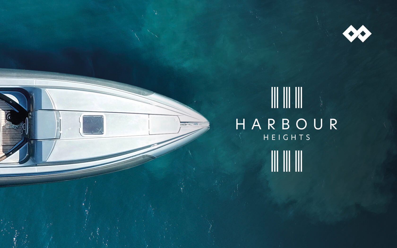
A transformation that takes real estate brand development to the highest heights.
GFH
Annual & ESG Report
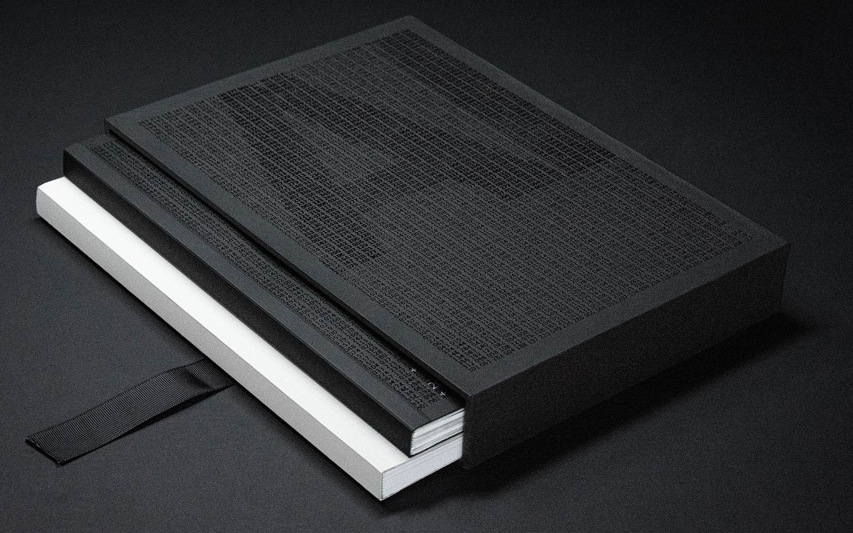
Slick print treatments from slip case to back cover and every section in between for this impressive annual and ESG report for one of the GCC's leading financial groups.
Unisono
Notebooks
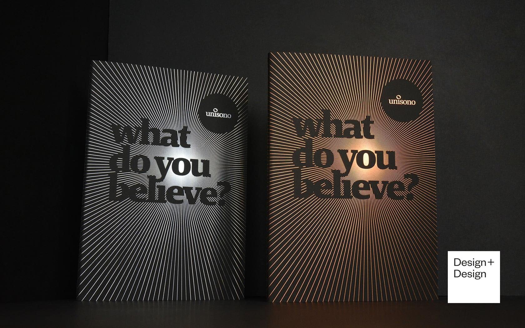
Luxurious print finishing combine with eloquent copy and dramatic typography on these 2019 Unisono Notebooks
Seef Entertainment
Branding
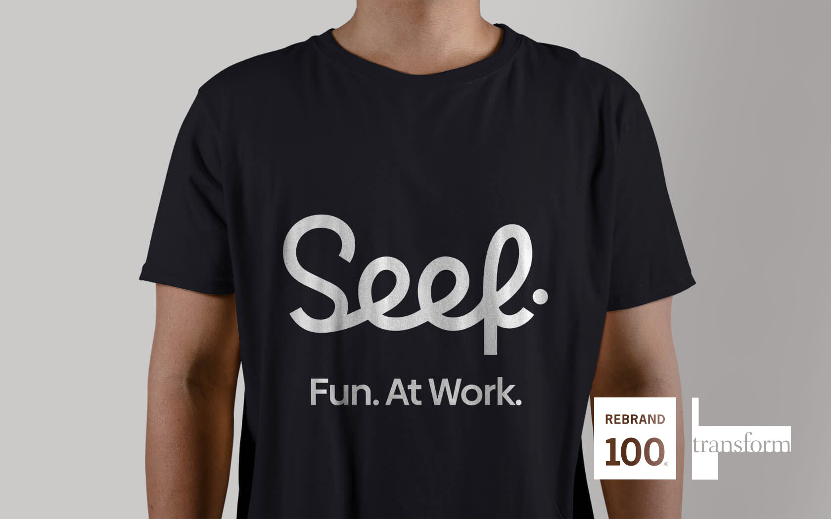
Silver Transform Award winning branding for the good people of Bahrain, who are about to get a whole new level of entertainment... Seef-level good times.