Saada. Rebrand
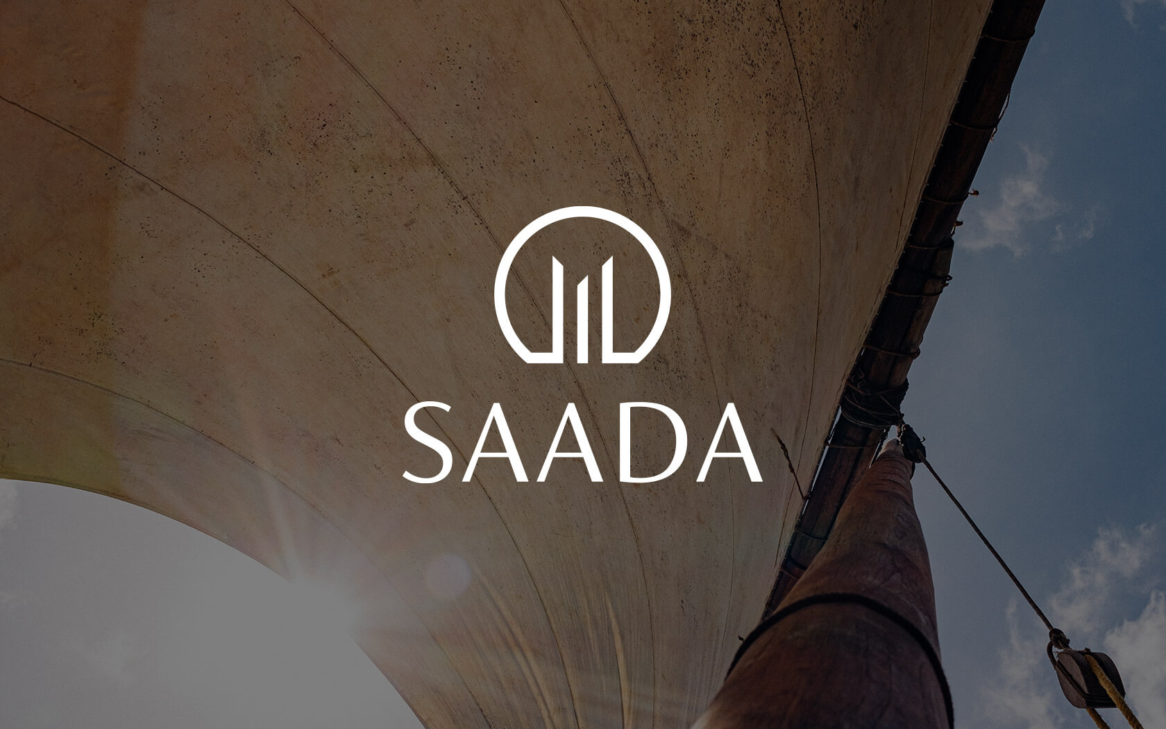
Happiness is a Choice
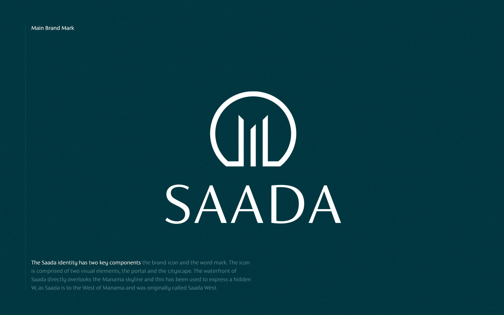
Creating the Happy New Face of Saada
Facing Manama’s ever expanding skyline is the shoreline of Muharraq, a place that, despite its perfect urban setting, has hitherto gone unnoticed by developers in the Kingdom. Until Edamah, it seems. The new water-frontage is coming to life with a mixture of eateries, lifestyle brands and light retail. The new Saada brand is a destination sure to bring happiness to local residents and international visitors alike. Perhaps that’s where the name originates from (Saada means ‘happiness’ in Arabic)?
With an aim enliven Muharraq’s waterfront we set about ideating the Saada brand identity to best encapsulate what makes the destination unique. From our client collaboration we connected around the idea of ‘skylines through portholes’. The connection between the original sea-faring purpose of the port-side location and the unique views the destination offers. A creative concept was born – porthole views.
Introducing the Saada brand
Originally named ‘Saada West’, the waterfront location was initially established as a multi-direction, 4 location master planned development featuring unique developments on all sides. After West, East, North and South were expected to follow but are currently not likely to align to Saada on a brand level. So the geographic suffix was dropped.
Challenges encountered in the Saada brand
The name means ‘happiness’ in Arabic but there was a certain disquiet about using anything even remotely focussed on the meaning (smiles and the like). People felt the name was jovial enough for a mixed use development, without the identity further locating the brand in a playful space. While the location could bring happiness to tenants and guests alike, it was felt that an appropriate response should ideally eschew typical renderings of happy faces.
Our strategic response
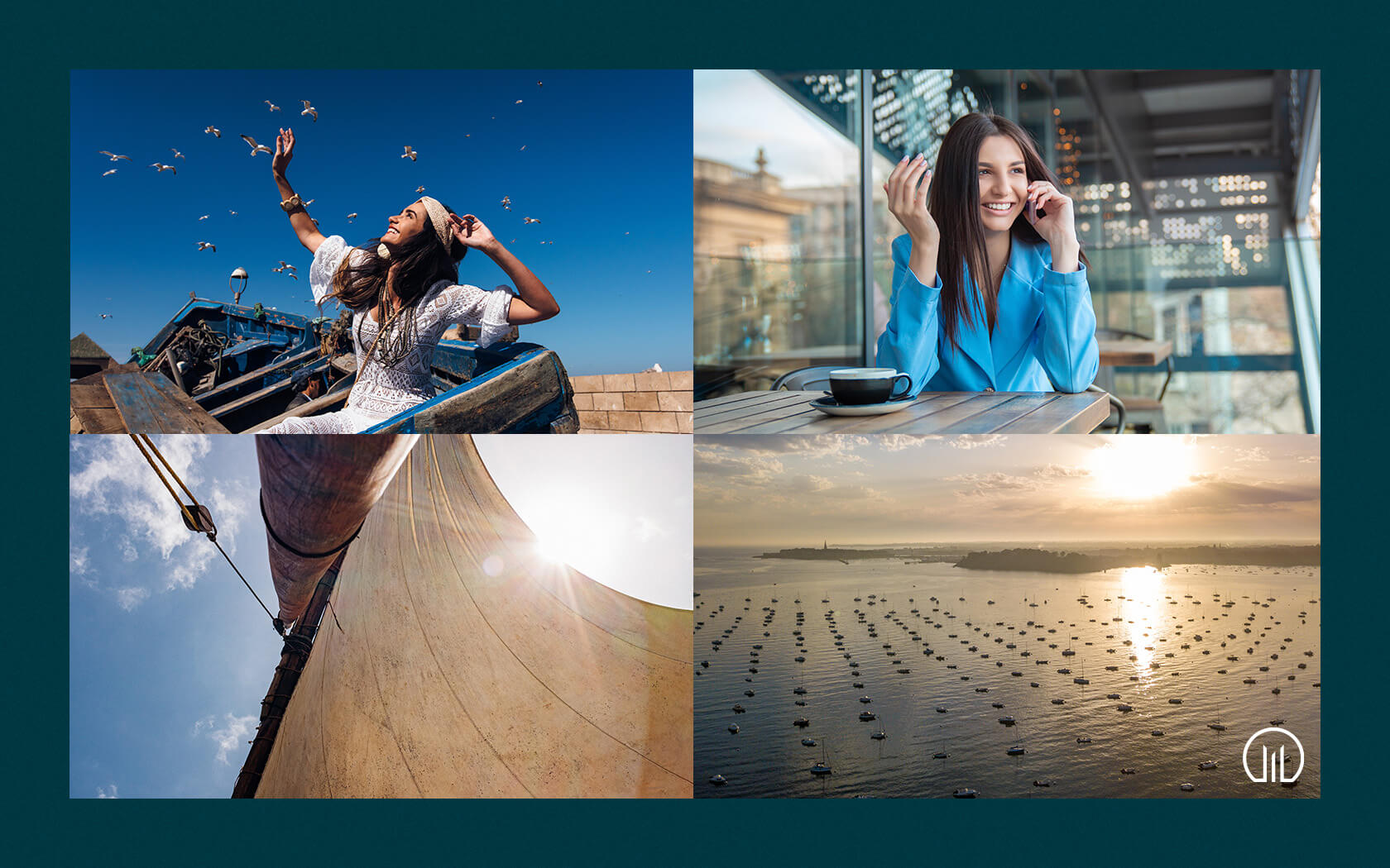
Avoiding tropes of facial expressions and typical emotive cues, we focussed our attention on what would make the location unique. Its uniqueness comes from its historical context and its aesthetic potential. The location is one of the first to play host to Bahrain’s pearl industry. Fishermen would land their catch and their pearls on the coast before heading into Muharraq’s markets to sell their wares in the centre of the island’s ancient capital. The notion of ‘port hole views’ was aired and found a positive response from all stakeholders.
The name was originally written ‘Sa’ada West’ in English. This was simplified to ‘Saada’ as no international English speaker would be able to correctly pronounce the glottal stop and the geographic suffix became redundant due to the other locations (West, North and South) being divorced from the project (they will be developed in isolation from one another at a brand level at least). The iconic form retained the initial ‘W’, formed out of a notional skyline, which represented the views of Manama as seen from across the water.
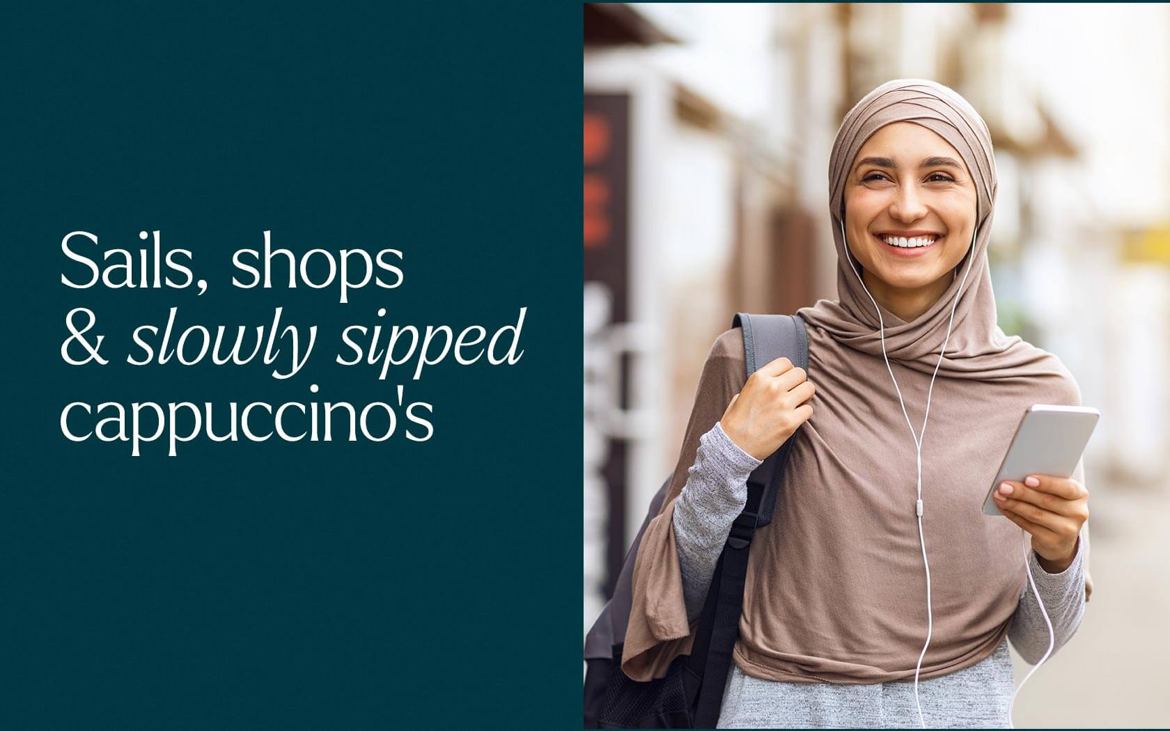
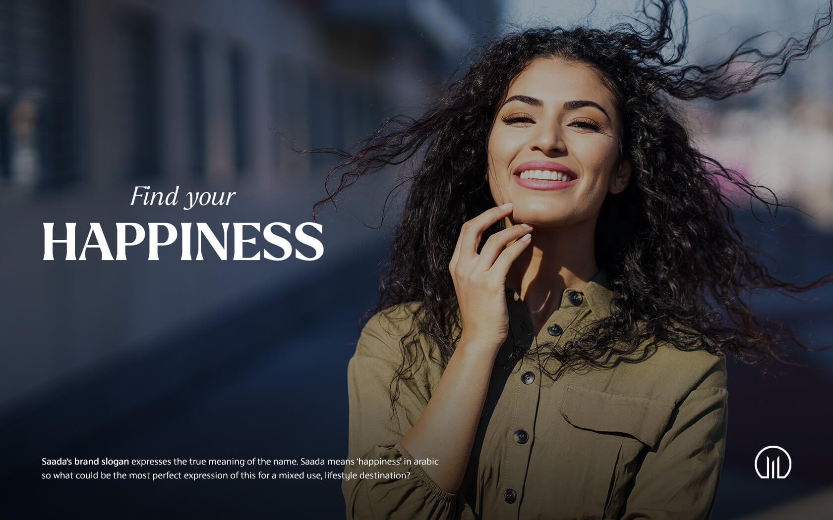
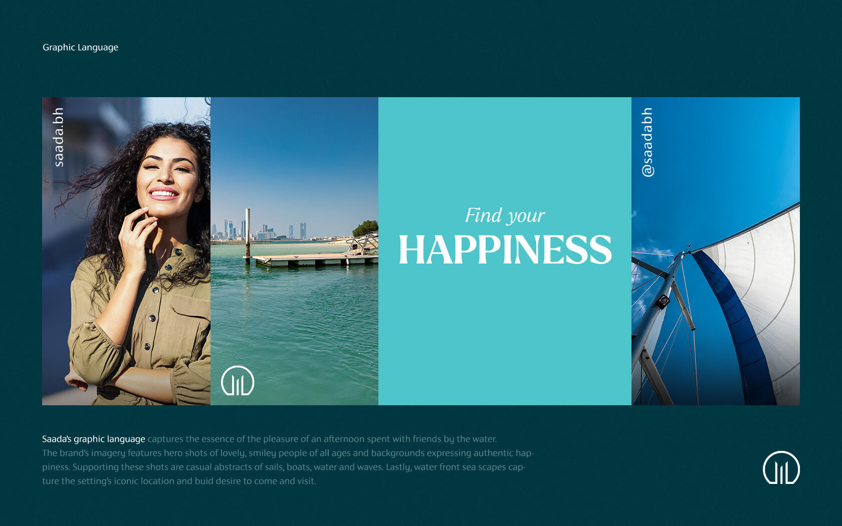
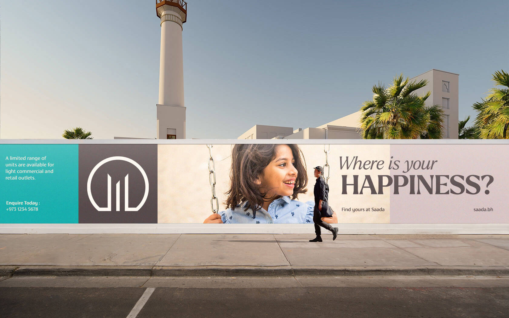
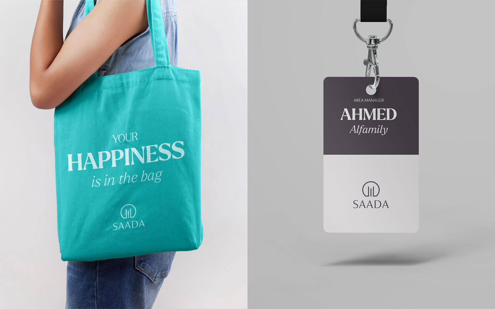
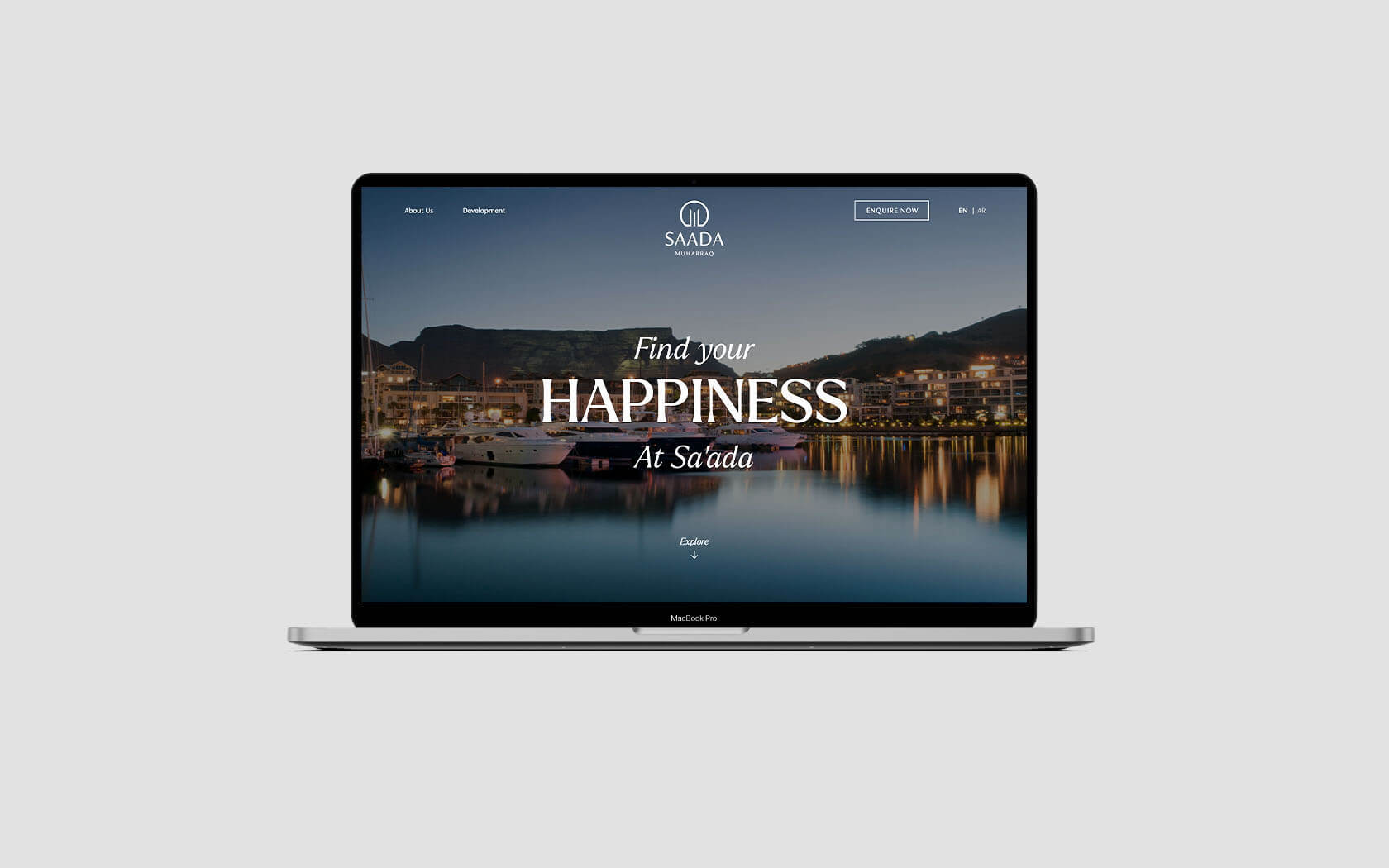
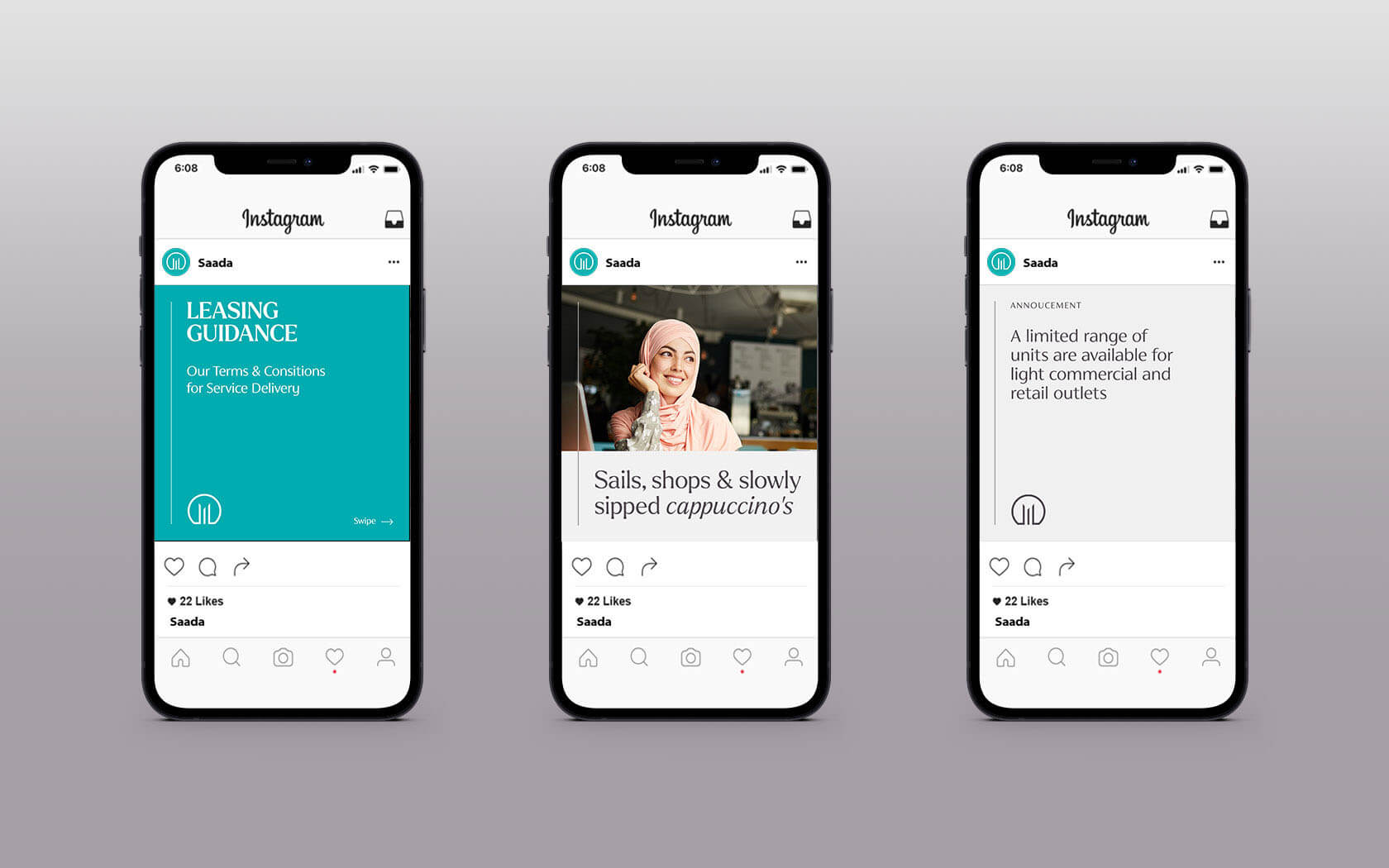
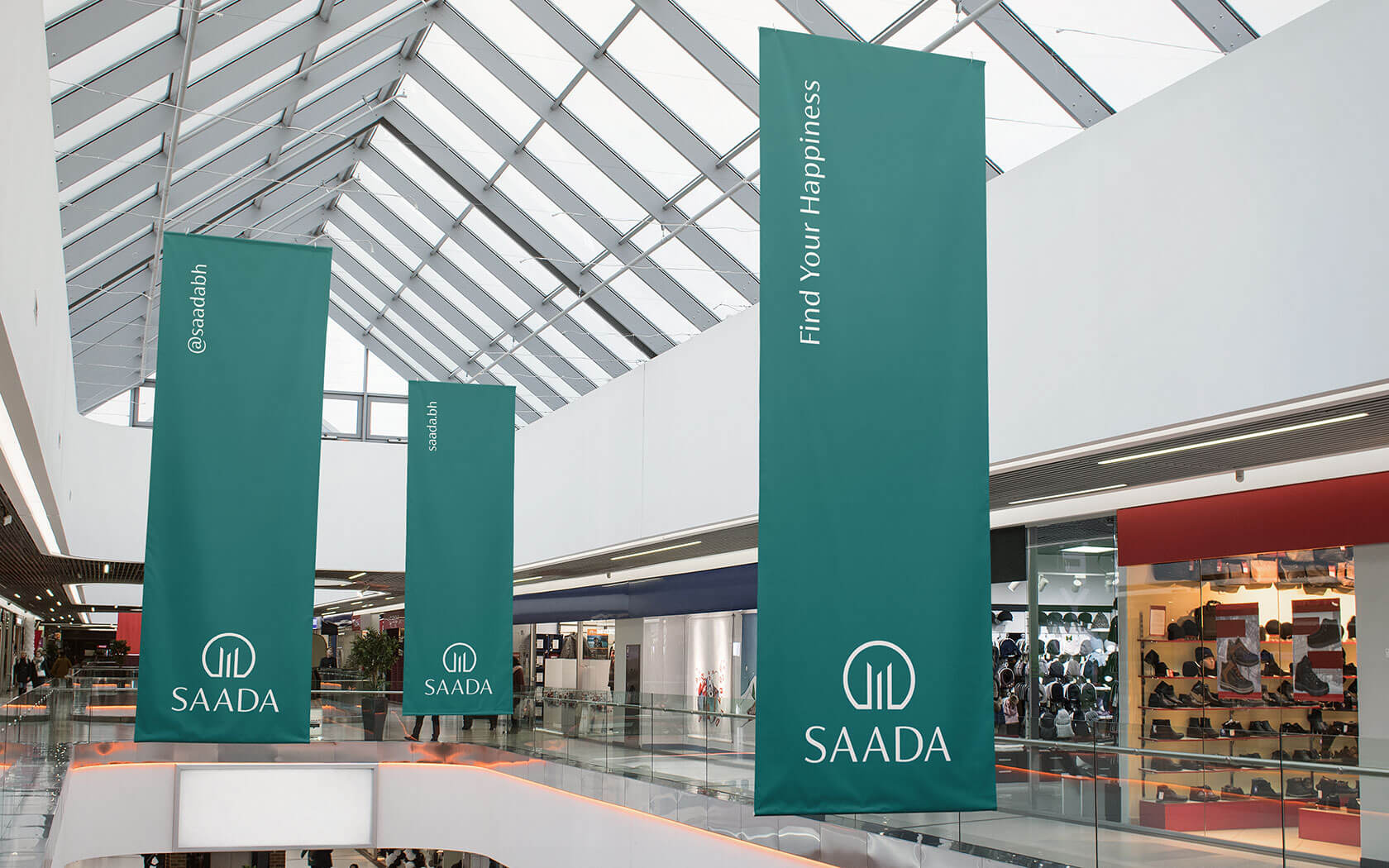
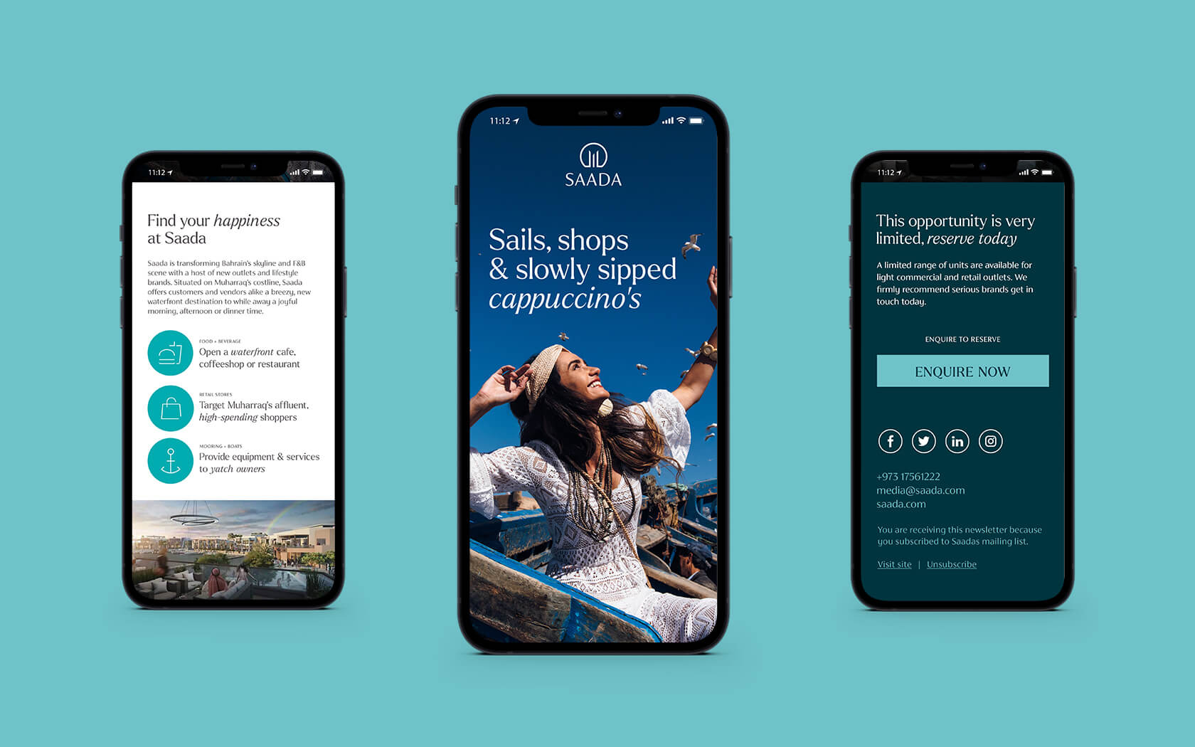
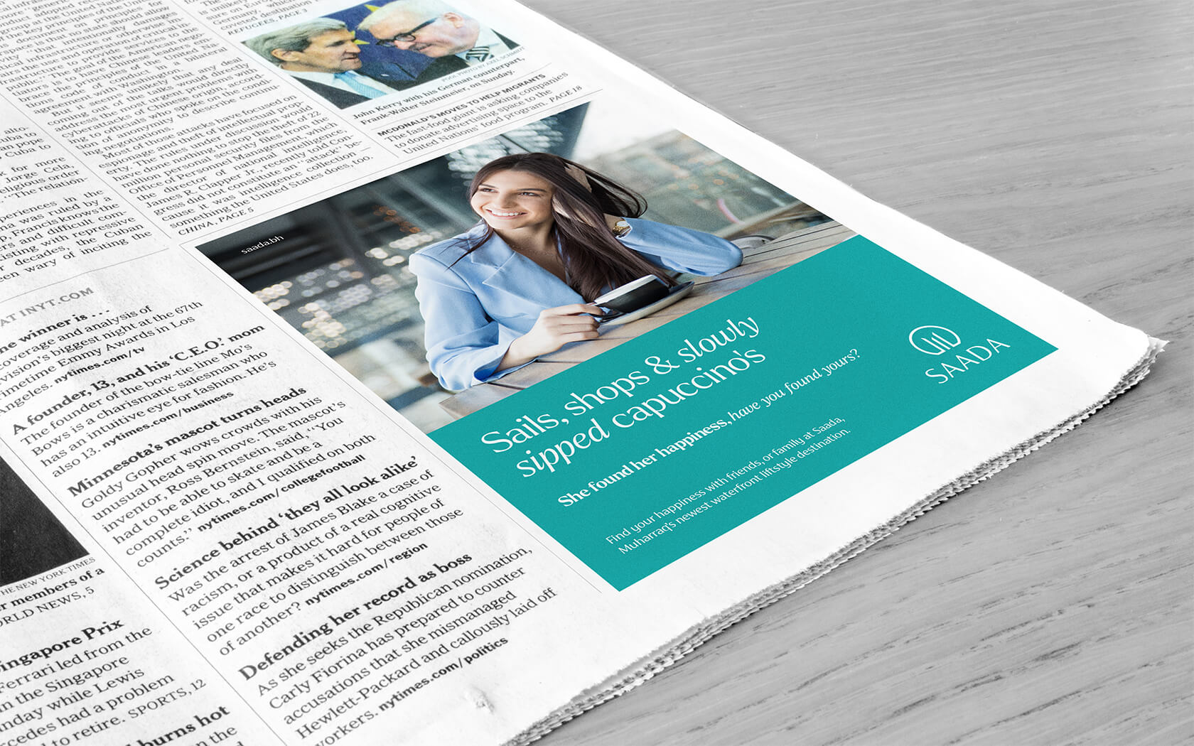
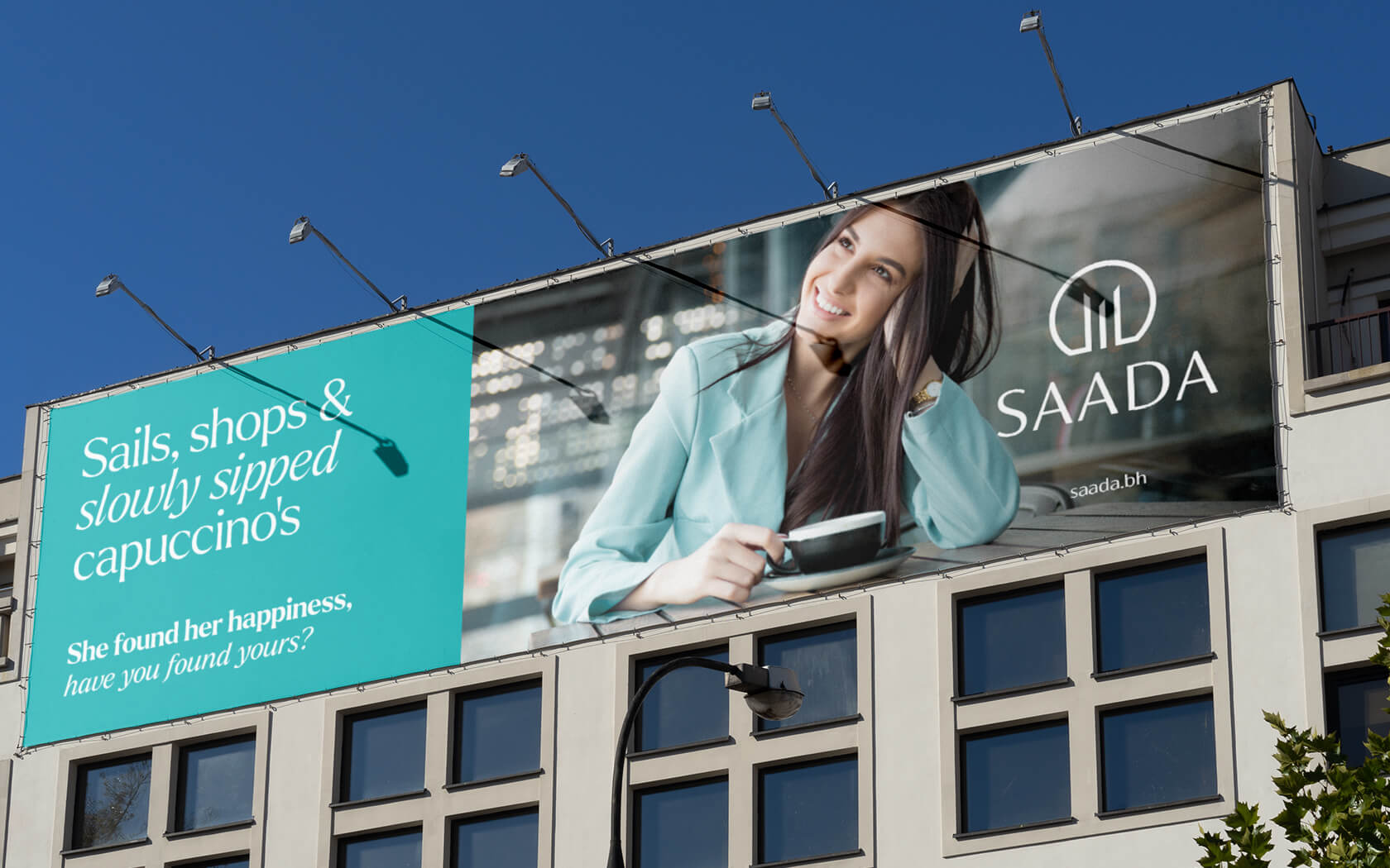
For a slogan, we landed upon ‘Find Your Happiness’, an identifier ideally suited to the notion that Saada was a destination capable of being somewhere everyone could refer to as their ‘happy place’. We then set about crafting a tone of voice that would bring ‘the sea-breeze lifestyle’ to life. The tone of voice expresses this thought in lines like ‘Sails shops and slowly sipped cappuccino’s; she’s found her happiness, have you found yours?’.
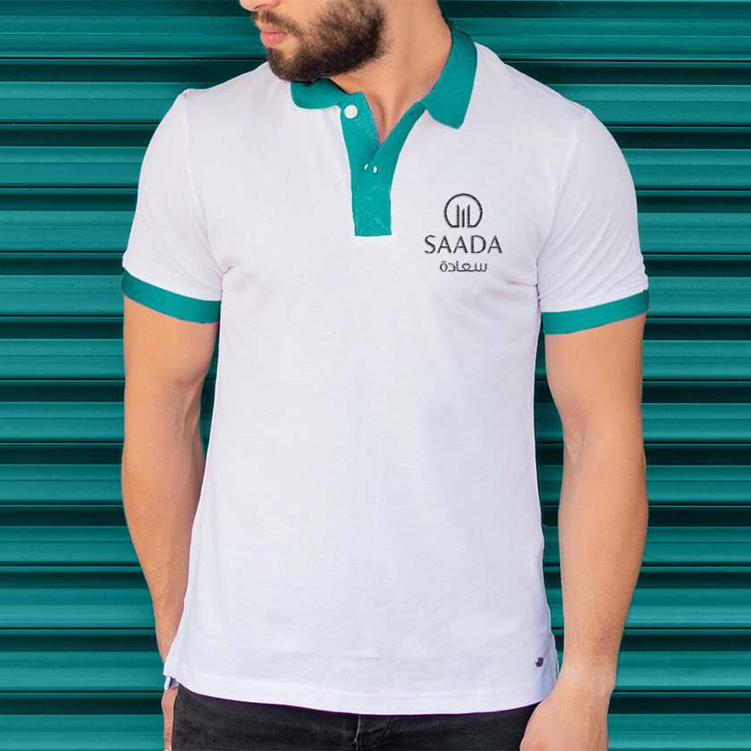
The colour scheme references the aqua green tones of the Arabian gulf, in a range depicting the different hues within a single wave – from the depths of the trough, through the shoulder to the wave’s face and finally the illuminated lip. These colours are supported by a rich and dark Mariana (trench?) Black and a Light Canvas (sails anyone) tone to compliment the oh-so nautical scheme.
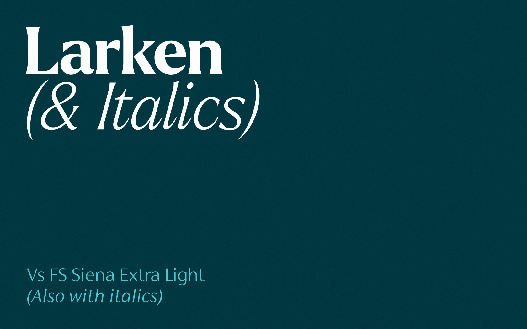
For the type palette, we are using Ellen Luff’s Larken in headline sizes for its sheer presence. A bold and confident serif typeface design, Larken sails between the rocks of the contemporary and breezy classic worlds with ease. As Ellen would say, Larken is “Designed to reflect nature, it creates a sense of natural softness and expressiveness. We pushed the concept into a usability focused direction, to work as a bold tool and beautiful communicator”. Nicely said. Suited to display sizes, the type design is coupled with Fontsmith’s Siena for smaller sizes. Both type families have a classical DNA thanks to the contrasting strokes in their designs.
Results of the Saada brand development project
With a fully integrated brand identity, the Saada destination is now well positioned to present itself as the waterfront designation Muharraq and indeed the Kingdom has been waiting for. While it is early in the build-out phase, we have received wave-upon-wave of positive feedback from the brand team’s leadership as well as the chief exec. The perception of a destination of note is being slowly but surely hoisted up for all to see. To see the Edamah’s website, click here
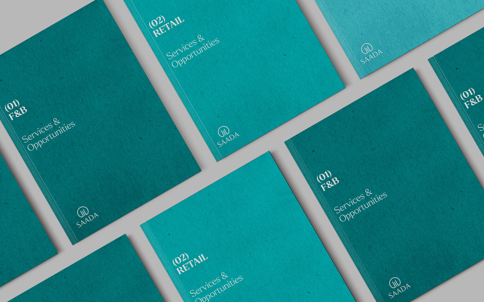
Services delivered
Brand Design, Visual Identity, Slogan, Tone of Voice and Graphic Design
The project process was deeply collaborative, the results highly distinguished and very appropriate to brief. The final mark is elegant, the aesthetic engaging and the tone of voice enlivening. In a word, ‘happiness’.
Nader Khalfan. Director of Marketing. Edamah.
Details View Close


Pretty happy with how this one turned out. Pun intended.
Liam Farrell. Creative Director & Partner.
GFH.
Calendar
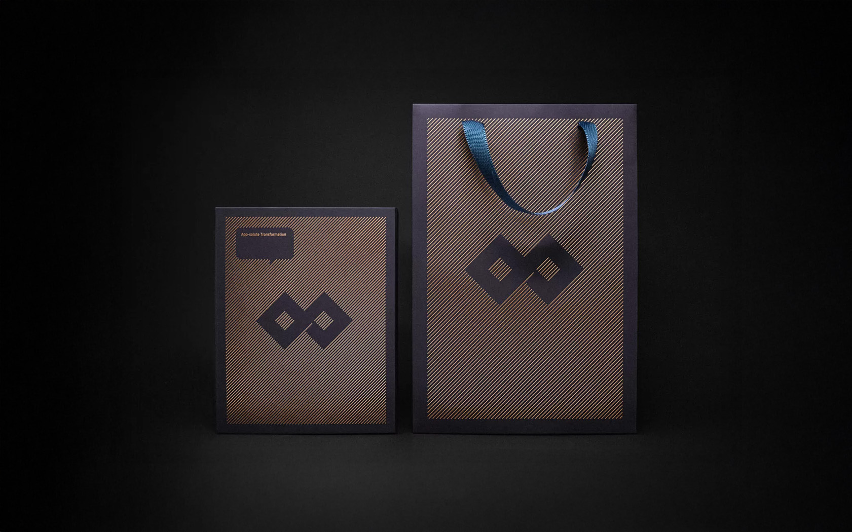
It's 2025 and our illustration work is enjoying an app-solute resurgence with this new calendar for GFH.
GFH.
Rebrand
Rebranding one of the region's most notable Islamic investment banks into a new financial group.
Gtech
Rebrand
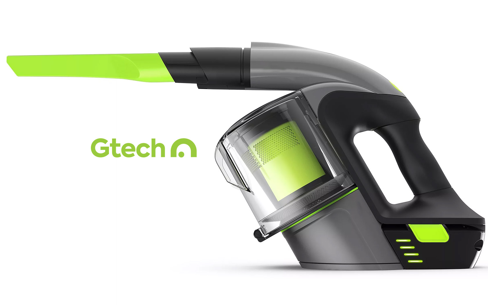
Britain's most-loved homeware brand gets a perfectly engineered brand strategy and revised identity.
GFH.
Annual Report '21
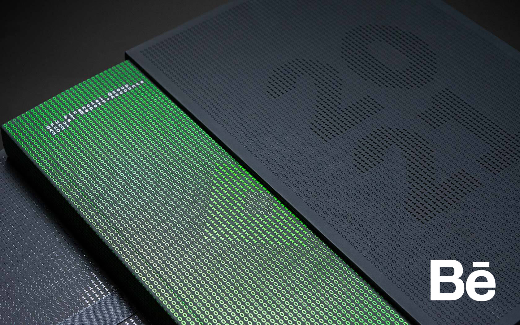
If anything created competitive advantage over the pandemic years it was technology. The 2021 Annual Report celebrates the company's understanding of how technology has influenced the past and will affect the future.
EDM.
Bilaj Residences Web
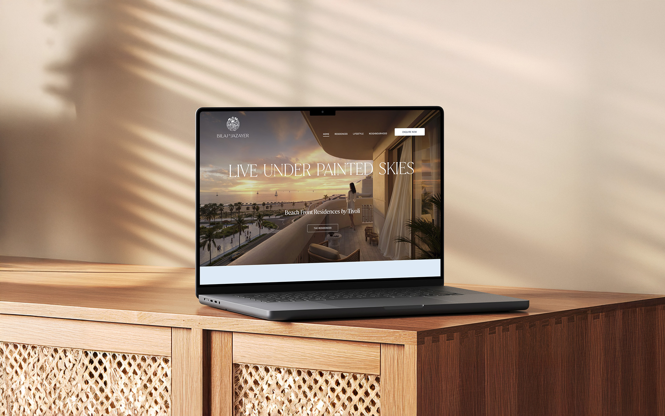
A new and super elegant digital home for Bahrain's award-winning destination brand, the elegant Bilaj Al Jazayer