Rawk. Branding
Raw for a Cause
Creating the Rawk Brand
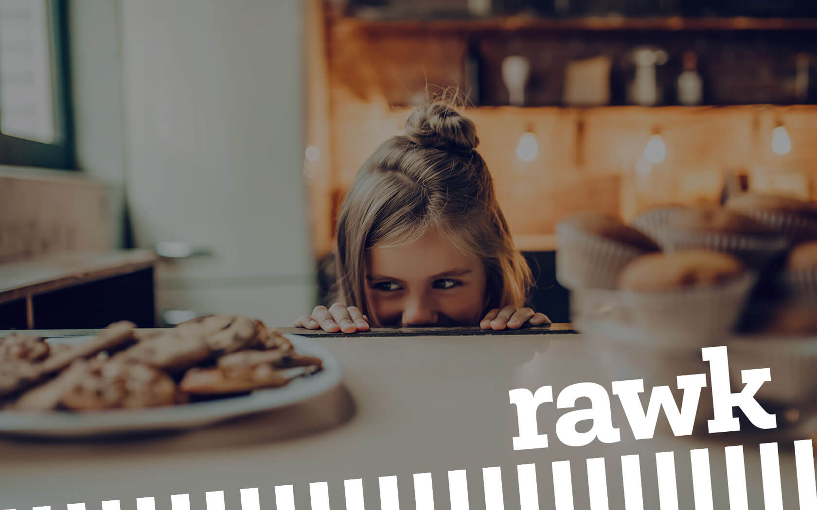
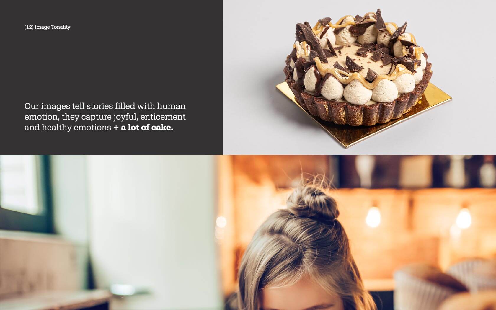
The Rawk brand identity was always going to challenge the status quo, as the product themselves upend the traditional cake making process and moreover, the results are nutritious and healthy. Rawk’s products are quite unlike your typical cake; the result of eating one is satisfying to your mind as well as your taste buds – you feel better knowing you’re feeding your body with healthy, nutritional goodies. They really are that good.
Unisono has been involved in the Rawk brand since the start, helping to refine the product quality as well as the marketing and the Rawk brand identity. The look is as unconventional as the cakes – while the cakes are patisserie quality treats, the substance of them is quite revolutionary. As it the graphic language and tone-of-voice the brand now employs.
The key challenges for the rawk brand identity project
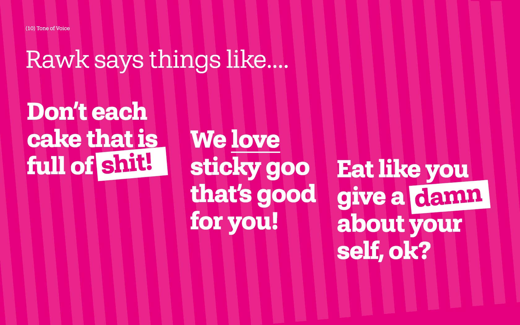
Our key challenge was how do we create a Rawk brand identity that could communicate how different the brand was from its contemporaries as well as reach across to the traditional cake buyer. The brand is upending the traditional cake business so needed an identity that was equally radical and yet also human and approachable. We were clear that Rawk needed to steer clear of visual tropes employed by typical cake, cafe or health brands. Our role was to find the right voice which could create distinction, belief and foster acceptance of the products in the brand’s target audience.
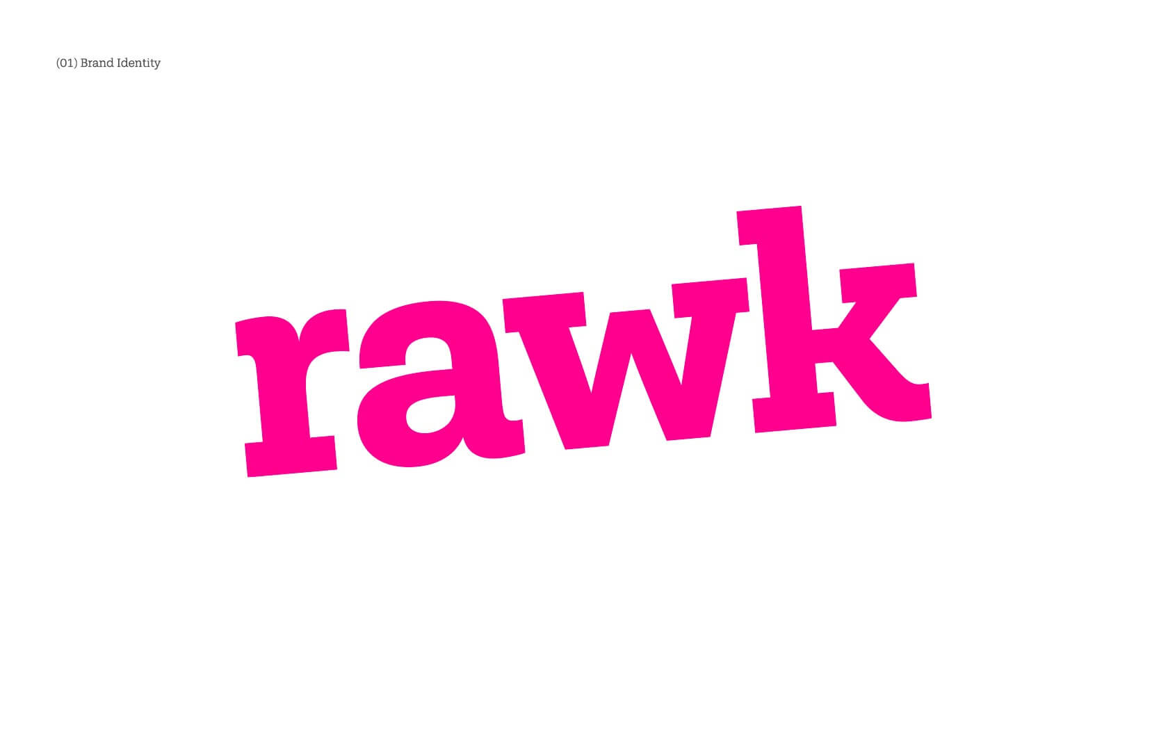
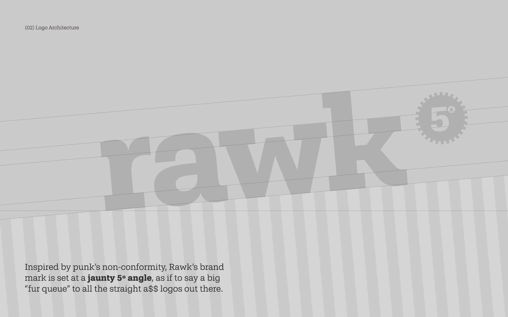
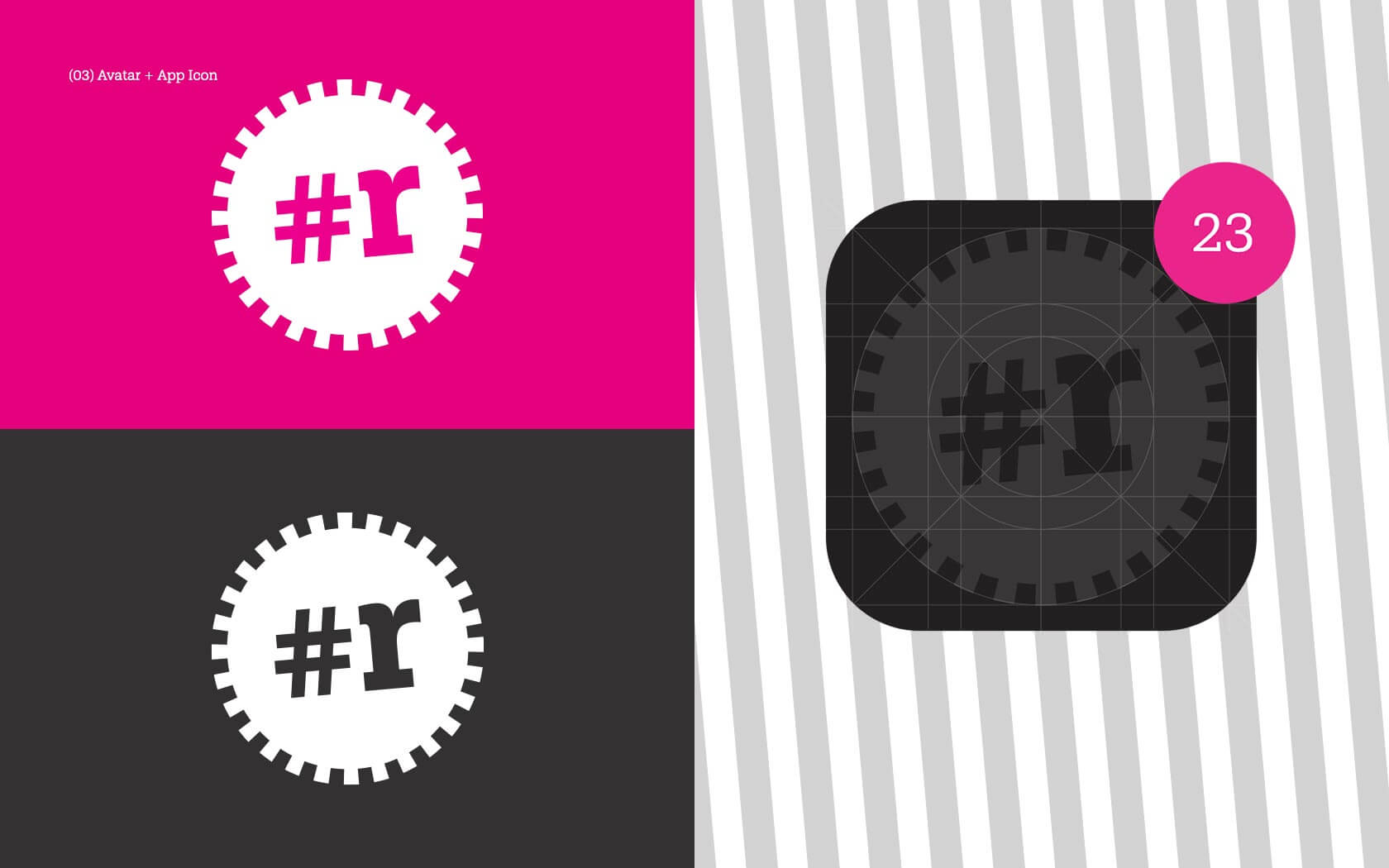
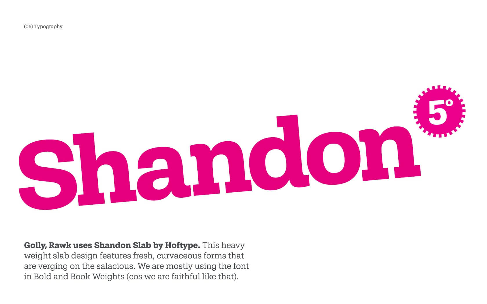
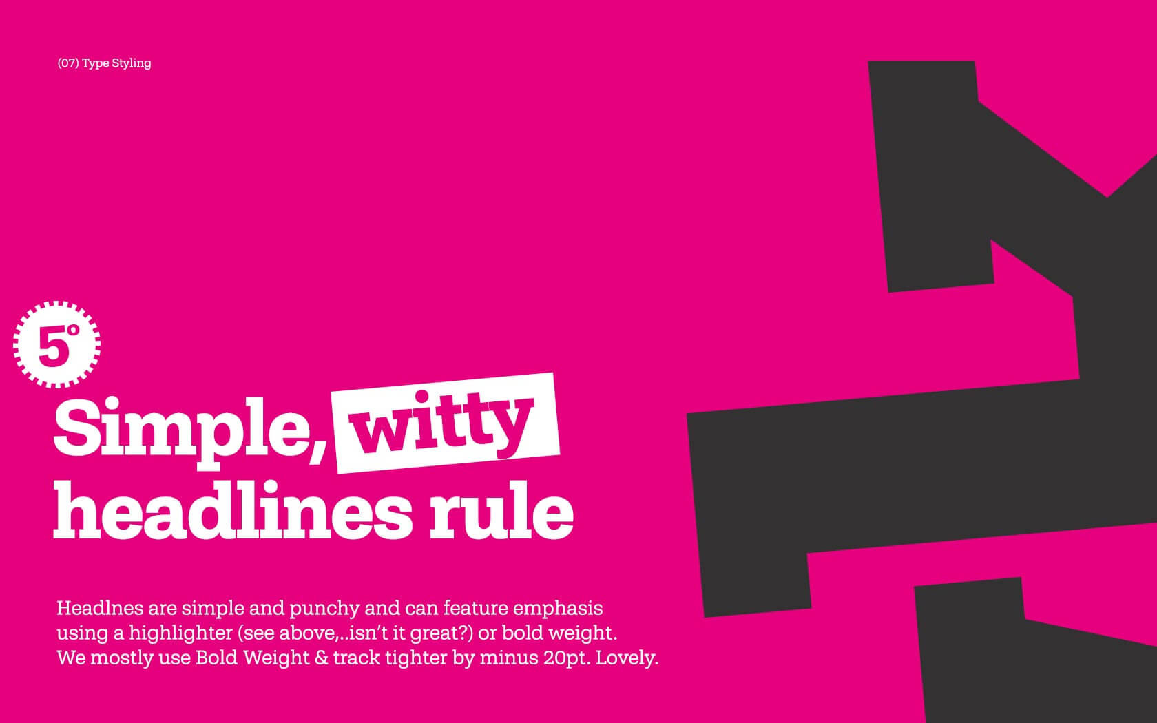
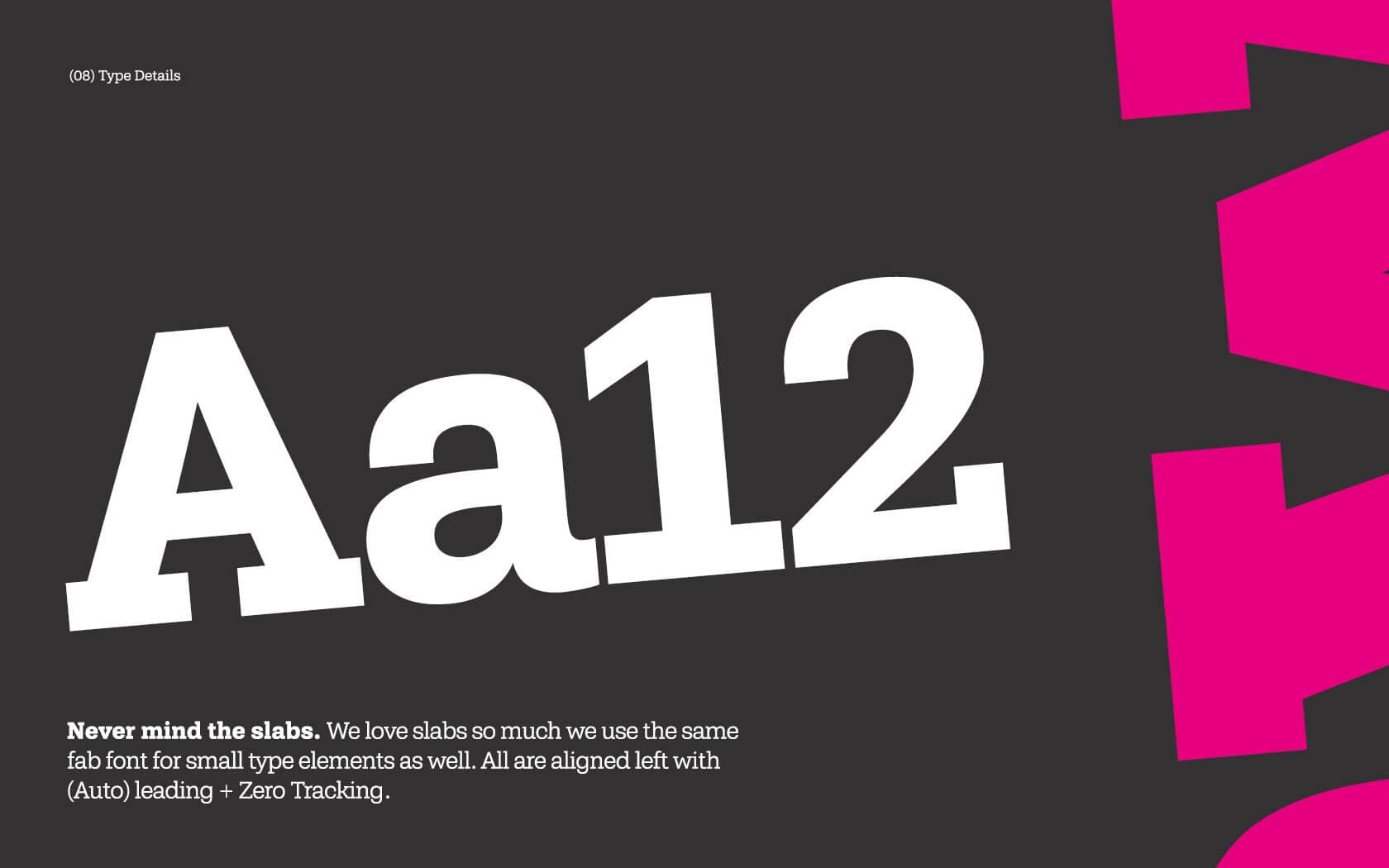
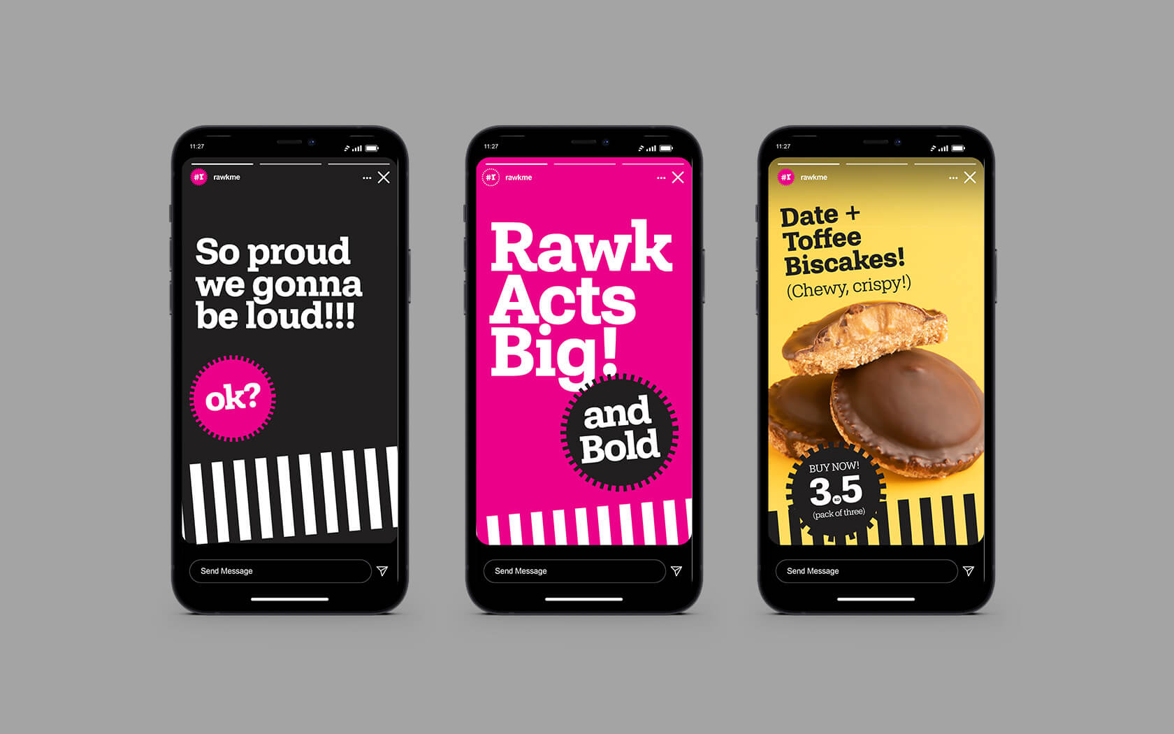
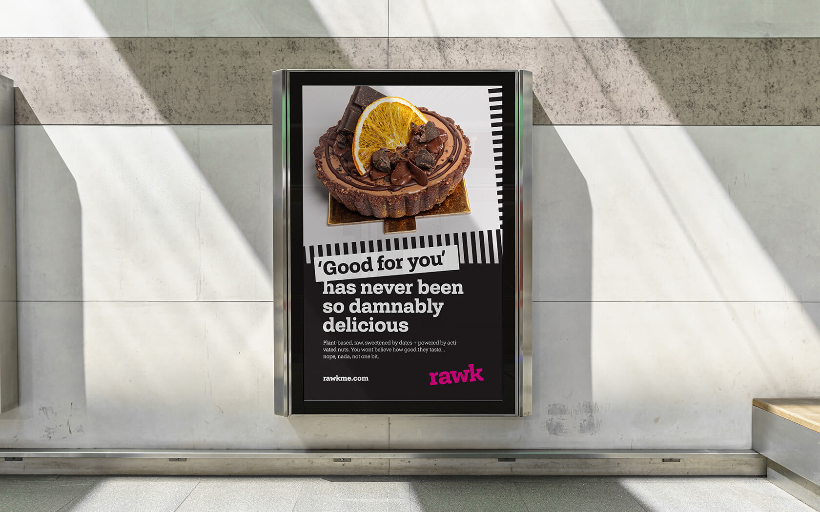
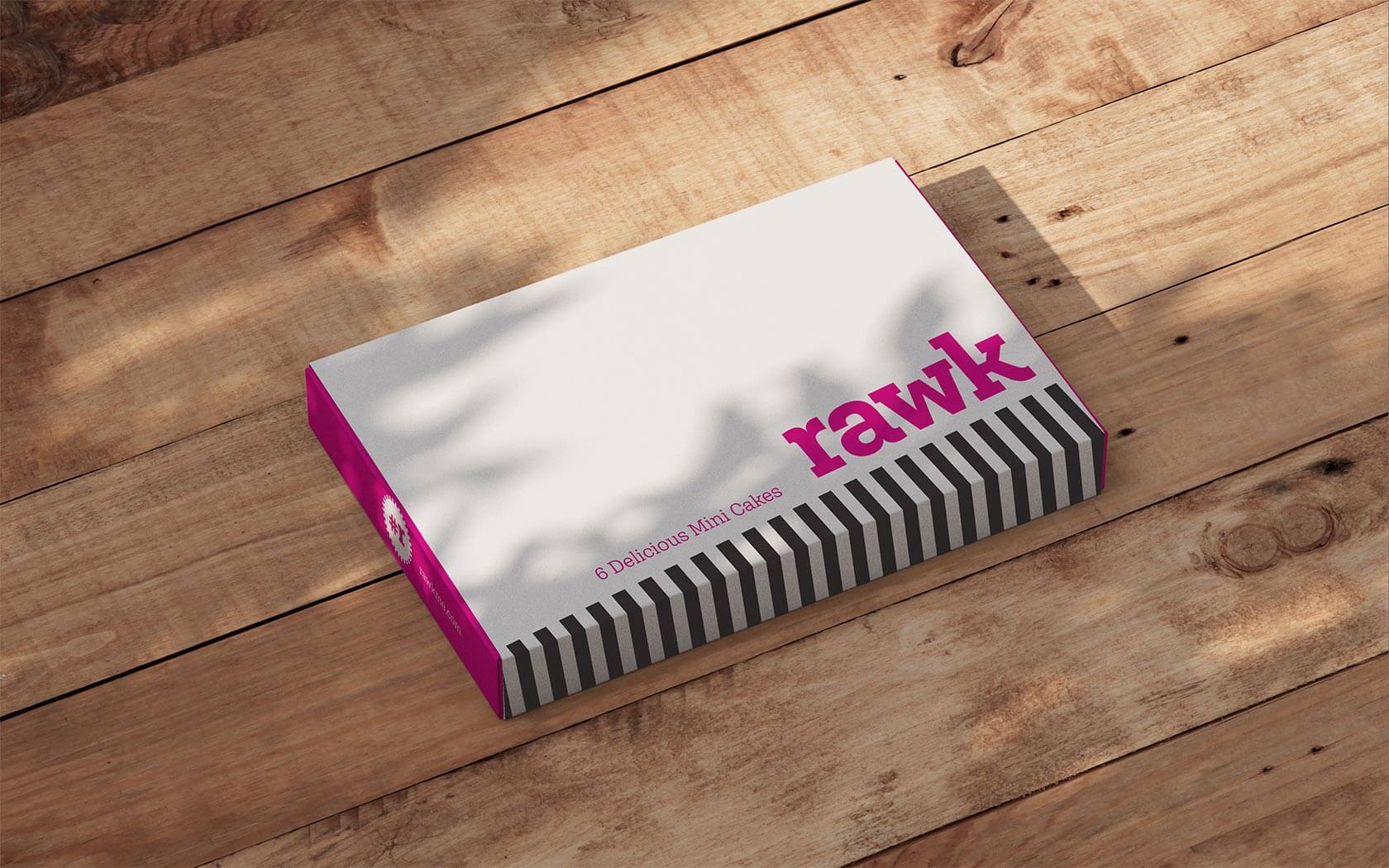
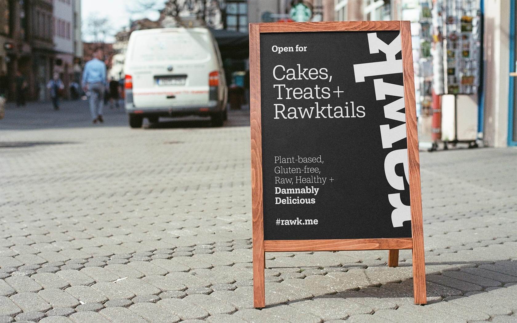
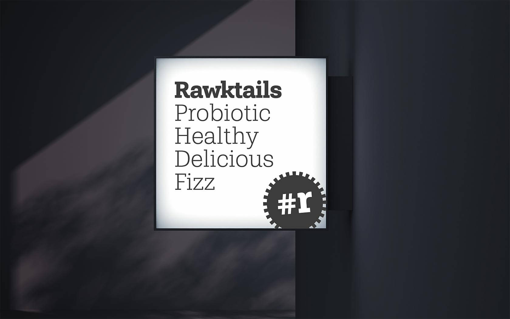
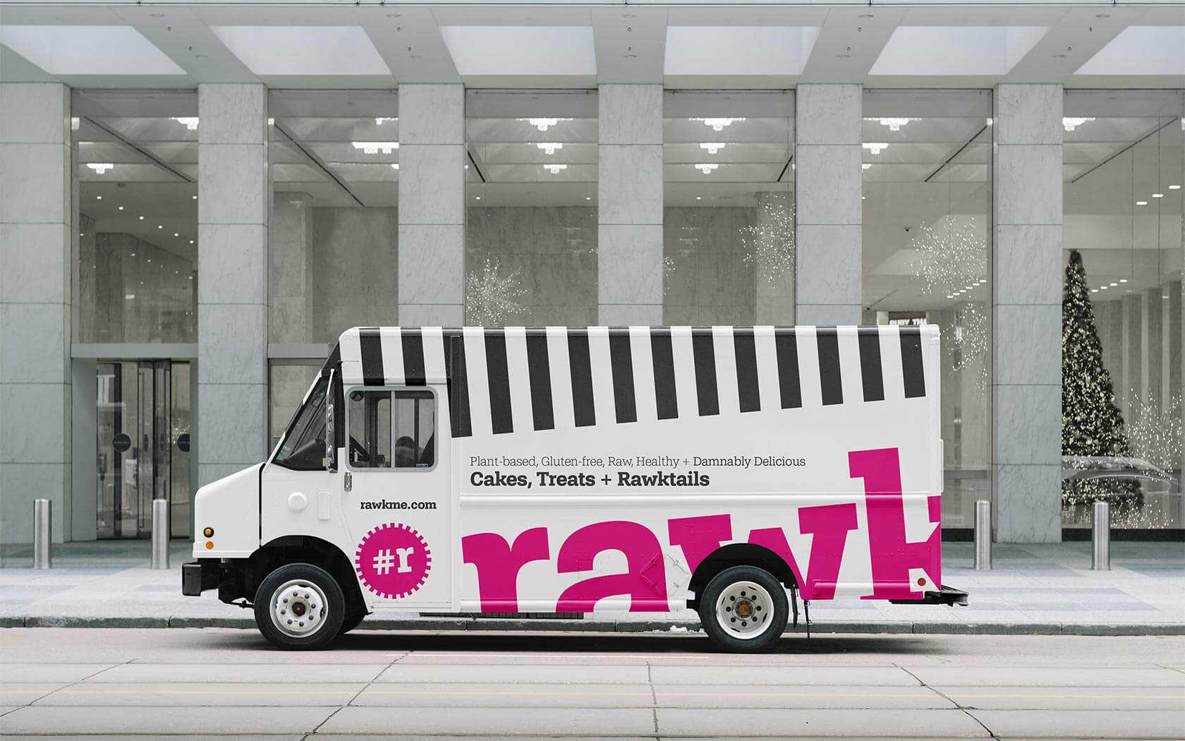
With a name that works, we started to create a graphic language that would support the raw, punky edge and have enough width to be able to reach from the health-conscious to the regular ‘treat’ market. From the initial design, a refined and simplified form was presented for feedback and consideration, the final form emerged from this exercise and the lowercase wordmark has started to be applied across all touch points. The logo is based on the brand font Shandon Slab, a fabulously characterful type design by renowned typographer Dieter Hofman, the founder of Hoftype. The lettering has been tracked tighter and delicately kerned before applying a signature 5º rotation. The final mark is a fun, playful and slightly quirky mark suited to such a fun, challenger brand.
A strategic approach to the rawk brand identity
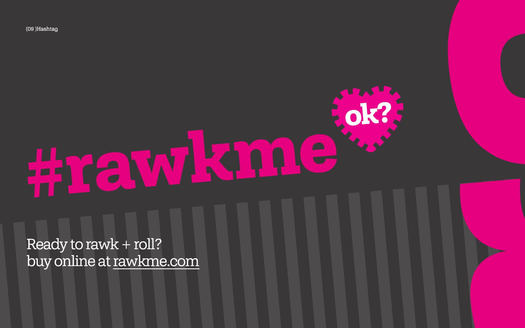
From our discussions with the founder Yusra, the brand’s punky, contemporary narrative came to life. The name fits with the strategic direction of the brand and creates the perception of a rocking + raw brand.
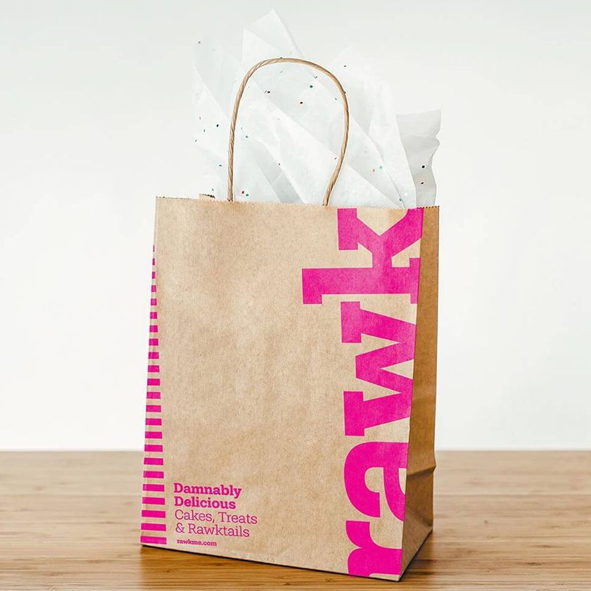
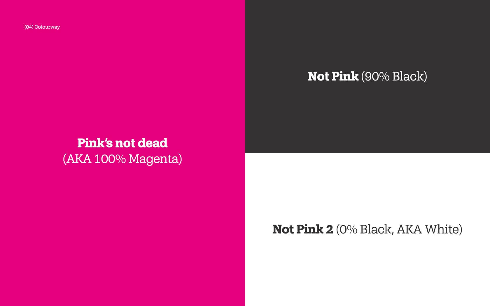
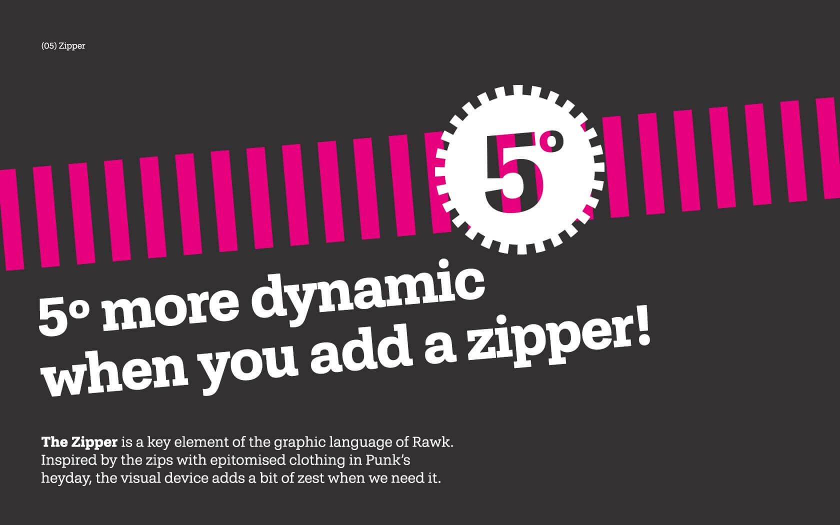
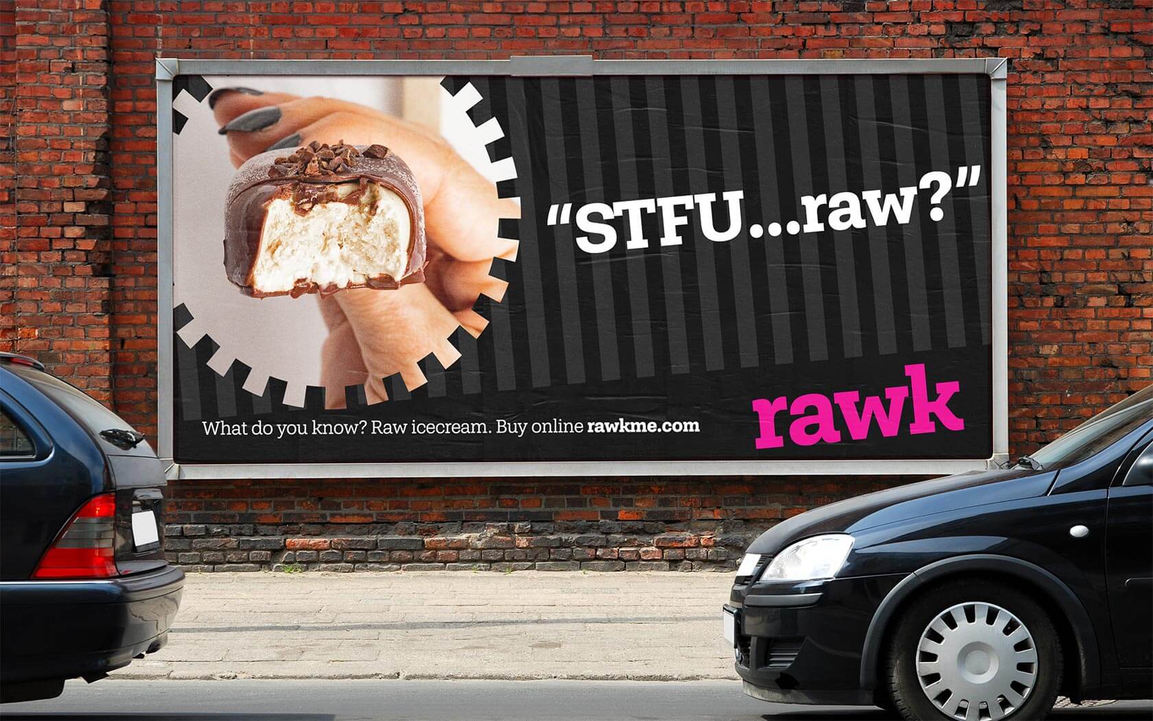
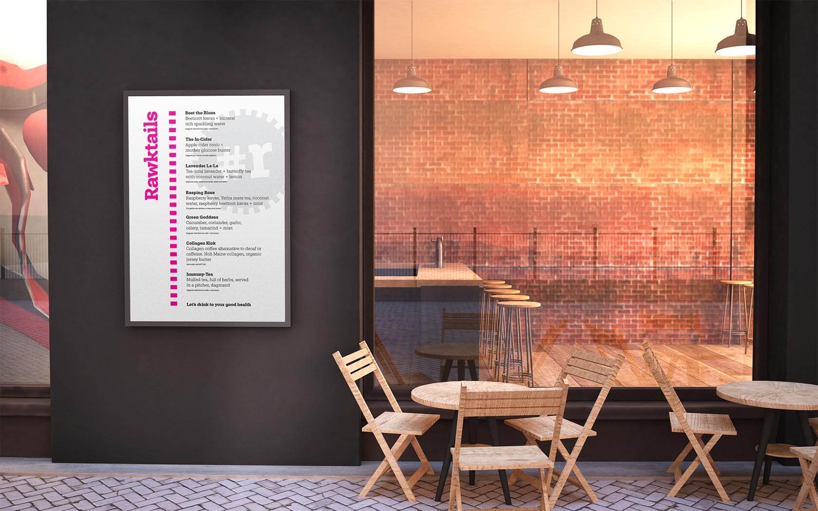
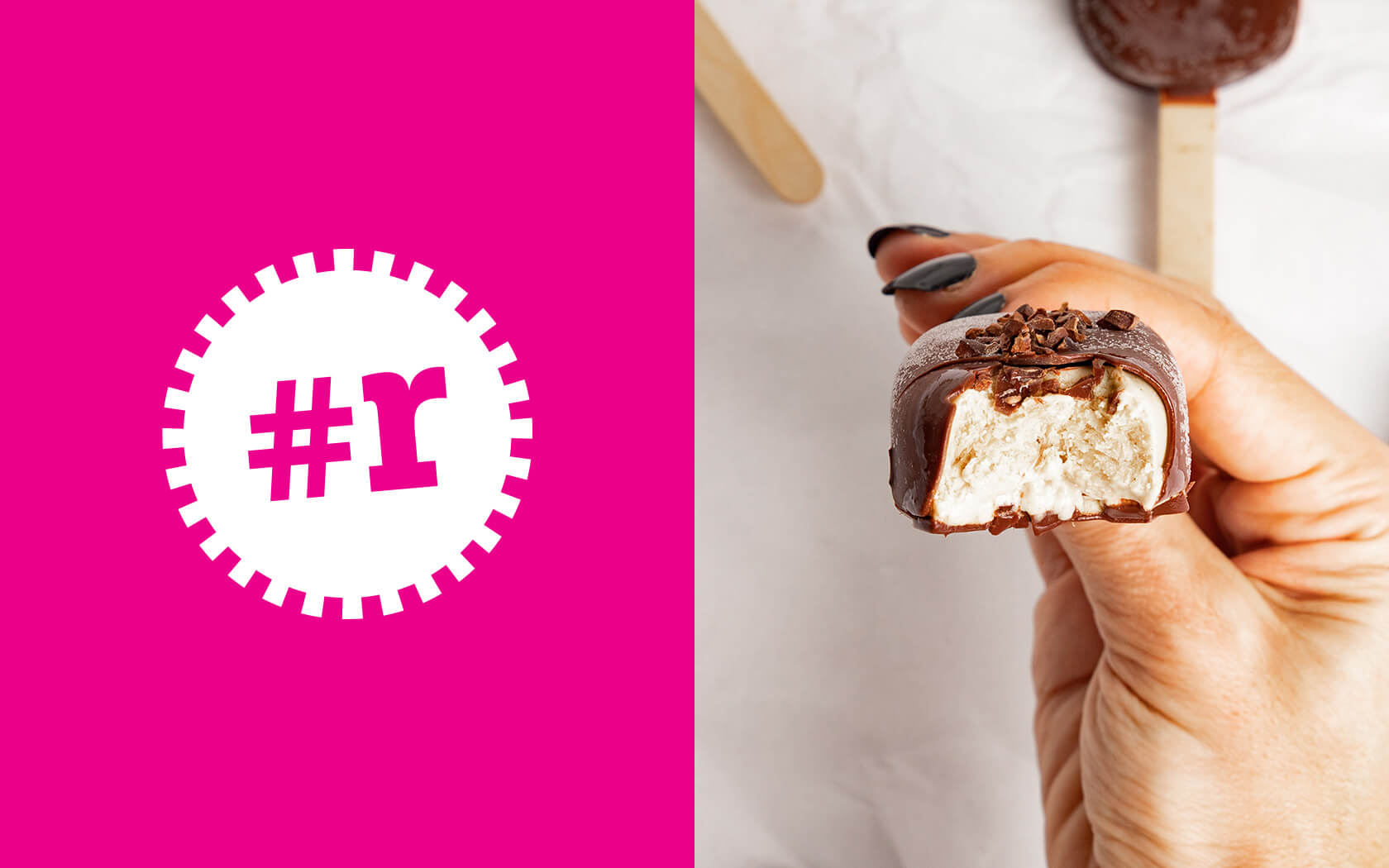
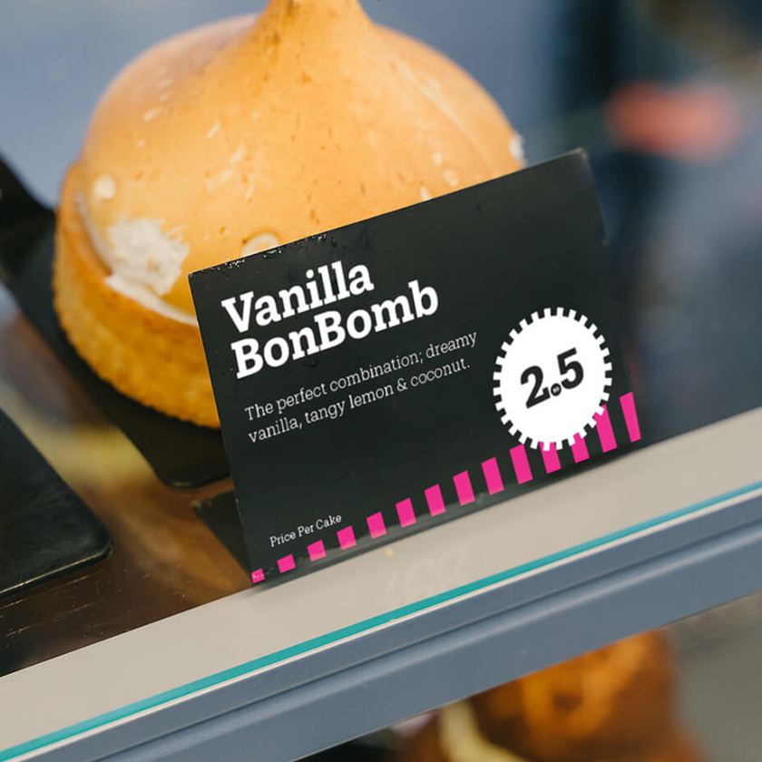
The colour palette is pink (100% process magenta, to be precise), supported by Black and White – simple. The type palette is singular and based on the logo. The finished aesthetic is one that is clearly punky, refreshingly bold and un-cakey and jolly bleeding well bold. The visual device is called a ‘zipper’ and references the zips which characterize ‘punk’ fashion in the 1970’s.
The results of the Rawk brand identity project is jolly tasty
The rawk brand identity has launched internally and externally and has earned a great response so far from internal staff to external stakeholders alike. Customers have been consistently positive about the results (they love the pink!) and the brand is now being applied to the new cake store in Bahrain – expect more soon. To see Rawk’s website and purchase come cakes, click here
Services delivered
Brand Design, Visual Identity, Slogan, Tone of Voice, Packaging, Apparel, Merchandising, Advertising, Graphic Design and Web.
I love it, the pink, the look and feel… and people respond really well to the identity.
Yusra Al Riffai. Founder, Rawk.
Details View Close
We admire the bold simplicity of Rawk’s raison d’être. “Make cake that’s good for you”. We love how the brand is ‘kicking ass out of tradition’ and feel the identity solutions fits snugly to their mission.
Liam Farrell. Creative Director & Partner.
Ras Hayan Village.
Branding
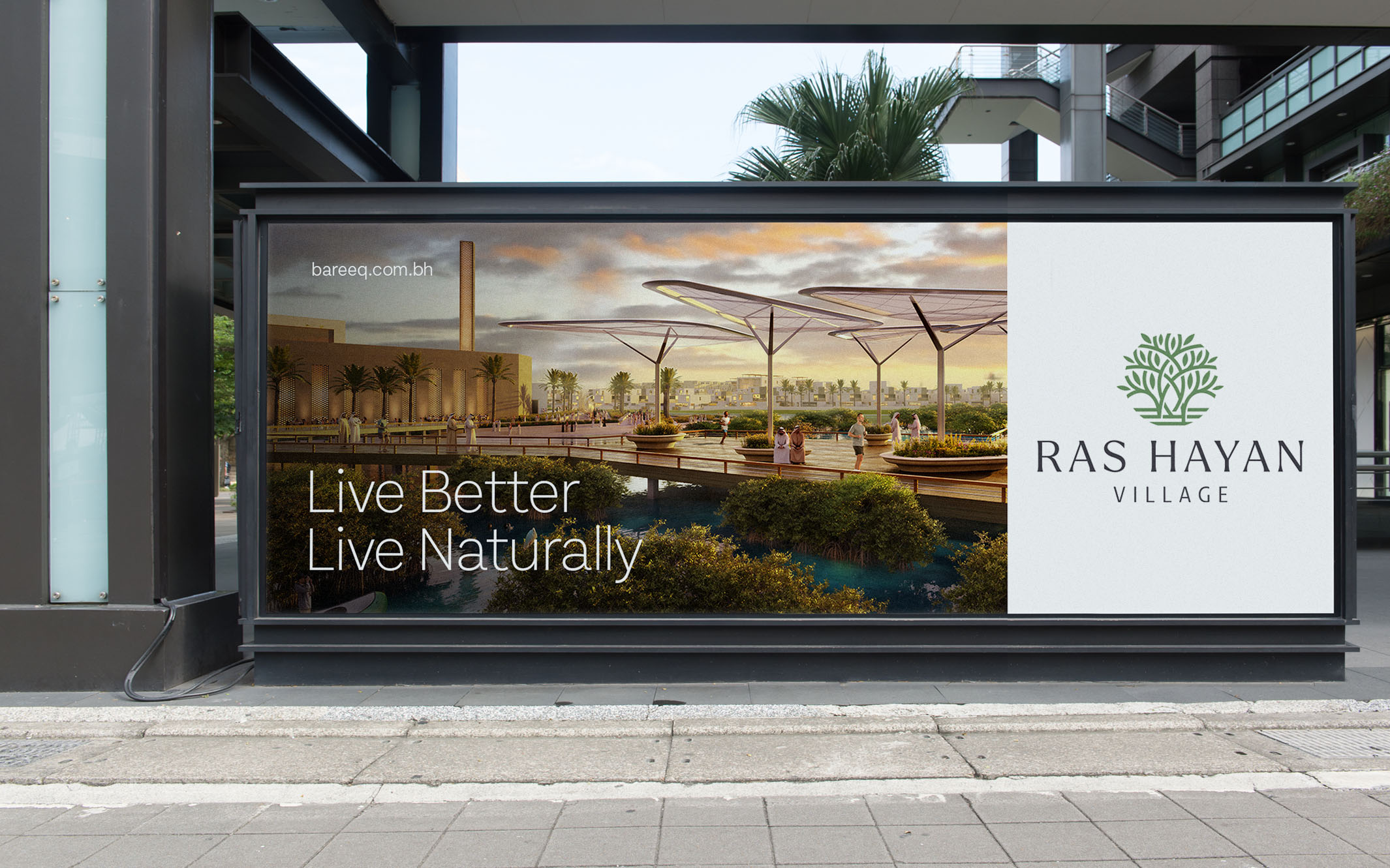
When Bareeq Development asked us to create the brand for Ras Hayan Village, their pivotal and inspiring new ecological real estate development, lets just say we were positively charmed.
GFH.
Annual Report 2024
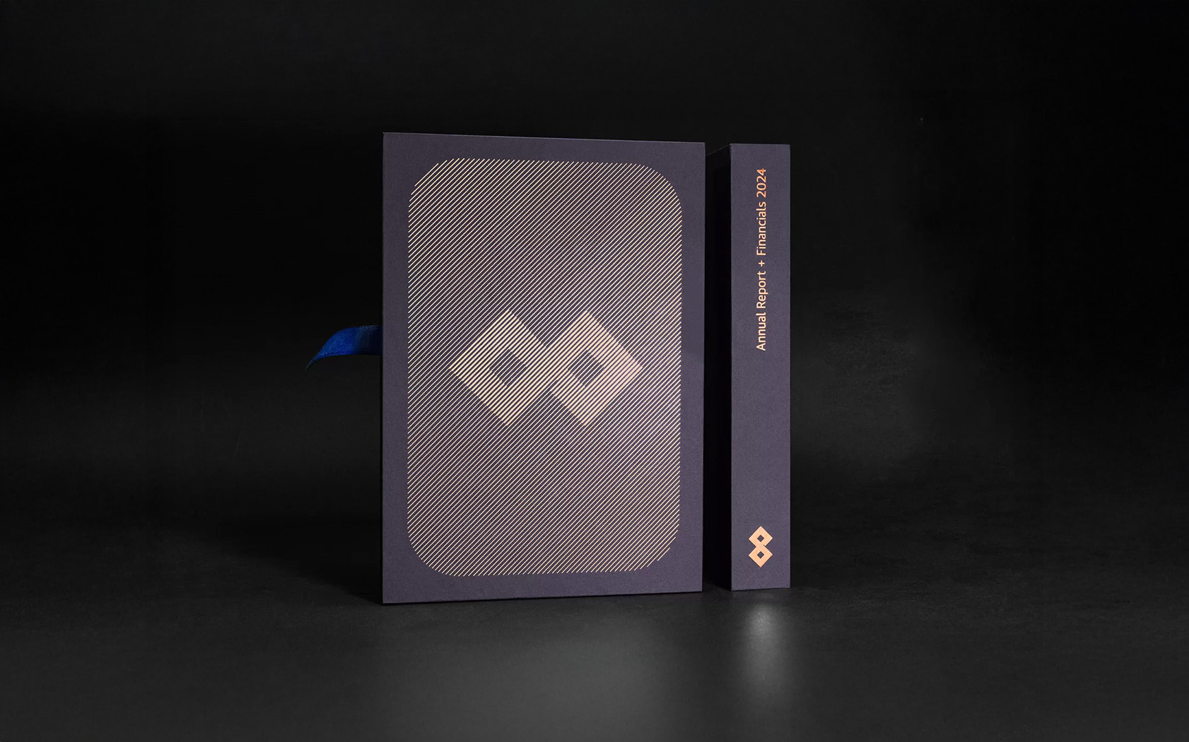
It's 2025 and our annual report work for leading investment bank GFH is looking app-solutely stunning! Enjoy.
Black Stripe.
Rebrand
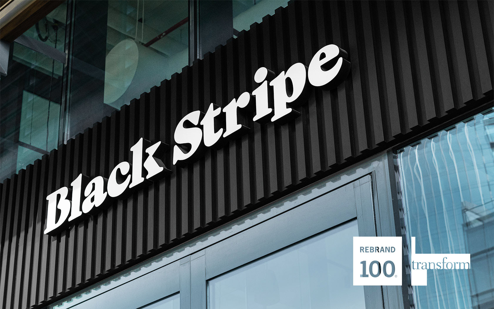
Nobody knows how to rock a bread roll quite like Joe's Mama and her new band... the almighty Black Stripe Burgers.
Tivoli
Brochure
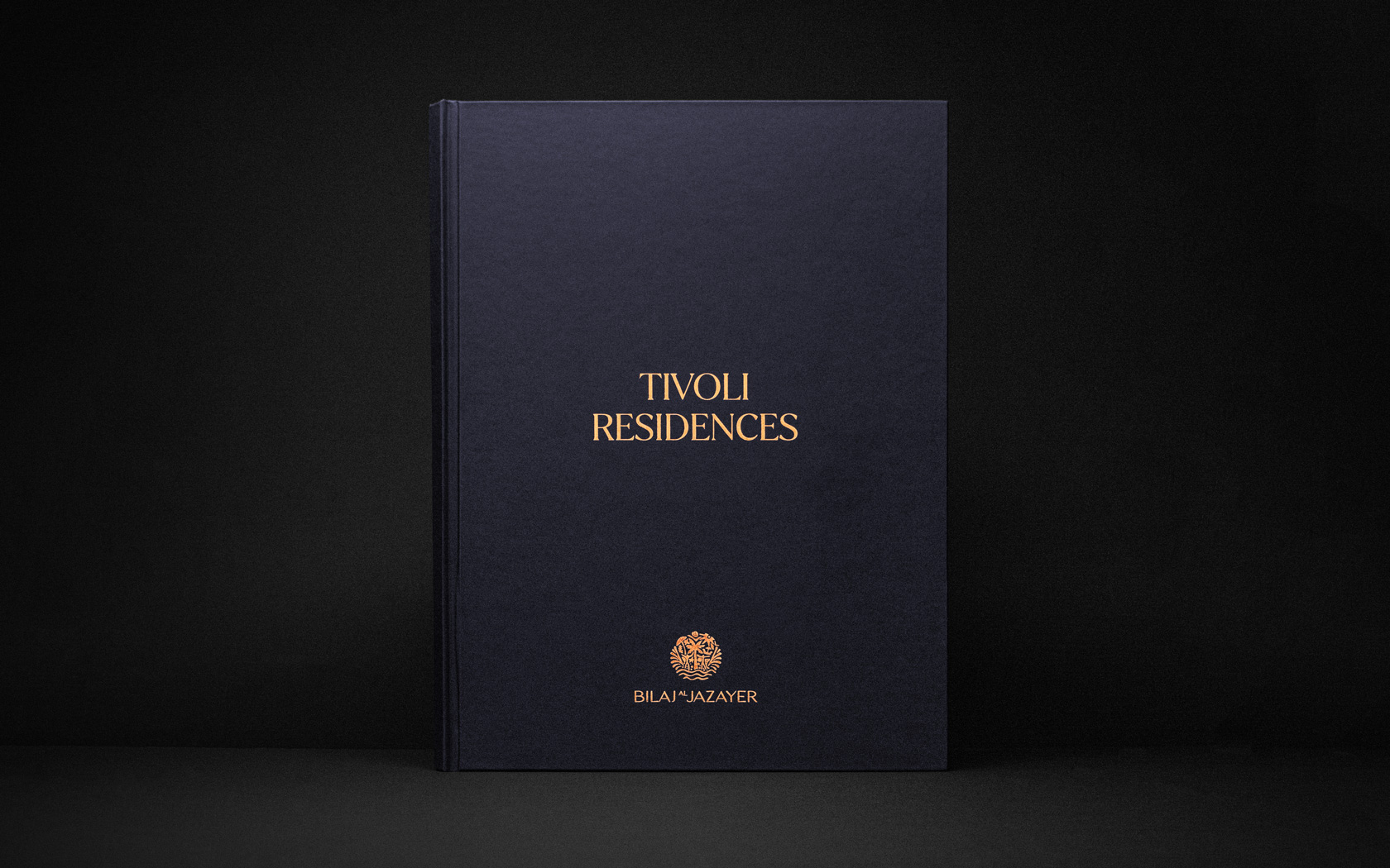
Prestige papers, bespoke treatments and delicious foil finishes set this Infracorp investment brochure well apart from the rest.
BIW.
Rebrand
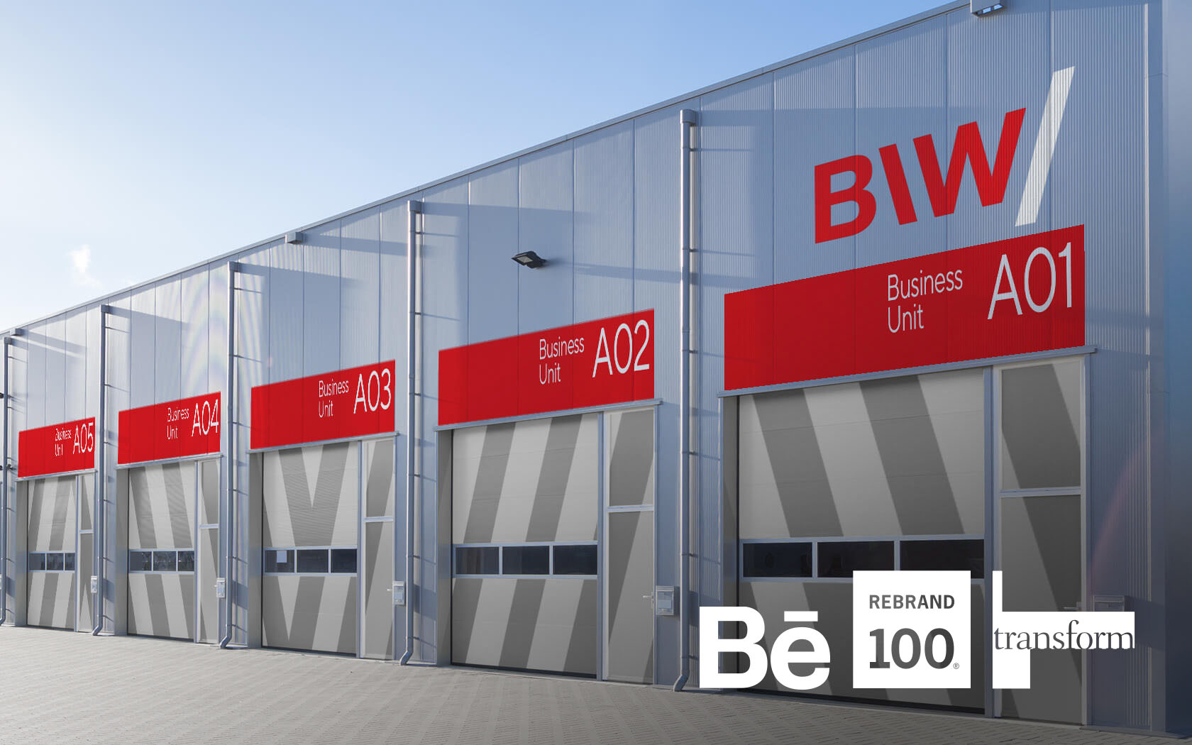
BIW’s award winning brand helps industrial firms to start up in Bahrain. It's where business begins.