Bahrain Rugby. Branding
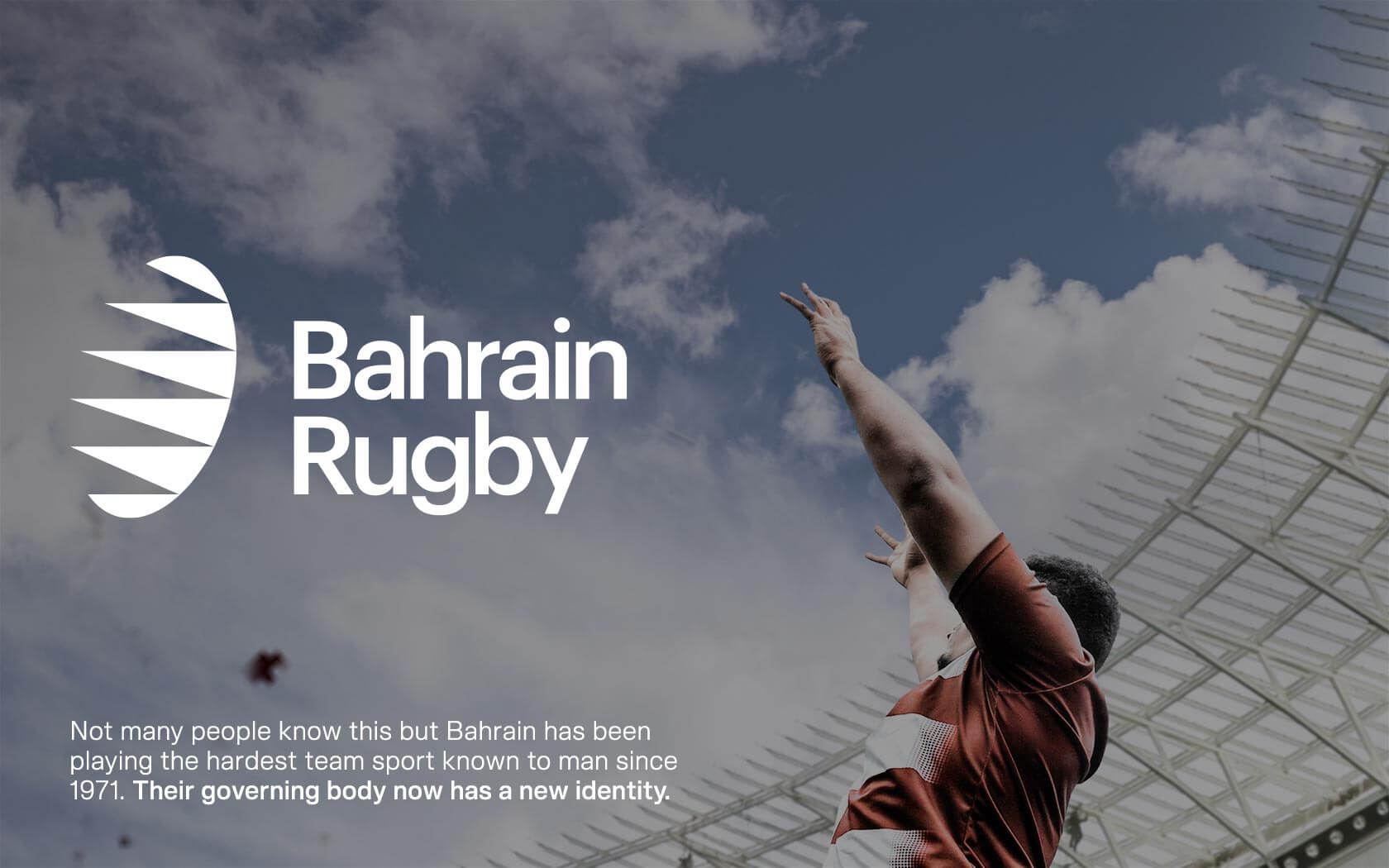
A Win for Bahrain Rugby
Creating a new brand identity for Bahrain’s Rugby scene
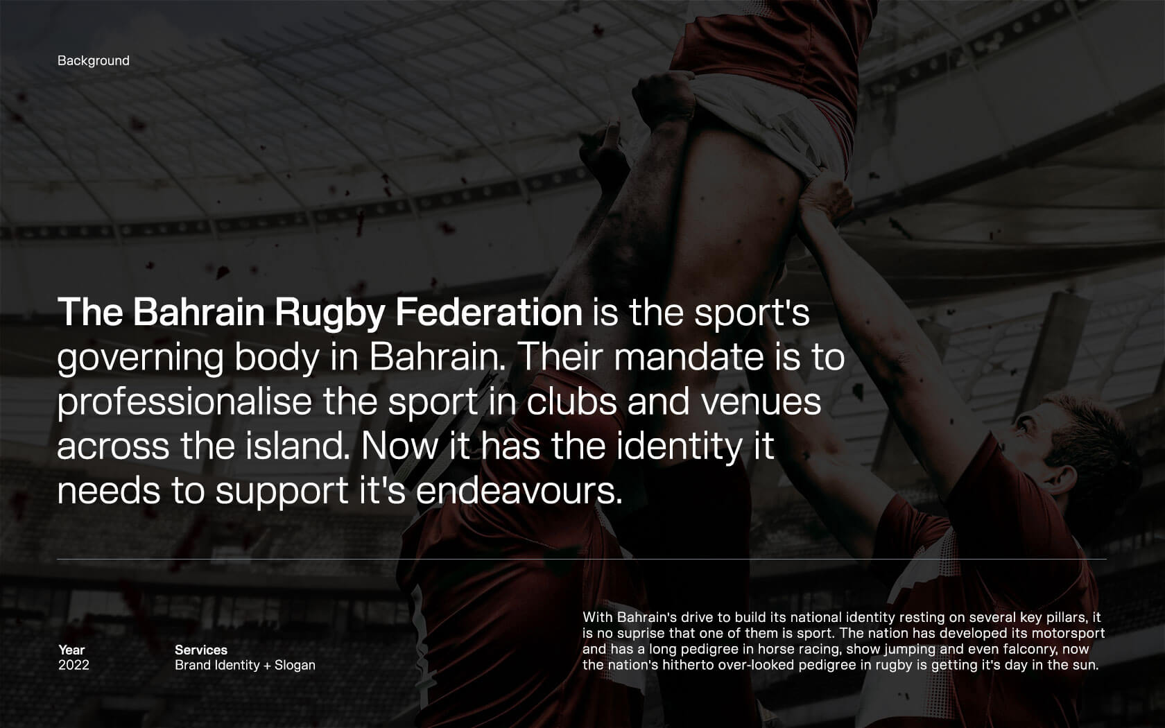
As the Bahrain Rugby Federation is keen to share, the sport in Bahrain has actually been around longer than people think, in fact the rugby has been played on the island for longer than a lot of people here have lived. 1971 is the first known instance of the sport being played in an organized sense. Until now, the sport has lacked a professional body to ensure standards are upheld. Not any more.
As part of a wider national drive to empower growth through sport, the aims of the Bahrain Rugby Federation is to professionalism the sport and to help foster its growth. In doing so, the sport will help tomorrow’s Bahraini’s to be fitter, leaner and probably a little bit meaner (on the field anyway habbibi).
Challenges encountered in the Bahrain Rugby Federation brand
We had a couple of challenges in creating the Barry rugby Federation ground, first one is ‘how do we create a brand that is exciting to sports fans whilst also being authority over the clubs the Sportsmans admire’? The second challenge was ‘how do we create a brand that feels nationalistic without being subjected to the same cliché nationalistic visual tropes typical Bahraini sporting bodies used in their identity exercises’?
Our strategic response
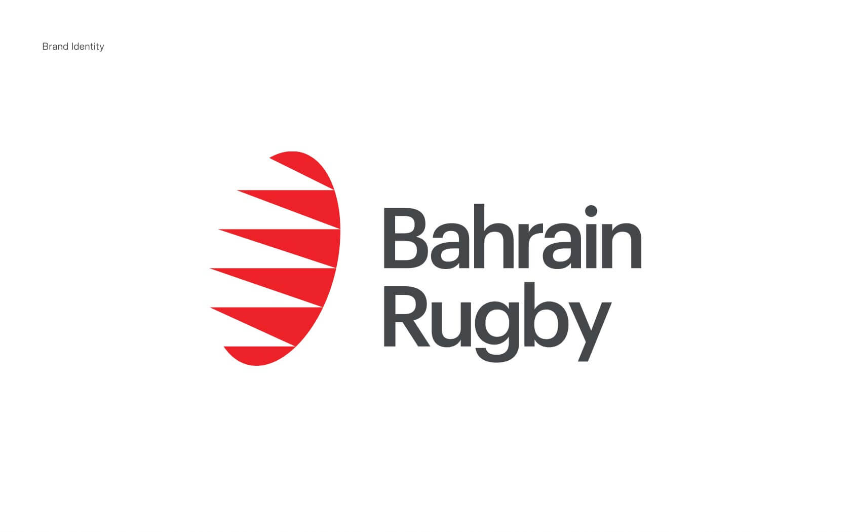
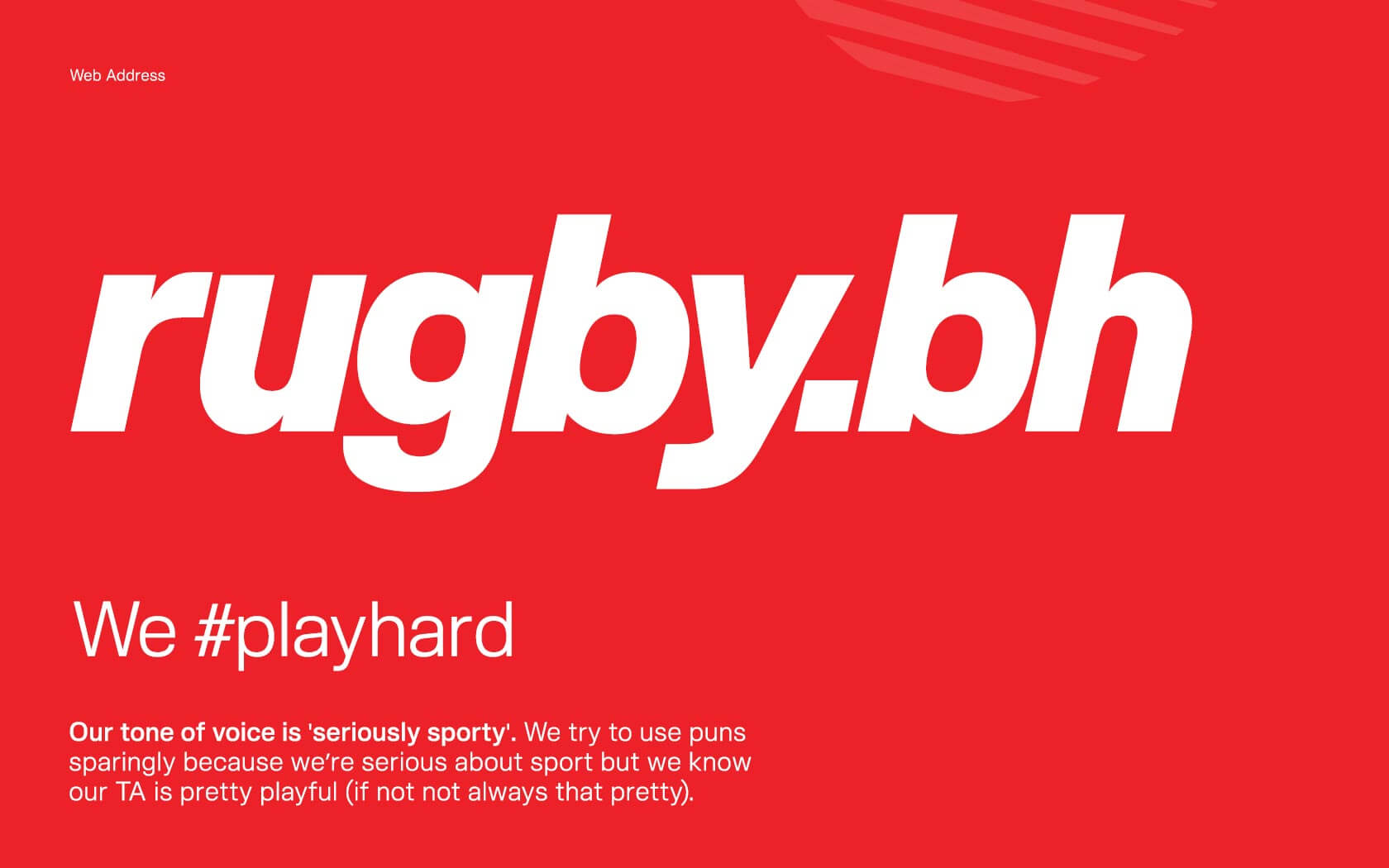
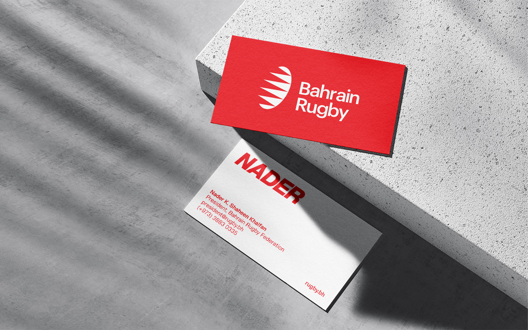
Firstly we had to get the name right, because a name as long as ‘The Bahrain Rugby Federation’ would never translate well into an official identity and certainly would be challenging in terms of a pithy URL, hashtag or social identity. We managed to persuade the client to adopt ‘Bahrain Rugby’ as it’s brand nom de plume and to use ‘Bahrain Rugby Federation’ as it’s legal title. This instantly freed us up creatively and also allowed us to influence the decision towards the rugby.bh URL.
A simple name change gave us a clear and uniquely defining URL telling people instantly that we were the ‘home of all things rugby on the Island’. The simpler name also enabled us to create a more precise visual and literal language for the brand. This gave the brand a modernity that is hitherto lacking in a lot organisational identities on the island.
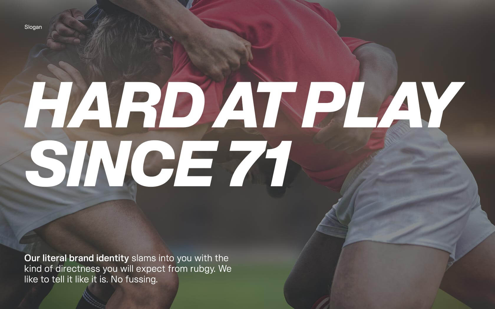
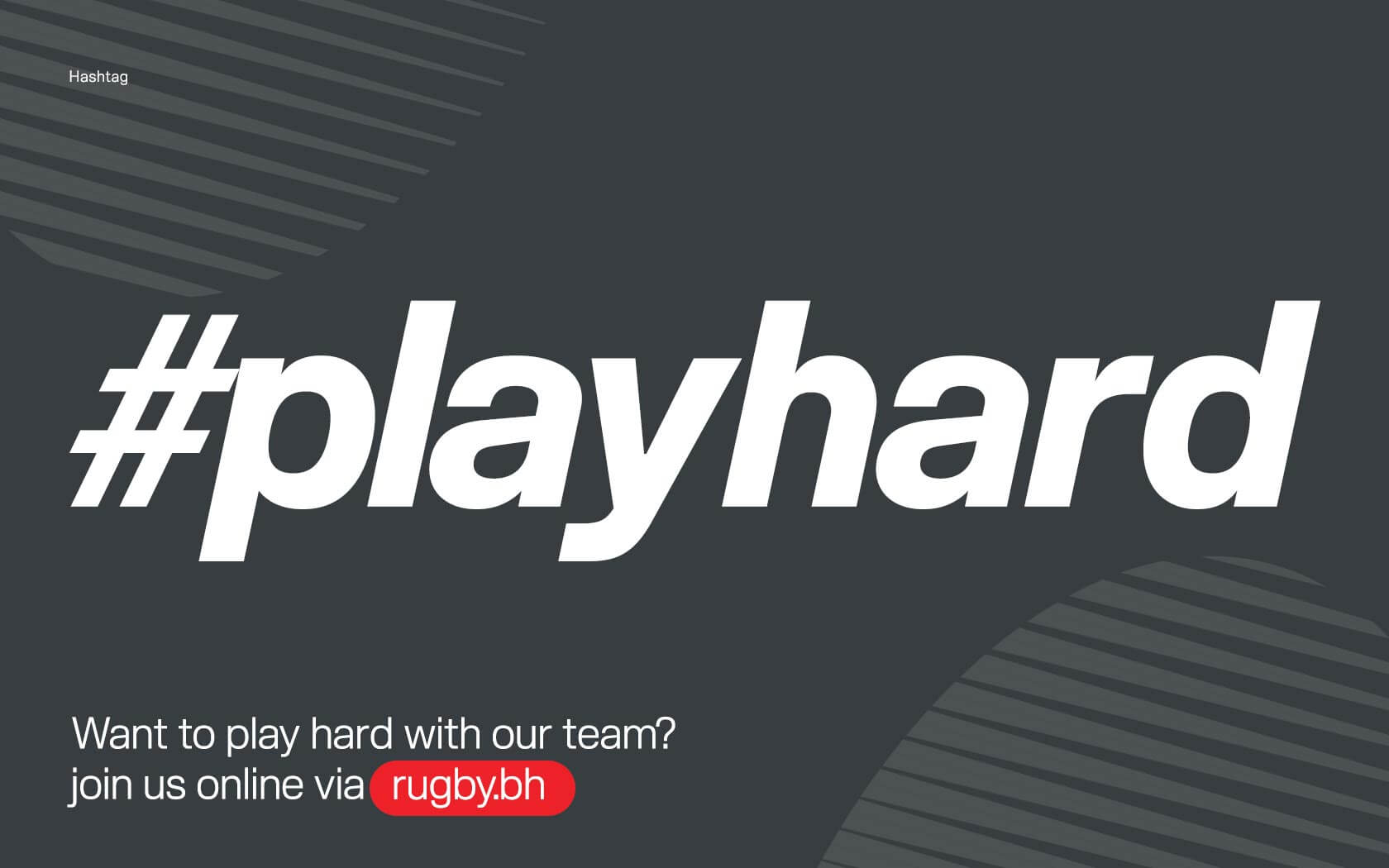
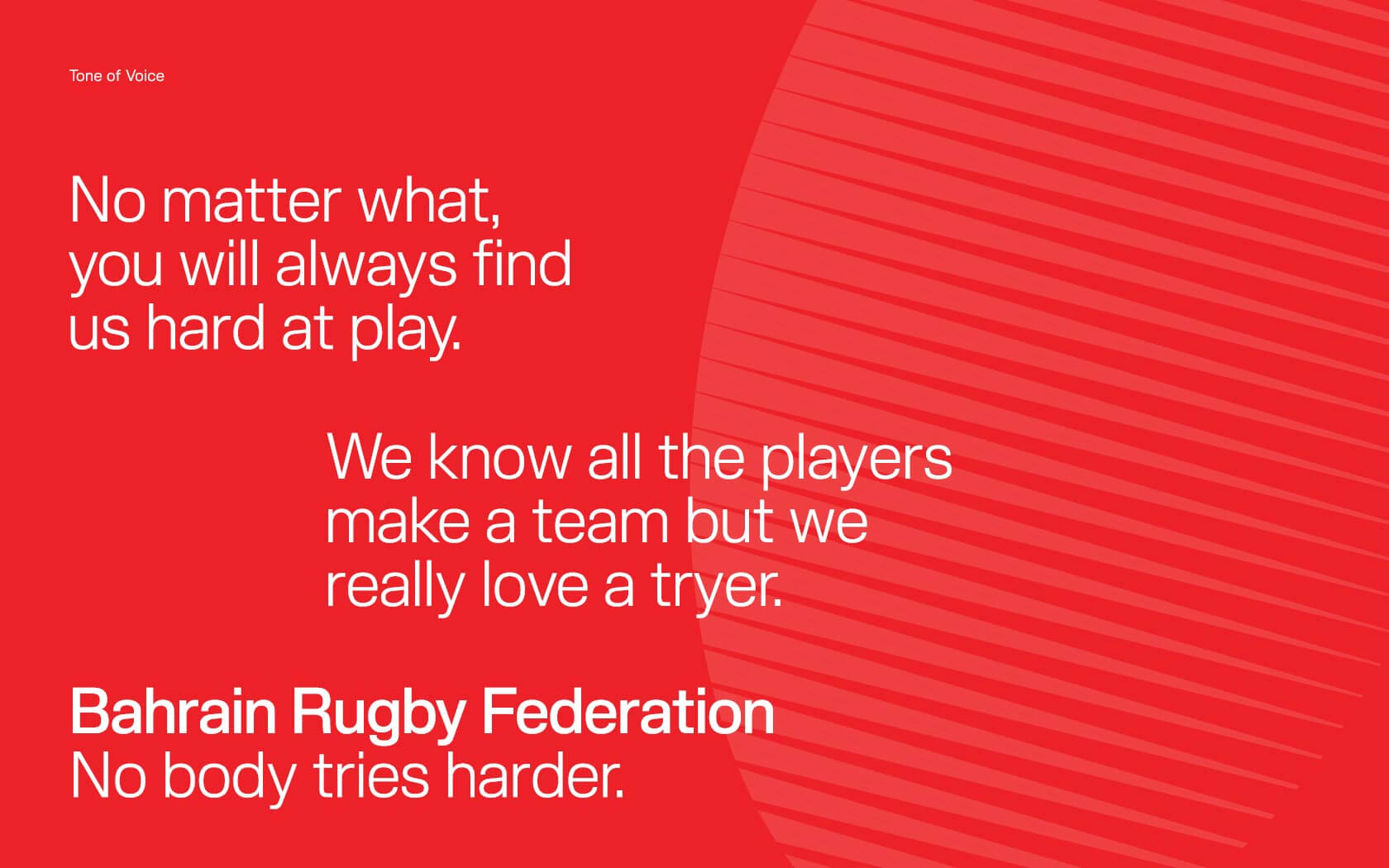
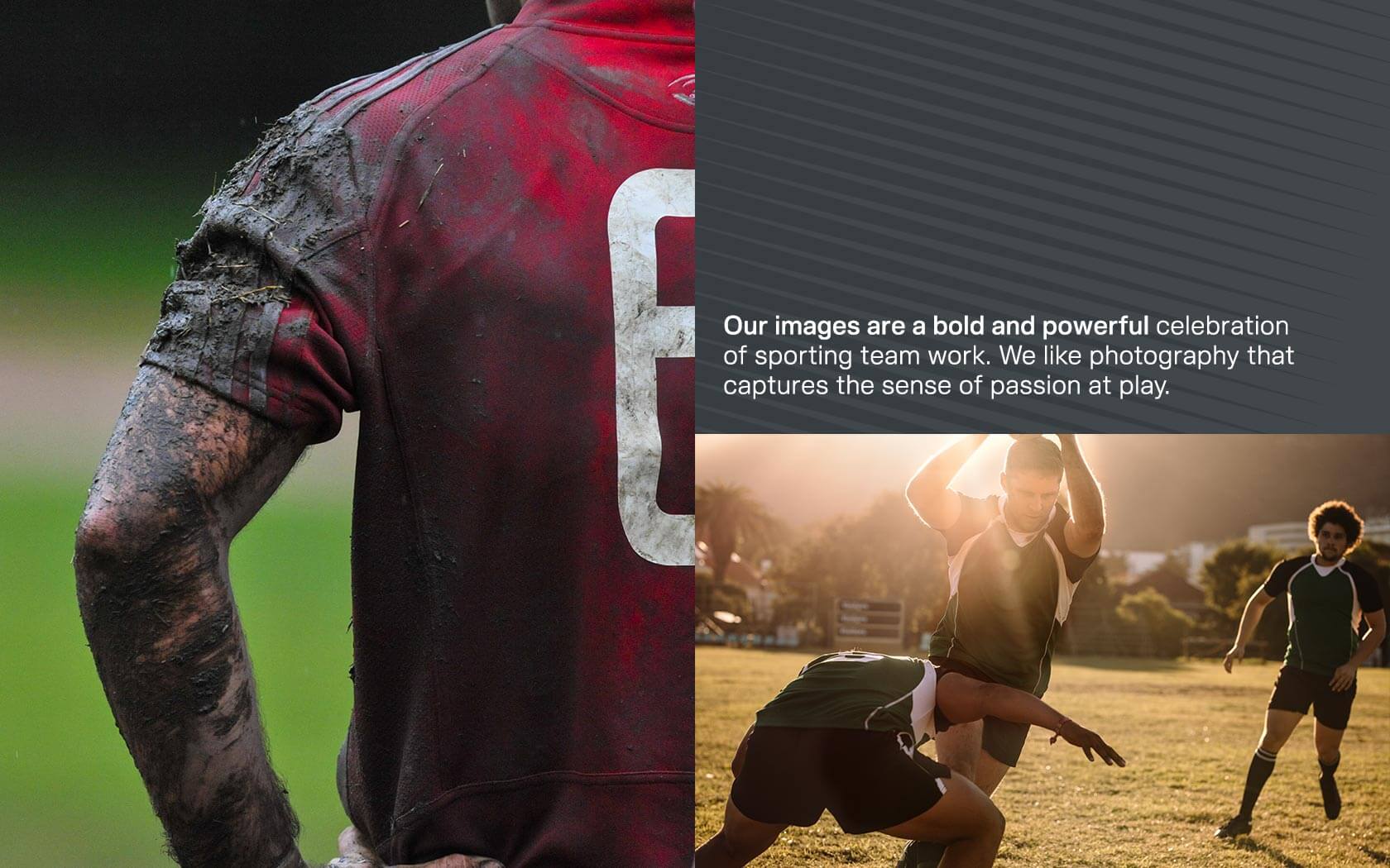
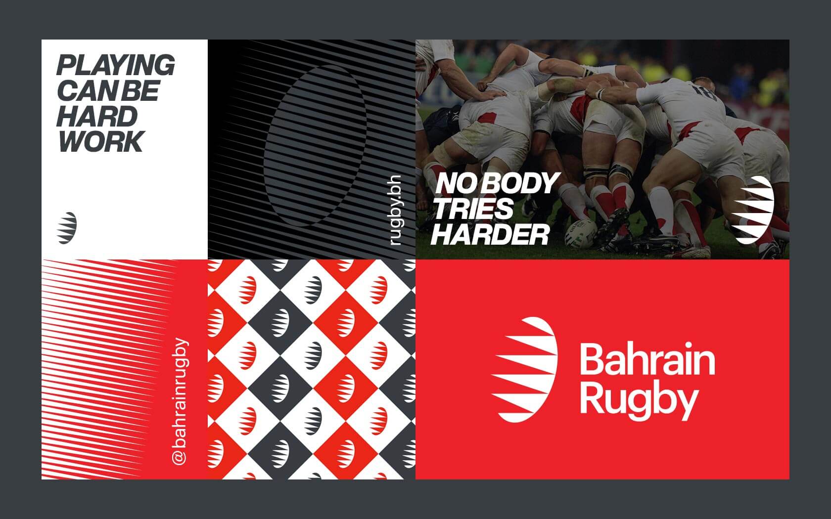
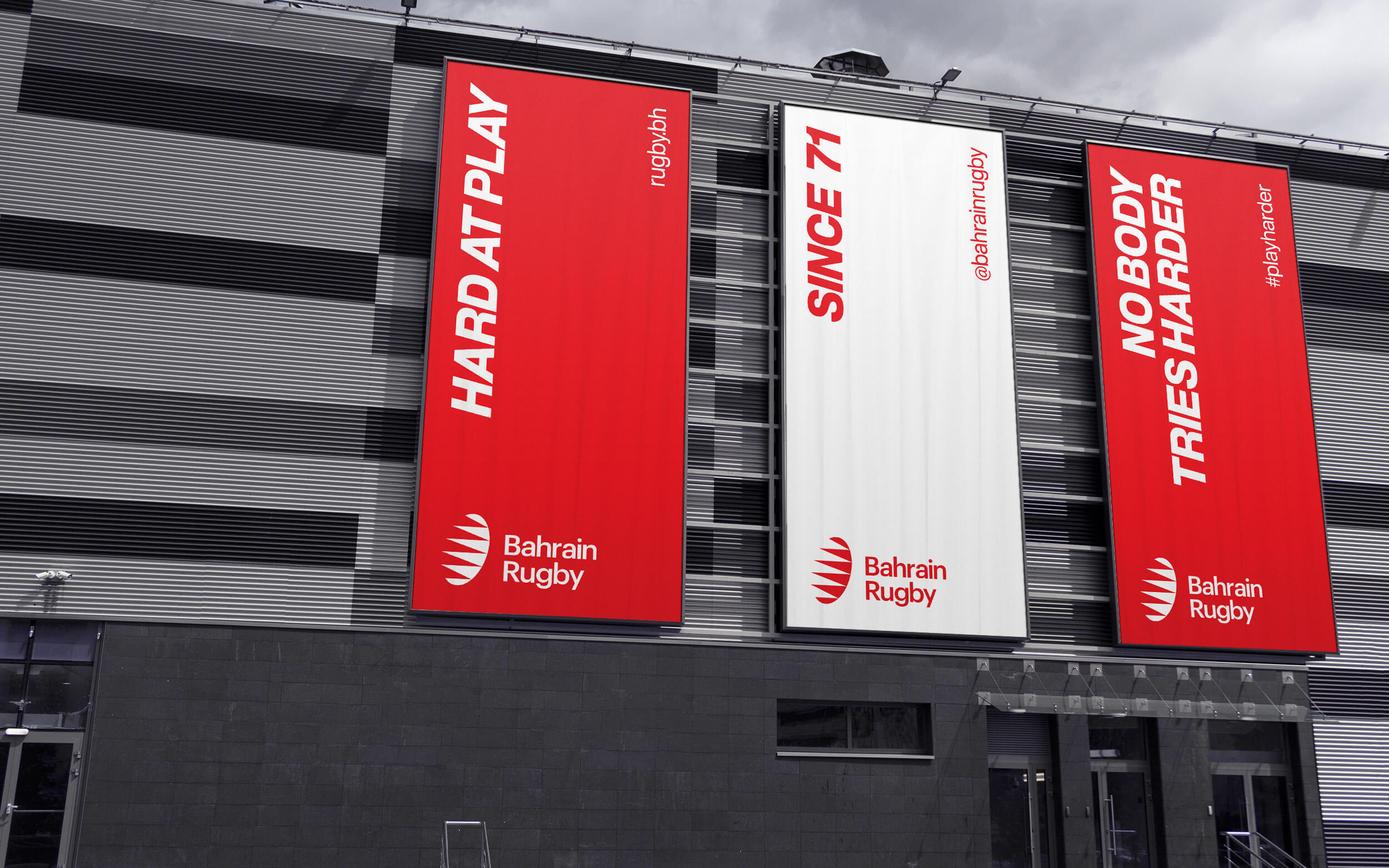
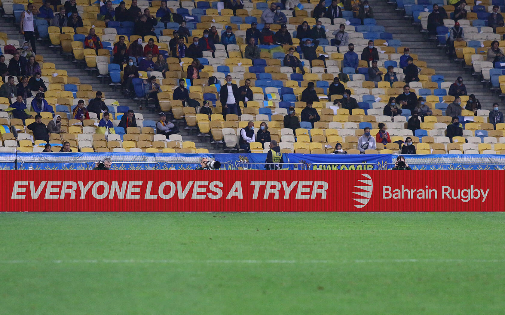
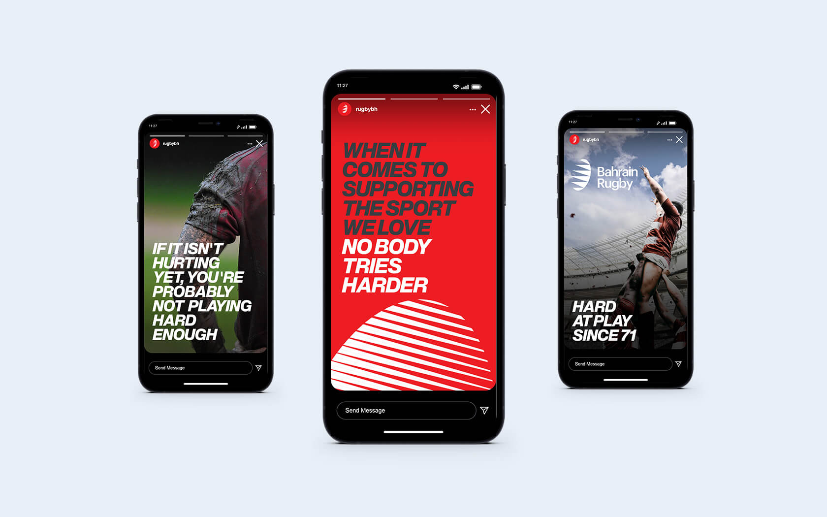
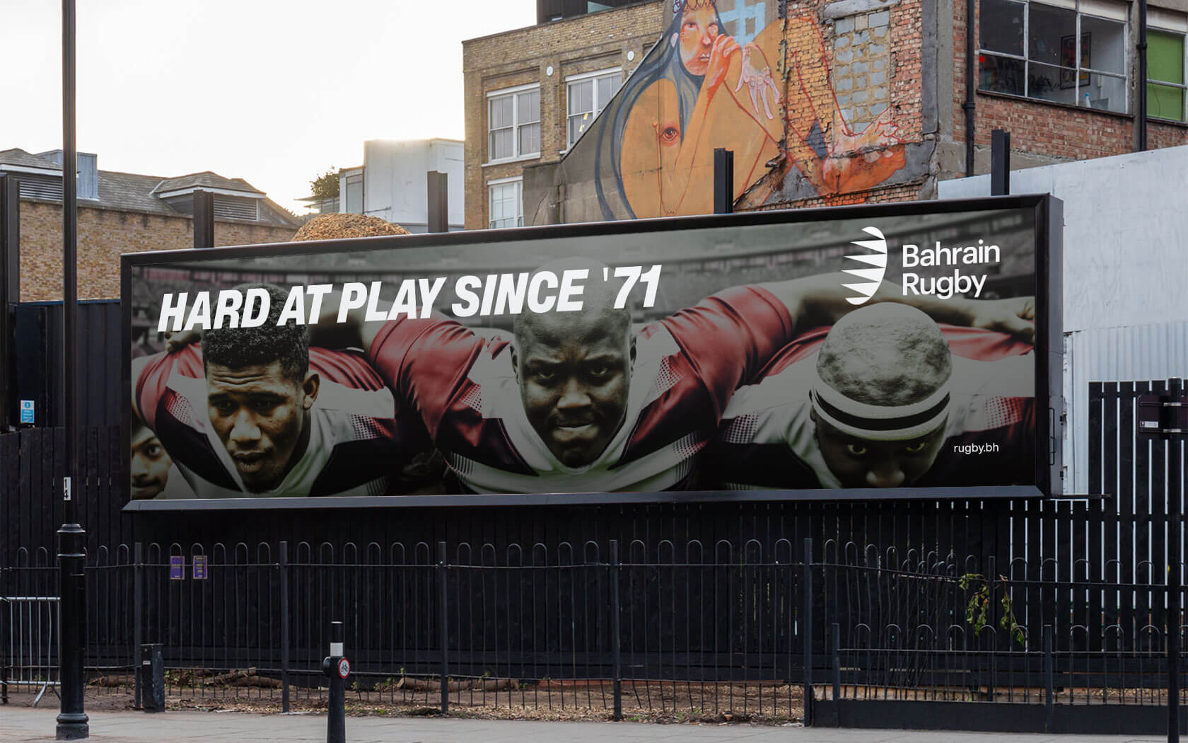
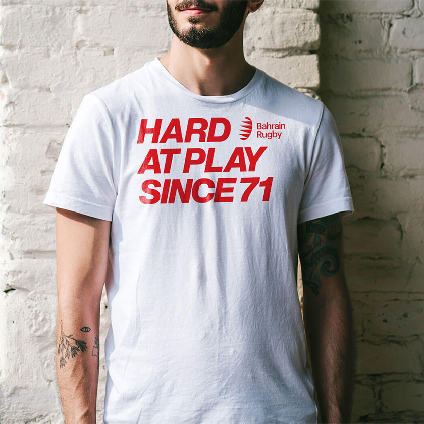
For a slogan, We wanted to bridge the requirement to build the perception of a serious sporting body with the need to engage with an audience that is anything but. Rugby teams are jocular and humorous, lighthearted and definitely playful, both on and off pitch but a federation needed to also convey an authoritarian voice that could command the respect of clubs. Several options were discussed and ultimately ’Hard at Play Since ‘71’ won through, thanks to its connection to Bahrain Rugby’s claim to being one of the earliest rugby football cultures in West Asia.
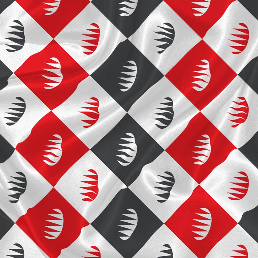
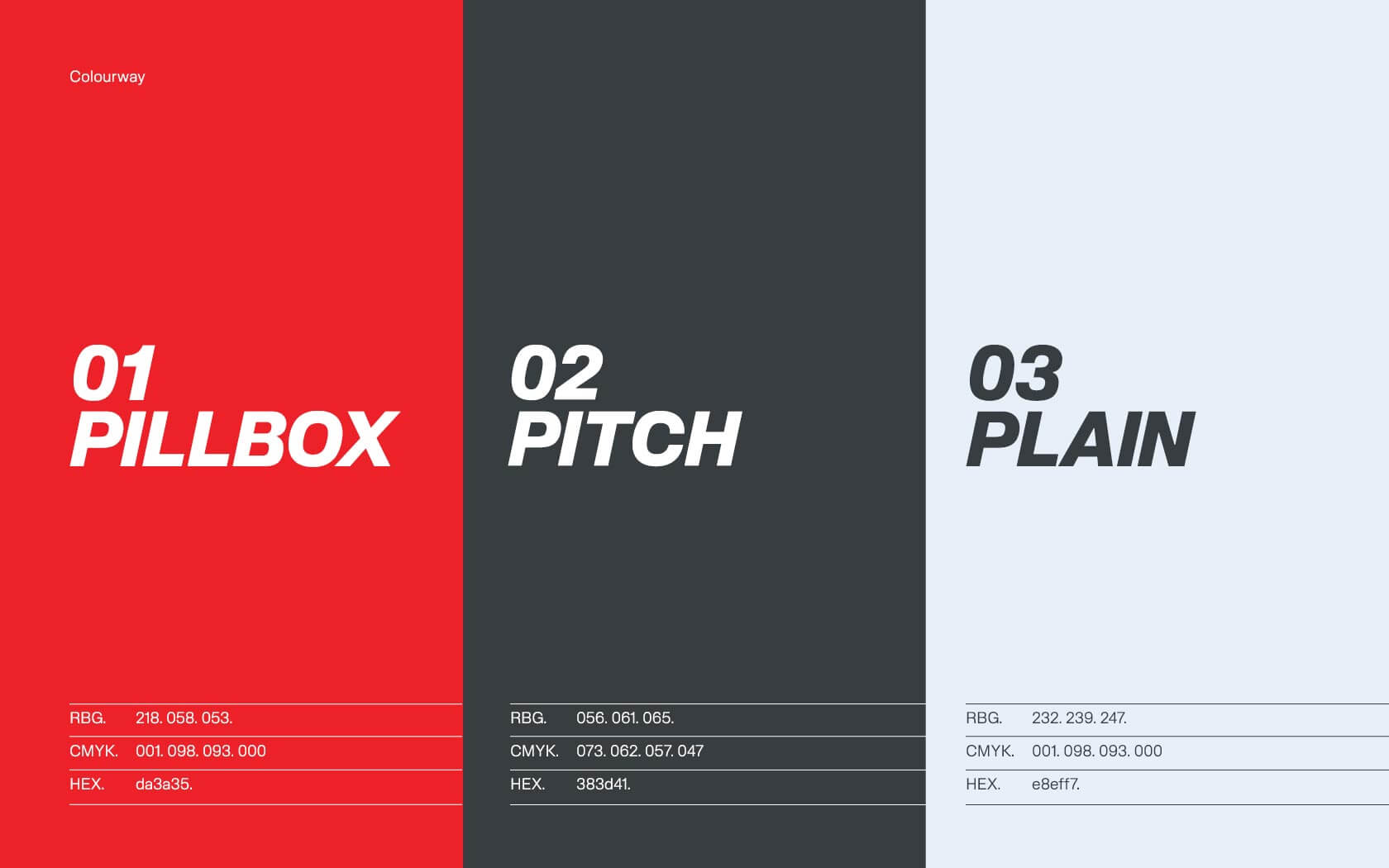
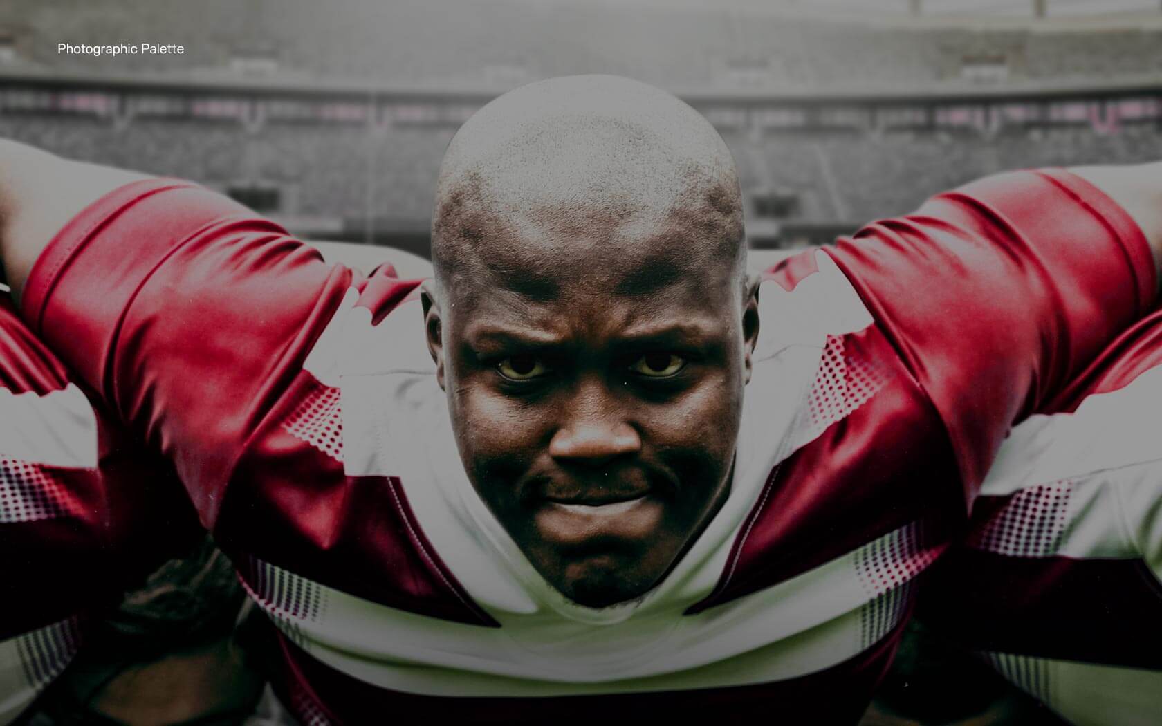
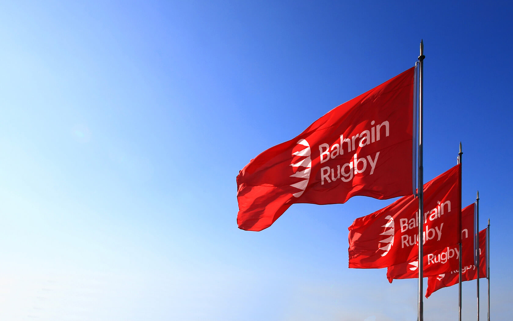
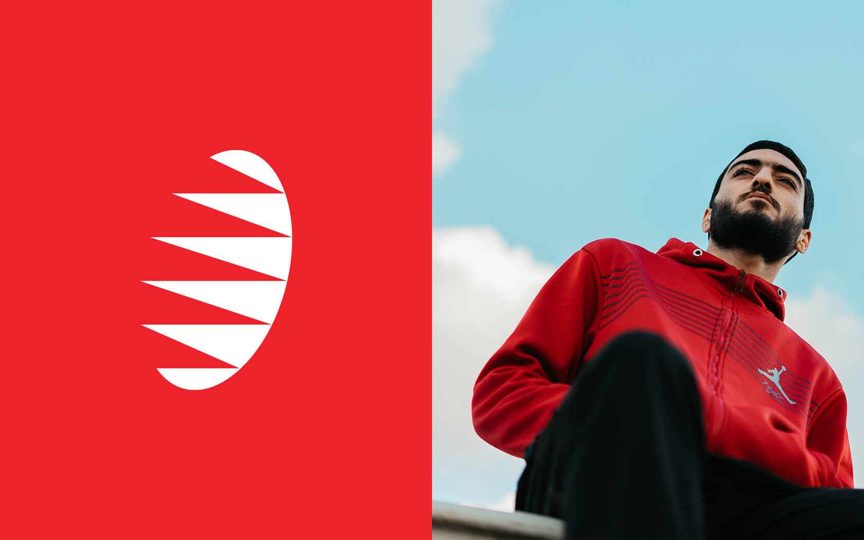
The colour scheme is proudly nationalistic combining pillbox red, pitch black and plain white colour. The link to Bahrains national flag is clear in the logo and colour scheme but more than that, red is such an agressive colour that anything else would not have hit as hard.
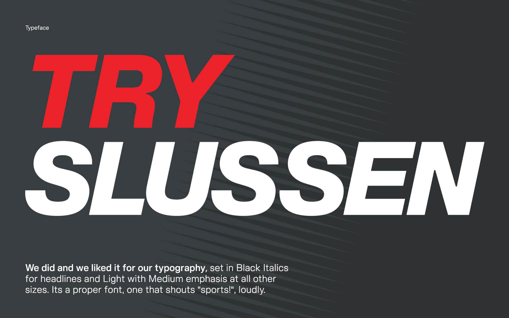
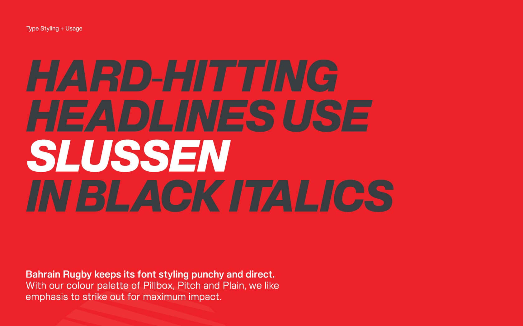
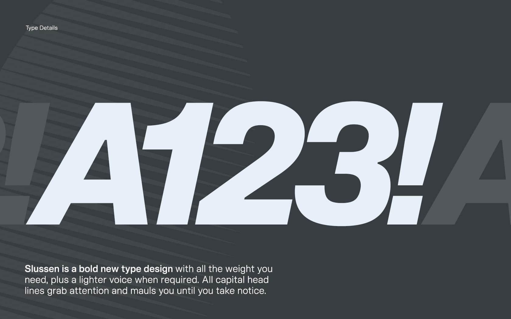
For the Bahrain Rugby Federation brand typeface, we are using Blaze Types’s Slussen set in Black Italics weight and set in all caps to deliver our super sporty headlines. Here is Blaze’s write up: When compared to more conventional Neo-Grotesque typefaces, Slussen’s design structure is based on a linear evolution throughout angular outlines. Combined with flat endings and a slight contrast in letterforms, this font family has been designed to cover a very large range of uses, from small captions to huge titles. From Compressed to Expanded, the complete family ranges across 6 widths and 8 weights + matching italics for a total of 104 styles in order to fit all types and sizes of supports, both print and on screen.
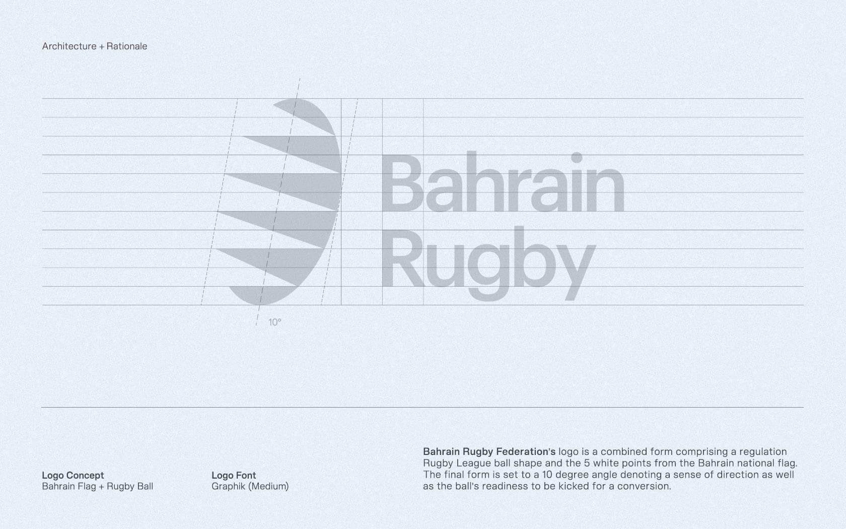
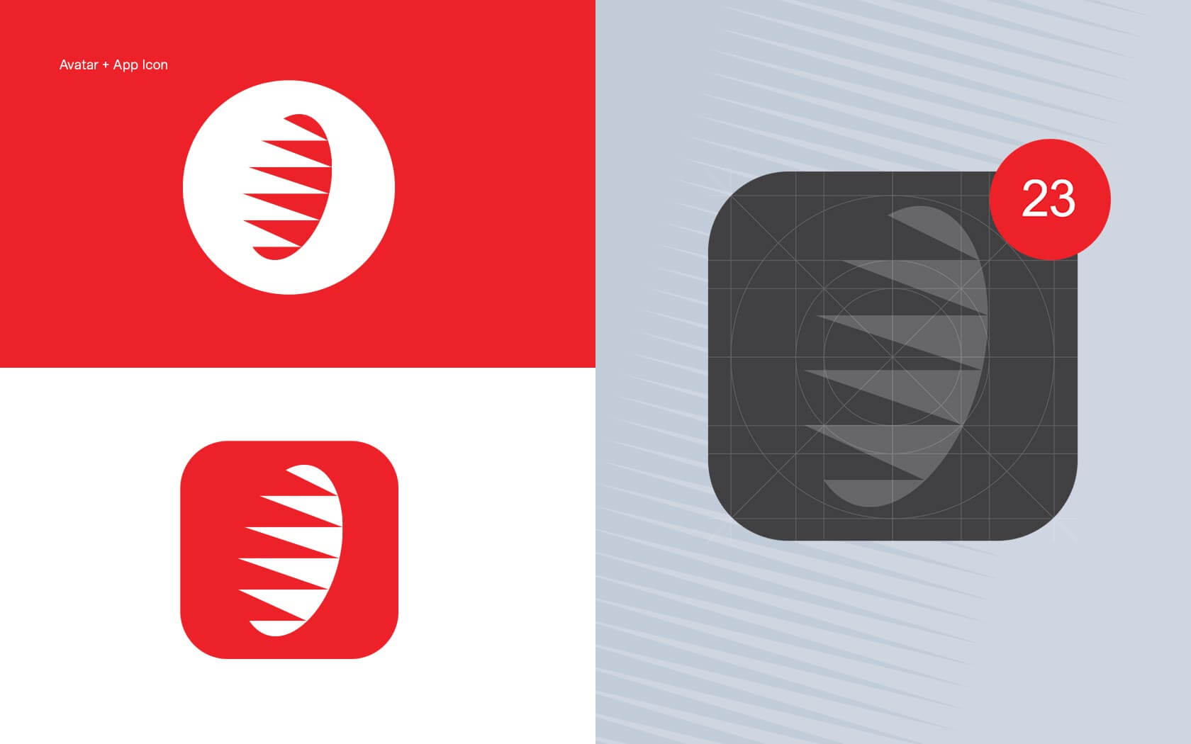
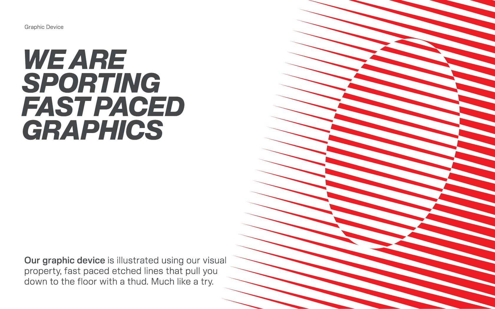
The additional visual device we are using across the Bahrain Rugby Federation brand is based on the logo and therefore the national flags visual structure of pointed red and white forms. It harnesses an angular, edged visual gradient which slopes to the right hand side at 15°, as if reaching for the ground like a forward aiming for a touching down. This visual device creates a dynamic sense of movement and direction when used across the brand’s touch points.
Results of the Bahrain Rugby Federation brand
The new identity was loved the minute it was unveiled and has been a success with the federations board and sporting audience alike. Whilst it is early days, it is safe to say the Bahrain Rugby Federation brand is scoring big with everyone who sees it.
Services delivered
Brand Design, Naming, Visual Identity, Slogan, Hastag, Tone of Voice and Graphic Design
This is probably the best sporting identity in the whole of Bahrain.
Nader Khalfan. President. Bahrain Rubgy Federation.
Details View Close
This is a project we are especially proud of. Full of muscle and mud. Love it.
Liam Farrell. Creative Director & Partner.
Big 5.
Rebrand
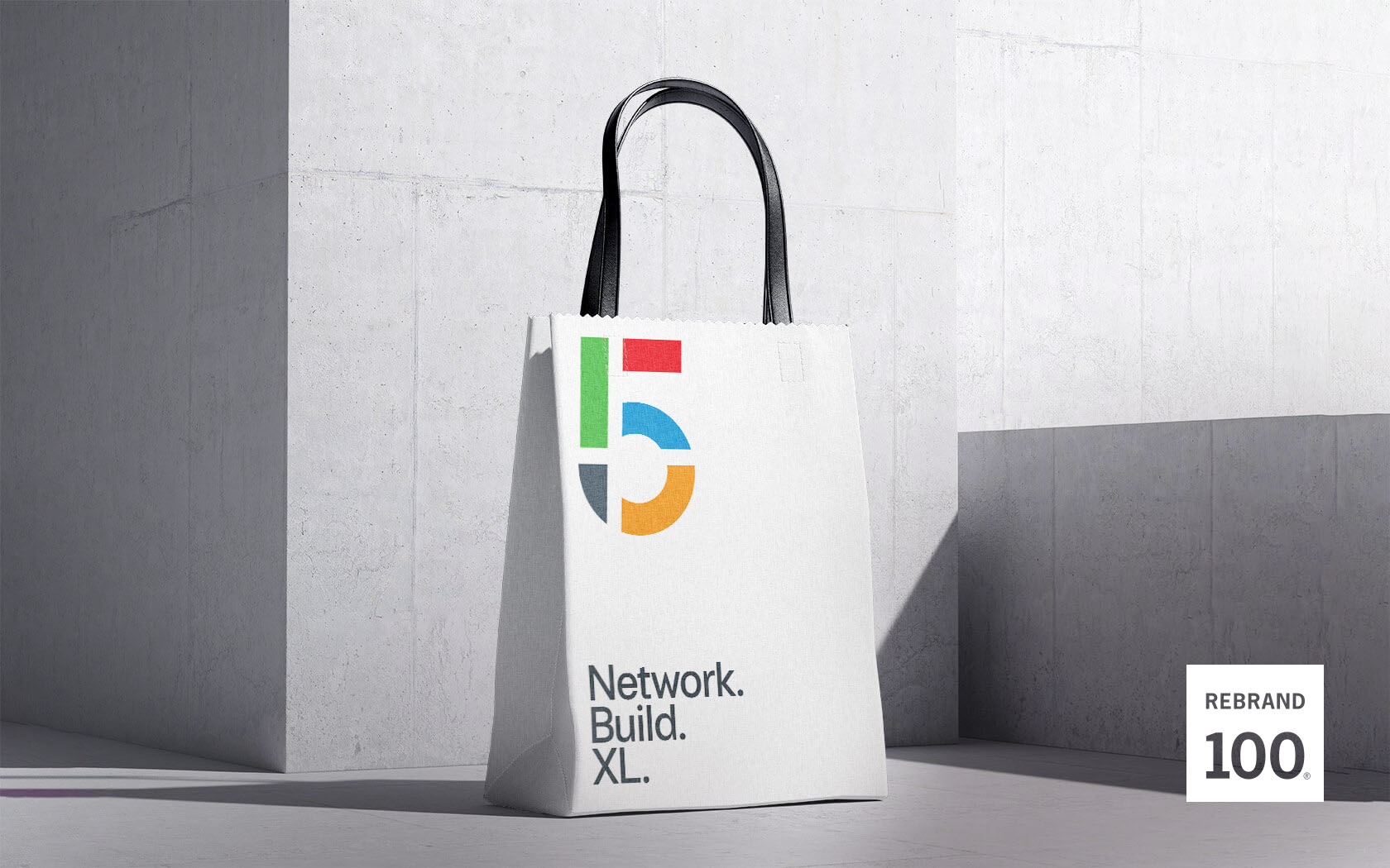
When DMG events asked us to reimagine their flagship construction industry's event, The Big 5, a show that never knowingly thinks small, we helped them to really XL.
GFH.
Calendar
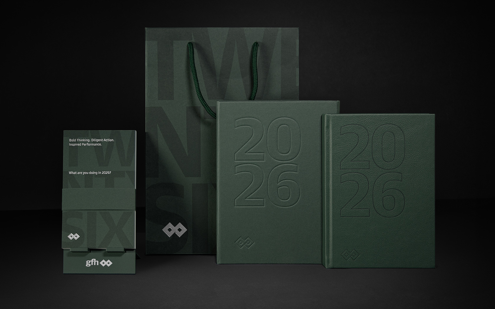
It's 2026 and our latest calendar for GFH is already out there providing a platform for our creativity.
Infracorp.
Website
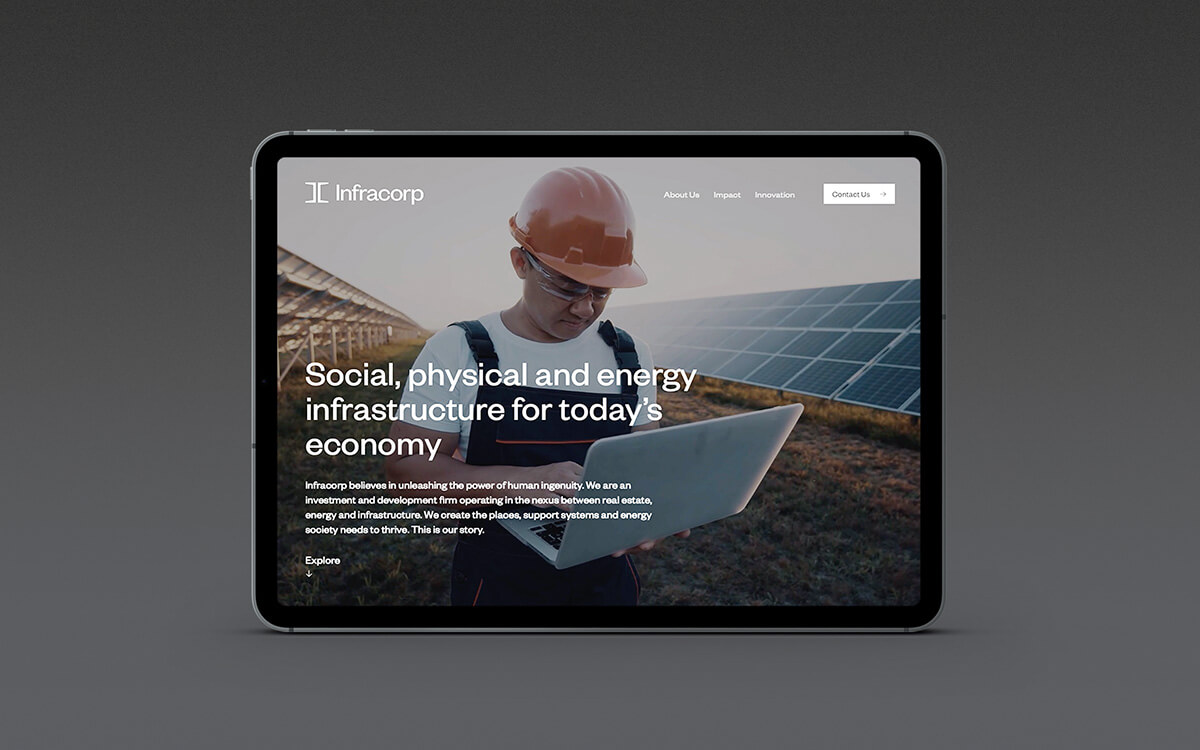
Two times Transform Award winners, Infracorp's unique digital home is effortless online design at its best.
Derma One.
Rebrand

Our sensational work on this premium healthcare brand in Bahrain, Derma One has picked up Transform and IVIA awards in 2018.
Onyx Skyview.
Branding
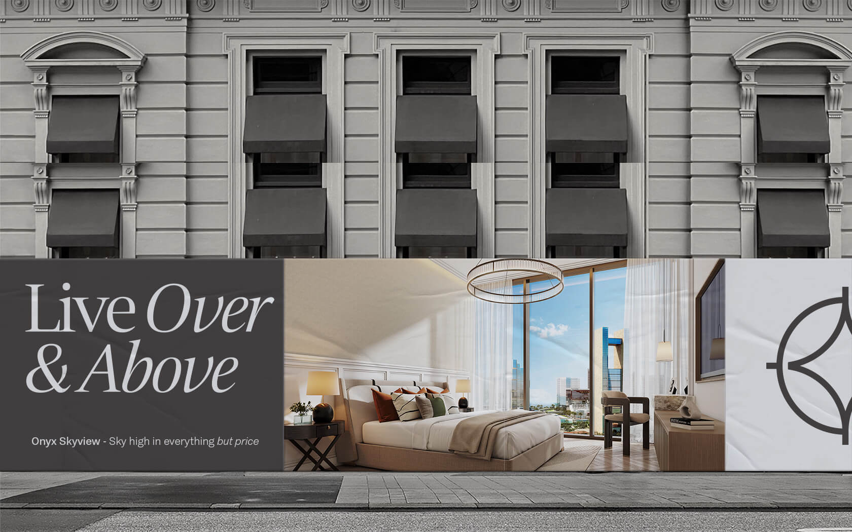
Reach higher than you previously thought possible with the new project from Kooheji Development - the incredibly spacious and beautifully connected experience that is Onyx Skyview.