Batelco. Rebrand

This is a great result. (These awards are) truly well deserved. This is exactly the result we were seeking. The rebrand aligned exactly with our requirements and has empowered us for the next era of growth.
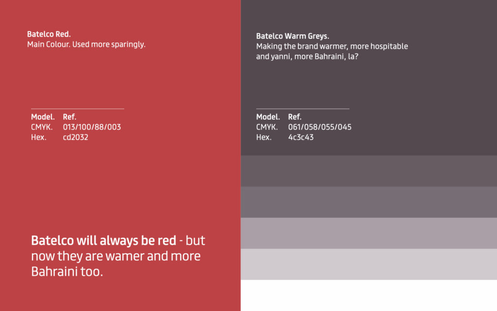
Batelco will always be red. Now it’s warmer, cooler and more Bahraini too
A full rebrand with a 360º roll-out, a three-year marketing strategy and a steady programme of promotions for Bahrain’s national telecom operator.
Batelco had lost a large share of its market to STC’s VIVA brand. We were asked to help win it back.
Challenge
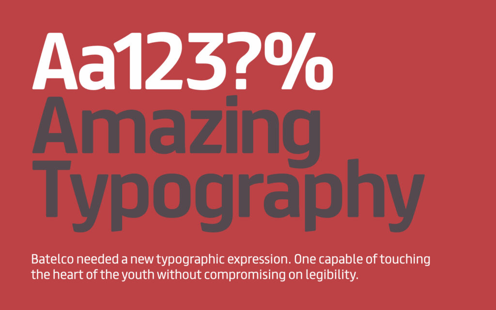
Batelco was very red and very white. Its spiky, unfriendly typeface made the brand feel cold to users and the Bahraini warmth was missing.
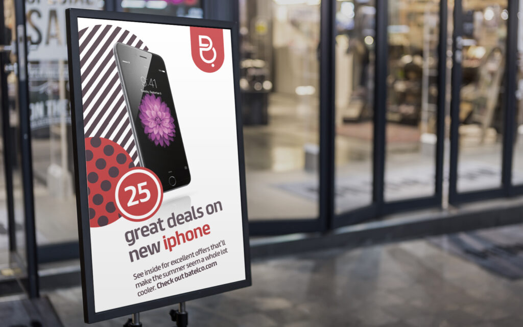
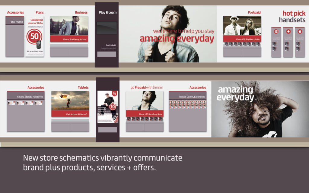
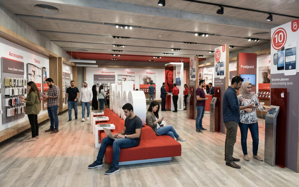
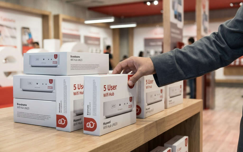
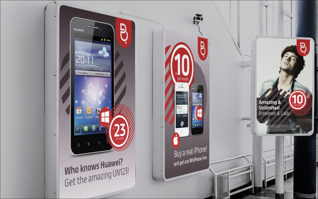
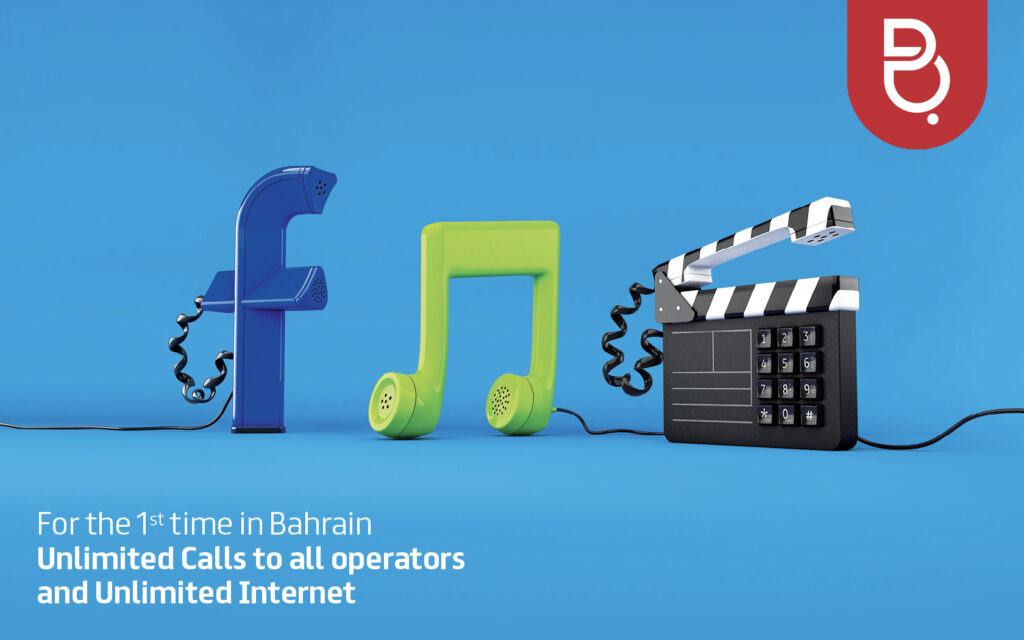
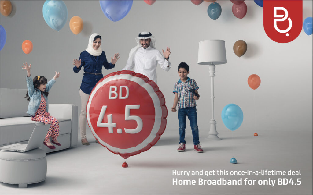
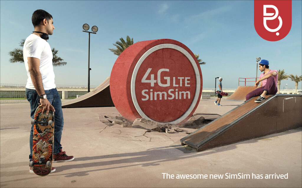
It also lacked the visual devices and brand tools to power its retail and promotional messaging. Batelco needed a fun retail design system that could connect emotionally and communicate its products and offers with real impact.
Put simply, Batelco needed to warm up and get cooler if it was to re-engage the market it had lost.
Strategy
We benchmarked brand mentors to find insights we could apply to Batelco: Apple, Nike and Levi’s. Each came from nowhere to lead and define its category, turning a commodity into a ‘to die for’ essential.
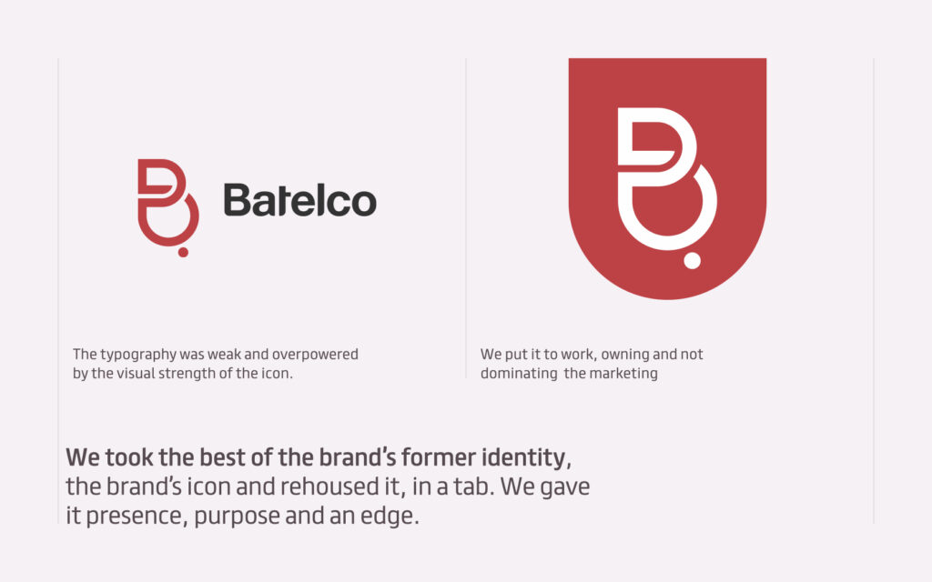
Lesson 01. Symbolise the brand. Nike stands for achievement, determination and unleashed potential. Apple stands for human-centric technology, advancement and hip coolness. Neither needs a word mark any more: the symbol tells the story. Show Batelco’s icon to anyone in Bahrain and they’ll tell you it’s Batelco. We were in symbol-only territory.
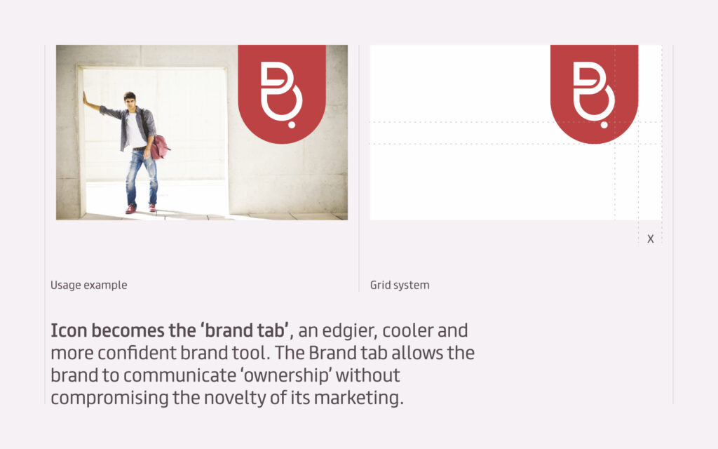
Lesson 02. Have a soul and be cool. Levi’s red tab turned humble workwear denim into a cult fashion must-have. Levi’s reduced its visual clutter, owned red and raised the cool factor through bold, focused design and visual storytelling, reinventing itself without losing its legacy. If it worked for jeans, it would work for telecoms: the utilitarian fashion accessory of now.
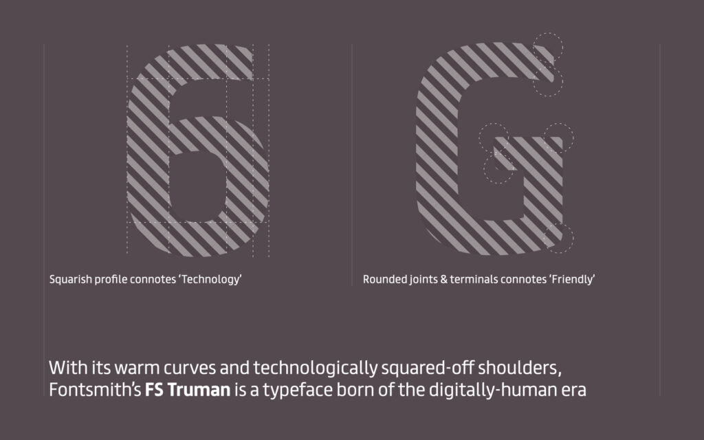
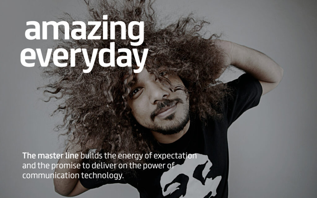
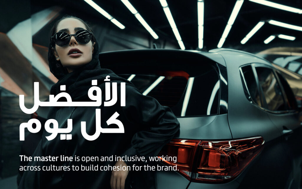
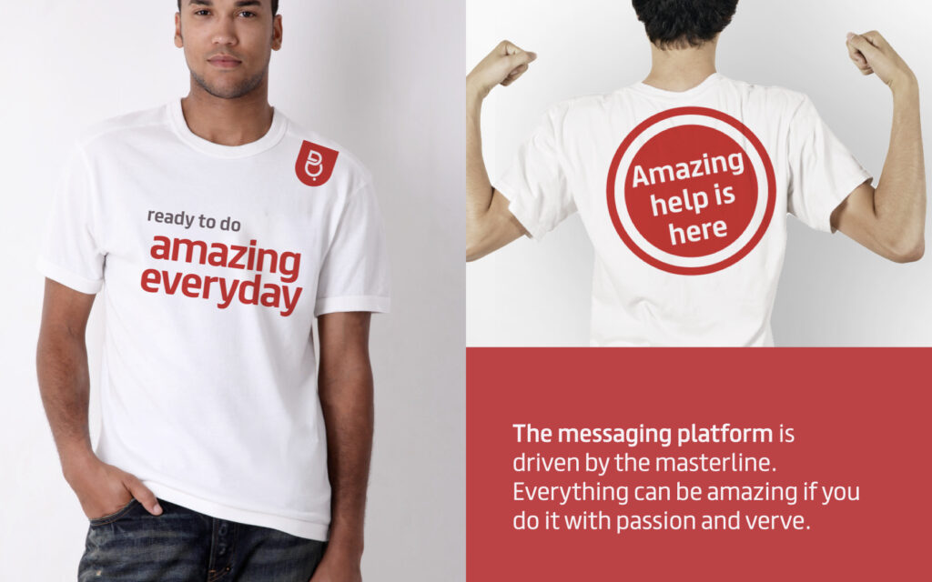
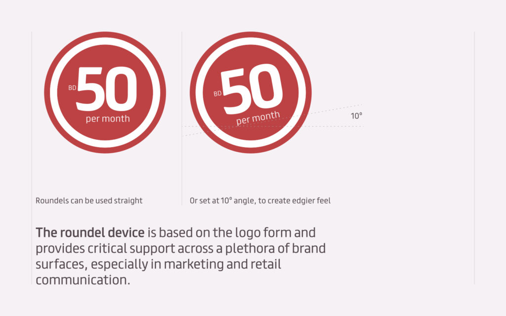
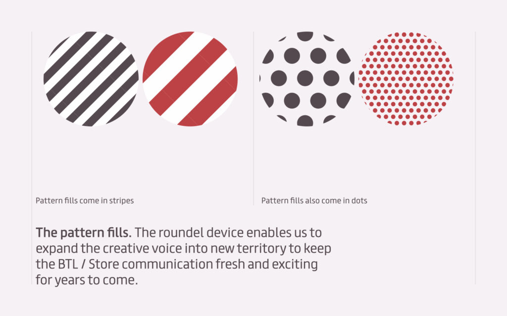
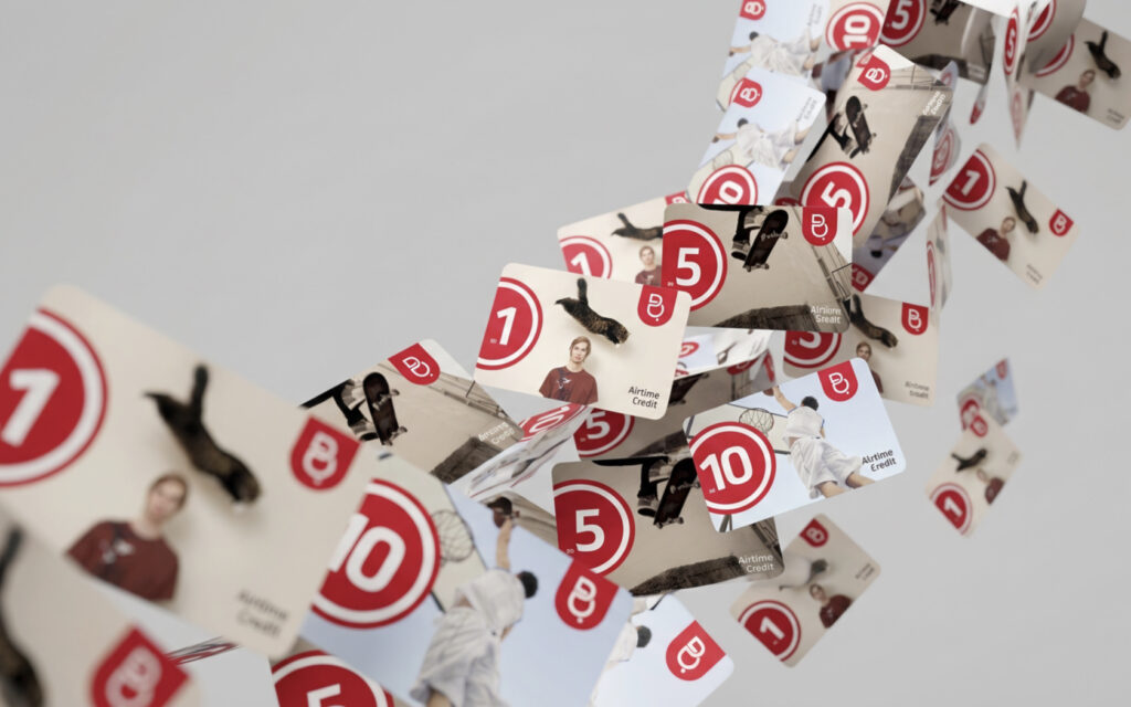
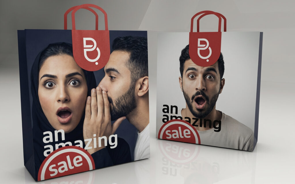
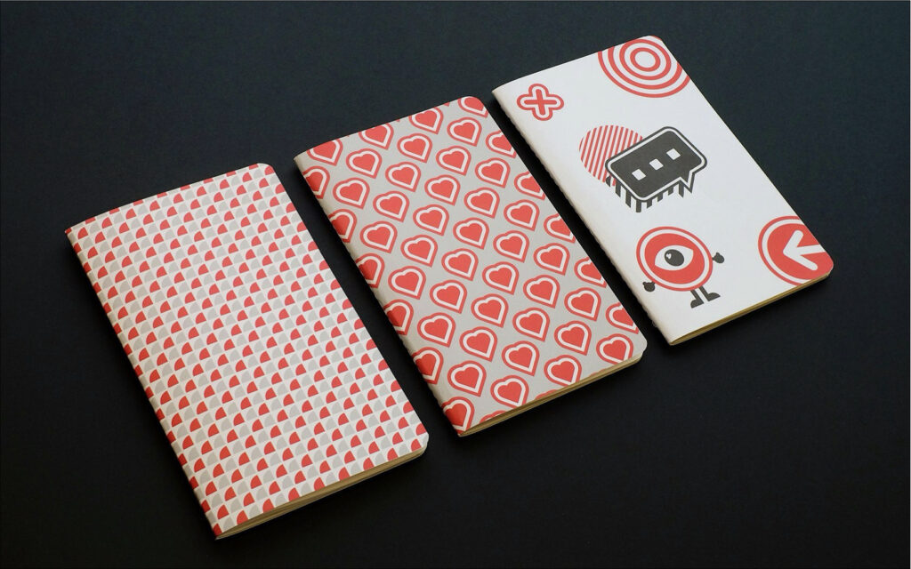
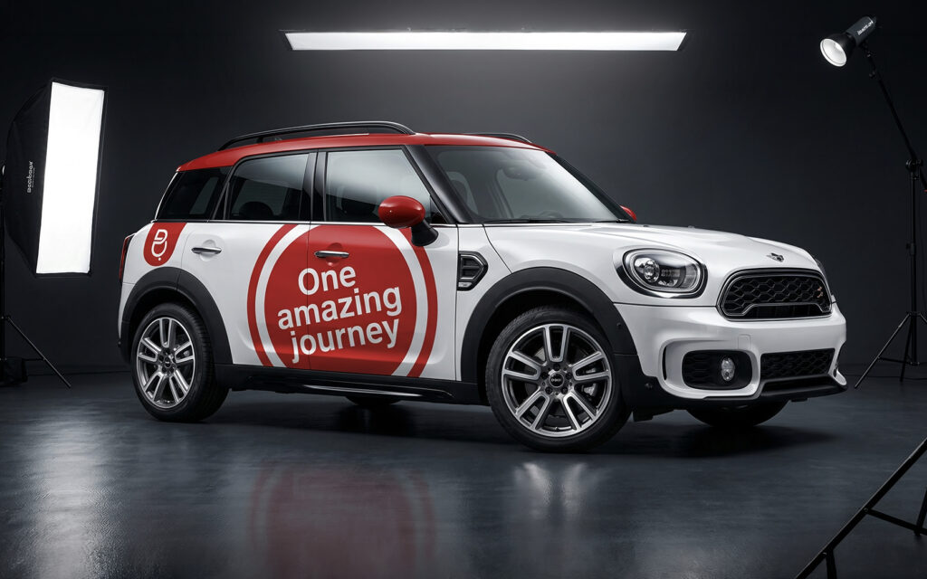
So we kept the best of the former identity, the icon, and rehoused it in a ‘brand tab’ that communicates ownership without dominating the marketing. We warmed the palette with Batelco Warm Greys, introduced Fontsmith’s FS Truman, set headlines at an edgy 10º angle, created the roundel and pattern-fill devices and wrote the master line, ‘amazing everyday’.
Result
Batelco retook a large swathe of the youth market from its rivals and the rebrand won five Transform Awards in 2015, including Best of Show for Brand Identity.
- Gold. Best Identity in Show from the Telecom Sector
- Gold. Best Visual Property from the Telecom Sector
- Gold. Best Visual Identity from the Telecom Sector
- Silver. Best Implementation from the Telecom Sector
- Highly Commended. Best Brand Evolution from the Telecom Sector
See all our wins on the Awards + Clients page.
Work We Delivered
- Research
- Brand Strategy
- Consultancy
- Marketing Strategy
- Brand Identity
- Graphic Design
- Retail Design
- Packaging Design
- Advertising
- Digital Design
- Tone of Voice
- Messaging
- Slogan
Industry
About Unisono
Unisono is a Bahrain-based branding agency specialising in strategic creativity across the GCC, West Asia and Africa. Our award winning creativity covers visioning, brand development, rebranding, brand strategy, visual and verbal brand identity, master lines, tone of voice, print and digital design.
Planning a telecom or tech rebrand? Let’s talk.

Awards
Everything starts with a simple “hello”
Want to work with us on your strategic brand, design or digital project? Call now and let’s talk about your brand-new project.