Harbour Club. Branding
This Harbour Club brand should really help wet your appetite
An introduction to the Harbour Club brand
The Harbour club brand process started with a review of location – nestled between the Harbour Row and Harbour Heights, the project was in good company. The project aims to create a focal point for new residential buyers in the Bahrain Harbour area – set to become the nation’s downtown and a key focus areas for Manama’s urban renewal.
The project needed a practical name and an identity that could properly position it in the minds of the upmarket clientele who the firm sought to become residential members. The brand was in seriously good company and needed to build a presence equally as strong as the neighbours.
Harbour Club brand strategy
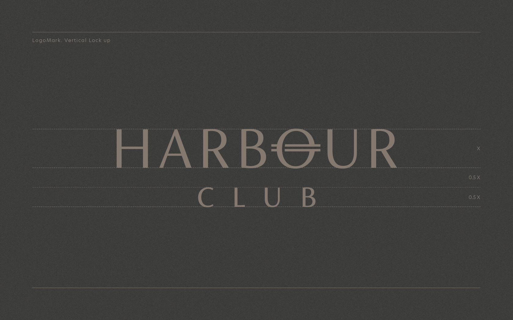
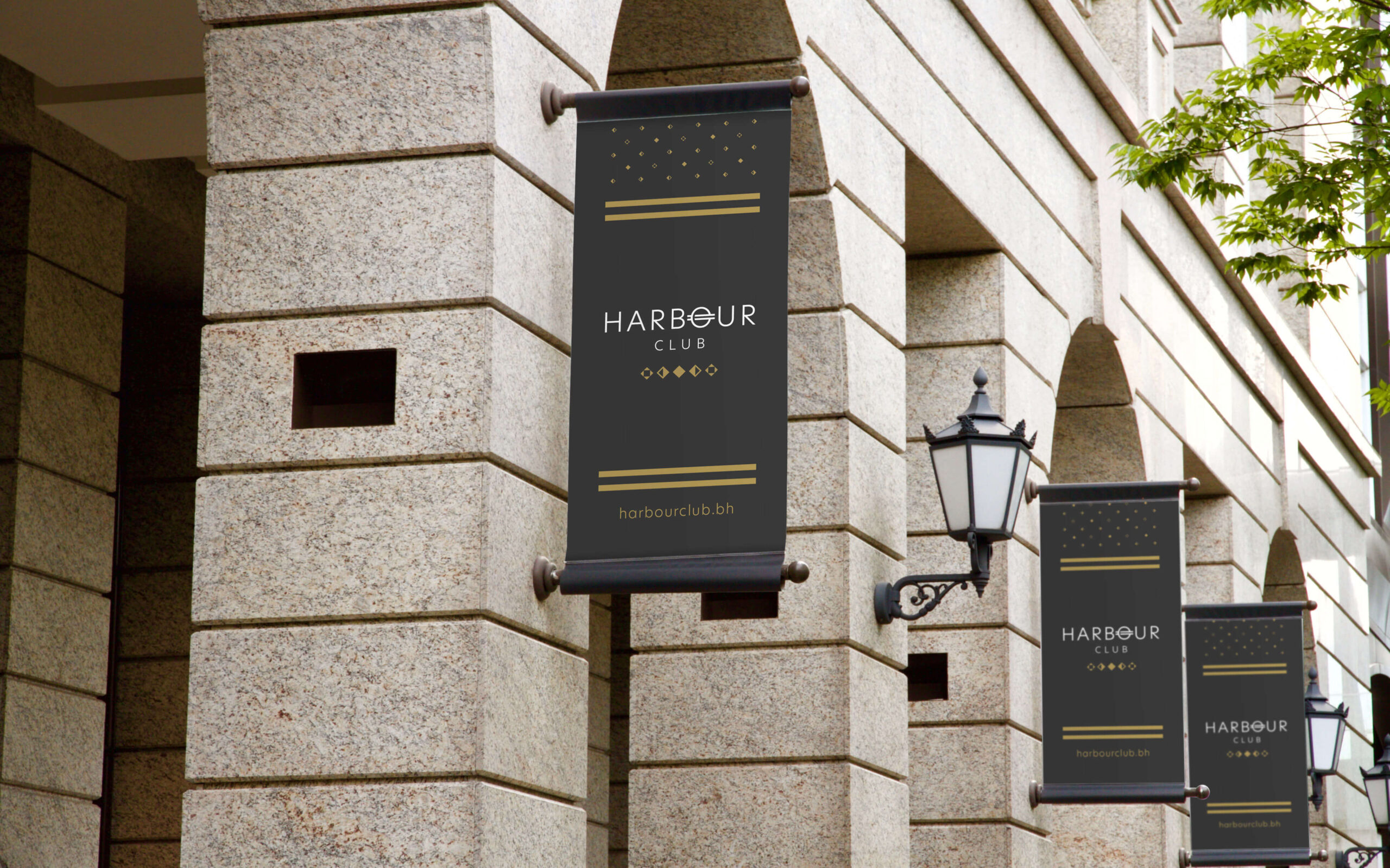
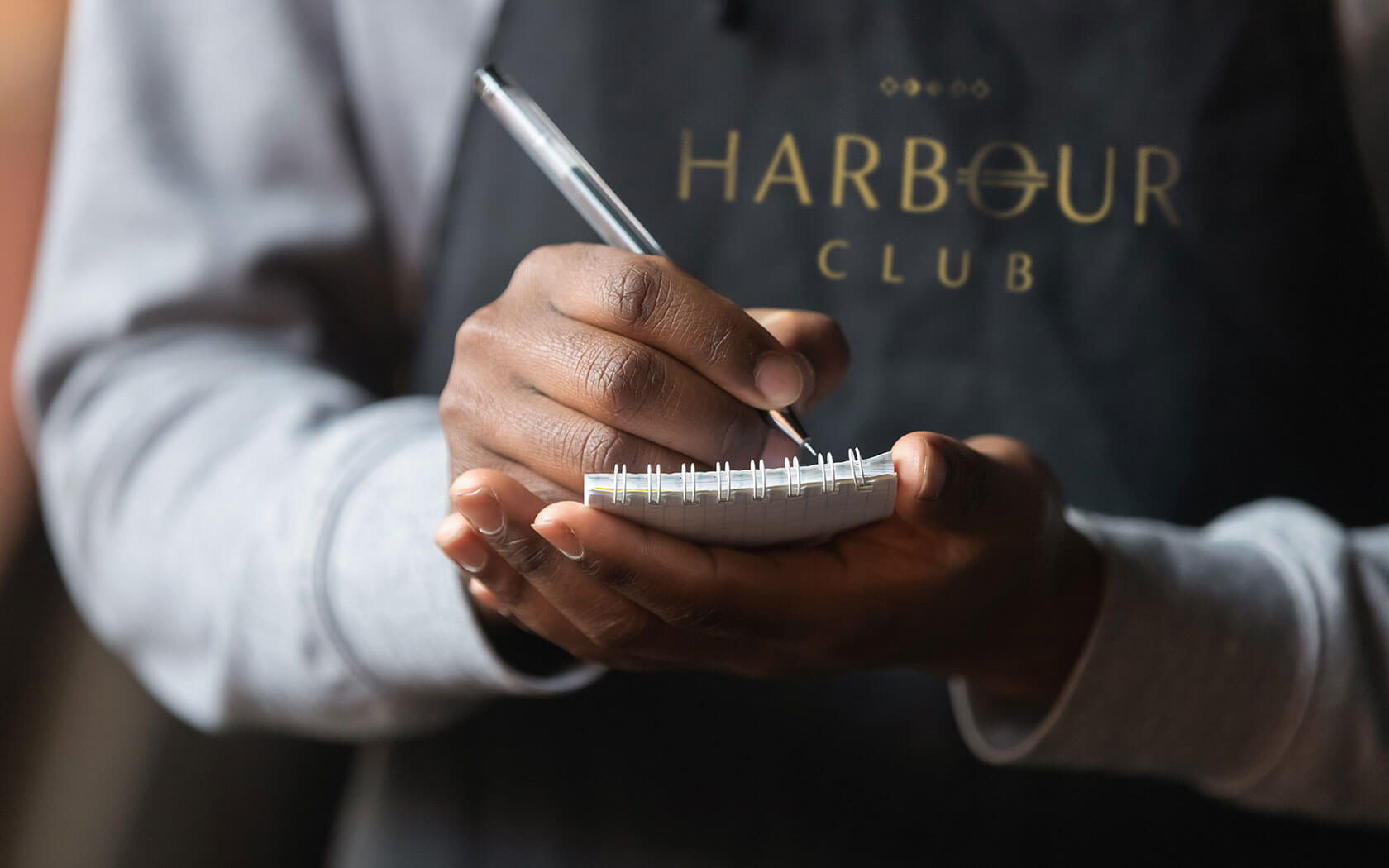
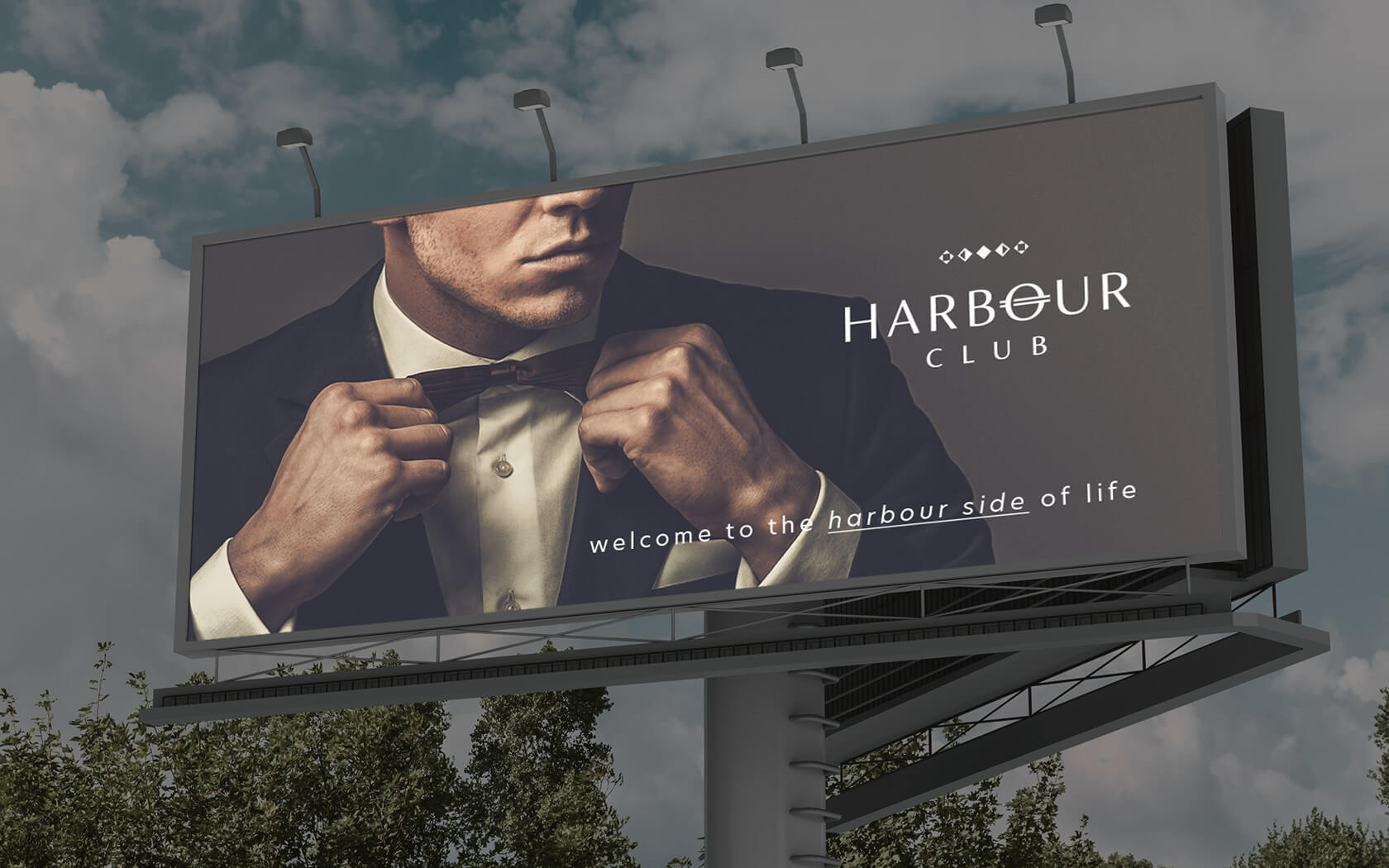
Our strategy was to redefine a water front hang out for tomorrow’s socialites. Our creative strategy centred around the name – with a signature totem like ‘Harbour’ to play with we wanted the identity to espouse maritime and naval cues but it a less-than-obvious manner. The visual properties of the brand are distinctly up market yet are not un approachable. The distinctive brand mark plays on the notion of the plimsol line – a device all marinas are well acquainted with as it tells you how much draft your vessel is carrying and how safe it is to take to the seas.
Harbour Club brand identity
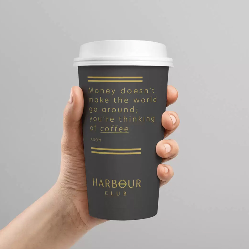
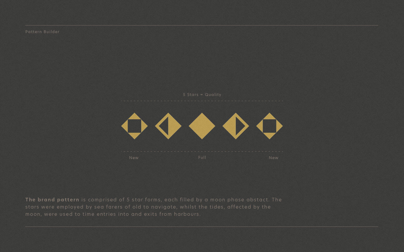
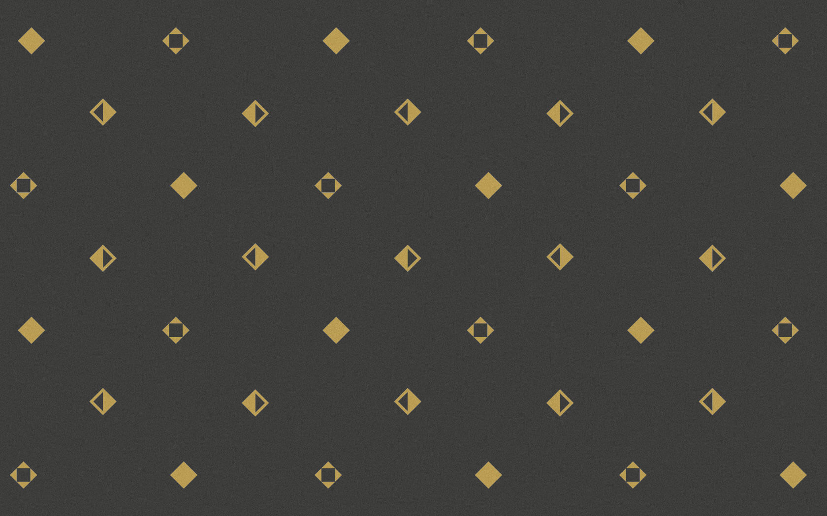
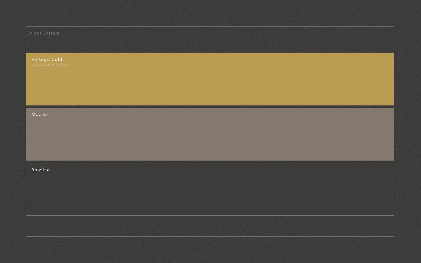
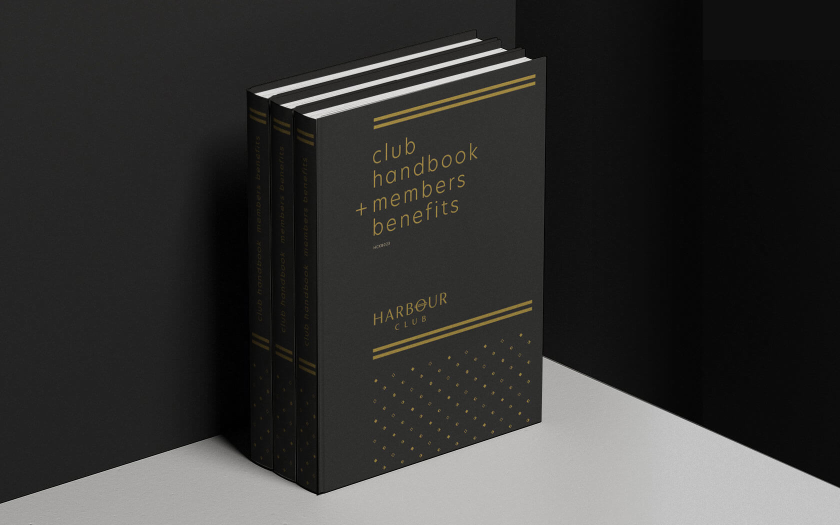
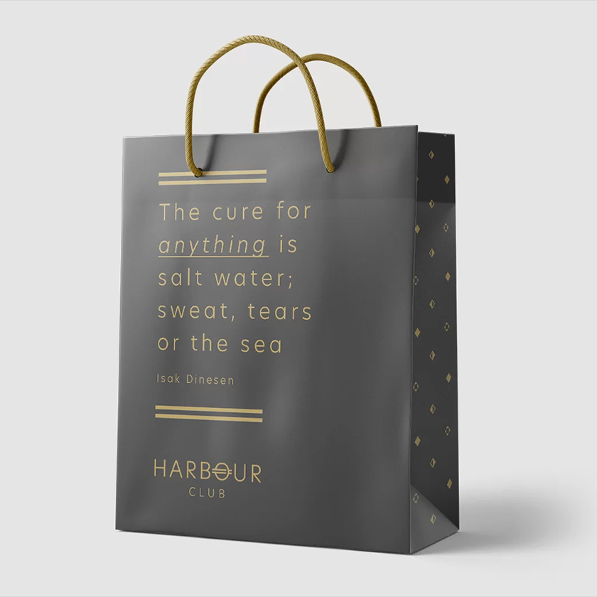
The brand mark is accompanied by a pattern mark built from diamonds housing abstracts of the moon – the stars and the moon are the key celestial markers used by sea farers for as long as our species have needed to navigate the waters. The pattern and type are set together in vintage gold and charcoal tones which together aid in the rendering of the upmarket Harbour Club brand tone.
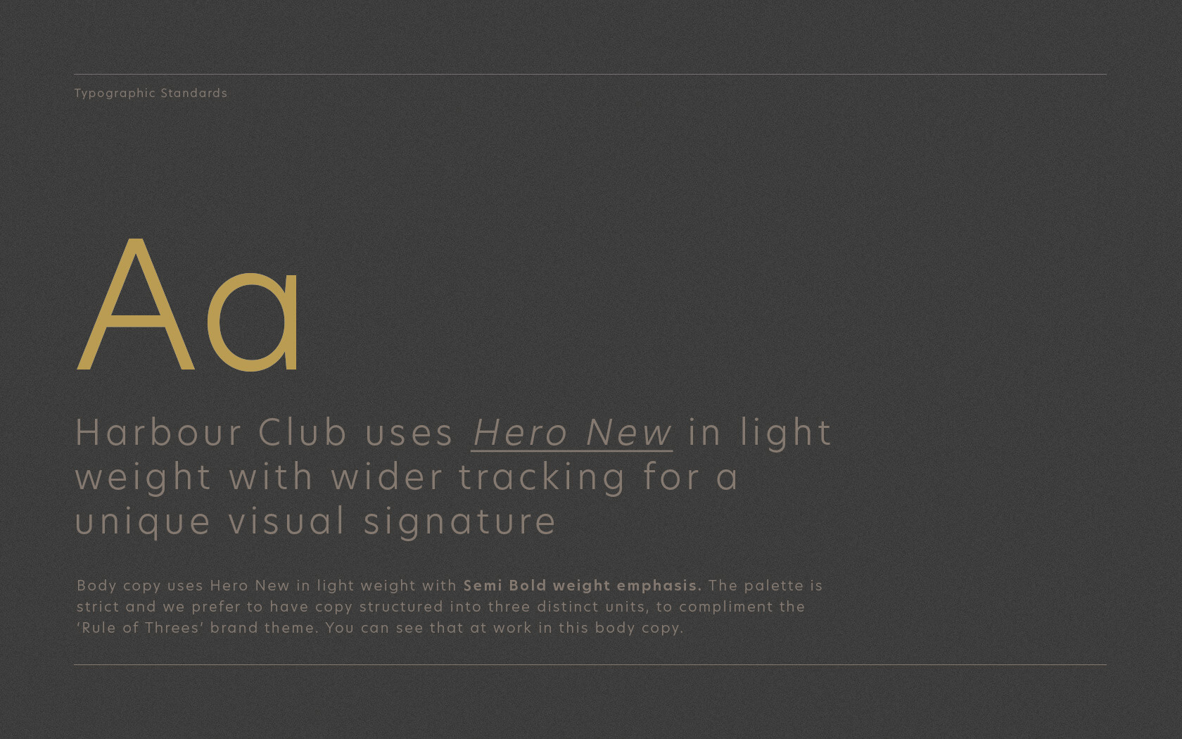
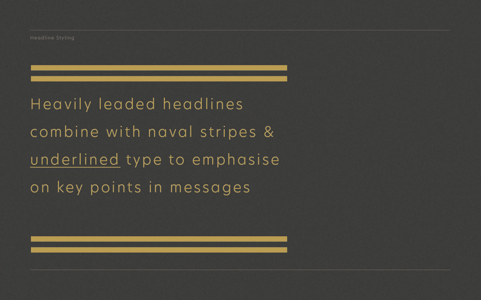
The font is Hero New by Miles Newlyn, set wide, heavily leaded and accompanies by underlines to provide emphasis to essential parts of the messaging. The headlines on key layouts can be set using naval striping which denotes levels of authority on vessels – in our the Harbour Club brand identity it allows the forms to sit in their context with clear punctuality.
Harbour Club brand imagery
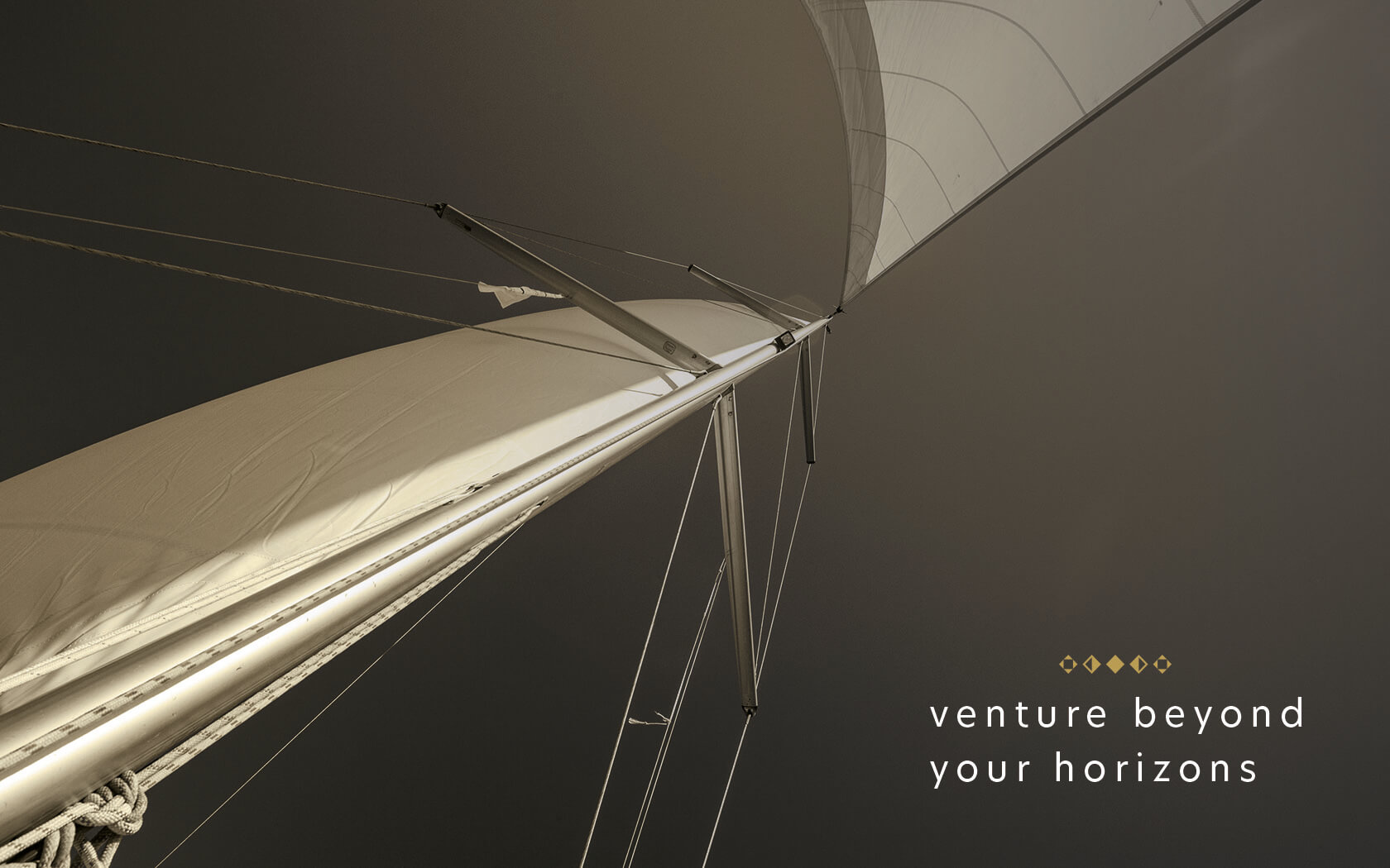
Supporting the brand identity is brand imagery which is evocative of high fashion for lovers of bespoke living and experiences of refinement. The slogan ‘Venture Beyond Your Horizons’ creates an indelible imprint of sophistication which aligns perfectly to the brand’s target audience.
Unveiled in early 2020, the Harbour Club brand identity has starting rolling out across the club’s key touch points – we will certainly be putting this gem of a brand into international awards shows and will keep our fingers cross for a few slabs of metal in our bloated awards cabinet!
To learn more about the project owners GFH, click here.
Services delivered:
Naming Consultation, Visual Identity, Graphic Design & Collateral Design
It’s not what you know, it’s not even who you know… but it is definitely who knows you.
Anon.
Details View Close


Harbours and clubs, this is a combination that really floats our boat.
Liam Farrell. Creative Director and Partner.
XLR8.
Branding

An exhilarating new sports brand for one of Bahrain's most dynamic business groups; GFH's new XLR8 takes to the streets.
Ertiqa.
Rebrand

Ertiqa's Transform Gold and Silver plus Rebrand 100 Award winning rebrand helps lead the way for digital waste transformation.
Sama Bay
Branding
Bahrain gets the beach it's been waiting for.. twice. Remember kids... Fun is loud, if you are doing it right.
Infracorp.
Branding

Unisono delivers a Transform Gold Award winning infrastructure brand identity for Infracorp, the region's first value investing brand.
UTB
Rebrand

Bahrain's newest technical university gets a visual identity uplift, new brochure and website.