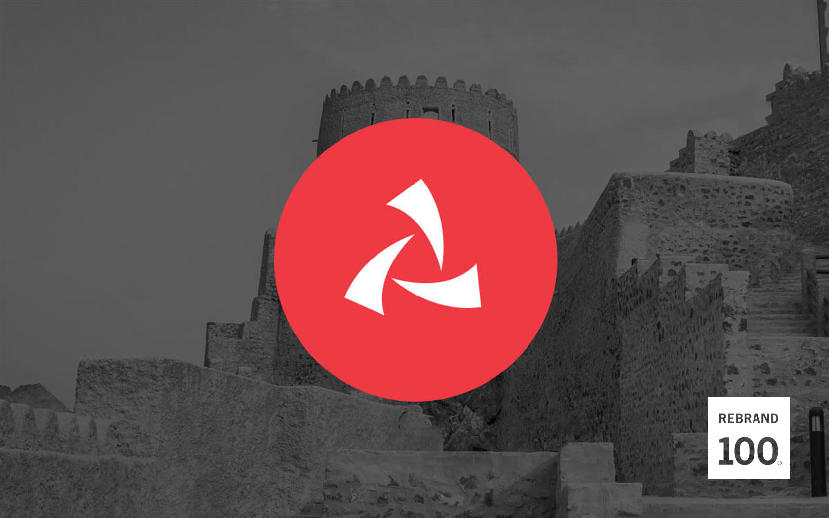
Esterad. Rebrand


A very import-ant and well awarded rebrand
An introduction to Esterad, a premium investment company brand
Esterad’s rebrand process started with the understanding of the brand’s rich legacy in Bahrain as a profitable and high dividend-paying investment company. It has a long and proven track-record of secure investments regionally and internationally in a variety of assets classes including real estate, public markets and private equity.
Challenges we faced in developing a brand strategy and identity
After a brief period of quiescence, Esterad was back, stronger than ever and ready to introduce its new ‘sweet spot’ investment strategy to Bahrain. This was focused on exiting all non-core activities and focusing on new, bold assets with controlling positions to form a diverse portfolio of high-yielding investments.
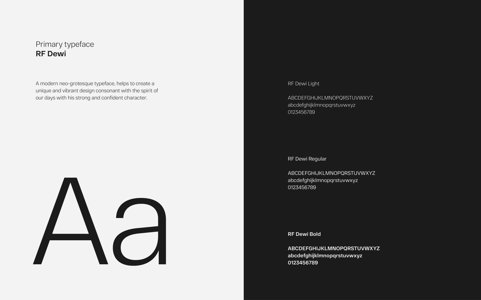
The main challenge for Esterad’s rebrand was the lack of strategy to build upon. Before we could show the world a ‘new Esterad’, we had to bring a brand-centric approach to the project, starting with a new vision, values and proposition for the future. That new strategy would serve as a compass on Esterad’s journey as a brand, including their identity – the colours and typeface used until then lacked stand-out and the ‘dot-com era’ brand mark was no longer fit for a bold, dominant, 21st century investment company.
To bring this to life, Unisono was appointed to develop a new strategy and brand identity suitable for a new, promising era and help Esterad realise its true brand potential.
Our strategy to bring this investment company brand back to life
We started the process with our interactive Why™ workshop – an engaging and collaborative session, where key stakeholders participated in exercises that helped unearth the brand’s true personality. A brand strategy was developed based on the workshop findings, which was later translated visually into a bold, modern brand identity.
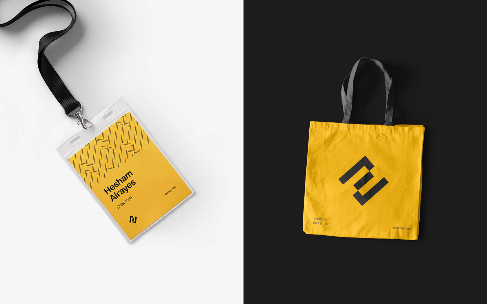
Esterad’s rebrand identity symbolises the brand’s transformation while retaining a professional and corporate aesthetic. The core visual identity reflects the initialism of the brand’s name, evocative of Esterad’s ability to transform investment opportunities into real market value; while the fifth element represents the intricate and dynamic nature of the investment sector.
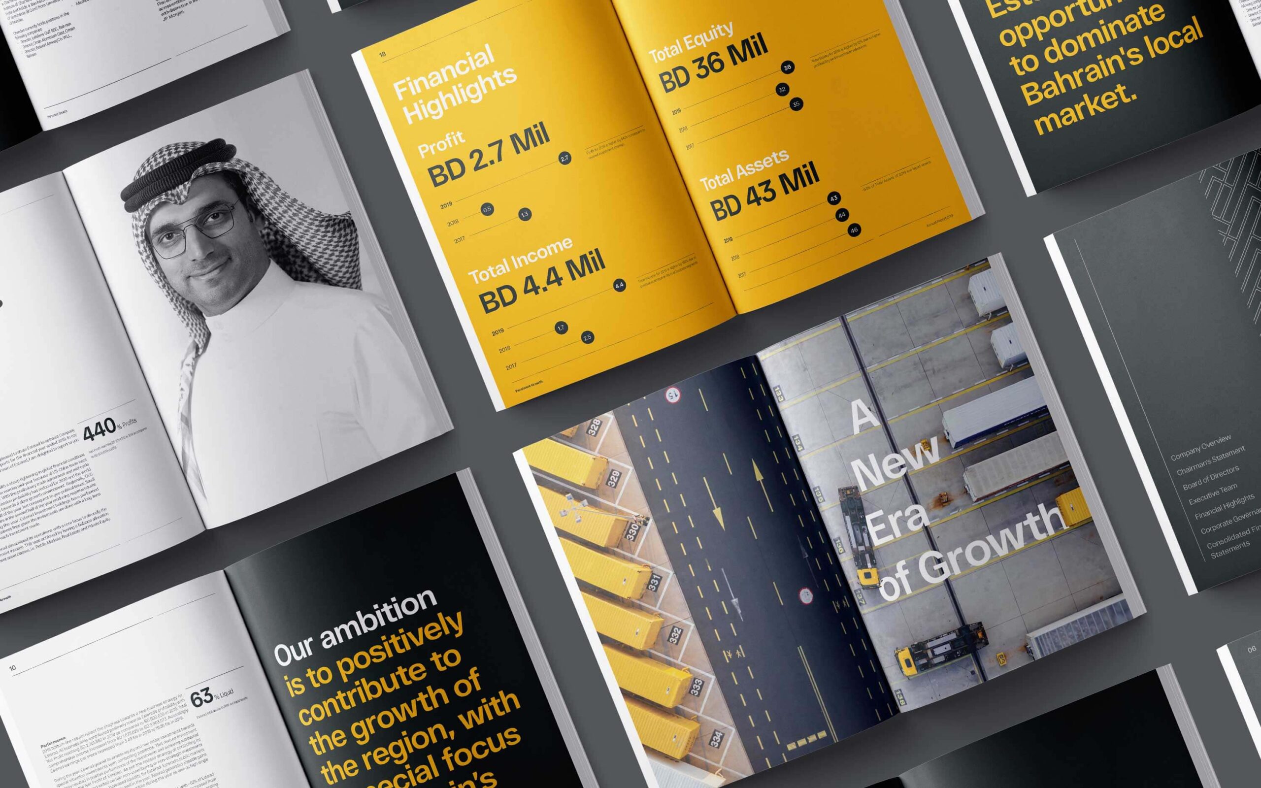
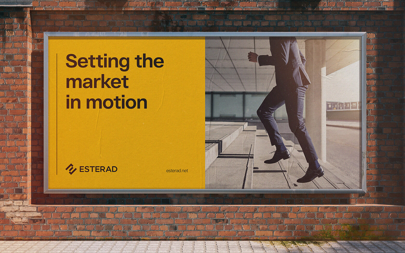
Esterad uses a dark grey and pure white colour palette, reflecting the brand’s modern professionalism, clarity and stability; a striking yellow accent colour represents Esterad’s confidence and high–energy they bring to the region’s investment industry.
Results from Esterad’s rebrand process
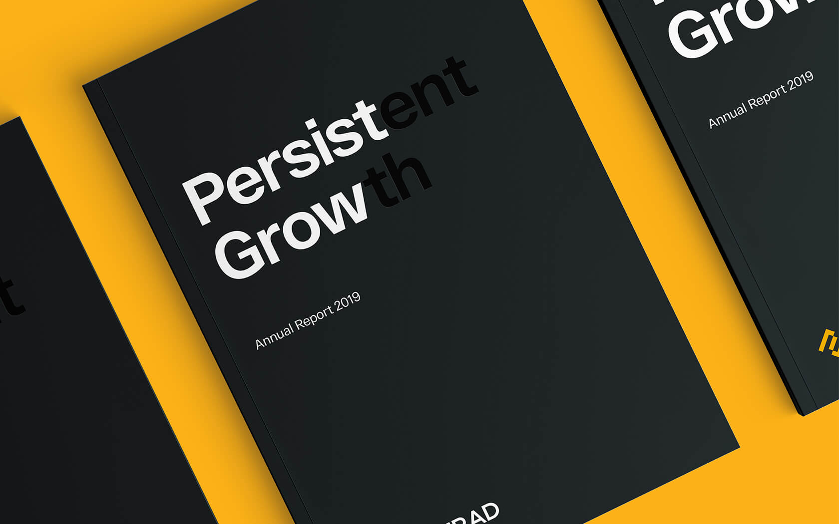
A brand-new Esterad was unveiled to the public earlier this year as part of a multistage rollout process. We are thrilled to see this new investment company brand on its journey to seize its opportunities and take the investment market by storm once again.
Services delivered
Brand Strategy, Naming, Brand Design, Visual Identity, Slogan, Tone of Voice, Digital Design, Print & Graphic Design.
The best way to measure your investing success is not by whether you’re beating the market but by whether you’ve put in place a financial plan and a behavioral discipline that are likely to get you where you want to go.
Benjamin Graham.
Details View Close


This rebrand was an important epoch for the firm and signified the great changes ahead.
Liam Farrell. Creative Director & Partner.
Shamsaha.
Rebrand

This illuminating rebrand for Shamsaha, the women empowerment charity, won Highly Commended at Transform 2021.
Bank Muscat.
Rebrand
Bank Muscat's iconic rebrand is helping a regional leader to grow beyond traditional banking.
Unisono
Notebooks
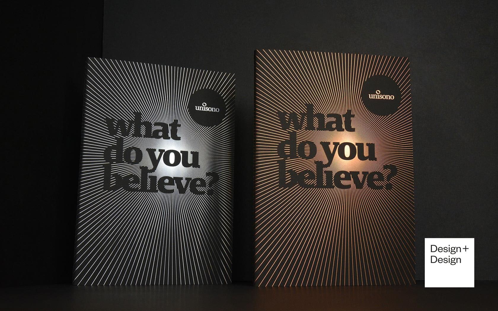
Luxurious print finishing combine with eloquent copy and dramatic typography on these 2019 Unisono Notebooks
Onyx Skyview.
Branding

Reach higher than you previously thought possible with the new project from Kooheji Development - the incredibly spacious and beautifully connected experience that is Onyx Skyview.
Healian.
Branding

Unisono has helped develop a healthy new financial service platform, bringing healthcare investments to a brand new audience.