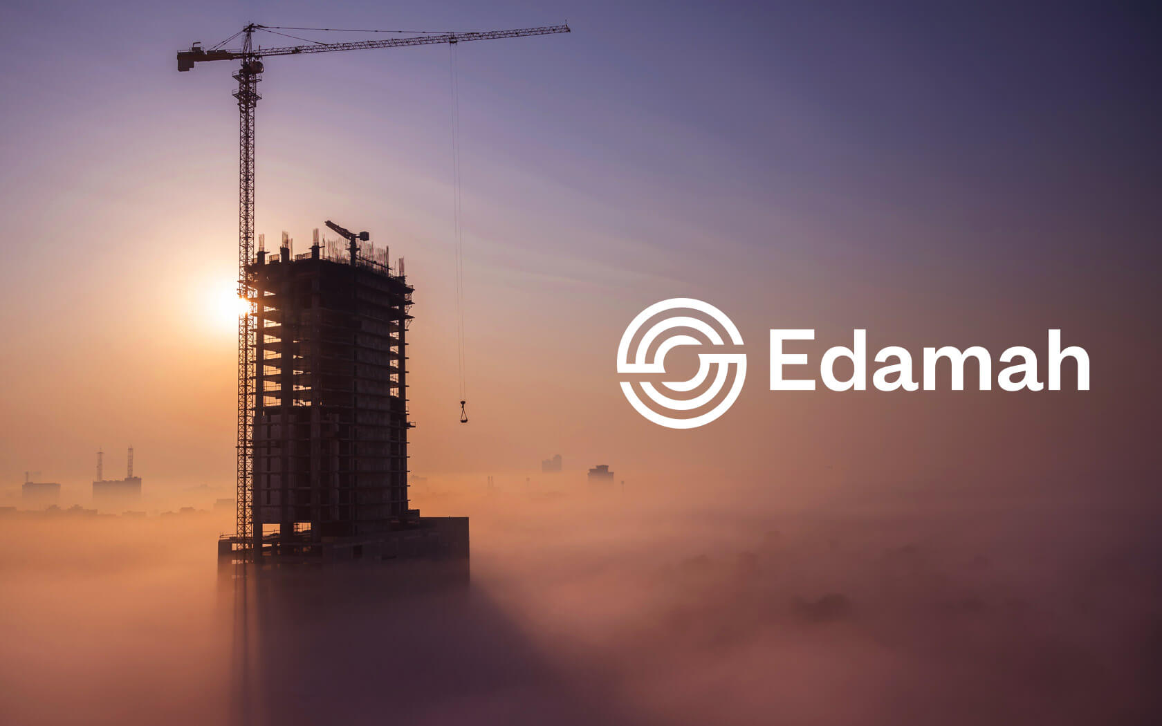
Edamah. Rebrand
A Brand that’ll Endure
Creating the Edamah Brand
Edamah is the Sovereign Wealth Fund of Bahrain’s real estate arm. As one of the leading real estate firms in the nation, it was key that the firm be represented strongly and to an international level. The existing identity was based on buildings which was a very narrow interpretation of their remit and how they added value to Bahrain.
We started out with a clear mandate and an empty page and began the process of discovery with internal and external stakeholders. What began to emerge soon into the process, was a company that was not only focused on great delivery, but also great creativity. We asked “do you see yourself as a creative company…?”
Introducing the Edamah rebrand
Bahrain Real Estate Investment Company (Edamah) is the real-estate arm of the sovereign wealth fund of the Kingdom of Bahrain. Incorporated in 2006 to manage and expand an assorted portfolio of real-estate in Bahrain, Edamah has established itself as one of the Kingdom’s leading property developers.
The name Edamah means ‘sustainability’ or ‘enduring’ in Arabic.
Challenges we faced working on the Edamah rebrand
Edamah is one of the leading real estate firms on the island but you would not realize this as their public profile has been very subtle. The firm is a creative power in the kingdom, creating some of the landmark projects which have created impact both in terms of how the citizenry live and how the kingdom looks. The brand identified itself with an icon which was a set of towers which when coupled with the slogan (building for bahrain) locked the perception of the firm into a construction space. Edamah inspires architects who work with builders but they are anything but a construction firm.
For the edamah rebrand, we conducted highly collaborative Why™ Workshop sessions over Zoom (a first for the strategy team) with the Board of Directors and leadership team to uncover the core purpose and motivation behind Edamah. What started to evolve was a picture of a firm which was highly collaborative and creative, in essence. The firm was a key advocate of creativity and this was not being presented to its audience. We posed the question ‘Do you think of Edamah as a creative company?’ The answers we insightful and opened the team’s eyes to the creative spirit which was present in every project they delivered.
What was needed was a way to bring both the creative essence and the impact their work delivers forward and make it a part of the perception of the brand.
Our strategic response
Our work began to position Edamah away from construction sector and towards being seen as ‘creative sponsors’ who transform the built environment through creative collaboration. We knew the identity had to release the firm’s inner creative spirit so it could express itself as a serious firm that creates impact in both residents lives but also across the skyline of the kingdom.
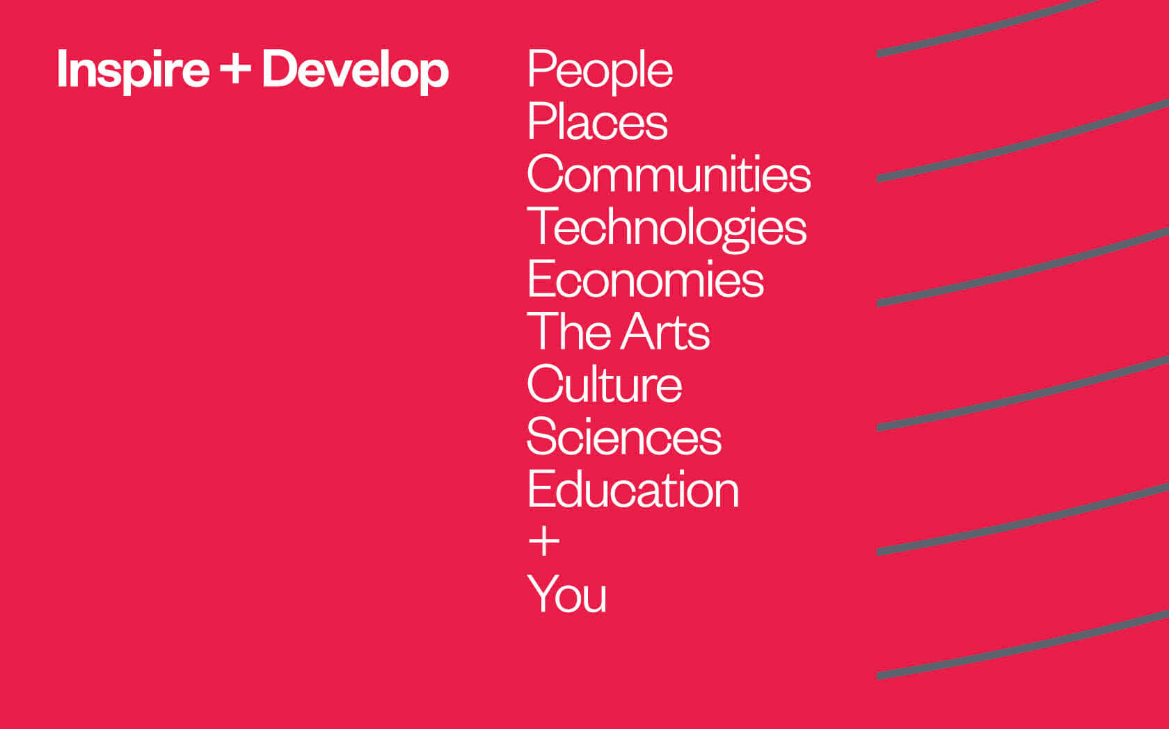
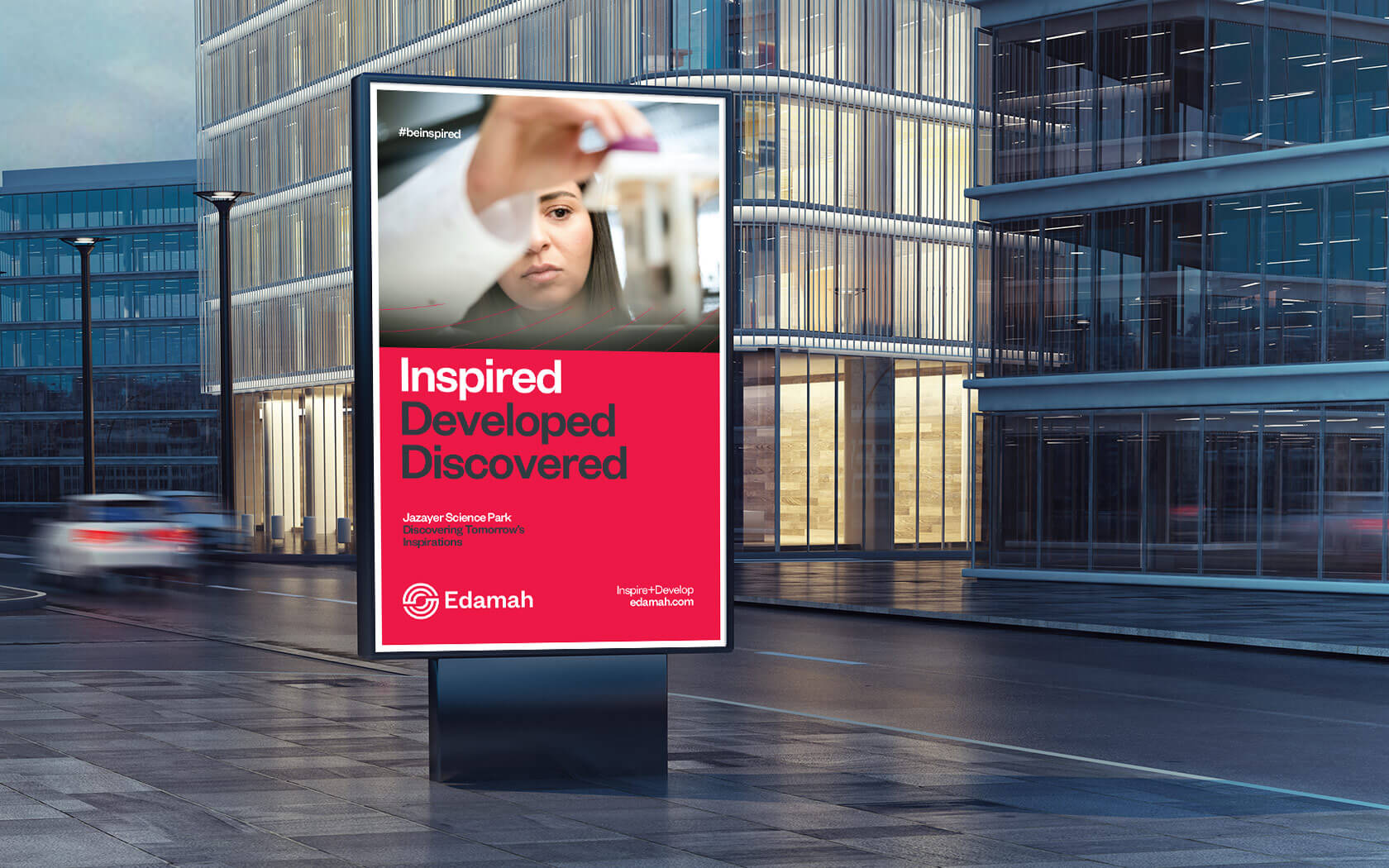
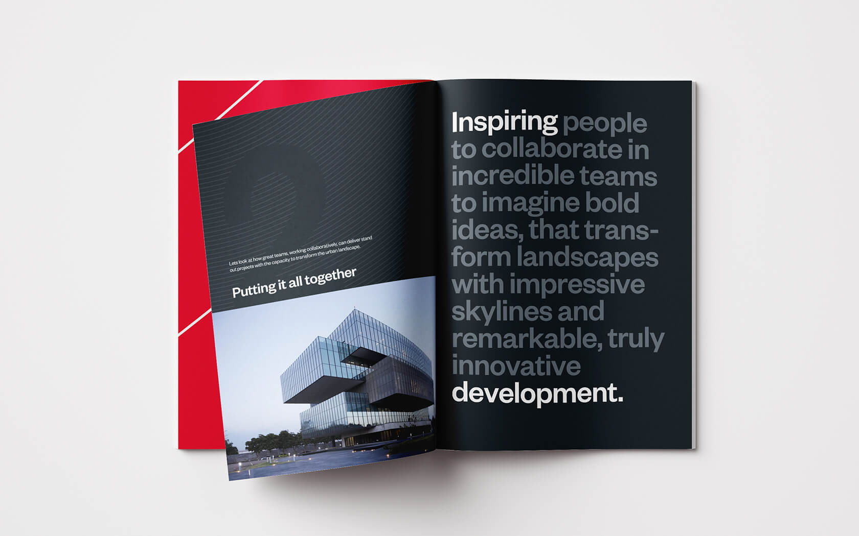
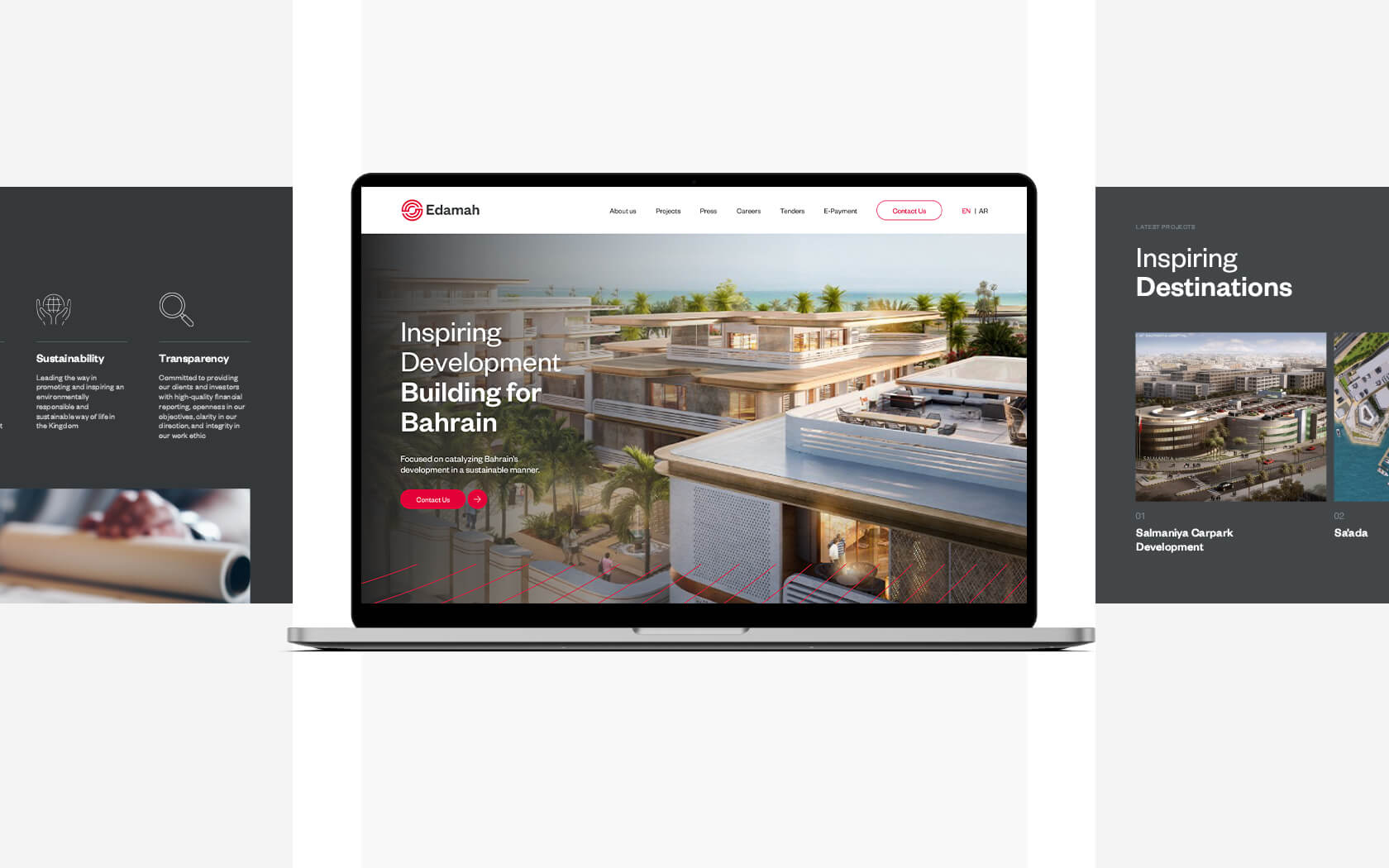
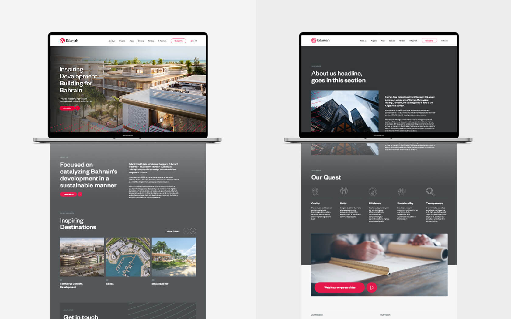
The Edamah rebrand strategy began with the firm’s reason for being or purpose – what we can call its ‘Why’. The firm believes its reason for being is to contribute to a greater cause. This influenced the vision which we expressed as ‘To inspire remarkable development’. To help it achieve its vision, the brand’s promise was crafted as ‘To create destinations that inspire positive progress’. With the brand’s reasons for being crafted, we started to work on its ways of being. The values of Empathy, Dedication and Imagination captured the soul of the firm which would be expressed through its persona, a Mature, Energetic, Sociable and Educated creative force. Finally, the brand’s positioning (Inspiring Transformational Development) captured how it is unique with in its market.
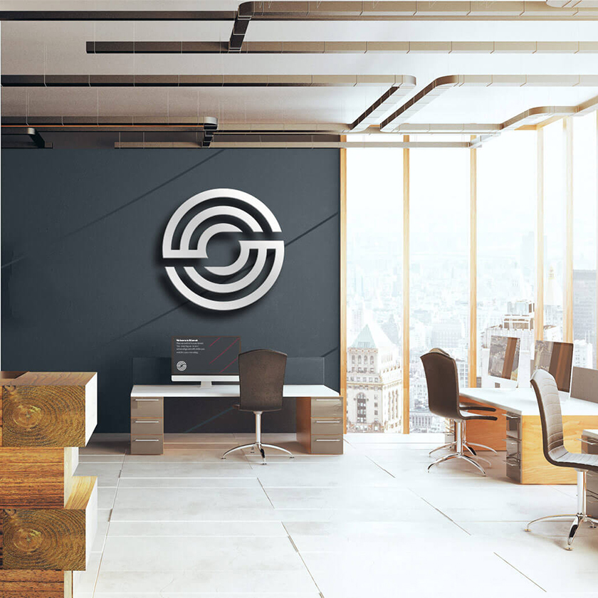
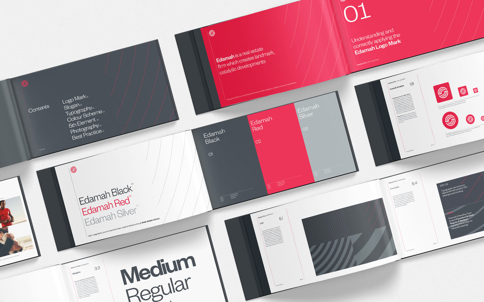
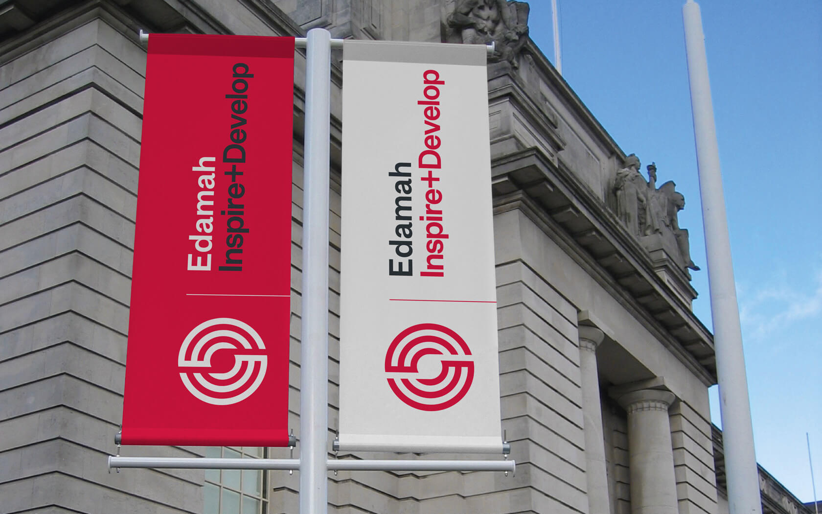
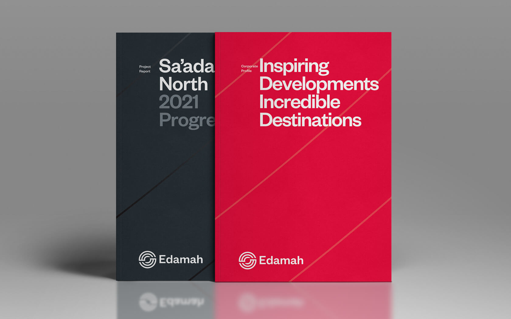
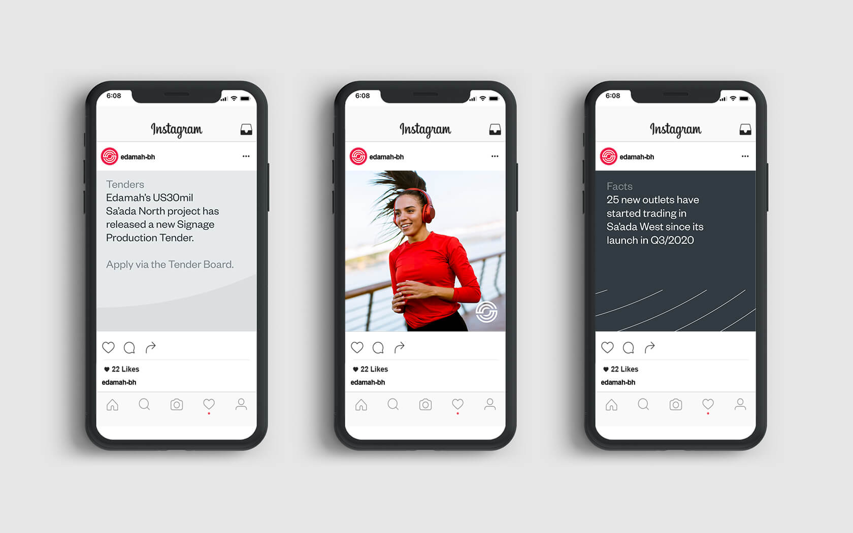
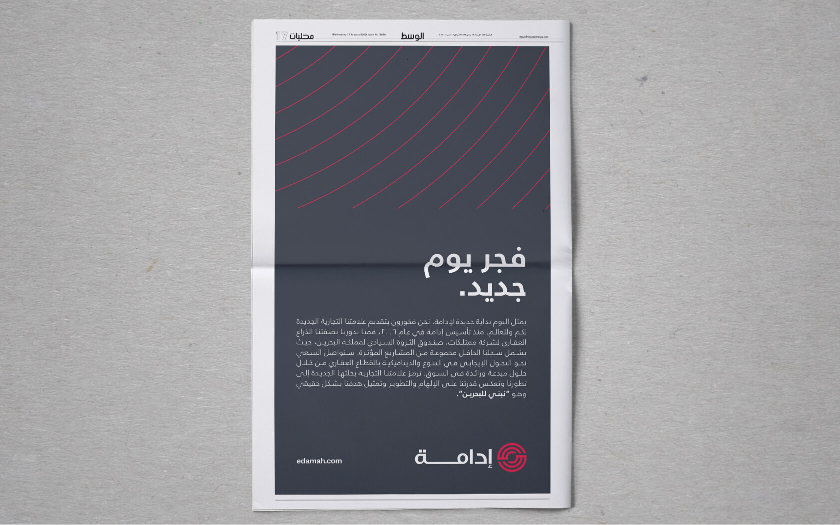
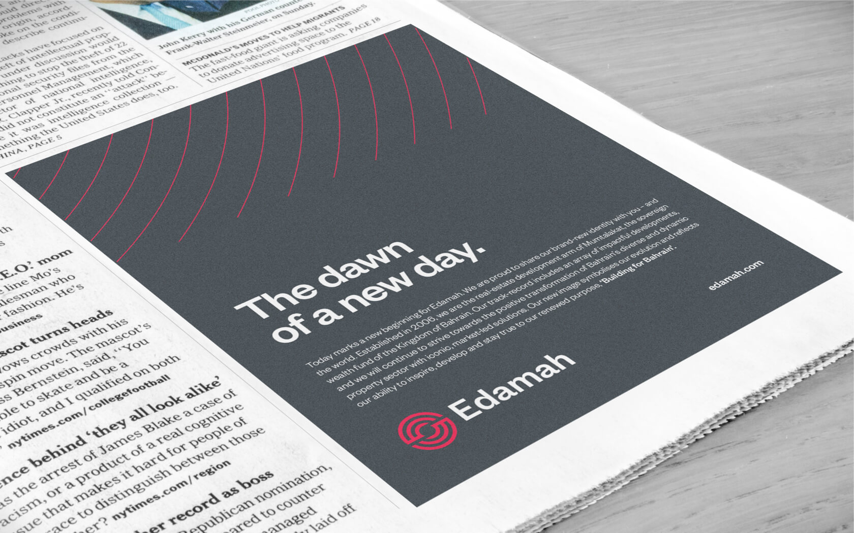
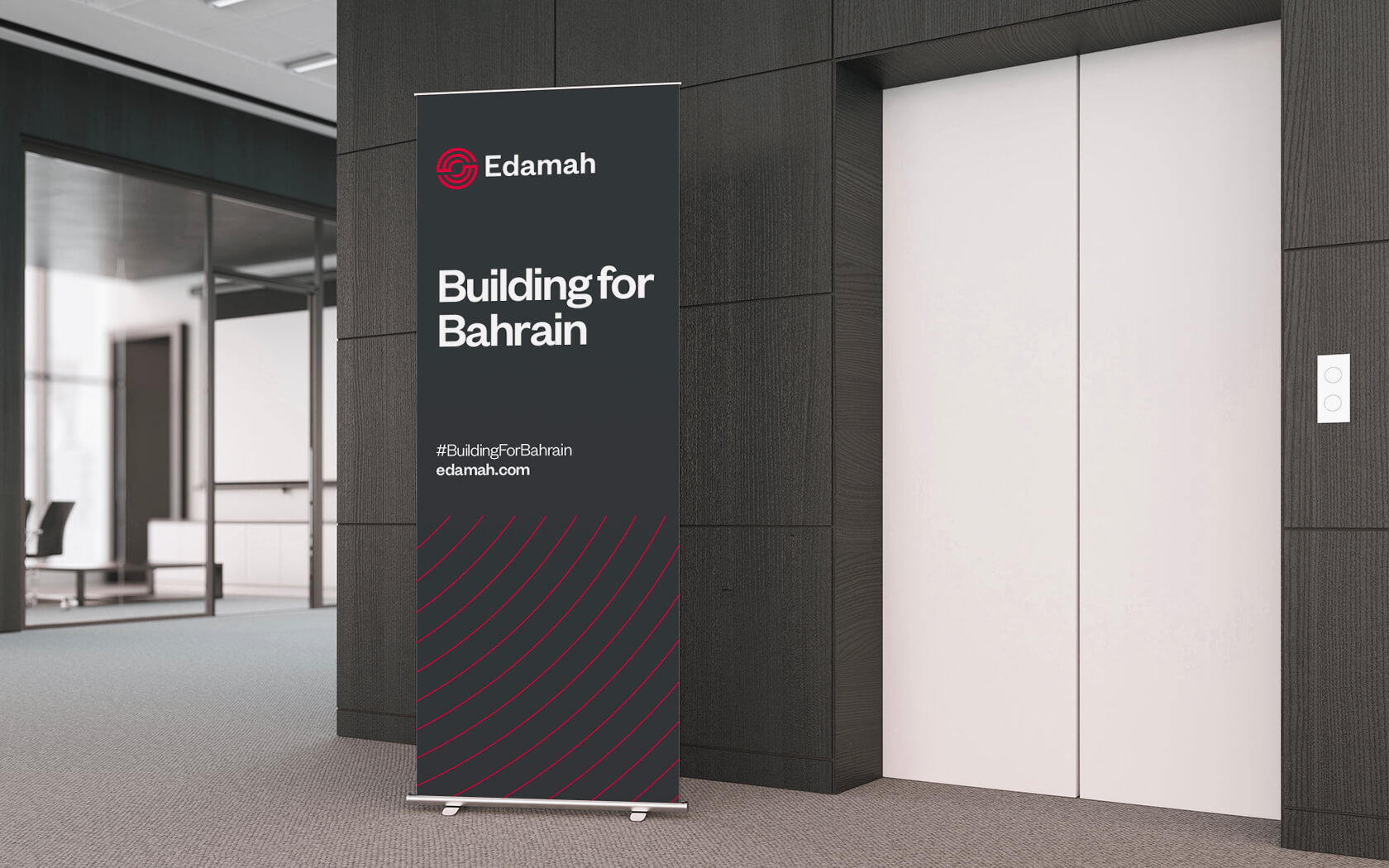
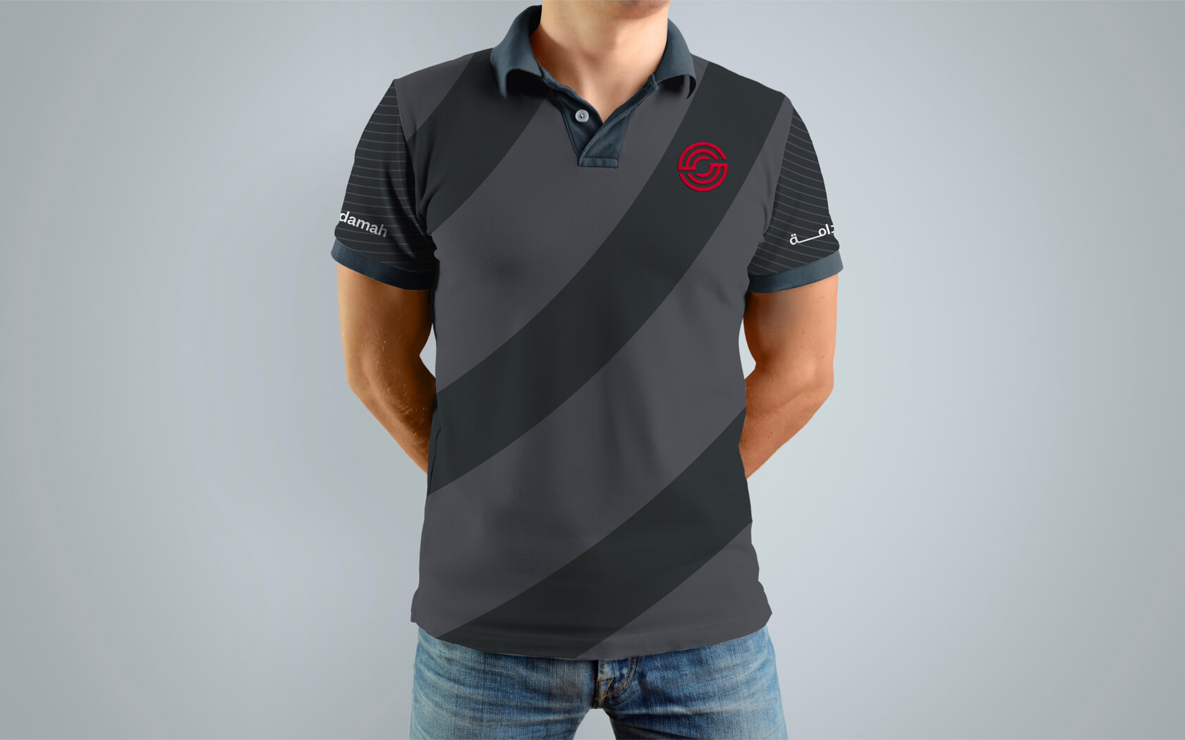
The meaning behind the name (Edamah) needed to be expressed so it wasn’t seen as an afterthought but as a core element in the perception of the firm. The brand’s impact can be felt both through its commitment to sustainable development but also in the enduring impact their work creates for communities on the island. The iconic form of the logo is comprised of two upper case ‘E’ letters whose rotational symmetry forms a visual continuity.
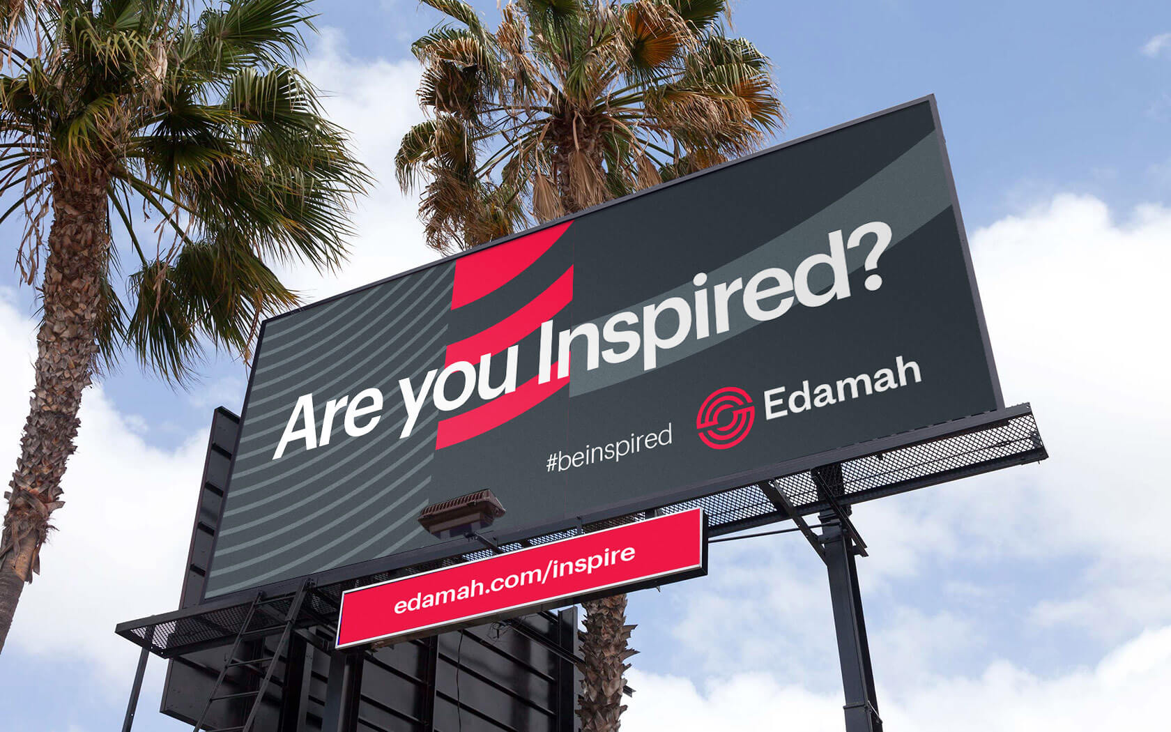
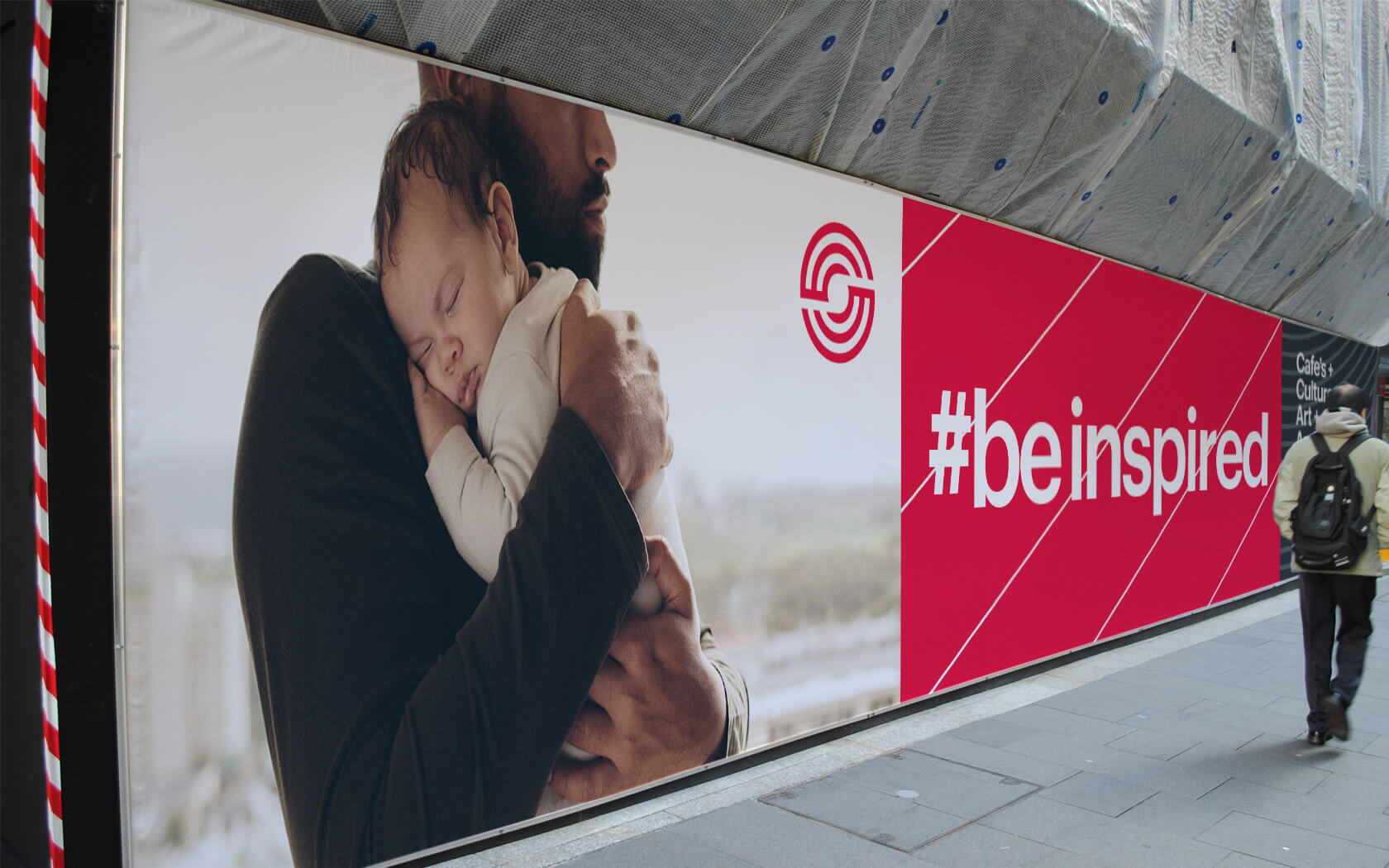
The phrase ‘catalytic development’ was expressed during a workshop and this has been expressed in both the icon and the 5th element (or master graphic) device. The form of the icon looks like a set of concentric circles emanating outward from a central space. The fifth element continues this form with an aesthetic that feels like an impact rippling out in various different waves.
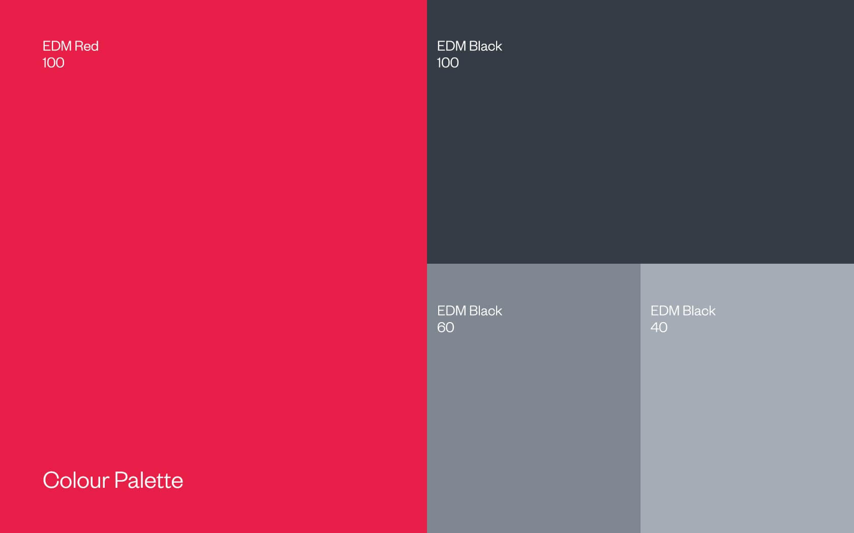
The red colour of the brand was chosen not for the association to the Nation’s colour but for the impact the brand creates. It is a sponsor of creative impact and therefore an agent of change. This was best expressed through a dominant red tone.
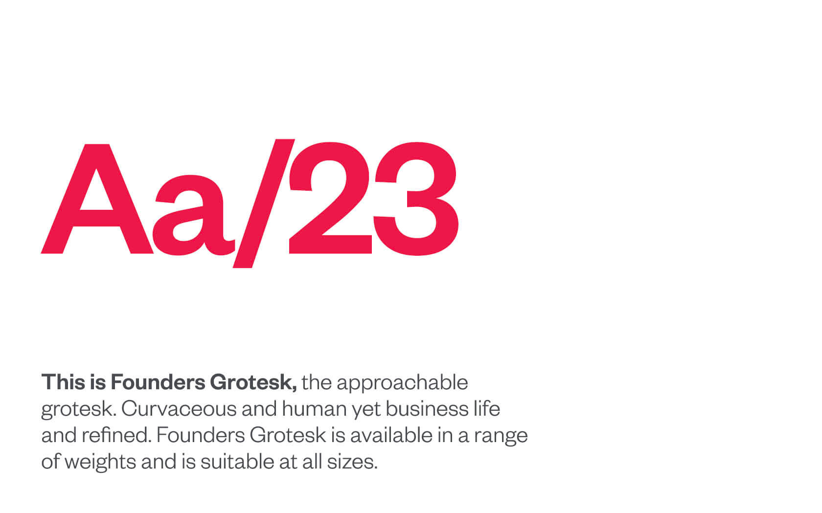
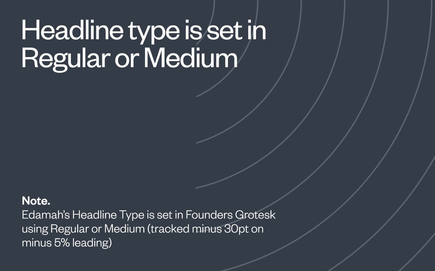
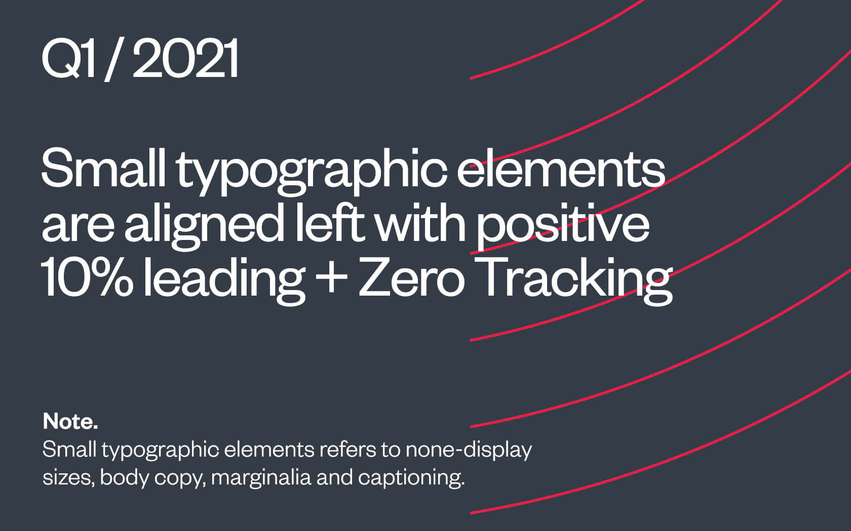
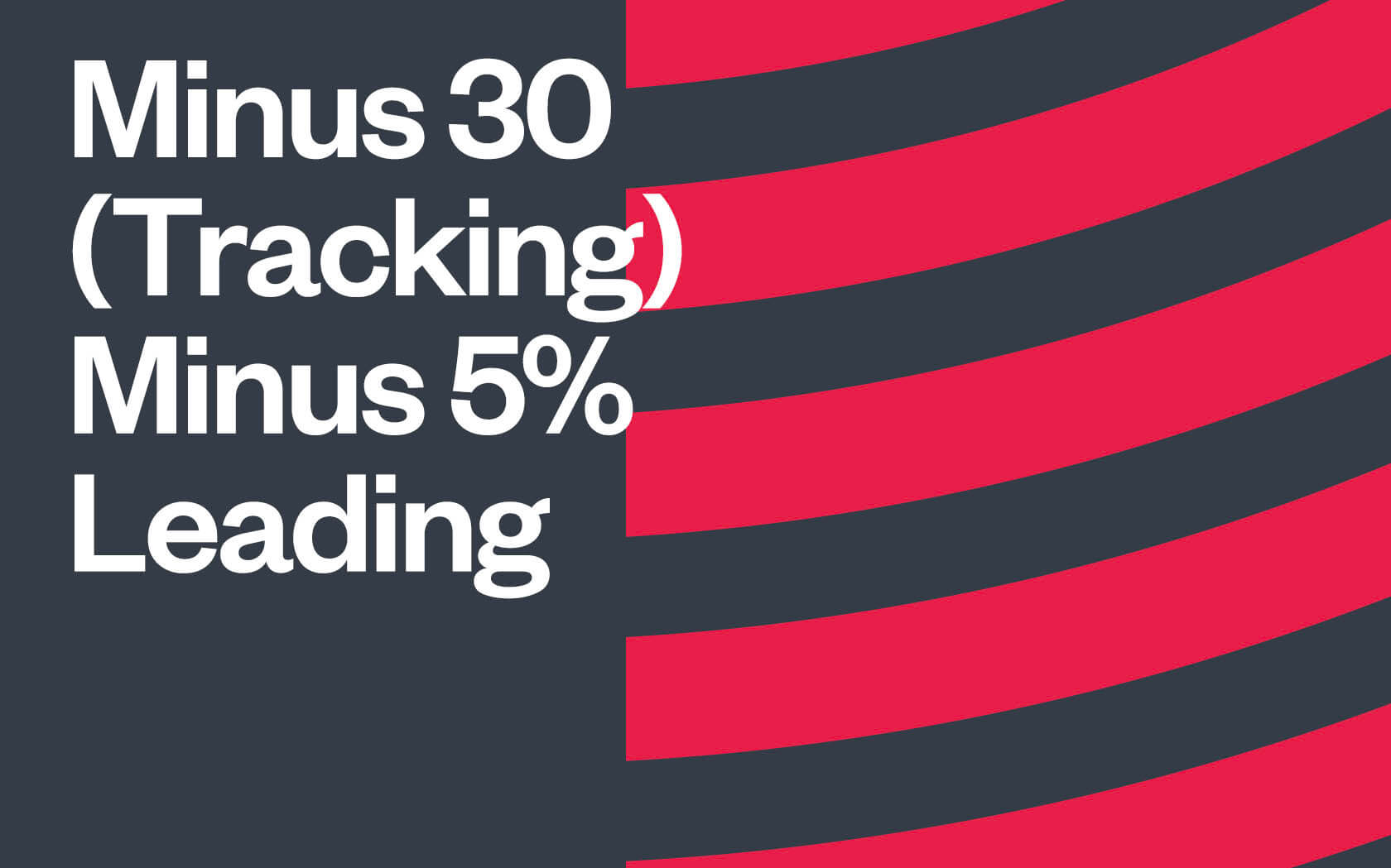
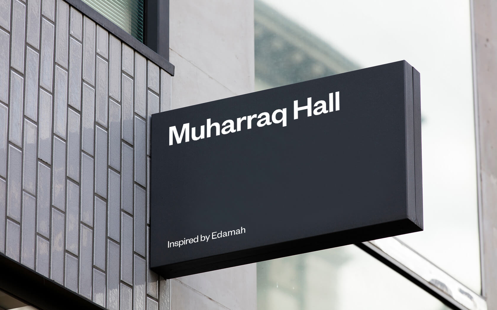
Finally, Founders Grotesk by the Kilm type foundry was selected as the English type face and Frutiger Neue by Nadine Chahine as the Arabic typeface. These faces shared a clean yet creative yet business like aesthetic suited to the modern corporation.
The creative part of the Edamah rebrand was complete, now we could work on rolling the brand out and begin the brand building process in earnest.
Results of the Edamah rebrand
Through this rebrand, we managed to best express Edamah’s position as one of the leading real estate developers in the Kingdom. We have received glowing feedback from the client’s Board of Directors and Management and the perception of a sponsor of creativity has been noted inside and out.
Services delivered
Brand Auditing, Brand Strategy, Visual Identity, Slogan, Tone of Voice, Packaging, Advertising and Graphic Design.
The Edamah rebrand process was highly collaborative… you are very receptive to input from all voices (and) big on collaboration.
Nader Khalfan. Marketing Manager. Edamah.
Details View Close


This was one of those creative solutions that pops into your mind as soon as you hear the name. Enduring and timeless.
Liam Farrell. Creative Director & Partner.
Propaganda
Rebrand
Middle East's premier underground night club gets a Unisono make over. Boom. Clap. Tisk.
Ertiqa.
Rebrand
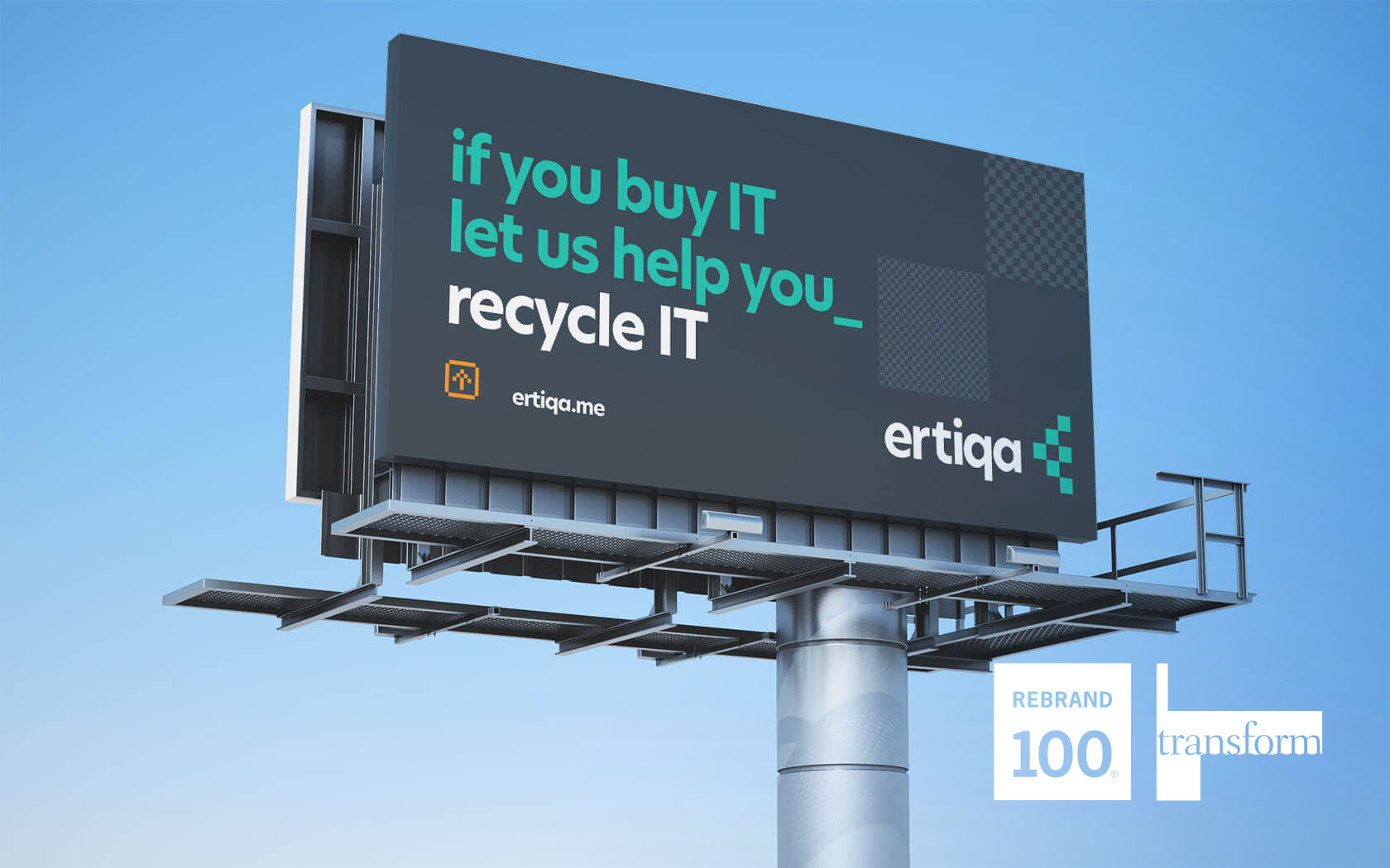
Ertiqa's Transform Gold and Silver plus Rebrand 100 Award winning rebrand helps lead the way for digital waste transformation.
Seef Mall.
Rebrand
This Transform Gold award-winning rebrand for what has become Bahrain’s friendliest mall also featured on Brand New, the world’s leading branding site.
Infracorp.
Branding
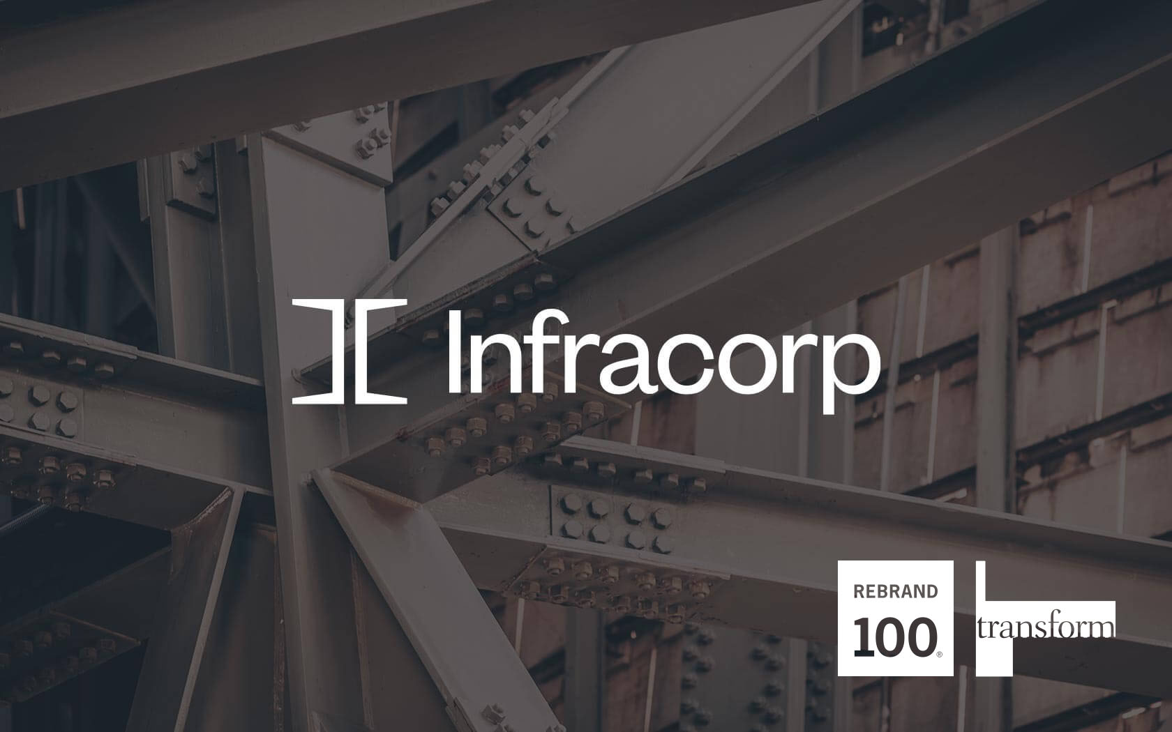
Unisono delivers a Transform Gold Award winning infrastructure brand identity for Infracorp, the region's first value investing brand.
Khaleeji
Rebrand
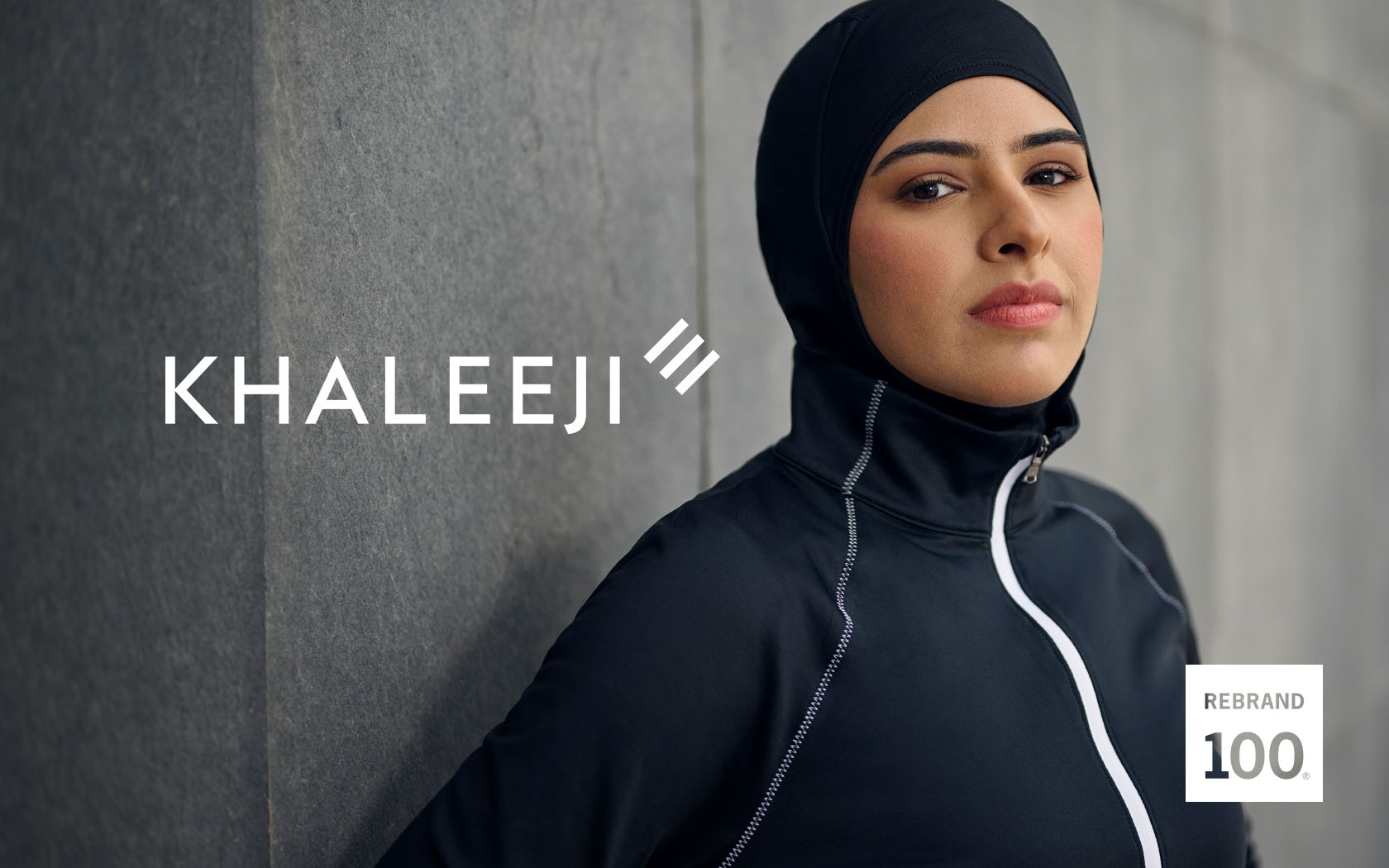
Bahrain's most ambitious Islamic bank gets a bold new, ambition-focussed brand strategy and identity.