Raees & Co. Rebrand
When it comes to legal practice, Raess&Co is is l’awfully good
Raees & Co is a Bahraini law firm that has been operating with integrity, expertise and passion since 2008. Originally named Nezar Raees Associates, and despite a growing international clientele and a solid success rate in the commercial legal sector for over a decade, they were still perceived as an undifferentiated ‘local’ firm. That’s why the company appointed Unisono to develop an international identity to position the firm as a thought leader in the industry.
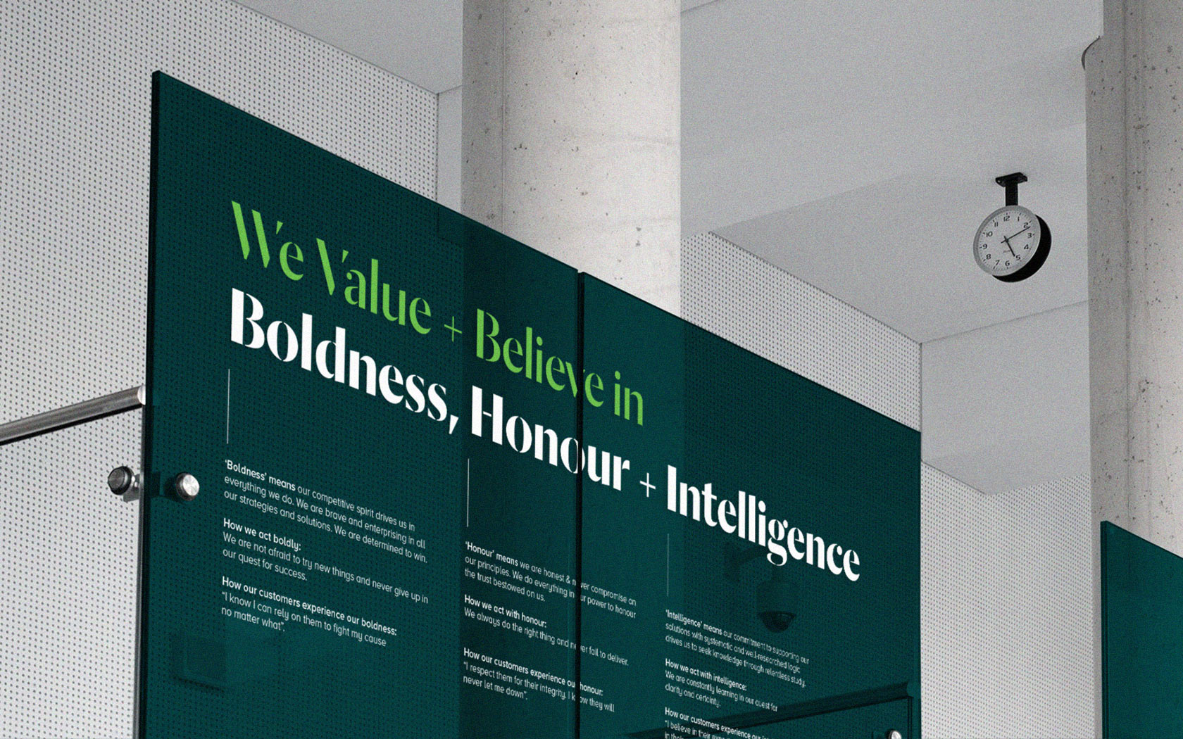
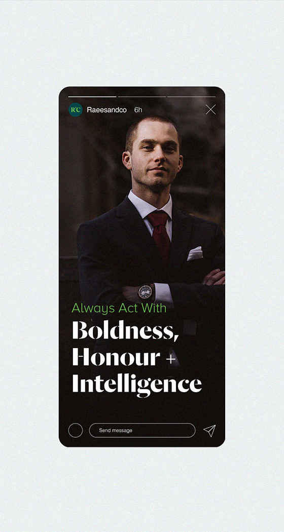
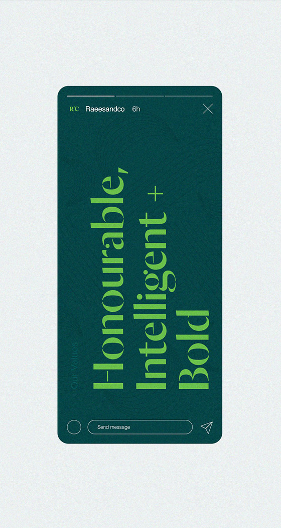
Through client workshops, we helped discover the brand’s true purpose: to challenge the status quo and the values they hold sacred: Honour, Intelligence & Boldness. That ‘challenger’ spirit inspired the development of a new brand identity – one that reflects the confidence and bravado of a brand that is not afraid of taking risks but that, at the same time, conveys their belief in the power of knowledge and constant learning.
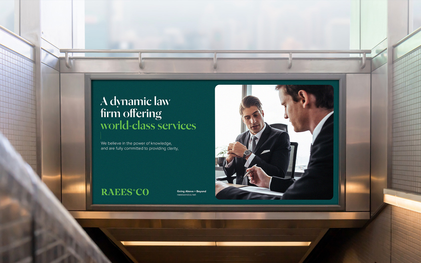
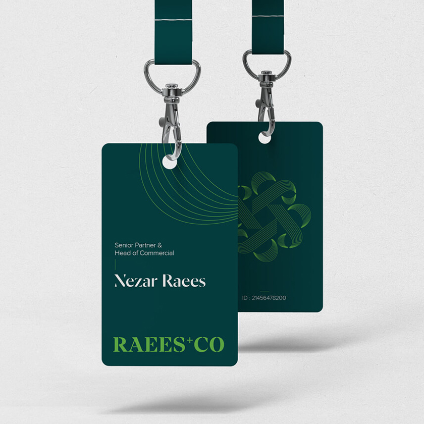
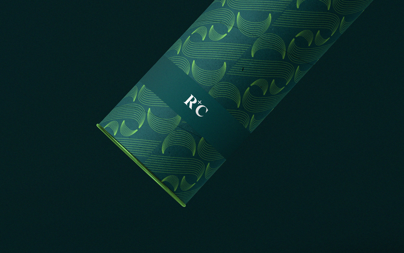
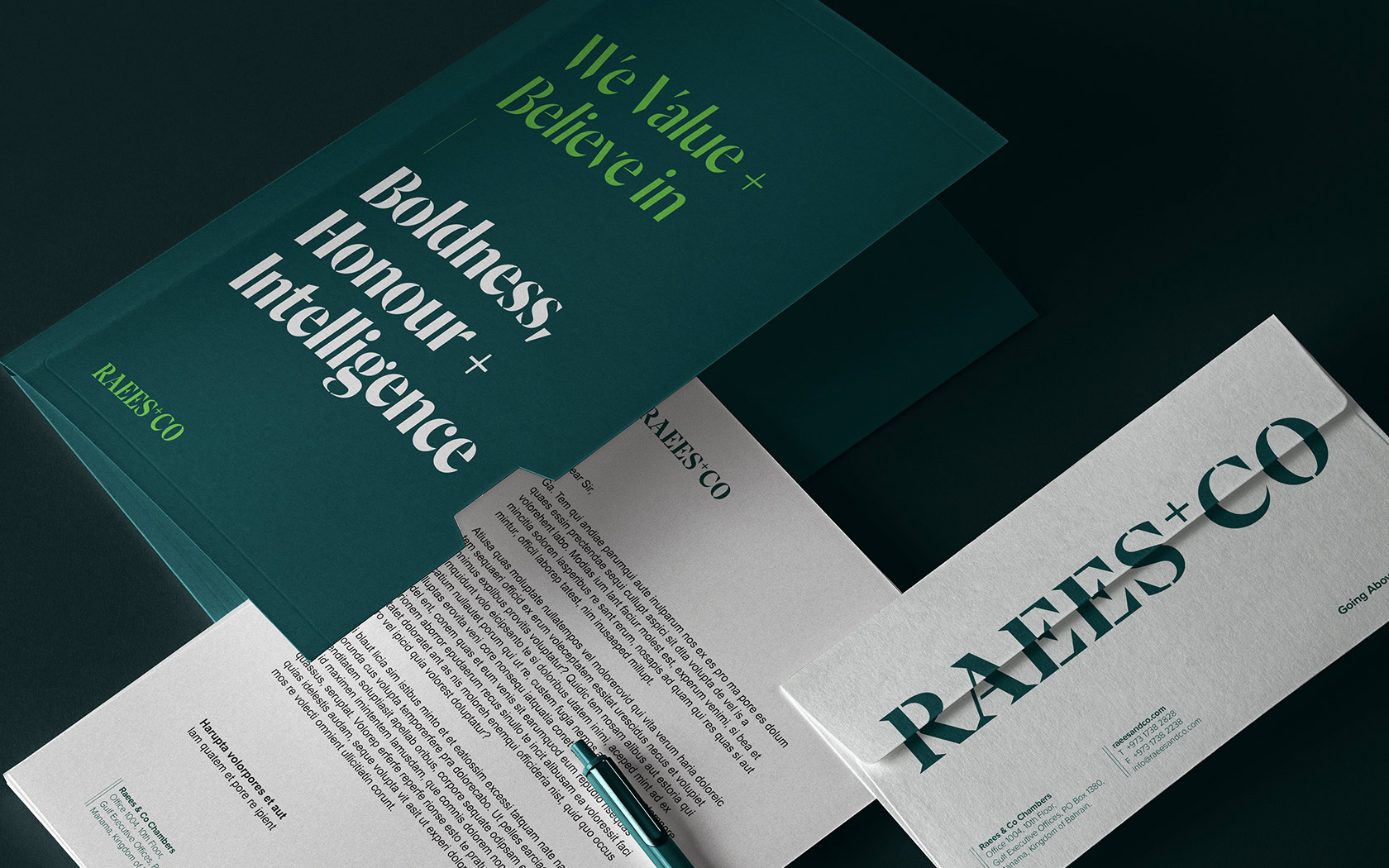
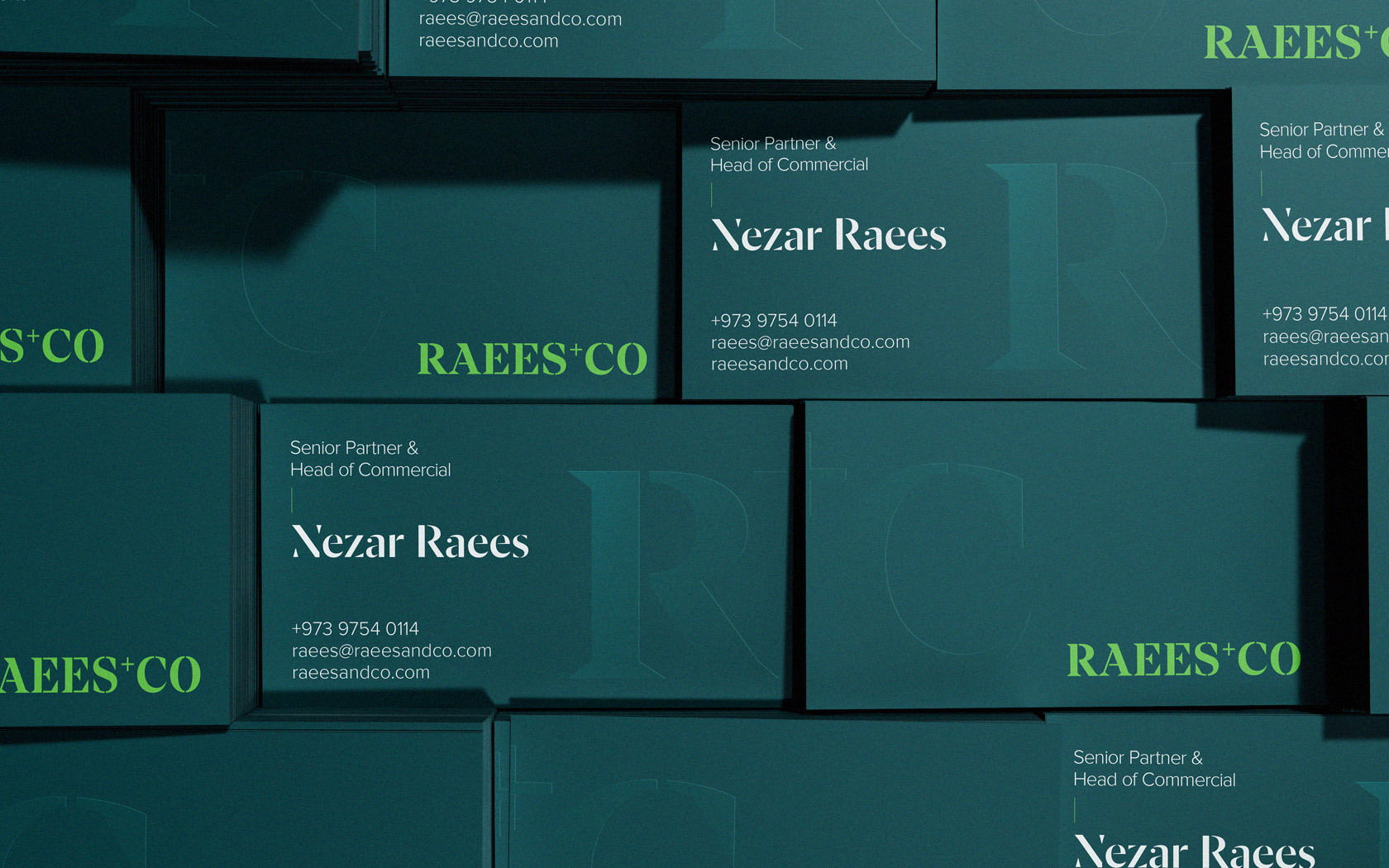
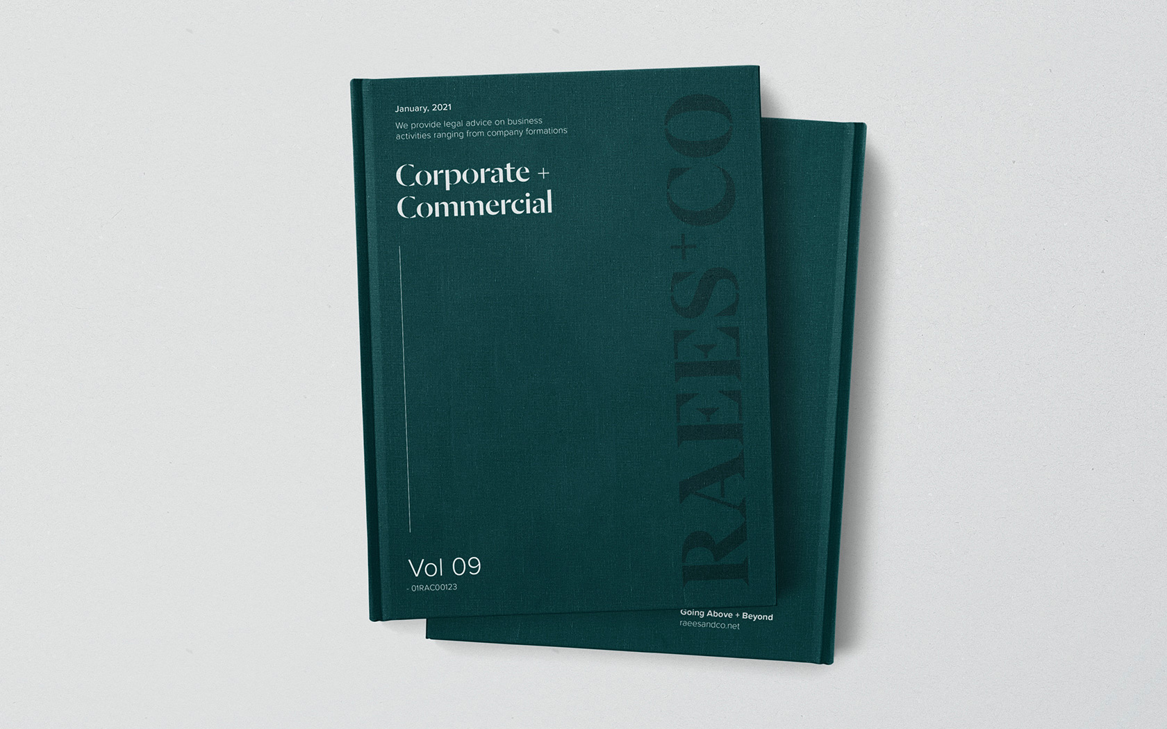
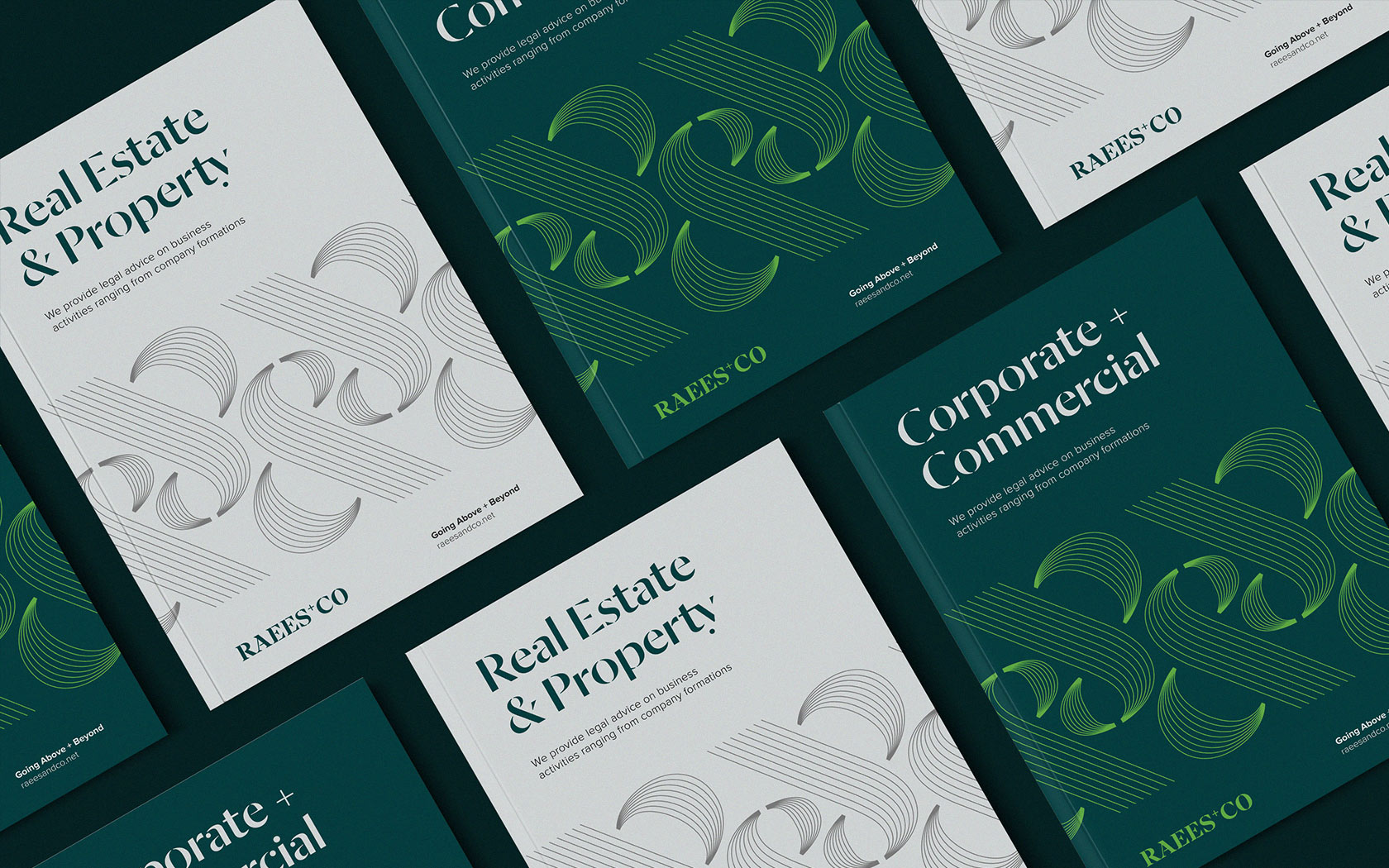
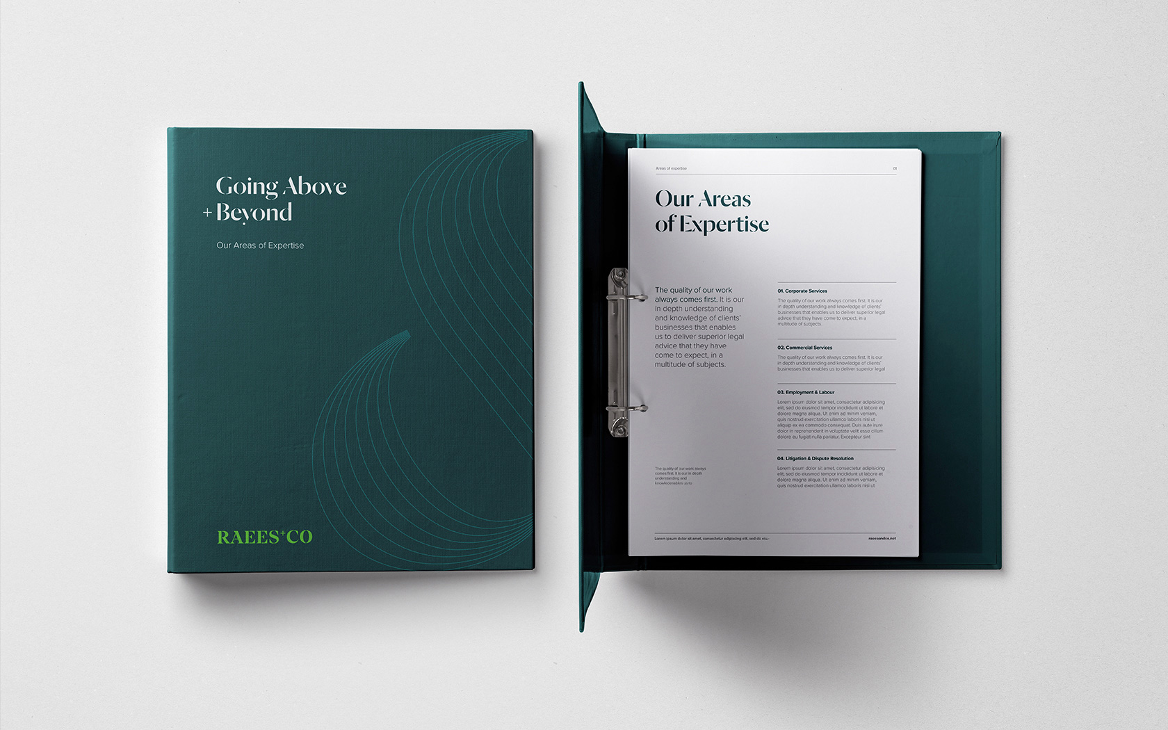
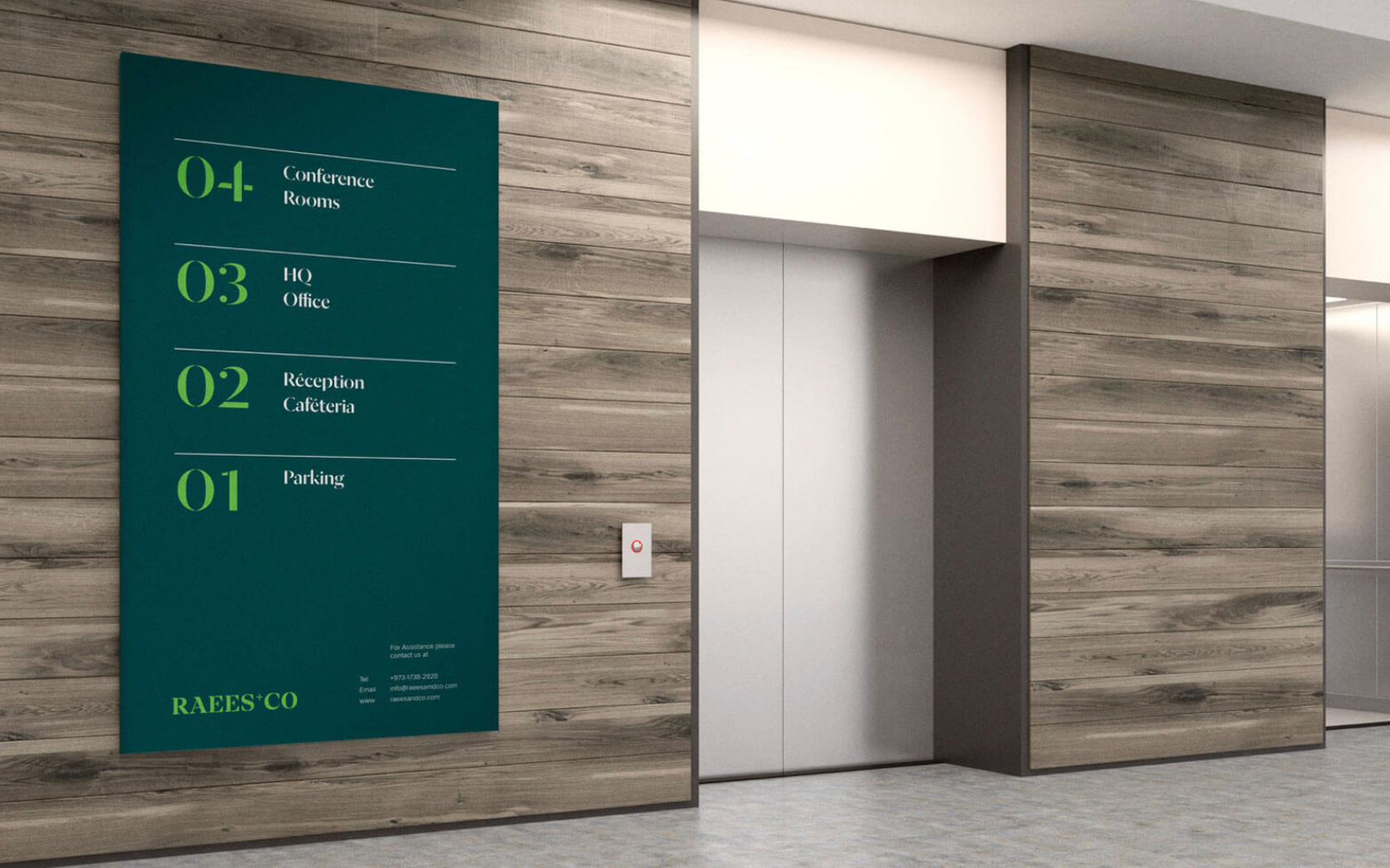
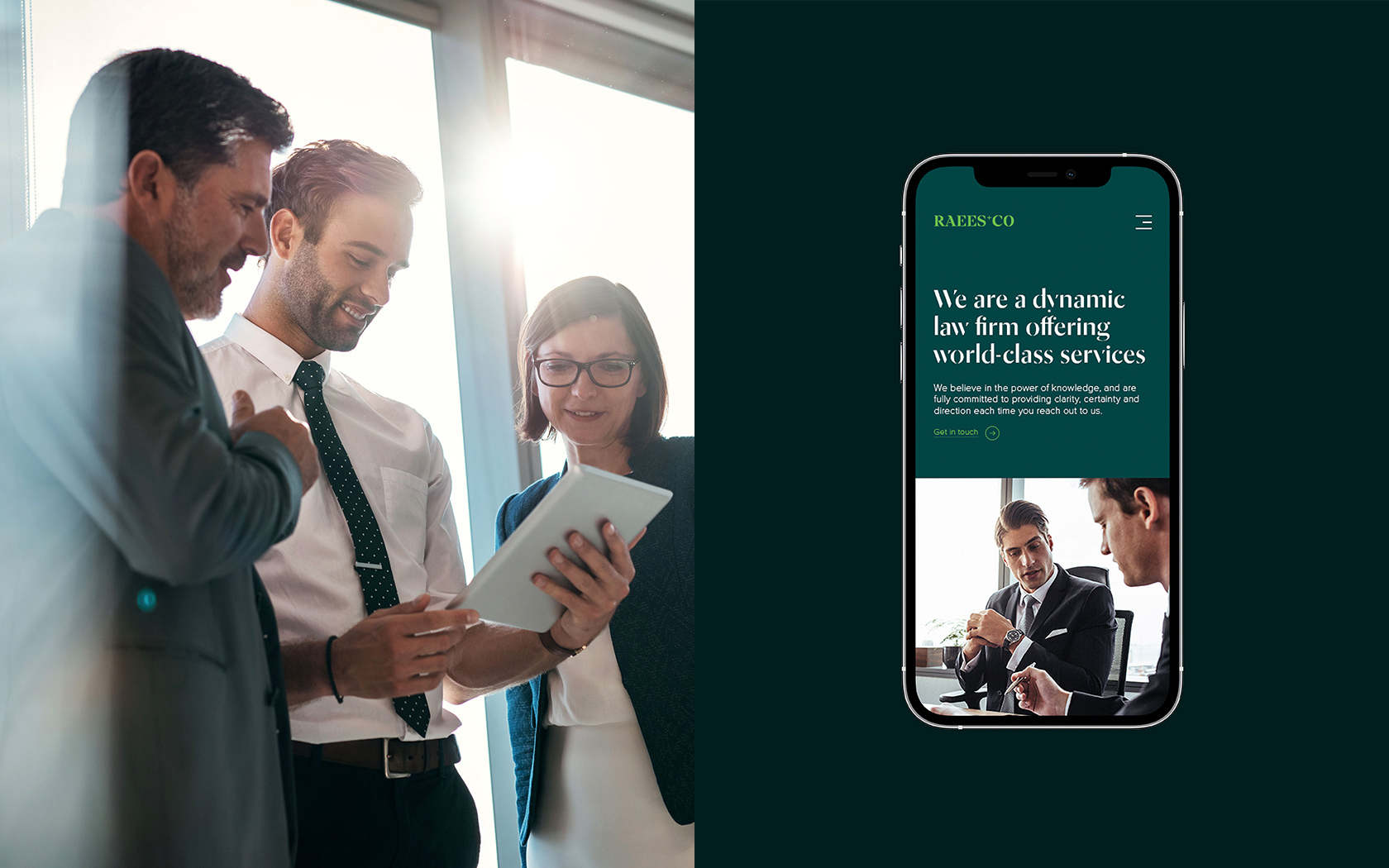
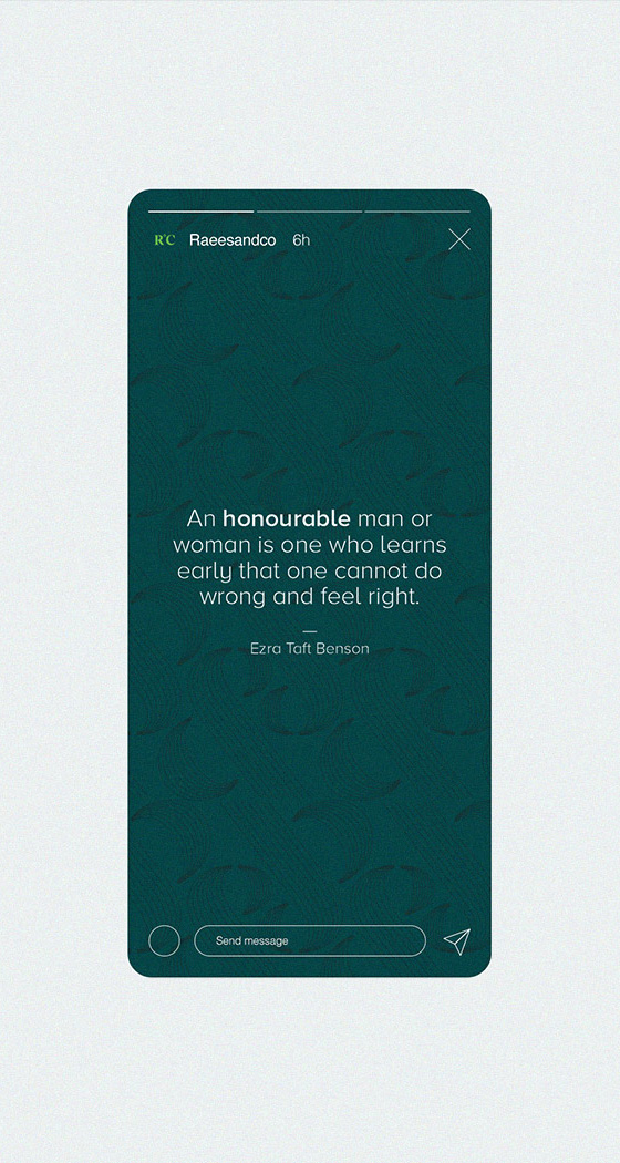
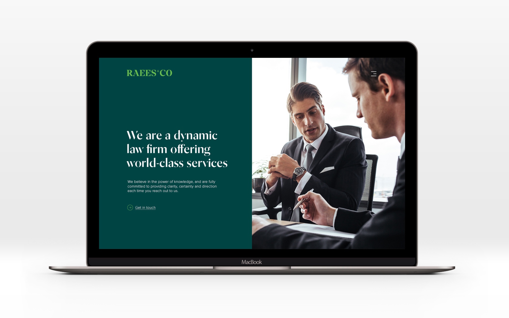
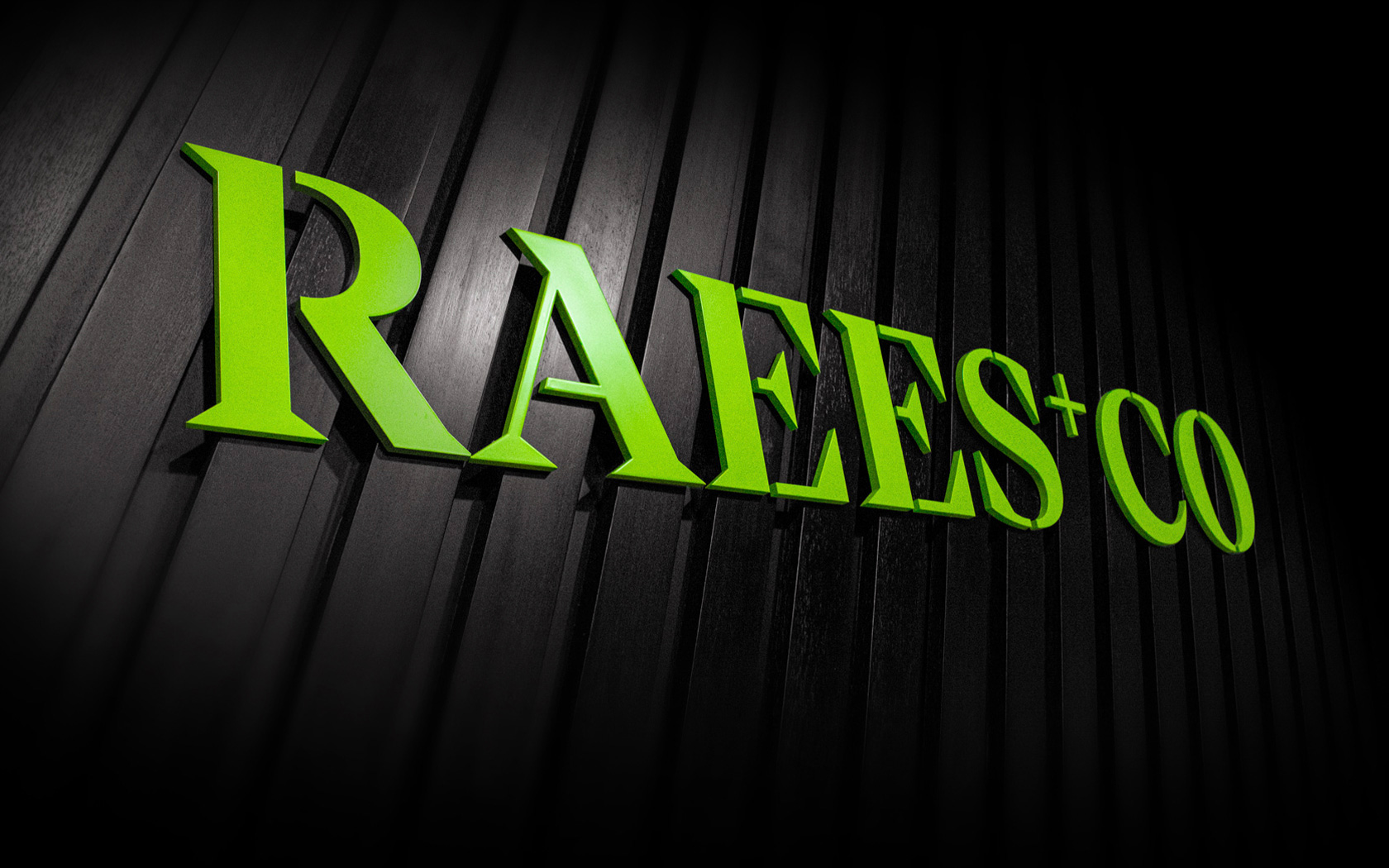
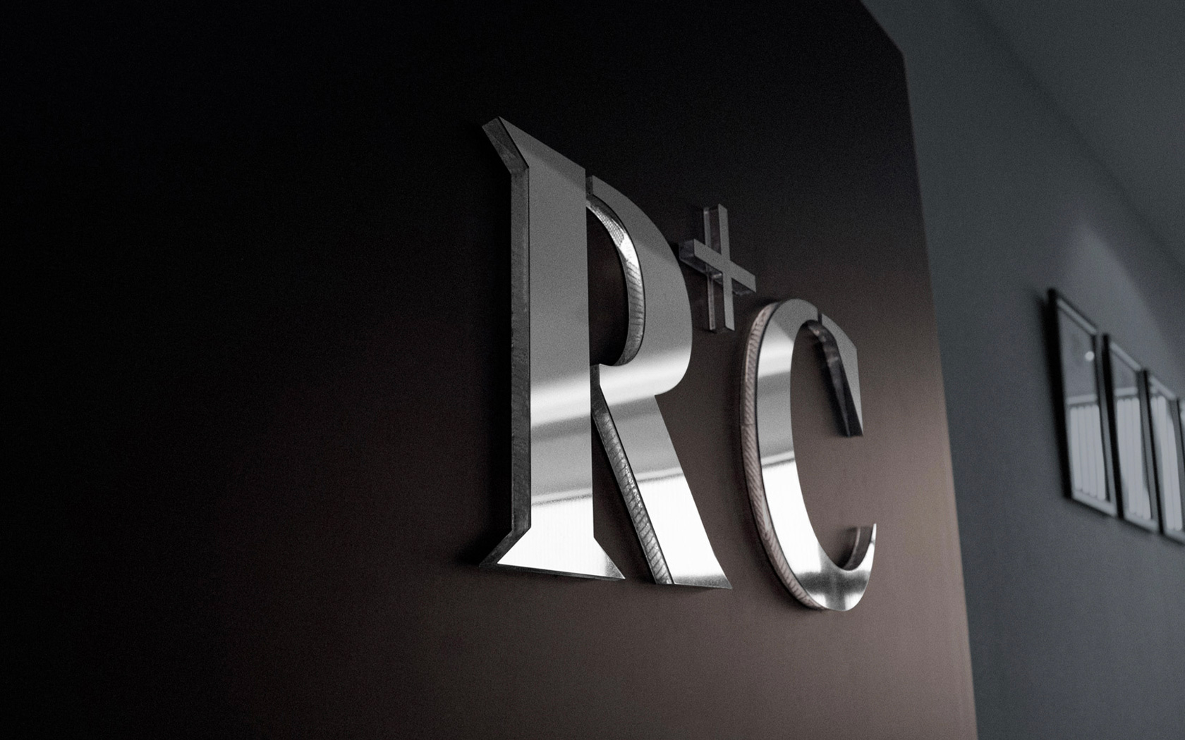
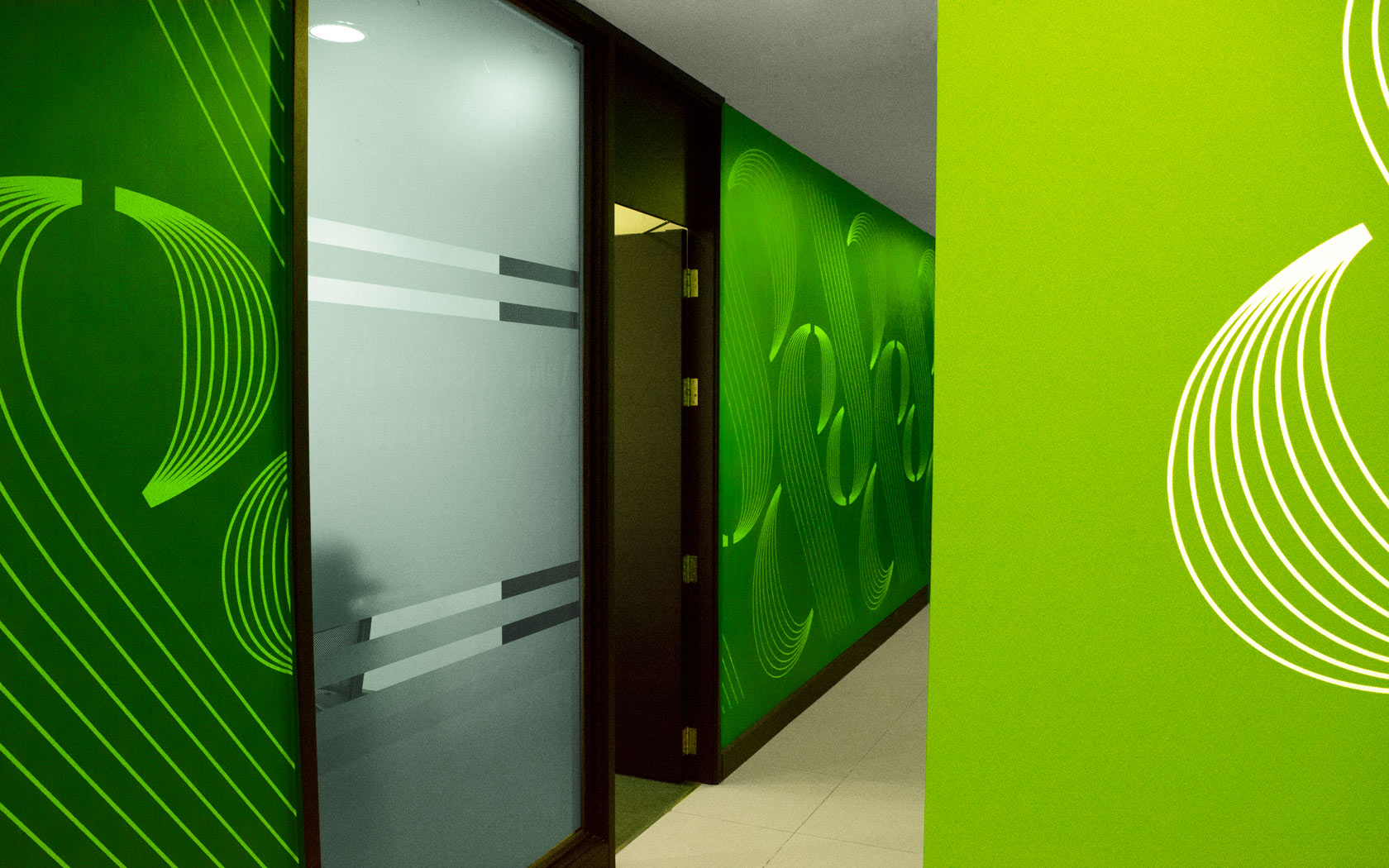
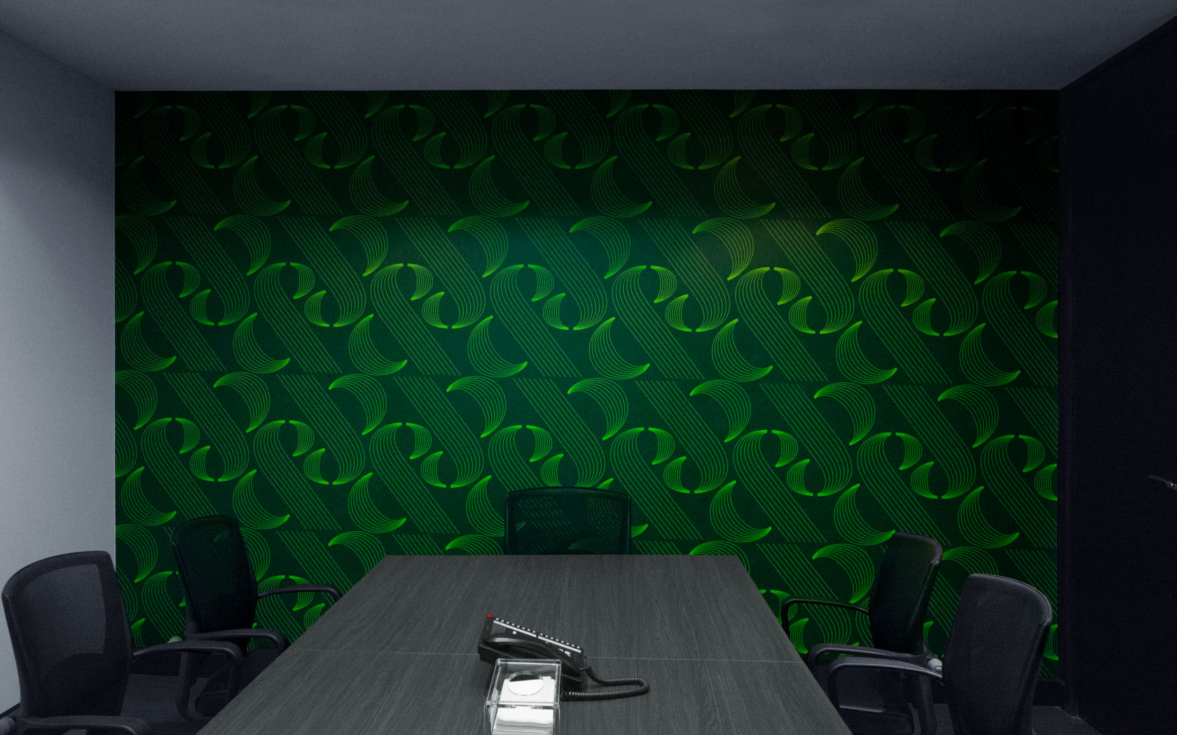
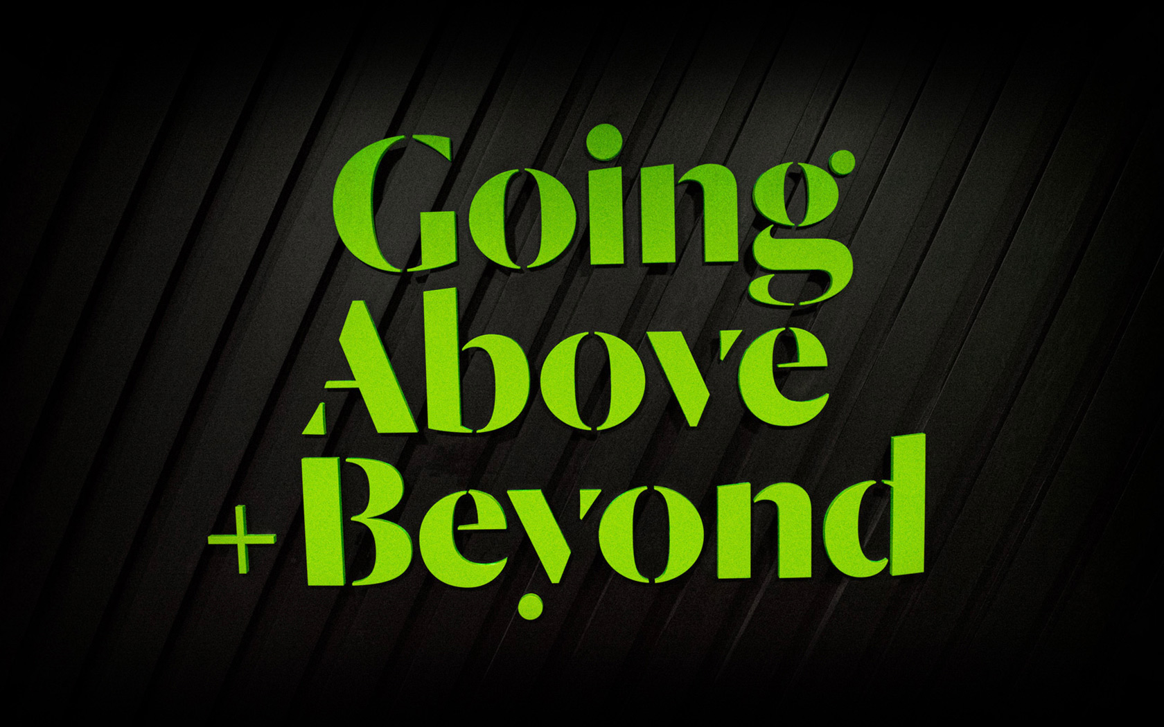
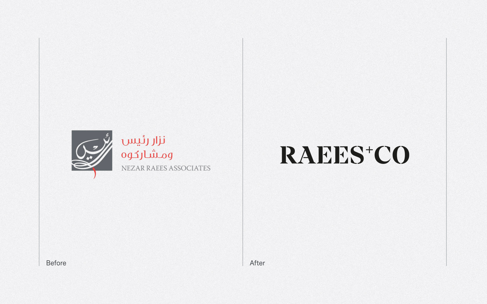
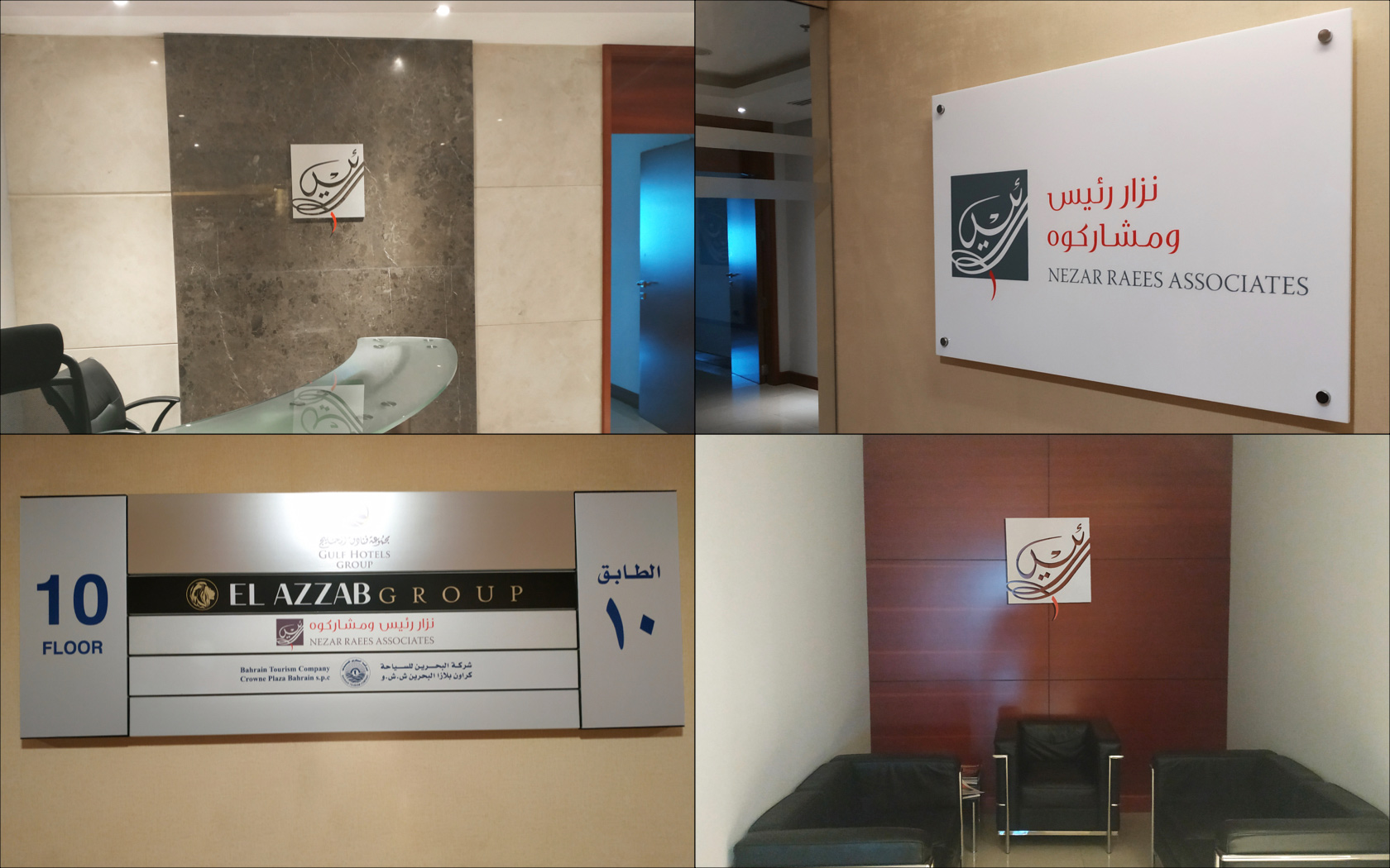
Under a new internationally-minded denomination agreed with the client – Raees & Co – we took the brand from a undistinguishable white and grey, traditional Arabic script logo to an assertive, contemporary and prestigious creative space. The new word mark logo was developed alongside a full typographic treatment, new colour pallet, patterned graphic element and upgraded photographic style. These elements were applied across the brand’s stationary, office interior design and digital applications, giving the brand not just a ‘facelift’ but a true, strategic and visual transformation.
Through this rebrand, we managed to reposition Raees & Co as one of the leading locally-based firm with international credentials – a powerhouse of expertise and the legal partner of choice. We received glowing feedback from the client’s management team and the perception of a greater level of ambition has been noted by the firm’s clients and associates.
Introducing Raees & Co
Originally named Nezar Raees Associates, this Bahraini law firm has been successfully operating since 2008, providing advisory, documentation and representation services for local and international clients alike.
Despite a growing international clientele and a solid success rate in the commercial legal sector, they were still perceived as an undifferentiated law firm with great knowledge but lack of presence and positioning. The company was also undergoing a name change exercise – that’s why they appointed Unisono to develop an international identity to position the firm as a thought leader in the industry.
Our challenges
Tasked with developing an international identity to position Raees & Co, we faced several perception issues that became obvious during our trademark ‘Why™ Workshops’ with the client’s leadership.
First and foremost, their image had a lot of room for improvement – we wanted this rebrand to combine international best practice with the essence of Bahraini law.
This was not a unique challenge. A lot of law offices feel cold, claustrophobic and stuck in time. From their visual identities to their office decorations, business cards and everything in between, visiting your lawyer is, more often than not, a less-than-enjoyable experience.
Another challenge was how Raees & Co could improve the image of lawyers in the region – not just the firm’s own associates, but how we could help bring back the prestige associated with the profession.
Our strategic response
We started by discovering everything we could about the brand and what made them different from the competition. In a crowded field like this, finding an edge, a unique factor about the brand, would be key to unlocking their new identity.
From this, we identified the brand’s true purpose: to challenge the status quo and the values they hold sacred: Honour, Intelligence & Boldness. That ‘challenger’ spirit inspired the development of a new brand identity that reflects the confidence and bravado of a brand that is not afraid of taking risks but that, at the same time, conveys their belief in the power of knowledge and constant learning.
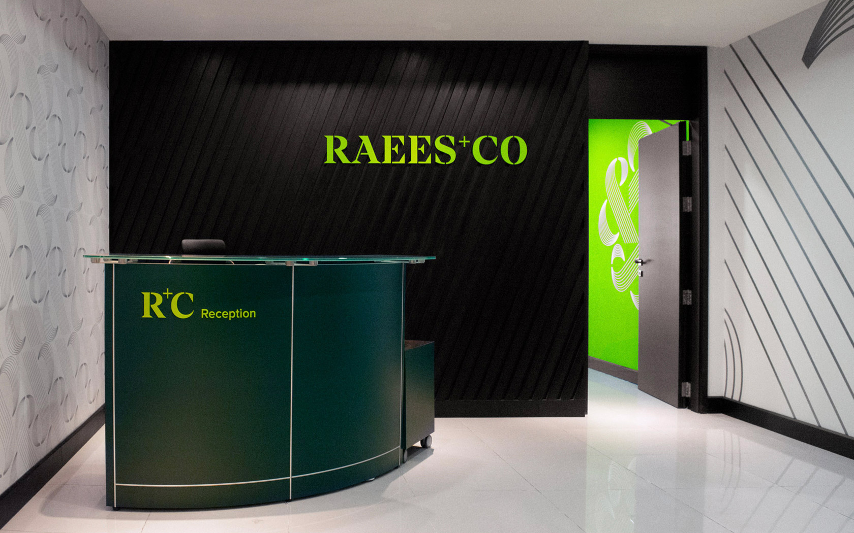
Under the new name agreed with the client – Raees & Co -we took the brand from a undistinguishable white and grey, traditional Arabic script logo to an assertive, contemporary and prestigious creative space. The new word mark logo was developed alongside a full typographic treatment, new colour pallet, patterned graphic element and upgraded photographic style. These elements were applied across the brand’s stationary, office interior design and digital applications, giving the brand not just a ‘facelift’ but a true, strategic and visual transformation.
Results
Through this rebrand, we managed to reposition Raees & Co as one of the leading local firms with international credentials – a powerhouse of expertise and the legal partner of choice. Their newly-decorated office is the talk of the town, contributing to higher engagement and motivation by all staff and team members, who now have a crystal-clear picture of ‘who’ their company is, what it stands for and its ambitions. We received glowing feedback from the client’s management team and the perception of a greater level of ambition has been noted by the firm’s clients.
Services
Strategy, Identity, Graphic Design, Interior Graphics, Art, Copywriting, Print Design, Digital + Web.
Links
Visit the relaunched Raess&Co website (also done by Unisono) here and visit our charming snapper See Raess&Co’s linked in feed here.
What you have done is nothing short of incredible. I was sure we would be happy with your work but the results have stunned me. Incredible.
Nezar Al Raees. CEO. Ratees & Co.
Details View Close
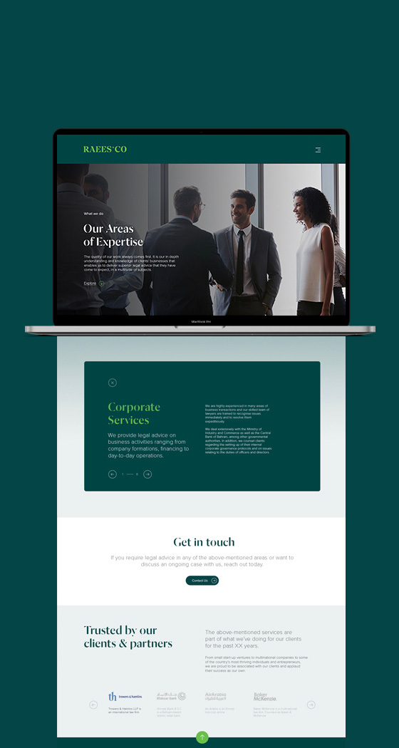
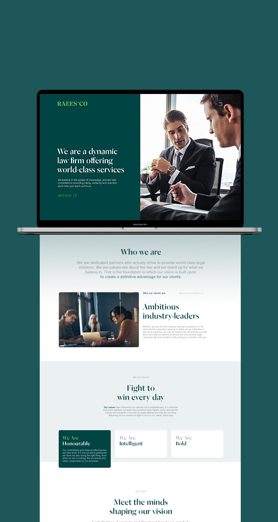
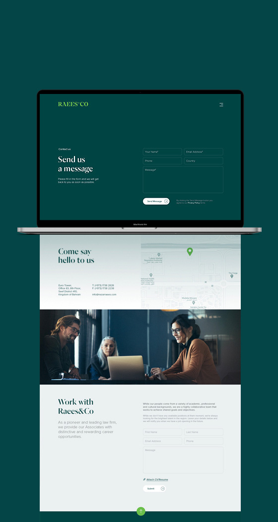
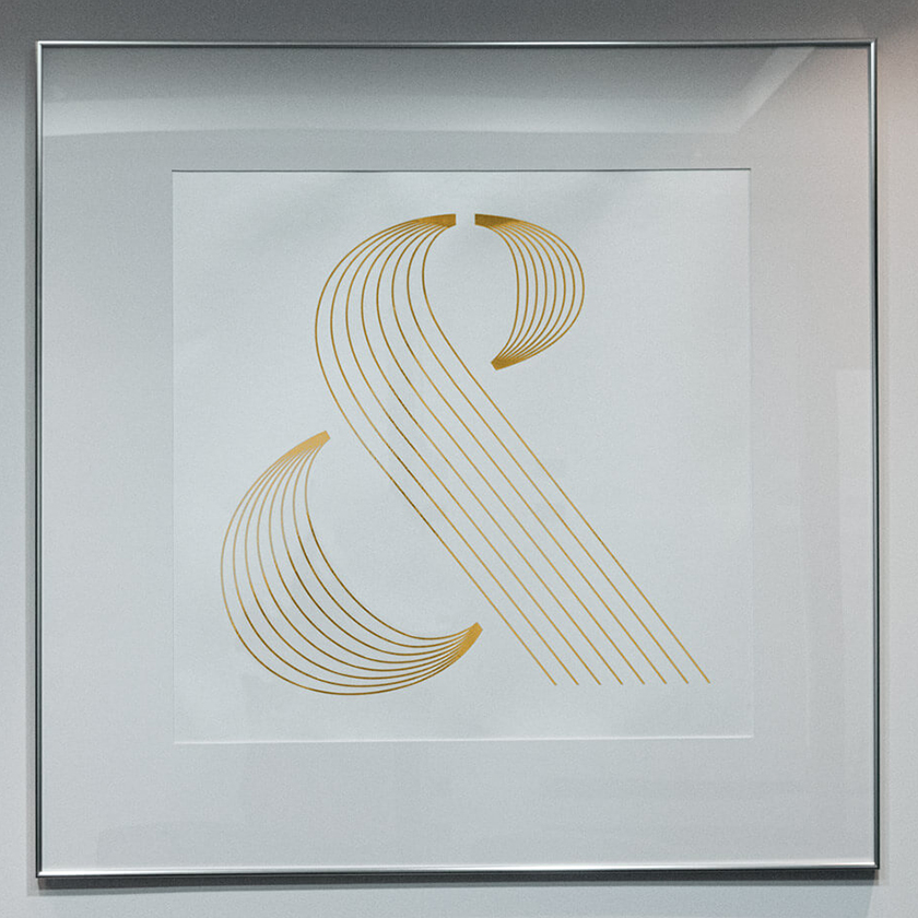
I hope I never need them but they sure look like a firm to contend with.
Liam Farrell. Creative Director & Partner.
Infracorp.
Website
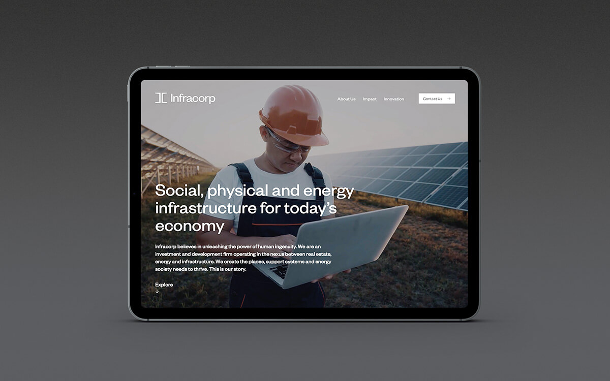
Two times Transform Award winners, Infracorp's unique digital home is effortless online design at its best.
BIW.
Rebrand
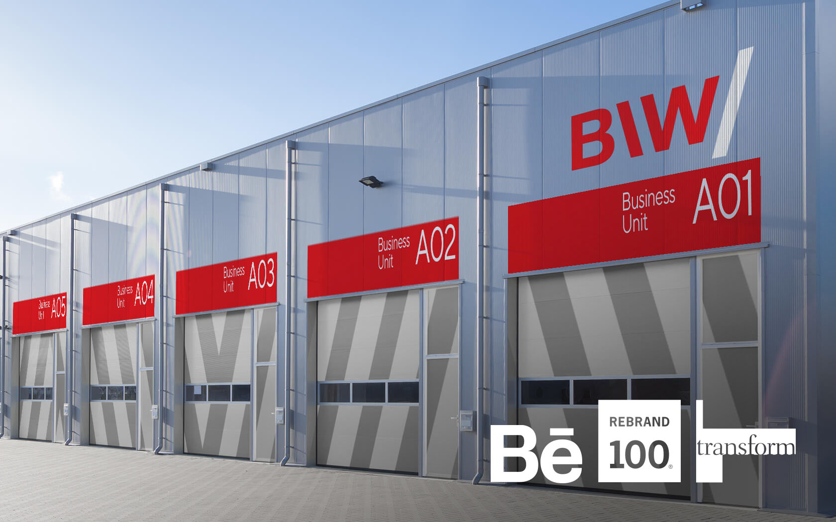
BIW’s award winning brand helps industrial firms to start up in Bahrain. It's where business begins.
Bahrain Rugby.
Branding
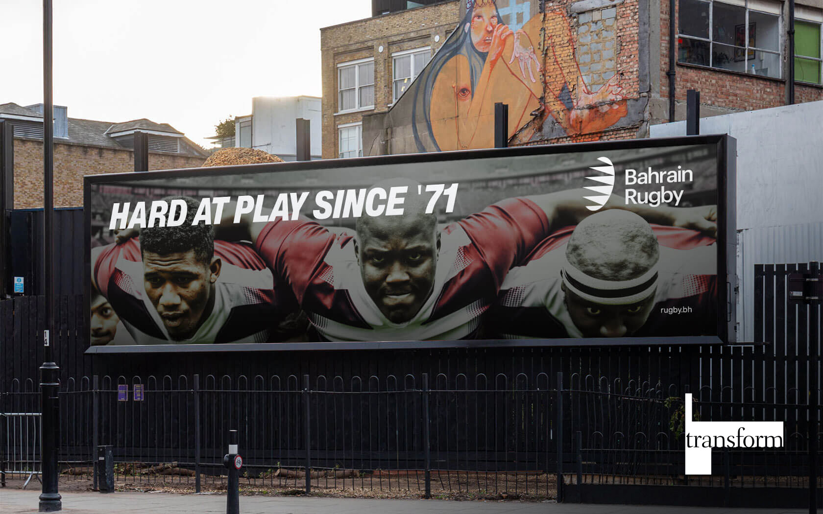
Transform Award winning identity for Bahrain Rugby Federation launched designed by Unisono. The fast-paced logo and collaterals are helping the nation's sporting endeavors to score big.
Mindset.
Rebrand
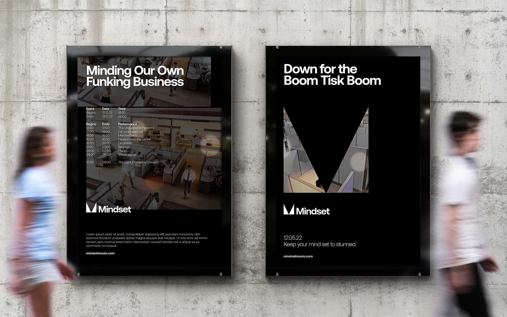
Mindset play host to some of Bahrain's most rocking electronic music nights, now they look as banging as they sound.
Saada.
Rebrand
This Transform Award winning, authentically Bahraini brand is helping Edamah create the nation's most promising new waterfront destination.