Seef Entertainment Branding
Entertaining from sea to shore
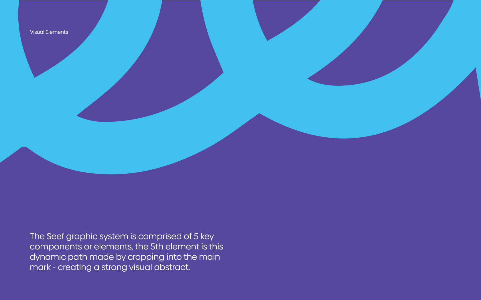
Creating the Seef Entertainment brand
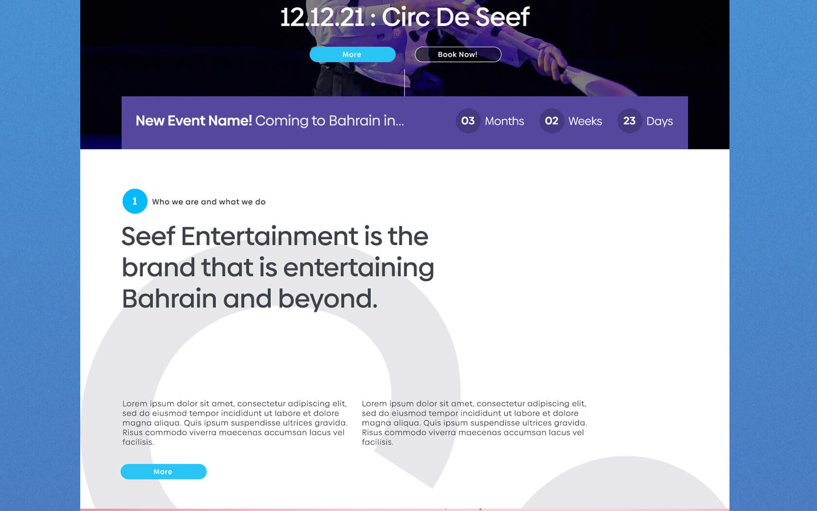
The Seef Entertainment brand is the newest addition to the entertainment scene in Bahrain. Part of the ever-expanding Seef (Mall, Properties, etc) universe, the new Entertainment off-shoot is sure to bring a smile to the faces of kids young and old all over the island.
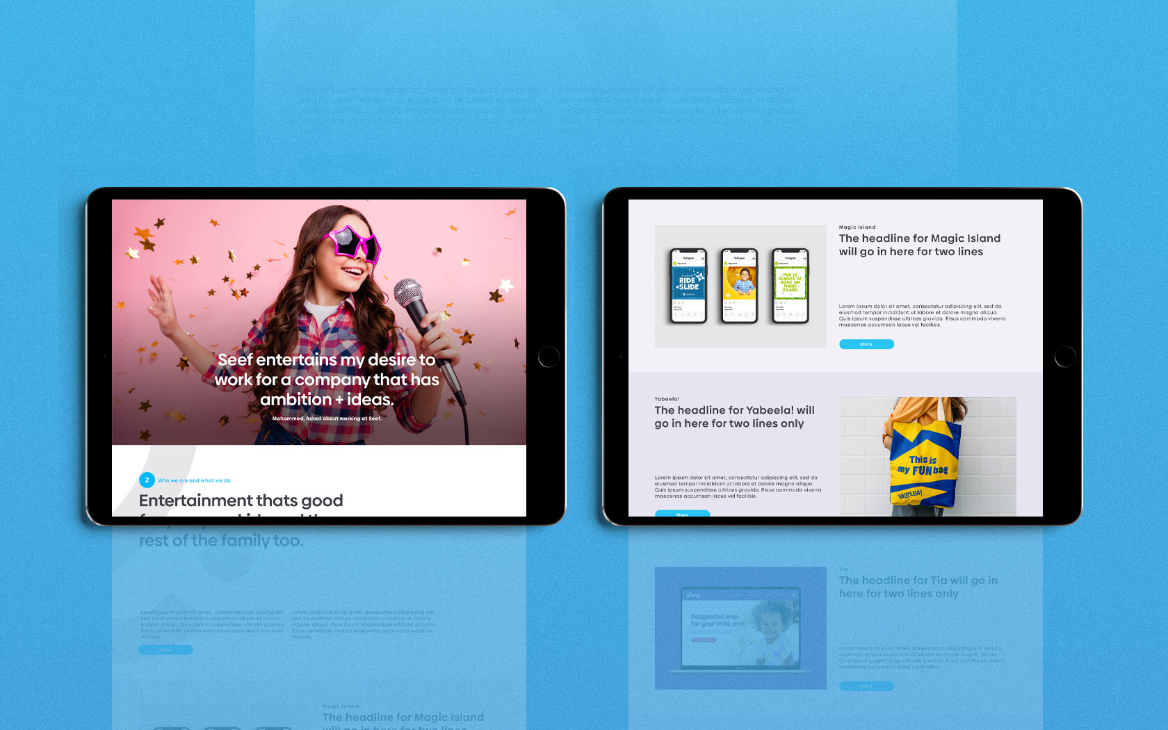
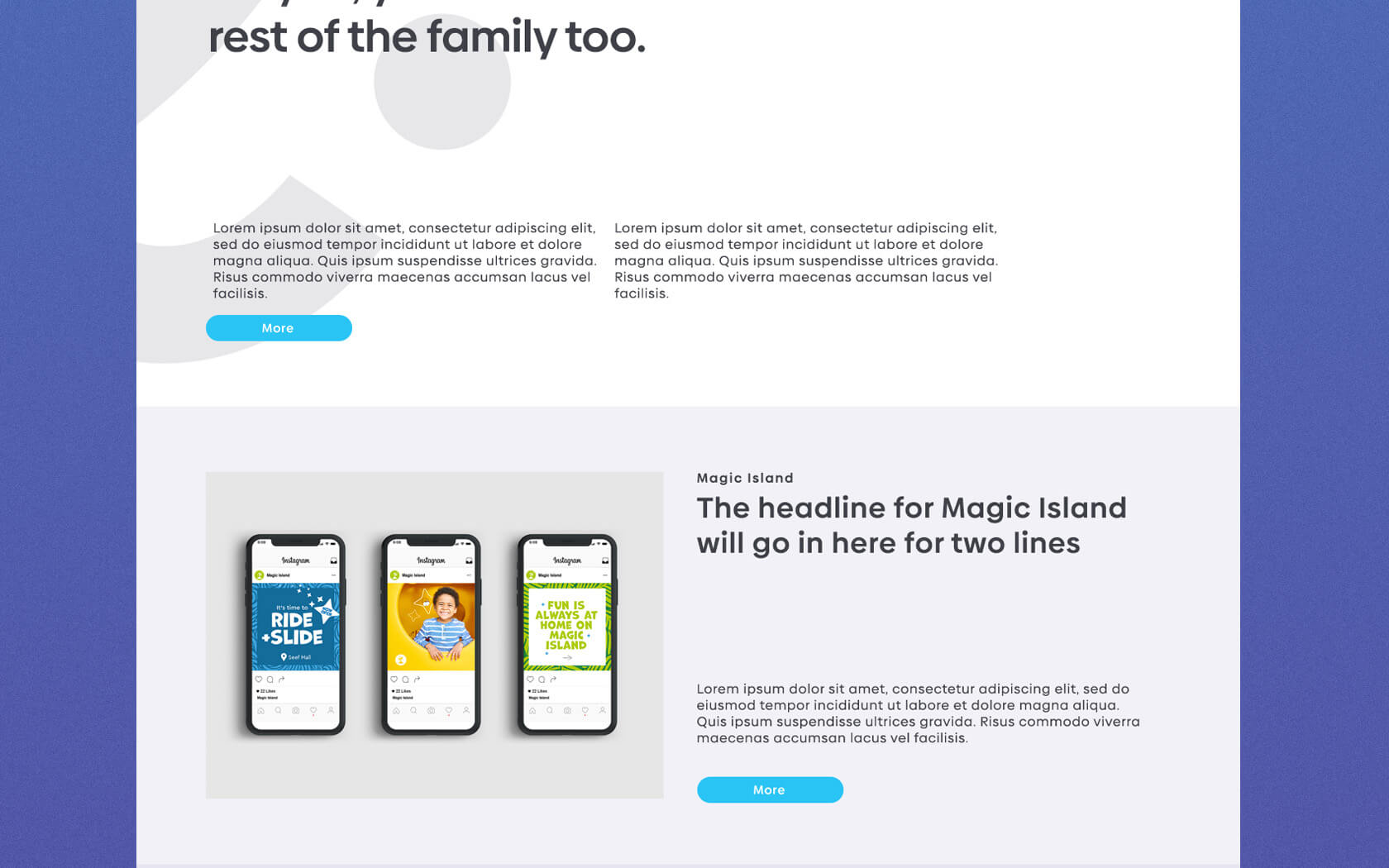
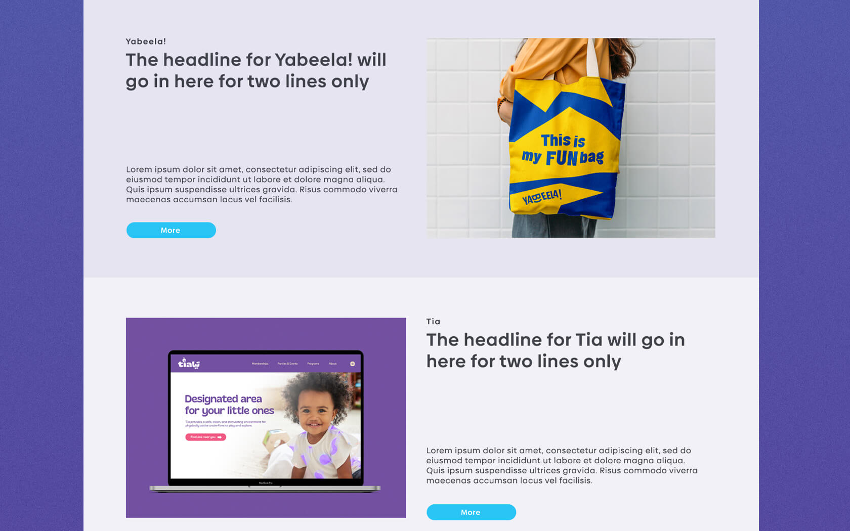
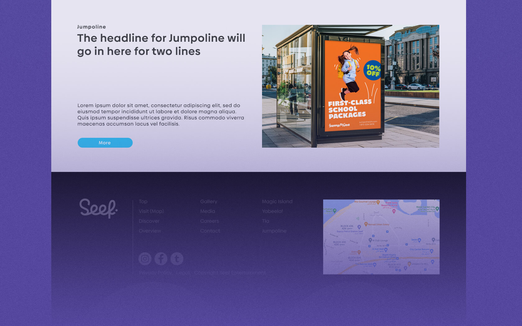
The Seef Entertainment brand is started its first live foray into the entertainment arena with the launch of it’s new Yabeela! Brand in Seef Properties newest mall, Al Liwan, in the popular Hamala district of Bahrain. Seef Entertainment’s portfolio also includes its legacy brands Magic Island and Jumpaline and new ventures are coming to the family soon.
Challenges with the Seef Entertainment brand
Seef Entertainment brand is a brand new venture which will house all of Seef Properties entertainment products (aka sub-brands). These include Jumpaline, Magic Island and the newly launched and massively successful Yabeela! a family entertainment complex which was also branded by Unisono.
Our key challenge was how to create a new brand that was as entertaining as its product brands but also serious enough to take centre stage in front of investors and shareholders alike? The Seef Properties brand is a very corporate entity and the new Entertainment brand would need to be as believable as Properties, yet a lot more fun. Seef Entertainment needed to be considered as ‘a good fit’ for a lot of international entertainment brands whom the firm wishes to partner with. So we knew the Seef Entertainment brand was going change things up, we didn’t know quite how much until we got into the strategy and worked out who ‘Seef Entertainment’ really were.
The Seef Entertainment brand strategy
Our role was to work with the stakeholders to champion the discovery of the right brand framework. This would bring the right understanding and expression (visual and literal) to create belief and foster participation with the brand’s corporate and entertainment audiences. From our sessions with key stakeholders at Seef Entertainment, the brand’s anthem started to emerge.
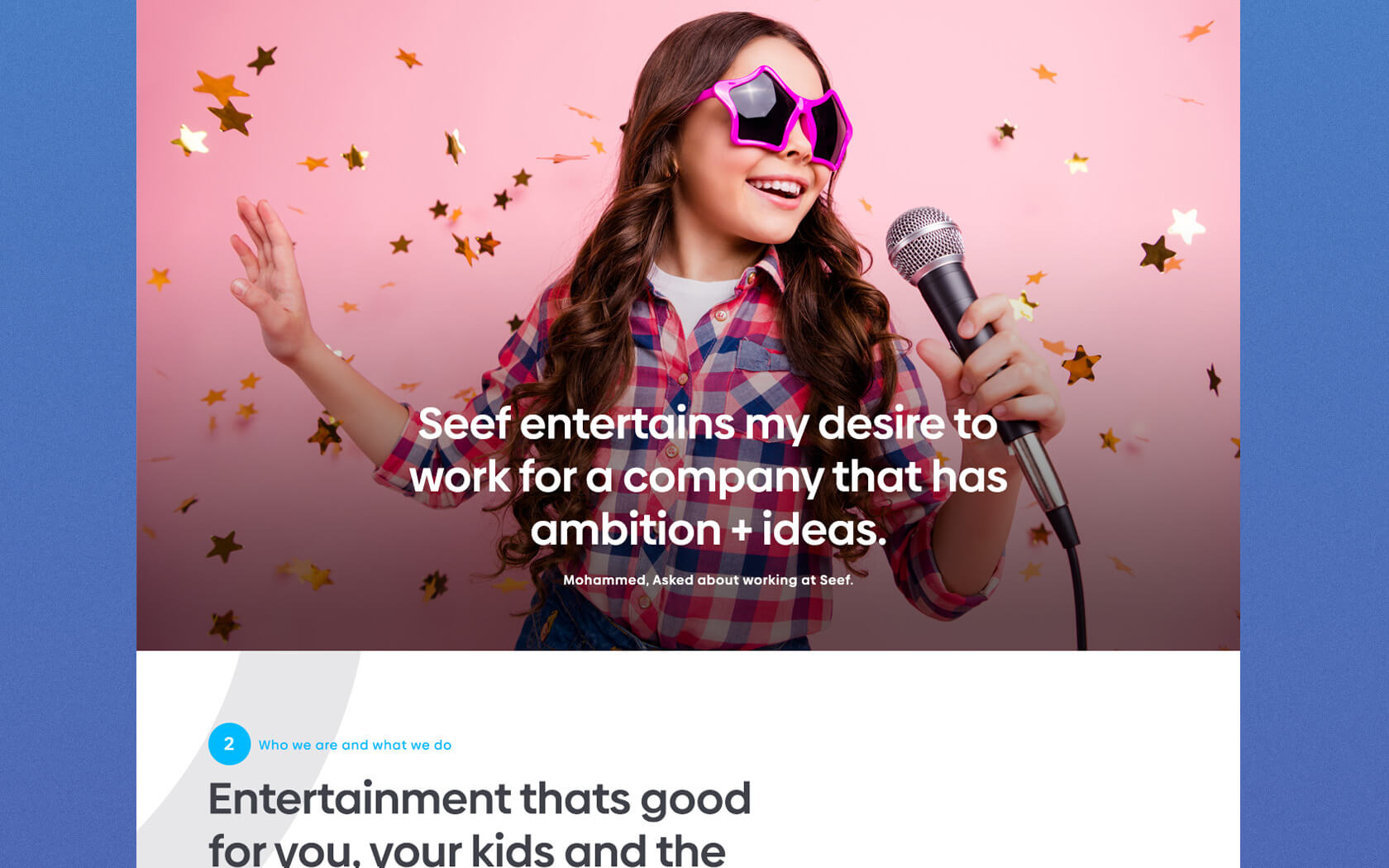
Hitherto unexpressed or unknown, the Seef Entertainment brand had actually, always been about the joy of shared experiences. Now the business is starting to create and entity what understands its role. The Seef Entertainment brand is like a circus master that brings in the acts for the audience to experience. The brand creates and shares moments to share that bring joy to all.
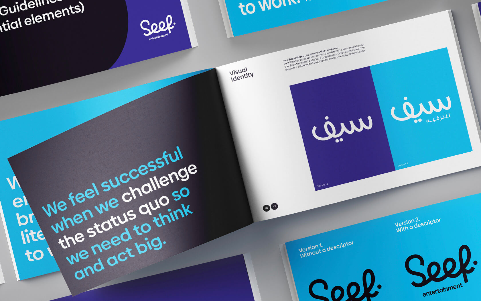
One element of the personality which has been conveyed clearly through the identity is the willingness to ‘challenge the status quo’ – all the stakeholders agreed it was an aspect of their personalty they wanted expressed. This key thought has come through the brands’ tone of voice and visually through the very incorporate and down right playfulness of their new identity.
With a strategy agreed, we began working to create a literal and graphic language that could express the joy, friendliness and playful qualities of the brand. From our candidate approaches, their was a lot of deliberation as each one expressed a core aspect of the brand very clearly. However, the desire to challenge the status quo and ultimately the perception of ‘what an entertainment company could be’ won the day and the fun, playful form you see today won through.
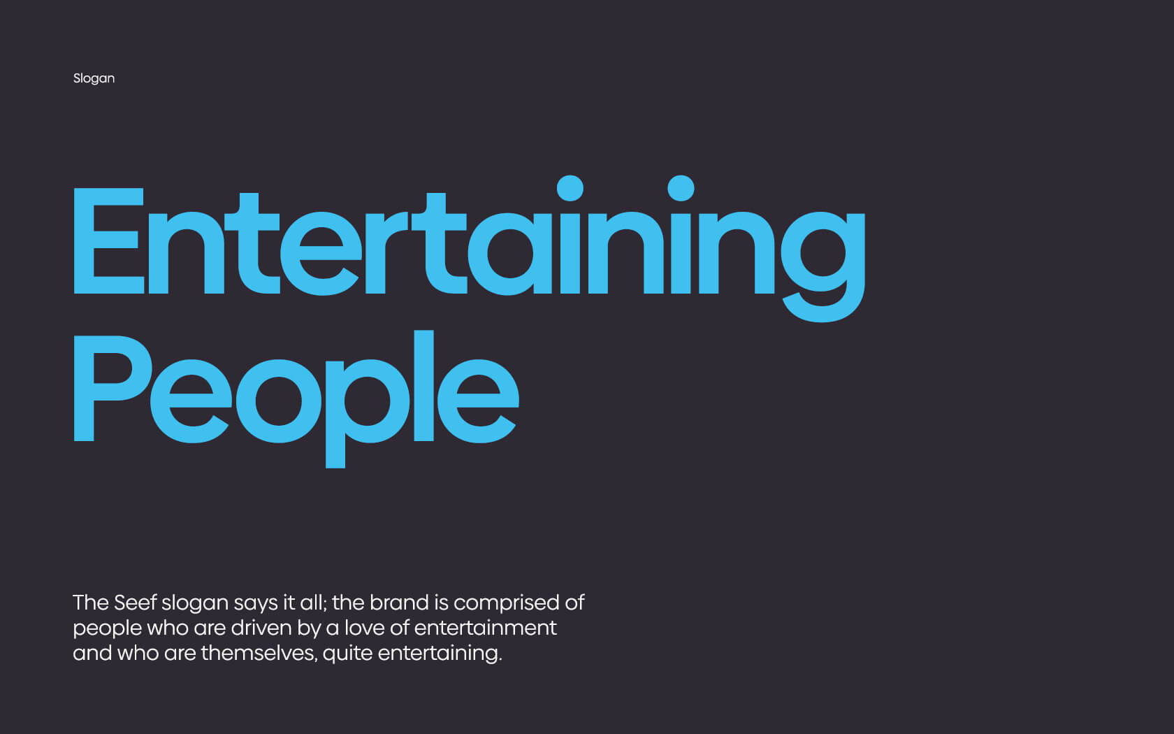
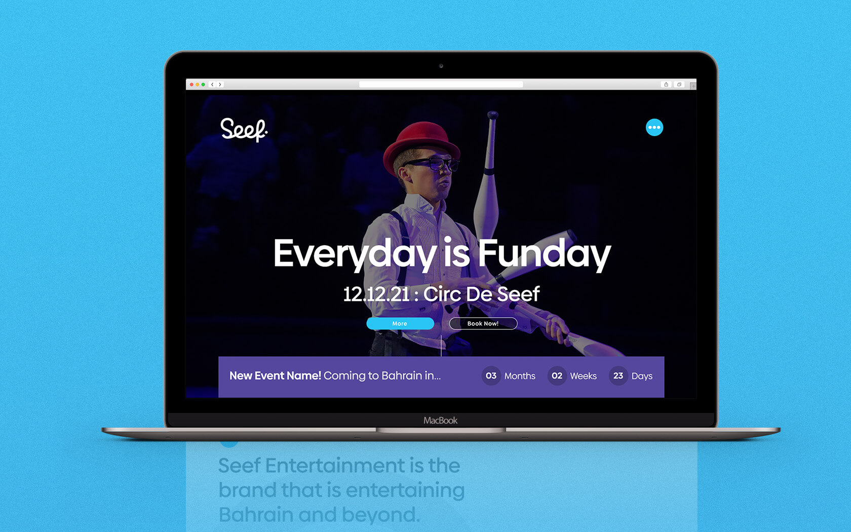
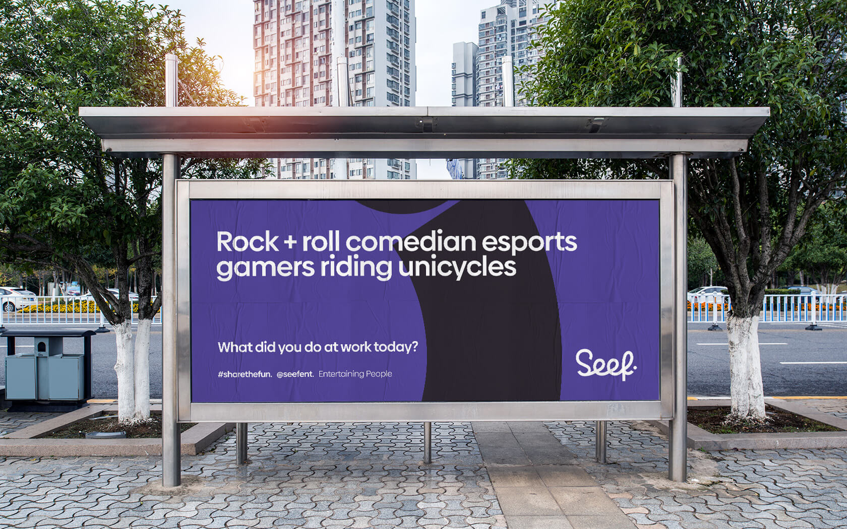
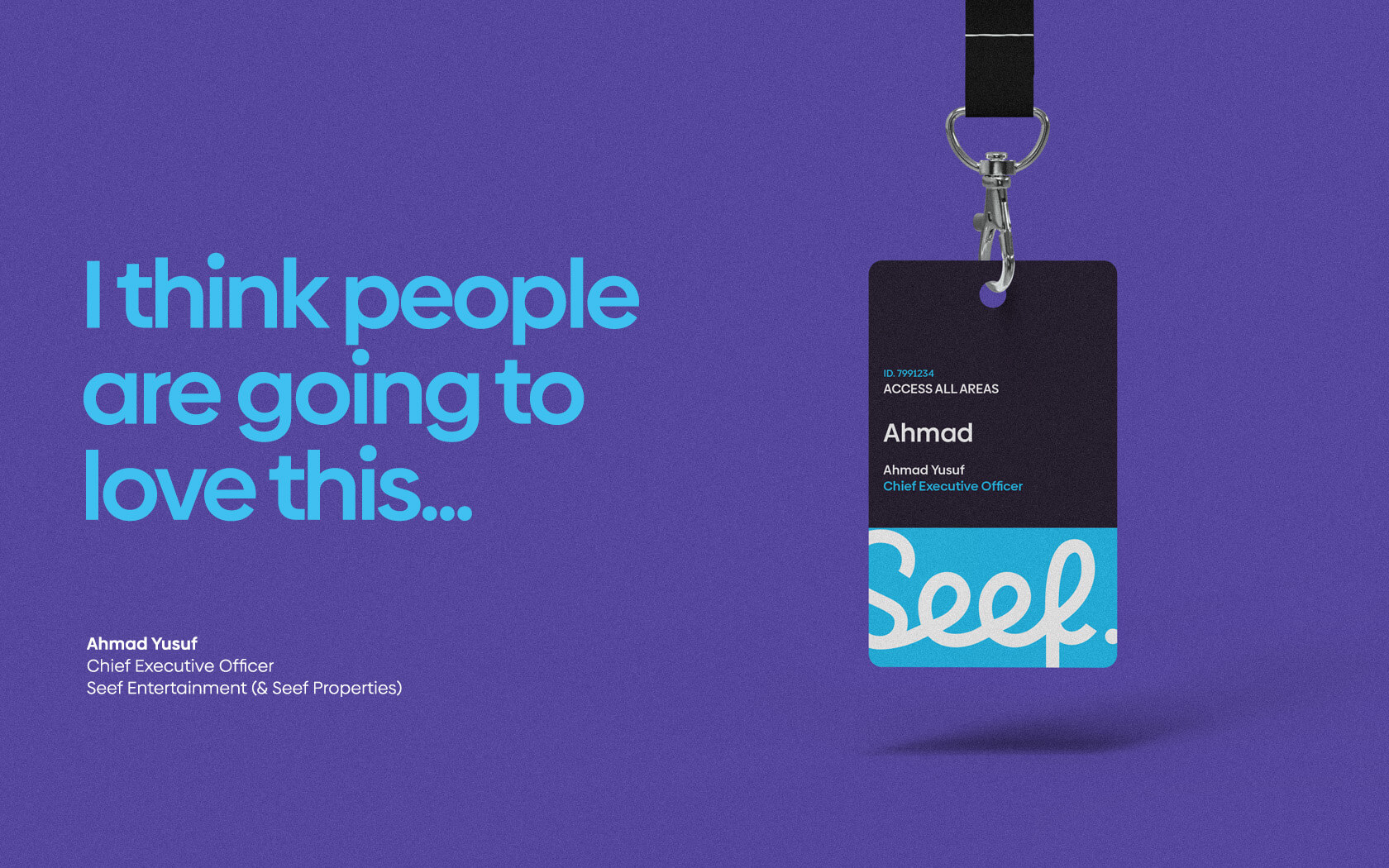
The tone of voice is playful, entertaining and brimming with dynamic energy. The brand’s slogan – Entertaining People – clearly expresses the idea that the Seef Entertainment brand is fundamentally about ‘people entertaining other people’.
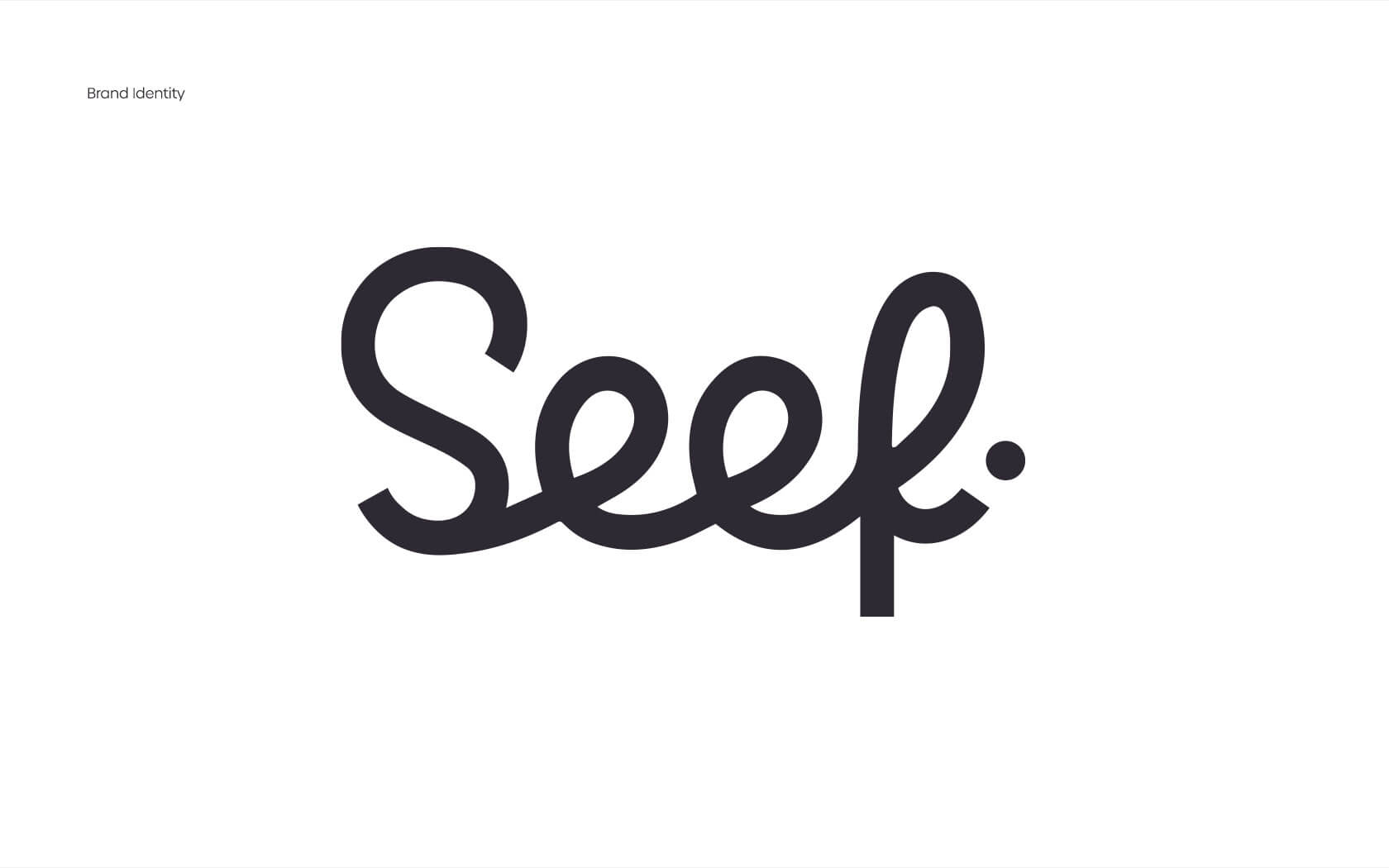
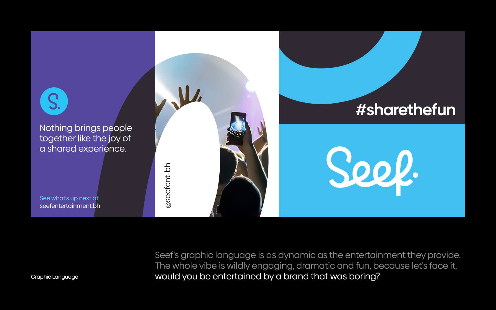
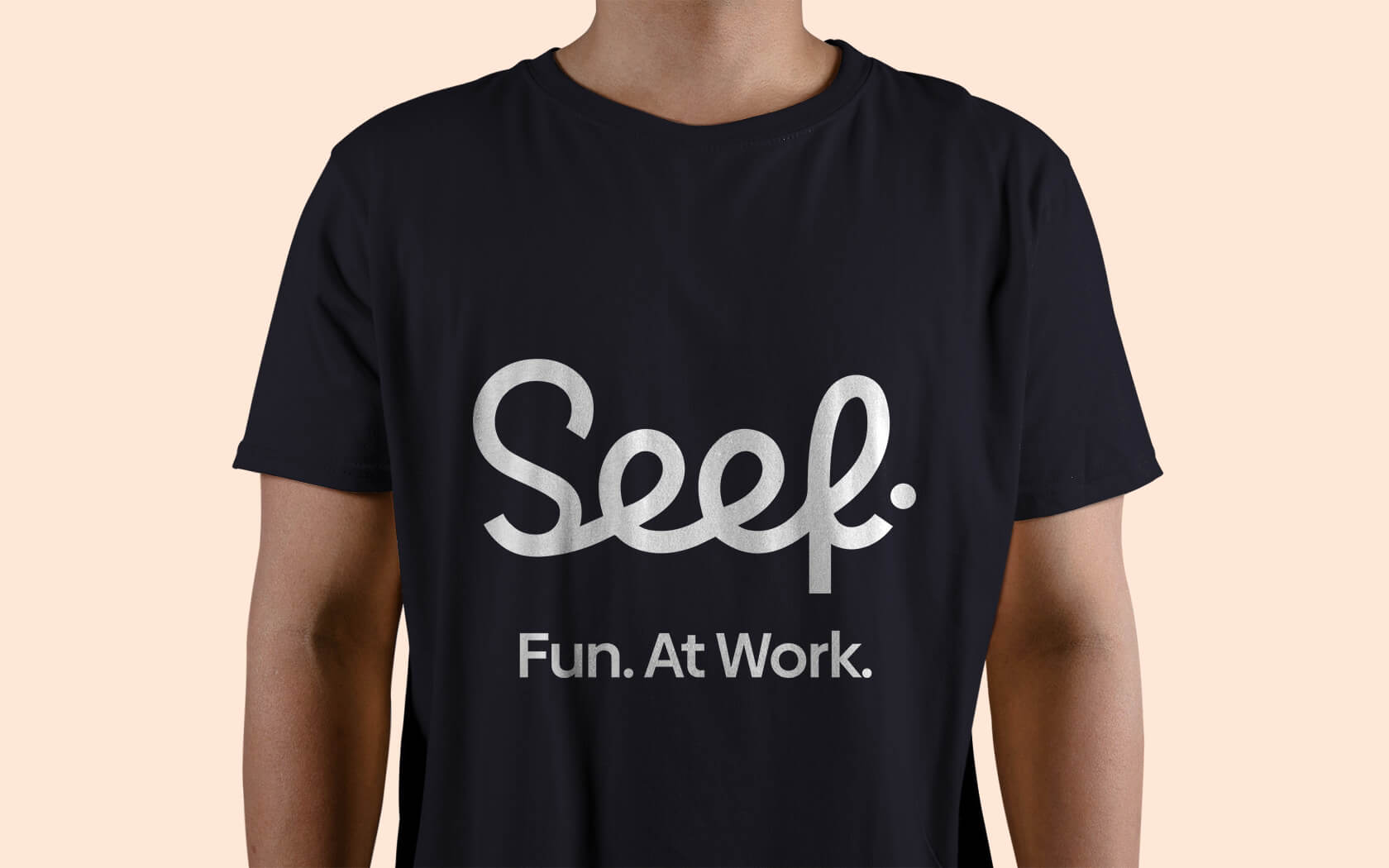
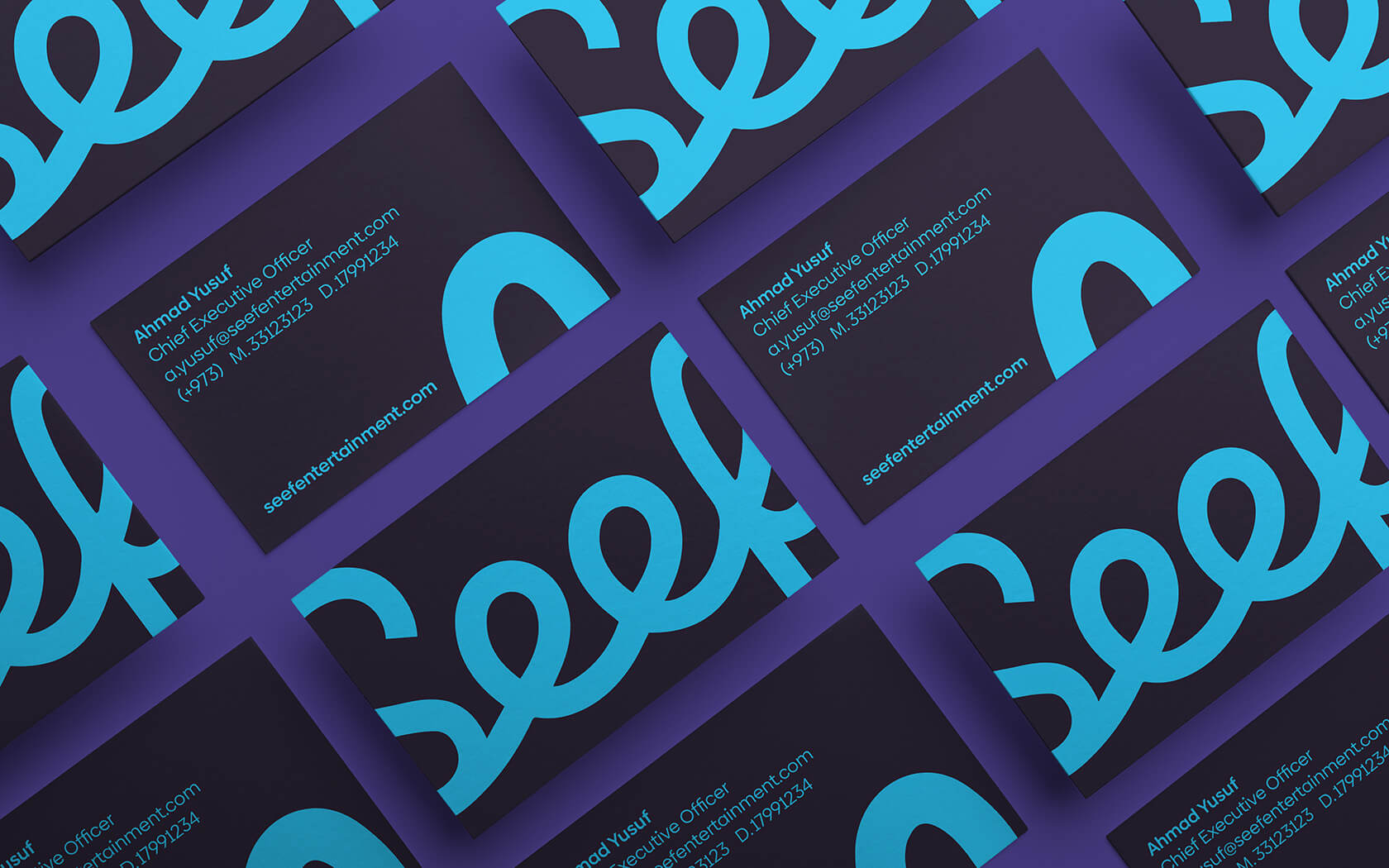
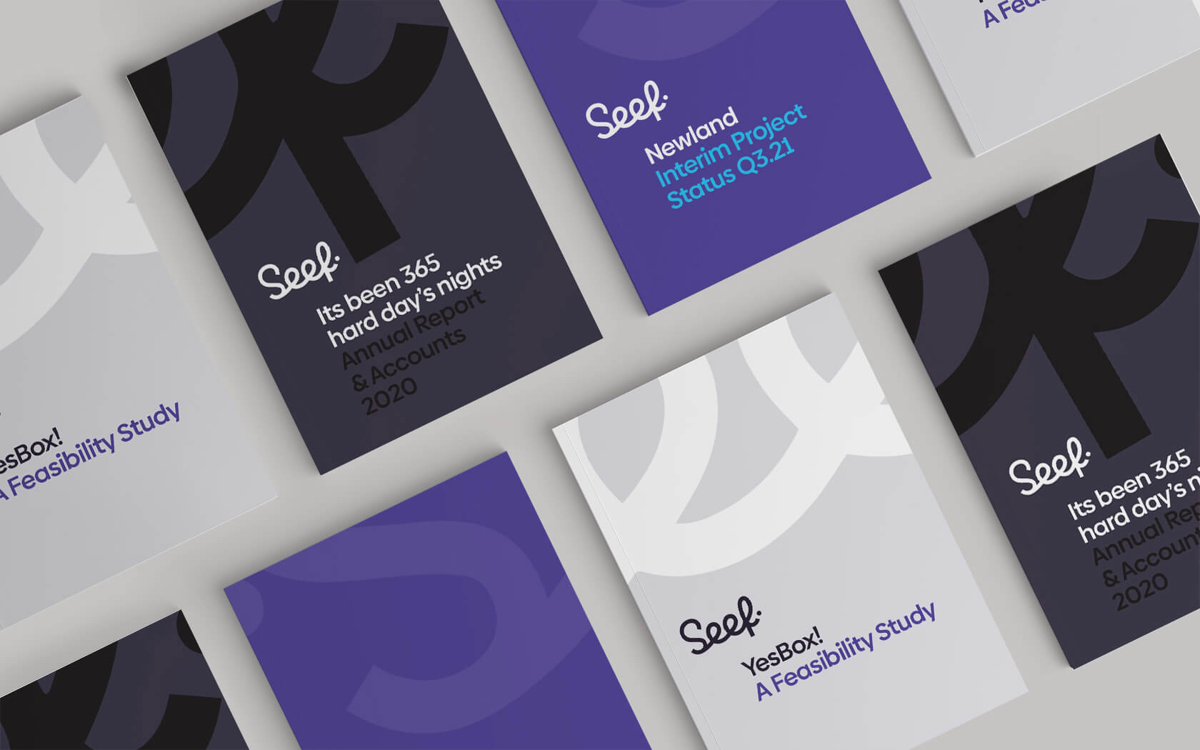
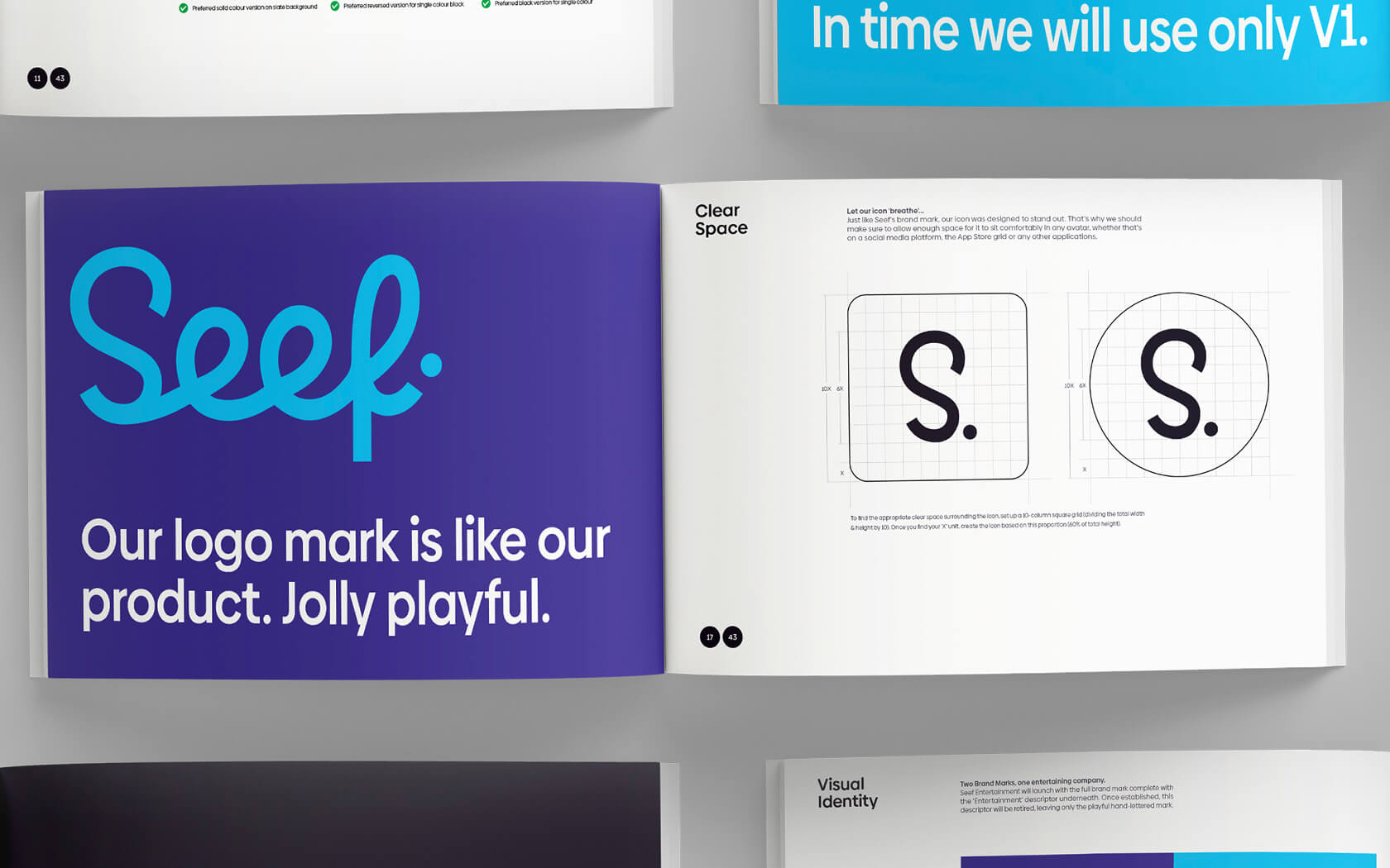
The final logo form is a super playful hand-lettering form finessed by Paul Von Excite, a calligrapher from the Netherlands who worked with our team on the project. We shared initial sketches with Paul who took our doodles and made them feel magical!
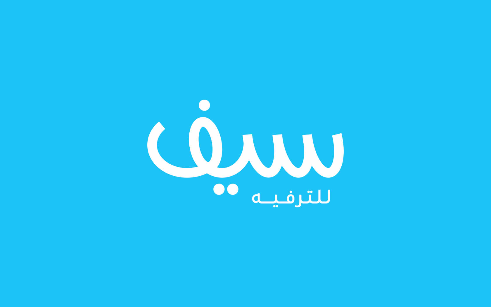
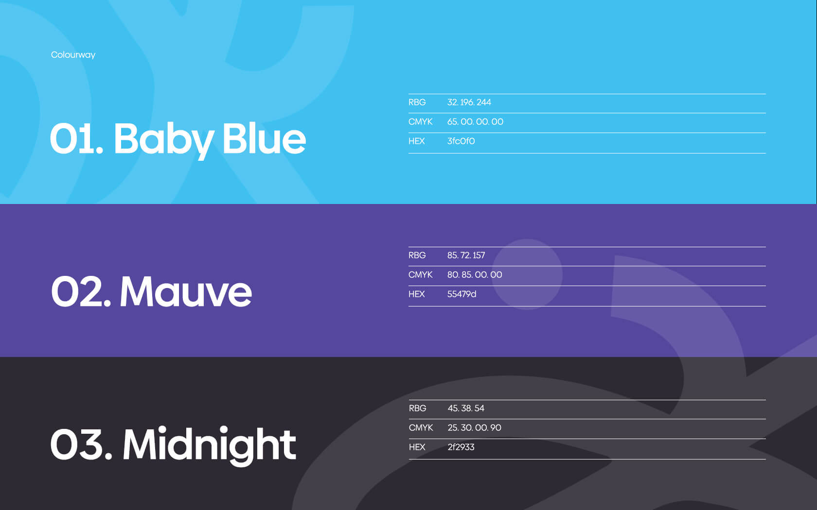
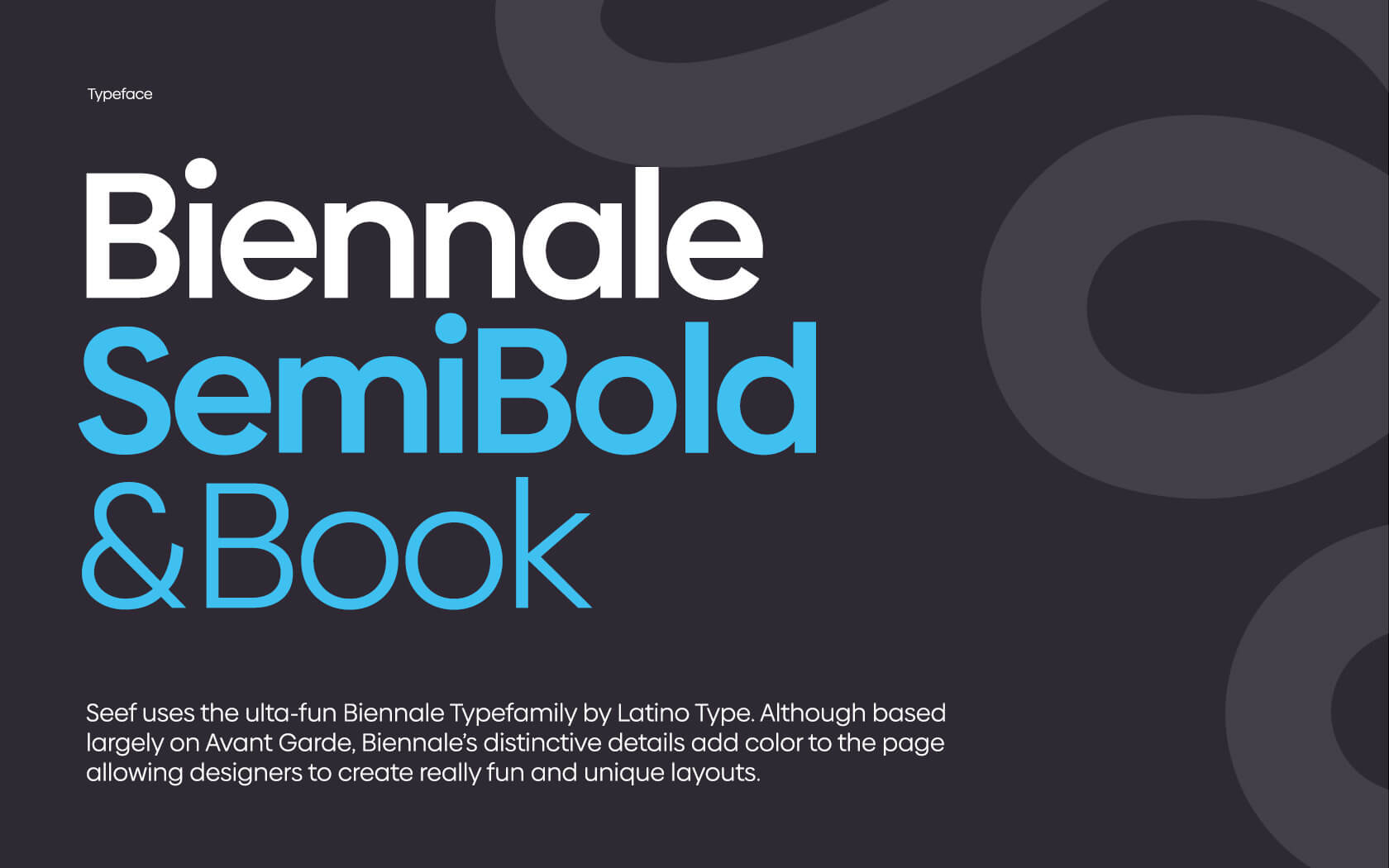
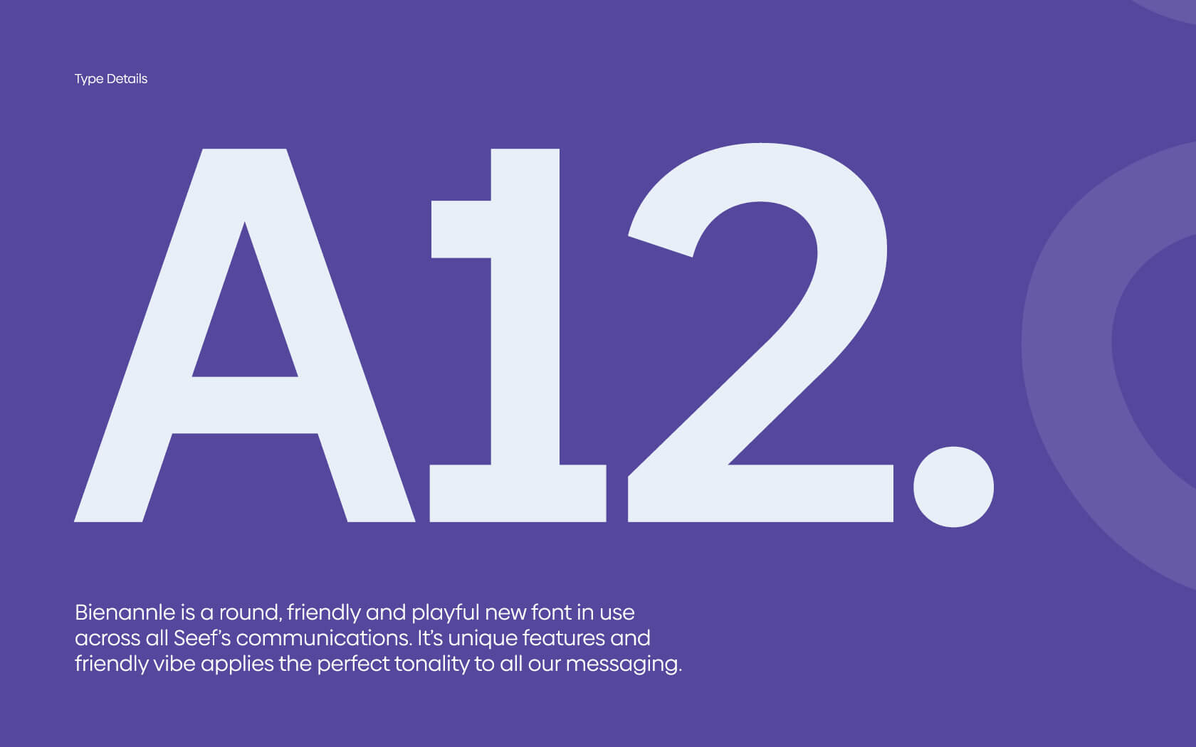
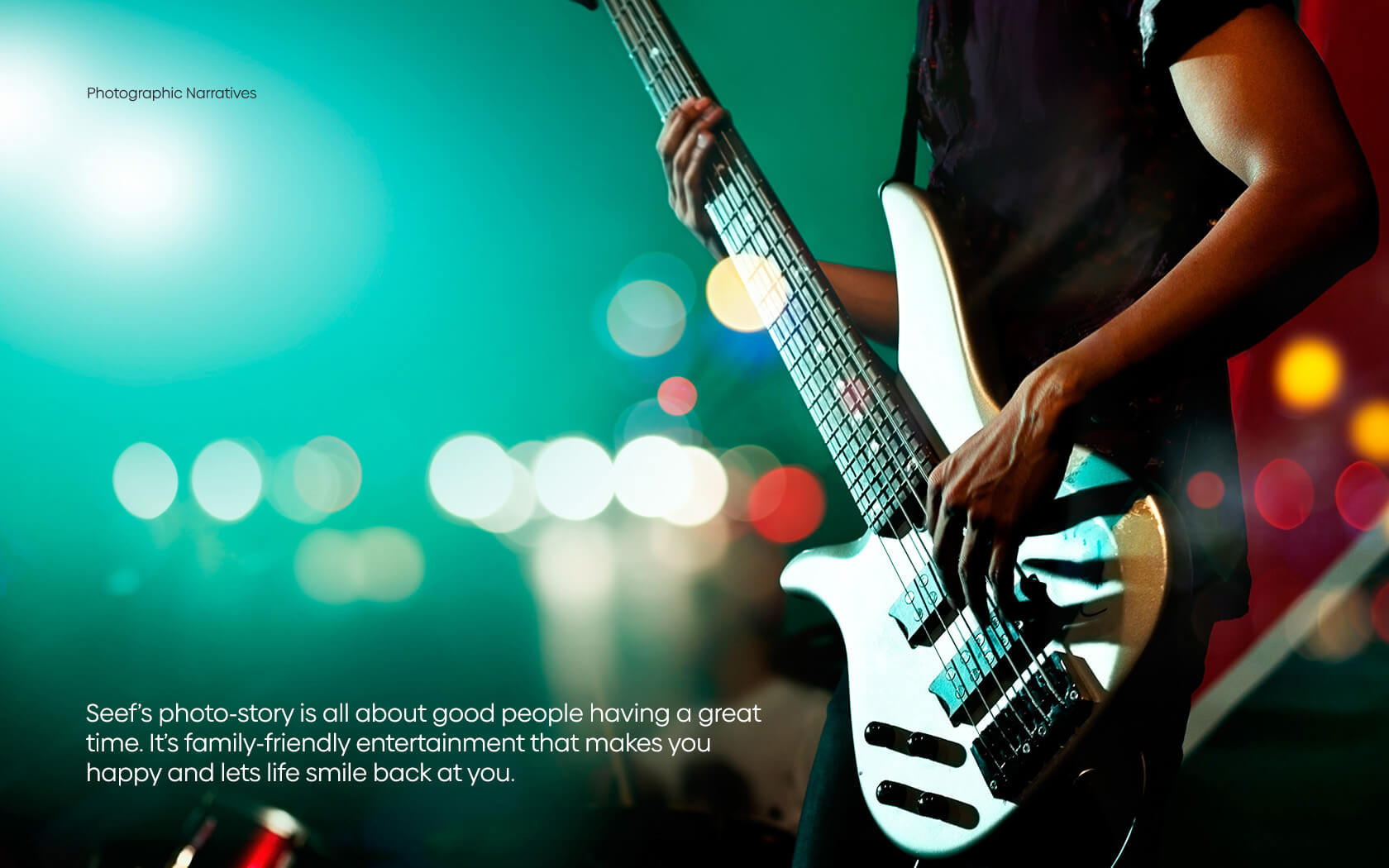
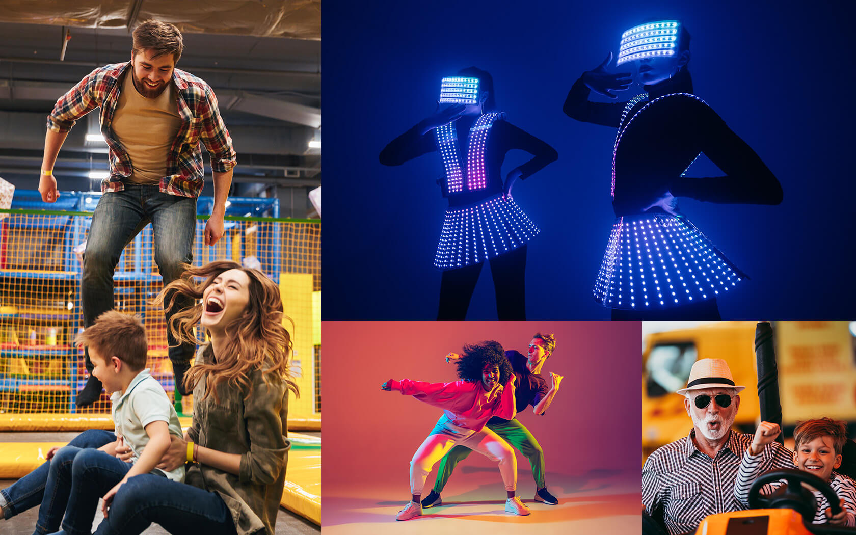
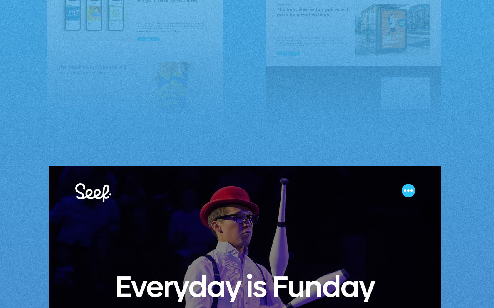
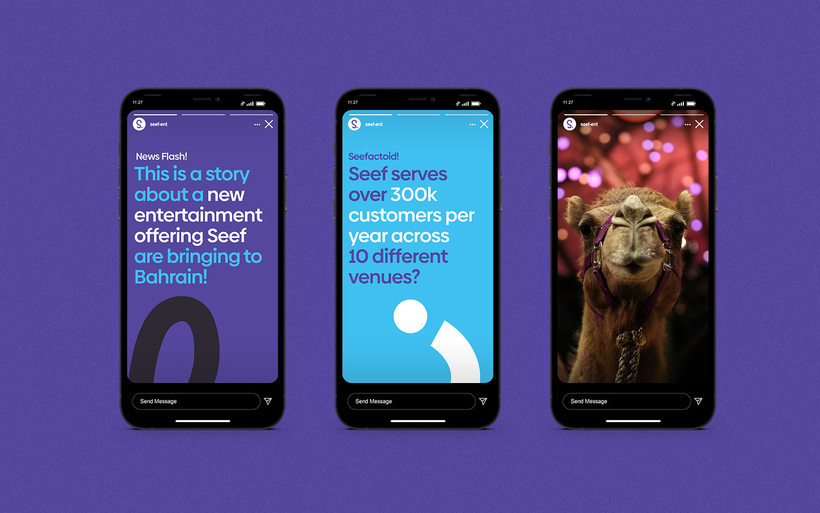
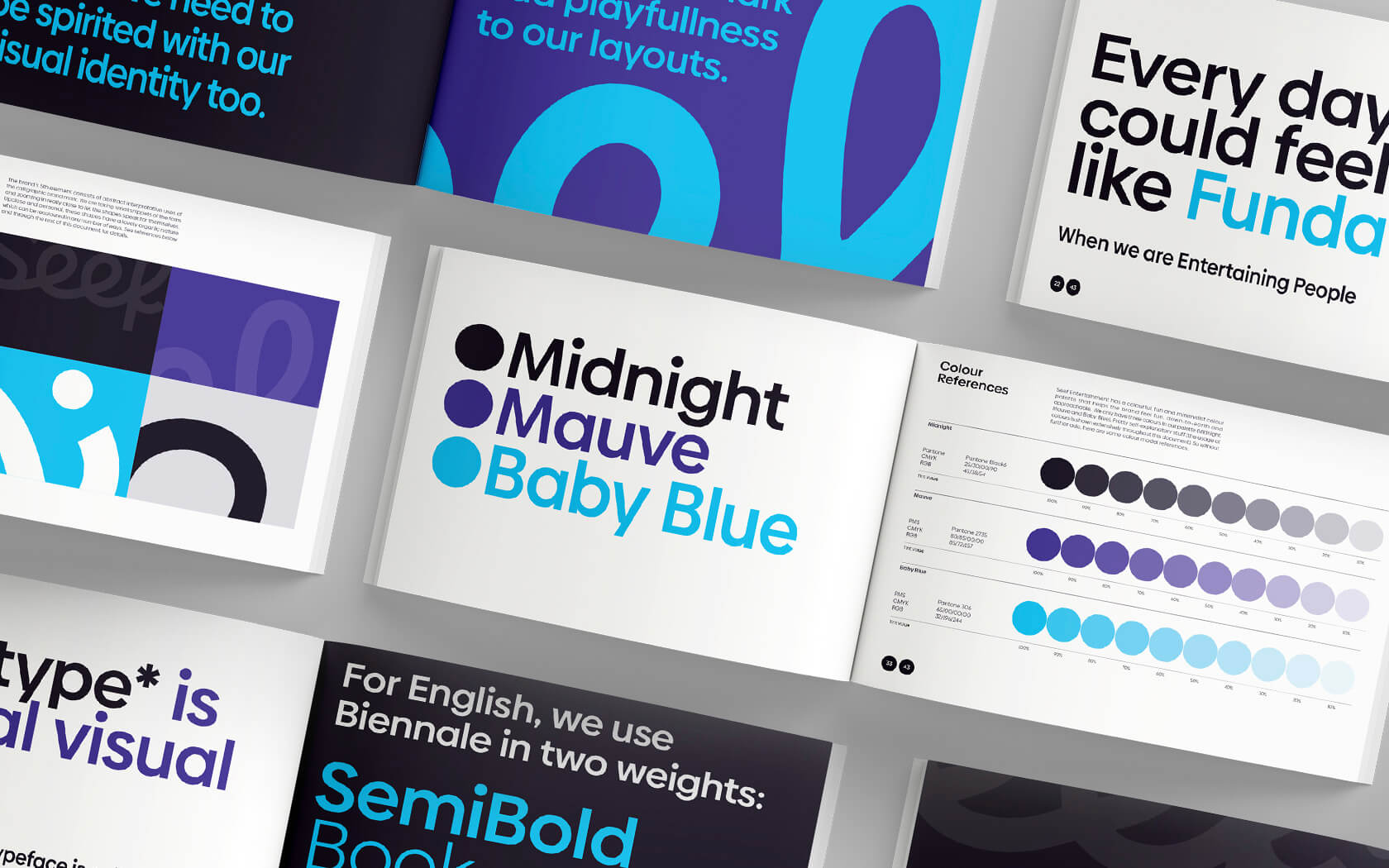
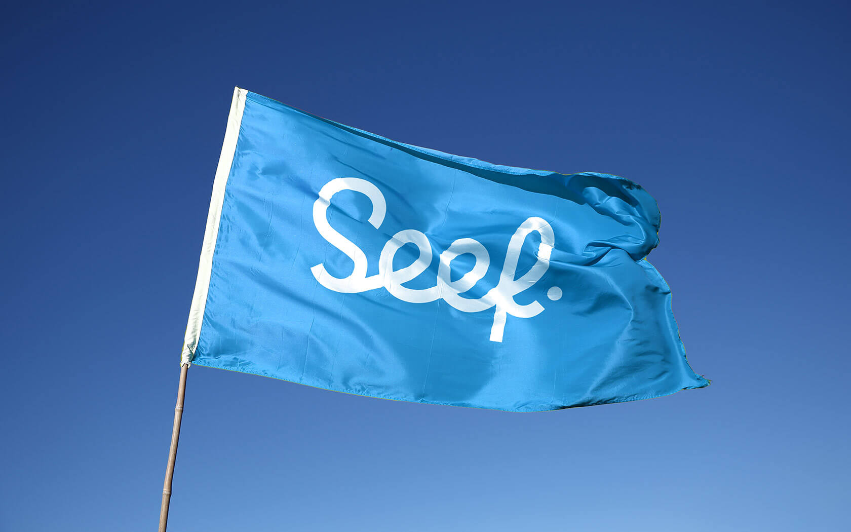
Supporting the graphics is Latinotype’s Biennale type family, a lovely, round and fun interpretation of the classic Avant Garde. The colour palette is Baby Blue and Mauve combined with a Midnight Bluish Black tone. A striking and dynamic combination that captures your attention in a pleasing manner. Finally, the photographic theme comprises a set of fun and highly engaging narratives from both the audience and performer perspective. Bright and colorful imagery captures the essence of the joy of a shared experience.
The results of our work with the Seef Entertainment brand
The brand has launched internally and has entertained all it has touched so far. The response so far from the CEO and stakeholders has been warm and enthusiastic.
Services delivered
Brand Strategy, Brand Identity Design, Slogan, Signage and Graphic Design.
I think people are really going to love this brand.
Ahmad Yusuf. CEO. Seef Entertainment.
Details View Close

From beginning to end, this project was fun with a capital F!
Liam Farrell. Creative Director & Partner.
GFH.
Rebrand
Rebranding one of the region's most notable Islamic investment banks into a new financial group.
Black Stripe.
Rebrand
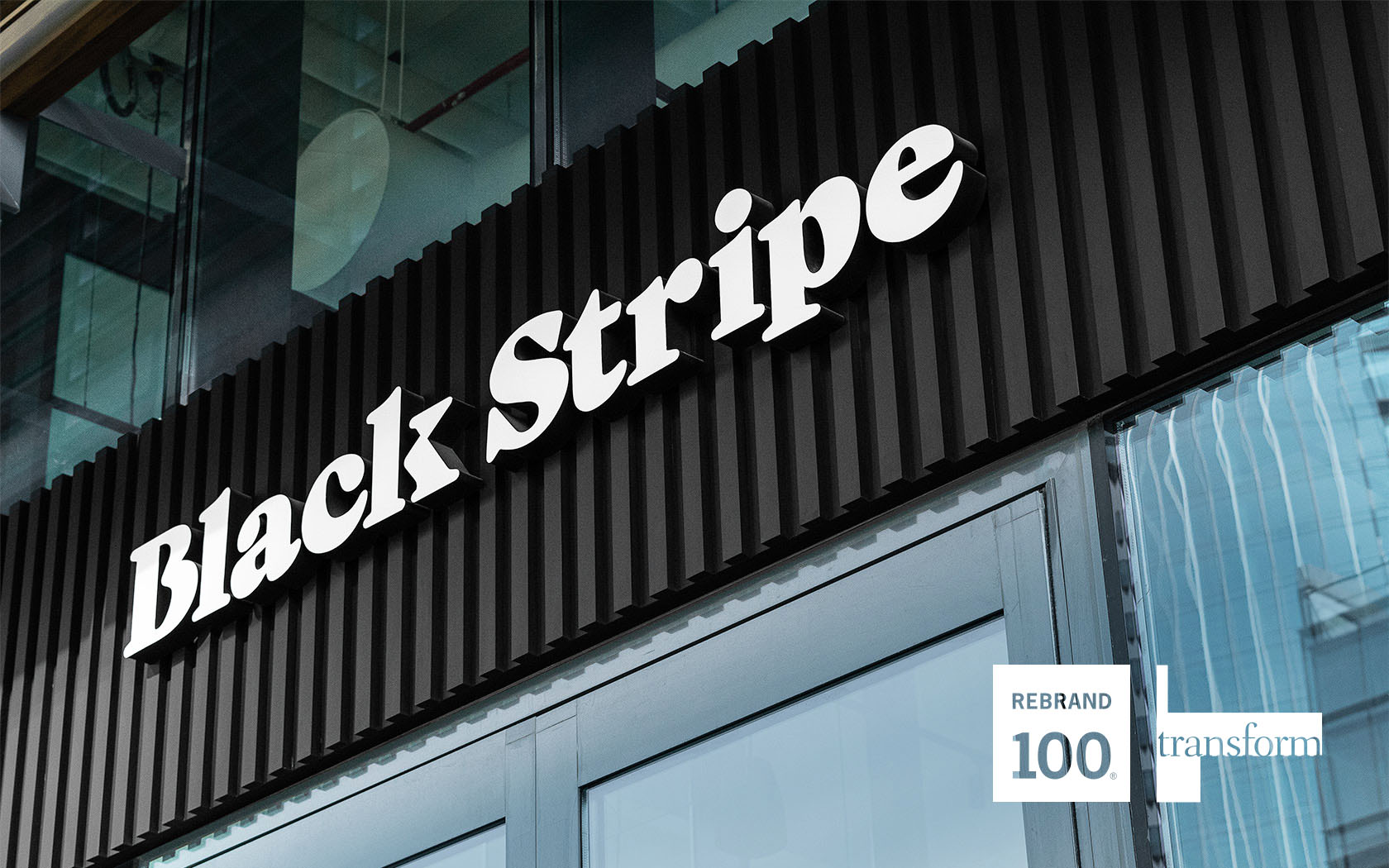
Nobody knows how to rock a bread roll quite like Joe's Mama and her new band... the almighty Black Stripe Burgers.
Harbour Club.
Branding
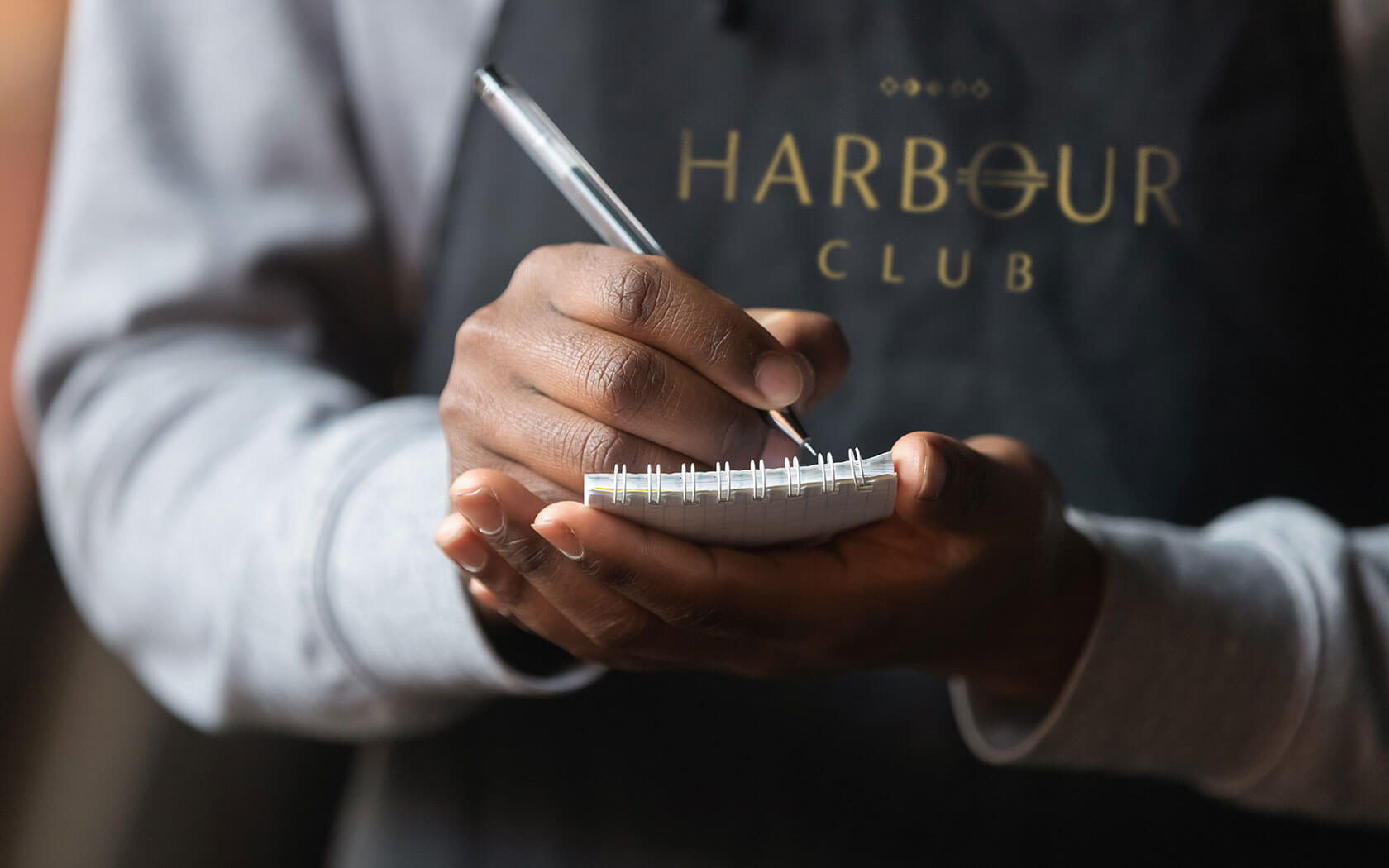
A club of distinction is being built one member at a time, down by the harbour. Perhaps its time to ask yourself.. "are you in the club?"
Infracorp
Brochure
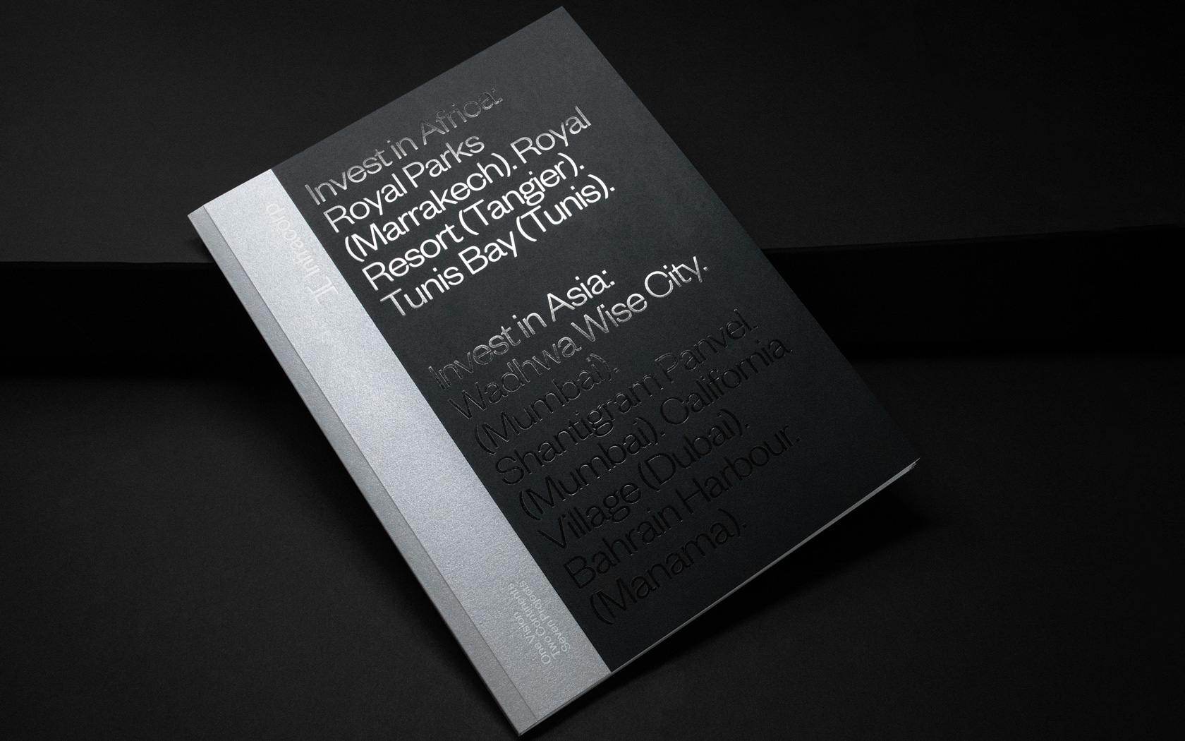
Prestige papers, bespoke treatments and delicious foil finishes set this Infracorp investment brochure well apart from the rest.
Marassi Galleria
Rebrand
Bahrain's most extraordinary life style experience has been given a new wardrobe and make over. Simpler, more glamorous and more befitting of this malls most amazing personality.