Gtech Rebrand

Rebranding & Re-engineering Perfection
Industry Setting
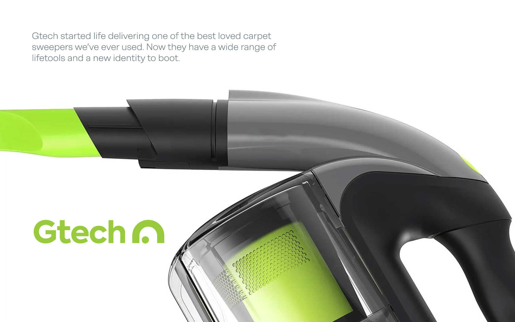
Gtech is a challenger brand that has earned its credentials in the home products department – what we like to call Lifetools. The simple tools that make everyday life that bit better.
Market Challenges
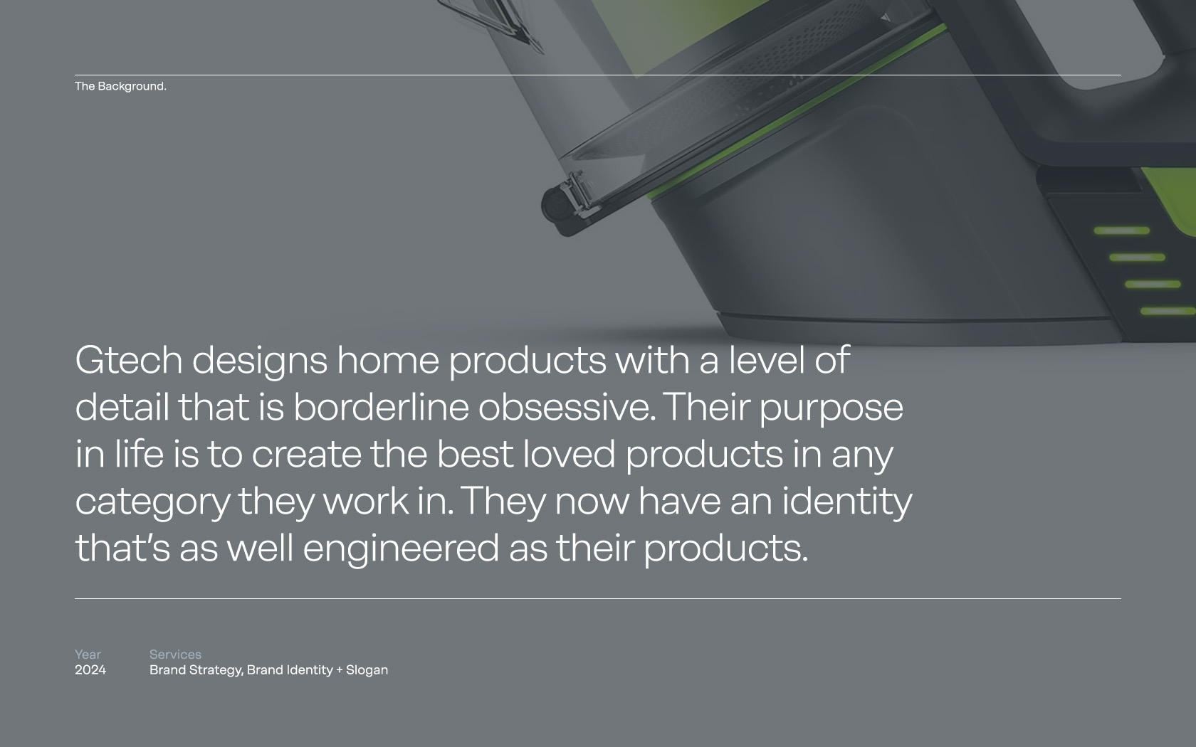
Gtech had a number of issues with its brand which needed to be fixed mostly due to the fact that the product was great, highly-loved by its audience and leaders in many fields – the products deserved an equally lovable brand.
Strategy Applied
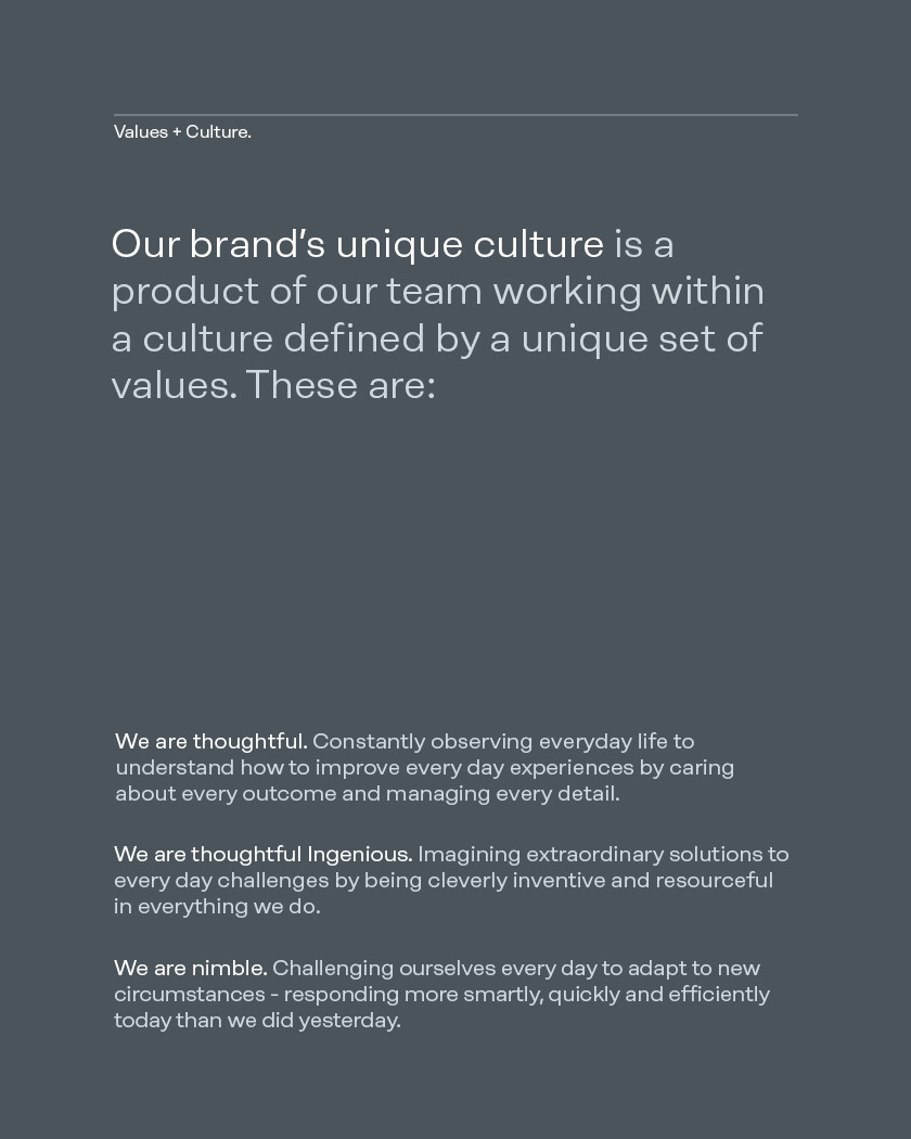
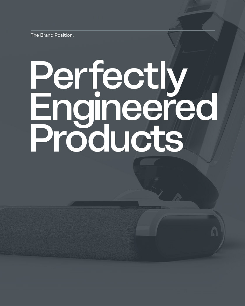
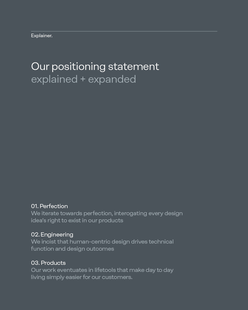
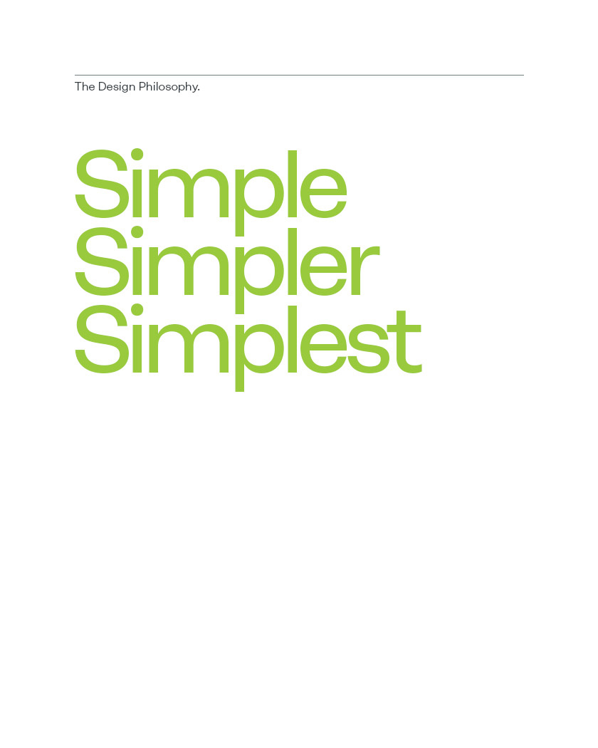
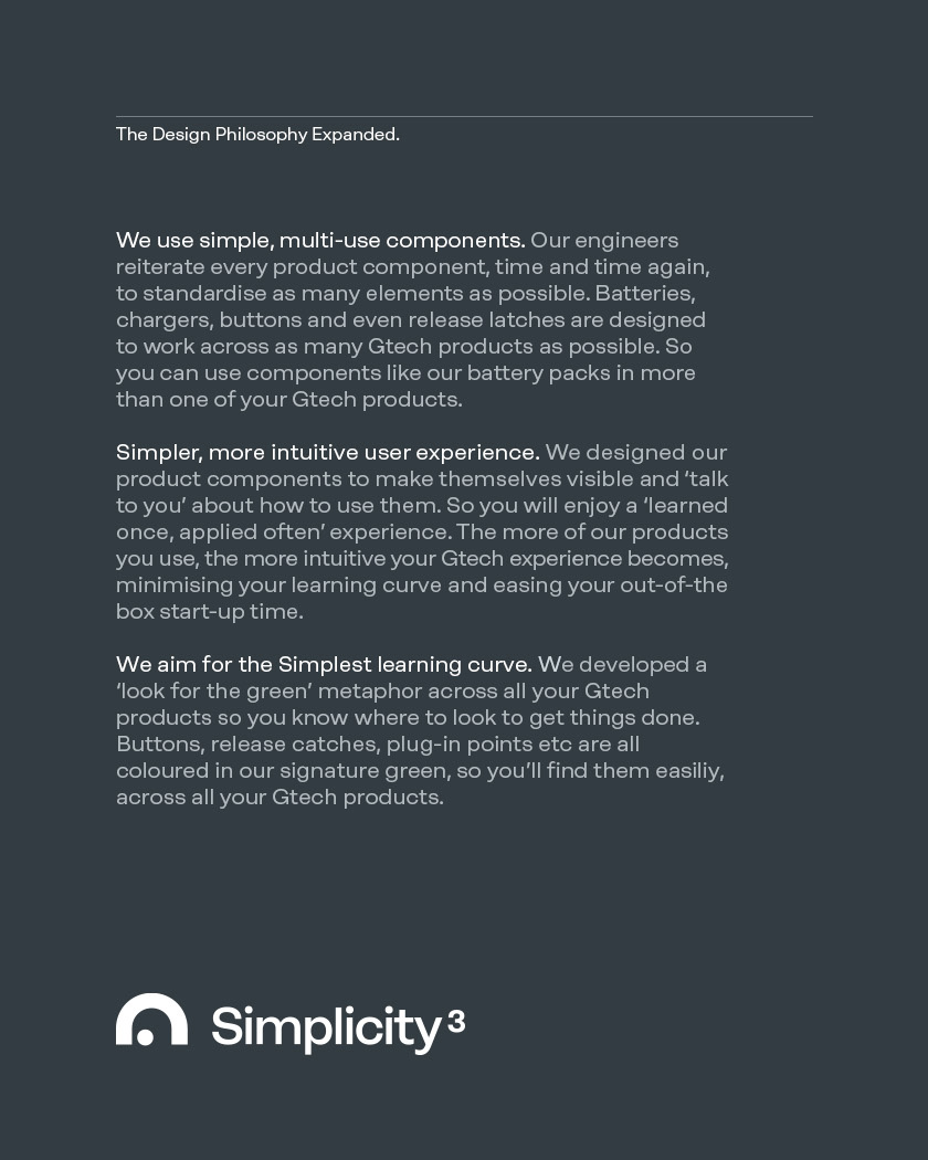
We workshopped with the key internal stakeholders and agreed the strategic framework. The essence of the brand was mastery – Gtech engineered product design towards perfection, every time. A new vision was drafted ‘To solve everyday challenges through extraordinary design’, coupled with new values of ‘Thoughtful, Ingenious and Nimble’ and a new ‘Perfectly Engineered Products’ positioning gave Gtech a previously missing poise.
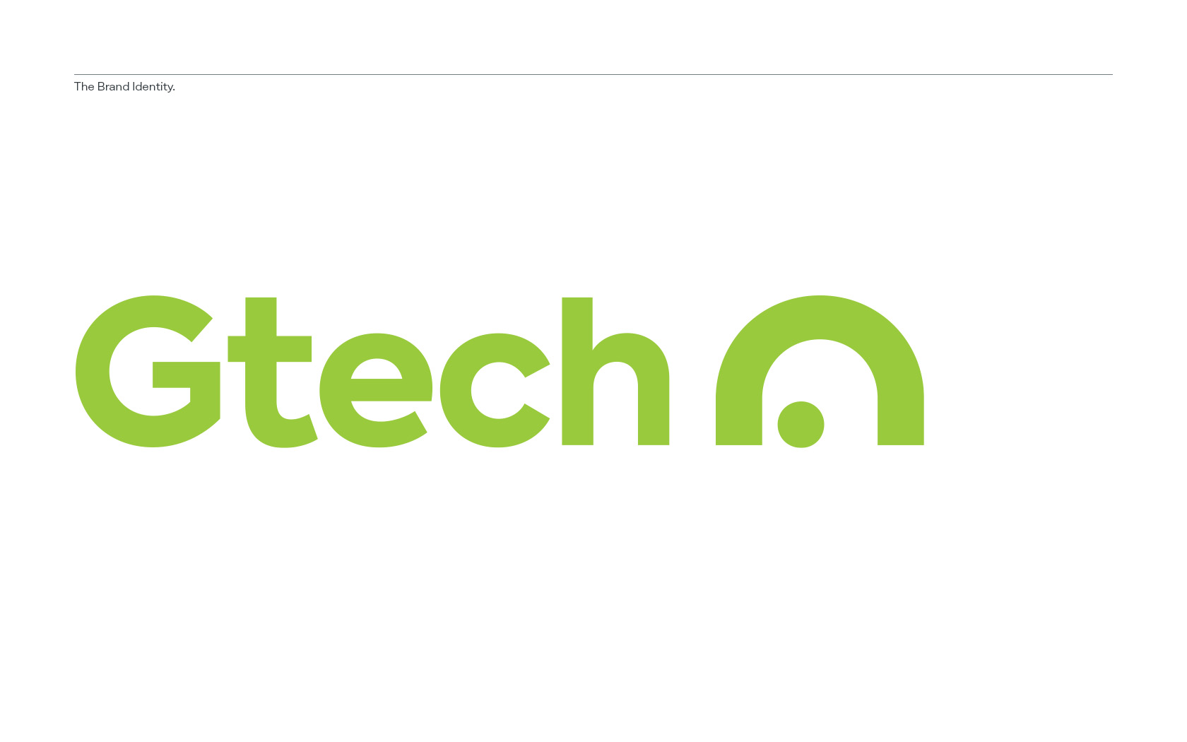
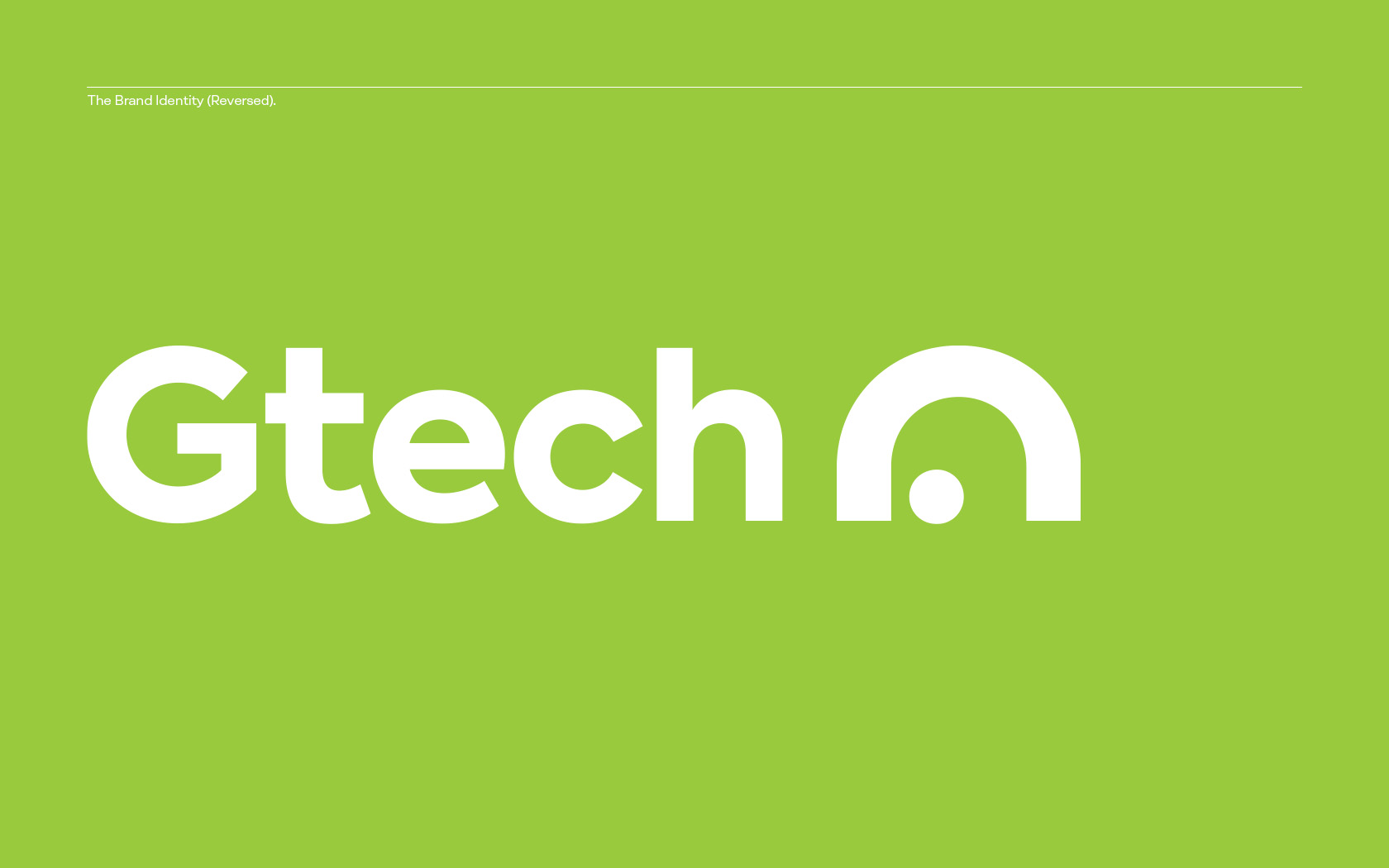
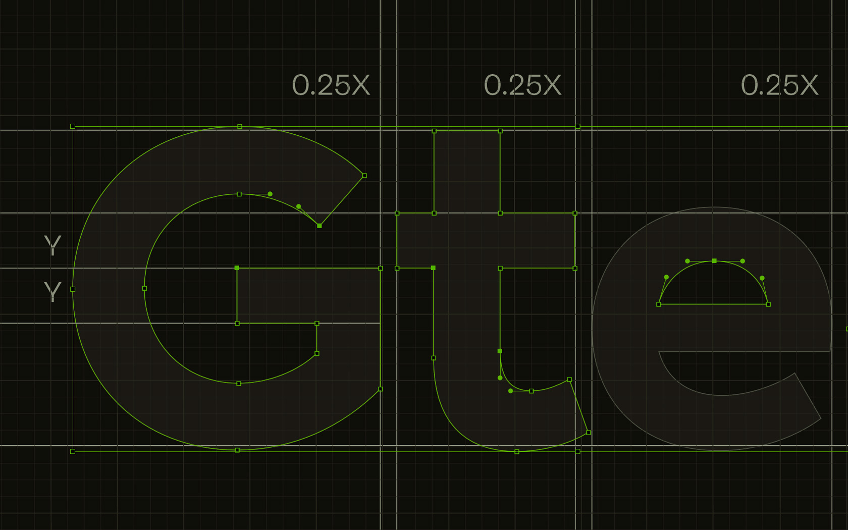
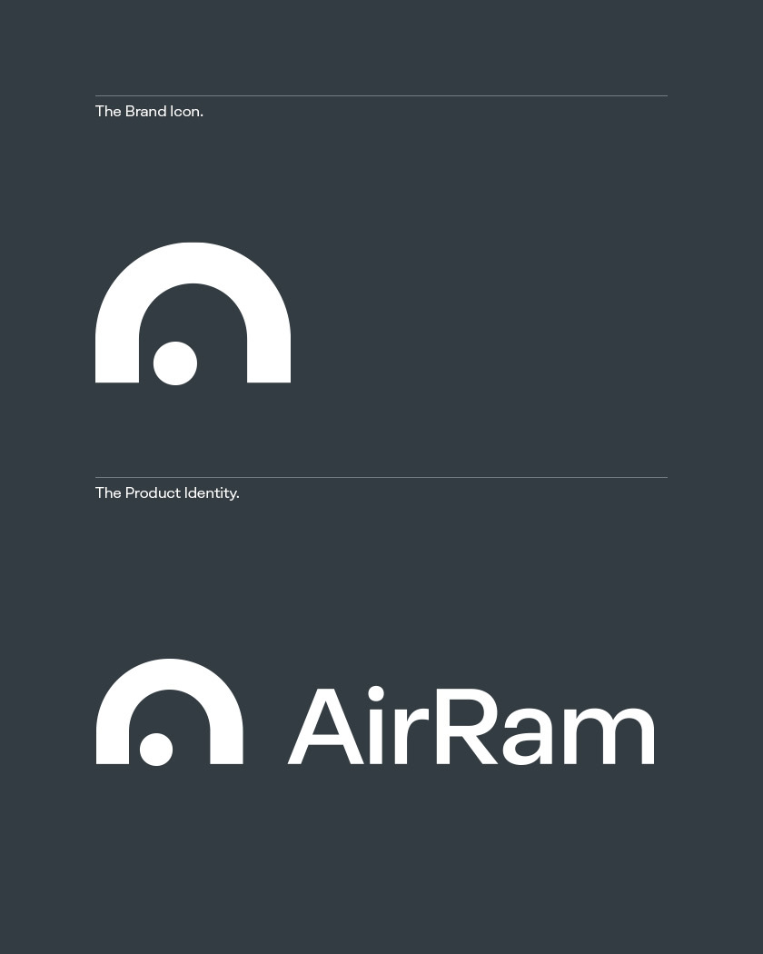
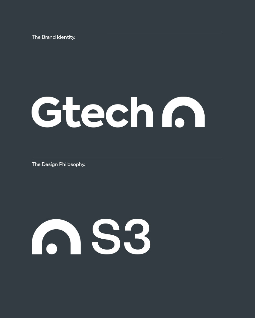
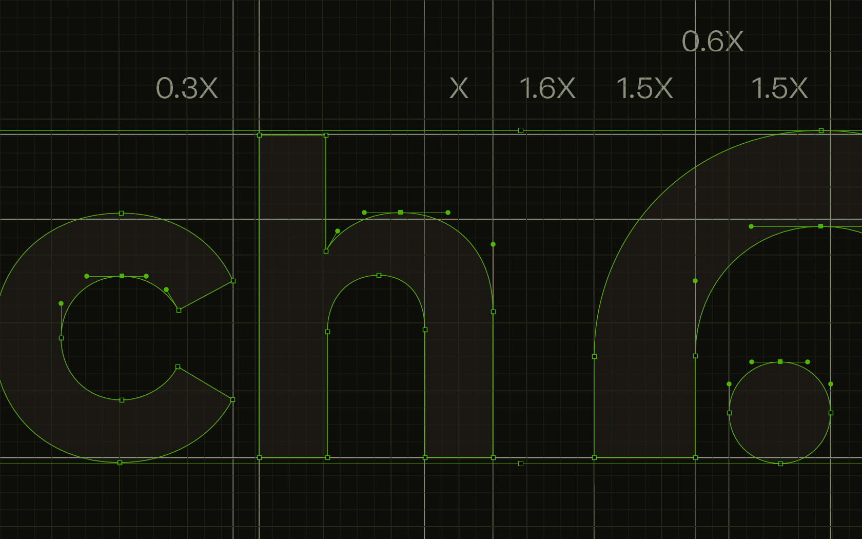
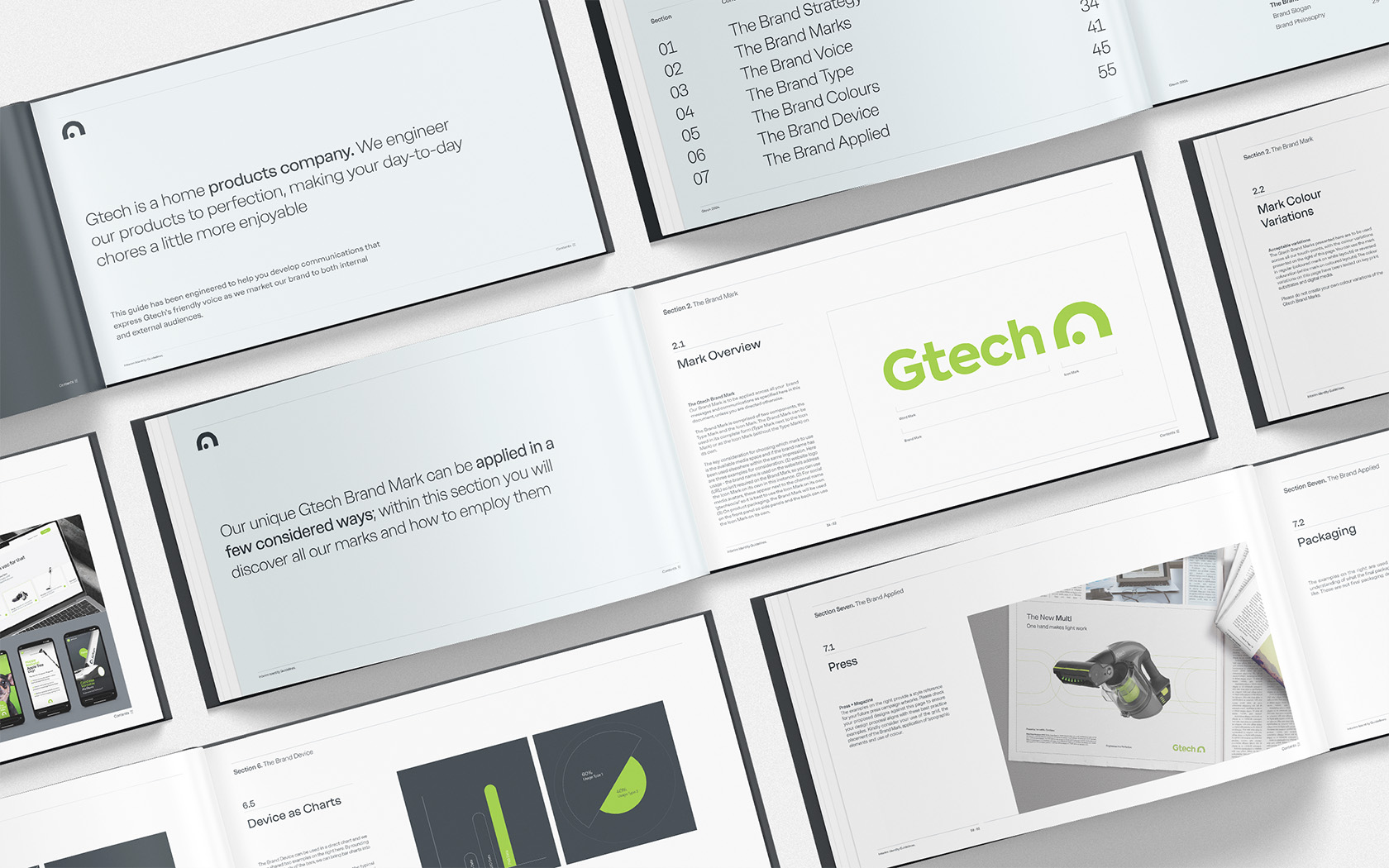
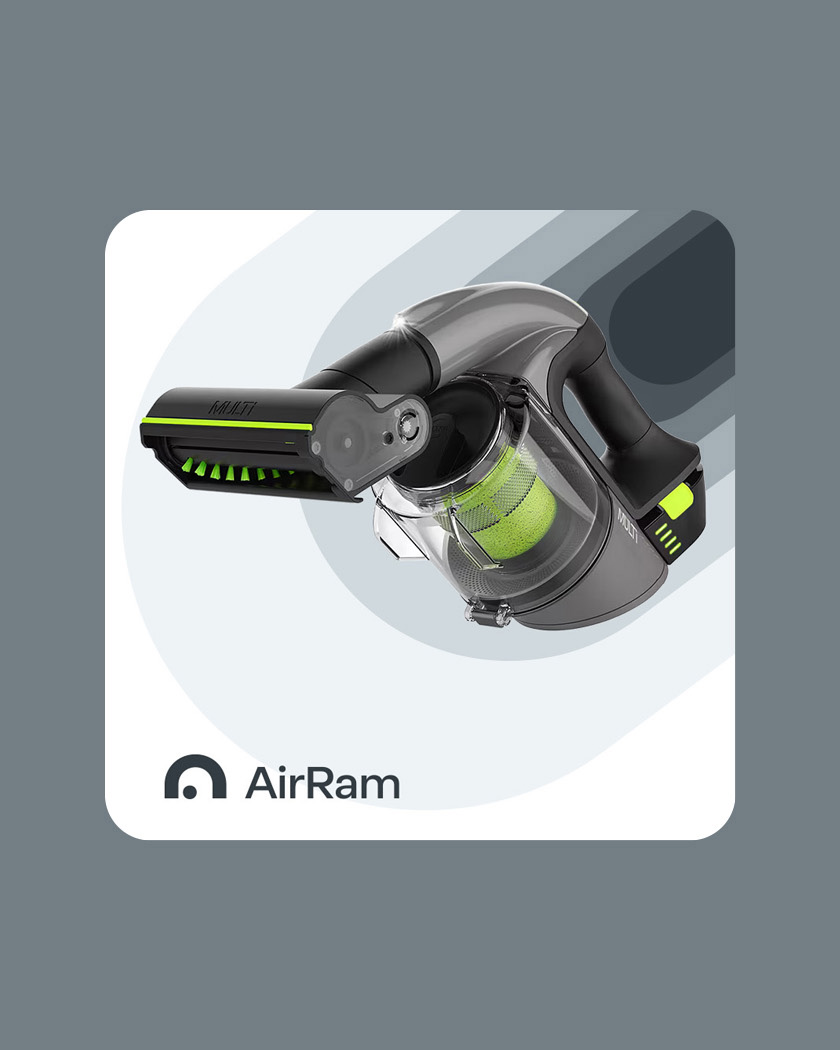
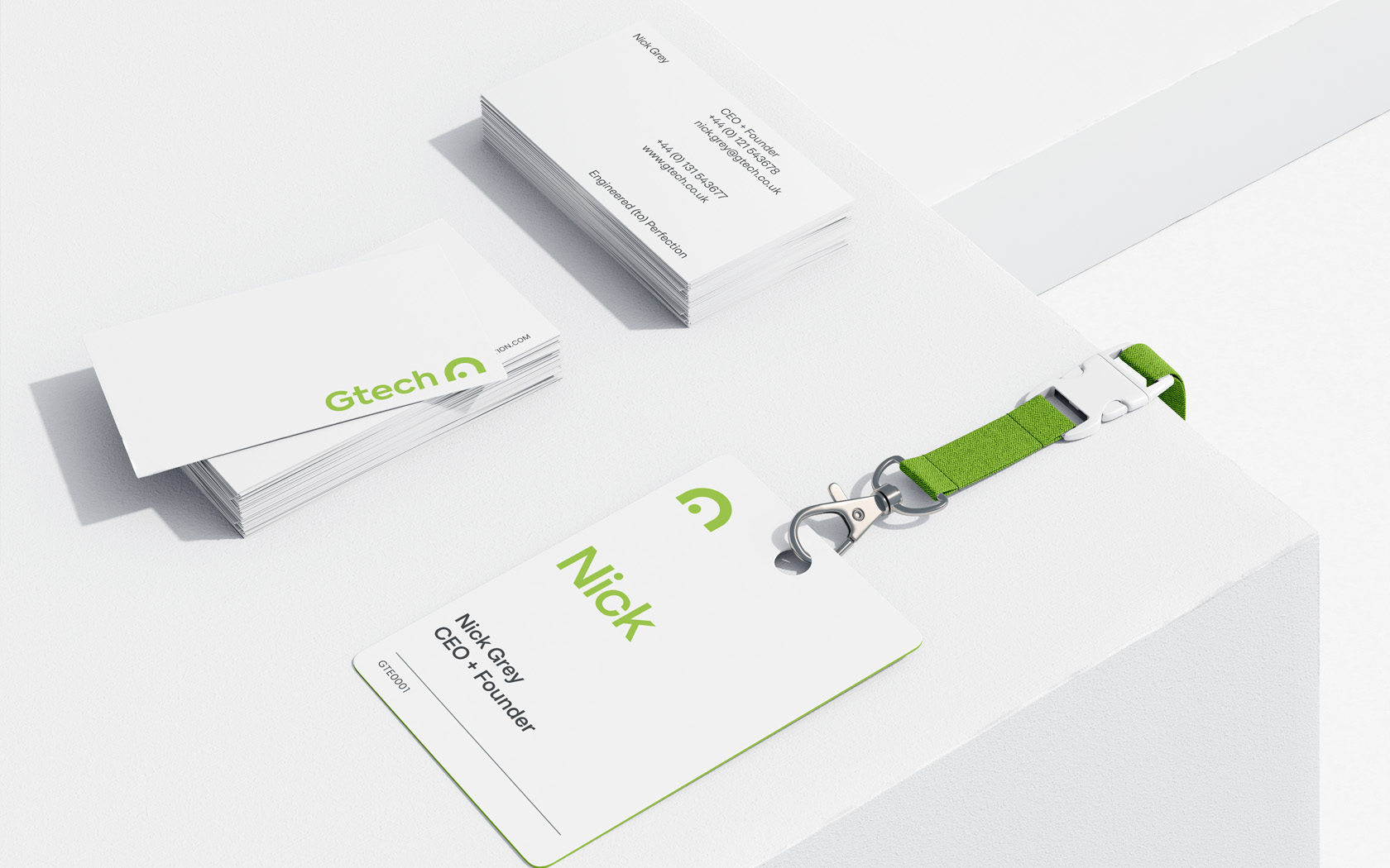
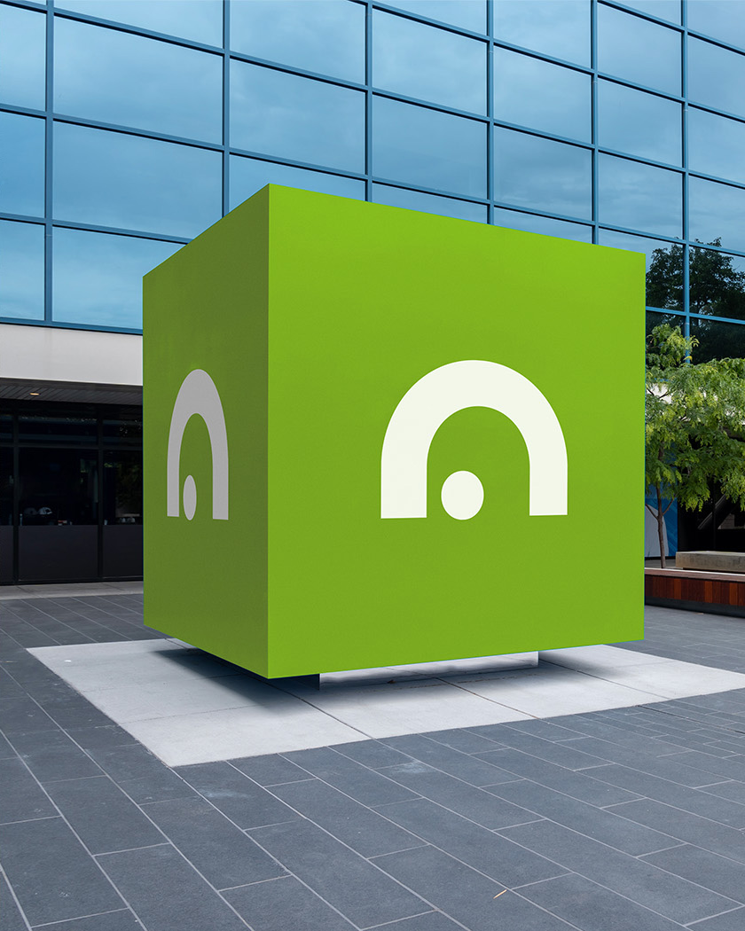
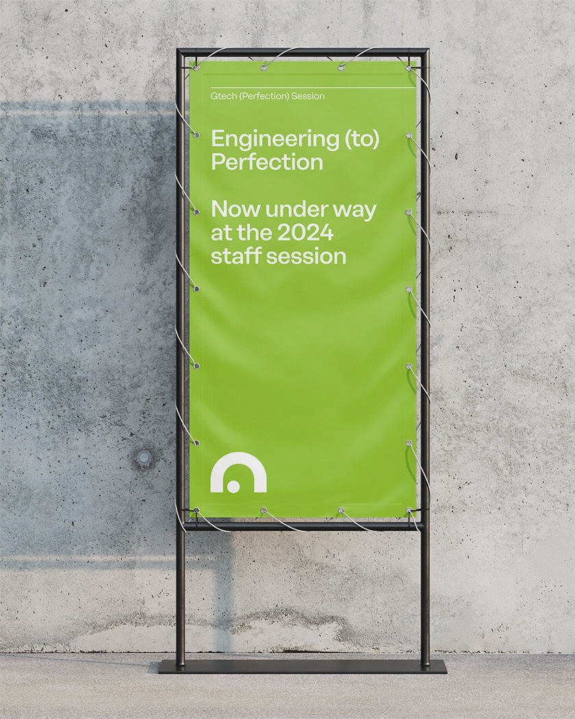
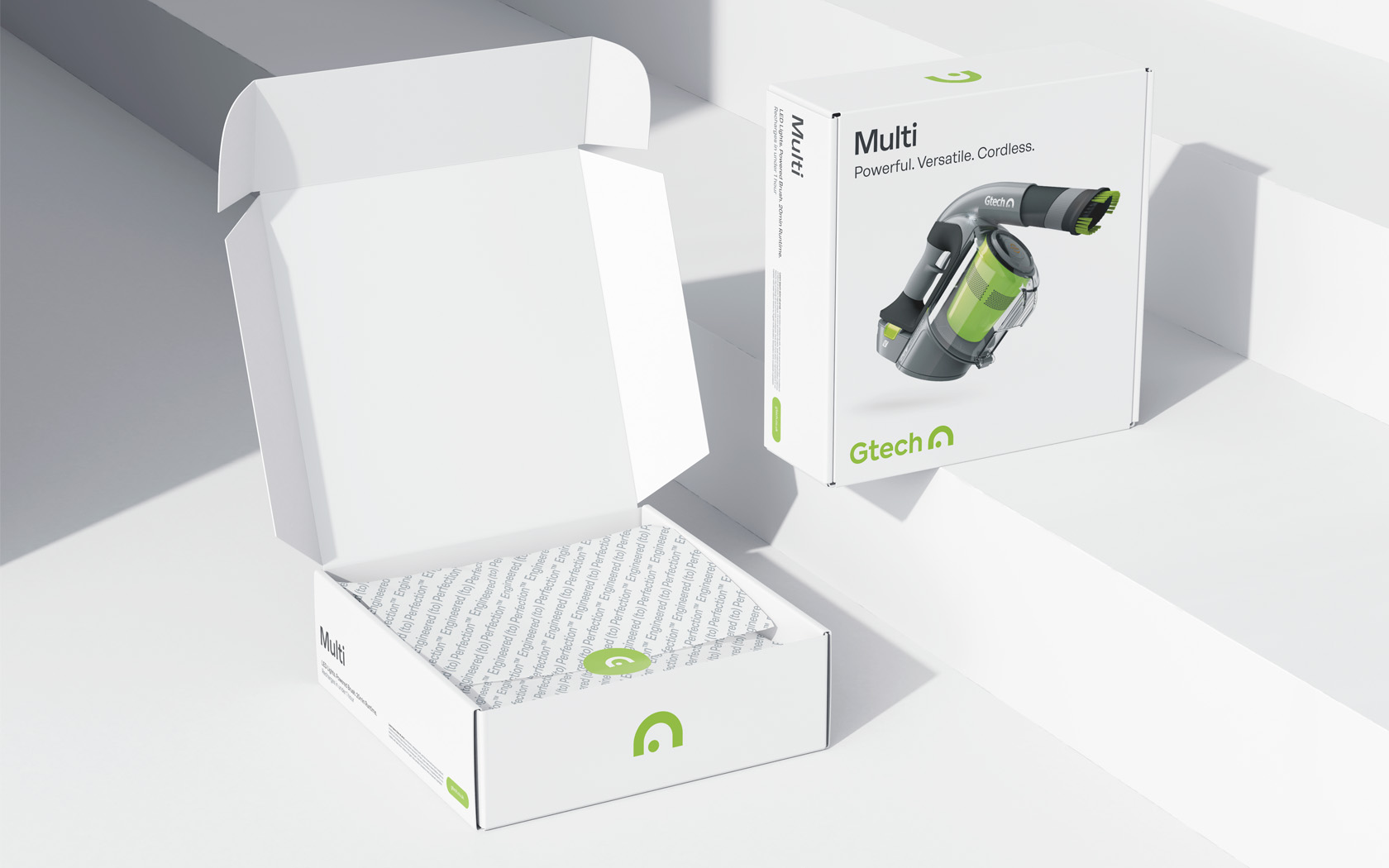
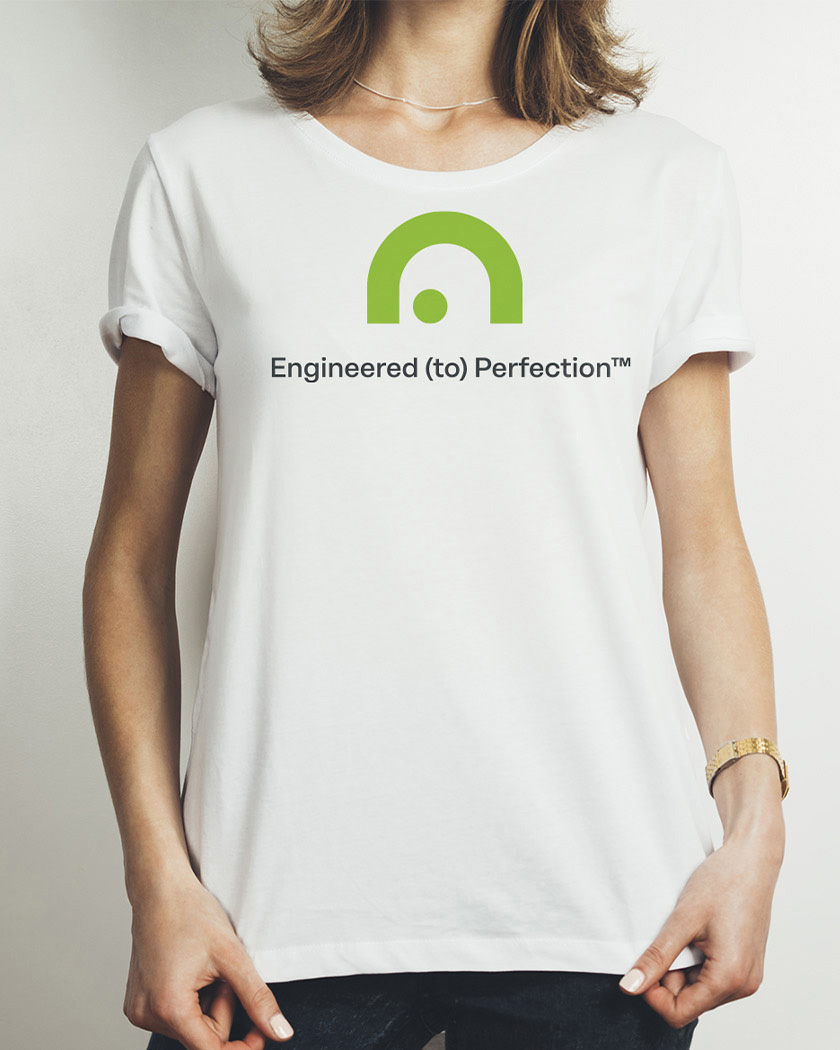
We redrafted our Creative Director’s original icon* and tidied up the typographic mark which was not supporting the notion of perfection in (visual) engineering.
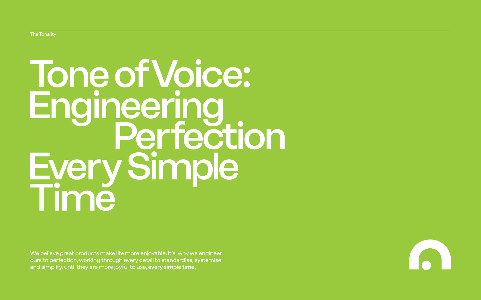
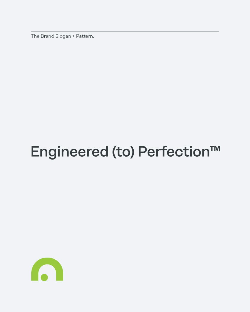
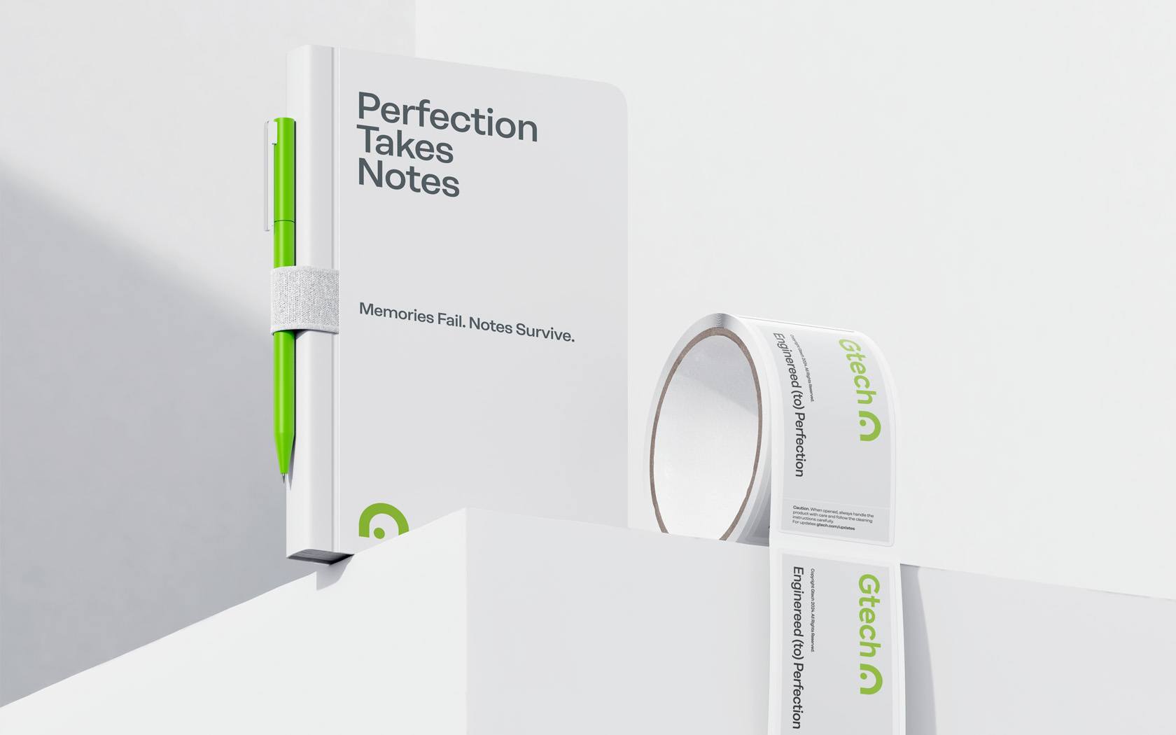
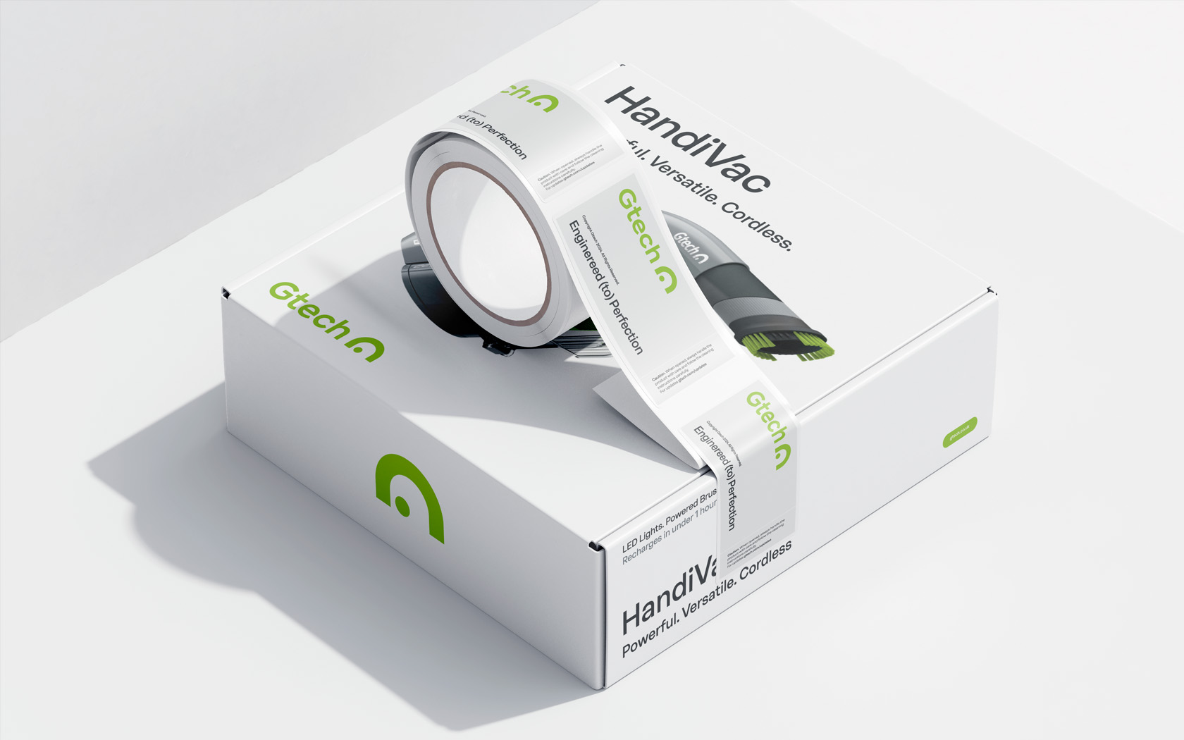
The ‘Engineered (to) Perfection’ slogan captures both an ambition and a status of a brand who aims high while recognising it’s always travelling on a journey and not resting at a destination.
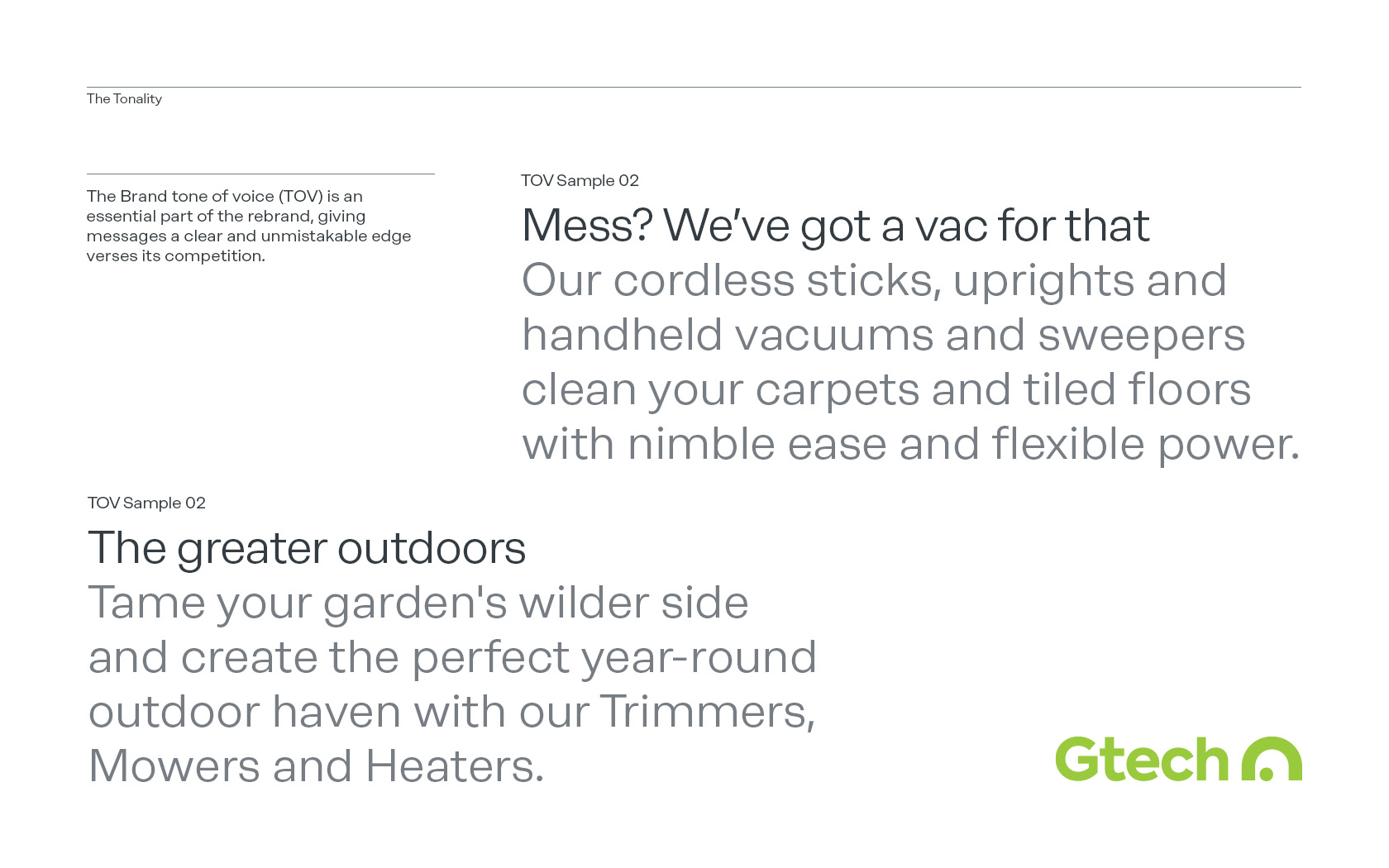
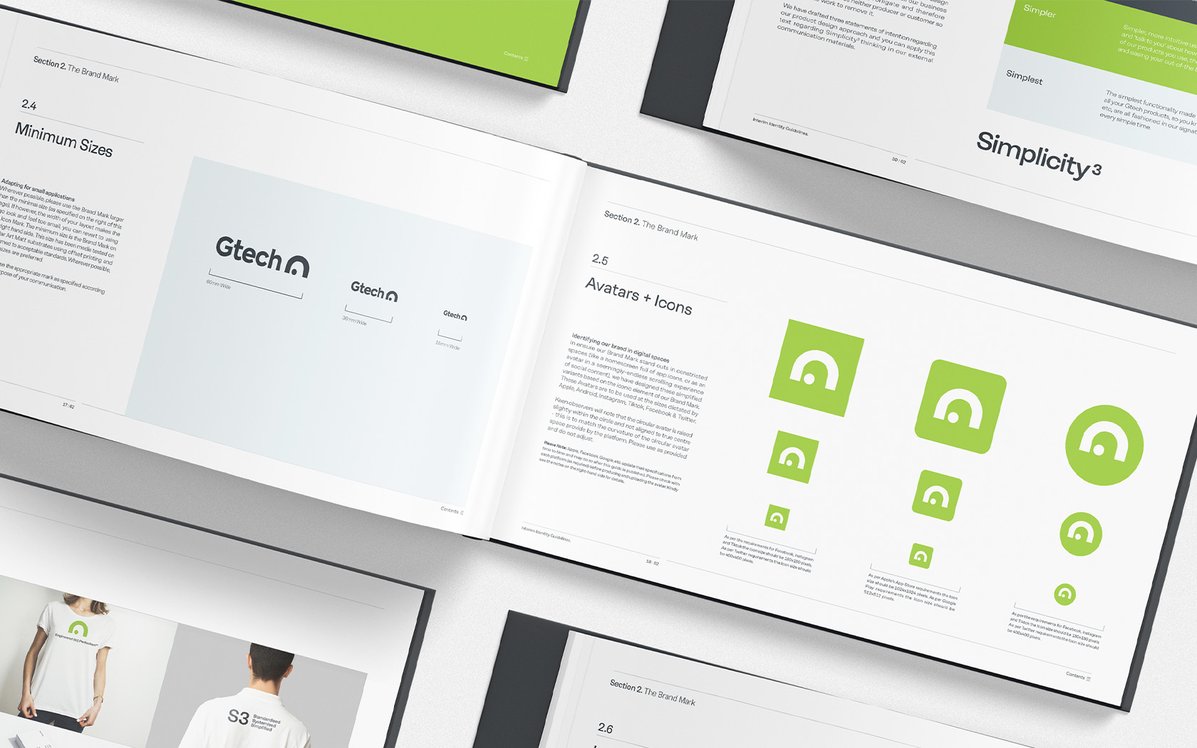
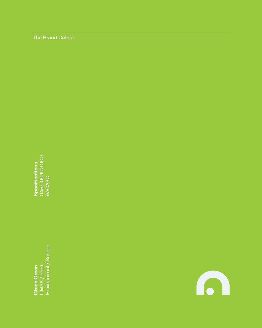
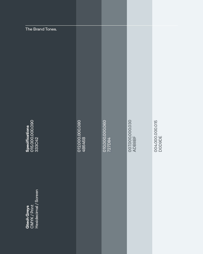
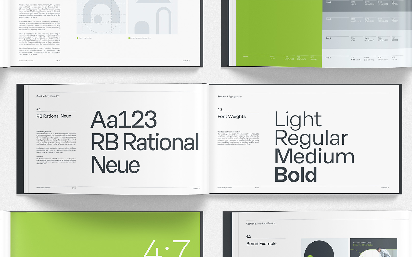
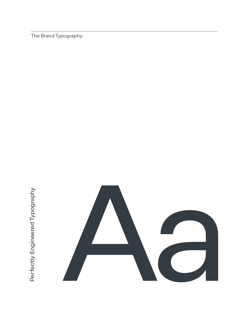
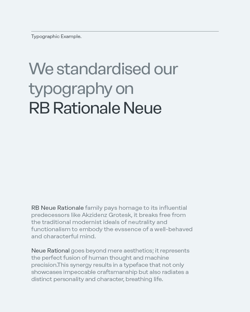
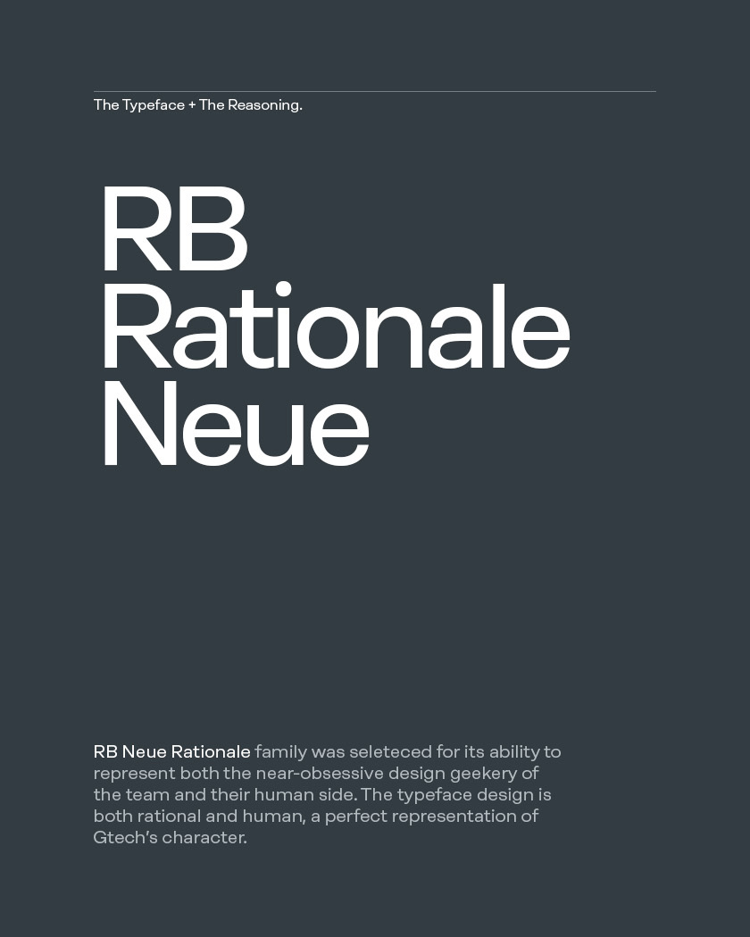
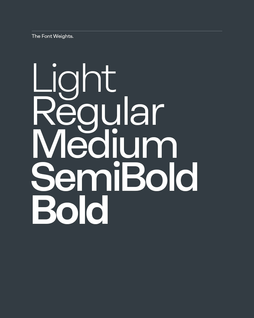
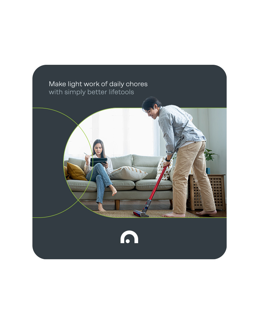
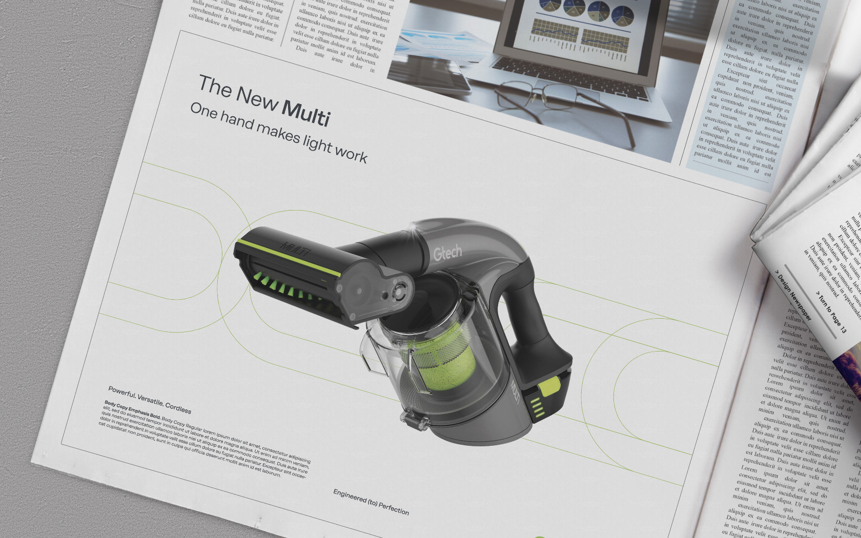
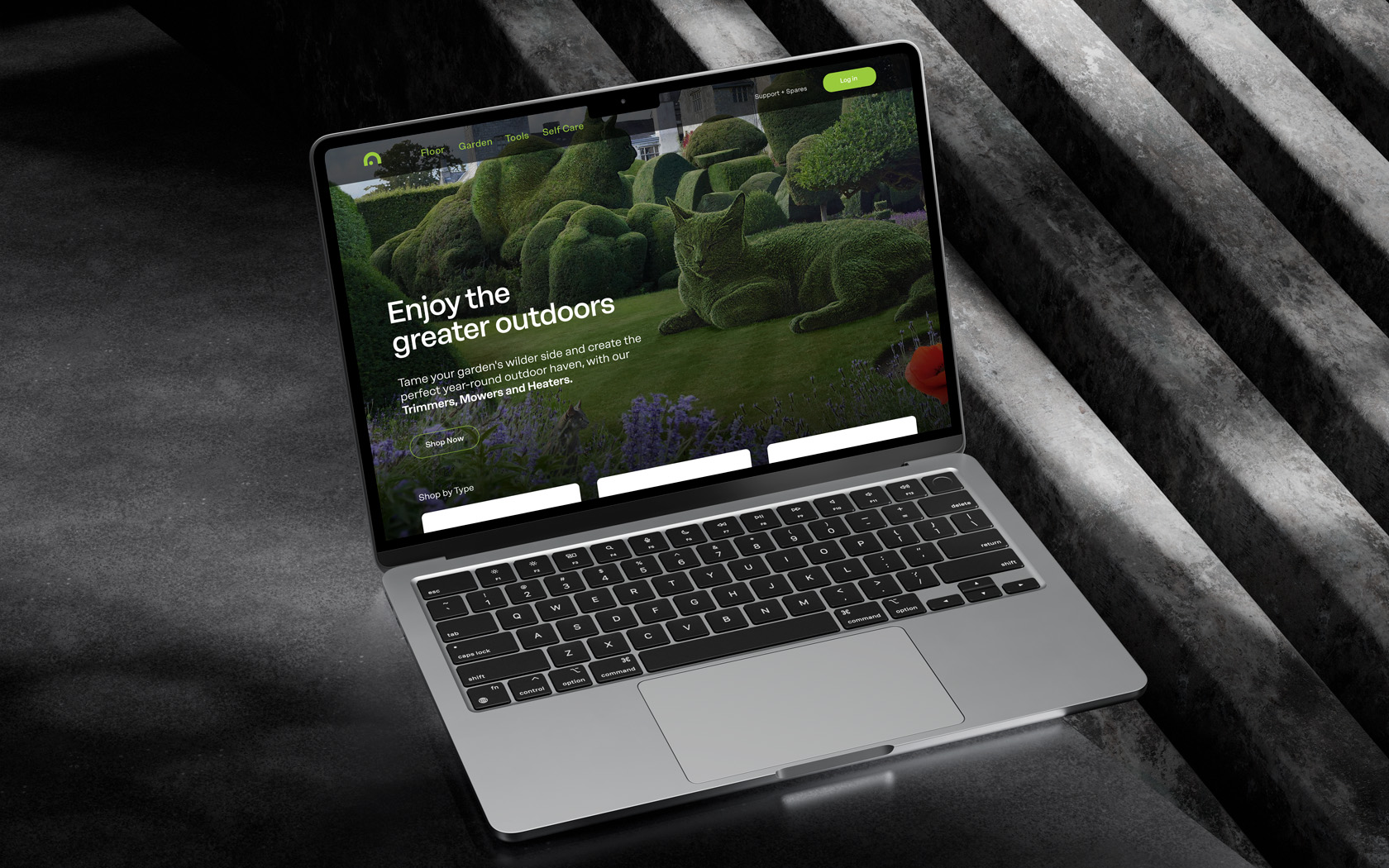
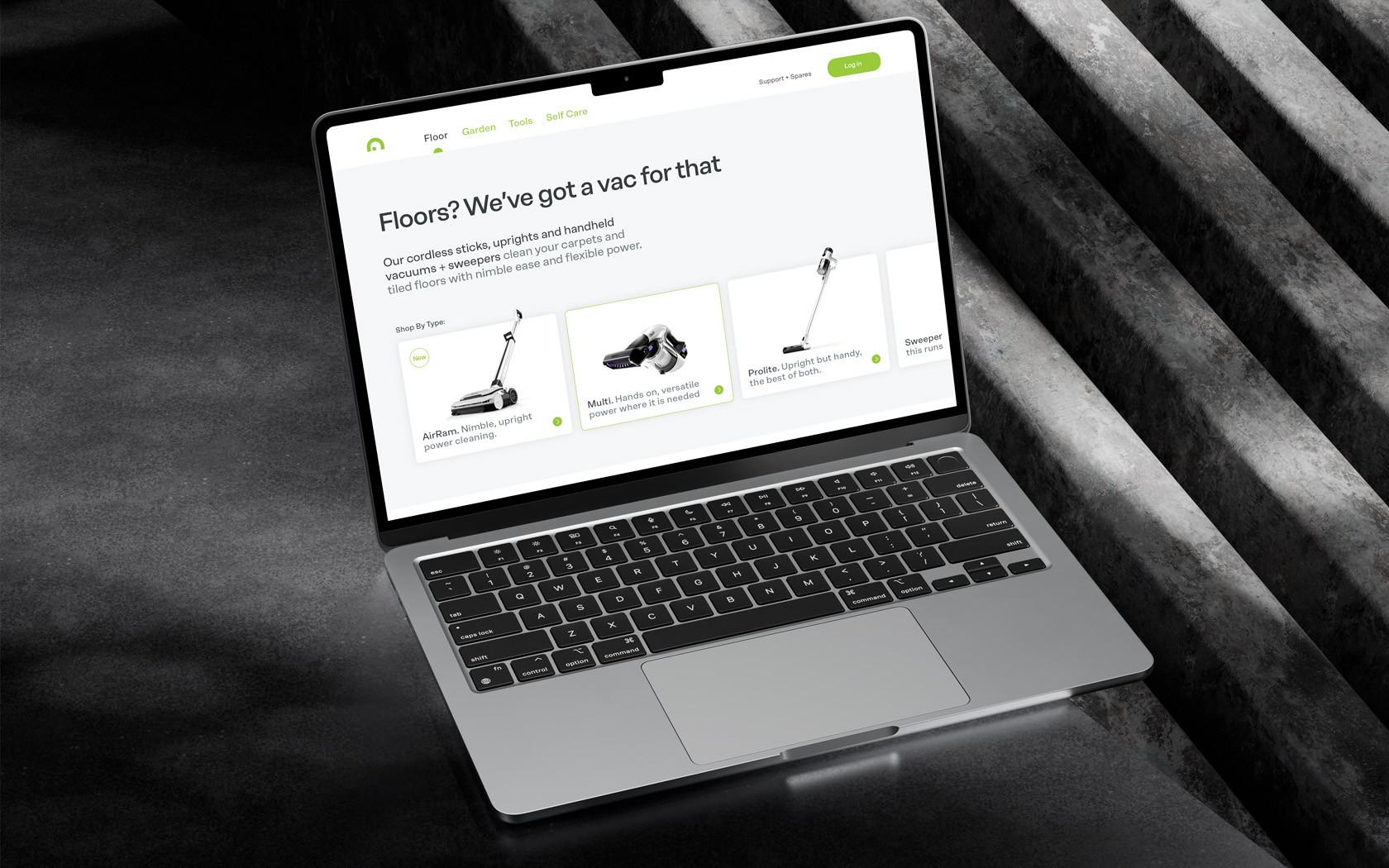
We created a supportive new graphic system based on interpretations of the ‘friendly home’ icon, supported by a consistent green focussed colour scheme. Messages are tighter and ever so playful and now come dressed in Rationale Neue by Berlin type design master Rene Bieder. This friendly, contemporary reinterpretation of Helvetica helped express the near-obsessive level of perfection coupled with a friendly and open minded nature of the brand.
* Liam Farrell, our founder and Creative Director first rebranded Gtech back in 2002 and we were appointed based on his reputation for future proofing brands, especially in regards to naming.
Services Delivered
Brand Strategy, Brand Design, Visual Identity, Slogan, Tone of Voice, Graphic Design.
Want to see more?
What you’ve done with the brand is pretty much spot on; its well engineered.
Nick Grey
CEO. Gtech
Details View Close

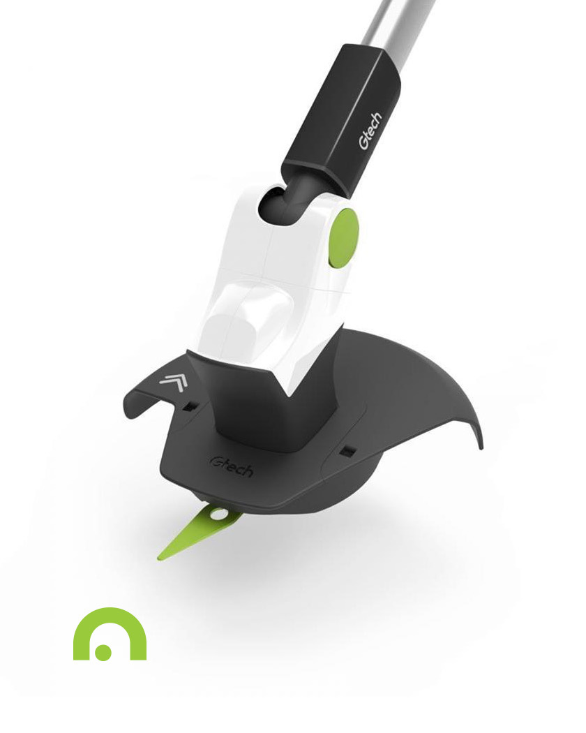
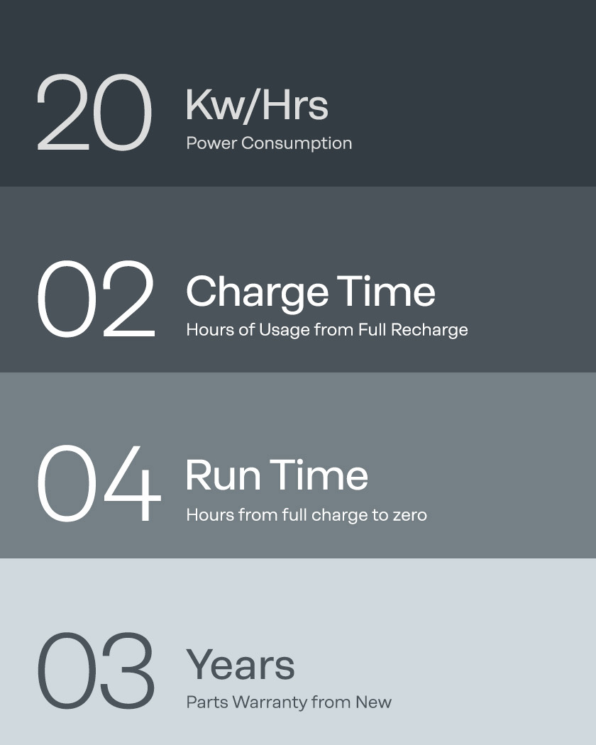

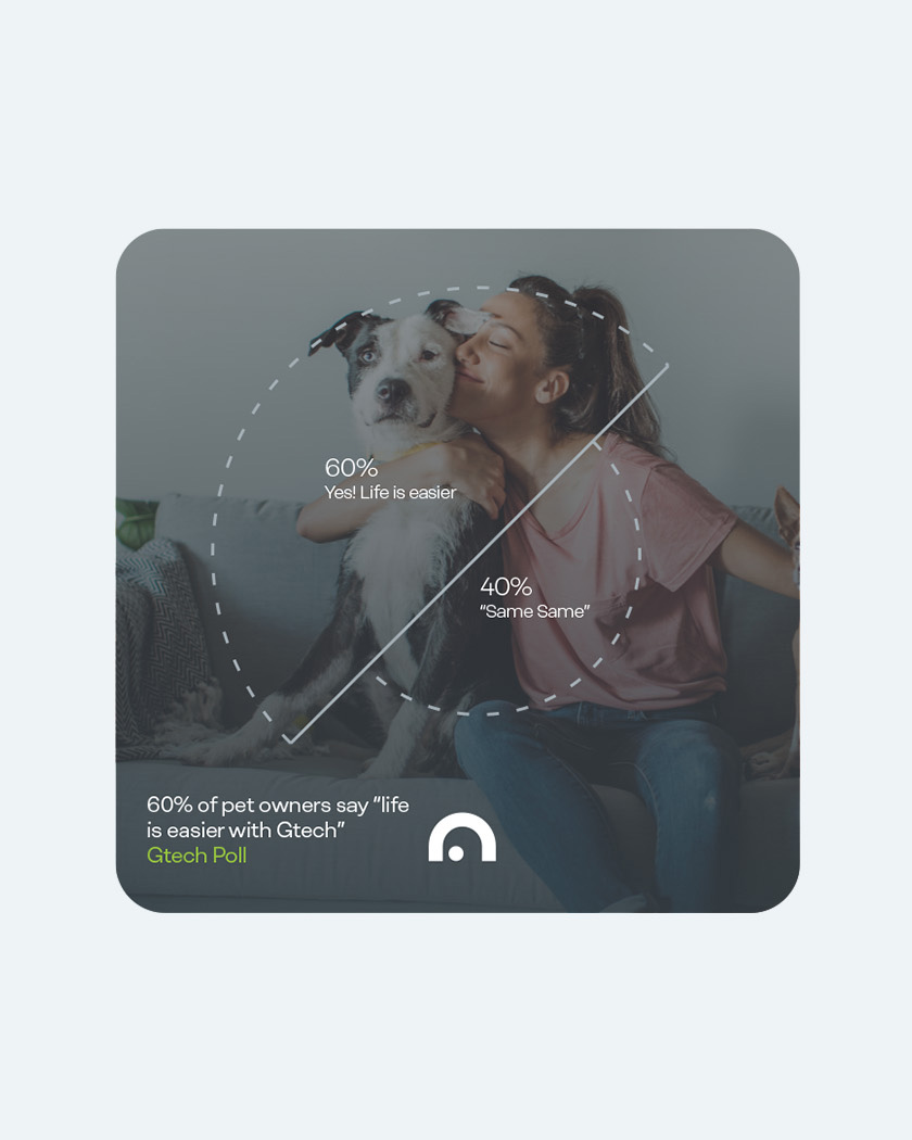
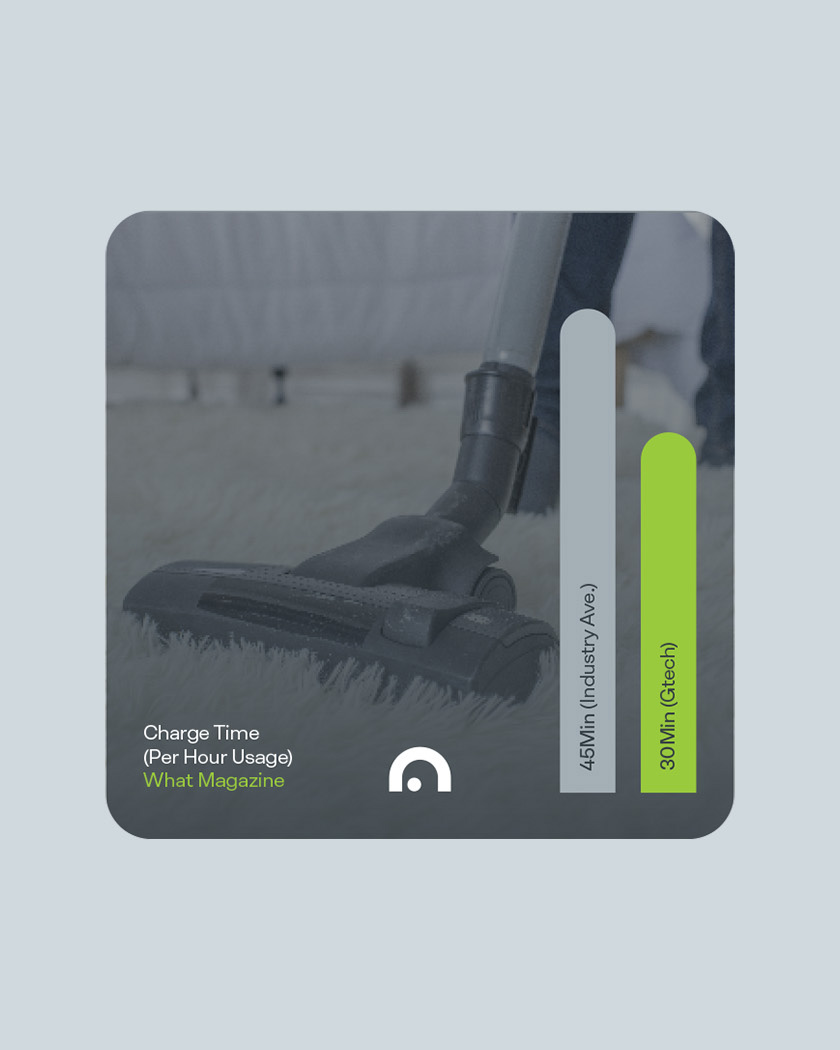

Seek perfection and you’ll find joyful surprises along your journey.
Liam Farrell. Creative Director & Partner.
Esterad.
Annual Report 2019
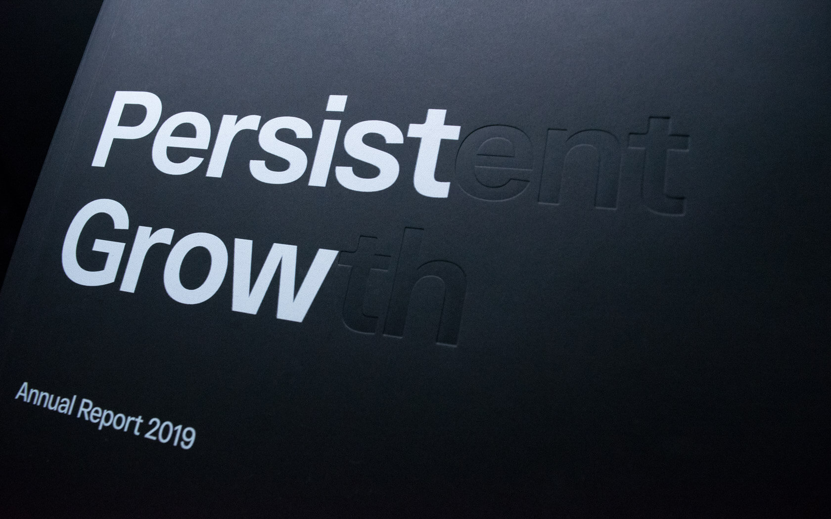
This beautifully finished Esterad Annual Report 2019 celebrates another remarkable year for this prosperous brand.
Shamsaha.
Rebrand
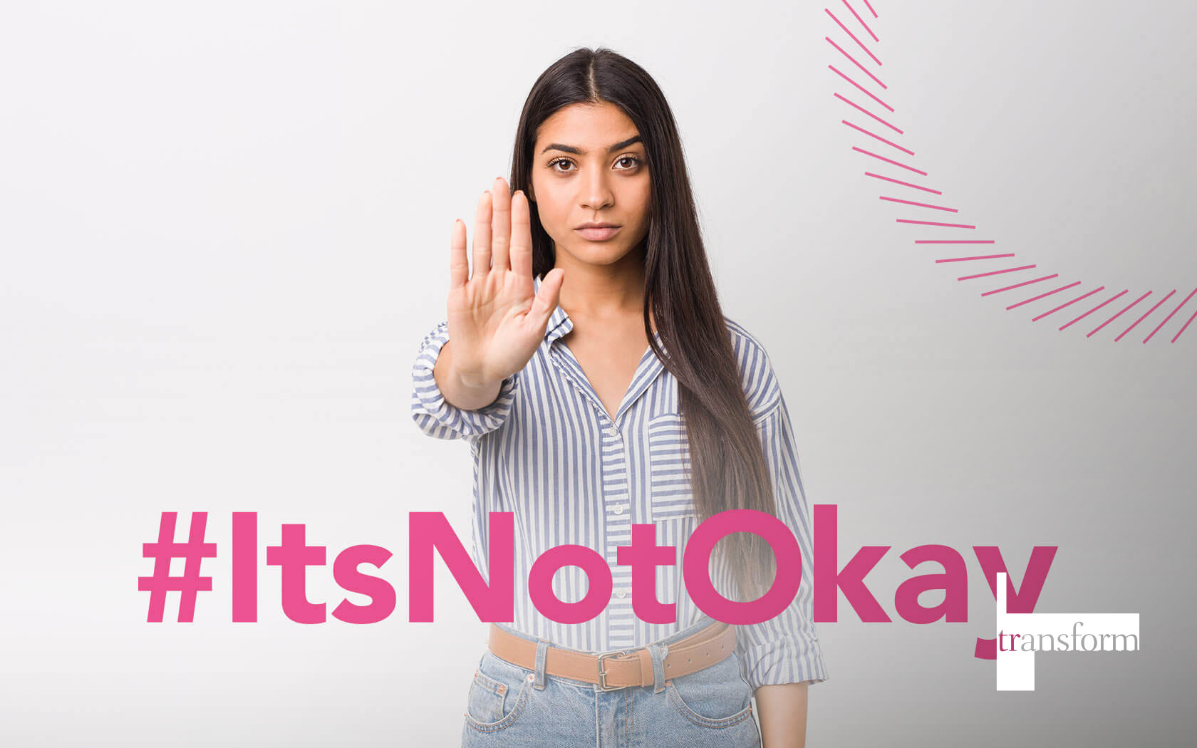
This illuminating rebrand for Shamsaha, the women empowerment charity, won Highly Commended at Transform 2021.
Tivoli
Brochure
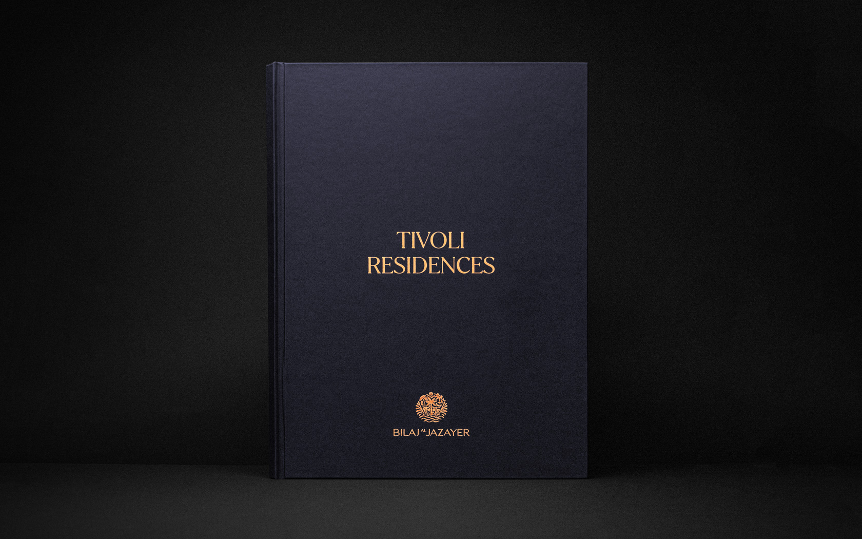
Prestige papers, bespoke treatments and delicious foil finishes set this Infracorp investment brochure well apart from the rest.
GFH.
Calendar
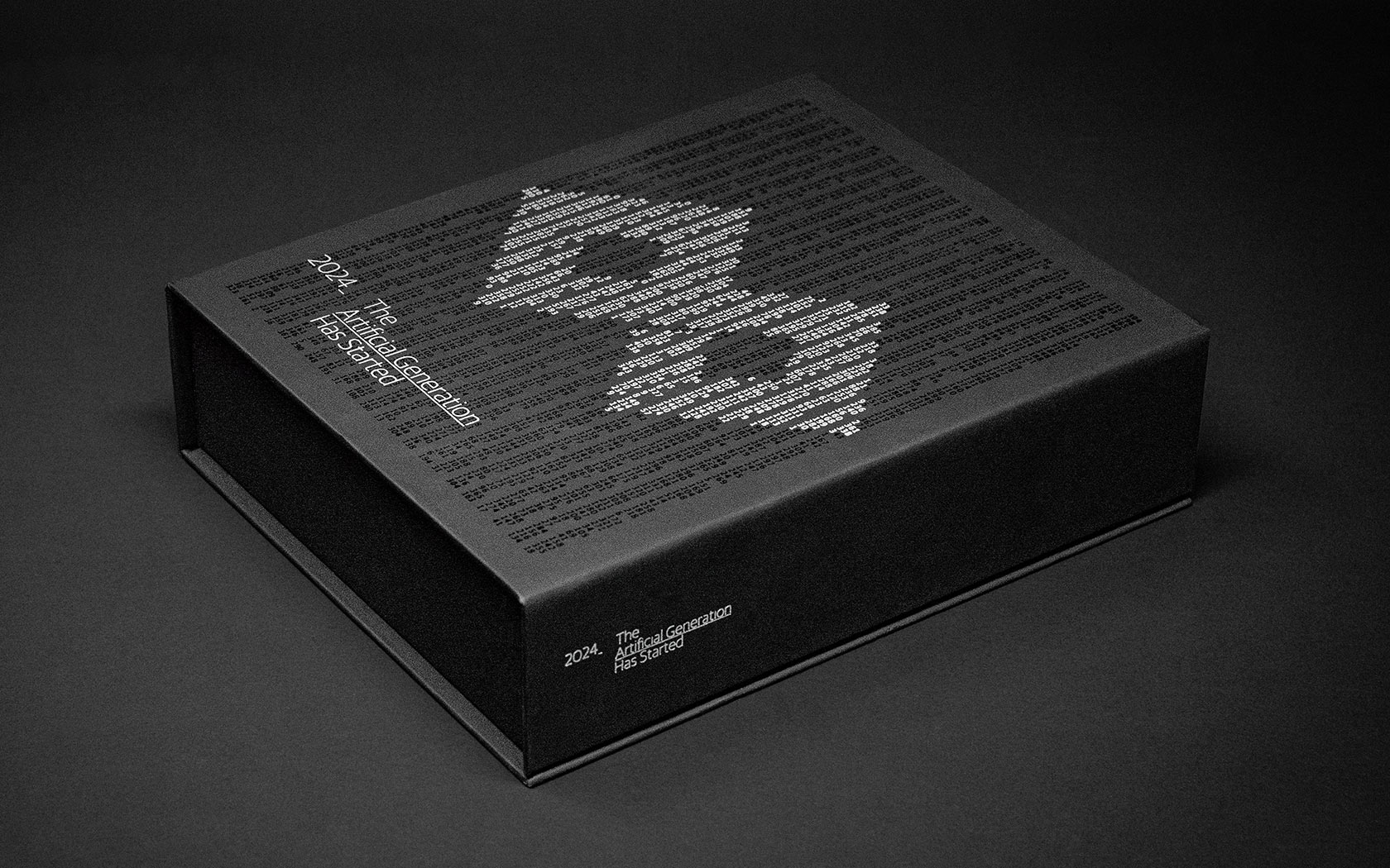
On 2024, when AI is set to generate more content than humans, it will take us beyond GenZ and into a new, artificial generation.
GFH.
Rebrand

Rebranding one of the region's most notable Islamic investment banks into a new financial group.